Set up the measurement tool. Clean and process the data. Turn it into information. Analyze it. Extract insights.
That’s hard work. But to have value, there’s still another step—the work must also be well communicated. You want data to form a straight line from KPIs to influencing business decisions.
If you’ve worked in web analytics for a while, you’ve suffered the pain of building graphs and tables in spreadsheets and then, once a “decent” dashboard has been set up, trying to automate it. Or, perhaps, you’ve relied on in-product Google Analytics reports, with all their limitations.
Google Data Studio promises far greater depth, including easy integrations for common data sources. But a tool offers potential, not a solution. In this post, I show several ways to use Google Data Studio that highlight why learning to use it is worth your while.
I’ll cover:
- How to avoid “blank page panic” by using templates;
- How to turn disparate data points into an intuitive flow;
- How to save time with data manipulation (and get cleaner data);
- How to aggregate data from different sources in the same dashboard.
Table of contents
Cool dashboards matter—whether or not you want them to
Our eyes are how we intake most analytics data. And even the most rational, spartan HiPPO, when presented with the same knowledge, prefers an attractive dashboard to a dull one.
Design and beauty matter—ask anyone at an agency who lost a client pitch with a better “steak” because they had comparatively little “sizzle.”
In the era of Excel, design didn’t matter. (The dashboard below exemplifies the limitations.) But, today, not every “internal” dashboard stays internal. Companies use social media to build their corporate image and reputation—and sharing results is a part of that.
Even if companies aren’t likely to share confidential information, they may share part of an internal dashboard or include a screenshot in a write-up touting their achievements.
Good dashboard design also makes you look more professional, giving you a better shot at wooing any CEO or CMO you show it to (not to mention justifying higher fees).
If you want to create something beautiful—and functional—but haven’t used Google Data Studio before, where do you start?
Where to start: Templates for Google Data Studio dashboards
Maybe you want to improve your dashboards, but you’re not that good at design (like me). Where do you start?
Fortunately, a lot of Google Data Studio dashboards have been shared by their generous designers. Most are well crafted and look very professional. You can use them as a starting point or inspiration.
Here are some of my favorite sources:
- Google Data Studio gallery. A few marketing templates are in the Data Studio reporting section.
- Data Studio Report Gallery. Includes all the previous templates and also reports built by the community, similar to the Google Analytics Gallery but with no filtering or classification system, which means it can take a while to find a report that suits you.
- Jeff Sauer’s report templates.
- Supermetrics. SEM and SEO templates.
- Sheets for Marketers. 50+ reports.
(Tip: Always adjust the color pattern to match clients’—or your own—corporate colors. Your clients are important, and they want to feel important, too.)
Once you have a template—created or borrowed—you can begin to customize it in ways other tools don’t allow. Here are five examples that showcase the power of Google Data Studio.
5 ways to build powerful Google Data Studio dashboards
1. Build a funnel in a table with the Bar feature.
This is quick, easy, and allows the dashboard viewer to see how campaigns (e.g., content, channels, etc.) are performing.
In the example below, pageviews and Events are categorized based on which stage of the funnel they target, and source data on the right shows the channels and pages that win the most users in each part of the sequence.
Anyone can answer, “Which content or channels are most important for each step in the funnel?”
A simple funnel is a table that starts with sessions and follows the user through to conversion (e.g., leads, transactions). If you have pageviews or Events that apply to a specific step in the funnel, it’s easy to visualize progress through it with a table—just put the steps in order.
Use the Bar format to represent the metrics. Go to Style > Column > Bar/Pub, and check “Show number.”
Use this feature to construct a visualization of any process that can be represented by steps, not only a conversion funnel. (You could, for example, visualize step-by-step progress for form completion.)
If you have more than one objective set up for each step of the funnel but want to use a combination of metrics, the next ideas are useful.
2. Create a custom dimension in Google Data Studio
In Google Data Studio, you can’t treat the data as you would in a spreadsheet, but you can manipulate your data to make your work easier and clearer. Using conditional logic, the CASE function can create new dimensions and metrics.
You can create a dimension based on auto-exclusive groups of data. For example, you could visualize visits from branded and non-branded campaigns or paid and non-paid traffic.
Let’s say your company invests a lot in Instagram content as well as in SEO. Building a dimension with the values: Insta Organic, Insta Paid, Google Organic, Rest Organic, Rest Paid Social, etc., could help you see—in one visualization—how your primary marketing channels are performing.
You can use this new dimension as a filter in the dashboard or to build a table or graph to represent the metrics for that value. (Just remember the Google Analytics scope limits.)
Steps to create a dimension in Google Data Studio
To illustrate the above, let’s create a simple dimension: paid and non-paid traffic.
- Define the dimension. Set the conditions, which in this example are the paid channels in Google Analytics: Display, Paid Search, Affiliates, and Paid Social (custom). Non-paid channels are the rest.
- If you want the dimension to be available throughout the dataset, in the main menu go to Resource > Manage added data sources > Edit > + Add a Field. If you need the dimension only at the table or graph level, then click “+ Create New Field” at the end of the Fields picker. Or, in the selected dimension area, click “+ Add dimension.”
- Use the function CASE to define it, based on logic. This example can be written in at least two ways, with or without regular expressions:
CASE WHEN Default Channel Grouping in ('Paid Social','Paid Search','Display','Affiliates')THEN 'Paid' ELSE 'Not Paid' END CASE WHEN REGEXP_MATCH (Default Channel Grouping, '(Paid Social|Paid Search|Display|Affiliates)') THEN 'Paid' ELSE 'Not Paid' END
- Create tables, filters, and segments with the new dimension “Paid & Non-Paid Traffic.”
3. Create a calculated metric inside Google Data Studio
When you have multiple objectives for a single step in a funnel, you may want to add them to calculate total conversions for that phase.
For example, for a site focused on obtaining leads, the main goal is achieved when a potential customer makes contact by email, a form fill, or a phone call. It’s the same macro goal measured three ways.
To calculate a collective goal of “leads,” you just add them. But you can do that only if the goals are mutually exclusive. In this case, it’s reasonable to assume that a user will contact you only once per session, so it works.
Steps to create a calculated metric
Let’s add all the contact goals and obtain the consolidated metric “Contact”:
- Identify the goals you need to combine.
- If you want the dimension to be available throughout the dataset, in the main menu go to Resource > Manage added data sources > Edit > + Add a Field. If you need the dimension only at the table or graph level, then click “+ Create New Field” at the end of the Fields picker. Or, in the selected dimension area, click “+ Add dimension.”
- Build the metric using math operators (as in the calculated metric feature in Google Analytics).
- Use the new metric.
4. Consolidate source data
Google Analytics, for example, registers different Facebook sources depending on the device, or if the visit comes from the app or website. That level of granularity isn’t always needed to measure progress toward business or web objectives, so we can aggregate those into a single source. (It’s the same in Instagram.)
The best practice is to have a unification filter in your Google Analytics View that replaces all Facebook sources with one: facebook.com. But the filter won’t work retroactively, which can make historical comparisons difficult.
If the filter isn’t set up in Google Analytics (or was set up recently), you can use the CASE function to do the same operation in Google Data Studio and display consolidated, easy to understand, and, therefore, more useful source data.
Steps to consolidate source data
Here are a few ways to consolidate or improve source data for Facebook, Twitter, or Google.
For Facebook, you can create a unique source name to group all variations tracked by Google Analytics as a custom dimension.
- If you want the dimension to be available throughout the dataset, in the main menu go to Resource > Manage added data sources > Edit > + Add a Field. If you need the dimension only at the table or graph level, then click “+ Create New Field” at the end of the Fields picker. Or, in the selected dimension area, click “+ Add dimension.” (In this case, I recommend building the new dimension at a data-source level.)
- Use the function CASE and regular expressions to group all Facebook and (if it makes sense) Instagram sources into one:
CASE
  WHEN REGEXP_MATCH(Source, '.*facebook.*') THEN 'facebook.com'
  WHEN REGEXP_MATCH(Source, '.*instagram.*') THEN 'facebook.com'
ELSE
  Source
END
- While we’re at it, we might as well turn “t.co” to “twitter.com,” so you don’t have to remind your HiPPO, client, or whoever uses the dashboard what it stands for each month.
- Further, if you’re creating a visualization that displays only source data (not medium), you can separate “google” into organic and paid traffic:
CASE
  WHEN REGEXP_MATCH(Source, '.*facebook.*') THEN 'facebook'
  WHEN REGEXP_MATCH(Source, '.*instagram.*') THEN 'instagram'
  WHEN Source = 't.co' THEN 'twitter'
  WHEN Source = 'google' AND Medium = 'cpc' THEN 'google ads'
  WHEN Source = 'google' AND Medium = 'organic' THEN 'google organic'
  ELSE Source
END
5. Mix and match data sources
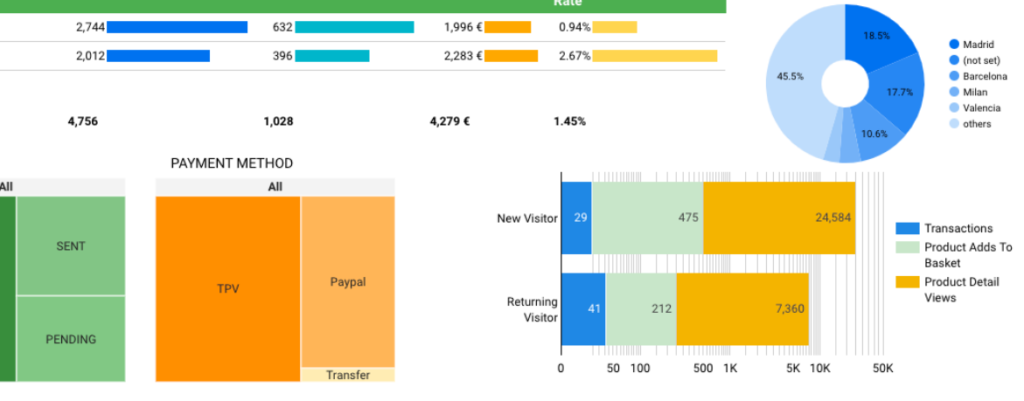
A big benefit of Google Data Studio is the ability to show data from different sources in a single visualization. You can highlight not only data from Google Analytics but also Google Search Console, Facebook, Instagram, YouTube, Google Ads, Google Sheets, and CRM or ecommerce platform data.
A simple chart from a supporting data source can add helpful context. For example, you can layer Google Search Console data into an SEO report.
That can help you corroborate Analytics data, reveal seasonal trends, or showcase achievements that haven’t yet materialized as traffic (e.g., an increase in impressions or progress from Page 4 to Page 3 of search results).
Another example: Aggregate data on the shipping status of ecommerce transactions or keep tabs on common payment types by connecting Google Data Studio to your ecommerce platform’s API.
For one-off reports (or incompatible sources), you can import the data into a Google Sheet and make the Sheet the source:
The never-ending options are exciting, but be careful. Identifying the data you really need and planning your visualization becomes more important (and challenging) as the list of potential data points you could include grows.
Conclusion
No visualization tool will rescue bad results or, on its own, make business decisions obvious. The right tools can help, but every new tool also has a learning curve.
This post includes a few examples of how elements like the CASE function can save time and deliver better insights in the dashboards you build.
Now that you have a sense of the traditional reporting problems that Google Data Studio can overcome, you should be motivated to learn its ins and outs and start creating more informative, more professional dashboards.


Thank you for this post. The content is amazing. I share it
Thank you very much Pablo, I hope it’s useful :)