There’s one thing that influences user engagement on your website more than anything else.
It’s not animated video backgrounds or design that “pops”. So what is it? Relevancy. Scent. Message match.
The concept is not new – Bryan Eisenberg discussed this already in 2005 when he wrote about website scent trails. As Eisenberg put it, “Creating and preserving intentional scent trails on your site translates to improved ROI for your paid and organic search terms.”
Table of contents
What Is “Scent” Anyway?
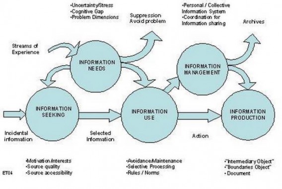
The concept of scent really began in 2001, when a Xerox Palo Alto Researcher, Dr. Ed Chi, reported that the way humans track information is not unlike the way that animals track food. That is, they follow a scent. The theory was derived from Optimal Foraging Theory, a model that helps predict how an animal behaves when it’s searching for food.
Instead of searching for food, we use what is known as an “information scent” to decide whether a path is interesting and relevant, all in order to reach our desired target online. According to Dr. Ed Chi, we use a series of cues to do this, “images, hyperlinks and bibliographic citations related to the information needed.”
As the idea of scent became popularized, it became a central tenant to landing page optimization in particular, as well as website optimization and experience as a whole.
In their conversion optimization glossary, Unbounce described scent as the following:
“Maintaining a consistent connection between your source ad and your landing page. Strong conversion scent ensures that visitors to your landing page get exactly what they expect to find. And that increases conversions.”
This is part of it, but as you’ll see, it’s not only applicable to ad/landing page continuity, but also to the whole user experience.
Using Environmental Cues to Drive Conversions
Predators can sniff out their prey using a combination of environmental cues, and we buy shit the same way. When the available cues suggest we’re heading in the right direction, we continue on. When we feel like we’ve reached a dead end, we bail.
Interaction Design Foundation wrote a great article on this. Here’s how they put it:
“These actions are guided by information from our environment. We identify and pursue specific routes on the basis of environmental cues. When the available cues give strong suggestion that a certain path will lead us to our goal, we are likely to pick up on them quickly.”
What this means in practice is:
- Reduce uncertainty and stress.
- Reduce friction.
- Increase relevance.
- Give users sufficient and persuasive information.
- Match your messages with users’ intent, from wherever the traffic flows.
What Happens When Your Site Smells Bad?
Scent isn’t just a hack or a quick fix, it’s imperative to the success of your website and your optimization strategy. Simply put, if your site lacks a strong scent, you’re not near your optimal potential. Here’s how Bryan Eisenberg put it in Always Be Testing:
“If you interrupt your scent trail, you leave your customer stranded. The path she was following becomes a dead end. Where’s she supposed to go? Do you really want to trust that she’s motivated enough to continue on her own? When it comes to scent trails, dropping the ball is one of the leading causes of abandonment!”
Here’s an example from an ad I saw on Facebook recently. I’m itching to go further into student debt, so this MBA fair ad catches my eye. I realize it’s in Austin – where I live – and it’s in a few weeks, so I click on it to get some more information:

However, when I arrive at their landing page, I am confused. Mainly, I do not understand why there is not a single mention of an event in Austin on the page. The only noticeable event is in Charlotte, quite far away from me:
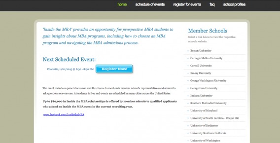
So bad scent ruined this conversion. They wasted their PPC money sending me to a page that was irrelevant to my pre-click interests.
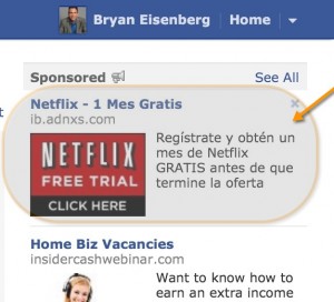
Bryan Eisenberg gave a pretty funny example where they even mismatched the languages. Here’s the ad:
And the landing page:
He also mentioned that the ad had a mismatched offer, design issues, and image issues. (He was surfing on an iPad. Why not use an image of an IPad?) Jeff Sexton later followed up with an excellent explanation of what went wrong here (read it!).
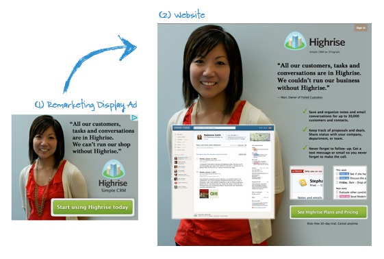
Now in contrast, look at this (slightly older) case study from Monetate, where they outline how 37Signals increased the conversion rate for HighRise by 102.5%. They then took the winning variation and drove traffic to the page via complementary ads that maintained a strong scent. Look at how well they match:
How To Improve Your Site’s Scent
Let’s keep things simple and talk about two things:
- Pre-click intentions
- Post-click experience
If your post-click experiences matches a user’s pre-click intentions, you have a strong scent. This is a really simple concept. Yet so many marketers don’t do it well. (Look at how many people drive paid traffic to their homepage still.)
Optimizing Pre-Click Intentions
As we said in a previous article, “If you just put 1 ad up on AdWords, use it for 20 different keywords and send all of the traffic to your home page – frankly, you’re an idiot and might as well use the money as wallpaper.”
Aside from the obvious (don’t drive paid traffic to your homepage), how can you optimize for users’ intentions?
Well, you have to get to know your target audience. It’s all about context, and honing in on that specificity.
Bryan Eisenberg listed the 3 fundamental questions they’ve used for years:
- Who is coming to the site? How did they arrive? And what are their goals?
- What’s the next step forward for them both in terms of their goals and your conversion funnel?
- What do they need to understand, believe, and feel in order to confidently take those next steps?
You can find the answers to these questions with a mix of quantitative and qualitative research, eventually forming data-driven customer personas and mapping them to a customer journey.
This is the heavy lifting. Matching the message (the post-click experience) is the natural next step.
Conversion Coupling: Nailing The Post-Click Experience
When Oli Gardner wrote The Most Entertaining Guide to Landing Page Optimization You’ll Ever Read, he devoted a huge section of it to what he called “conversion coupling”. Here’s the definition:
“Conversion Coupling: the bond that exists between the source of a click and the ensuing landing experience.”
He further divided conversion coupling into one or more of the following components:
- Message match: Matching the copy of your ad to the headline of your landing page.
- Design match: Matching the design of your display ad to the design on your landing page.
Conversion coupling is really at the core of maintaining a strong scent. It’s the second half of the equation. Once you understand your customers’ intentions, you can optimize their post-click experience. You can bring them, through message and design match, a relevant experience.
Message Match
According to Oli Gardner, “message match is the idea of matching the pre-click message to the post-click message on your landing page, with the goal of making people think they made a ‘good click’.”
Using similar (or better, the same) copy on your landing page as your ad helps to reduce confusion. It lets visitors know that they’ve come to the right place.
Then, Oli gave an example of a good message match from a Google search:
Then, the landing page:
Notice that at least the headline copy is identical in the ad and the landing page.
Of course, this is a rarity. Most companies’ message matching ability is pretty awful. For examples of bad message matching, check out this article.
Though, it’s not always a simple case of aligning the copy. Sometimes companies go so far as sending clickers to a landing page without information that was implied or promised.
Are You Missing (Relevant) Information?
When users expect information to be on a page, it needs to be there. Otherwise, people leave.
In 2004, Jakob Nielsen wrote about a study they conducted on teenagers’ web usage. They told participants in the study to try to find the answer to the question, “How much can I weigh without being considered overweight?”
One of the articles they stumbled upon was titled, “What’s the Right Weight for My Height?”
Actually, though, the article didn’t contain the answer. Here’s how Nielsen summed up their findings:
“Unfortunately, because the path to the article has good information scent, and because the article itself has very strong information scent, our users concluded that the site didn’t contain the required information. After all, they’d found the one place where this information ought to be, and it wasn’t there.”
Thing is, the information was actually located on the site. It was just under a tab labeled “Body Mass Index (BMI)”. In this case, Nielsen suggests providing a cross-reference to the desired location. For example, the “What’s the Right Weight for My Height” article should have had a link directing users to the BMI chart.
The Power of Trigger Words
Trigger words represent the wording that users are silently thinking about while searching for their solution.
Not only can you use them on your PPC ads, but you can also sprinkle them on homepage links and in your site navigation to direct people to their goals. According to UIE, a web page can only do one of two things:
- Contain the content a user wants
- Contain links that direct them to content a user wants
And if a web page doesn’t do either of them, then the user stops clicking because they aren’t likely to find their target content.
They actually did a study where they interviewed participants extensively about what they hoped to find online. They then set them off to see if they could find what they were looking for. Here’s what they discovered:
“In the tasks where users successfully found their target content, the description words appeared on the home page 72% of the time. When users were unsuccessful, their words only appeared an average of 6% of the time on the home page.”
Hence, the idea of adding trigger words to a landing page (or homepage). And, more generally, providing all the information necessary to assure the potential customer that they’re in the right place and can find what they want.
Design Match
According to Oli, “This is one of the easiest techniques to master.”
All you do is take the design on your ad, and repeat it on your landing page. Pretty simple, yet many times not executed.
Here’s an example of good design (and copy match). Not that we can templatize these CXL posts in any effective way, but I was curious (and researching an article on scent), so I clicked on this:
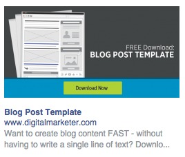
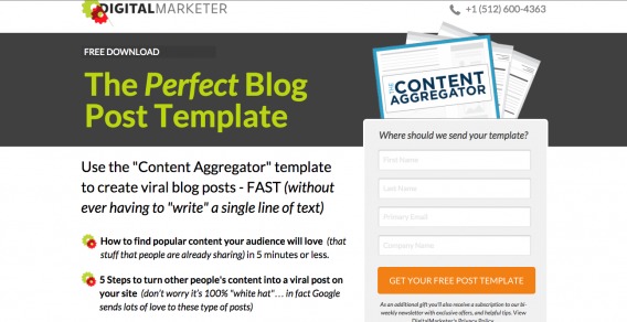
This brought me to a pretty good landing page. It has (almost) the same headline with a similar design and colors. I guess if I had one complaint, it would be that I’m skeptical of the ability to create viral blog posts “without ever having to ‘write’ a single line of text.” Also, “in 5 minutes or less,” seems too good to be true.
I can’t extrapolate my own fears and doubts onto the masses though; perhaps the curiosity gap prods users to enter their information and download the template. Either way, the design is the same, so I can assume I’m in the right place:
Hungry For One More Example?
I figured I may be getting a little chubby from all the excess cornbread and tacos, so I searched “paleo recipes” on Google. Came up with this ad:

Fair enough. Completely free with all different types of meals for 14 days? Sounds legit. Click:
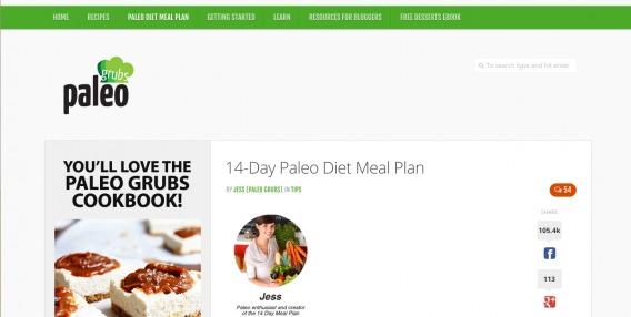
Matching headline? Nice! Not the slickest design (lots of wasted space?), but I know I’m in the right place. I can also tell that it is positioned as a cookbook, so I’m ready to exchange an email if all looks okay. But then I scroll down a bit, beyond Jess’s letter, and am a little confused:
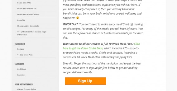
Weird. There are few different calls to action here. Also, I see Step #1. Where the hell is step #2? Oh well, I decide to keep scrolling and see what’s up with this cookbook. I see this:
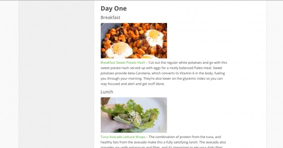
All the recipes are there and clickable! This is nice for me, but it seems like it would diminish the effectiveness of the email lead magnet. In the end, however, I ended up entering my email and grabbing the PDF. Not only because I was hungry for some paleo lasagna, but because my search intent was matched with value that was relevant to me. Sure, the page could be optimized in many ways, but the information scent was in the right place.
Conclusion
Ultimately, scent is pretty synonymous with relevance for your users. As Bryan Eisenberg put it, “What I find most exciting about current information-scent research is it forces the question, ‘What’s most relevant to the customer?’ The end result can only be a Web site that contains not only the relevant product or solution but also the relevant scent and content to get the customer to it.”
Designing your site, navigation, ads and landing pages for your user’s benefit isn’t just good for strengthening your scent, it’s the true way to increased growth and conversion rates.
Here are some takeaways as far as information scent is concerned:
- Understand your target audience’s pre-click intentions.
- Match your pre- and post-click message.
- Match your pre- and post-click design.
- Provide cross-references and clear links.





Excellent post. A few good nuggets to take away and implement.
Thanks for commenting, Dean – glad you enjoyed the article.
Simply amazing. Today I read a post too cool to be true and in fact was the translation of your article. Forgive my English, because of Google Translate.
We need repeated visits from our target audience because it means loyalty and high conversion for us. Scent trails start from the moment that a potential customer uses a search engine to search for an accurate information. We should take advantage of it. We should offer relevant information. Your tips on how to create customer engagement is useful to create brand loyalty.
Thanks,
Carl Ocab
http://www.carlocab.com