No top conversion optimization agency, consultant, or specialist operates without a heuristic framework of some sort, and neither should you.
The earlier you catch any issues in your site’s usability, the easier—and cheaper—they are to fix.
Heuristic analysis delivers fast insights into how people use your website. You can use this method at any stage of the design process to generate quick wins.
This guide will help you master heuristics to improve your UX. You’ll develop a simple, repeatable formula to draw out better insights, test more ideas, and find massive conversion opportunities.
Table of contents
What is heuristic analysis?
In UX, heuristic analysis is a set of rules for detecting issues with a site’s usability.
In most cases, impartial experts will use this standardized discovery formula to locate obstacles preventing your customers from having an awesome experience.
For example, a step-by-step analysis might pick up inconsistent icons across different pages of your website. Or text that’s too small on the mobile version of a website. These details can frustrate or annoy users.
Heuristic steps reveal insights like these. Design teams can then fix issues earlier in development, making heuristics a fast and practical way to solve problems.
Heuristic analysis origin story
In 1994, Jakob Nielsen (of UX research firm Nielsen Norman Group) came up with ten usability heuristics for user interface design.
Around 30 years later, this ten-item checklist remains as relevant as ever and it’s still widely used as a starting point for UX analysis. Here are those steps in a nutshell.
1. Visibility of system status
Design should always keep users informed about what is going on to reduce frustration.
When ChatGPT is lagging, a popup alerts users:

Let customers know when there are problems. Show that you’re aware of the issue—and you’re doing something about it.
2. Match between system and the real world
Drop the jargon and keep it simple. Online bank Monzo makes financial topics relatable with a down-to-earth tone:

Speak the way your users speak with plain language. Don’t make them think.
3. User control and freedom
Always give people a clear exit from any action or screen. Provide an effortless experience for each user. This can be as simple as a clear and obvious “X” in the top right corner of popups.
As shown here, Sephora provides an X that’s easily detectable—allowing users to close the box quickly:
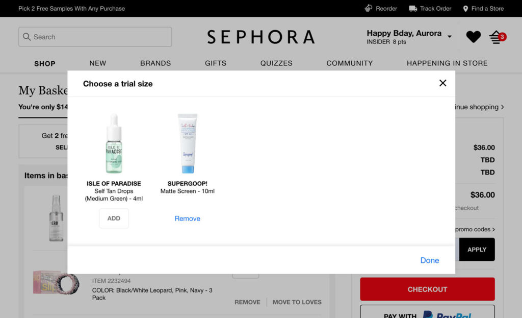
Avoid deceptive design elements like dark patterns that trick customers (e.g., buying or subscribing to something unintentionally). User control promotes retention.
4. Consistency and standards
Stick to familiar terms and features that users already know. People expect that clicking the site’s logo will take them back to the homepage.
They also expect the shopping cart to be in the upper right corner with a cart or bag icon, like clothing brand Pretty Little Thing:

Style and creativity have their place. Keeping certain elements in familiar places reduces uncertainty. Customers are comfortable and happy when they know what to expect.
There’s science behind this feeling of comfort: The familiarity principle is our tendency to prefer what’s recognizable, and we feel this effect in action when we see an X in the top right corner.
5. Error prevention
Prevent problems from occurring—and amplifying—by notifying users. Imagine a customer accidentally shared private information with the world because they didn’t realize their project was public. It’s an avoidable, face-saving issue.
Here’s a great example of error prevention from Typeform:
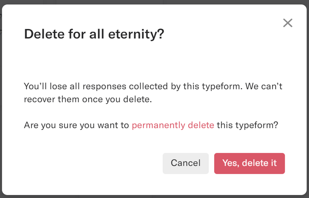
The message has a lot more personality and useful information than the standard “Are you sure you want to cancel?” message.
Avoid customer frustration, and save your help desk from sending unnecessary support tickets.
6. Recognition rather than recall
People learn by doing. Offer timely help—when people need it most. Jakob Nielsen, himself, demonstrates how this works in a physical setting. “Look left” and “look right” markings on crosswalks help pedestrians in the UK:

Again, do not make people think. In an online setting, the option to “Open recent files” allows users to easily recall what they were just working on. Help them easily get to where they want to go.
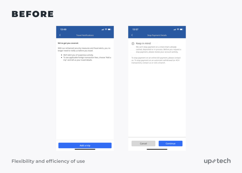
7. Flexibility and efficiency of use
Today, convenience wins. Ease and efficiency is why Amazon’s super-fast delivery model tops the five-day delivery standard of other online stores.
Stripe also does this with their “secure one-click checkout” for opted-in customers:
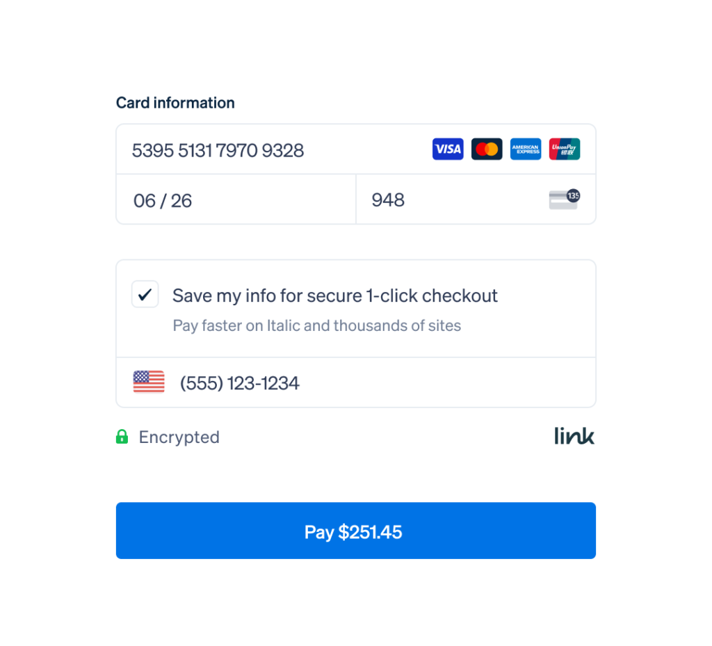
Offer shortcuts and personalization to cut out extra steps for customers. Help them get what they want as quickly as possible.
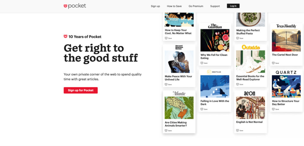
8. Aesthetic and minimal design
Don’t let unnecessary content or features distract users from important information. Negative (or white) space focuses the user’s eyesight and avoids overwhelm.
Multiple eyetracking studies show users rarely read in-depth online. Instead, they prefer to scan.
Bookmarking tool Pocket is an expert in minimalist design on its site:
9. Help users recognize, diagnose, and recover from errors
Error messages have to be clear. Help users help themselves.
Dropbox’s log-in screen gets overly specific by telling the user they’re missing the @ symbol from their email.

This message goes beyond the traditional “unacceptable email” notification, leading customers to more questions and confusion.
Tell users what went wrong in simple language and how to fix it.
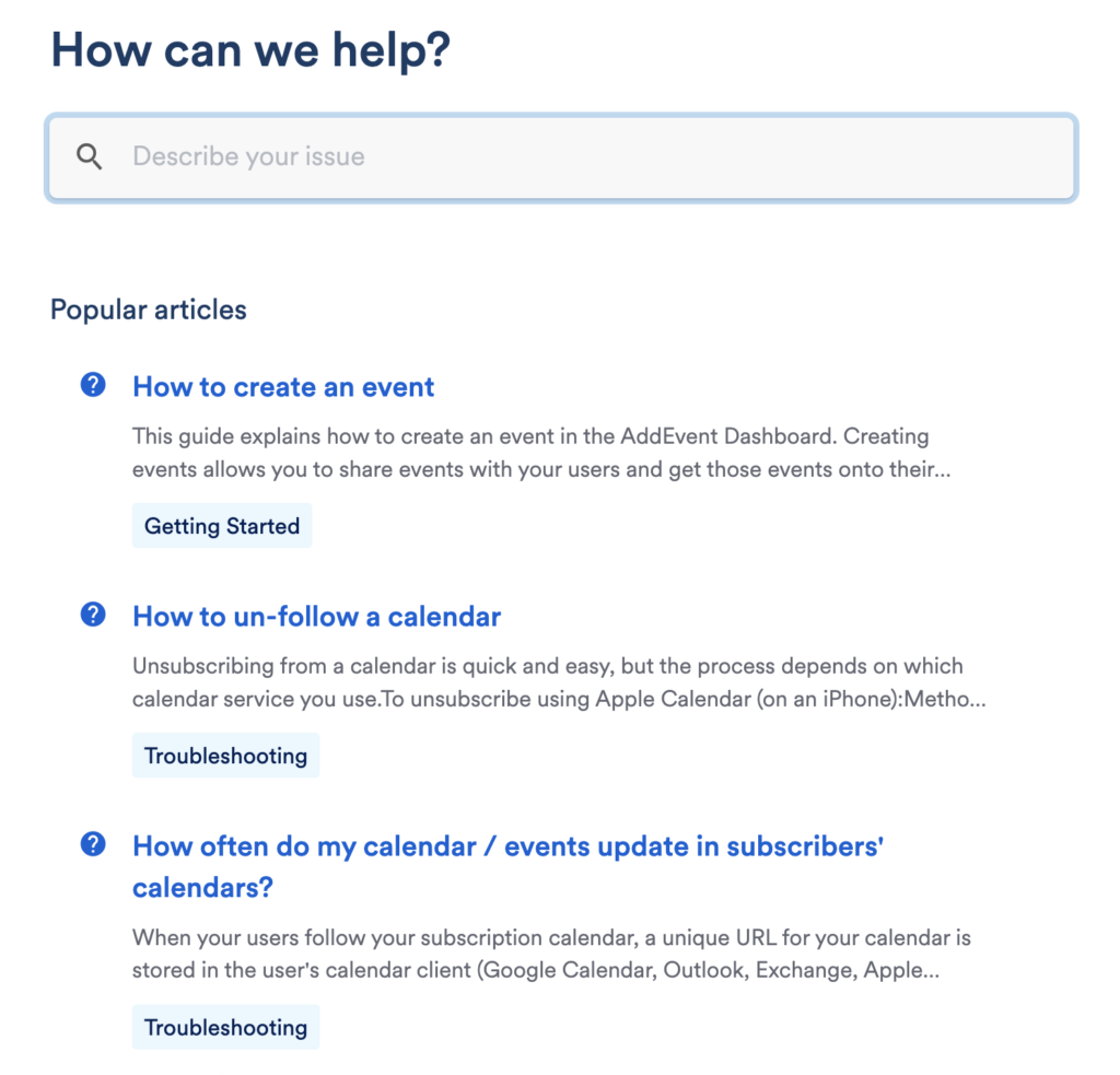
10. Help and documentation
Users shouldn’t require help often. But when it’s needed, it should be easy to find.
- Proactive help covers popup push and pull notifications that are relevant to the user’s task.
- Reactive help is self-service to answer questions and troubleshoot problems.
For example, AddEvent’s knowledge base (reactive) is easy to find and well-structured:
The evolution of technology has drastically impacted heuristics. For example, AI and voice-based smart devices now need to be more context-specific to figure out what the user wants at that moment.
While Nielsen’s are the most common heuristics, they aren’t the only set. (We’ll cover more soon.)
These existing rules of thumb are still relevant but best used as a baseline. Pair them with your own contextual market research into your project and users for meaningful results.
It’s also important to distinguish heuristics role within the larger web of interpretive lenses.
What’s the difference between heuristic analysis, user testing, and cognitive walkthrough?
Heuristic evaluation includes three inspection methods:
- Heuristic analysis
- Cognitive walkthrough
- User testing
These three terms are often used interchangeably. When actually, they’re parts of a whole.
In heuristic analysis, a system expert compares the system with recognized usability principles. This is to improve the usability and efficiency of a digital product.
In cognitive walkthroughs, a new user walks through each step of a task flow. This is to identify aspects of specific tasks that could be challenging.
In user testing, the end-user navigates the site realistically. This is to find out how users will use the site in typical situations.
In the heuristic analysis step, evaluators are usability experts. They should be knowledgeable in human-computer interaction design or usability engineering.
Ideally, they should also have a certain amount of knowledge of your industry. For example, a general understanding of restaurant operations for those evaluating an app in the hospitality sector.
Heuristic analysis is a faster, more systematic way to find gaps in the overall experience of your product before it gets in front of users.
How heuristic analysis helps improve your UX
Most marketers know their site needs evaluating. However, many don’t do a very thorough job. They instead wait for customers to find issues:
“Why is your sign-up rate so low?” “Which part of your checkout is losing users?”
Where do you even start to answer these questions?
Heuristic analysis ensures you cover all the bases to get to the bottom of issues so customers don’t suffer from a subpar experience.
Here are three ways heuristic analysis helps improve your UX.
Uncovers errors and inconsistencies before and after launch
Unlike user testing, you can run heuristic analysis before you launch.
Discovering the bigger problems earlier helps uncover friction in your funnel. Limiting the number of issues means a better experience for first-time users, fewer complaints, and more positive talk about your brand.
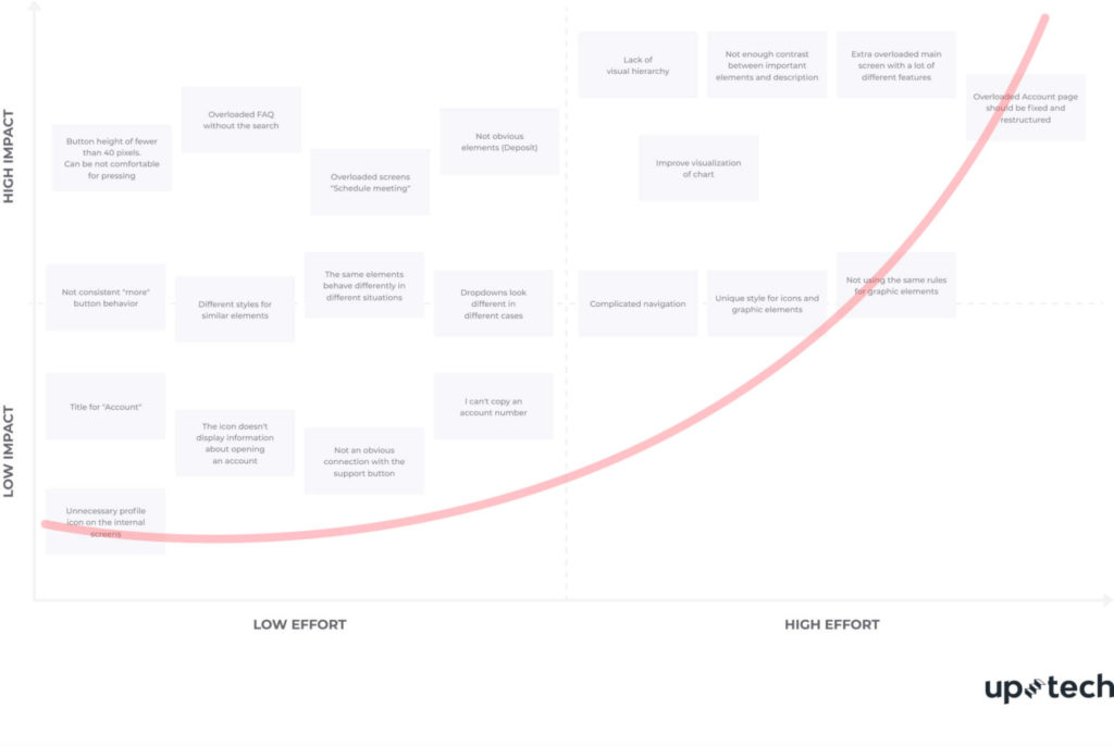
Plus, the longer you wait to make changes in the design process, the more expensive it’ll be. As shown by this chart:
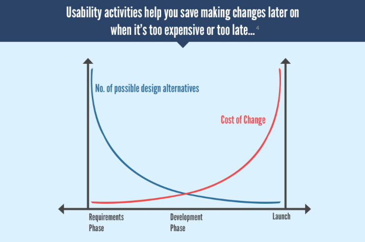
Let’s say you want to add version history to your app. In the requirements phase, this just means a little longer to map out the functionality and flows.
But what about when your product has launched and is being used by hundreds of users? Problems begin snowballing.
You’ll need additional time to develop. There will probably be a service disruption during the roll out, and another one while you fix unforeseen bugs.
Heuristic analysis prevents these issues. Run the analysis now, redesign based on the findings, and then run it again. Regular testing is good practice for continuous improvement.
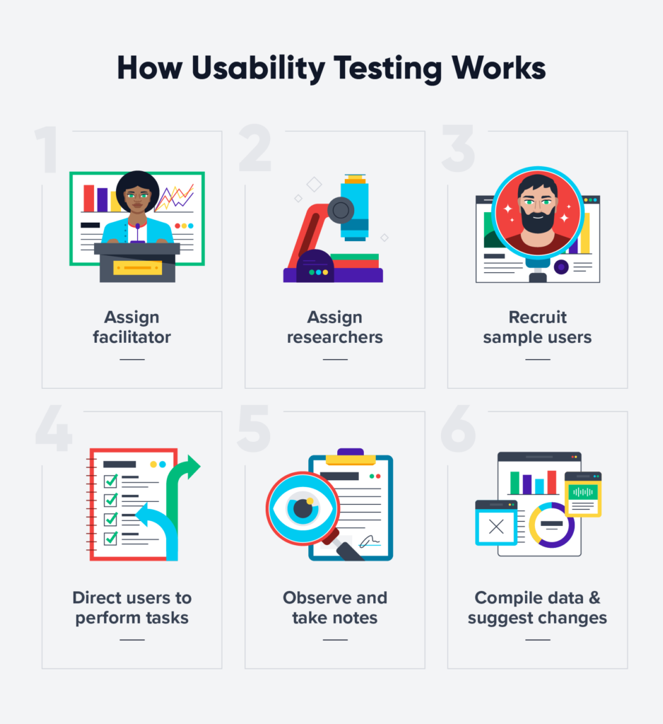
Faster than regular usability tests
Usability testing usually has around six main stages. This can vary if it’s in person or remote:
- Find a facilitator;
- Assign researchers;
- Recruit sample users;
- Direct users to perform certain tasks;
- Observe and take notes;
- Compile the data and suggest changes.
A lot of factors can slow the process down:
- Helping people set up complicated software can be time-consuming.
- You may need employees to staff tests.
- Remote testing relies on the platform working seamlessly for everyone.
- The need for special equipment (like eyetracking devices) can limit recruitment.
- The resulting data can take a long time to sift through and analyze.
For heuristic analysis, you’ll only need around three to five UX experts. Results can be as fast as a few hours. It’s a simple, repeatable form of evaluation.
Determines the impact of specific flows (even with low numbers)
Following a set of heuristics pins down issues to specific user flows. Evaluators work systematically with the same set of guidelines— unlike users who naturally navigate.
You can identify issues with specific pathways, instead of waiting for test users to uncover the issues themselves.
Then organize usability issues into a scale severity and solve them in order.
For example, a cosmetic issue (like inconsistent typography) won’t be as urgent as the “add to cart” button not working.
To run a successful A/B test to discover the same impact, you need enough traffic and conversions for statistically valid results. You can still conduct heuristic analysis with low numbers.
It’s also compatible with other usability methods like user interviews, surveys, and split testing. Layering these techniques results in a fuller picture of the state of your UX.
7 steps to conduct a successful heuristic analysis
Need help guiding your design process to uncover fundamental flaws? Follow these seven steps.
1. Define the analysis scope
The scope of your analysis will depend on a couple of things: budget and time.
Figure out your budget first. Find out the number of evaluators or processes you can afford.
According to Jakob Nielsen, five evaluators can help you discover around 75% of usability issues. Beyond that, the proportion of new issues hugely drops, and it usually isn’t worth the extra resources.
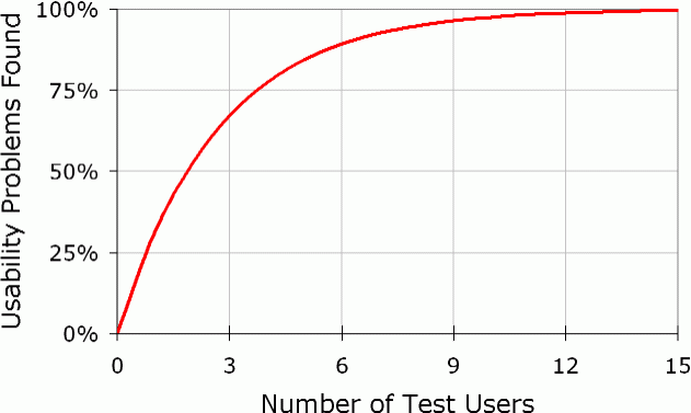
Three experts offer the optimal cost-to-benefit ratio for smaller budgets (60%).
You can ask your network for recommendations or use search engines to find freelance UX consultants near you. Make sure to vet each to determine their suitability for your project.
Factor in the size of your site after. Examining the entire thing could be too time-consuming and costly.
Evaluate a feature on your app or a user flow across different pages instead. Set parameters. For example, your goal could be to optimize your sign-up flow or checkout process.
It’s important to dictate exactly what your business wants from the analysis. So evaluators each have clear requirements.
2. Get to know the end-user
Just like marketers know who they’re selling to, UX designers need to understand the end-user.
User research shouldn’t be an afterthought. If it’s too vague, the final product won’t resonate with them. You should start with the optimum customer experience for specific people and work backward to make it happen.
Consider demographics. Where are they from? What do they do for work? How old are they?
You also need to understand their reasons for being on your site. What do they want to get out of it?
Here’s a “proto persona” from Uptech. At this stage, they only have assumptions about needs, desires, and fears they need to validate.
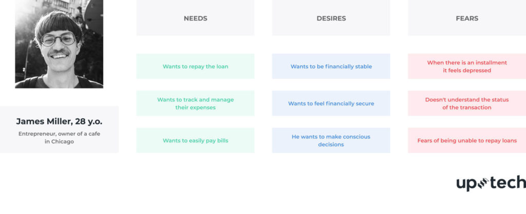
By updating these with survey and interview answers, you can create data-based user personas that are actually useful.
Why are these important?
If you’re aiming at a younger, more tech-savvy demographic, you won’t need to include as many prompts as you would for an older audience. For multilingual products, you’ll need to consider how users’ languages and cultures overlap.
All these nuances will affect how each person interacts with your site, so you should factor them into the design process.
3. Define which set of heuristics you’ll use
Your usability inspection method is up next. Vast research has to go into picking the right list of heuristics.
Get this wrong, and you’ll skew your results (no matter how good the experts are).
There are lots of variations to Nielsen’s heuristics. Here are a few other well-known versions:
- Don Norman’s 6 Design Principles for Usability;
- Ben Shneiderman’s Eight Golden Rules of Interface Design;
- Jill Gerhardt-Powals’ 10 Cognitive Engineering Principles;
- Susan Weinschenk and Dean Barker’s 20 Usability Heuristics;
- Dr. David Travis’ 247 Usability Heuristics for special interface types.
The example below is Weinschenk and Barker’s version:
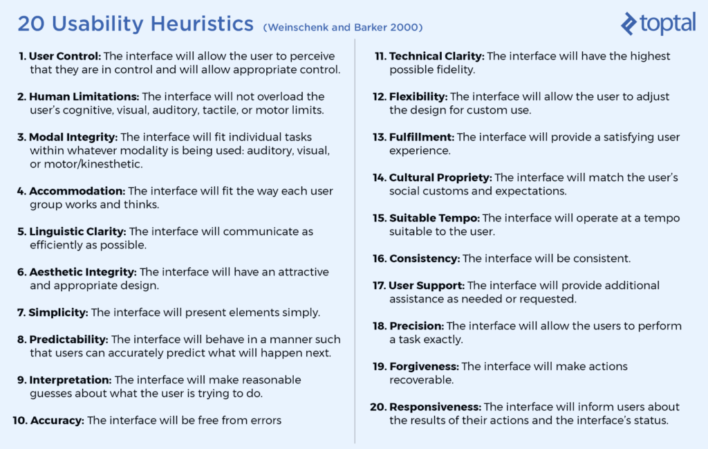
There are a lot of similarities to Nielsen’s, but more recent additions in line with the times. For example, “the interface will match the user’s social customs and expectations.”
You can use an exact copy of one of these, tweak it slightly, or combine a few. You also don’t have to work around an existing set at all.
You have to design heuristics to fit your unique product. Not the other way round.
4. Choose a consistent reporting style
You can go down one of two routes with reporting.
Let evaluators record their own findings and report back. Using the same reporting tools means everyone is on the same page. This could be a simple spreadsheet or a Google Doc.
It’s important that all evaluators complete their analysis separately. This ensures all findings are independent and unbiased. Afterward, they can discuss.
Another evaluation method is having an observer. This person takes notes of all verbalized comments from each evaluator and compiles a single report.
The observer should answer any specialized questions from the evaluators. For example, your site may have limited functionality in the early stages. The observer could help guide them.
While an extra body might add a little more upfront cost, it’ll save time when comparing multiple documents and reporting styles at the end.
Both reporting styles work. It depends on whether your priority is saving money or time.
5. Set up a scoring system to evaluate issue severity
To ensure consistency, each evaluator has to work with the same scoring system. Otherwise, it’s pointless.
The severity rating of a usability problem is usually a combination of three factors:
- Frequency. Is it common or rare?
- Impact. Will it be easy or difficult for users to overcome?
- Persistence. Will users be repeatedly bothered by it?
The rating you use will depend on your needs. Here are a couple of options.
You can use Nielsen’s 0 to 4 rating scale:
- 0 = I don’t think this is a usability problem at all.
- 1 = Cosmetic problem only (doesn’t need to be fixed unless extra time is available).
- 2 = Minor usability problem (fixing this should be given low priority).
- 3 = Major usability problem (high priority to fix).
- 4 = Usability catastrophe (imperative to fix this before release).
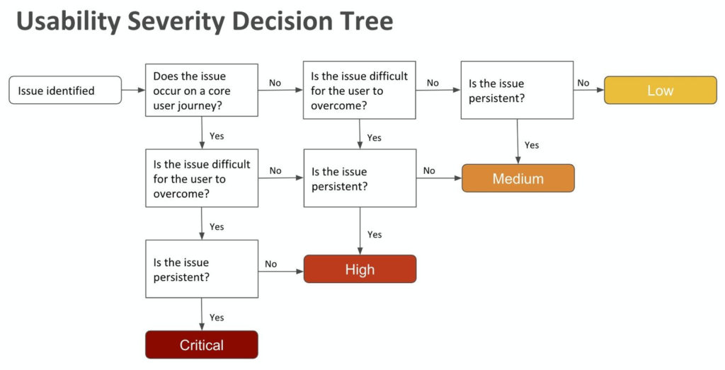
You could also use this decision tree as a template (or build one of your own):
Evaluators should relate any issue to screenshots of the user interface. Readers can visualize each problem without needing access to the system.
Uptech found that the buttons to proceed were too small and not optimized for mobile:
This showed the design team exactly where the problem lay and at which stage of the flow.

You could break yours down page by page. Or stick to screenshotting a section at a time. It depends on the scale of your analysis.
You can use any type of scoring system and format. Just make sure everyone knows how it works and sticks to the same one.
6. Analyze and present the results
If you’ve used an observer, getting the results will be easy.
They can collate their written findings and remove duplicates or overlaps for one final report.
If evaluators have recorded their own results, this step will take longer. There might be some back and forth to decipher styles of note-taking.
Either way, you should end up with a list of usability problems and the specific heuristic(s) each violates. For example, if the support button doesn’t imply connecting a user to the help desk, it violates the “match between system and the real world” heuristic.
Here’s a template you could use to make your reporting clear with the scoring system on the top right:
Evaluator name:
Date:
Website/App:
Device:
Browser/OS:
Task/Feature:
Breakdown of Heuristic/Issues/Recommendations:
Score:
It’s good practice to assign a reference code or color to each heuristic. That way, they’re easily identifiable next to each problem. The data can then be transferred into a table or a map like this:
Present your findings to your design team clearly. They should instantly spot which issues are priorities and which can wait.
7. Prepare for next steps
Heuristic analysis is a helpful exercise to identify specific UX problems and design-led solutions. However, it can’t work alone.
You should test a product’s usability vigorously with four stages of research:
- Explore solutions. This includes heuristic analysis and literature review (researching published data to understand the context surrounding a domain or topic).
- Observe users in context. Conduct user interviews and focus groups.
- Study solutions. Tree testing presents users with a text-only version of the site’s hierarchy and asks them to complete a series of tasks.
- Verify critical decisions. A/B testing and onsite surveys.
You can’t just rely on the findings of heuristic analysis. You need to overlap them with contextual information from users themselves.
Samsung’s 2005 user research found TV owners saw their sets as furniture, and placed a lot of value on sleek design. By redesigning these products, the team was able to make them more relevant for customers. Samsung’s market share doubled in just two years.
Undertaking a more thorough heuristic evaluation covers all bases and can result in more meaningful changes.
3 limitations of heuristic analysis
Every strategy has limitations. Heuristic analysis is no different. It’s important to realize these and find ways to work around them.
You could struggle to find (and afford) experts
In an unusual niche? Lack of budget? Finding affordable and experienced usability evaluators could be challenging.
Widening the net with inexperienced evaluators could also negatively impact the value of finds.
If you’re stuck, Leah Buley’s book The User Experience Team of One describes a way of reviewing your site’s usability yourself.
- Take yourself from the start to the end of your product (over a few hours) as a user would.
- Think of the possible user journey steps as they try to accomplish specific tasks.
- Screenshot each part and paste it into a slidedeck.
- Make notes of your observations and reactions to each step (in your user’s mindset).
- Use your slides to review and share findings once finished.
It’s not an ideal setup, but it’s better than making big decisions based on gut feeling alone.
You might uncover false positives
When you’re selling a house, you know everything wrong with it. You can then waste time fixing non-issues most viewers won’t notice. Heuristic analysis in isolation can also result in these false positives.
Experts are on the lookout for tiny details. But these “issues” may not have a negative impact on UX. Early in development, heuristic evaluation reports around 50% false problems.
That’s why extensive user testing should verify any findings. Pair heuristic analysis with surveys and market research to discover these contextual insights.
You could end up with biased results
Thinking about evaluating in-house? Anyone who worked on your project is more likely to let bias creep in. For example, a feature that seems obvious to you (because you helped build it) may not be to first-time users.
Undertaking heuristic analysis yourself can save money, but it will impact results. Impartial experts have the benefit of looking at your site with a fresh mindset. But be aware, they’re human too.
Each of their unique backgrounds and attitudes will impact their opinions and observations. That’s why user testing with hard data should complement any heuristic analysis process.
Conclusion
Successful heuristic analysis is a quick fix for a lot of UX issues. But it can’t work alone.
The process should reveal early insights that provoke positive discussions. It’s a chance to create a great first impression by the time you get to the all-important user testing stage.
Completing analysis under the umbrella of heuristic evaluation helps designers make decisions based on empathy for their users. As a collective, these tests ensure you’ll deliver the right solutions that resonate.
Analyze your own data without relying on tools with CXL’s advanced experimentation analysis course.
Related Posts
-

Usability testing is important, but when you're juggling tons of other tasks - acquisition, hiring,…
-

Ever wonder why your site has a lot of visitors but not enough transactions, purchases,…
-

"Never interrupt your enemy when he is making a mistake." —Napoleon Bonaparte When your competitors…
-
Competitive analysis is an important element of business strategy. Knowing where you stand in relation…