There’s no denying that your homepage is vital to your site, especially if you’re a SaaS company. It’s likely one of your most visited pages, acting as a proverbial launch pad.
While you read about optimizing individual landing pages day in and day out, optimizing homepages is less frequently explored. Do the same old rules from 2010 still apply? Are people still visiting and using homepages they same way they were a decade ago?
If your bounce rate is through the roof, your homepage might be experiencing failure to launch. What gives? How do you get your visitors to move beyond that starting point and into your conversion funnel?
Table of contents
First, what are the goals of a homepage?
Before you can start optimizing, you need to nail down your goals—just like you would with any other experiment. A homepage really has only two goals:
- Explain the value proposition as clearly and convincingly as possible.
- Get people off the page and on to the next step in your conversion funnel.
It may seem simple, but that’s a tall order. To accomplish this, you’ll need to nail down the four core elements of user experience (UX):
- Value. How valuable is it? Is it useful to your visitors?
- Usability. How easy is it to use? Is it complex or simple? Is it intuitive?
- Adoptability. How easy is it to use for the first time? Does it integrate into day-to-day life? Is it habit-forming? Is it familiar?
- Desirability. Is it fun? Is it engaging? Do visitors want it or need it?
Your homepage, just like your service, needs to be valuable, usable, adoptable, and desirable. Otherwise? Watch your bounce rate climb and your conversion rate stall.
What are the pillars of a great homepage?
So, what factors impact the effectiveness of your homepage? Of course, there are dozens.
How appealing/visible is your logo? How accurate are your buyer personas? How accessible is your contact information? Do you have enough text for search engines? Are you using compelling images? Does it load fast enough?
Peep wrote an introductory article on homepage optimization. Before you continue reading this article, I recommend you take 4–5 minutes to read his.
While there are dozens of factors to choose from, there are four in particular that are (a) high impact and (b) easy to test. Those factors are:
- Value proposition;
- Navigation;
- Content;
- Call to action.
1. Clear value proposition
Here’s what Peep has written about value propositions:

Peep Laja, CXL:
“This is the most important part of your home page. Your value proposition is a concise chunk of text (headline, sub-headline and and maybe a few bullets points) that should address these questions:
- What is this site about?
- What can I do here?
- How is it useful to me?
- Why should I buy from you instead of the competition?”
You guessed it. Your value proposition proposes your value to your visitors.
When you onboard a new user, your goal is to get them to experience your value as quickly as possible, right? Well, when you have a new visitor on your site, your goal is similar.
According to Copyhackers, a value proposition is effective if it is…
- Unique;
- Desirable;
- Specific;
- Succinct;
- Memorable.
No one is going to search your site top to bottom looking for your value proposition. If you don’t answer the questions Peep mentions within the first 8 seconds or so, you’ve already lost the visitor.
Good example: Tinder
Let’s look at Tinder’s early value proposition:
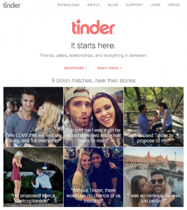
Friendships, relationships, and everything in between start on Tinder. Seems pretty straightforward. Of course, the images with personal stories help drive the point home. (They’ve since simplified their homepage as users now arrive on the site with far more knowledge about Tinder.)
If you’re looking for a serious relationship, one-third of the couples are shown mid-proposal. If you’re worried that Tinder is “less legitimate,” one couple notes that they “LOVE” that they met on Tinder—they’re proud of it. If you’re worried that Tinder is only for people desperately looking to “hook up,” another third of the couples found perfect, romantic partners.
So, to summarize:
- What is this site about? Finding significant others and new friends.
- What can I do here? Find a life-long friend or maybe your spouse.
- How is it useful to me? Meet and develop relationships with people you might not otherwise.
- Why should I buy from you instead of the competition? Nine billion matches, downloadable app.
And…
- Unique? Yes, most are web-based.
- Desirable? Yes, humans crave connection.
- Specific? Yes, it’s for young adults.
- Succinct? Yes, no more than a few sentences.
- Memorable? Yes, there are personal stories.
Bad example: Pingpad
Now consider Pingpad’s value proposition:
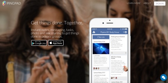
The first time, I didn’t even notice the copy under “Get things done. Together.” Based on just that line, I have no idea what Pingpad does. What kind of things? Together with whom? In person or online? How does Pingpad help?
Even after reading the copy underneath the headline, I’m left with questions. Is it only for students? What kind of “tasks” does it help with? Why would I want to get things done in a private group?
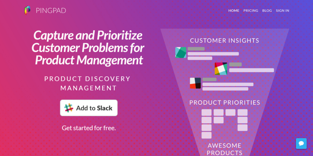
Since we first wrote this article, they’ve updated their homepage copy. It’s an improvement—far more specific about what it does, with the jargony headline (“product discovery management”) buried beneath the main one:
2. Strong navigation system
MK Cook, a UX designer at Digital Telepathy, has written this on navigation systems:

MK Cook, Digital Telepathy:
“The point of navigation is to help users find what they’re looking for in the site — without stress AND without leaving the experience. What I’m emphasizing is that in a good nav, users don’t rely on the browser’s back button to get around. This is an important guiding principle: Users should never have to hit the back button.”
Navigation systems have two primary goals:
- They must be discoverable. How easy is it to find the navigation? How easy it to find what you’re looking for using the navigation?
- They must be accessible. How easy is it to use the use navigation? Is it intuitive? Is it prototypical?
Your navigation system likely plays a major role in getting visitors off your homepage and into the conversion funnel. As a SaaS company, you might rely on your navigation to get visitors to your pricing or demo page, for example.
Good example: Influitive
Influitive uses a standard navigation system:
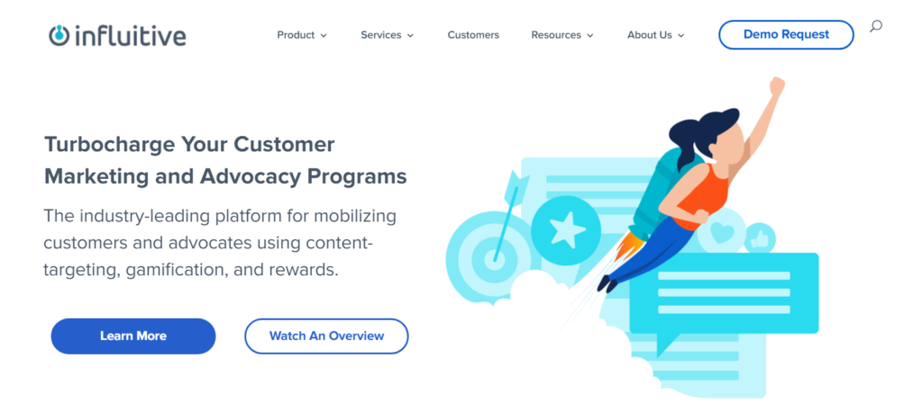
Categories include product, services, customers, resources, about us, and a demo request. All of this is very standard.
This navigation system is predictable. Everything is where you would assume it to be, which is good. No one wants to be surprised when it comes to your navigation. They just want to find what they want without having to think.
To summarize:
- Discoverable? Check.
- Accessible? Check.
Bad example: Postmates
Now consider the navigation on a past version of Postmates:
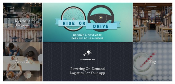
This is found approximately three-quarters of the way down the page. It’s buried under the value proposition and a long list of states and cities where Postmates is available.
When I first arrived on the page, I scrolled right by this section. As far as I knew, there were no other pages to browse.
Sure, this style of navigation looks nice. It’s even a bit innovative. Unfortunately, it strays too far from the prototypical navigation. When’s the last time you saw an image-based navigation system more than halfway down the page? As a result, it’s easy to miss and overlook.
Never sacrifice usability for design’s sake.
3. Useful/interesting content
There are a lot of questions about homepage content. How long should it be? What should be above the fold? What percent of it will people actually read?
Here’s what you need to know:
- It should be as long as you and your visitors need. Are all of their questions about the value proposition answered? Have they been given enough opportunities to leave the page?
- Your value proposition should be above the fold. What about your call to action? Well, that depends.
- Your visitors will read whatever they find genuinely useful/interesting. If you have a ton of filler/fluff content, of course you’re going to find that “no one reads homepage content.” That obviously isn’t true. People will read what they find interesting and scan the rest for more potentially interesting content.

Jen Havice, Make Mention Media:
“Whether you’re writing copy for a straightforward landing page or one of these hybrid homepages, no one size fits all. It depends on what you want your visitors to do and what they need to do it.
So before you decide that the copy for your page should fit on one side of a Post-it Note, make sure you know what motivates and concerns your visitors first. Understand their state of awareness and how that might affect what to include or cut from your copy.
In the end, it’s not about short or long copy. It’s only about writing just enough to get the job done.”
Good example: Evergage
Take a look at Evergage’s homepage content:
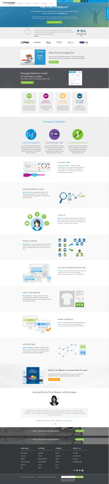
Each section is informative and useful to someone in search of a personalization tool. There isn’t so much content that it feels overwhelming, yet there is enough to given context and reinforce the value proposition.
As you near the bottom of the page, they give you a couple of conversion options: download an ebook (for those higher in the funnel) or schedule a demo (for those ready to convert).
Bad Example: Cadre
Now consider this past example from Cadre:
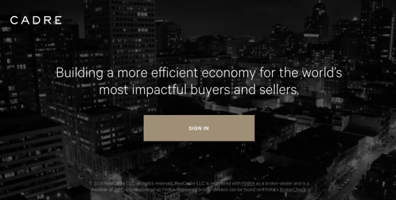
What you see above is the extent of the content on the page. “Building a more efficient economy for the world’s most impactful buyers and sellers.” That’s it.
No elaboration, no data on the state of the economy, no useful content for buyers, no useful content for sellers.
Let’s put aside the search engines, who need more than a sentence. Is having a short homepage okay? Of course it is. If you test it and it works, go for it. However, Cadre is awfully vague for a startup in the finance/commerce space.
If you have too much content on your homepage, visitors will skip it or scan it. If you don’t have enough, they will be left confused and bounce.
4. Desirable call to action
When choosing the call to action for your homepage, think back to your two overall goals and ask yourself these questions:
- What do I want the visitor to do next?
- What does the visitor want to do next?
- How informed is the visitor at this point?
- How motivated is the visitor at this point?
- Does the visitor have enough information to make a decision and leave the page?
Sometimes, what you want is at war with what the visitor wants. The visitor should always win. If you try to rush their decision, you will have a high bounce rate.
Good example: Turo
Now, consider how Turo started out:
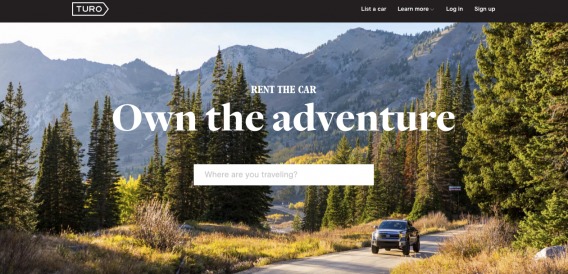
The moment you click on the “Where are you travelling?” field, you see…
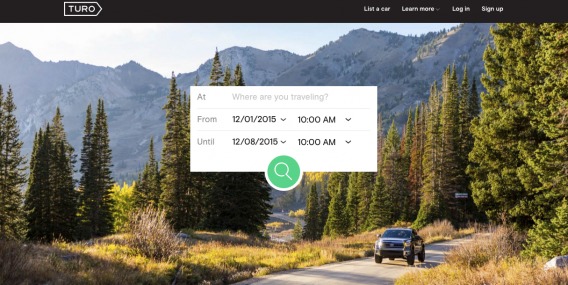
Why does this work? Because after simply reading “Rent the car. Own the adventure.”, most visitors are not ready to jump straight to renting a car. Instead, they want to review their options for their unique trip.
As Turo has become more popular, they’ve been able to roll out a more aggressive homepage call to action—one that moves users straight into the booking process:
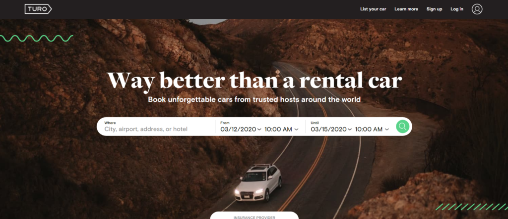
The best call to action may change over time. In its infancy, Turo couldn’t rush visitors to make a decision that they weren’t prepared or motivated enough to make.
Now that it’s more popular (and not unlike Tinder), much of the work has been done before users arrive on the site.
Bad example: Spire
Then you have Spire’s call to action:

Or do you? “Get started” with what? In addition to being vague, it’s a big ask considering how little information they provide about what exactly they do.
Without a relevant call to action at the right time, your homepage isn’t doing its job. You’re leaving too much pressure on the visitor to find the next step. Unfortunately for you, most visitors will take your least-preferred next step—to leave.
3 common mistakes on SaaS homepages (and how to fix them)
Odds are, you’re committing a homepage faux pas. More often than not, those mistakes are somehow related to the pillars we just discussed.
So, if your bounce rate is sky high or your traffic flow to the next step in your conversion funnel is slow, start with these common mistakes (and fixes).
1. Confusing value proposition
Most value propositions aren’t as effective as they could be. You have the curse of knowledge. You know so much about your service that you can no longer explain it clearly to someone who is completely unfamiliar with it.
Or, perhaps, you’re sacrificing clarity for cleverness. Or, perhaps, you don’t truly understand how your visitors perceive your value.
Oli Gardner of Unbounce offers a potential solution: flip your headline and your subheadline. We tend to lead with a vague, generic headline and leave all of the real value hidden in the subheadline. It’s a mistake that site, after site, after site, after site makes, usually without even realizing it.
Some other test ideas…
- The offer itself. Do you really understand the value you provide? Talk to happy customers. Why are they still paying you? What do you have that no one else has? Talk to unhappy customers. Why are they leaving? Where are they going and why? Your customers will write your value proposition for you, but you have do the research.
- The copy. Is the way you word the value proposition easy to understand? Is it too advanced? Too vague and generic? Is it trying so hard to be clever that it doesn’t make sense to everyone? Does it take more than 8 seconds to interpret? Run a 5 second test to find out.
- Your credibility. Why should anyone believe that your service will really deliver the value you’ve promised? If visitors think something sounds too good to be true, it is. Make your value proposition practical and believable. Back it up with social proof, detailed and authoritative content, etc.
2. Unintuitive navigation
There’s a lot of debate about navigation systems. You’re familiar with the hamburger menu, right? It’s been widely criticized for being confusing and unintuitive.
Given that we know navigation space is getting smaller, that criticism might have some weight to it. According to Nielsen, we are indeed trending toward sacrificing usability for design. (Still, there is no universal rule. Sometimes the hamburger menu works.)
Debates aside, what’s important is that your navigation feels like second nature. It should be familiar, prototypical, and effortless. As a general rule, if visitors can “feel” themselves navigating, your system isn’t as effective as it could be.
If you want a meaningful, effective navigation system, run through this list:
- Do visitors know where they are if they arrive on your site anywhere other than the homepage? “You are here” style indicators go a long way.
- Are you using a tiny navigation system on a large, desktop screen?
- Are your navigation points in familiar, expected places? For example, is “Contact us” in the bottom-right-hand corner of the footer?
- Does your navigation look interactive? Are visitors sure they can click? Does it stand out from the elements surrounding it? Does it have enough visual weight?
- If your navigation system is deep, is it possible for visitors to skip more than one level at a time? Or do they have to drill down through four different pages to find the subcategory they want?
- Have you grouped your content in a way that makes sense and is easy to navigate? What are visitors having a difficult time finding? Are they frequently looking for something in the wrong place?
- If you have a long page, should your navigation be visible at all times? Should you have an “up” or “back to the top” button?
- Is your dropdown list too small? Too big? Does your hover dropdown disappear as visitors try to click the link they want? Does your vertical dropdown extend way too far beyond the fold?
3. Weak call to action
If your call to action is weak, it’s because it doesn’t call visitors to perform their most desirable action. So, how do you get to the heart of what the visitor wants? As usual, with a mix of qualitative and quantitative research.
Using qualitative research tools like Qualaroo and UserTesting.com, you can get answers to questions like:
- Did you find everything you were looking for today?
- Is there something holding you back from signing up or making a purchase?
- What were you hoping to get from visiting our site? Did you get it?
- After reading the value proposition, what part of the page do visitors turn their attention to?
- How far down the page do visitors read before taking an action?
Next, dig into the quantitative data…
- What’s the bounce rate on your homepage?
- How does that compare to the bounce rate on other pages?
- What page do most homepage visitors end up navigating to next? Is it the same as the one you suggest?
- What percent of homepage visitors enter the conversion funnel?
Changing behavior is much more difficult than accommodating it. If you want people to go to your pricing page but they routinely end up on your features page, adjust your flow. Your data is telling you that your visitors aren’t ready to look at prices yet.
Cater to their most desired action, not yours. The features page might be an additional step, but if the data is there, it’s a necessary step. In the end, conversions will increase if you simply adjust.
Also, note that you might have different segments visiting your landing page. For example, startups and big businesses. While the call to action itself may be the same (e.g., sign up), the options (and copy) may be very different.
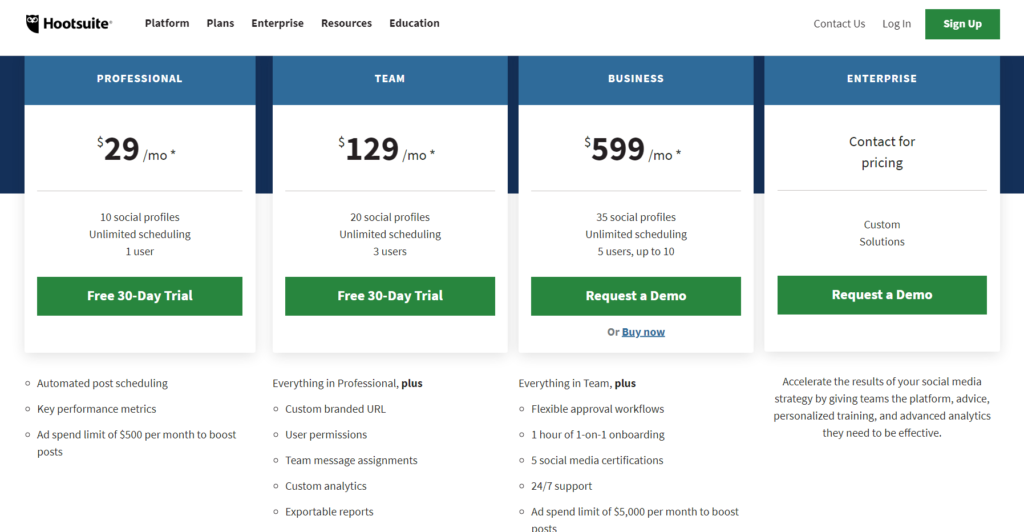
Here’s how HootSuite does it:
Conclusion
Homepages have two very simple goals, but more goes into achieving those goals than you might think. Not optimizing for them would be like expecting to win a race you’re not even running.
Since you have so many potential optimization points on your homepage, focus on the elements that matter most. Run tests on the factors that will yield the biggest ROI.
So, is your homepage experiencing failure to launch?
If so, here’s what you can do:
- Clarify your value proposition. Cover the what, how, and why as quickly, concisely, and clearly as possible.
- Strengthen your navigation system. Make it familiar, prototypical, and intuitive.
- Provide useful/interesting content. Write as much content as you and your readers need, nothing more.
- Create a genuinely desirable call to action. Are you asking your visitors to take their most desired action?
Related Posts
-

You got people to sign up for your free SaaS trial—great! Trouble is, a significant percentage…
-

When we talk about conversion optimization, much of the strategies remain the same across industries.…
-
Today I'm reviewing value propositions of several websites. Value propositions are critically important - especially…
-

As a marketer, being data driven is essential. The problem is, most companies aren't using…


Hi Shanelle,
This article is splendid! I read it all and after reading I tried to implement number 1 about a clear and concise message on my homepage. This is a really great article with lots of examples, i’m happy i found it! Thanks a lot for taking your time to write it out!
Cheers,
Thanks for reading and the kind words, Nichlas.
Let me know how the value proposition tweak works out.