Static data visualization is a silent engagement, productivity, and conversion killer. Marketers have been uploading data to tools like Flourish, Datawrapper, and Tableau for years—then manually formatting, exporting, and embedding the results.
It works, but it’s also slow and what took weeks to create is often lost and forgotten in a four-second scroll.
Anthropic just pushed an update to Claude that lets it generate interactive visuals directly from raw data, with embed codes you can drop into your CMS. We were skeptical. Plenty of tools already do this, and most are clunky enough that teams abandon them after one sprint.
But after running it against a real dataset, the skepticism faded fast.
Table of contents
Static tables are costing you more than you think
When a reader hits a wall of numbers, they face a cognitive tax. They have to interpret the data themselves, hold multiple values in working memory, and construct their own insight.
Most don’t bother. They scroll past, or worse, they leave. Which means you’ve done all the analytical work and captured none of the engagement value.
Interactive charts flip this.
The reader becomes a participant. They filter, hover, zoom, and compare. The insight lands because they found it themselves, not because you told them what to think.
Static tables communicate “we have data.” Interactive charts communicate “we understand it.”
The difference in engagement isn’t subtle: it’s the difference between a reader skimming and a reader exploring.
So, if your content team is sitting on research, surveys, or any kind of structured dataset and publishing it as static HTML tables, you’re basically leaving credibility, and SEO dwell time, on the table.
Why Claude’s visualization feature is worth paying attention to
First off, it’s available across all Claude plans and simple to use. You upload a CSV, ask for charts, and it generates interactive visuals. You can also refine them in the same conversation without starting over. That’s the whole pitch.
But what makes it really worth your while isn’t the feature itself, it’s the accuracy.
The embed workflow: Simpler than you’d expect
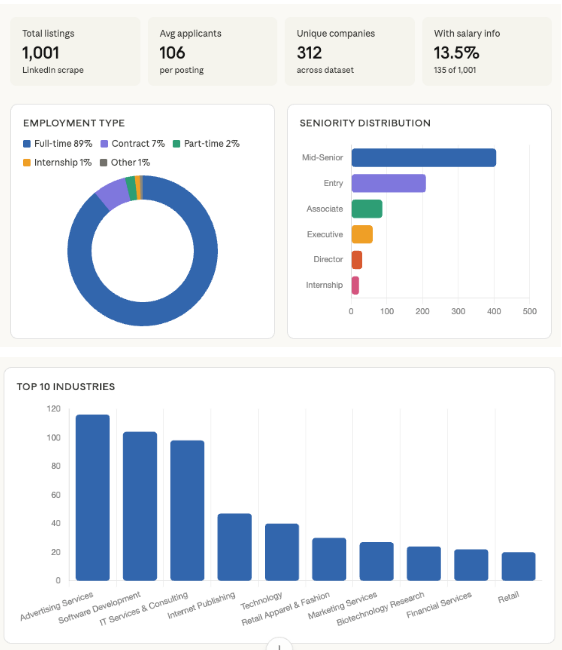
We uploaded a 1,000-row dataset from a LinkedIn job description analysis we’d already done manually. The prompt was deliberately minimal:
| “Map out interactive charts based on the attached dataset.” |
No structure, no prompt engineering, and no field mapping instructions.
Two things stood out with the first output.
First, it analyzed the dataset accurately, which sounds like a low bar until you’ve watched other LLMs hallucinate column values or conflate fields.
Second, it read the context. The charts it generated mirrored how we’d originally framed the analysis in our blog: focused on applicants, industries, and seniority distribution. It didn’t just process the CSV; it inferred intent.
But, the initial output wasn’t perfect—it stayed broad when we needed specific.
So we followed up, asking it to zero in on how AI appears in those job descriptions. Same quality output, just with a tighter focus.
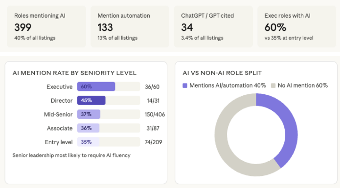
Again, the prompt was simple. No real structure, no prompt engineering best practices, and still, Claude got it right.
That’s the actual workflow: one rough prompt to see what it builds, one refined prompt to get what you need. The output includes embed codes, so all you have to do is paste them into your blog, and you’re done—in two steps, instead of 10.
Why this matters more than another chart tool
There are already plenty of AI data visualization tools. Flourish is excellent, and Datawrapper is pretty fast. So why does this matter?
Because the bottleneck was never the charting tool; it was the handoff: the step between “we have a dataset” and “this is live in the article.”
The old workflow looked like this:
| analyst creates data → designer builds chart in Flourish or Datawrapper → developer embeds it → content team gets it three days later. |
Most lean content teams don’t have the capacity for this workflow, or they’re already stretched thin.
Claude collapses that handoff.
The new workflow:
| Upload CSV→iterate in conversation→grab embed code→copy, paste, done. |
Same day, one person.
There’s no new tool to learn, no account to create, and no CSV formatting requirements to meet first. You ask, it delivers, you refine. Simple as that—your static blog post becomes an interactive data experience without touching your CMS configuration or calling a developer.
That’s more than a minor UX improvement. That’s removing an entire class of friction from data-driven content production.
You don’t need to overdo it either. Embedding two or three key interactive charts in a data-heavy post is enough to meaningfully change the reader experience.
What this doesn’t solve
This isn’t perfect, and you should know where it breaks down.
- Complex or dirty datasets will trip it up. If your CSV has merged headers, inconsistent formatting, or calculated fields that aren’t labeled clearly, Claude will make assumptions, and those assumptions won’t always be right. Clean your data before you upload it.
- The first output usually isn’t the final output. Claude will pick the chart types it thinks are appropriate, which means your first pass might lead with bar charts when you needed a scatter plot, or aggregate data that you needed broken out. Budget time for refinement. The iteration loop is fast, but it’s not zero.
- Embed codes need testing. The visuals look good inside Claude’s interface. They don’t always render identically across every CMS. WordPress, Webflow, and HubSpot all handle embeds differently. Test in staging before you publish.
A sharper presentation layer won’t rescue weak analysis. If your underlying data has sampling problems, selection bias, or just isn’t interesting, Claude will simply make your mediocre insights look better.
That’s not a win, and neither is using it as a shortcut for actual research.
The standard for data-driven content is on the up because the production barrier has come down. Use the feature to present strong analysis more effectively, not to fake it.
What to do next
- Pull your highest-performing data posts: Look at the research-backed content you’ve published in the last 12 months that has strong SEO traction. These are the highest-leverage candidates for a visualization upgrade.
- Upload the underlying dataset to Claude: Keep your first prompt minimal. Ask for interactive charts based on the dataset. Let it interpret before you redirect.
- Follow up with your actual editorial angle: Your second prompt should be specific. Ask it to focus on the dimension of the data that matches your story. This is where Claude earns its keep. It doesn’t just visualize; it reframes the data around a narrative.
- Export the embed code and test it in your staging environment: Before you update a live post, confirm the chart renders correctly in your CMS. Check on mobile. Resize the viewport. Don’t skip this step.
- Update the meta description and internal links on posts you refresh: Refreshed posts with new interactive elements perform better when you signal the update. A fresh meta description and a few updated internal links help Google notice the change.
Interactive data is effective, but it’s not a content strategy
Interactive charts won’t fix weak analysis. A visually dynamic presentation of shallow research is still shallow research.
The real unlock here isn’t the chart itself. It’s what happens when your content team can close the loop between analysis and presentation without a four-person handoff chain.
The practitioners who will get the most out of this are the ones who already have proprietary data—customer survey results, industry benchmarks, internal sales data—and have been under-presenting it.
If your dataset is strong and your static tables have been burying it, Claude’s visualization feature is a legitimate production accelerator. However, if you’re looking for a way to make thin content look more authoritative, this isn’t it.
The real opportunity? Turning raw data into interactive content that drives decisions.
CXL’s B2B Marketing and AI and Digital psychology and persuasion Minidegrees, and Data Visualization & Presentation Course will give you the foundation you need to create scroll-stopping visuals.
Alternatively, you could also join one of our live and on-demand AI-focused sessions:
- Measuring the modern AI-powered funnel
- Build content automations for lead generation with n8n
- Optimizing B2B content funnels with AI
- Increase your visibility and revenue from AI-based discovery engines.
- Content strategy for LLM visibility and changing search habits
- Optimize pages for AI search with GEO/AEO
- Build brand mental availability for zero-click behavior
→ Save your seat at our 5-day n8n webinar series and learn how to automate manual marketing tasks.