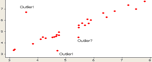
Outliers are unusually high or low observations that sit far from the rest of a dataset. In A/B testing, a small number of extreme values can materially change averages, variance, confidence intervals, and the conclusion you draw from a test.
This matters particularly for revenue metrics such as average order value and revenue per visitor, where a handful of unusually large purchases can have a disproportionate effect.
An outlier is not automatically bad data. It might be a recording error, unusual customer behavior, or a genuinely valuable segment. The important part is identifying it, understanding why it occurred, and deciding how it should be handled before it distorts your analysis.
This guide explains how to detect outliers and five ways to deal with them without automatically throwing useful data away.
TL;DR
- Outliers are observations that sit unusually far from the rest of a dataset.
- Extreme values can heavily influence revenue-based A/B test metrics, especially with small samples.
- Use visual checks such as boxplots alongside statistical methods to identify unusual values.
- Do not automatically delete an outlier. First determine whether it is an error, unusual but valid behavior, or a meaningful customer segment.
- Decide how outliers will be handled before analyzing experiment results whenever possible.
Table of contents
What is an outlier in statistics?
An outlier in statistics is an observation that lies an abnormal distance from other values in a random sample from a population.
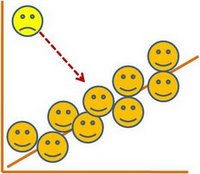
There is, of course, a degree of ambiguity. Qualifying a data point as an anomaly leaves it up to the analyst or model to determine what is abnormal—and what to do with such data points.
There are also different degrees of statistics outliers:
- Mild outliers lie beyond an “inner fence” on either side.
- Extreme outliers are beyond an “outer fence.”
Why do outliers occur and how to find them in a dataset? According to Tom Bodenberg, chief economist and data consultant at Unity Marketing, “It can be the result of measurement or recording errors, or the unintended and truthful outcome resulting from the set’s definition.”
Outliers in data may contain valuable information. Or be meaningless aberrations caused by measurement and recording errors. In any case, they can cause problems with repeatable A/B test results, so it’s important to question and analyze outliers.
Why are they occurring? Where—and what—might the meaning be? The answer could differ from business to business, but it’s important to have the conversation rather than ignore the data, regardless of the significance.
The real question, though, is, “How do outliers affect your testing efforts?”
How do outliers affect A/B testing?
Outliers can disproportionately change averages and variance, which can alter the apparent size, uncertainty, or even direction of an experiment result.
Though outlier statistics show up in many analyses, for conversion optimization you should mostly be concerned about tests in which you’re optimizing for revenue metrics, like Average Order Value or Revenue Per Visitor.
Taylor Wilson, Senior Optimization Analyst at Brooks Bell, explains a few scenarios in which that could happen:
In this particular situation, resellers were the culprit—customers who buy in bulk with the intention of reselling items later. Far from your typical customer, they place unusually large orders, paying little attention to the experience they’re in.
It’s not just resellers who won’t be truly affected by your tests. Depending on your industry, it could be very loyal customers, in-store employees who order off the site, or another group that exhibits out-of-the-ordinary behavior.
Taylor Wilson
Especially in data sets with low sample sizes, outliers can mess up your whole day.

As Dr. Julia Engelmann, Head of Data Analytics at konversionsKRAFT, mentioned in a CXL blog post, “Almost every online shop has them, and usually they cause problems for the valid evaluation of a test: the bulk orderers.”
This isn’t a fringe problem. She shared a specific example of how including and excluding outliers can affect the results of a test, and, ultimately, the decision you make:
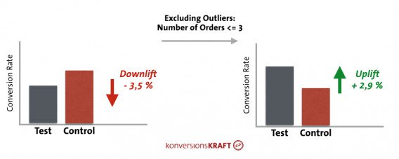
A problem outlier statistics can cause: They tend to be unaffected by smaller UI changes that do affect a more fickle mainstream population. Bulk orderers will push through smaller usability changes in a way that your average visitor may not.
This article outlines a case in which outliers skewed the results of a test. Upon further analysis, the outlier segment was 75% return visitors and much more engaged than the average visitor.
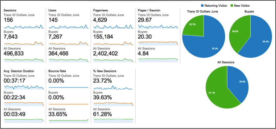
Think your data is immune to outliers? Maybe it is, but probably not—and, in any case, it’s best to know for sure. So how do you diagnose a potential issue on your own? How do you detect outliers in your data?
How do you detect outliers in data?
Data visualization is a core discipline for analysts and optimizers, not just to better communicate results with executives, but to explore the data fully.
As such, outliers are often detected through graphical means, though you can also do so by a variety of statistical methods using your favorite tool. (Excel and R will be referenced heavily here, though SAS, Python, etc., all work).
Boxplots and scatterplots
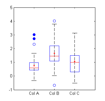
Two of the most common graphical ways of detecting data sets with outliers are the boxplot and the scatterplot. A boxplot is my favorite way.
You can see here that the blue circles are outliers, with the open circles representing mild outliers, and closed circles representing extreme outliers:
It’s really easy to analyze boxplots in R. Just use boxplot(x, horizontal = TRUE), where x is your data set. It generates something that looks like this:
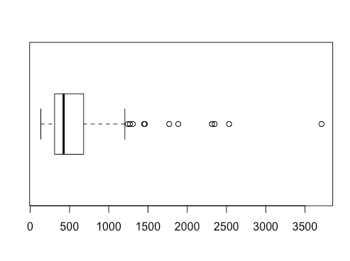
Even better, you can use boxplot.stats(x) function, where x is your data set, to get summary stats that includes the list of outliers ($out). R still uses the standard 1.5 × IQR rule by default when identifying values beyond a boxplot’s whiskers:
> boxplot.stats(rivers)
$stats
[1] 135 310 425 680 1205

$n
[1] 141

$conf
[1] 375.7678 474.2322

$out
 [1]  1459 1450 1243 2348 3710 2315 2533 1306 1270 1885 1770
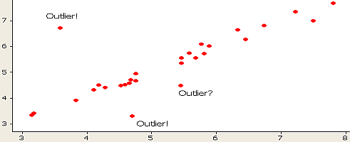
You can also see these in a scatter plot, though it’s a bit harder to tell where extreme and mild outliers are:
Other graphical outlier detection options
A histogram can work as well:
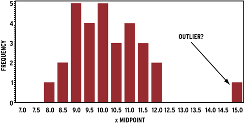
You can also see outliers fairly easily in run charts, lag plots (a type of scatter plot), and line charts, depending on the type of data you’re working with.
Conversion expert Andrew Anderson also backs the value of graphs to determine the effect of outliers on data:
The graph is your friend. One of the reasons that I look for 7 days of consistent data is that it allows for normalization against non-normal actions, be it size or external influence.
The other thing is that if there are obvious non-normal action values, it is okay to normalize them to the average as long as it is done unilaterally and is done to not bias results.
This is only done if it is obviously out of normal line, and usually I will still run the test another 2–3 extra days just to make sure.
Andrew Anderson
The important point here is inspecting unusual behavior rather than treating seven days as a universal experiment-duration rule. Test duration should follow the experiment design and stopping rule you chose before launch.
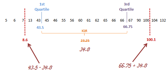
But is there a statistical way of detecting outliers, apart from just eyeballing it on a chart? Indeed, there are many ways to do so (Wikipedia has a comprehensive article on outlier detection); the main two being a standard deviation approach or Tukey’s method.
For heavily skewed or contaminated data, robust measures such as the median absolute deviation (MAD) can also be useful because they are much less sensitive to extreme observations than the standard deviation.
In the latter, extreme outliers tend to lie more than three times the interquartile range (below the first quartile or above the third quartile), and mild outliers lie between 1.5 and three times the interquartile range (below the first quartile or above the third quartile).
It’s pretty easy to highlight outliers in Excel. While there’s no built-in function for outlier detection, you can find the quartile values and go from there.
How should you deal with outliers in data?
There is no single correct treatment. Depending on why the outlier exists and what you are measuring, you may filter, trim, cap, model, segment, or retain it.
Should an outlier be removed from analysis? The answer, though seemingly straightforward, isn’t so simple.
There are many strategies for dealing with outliers in data. Depending on the situation and data set, any could be the right or the wrong way. In addition, most major testing tools have strategies for dealing with outliers, but they usually differ in how they do so.
Because of that, it’s still important to do a custom analysis with regard to data sets with outliers, even if your testing tool has default parameters. Not only can you trust your testing data more, but sometimes analysis of outliers produces its own insights that help with optimization.
So let’s go over some common strategies:
1. Set up a filter in your testing tool
Filtering can reduce the influence of extreme observations, but the rule needs to be justified and applied consistently across variants. The goal is to prevent a small number of extreme values from dominating the metric, not to uncover statistical significance.
Modern experimentation platforms often include outlier handling directly in their metric configuration.
Optimizely, for example, currently offers outlier smoothing for revenue metrics. It identifies unusually high daily values using a moving threshold and replaces those extreme values before calculating the experiment result.
Statsig uses winsorization for several metric types, capping extreme values at a configured percentile rather than removing the observations entirely.
The exact implementation differs by platform, so understand how your testing tool handles outliers before applying another treatment manually.
2. Remove or change outliers during post-test analysis
Kevin Hillstrom, President of MineThatData, explains why he sometimes adjust outliers in tests:
On average, what a customer spends is not normally distributed.
If you have an average order value of $100, most of your customers are spending $70, $80, $90, or $100, and you have a small number of customers spending $200, $300, $800, $1600, and one customer spending $29,000. If you have 29,000 people in the test panel, and one person spends $29,000, that’s $1 per person in the test.
That’s how much that one order skews things.
Kevin Hillstrom
One way to account for this is simply to remove outliers, or trim your data set to exclude as many as you’d like.
Do not choose a trimming threshold after looking at which treatment wins. Define the rule from historical data or before the experiment whenever possible, then apply it consistently to all variants.
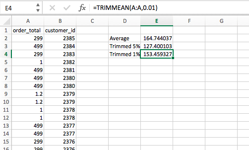
Excel’s TRIMMEAN function
Trimming outliers is really easy to do in Excel—a simple TRIMMEAN function will do the trick. The first argument is the array you’d like to manipulate (Column A), and the second argument is by how much you’d like to trim the upper and lower extremities:
Trim outliers in R
If the mean differs substantially from the median, that can be a sign of skewness or influential extreme values worth investigating.”
In that case, you can trim off a certain percentage of the data on both the large and small side. In R, it’s just mean(x, trim = .05), where x is your data set and .05 can be any number of your choosing:
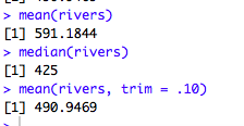
This process of using Trimmed Estimators is usually done to obtain a more robust statistic. The median is the most trimmed statistic, at 50% on both sides, which you can also do with the mean function in R—mean(x, trim = .5).
In optimization, most outliers are on the higher end because of bulk orderers. Given your knowledge of historical data, if you’d like to do a post-hoc trimming of values above a certain parameter, that’s easy to do in R.
If the name of my data set is “rivers,” I can do this given the knowledge that my data usually falls under 1210: rivers.low <- rivers[rivers<1210].
That creates a new variable consisting only of what I deem to be non-outlier values. From there, I can boxplot it, getting something like this:
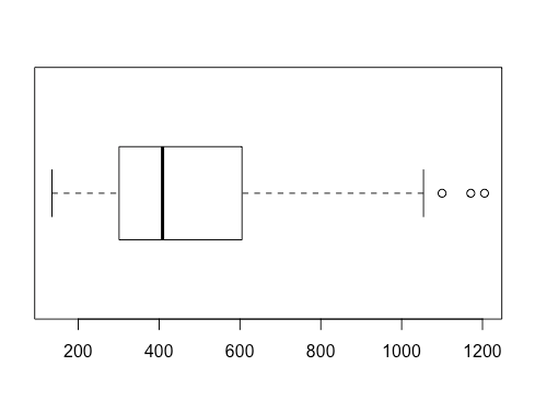
There are fewer outlier values, though there are still a few. This is almost inevitable—no matter how many values you trim from the extremes.
Remove outliers beyond 3 standard deviations
A three-standard-deviation rule is most defensible when the distribution is reasonably symmetric. It can behave poorly on highly skewed data because the mean and standard deviation are themselves affected by extreme values.
You can also do this by removing values that are beyond three standard deviations from the mean. To do that, first extract the raw data from your testing tool.
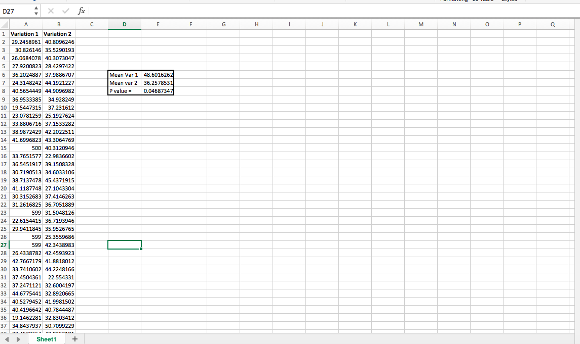
Instead of taking real client data to demonstrate how to do this, I generated two random sequences of numbers with normal distributions, using =NORMINV(RAND(),C1,D1), where C1 is mean and D1 is SD, for reference.
In “variation 1,” though, I added a few very high outliers, making variation 1 a “statistically significant” winner:
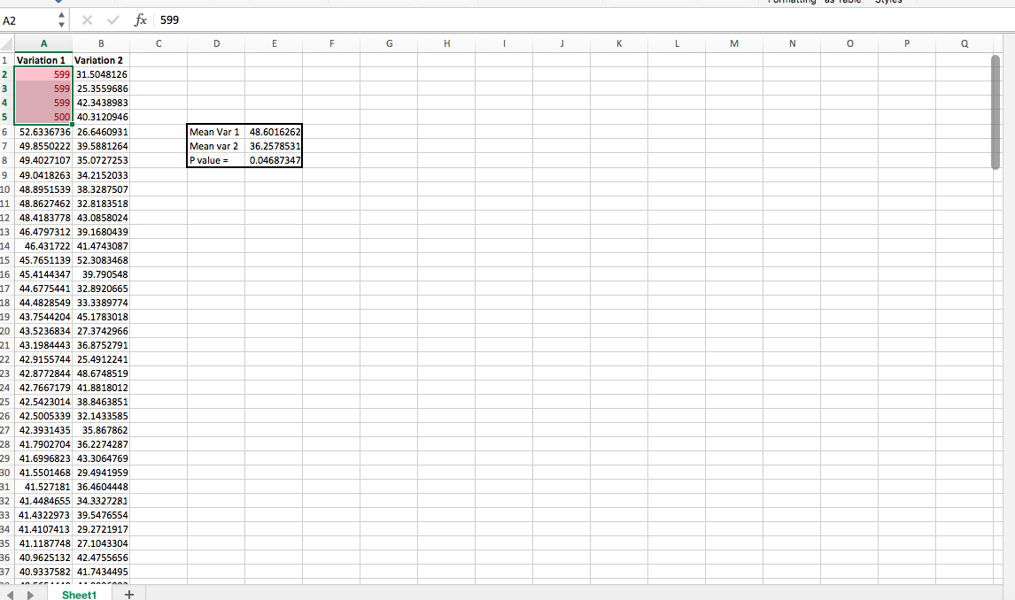
Then, you can use conditional formatting to highlight those that are above three standard deviations and chop them off:
After you do, you have a different statistically significant winner:
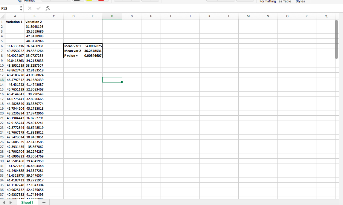
My example is probably simpler than what you’ll deal with, but at least you can see how just a few high values can throw things off (and one possible solution to do with that). If you want to play around with outliers using this fake data, download the example spreadsheet with outliers in its data set.
3. Change the value of outliers
Much of the debate on how to deal with outliers in data comes down to the following question: Should you keep outliers, remove them, or change them to another variable?
Essentially, instead of removing outliers from the data, you change their values to something more representative of your data set. It’s a small but important distinction: When you trim data, the extreme values are discarded.
When you use winsorized estimators (i.e. change the values), extreme values are replaced by percentiles—the trimmed minimum and maximum.
Kevin Hillstrom mentioned in his podcast that he trims the top 1% or 5% of orders, depending on the business, and changes the value (e.g., $29,000 to $800). As he says, “You are allowed to adjust outliers.”
Here’s how to winsorize outliers in R.
4. Consider the underlying distribution
Traditional methods to calculate confidence intervals assume that the data follows a normal distribution, but as with certain metrics like average revenue per visitor, that usually isn’t the way reality works.
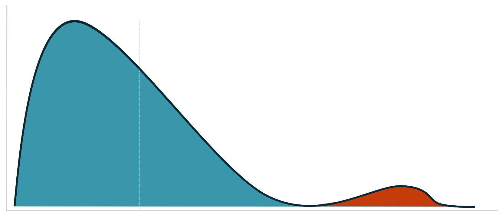
In another section of Dr. Julia Engelmann’s wonderful article for our blog, she shared a graphic depicting this difference. The left graphic shows a perfect (theoretical) normal distribution. The number of orders fluctuates around a positive average value. In the example, most customers order five times. More or fewer orders arise less often.
The graphic to the right shows the bitter reality. Assuming an average conversion rate of 5%, some 95% of visitors don’t buy. Most buyers have probably placed one or two orders, and there are a few customers who order an extreme quantity.
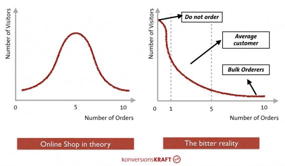
The distribution on the right side is known as a right-skewed distribution.
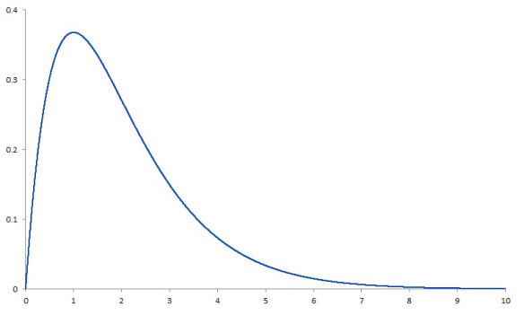
The problem is not that confidence intervals become impossible to calculate. The problem is that methods built on inappropriate distributional assumptions can produce misleading uncertainty estimates when the data is heavily skewed or dominated by extreme values.
In those cases, consider methods designed for skewed or heavy-tailed data, robust estimators, or resampling approaches such as bootstrapping.
For conversion and revenue-per-visitor metrics, many visitors contribute a zero while a much smaller group generates positive, and sometimes extremely large, values. That naturally creates highly skewed data.
Use a method that fits the data
In this case, it’s worth taking a look at the data using methods other than the t-test. (The Shapiro-Wilk test lets you test your data for normal distribution, by the way.) All of these were suggested in this article.
Depending on the metric, sample size, and distribution, alternatives include:
- Robust or trimmed-mean methods. These reduce the influence of extreme observations. Current SciPy implementations include trimmed t-tests specifically for long-tailed data or samples contaminated by outliers.
- Bootstrapping. Resampling can estimate uncertainty and confidence intervals without relying on a specific parametric distribution for the raw observations.
- Rank-based tests such as Mann–Whitney. These can be useful when the hypothesis concerns distributional or rank differences, but they are not a drop-in replacement for every comparison of means.
At its core, it belongs to the resampling methods, which provide reliable estimates of the distribution of variables on the basis of the observed data through random sampling procedures.
5. Consider the value of mild outliers
As exemplified by revenue per visitor, the underlying distribution is often non-normal. It’s common for a few big buyers to skew the data set toward the extremes. When this is the case, outlier detection falls prey to predictable inaccuracies—it detects outliers far more often.
There’s a chance that, in your data analysis, you shouldn’t throw away outliers. Rather, you should segment them and analyze them more deeply. Which demographic, behavioral, or firmographic traits correlate with their purchasing behavior? And how can you run an experiment to tease out some causality there? You need to ask: what is an outlier for these statistics that we’re about to collect?
This is a question that runs deeper than simple A/B testing and is core to your customer acquisition, targeting, and segmentation efforts. I don’t want to go too deep here, but for various marketing reasons, analyzing your highest value cohorts can bring profound insights.
When should you decide how to handle outliers?
Whenever possible, decide before the experiment starts. Predefining the rule reduces the risk of changing the analysis after seeing which treatment benefits from a particular decision.
In any case, it helps to have a plan in place. As Dan Begley-Groth once wrote:
In order for a test to be statistically valid, all rules of the testing game should be determined before the test begins. Otherwise, we potentially expose ourselves to a whirlpool of subjectivity mid-test.
Should a $500 order only count if it was directly driven by attributable recommendations? Should all $500+ orders count if there are an equal number on both sides? What if a side is still losing after including its $500+ orders? Can they be included then?
By defining outlier thresholds prior to the test (for RichRelevance tests, three standard deviations from the mean) and establishing a methodology that removes them, both the random noise and subjectivity of A/B test interpretation is significantly reduced. This is key to minimizing headaches while managing A/B tests
Dan Begley-Groth
Whether you believe that outliers don’t have a strong effect (and choose to leave them as is) or whether you want to trim the top and bottom 25% of your data, the important thing is that you’ve thought it through and have a strategy.
Being data-driven means considering anomalies like this. To ignore them risks making decisions on faulty data.
What to take away
Outliers can materially change A/B test results, particularly for highly variable metrics such as revenue and average order value.
But an outlier is not automatically something to delete. It may be an error, a legitimate extreme customer, or a segment worth understanding separately.
Before changing the data:
- Identify why the unusual value occurred.
- Check whether the metric is naturally skewed.
- Decide whether removal, trimming, winsorization, segmentation, or no adjustment is appropriate.
- Apply the rule consistently across experiment variants.
- Define the treatment before seeing the result whenever possible.
The goal is not to make the data look cleaner. It is to prevent a small number of observations from producing a conclusion that does not represent the question you are trying to answer.
Frequently asked questions about outliers
What is an outlier?
An outlier is an observation that sits unusually far from the rest of a dataset.
Should you always remove outliers?
No. First determine whether the value is an error, legitimate behavior, or a meaningful segment.
Can outliers change A/B test results?
Yes. A small number of extreme values can materially affect averages, variance, and experiment conclusions.
How do you detect outliers?
Use visual methods such as boxplots alongside statistical approaches such as IQR rules or robust measures.
What is winsorization?
Winsorization caps extreme values at a chosen threshold rather than deleting the observations.
When should you decide how to handle outliers?
Ideally before the experiment starts, using a rule that is applied consistently across variants.
What should marketers do next?
Outlier handling is one part of trustworthy experimentation. Strong analysis also depends on correct test design, sample sizing, statistical power, and choosing metrics that reflect the business outcome you care about.
Strengthen your A/B testing statistics: CXL’s Statistics for A/B Testing course covers statistical significance, statistical power, sample sizing, and interpreting experiment results.
Build a complete experimentation skillset: The Conversion Optimization Minidegree covers conversion research, experimentation, statistics, and testing strategy.
Build stronger analysis workflows with AI: The AI Native Marketer program teaches marketers to build systems around analysis, measurement, research, and reporting.
Related Posts
-

A/B testing is highly useful, no question here. But a lot of businesses should not be…
-

A/B testing is fun. With so many easy-to-use tools, anyone can—and should—do it. However, there's…
-

Do you need to be a big company and need large volumes of traffic to be data…
-

Sometimes A/B testing is made to seem like some magical tool that will fix all…