Mobile Ecommerce Design: How to Earn More Conversions

There are an almost limitless number of mobile usability gotchas that need to be identified and gradually refined.
There are an almost limitless number of mobile usability gotchas that need to be identified and gradually refined.

Ever wonder why your site has a lot of visitors but not enough transactions, purchases, or inquiries? In this post, we look at marketing and UX metrics from a slightly different angle.

A great deal has been written about whether, in the Internet age, your business should have a phone number on its website.
On one hand, having a phone number can increase the trustworthiness of your website, help sell potential customers who aren’t comfortable buying online, and allow customers to contact support easily.
The flip side? Phone support costs money.
Many anecdotes support both strategies, but we should be asking, “Where’s the data?”

For most sites, mobile traffic is a majority of total traffic, and smooth navigation for mobile users is critical.
Many sites use the hamburger navigation icon to display the menu. It’s become the default option.
But is the hamburger menu the best idea? Maybe not.

Typography is the detail and the presentation of a story. It represents the voice of an atmosphere, or historical setting of some kind. It can do a lot of things. (Cyrus Highsmith)
We only have a handful of tools to communicating online, really. Words, images, colors, and composition are the usual suspects, but they’re stealing most of the credit for what goes into making effective websites and landing pages.
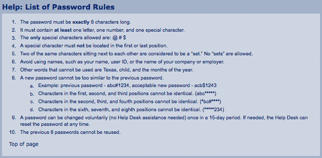
Have you ever forgotten a password for a site? What about a security question?
Have you ever spent a ridiculous amount of time trying to think of a password you can remember, but also complies with a list of arbitrary requirements (e.g., seven uppercase letters, four special characters, etc.)?
When these UX problems pop up, they cause friction.
Friction that prevents new SaaS customers from signing up, friction that prevents loyal eCommerce customers from creating an account for next time, friction that prevents current customers from accessing their accounts.

Customer personas are often talked about in marketing and product design, but they’re almost never done well.

Often, marketing creativity encounters technical limitations. A web page can load only so fast. UX is constrained by browsers. Cutting-edge solutions are accessible only to those with large budgets.
Nothing is more frustrating than filling out a badly designed form.
It’s a common experience, though. How many times have you entered a password only to be taken back with red ink proclaiming “Error! Password needs a capital letter, two numbers, a special character, and a quote from a Fetty Wap song.”

You got people to sign up for your free SaaS trial—great! Trouble is, a significant percentage of users sign up for the trial, log in once, and never come back. You might as well have burned the money it took to acquire them.
The reality is, you’ll never retain all of your customers, and some of those reasons you can’t control: