Have you ever forgotten a password for a site? What about a security question?
Have you ever spent a ridiculous amount of time trying to think of a password you can remember, but also complies with a list of arbitrary requirements (e.g., seven uppercase letters, four special characters, etc.)?
When these UX problems pop up, they cause friction.
Friction that prevents new SaaS customers from signing up, friction that prevents loyal eCommerce customers from creating an account for next time, friction that prevents current customers from accessing their accounts.
Table of contents
Why is password UX a problem?
First of all, the average person has a lot of passwords to keep track of. In a survey on password habits, 70% of respondents said they have more than 10 password-protected accounts online, with nearly 30% having “too many to count.” Another survey found that more than 50% of people use three or more passwords on a daily basis.
Passwords are hard to remember
According to the Online Registration and Password Study, 51% of people dislike the idea of remembering another password. Not so surprising. But 38% agreed that it sounds more appealing to do household chores than to come up with another new username or password.
That same study found that 37% of people have to ask for assistance on their username or password for at least one website every single month.
In fact, the concern for the ease of password memorization is pretty universal, according to a survey…
- 76% of those ages 18 to 24 are concerned about it.
- 59% of those ages 25 to 34 are concerned about it.
- 55% of those ages 35 to 49 are concerned about it.
- 50% of those ages 50 to 64 are concerned about it.
Despite this apparent dislike for password creation and memorization, Perception and Knowledge of IT Threats: The Consumer’s Point of View found that 71% of respondents rely on their memory to recall passwords.
That might explain why people reuse their passwords across multiple sites, regardless of age…
- 76% of those ages 18 to 24 reuse passwords.
- 58% of those ages 25 to 34 reuse passwords.
- 61% of those ages 35 to 49 reuse passwords.
- 56% of those ages 50 to 64 reuse passwords.
- 62% of those ages 65+ reuse passwords.
The perception and knowledge of IT threats study also found that 7% of people use special tools, like LastPass, to remember their passwords. However, studies have shown that people just don’t trust password managers for them to be a viable, mainstream solution.
Passwords aren’t that secure.
As the popularity of reusing passwords indicates, passwords are not actually as secure as most companies would assume. According to a survey from PCMag, 35% of people never change their passwords, which is terrifying given mandatory resets are also at play.
Speaking of mandatory resets, how effective are your calls for users to change their passwords? According to ESET & Harris Interactive Password Poll, 18% of people ignore the requests completely while 19% “sometimes change their passwords.”
When they do change their passwords due to a threat or mandatory reset, a study found that many users make small, incremental changes to their existing passwords, which doesn’t make a hacker’s job too difficult.
A survey from LastPass showed that more than half of people don’t change their password even when a data breach happens and their password is potentially at risk.
KoreLogic research suggests that less than 10%, and probably less than 2%, of users have passwords that are complex enough and long enough to withstand a combination of dictionary, rainbow, and brute-force attacks.
But what about your password requirements? Do they help? An analysis showed that over 70% of people use simple numeric prefixes or suffixes to avoid “must contain a digit” requirements. Similarly, when a “must contain a special character” requirement is present, 30% of people will just add a single special character at the end.
Passwords are causing serious friction
Passwords are also preventing people from making a purchase. If people attempt to recover a password while checking out on an eCommerce site, 75% won’t complete their purchase.
Additional research has found that 46% of those surveyed in the U.S. report that authentication failures have prohibited online transactions frequently or very frequently.
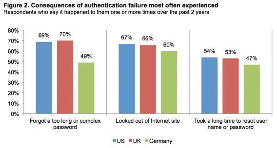
A study of consumer attitudes found that 67% of U.S. respondents have been locked out of an account at least once in the past two years. 54% reported waiting a long time to reset a username or password at least once in the past two years. 63% said they agree or strongly agree that failure due to a forgotten password, username or answer to a security question were the cause of authentication and identification failures.
This isn’t a new problem
Actually, people have been asking for alternative solutions to the traditional username and password authentication system since 2004 when 80% of workers reported being “fed up” with using passwords and 92% said they would be more interested in using biometric technology or tokens/smartcards.
But with the growing concern over online privacy in recent years, the password problem has been brought to light again. According to YouGov Cyber Security, 61% of people are moderately to very concerned about being hacked. Another study found that 46% of U.S. respondents agree or strongly agree that they do not trust websites that rely only on passwords.
All that to say that the traditional username + password authentication system is broken in a big way. And, it seems, the only reason mainstream innovation has stalled is because companies want to do it “how it’s always been done.”
How to optimize password authentication
If you want to stick with the traditional username + password authentication process, at least take the time to optimize it and improve the UX.
There are five things you can do immediately to make things easier for your visitors: limit and highlight password requirements, allow unmasking, show a strength meter, don’t make them confirm the password, and experiment with passphrases.
1. Limit requirements and make them visible
Here’s an example of password requirements done right from Hootsuite…
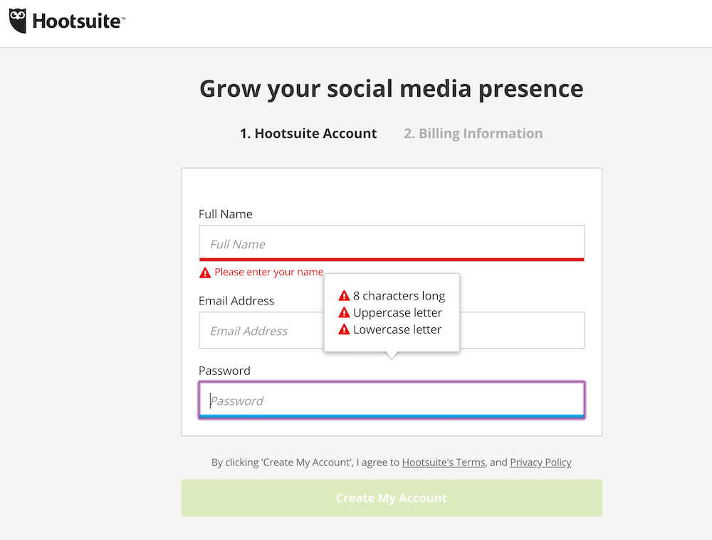
Three simple rules that are clearly visible the moment you select the password field. As Katie Sherwin of Nielsen Norman Group explains, this makes the process more efficient…

Katie Sherwin, Nielsen Norman Group:
“State the password requirements, and make sure that the user can see them the entire time that the field is selected. If you can successfully reduce some of the technical restrictions, you’ll have less text to display and fewer rules for the user to process, making password creation faster.” (via NN/g)
Simple, clear expectations from the beginning mean fewer errors. As a user, there’s nothing quite as annoying as typing in a password only to return three errors because you didn’t include a special character, three uppercase letters and two numbers.
2. Allow password unmasking
Here’s an example of password unmasking from Mailchimp…
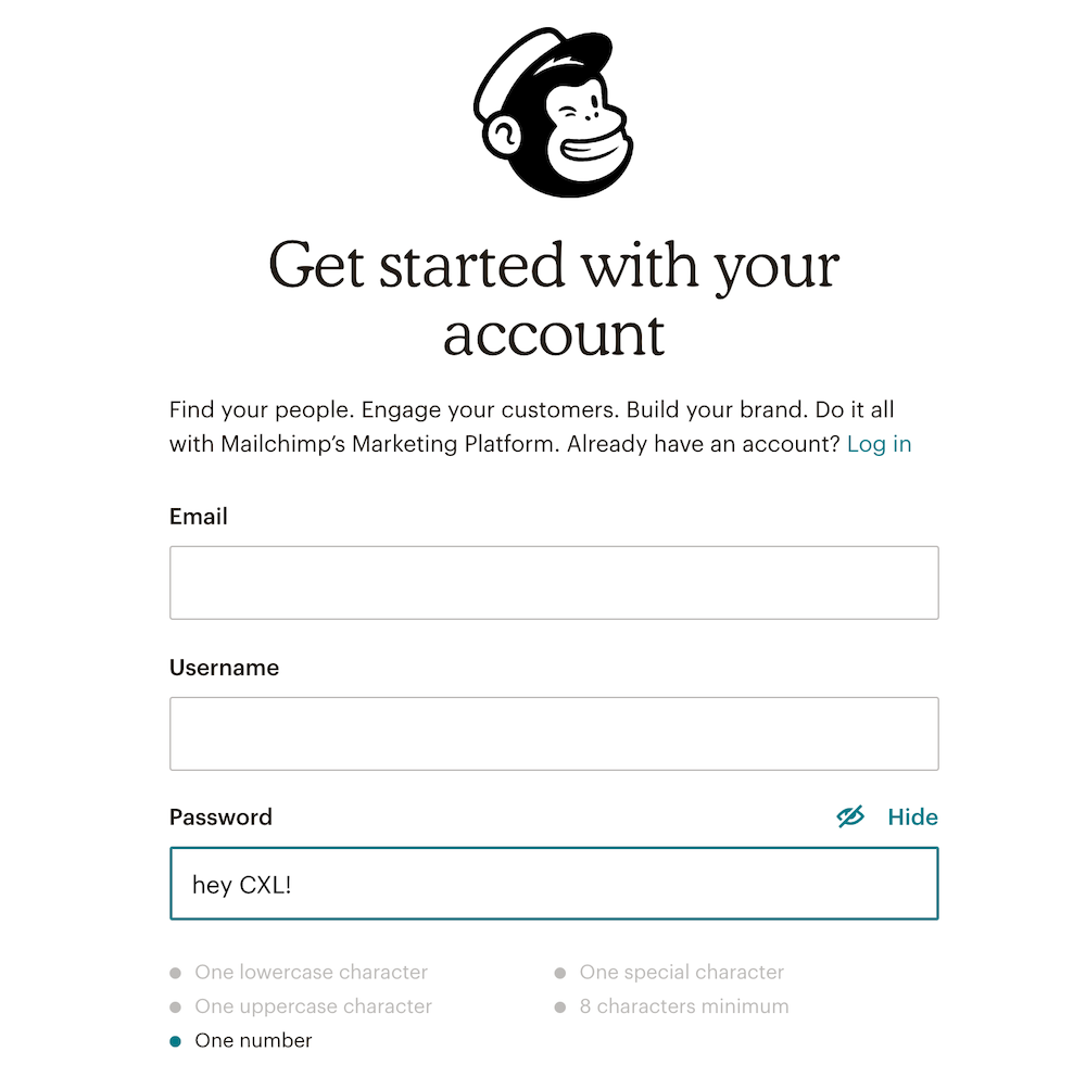
As you can see, you can click the “Hide” text above the password field to show or hide the text in the password field.
Katie shares some device-specific unmasking best practices…

Katie Sherwin, Nielsen Norman Group:
“Allow users to unmask the password. Seeing the password will support memory and will allow users to check their work. On desktop, hide the password by default, and next to it, place a checkbox labeled Show password. On mobile devices and tablets, show the password by default and let users toggle the visibility with a Hide password control.” (via NN/g)
Passwords are often masked for added security. Someone could be looking over your shoulder or even at your phone from across the table and catch your password.
But as Luke Wroblewski explains, it really doesn’t add as much security as most companies think it does…

Luke Wroblewski, Google:
“Wait… what? You’re displaying people’s passwords by default? Simply put, yes. We decided to optimize for usability and ease of log in over questionable security increases. On a touchscreen phone, its trivial to move the device out of sight of prying eyes. Or easier still to simply hit the Hide action to obscure a password.
But not that it matters, there’s a visible touch keyboard directly below the input field that highlights each key as you press it. These bits of feedback show the characters in a password at a larger size than most input fields. So in reality, the •••• characters aren’t really hiding a password from prying eyes anyway. As a result, we opted for usability improvements instead.” (via LukeW)
So, to summarize…
- On desktop, mask passwords by default, but add a “Show” option so that people can remember the password and check their work.
- On mobile, unmask passwords by default, but add a “Hide” option. It’s especially hard to type a complex, secure password on mobile.
- Unmasking passwords on mobile is not really hurting security very much. Mobile keyboards indicate exactly which letters were typed, anyway.
3. Show a strength indicator
Below, you’ll notice that Airbnb has a password strength indictor below the field…
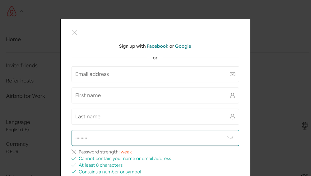
You’ve likely seen this time and time again. Katie explains why it’s not an outdated practice and can actually help improve security…

Katie Sherwin, Nielsen Norman Group:
“Motivate people to create better passwords by showing how secure the password is.
A study by Egelman et al. (2013) found that strength meters motivated users to create stronger passwords. Visually representing the strength of the user’s password, and showing that there is room for improvement, changes the motivation. The benefit is getting a secure password, instead of just complying with a system’s arbitrary command. It’s a slight mental shift that has a potentially large impact on security.” (via NN/g)
Often, as demonstrated in the Airbnb example above, strength indicators replace visible password requirements. This is not necessary, especially if you limited the requirements, as suggested above.
Instead, you can use them together to reduce errors while also subtly motivating people to care about their own security (vs. enforcing a ton of arbitrary requirements).
4. Don’t make people confirm
Note that when signing up for Facebook, you don’t need to enter your password twice…
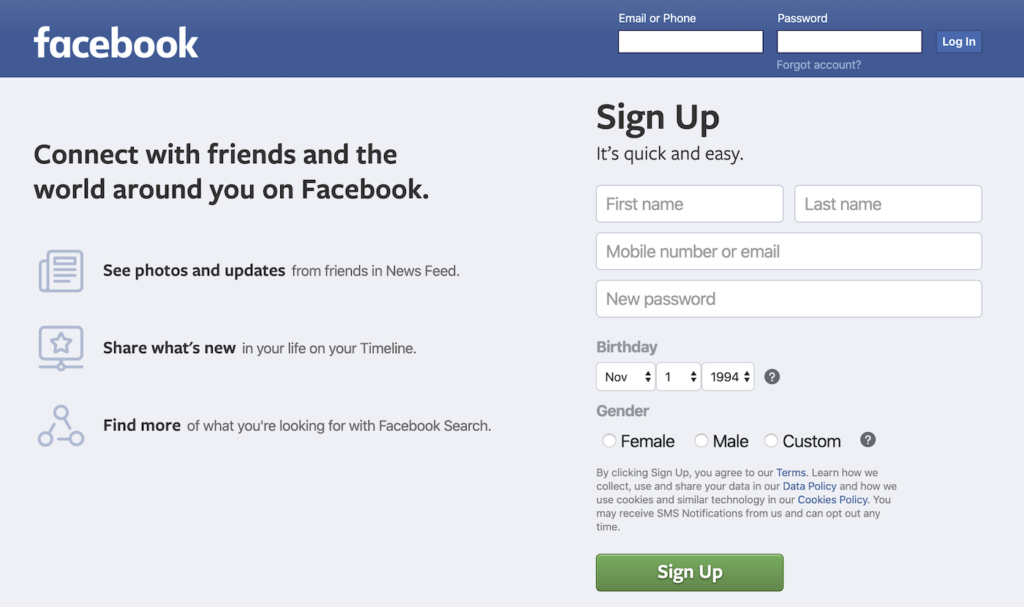
Yes, there’s power in repetition, but password confirmation fields were largely introduced due to password masking. If you followed the advice above and gave people the option to unmask their passwords, the password confirmation field might be less necessary than you think.
Jessica Enders of Formulate explains…

Jessica Enders, Formulate:
“The desire to prevent errors on forms is a good one. But given that double entry…
- Increases the workload for every single user;
- Can be bypassed by copying and pasting, or automatic form-filling tools;
- Only ensures the two fields match, not that they contain the valid information; and
- May be seen as belittling the user;
…it is important to establish a real need before implementing double entry.” (via Formulate)
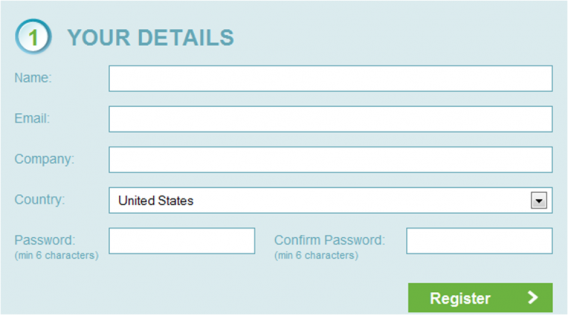
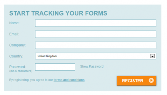
Formisimo shared a case study where they experimented with removing their password confirmation field after reading about its modern irrelevancy.
Here’s the control…
And here’s the treatment…
The results were impressive, to say the least…
- 14.3% more visitors started the form after visiting the page.
- 56.3% increase in overall conversions.
- 35.5% increase in the form completion among those who begin.
- 23.9% decrease in the number of corrections made.
5. Experiment with passphrases
Take a look at Simple’s iteration on the traditional password authentication process…
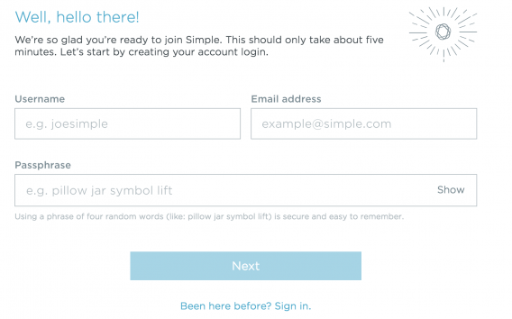
Passphrases aren’t something you see often, but are certainly worth testing.
Some UX experts say that passphrases are more user-friendly because it’s simply easier to remember a series of recognizable words than random characters. Also, by default, requirements are reduced with the introduction of passphrases vs. passwords.
They also contribute to improved security, though. Since passphrases are longer, they stop more brute-force attacks and the use of multiple words helps stop dictionary attacks.
Authentication alternatives to consider
If you’re thinking of moving away from the traditional, you have a number options, all with their own set of pros and cons.
1. Biometric authentication
The most common example of biometric authentication is unlocking your phone with your thumb print. However, that functionality is expanding quickly. Many mobile apps now let you log in with the same fingerprint that you use to unlock your phone.
Of course, thumb prints aren’t the be-all-end-all of biometric authentication. A survey of consumer attitudes found that respondents were interested in a number of different biometric authentication methods…
- 83% were interested in voice recognition.
- 70% were interested in facial scans.
- 57% were interested in hand geometry.
- 56% were interested in fingerprints.
- 50% were interested in eye scans.
In fact, 8 in 10 Brits would ditch passwords in favor of biometric security.
Even for as something as sensitive as banking, consumers are interested in biometric authentication…
- 53% of those surveyed agree or strongly agree that they would like their bank to use fingerprint scanners.
- 33%of those surveyed agree or strongly agree that they would like their bank to use iris scanners.
- 30% of those surveyed agree or strongly agree that they would like their bank to use facial recognition.
- 29%of those surveyed agree or strongly agree that they would like their bank to use electrocardiogram (ECG) heartbeat monitors.
- 27% of those surveyed agree or strongly agree that they would like their bank to use voice verification.
Advantages…
- There’s nothing to forget; your biology is always with you.
- Very secure.
- Easy on the user; minimal effort required.
Disadvantages…
- It’s in the early stages of development and thus, difficult to implement. Most phones and tablets are equipped, but desktops are just now catching up (e.g., Windows 10).
2. Two-factor authentication
If you are a regular iTunes or Gmail user, you’re likely familiar with two-factor (2FA) authentication already. A password is still required, but a code is sent to a second device (e.g., your phone) for additional security. Thus, you’re notified when someone other than yourself attempts to log into your account.
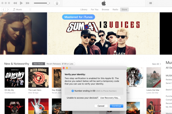
The proverbial jury is still out on this one. While it undoubtedly adds security, it still requires the memorization of a password and can become annoying quickly.
On one hand, the Siber Systems RoboForm Online Security Survey found that 43.2% of people would trust a company more with their personal information if they introduced a two-factor authentication process.
On the other, in 2013, 75% of survey respondents had never signed into a website using two-factor authentication and 27% had decided against signing into a site with two-factor authentication because they didn’t want to disclose their cell number and/or because they found it inconvenient.
Advantages…
- You can reduce password requirements, making the UX marginally better.
- Added security.
Disadvantages…
- It can become annoying if overused. Where possible, add a “trust this device for X days” option or consider making it optional (or, at least, easy to disable) like iTunes and Gmail do.
3. Social (and other third-party) authentication
Social, and other third-party authentications, are growing in popularity. Twitter, Facebook, Google, LinkedIn, and more offer third-party authentication options. For example, Basecamp offers the option to sign up and log in using your Google account…
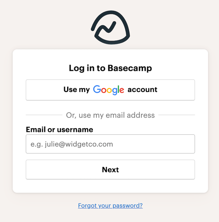
In general, people are receptive to the rise of social authentication. One survey found that 77% of people find the option helpful and appealing.
Advantages…
- You can end up grabbing quite a bit of information about your users from their third-party accounts.
- No less secure than a standard password.
- It’s easy for your visitors to use.
- It’s easy for you to implement.
Disadvantages…
- It always requires a back up authentication method because visitors might not have an account with the third-party of your choice.
- Asking for various permissions from the third-party is required and might scare people off.
- It doesn’t work behind firewalls, which is a problem for people who can’t use Facebook at work.
- The user needs to remember how they originally signed up if they want to sign in.
4. No password authentication
Perhaps the most well-known example of the no password authentication is Slack. Instead of typing out your password on mobile, which can be difficult, you have the option to receive a magic link via email, which signs you in automatically…
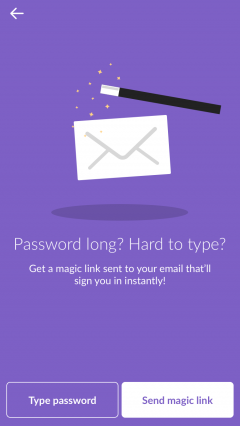
But, of course, it’s not just Slack that’s authenticating without passwords. Status Hero uses a similar process as well…

Auth0 wrote a step-by-step guide to setting up a similar authentication process using universal links, which you can read here.
Advantages…
- They never need to create, remember or use a password at all. Think of it like two-factor authentication without the need for an initial password step.
- Typically, these links expire after a short period of time, adding an extra layer of security.
Disadvantages…
- This can be difficult to set up and support, depending on your site.
Conclusion
It’s time we rethink modern password UX and online authentication in general. No more doing it one way because it’s how it’s always been done.
Here’s what you need to know about the password UX problem we’re facing…
- Passwords are a problem because they’re hard to remember, less secure than we think, and causing serious frustration and friction.
- If you want to use traditional passwords, you should: limit requirements and make them visible, allow unmasking, show a strength indicator, avoid password confirmation fields, and experiment with passphrases.
- Biometric authentication is promising, but still in the early stages of development and implementation.
- Two-factor authentication can be annoying if overused, but marginally improves UX and adds a layer of security.
- Social (and other third-party) authentication are rising in popularity due to ease of use and implementation, but you still need a fall-back method and giving you third-party permissions might scare people off.
- No password authentication can be difficult to set up and support, but is easy to use and very secure.
Working on something related to this? Post a comment in the CXL community!

/cdn.vox-cdn.com/uploads/chorus_image/image/65594669/WA_Lock_blog__1_.0.png)


