
There are many, many, many lists of conversion optimization best practices. Some are sacrosanct:
- Sliders distract – you should get rid of them.
- Everything needs to be shorter – cut stuff out.
- Just make the button bigger!
These practices often come from broad trends observed over many experiments and they highlight what usually and typically works. Often, they’re tapping into a kernel of persuasion wisdom.
But there’s a problem: just because it usually and typically works, doesn’t mean it’ll work for you. Websites have different target audiences, different marketing, positioning, pricing, product selection, seasonality. Your industry may be atypical. Mostly, it’s just all relative:
“Since different pages have different goals, one-size fits all strategy is never applicable.” – Greg Ciotti
And then there’s the human element. When something has been written about and tried so much, we can lose sight of the kernel of persuasive wisdom that made it initially great, and blindly follow a trend.
In other words, we’re paying attention to the symptom of success, not the cause.
In this post, we’ll cover a few examples of when best practices flat out failed, figure out where those implementations failed to understand the kernel of wisdom and see what we can learn from their mistakes to stop blindly following best practices and start making money.
Table of contents
- Failed Best Practice #1: No Sliders
- Failed Best Practice #2: Trust Seals
- Failed Best Practice #3: Bigger Buttons
- Failed Best Practice #4: Only One Call To Action (CTA)
- Failed Best Practice #5: Use Photos of People
- Failed Best Practice #6: Make Forms Shorter
- Failed Best Practice #7: Make Pages Shorter
- Failed Best Practice #8: Put Your CTA Above The Fold
- Conclusion: It’s All Relative
Failed Best Practice #1: No Sliders
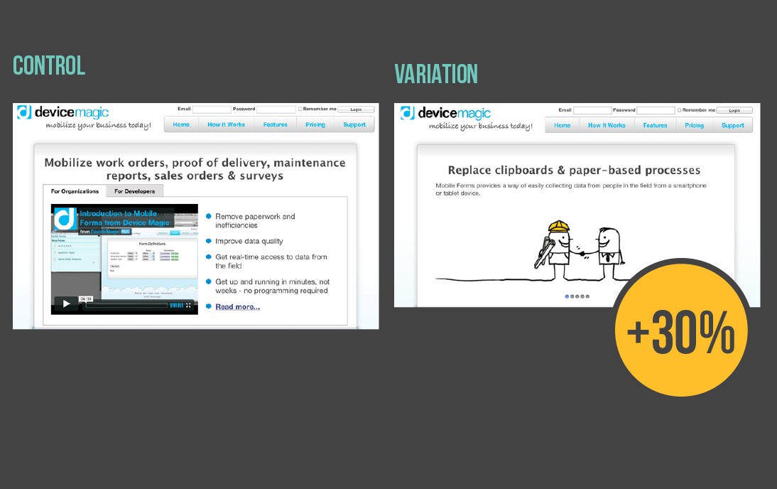
Sliders are perhaps the most universally despised design trend by conversion optimizers. But, despite this universal doubt and evidence, there have been cases where a slider worked: moving from a video to a slider increase conversions by 30 percent for Device Magic.
Why This Best Practice Failed: Sometimes Sliders Communicate Better
Usually, sliders lose out because the motion is distracting, the use of multiple headings can be confusing and often at least some of the headings are irrelevant to the user. (Longer explanation why they suck found here).
In this case, the version with the slider overcame these typical challenges by removing clutter and leaving a bold graphic with a clear, practical headline.
While sliders usually add clutter and distract from content that matters, in this case the initial slide include copious white space and the variation removes extraneous elements. This visual simplicity compared with the bullets, tabs and video of the control might be more clear and clarity is the first step to persuasion.
Beyond that, the slider version also communicates more quickly than the video. Sites only have 10 seconds to communicate their value proposition, which means the thumb nail and copy around a video that for the first impression are critical. Here, the thumbnail is cluttered and the headline is generic – not enough for a quality first impression.
Research also suggests at most 30 percent of users actually watch videos and Wistia found even users that do watch taper off pretty quickly:
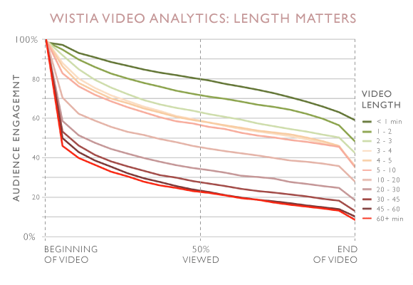
The longer the video, the fast people give up. Here, the video clocks in at more than four minutes, potentially losing users and conversions.
It’s worth noting that this case study doesn’t examine how a hero image using just the first slide would have affected conversions. Users largely don’t click through sliders, so Device Magic may gotten a bigger or at least similar lift from going to an image.
Key Takeaway: Sliders May Suck, But Clutter Sucks More
In this case, the slider won by tapping into the persuasive wisdom of clear, bold first impressions – something sliders usually fail to do.
This case study shows that it’s not just about the features of a page, but how features features are implemented (imagery on slides, order of slides, length of animation, video thumbnail, quality of video, etc.) that determines how effective they are.
You can design sliders that suck less than lengthy videos or videos that are geared towards conversion, but keep in mind that implementation makes all the difference.
This is not to say that the slider version couldn’t be beat by something better, but sliders proved to be 30% better than what they had before.
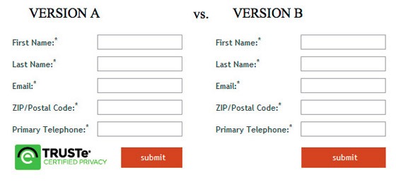
Failed Best Practice #2: Trust Seals
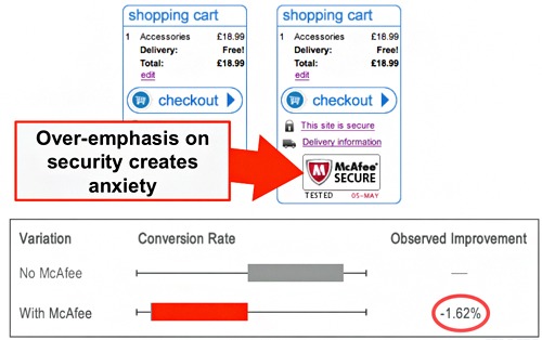
Trust seals are heralded as key parts of a checkout flow because they increase the authority of a page. In this case, trust seals decreased conversions by nearly 1.6 percent.
Eric Hansen also tweeted about a test where removing the trust seal increased conversions by 3.5 percent.
Why This Best Practice Failed: Trust Seals Only Matter When Trust Matters
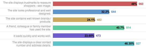
Typically, trust seals work because they make users feel safer when shopping. Users themselves indicate that trust seals are the most common way they assess security:
But here’s the tricky part: users don’t understand trust seals. In a study, the University of College London found that users have significant misconceptions about the meanings of trust seals.
That users don’t understand trust seals means that technical security is not the issue. Rather, users see trust seals as a stand-in for credibility and they are only be effective in increasing conversions when a lack credibility is holding down conversions.
More than a neutral factor, they could actually hurt conversions by introducing anxiety when security is not already a factor – WhichTestWon saw a 12.6 percent higher conversion rate on a form without a seal:
Because the information being shared isn’t highly sensitive (and the form has other, more severe problems), the trust seal was irrelevant and increased anxiety, leading to fewer conversions.
That’s likely what happened with checkout case study: the size of the trust seal suggests it’s the most important thing on the page. This draws attention to the issue of security and distracts users from the CTA.
Key Takeaway: Use A Tool Only When You Need It
Rather than relying on a best practice, optimizers should conduct qualitative user research to find out what barriers users are experiencing – and then pick the right tool to resolve that issue.
Trust seals are a tool that solves the issue of credibility, so when users aren’t questioning credibility, they are irrelevant and distracting.
Sidenote: There are a few other tools that solve the credibility issue including visual design, along with testimonials and reviews. Trust seals may also not be the right tool to create trust if these other elements are lacking.
Failed Best Practice #3: Bigger Buttons
In theory, bigger buttons draw the users eye and lead to higher conversions. In practice, this larger button decreased conversions by more than 10 percent:
The company running this test did see an increase when they made the button bigger AND changed the copy, but increasing the size alone made conversions drop by 10 percent.
Why This Best Practice Failed: Size Isn’t All That Matters
Conversion optimization wisdom dictates that call-to-action buttons that stand out from the page and draw attention to themselves convert better. Size is an easy way to show that the button is important.
However, other elements play into how users read a page and what defines visual hierarchy.
For one, users have certain expectations of where information will be. They will look in those parts of the page first, regardless of size, as VWO found out when testing a homepage change:

While the main, central CTA button is larger, the upper right button is placed where users expect to see a free trial button. Users with an intent to get a free trial may look there first, which leads to that smaller button seeing 3x as many clicks.
Playing with size in order to establish a visual hierarchy also risks adding clutter. SmartWool found when they saw a 17 percent increase in revenue per visitor when they made all the images the same size, creating a simpler page:
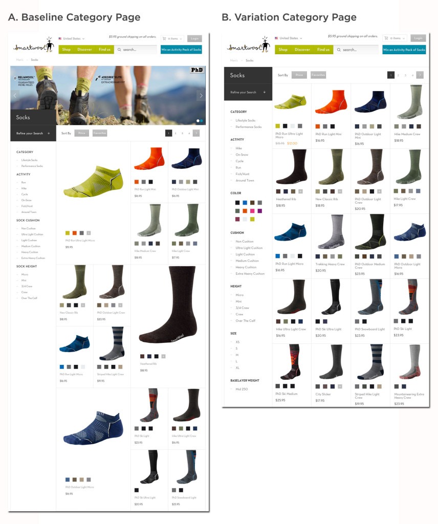
Variation in image sizes breaks the visual rhythm of the page, adding friction, and the simpler page saw a lift by removing the clutter and restoring the rhythm of the page.
Images that are out-of-proportion with other elements can add friction in another way: they look sales-y and unattractive.
With the longer copy, the size of the button made sense as it was needed to give space to the text. By keeping the original copy but increasing the size of the button, the attempt to draw the users eye is more transparent, obviously geared towards sales and less visually appealing.
The feelings evoked by visual design can have a significant impact on users’ actions. Using a button that drew too much attention to itself may have turned off users.
Key Takeaway: Think About User Experience Alongside Conversions
In all of these examples, a bigger size created a visual hierarchy that introduced friction for users in some way. The bigger button lost by being unattractive and creating clutter.
When designing pages, visual hierarchy has to serve the user experience, which means paying attention to expectations, visual rhythm and design in a holistic way.
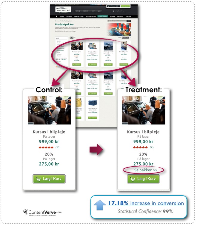
Failed Best Practice #4: Only One Call To Action (CTA)
Conversion optimizers will tell you that having too many options will distract users, but one Danish e-commerce site saw a 17 percent increase in conversions by adding another CTA right above their add to cart button:
Similarly, Get Response saw a 158 percent increase in trial sign-ups with no change to sales conversions by adding a “FREE trial” button right next to their primary CTA on the home page:

Why This Best Practice Failed: Traffic Isn’t Always Targeted
To be fair, the one-CTA-to-rule-them-all statute is typically touted for landing pages, where specific traffic from particular sources is carefully led to a highly relevant page, which is the benefit of landing pages.
However, the single CTA concept is increasingly applied to home pages and other site content, and some companies have increased their homepage conversions dramatically with a single CTA that drives users to a single, clear next step.
Unfortunately, you can also swing too far – going from a page for everyone to a page for the small percent of your traffic that’s ready to make a big leap and convert right away.
Traffic to your site pages comes from a wide variety of sources, and, as Google’s Customer Journey tool shows, traffic from different sources may be in different stages of the sales funnel depending on industry, size and geography:
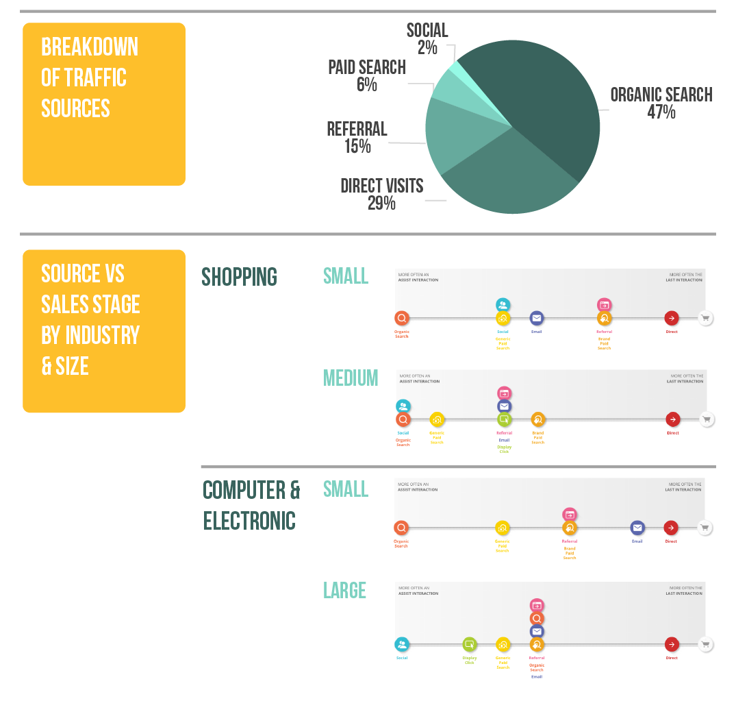
Image adapted from Conductor and Google.
With a secondary CTA, users who aren’t ready to raise their hand can still move forward through your sales funnel.
In the examples above, visual design creates hierarchy between the CTAs by making the secondary CTA a text link or a less contrasting color. This means users ready to convert are clear on their next step, and you’re also giving another option to traffic not ready to convert.
Key Takeaway: Adapt Conversion Strategies Based on Sources Of Pages
Focusing pages on specific actions and removing clutter can drive more users to the most desired action, but for pages with a wide variety of sources, one CTA may not be enough to capture most users.
In those cases, establish a hierarchy among CTAs with visual styles that create different weights. Also, consider how different sources convert when crafting your pages and driving traffic to them.
Failed Best Practice #5: Use Photos of People
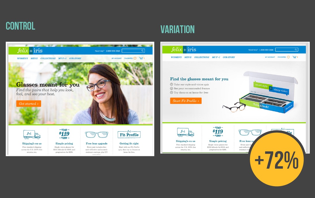
Even though photos of women (along with babies and attractive people) sell products more according to some research, removing the photo of a person and changing CTA led to a 72 percent higher conversion rate for Felix + Iris:
Why This Best Practice Failed: Visual Cues Are Complicated And Can Distract
Human brains process visual information extremely fast. While it’s debatable exactly how fast, MIT found that we can identify images seen for only 13 milliseconds and an often-quoted 3M report suggests we process visual data 60,000 times faster than text.
Studies on brain damaged patients shows that the brain has specific pathways that respond to human faces and some brain research further suggests newborns process positive facial expressions faster than neutral or negative ones.
All of this means that visual information – particularly human faces – are like magnets for our eyes, and conversion optimizers have seen success by putting more human faces on landing pages, even testing different people and moods.
However, all of this persuasive power can be totally lost if aimed in the wrong direction. When emotion and authenticity are not the important messages, faces can be distracting:
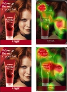
These eye tracking heatmaps reinforce the idea that faces draw our attention, but in this case the face distracts from the product and the CTA.
The second test shows gaze cueing, where photos are looking at the key message that marketers want users to also look at. This technique may make faces less distracting, but the evidence is not clear.
Research has shown that people do look where others are looking, but that only used when deemed useful and the effect is less present in people on different parts of the Autism scale and also varies by gender and even political temperament. Futhermore, eyetracking study by EyeQuant showed that gaze cueing and faces are not as powerful as marketers like to believe.
In conversion tests, gaze cueing had mixed effects and sometimes images with positive energy looking at the user (away from the CTA) out-performed images looking at the CTA:

Taken together, these studies suggest that visual processing is incredibly complicated and must be tested.
In the Felix + Iris example, the human photo did not add anything persuasive to the page because the value proposition and CTA had nothing to do with emotion or authenticity. Switching to a product shot provided the needed clarity and removed the distraction.
Key Takeaway: Irrelevant Photos Are Distracting, Not Persuasive
Since we process images so much quicker than text, you can convey a lot information through photos, but they need to be used thoughtfully and carefully because the magnetism of a photo used incorrectly can end up being a distraction.
When choosing photos, think about how images reinforce or distract from your unique value proposition. If your value proposition is around emotions, faces could work well. If not, consider a product shot or informational graphic.
Failed Best Practice #6: Make Forms Shorter
There are lots of best case practices for form design, making forms shorter being the most popular one. In theory, shorter forms means less friction for users, but in this case, a shorter form led to a 29 percent drop in conversions.
Why This Best Practice Failed: Confusing Causation And Correlation
The shorter forms best practice is based on the Fogg Behavioral Model which states that people act when the desire to do something outweighs the barriers to action and their action is triggered.
Reducing form fields should increase action because each field is another bit of friction standing in the user’s way. However, while shorter forms are correlated with less friction, but they do not necessarily cause less friction.
Shorter forms mean increased clarity because they’re visually simple (less field, less stuff) and typical (shorter forms are becoming the norm). Simplicity and prototypicality often lead to a better ‘gut feeling’ about a site:
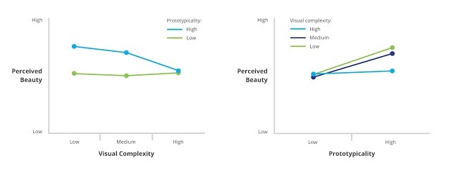
That positive gut feeling matters because we evaluate pages so quickly, but the whole system breaks when shorter forms fail to make forms more simple or more typical.
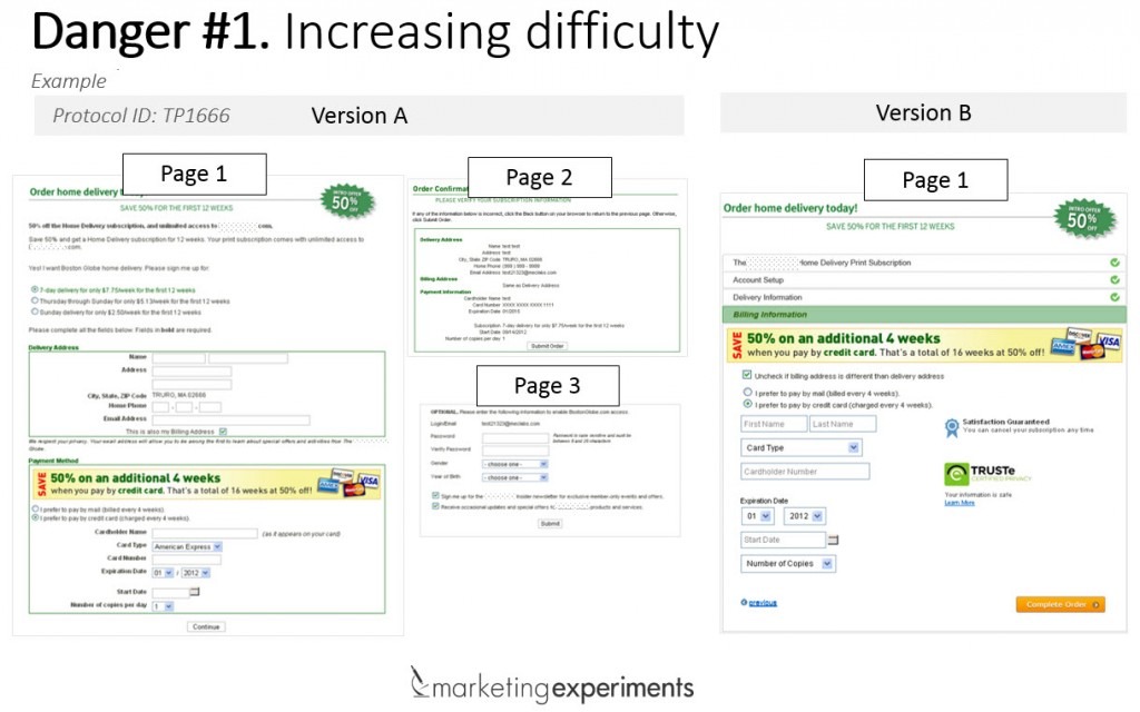
In this case, the shorter form collapsed three pages into one, removing the sequential order that users are used to with checkout flows and potentially making the page more unusual, increasing friction.
Collapsing multiple pages in this case study also means that the final form has more going on, and that visual clutter could mean a negative gut feeling and less conversions.
In other cases, shorter forms increased friction by removing pivotal choices. For one experiment, removing a single field led to a 40 percent drop in conversions:
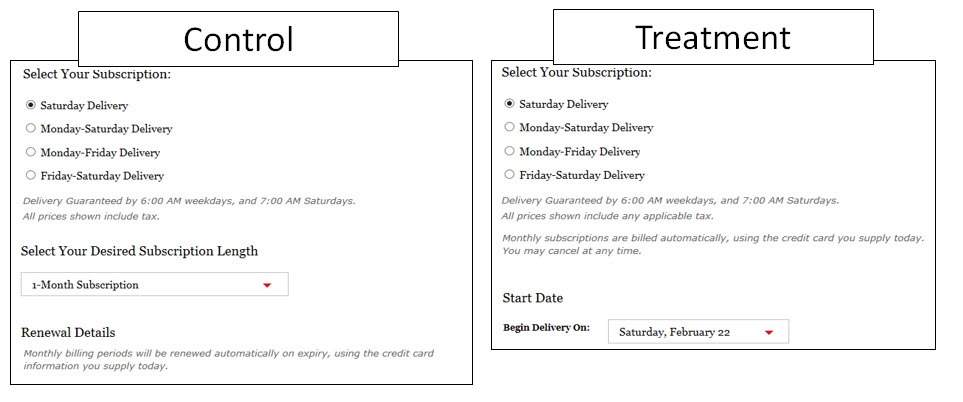
In this scenario, the only change from control to treatment was removing the dropdown selection of desired subscription length, but that variable was important enough to users that conversions dropped when it was gone.
Key Takeaway: Form Fields Do Not Always Cause Friction
Friction is more complicated than a number of forms – it’s about getting users to easily and quickly understand how to meet their need. When the key option they’re looking for isn’t there or the page feel complex or unusual, added friction can drop your conversions.
When designing forms, talk to users and test different option to create the clearest form – meaning the most typical and simple.
Failed Best Practice #7: Make Pages Shorter
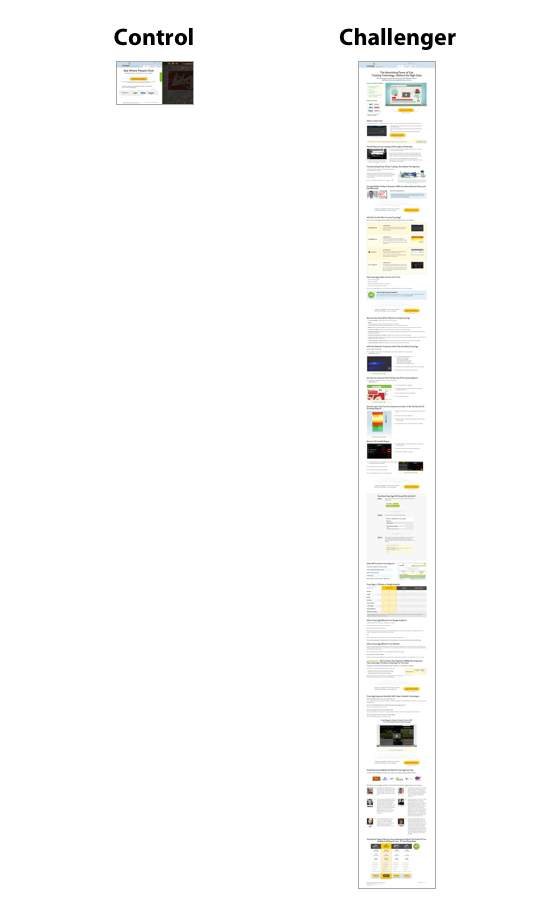
Much like shorter forms, many experts believe shorter pages are inherently better, yet a MUCH longer page increased conversion rate by 50 percent in the early days of Moz. The same thing happened with the early days of Crazy Egg, including an equally extreme difference in page length that increased conversions by an amazing 363 percent:
Why This Best Practice Failed: Sometimes Some Products Need More Time
Since people don’t read on the web but instead scan, the prevailing wisdom is that shorter pages can be consumed faster, so those pages convert better.
In reality, the ideal length for a page is more complicated because the time it takes to persuade a user to take an action varies based on their level of awareness, product complexity and price.
The length of a page should respond to the awareness level of your users – users who know less about your product or the problem you’re solving will need more information and thus longer pages. On the other hand, users who are familiar with your product and closer to wanting to buy won’t need as much convincing.
With both the Moz and CrazyEgg examples, the longer landing pages increased conversions during early stages of these companies. These early customers probably needed more context before converting because they had low awareness.
Building on this idea, CrazyEgg further optimized the page a few years later, now testing shorter versions:
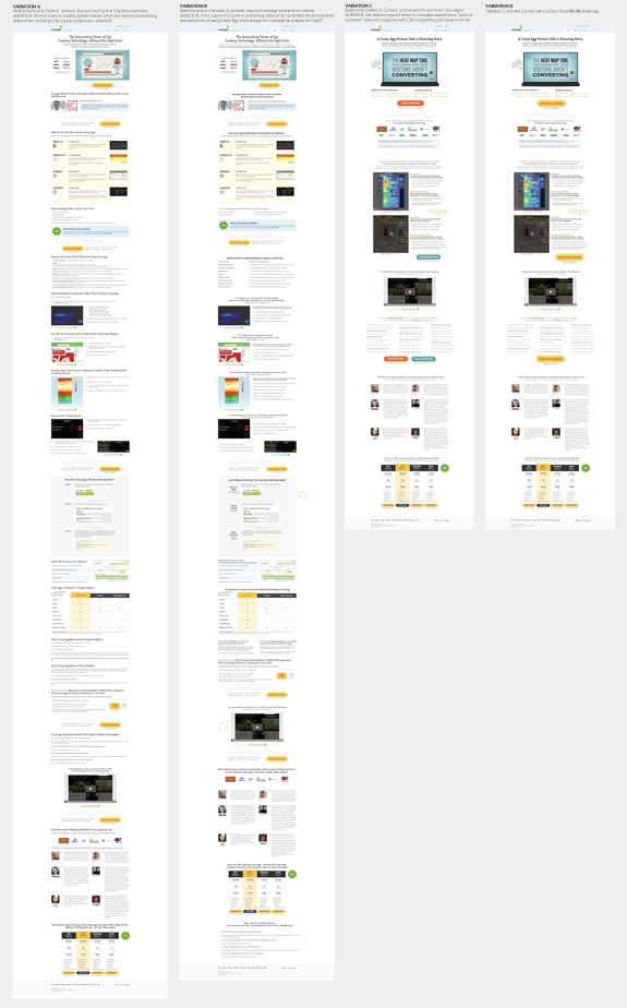
This time, Version D (furthest to the right) won with a 13 percent lift because the brand’s longer history meant more aware consumers were visiting and they didn’t need a long explanation of why to buy.
Price and product complexity also have an impact on the length of sales pages. Simply, “the more complex or expensive the product, the more information [customers] need to make a decision.”
At the same time, brand also plays a role on consideration – industries where loyalty has a big role in purchase decisions may lend themselves more to shorter pages. As McKinsey & Company found, the percent of purchases at different stages come down to more than complexity or price:
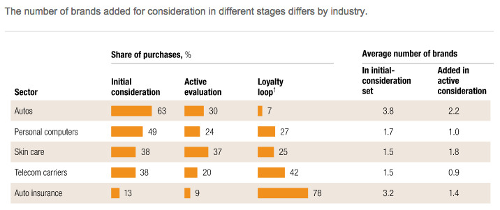
For the auto industry, a high percentage of consumers bought at an early stage in the process, even though the product is complicated and expensive. For auto insurance, consumers shopped around.
This suggests customers may rely on brand to shortcut their research for some complex products, which means shorter pages could work.
Figuring out how much information your customer needs is a complicated mix of awareness, complexity, price, brand loyalty – and even demographics (more men buy digitally after browsing in-store) and seasonality (holiday shoppers care more about deals).
Key Takeaway: Align Length With Needed Content
Page length is just not a good metric of communication efficacy. Users looking for more information may not convert on shorter pages, as was the case with Moz and Crazy Egg.
While saying more with less is great, but sometimes you’re actually saying less with less. By the same token, you can also say less with more. If the level of scrutiny is higher, people need more information.
Instead of focusing on page length, think about what you’re trying to communicate and how to communicate that clearly – it might take a longer page.
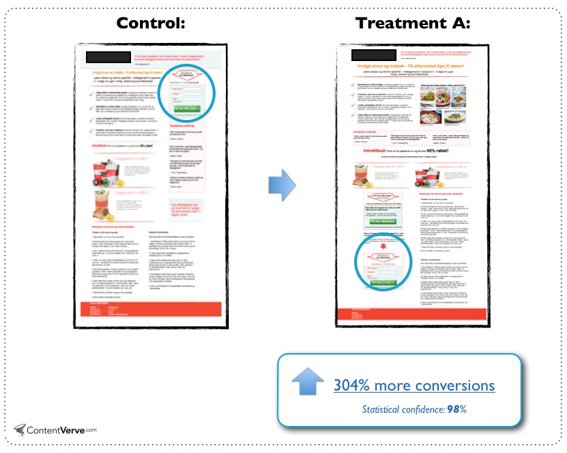
Failed Best Practice #8: Put Your CTA Above The Fold
Despite the popular believe that people don’t scroll, moving the CTA well below the fold resulted in a conversion lift of 304 percent:
Why This Best Practice Failed: People DO Scroll
The ‘above the fold’ narrative started with newspapers and we still give about 80 percent of our attention to this placement.
Still, while users are paying attention above the fold, they may not yet be ready to take an action. If users don’t have the motivation to act, your CTA won’t be an effective trigger.
“You should place your CTA where it best compliments the decision-making process of your prospects.” – Michael Aagaard on ContentVerve
Similar to the point about page length, Aagaard observed a correlation that “between the complexity of the product/offer and the optimal placement of the CTA,” and below-the-fold CTAs converted better for complex products.
Just like page length, optimal CTA placement may also vary based on product and problem awareness, brand and industry. Lower CTAs can work when users need more information, which may have been the case in this study.
Placing a CTA low on the page gives you time to take the user through a linear AIDA process to persuade them to buy:
Illustrative image only. Don’t just copy the layout as it has many shortcomings.
With this linear persuasion process, you can increase the motivation of the buyer as you lead them to that final trigger.
Moving content below the fold also decreases clutter above the fold, which can increase clarity, creating a better first impression and increasing conversions.
However, the failure of this best practice could just come down to a change in user behaviors: users today are used to and expecting to scroll.
The often-cited 80 percent stat above comes from a Nielson Norman Group study focuses on attention, but Nielson also found that scrolling beats pagination and that pages designed to scroll did lead users downward.
Further data suggests that users scroll at least a bit 76% of the time and scroll to the bottom 22 percent of the time. Once your users are at the bottom, they are unlikely to scroll up to click your CTA button.
Key Takeaway: Place CTAs Where They Fit In The Persuasive Flow
Rather than following a best practice, consider the flow of information, and test how much content users need before converting and place your CTA accordingly.
Conclusion: It’s All Relative
Conversion optimization best practices are handy shortcuts that work on most pages for most users, most of the time. They can work well as a place to start for site with no pre-existing data or not enough traffic to run meaningful tests.
However, best practices won’t necessarily work on your pages, for your users or in your timeframe – and even if they do, something else could work better.
Rather than blindly following best practices, think about the persuasion psychology that made them best practices and pay attention to that:
- Slider often increase clutter → keep pages uncluttered and distraction-free
- Trust seals increase credibility → make credible sites
- Bigger buttons draw attention → don’t make users work to figure out the next step
- Having only one CTA increases clarity about what to do next → use visual hierarchy and design to make the next step obvious
- Photos of people are eye-catching and emotional → draw the user’s eye to appropriate appeals (emotional, logical, authoritative)
- Shorter forms should reduce friction → don’t make it hard on your user
- Shorter pages are easier to digest → make your pages scannable and easy-to-follow
- CTAs above the fold are easier to see → make your CTAs stand out from the page and put them where they make the most sense in the flow of the page
Related Posts
-

Testing in an enterprise is truly a team sport. If a testing program was a…
-

Conversion optimization is hard; it’s constantly changing and you need to know a lot about…
-

You're working to increase your online profits, and you perform conversion optimization. That's great. But…
-

Learn how to run conversion optimization experiments the right way. In this video, I sit…


Hey Aviva – thanks for an awesome post! I love the detail in the examples and just had to follow up on a few things! We recently moved our Signup for a Demo to be much further down the page, and we’ve got a better result in terms of the quality of signups. One of the reasons seemed to be that by that stage, people were already more convinced of how useful our product would be for their marketing analytics stack and they were more ready to try. Also, by that stage they had also seen the video (which is above the fold) and so had a much better understanding of the value proposition. (In the previous version we’d taken them to a demo before they saw the video and that didn’t convert at the same rate.)
Also – we *were* thinking about separating our long form landing page into separate pages, but having read your article I think we’ll save ourselves some wasted effort (who wants waste right? – so I’ll thank you for saved hours of work that would have taken! “Thank you!” :)
Lastly – I’m interested in the slider vs video option. I think we may test that and see what the result is…
cheers & keep up the great work!!
@paulmboyce, cofounder, PopcornMetrics
Hey Paul –
Thanks for the feedback! It’s a good point about quality of leads as well – that bit of added friction by moving it down the page can sort of weed out folks.
I think whenever you’re considering making a change, you need to weigh the effort of trying it versus the potential lift – Dan McKinley (formerly Principal Engineer at Etsy) has a great post about this: http://mcfunley.com/data-driven-products-now It could be that splitting your page into a few works, or it could be that it doesn’t. It also might work for some segments (Maybe newer visitors) but not other (people ready to make a purchase, perhaps those who have visited a few times).
The great and terrible thing is just that it’s all relative.
In the very first example, “no sliders”, you show a 30% lift, but you changed the messaging too! That’s not controlling for variables and really doesn’t support your claim whatsoever.
Hey Rob – You’re right, it’s definitely not a controlled enough test to say definitively that the move to a slider is what made the difference, there were a lot of peripheral changes that went along with it like messaging, design, etc.
The point I’m trying to make is actually exactly that – it’s not as simple as slider vs video, how you implement those things matters a lot. A poorly executed video can lose to a more well-executed slider.
We’ve got to remember that a lot of these examples, whilst they’re very good by the way, are context dependant. Best practice guidelines are exactly what they say: guidelines only and should not be taken verbatim but only in the context of your site and users.
That being said, some of these examples were a shock. The biggest one was the trust seal. See, do you not think that in context, if you amended the design of that page to be more professional and reduce the size of the trust logo, this would alter the outcome of the AB test? This is why I much prefer MVT to AB.
I can relate to some of these though. You’ll have an assumption, like I did about a banner slider with 17 images on them, believing that the, say, 15th image would never be seen let alone convert. I was so wrong! And these failed AB tests are just as useful as the successful AB tests – so long as we learn from them and iterate from them.
There’s an example I’ve got on my site of a blatantly obvious AB test that should have been successful for a website pitch – and in fact failed! http://davidmannheim.co.uk/ab-test-failed-top-level-navigation-amend/ for reference.
Hey David –
I totally agree – everything is hugely dependent on context, which is why ‘best practices’ fail. I definitely think you learn more from failure than success, because it shows you the boundaries of a particular technique, where it stops working.
yeah, context is key. Users act differently at different times, sometimes there is a time constraint, some times it’s an important task to complete and some times they are stressed. All of which can throw best practice out the window.
Great article and just a reminder how important user testing is in the design process, whether that be wireframe lab testing or full on a/b testing
Great article!
Regarding #2, this also goes for other trust building elements, like money back guarantee (one test I did saw a massive (50%) drop in conversions *with* 30 day money back guarantee), testimonials and product ratings.
I work for a large Norwegian newspaper, and I did a test using testimonials and score. The test was as follows (aprox. 50.000 unique visitors):
Testimonial set* 1 & 2, rating (baseline)
Testimonial set 1 & 2, no rating (-12.1%)
Testimonial set 2, no rating (-9.0%)
Testimonial set 1, rating (+6.2%)
No testimonials, no rating (+74.1%, 98.2% confidence)
*each testimonial set was 2 testimonials from actual customers, full name, location, no picture.
Ratings and testimonials builds trust.
But in the absence of risk, trust is redundant.
Trust-building elements could thus introduce a sense of risk, and produce the opposite effect.
Sverre
Thanks for sharing! You have to use the right tool for the job – if trust isn’t an issue, trust signals are just clutter.
Great article Aviva! As someone who also hates sliders, the Device Magic case is fascinating. I agree with most of your analysis as to why the slider design was more effective—but the lift can’t be attributed entirely to the slider. The headline & copy changes in the new treatment surely contributed. It would be interesting to see a video vs. slider test with identical headlines (1st slide headline matching the control), since few people absorb much of anything past the first slide.
I’ve also seen trust seals fail on occasion—good to know I’m not the only one…
Yea, I think the slider example is the one that hurts the most of these – because sliders do generally suck and are SO overused.
There’s definitely more going on in that case study and you can’t attribute the lift fully to the move to a slider, but I still think it shows that you can’t make assumptions. Video “should” be more persuasive than a slider, but when it’s not implemented well, video doesn’t live up to what it can do as a persuasive tool.
I worked on a site where the slider was very successful. It was ugly and we all hated it (but our directors) but people interacted with it, used it and followed through it. I think it goes to show that, never trust a best practice, ALWAYS test for yourself.
Totally agree, Paul!