Your landing page is where curiosity turns into intent—or gets buried in a tab you’ll never see again. Buyers lose interest in seconds. And once that happens, it’s pretty hard to get them back.
You’ve seen the numbers. A prospect clicks your $50 LinkedIn ad, lands on your page, but nothing happens, leaving you with a smaller budget and zero insight into why.
Most B2B companies treat landing pages like digital brochures. Pretty pictures, tired punchlines for copy, and a form that asks for almost everything. Instead of fueling their go-to-market (GTM) strategy, the page turns into nothing more than an expensive piece of marketing collateral.
But just think about it: every visitor who lands on your page has already shown interest. They clicked something of yours. They want to be convinced.
Your job is to remove every possible reason that could hinder them from taking the next steps. And that means giving them everything they need to convert.
Table of contents
- The conversion framework behind every top-performing B2B landing page
- 1. Messaging and positioning: Your message matters right before anything else matters
- 2. Social proof and trust signals: Strangers’ opinions are more compelling than your sales pitch
- 3. Personalization and relevance: Generic landing pages sink conversions
- 4. Calls to action and conversion mechanics: The moment everything clicks or crashes
- 5. Design and usability: Make it effortless to say yes
- 6. Analytics and experimentation: Data drives improvement
- Make your landing pages work for your business
The conversion framework behind every top-performing B2B landing page
The B2B landing page play is surprisingly simple: match message to intent, prove value fast, remove friction, and make the next step feel like the obvious move.
Here’s what high-performing landing pages actually look like, along with some conversion rate optimization (CRO) strategies.
1. Messaging and positioning: Your message matters right before anything else matters
Your prospect just clicked through from a webinar ad about “AI-powered sales forecasting.” They land on your page and the headline screams “Revolutionary Business Intelligence Platform!”
That’s a hard disconnect. You promised one thing, delivered another. Game over.
The best landing pages feel like a natural continuation of whatever brought someone there. If your ad mentioned “reduce forecast errors by 40%,” your headline better talk about forecast accuracy—not vague platform benefits.
Start with clarity, not cleverness. Your visitors aren’t here for wordplay or creative metaphors. They have a problem, they think you might solve it, and they want to know if they’re right. Fast.
How landing page messaging hierarchy actually works:
Your headline does one job: prove they’re in the right place. It should echo the promise that got them to click while being specific enough that your competitor couldn’t use the same line.
The subhead adds context and urgency. This is where you acknowledge their pain point and hint at your unique approach. Not features—approach. “Forecast with confidence using real-time pipeline data” beats “Advanced analytics dashboard” every time.
Your call-to-action (CTA) reflects where they are mentally. Someone researching solutions wants to “see how it works,” not “start free trial.” Match the commitment level to their readiness to commit.
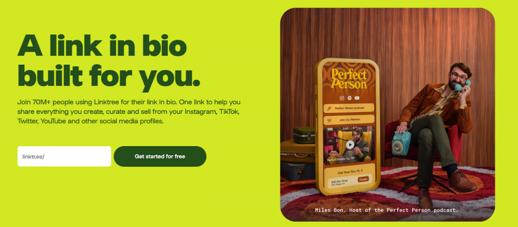
Linktree nails the basics of messaging. The headline is simple and direct—“A link in bio built for you.” It instantly tells you what the product is and why it matters. The subhead backs it up with proof (70M+ users) and a clear benefit (one link to share everything).
Most B2B pages get this backwards. They lead with what the product is instead of what it does. They assume everyone who lands there is ready to buy, so they jump straight to “book a demo” when half the audience is still figuring out if this type of solution makes sense.
Know your buyer’s journey stage, then write for that specific moment.
Early-stage researchers need education and proof points. Late-stage evaluators need comparison details and implementation confidence. The same visitor at different stages needs completely different messaging.
Steer clear from serving everyone with one generic message. Pick your primary audience and optimize ruthlessly for them. You’ll convert more of the right people.
2. Social proof and trust signals: Strangers’ opinions are more compelling than your sales pitch
Your prospects don’t fully trust you. They shouldn’t. You’re trying to sell them something.
But they do trust other people who’ve been in their shoes. That’s why social proof makes all the difference.
Flashy customer logos work, but clear context works better. Slapping Fortune 500 logos across your page tells visitors you have big clients. Adding “Reduced manual reporting by 60% for teams like yours” tells them what’s possible for them.
Effective testimonials tell a story your prospect quickly recognizes. “We were spending 10 hours a week on forecasting” hits different than “Great product, highly recommend!” One creates identification, the other creates skepticism.
Full case studies can address the specific doubts your prospects have. The honest before-and-after story is expected, but you also want to include the messy middle—implementation challenges, unexpected benefits, and what almost went wrong. Real stories have rough edges.
For B2B buyers, trust extends beyond customer happiness into operational confidence. Security certifications and compliance badges are essentials for many. SOC 2, GDPR, HIPAA compliance signals that you understand enterprise requirements. Display them prominently, especially if your buyer needs to justify the purchase to security teams.
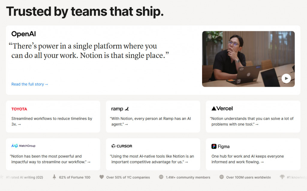
Notion leans on social proof by letting customers do the selling. It showcases trusted brands like Toyota, Figma, and Ramp, each tied to a concrete result—faster workflows, smoother collaboration, or AI-powered productivity.
The mix of logos, quotes, and real outcomes makes the proof impossible to ignore. And when you click through, many expand into full case studies or customer success stories.
So, there are three elements that work together to build trust here: crowd (others like you use this), conversations (real people sharing real results), and confidence (we meet your industry standards).
Place social proof where doubt peaks most. Right after your main value proposition, before your pricing details, and especially near your call-to-action. When someone’s deciding whether to click “Get Demo,” they need that final nudge from someone who already made the leap.
You can also add a designated “Why people trust us” section that many seek.
3. Personalization and relevance: Generic landing pages sink conversions
A CFO and a sales manager both click your ad about “revenue optimization.” They land on the same generic page talking about “increased efficiency and better results.”
The CFO thinks about cost reduction and ROI forecasting. The sales manager thinks about quota attainment and pipeline visibility. Same problem, completely different priorities.
Your generic page just failed both of them.
There’s a popular saying in marketing: if you try to speak to everyone, you end up speaking to no one. Generic messaging forces visitors to translate your value proposition into their specific context. Most won’t bother. They’ll bounce and find someone who actually understands their world.
Precise targeting at your campaign level can be wasted if your landing page is generic. The only way to convert that traffic is to match the targeting with equally personalized pages.
Segment your pages like you segment your campaigns—different audiences need different conversations. Over and above changing the headlines, the entire narrative is rebuilt around what each segment cares about most.
Use UTM parameters to automatically route traffic to segment-specific pages. Financial services executives clicking your compliance ad should see risk reduction benefits, while retail operators from speed-focused campaigns should see customer experience wins.
When your page reflects their specific situation without them having to explain it, you demonstrate understanding. When you show case studies from similar companies facing identical challenges, you prove relevance.
Real personalization makes every visitor feel like you built the page specifically for them.
4. Calls to action and conversion mechanics: The moment everything clicks or crashes
Your visitor just read through your perfectly crafted value proposition, nodded at your social proof, and feels ready to take the next step. Then they see three different CTAs: “Get Demo,” “Download Guide,” and “Start Free Trial.”
Decision paralysis kicks in. They choose nothing.
Most B2B buyers are already overwhelmed with choices. Your job is to make the next step obvious.
The CTA placement debate misses the point since layouts come differently.
Put your primary CTA where it feels natural, not where some best practice guide tells you. If your page builds a compelling case over three sections, having the CTA only “above the fold” means people decide before they’re convinced. It’s unlikely. So, prioritize logic and tests.
Custom CTAs convert 42% more visitors than generic buttons (Hostinger).
Shopify’s CTA works because it’s simple and frictionless. “Start for free” is clear, low-commitment, and action-oriented. The page uses two buttons, one in the header and one below the hero copy. The repetition reinforces the action without creating confusion.
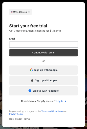
And when you click through, this is the form that opens. It’s simple in the right way. Shopify offers multiple signup options (email, Google, Apple, Facebook). This reduces friction without sacrificing the information they need to move you into a real trial.
Your CTA and form work as a team—the button gets attention, but the form determines conversion.
Your form strategy should match your sales cycle complexity. Selling simple software to small businesses? Keep it short—name, email, company size. Selling enterprise solutions with six-month implementation cycles? You can ask for more because the commitment level is higher.
Single-step forms feel less intimidating but give you less qualification data. Multi-step forms reduce friction by starting small (e.g., first asking for a role) and then collecting more information step by step.
Progressive profiling can look like this:
- First visit: basic contact info
- Return visitor: pain points and timeline
- Demo request: budget and decision-making process
The key is making each step feel valuable, not invasive.
5. Design and usability: Make it effortless to say yes
Scannability matters because busy people consume information in chunks.
Your prospects are scanning. They’ve got three browser tabs open, Slack notifications pinging, and a meeting starting in five minutes. If your page doesn’t communicate value at first glance, you’ve lost them.
How to make your page scannable:
- Break up long paragraphs and use whitespace like punctuation
- Let your headlines carry the weight while subtext adds the detail
- Frame bullet points as benefits your prospect can immediately picture
Most B2B pages fail the mobile-first test spectacularly. Your CFO might not be filling out forms on their phone, but they’re likely reviewing your solution during their commute. If your page looks broken or loads slowly on mobile, you’ve just lost credibility before they even reach their desktop.
Pay attention to user experience (UX). Smart UX design can quadruple your conversion rates (Hostinger).
Every second of page load delay costs you conversions, especially for impatient executives who equate slow websites with slow companies.
Accessibility matters for everyone:
- Clear contrast makes text readable in any lighting
- Simple form labels reduce confusion for all users
- Logical tab order helps keyboard navigation
When someone converts, they should remember your message and value proposition, not your clever animations or creative layout. Remove every attention-grabbing element that doesn’t directly support the decision to take action.
6. Analytics and experimentation: Data drives improvement
Analytics and experimentation are not necessarily visible to end-users, but they’re still a major factor in whether your landing pages deliver desirable results.
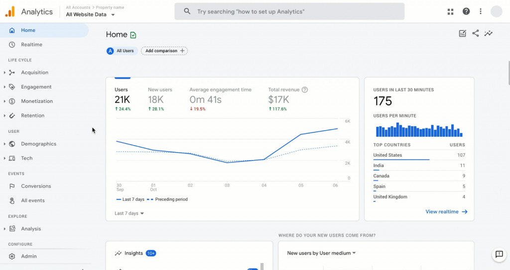
Google Analytics is the standard for tracking website performance. It tells you where visitors come from, how they interact, and what actions they take.
Analytics fuel experimentation. Paired with A/B testing, it shows which landing page variations actually perform better.
When pages don’t convert, most teams make uninformed fixes—changing colors, tweaking copy, or completely rebuilding. Analytics and experimentation surface the needed insights. You get clear data on what resonates with your market and why people aren’t converting.
Sure, there are best practices. But they’re just someone else’s successful experiments. You need industry specifics. What worked for a SaaS company selling to startups might fail completely for an enterprise security vendor. Your audience is different, your solution is different, your market timing is different.
You need an experimentation-led approach when building landing pages. It’s one of the smartest GTM strategies because landing pages are critical touchpoints where your campaigns, ads, and outbound traffic land. Treating them as “set and forget” assets wastes massive opportunity.
What smart experimentation looks like:
- Test positioning and messaging across different audience segments
- Validate value propositions with real prospect behavior, not internal opinions
- Compare offers and content formats—demo vs. trial vs. white paper vs. consultation
Your funnel data reveals what’s actually happening. Track these:
- Impression-to-visit rates (is your targeting working?)
- Visit-to-lead conversion (is your page compelling?)
- Lead-to-qualified prospect (are you attracting the right people?)
Tools like Unbounce, Optimizely, and Hotjar turn experimentation from expensive guesswork into systematic learning. Heatmaps show where people get stuck. A/B tests reveal which headlines convert. User recordings expose the friction you never noticed.
Make your landing pages work for your business
Landing pages sit at the center of your go-to-market engine—tied to your ads, email campaigns, sales outreach, and product positioning.
You can have brilliant ads, magnetic content, and a world-class sales team. But if your landing pages don’t convert, none of it matters.
So test, learn, and scale. You don’t build perfect pages on the first try. You build testable pages, gather real data, and iterate based on what actually converts a specific audience.
Your landing page is where interest becomes action, where visitors become leads, where marketing spend becomes pipeline. Get this right, and everything else in your GTM stack performs better.
Dig deeper with CXL’s Go-to-Market Strategy course to learn how to align positioning, messaging, and execution for real growth.ut CXL’s comprehensive course on Go-to-Market Strategy.
Related Posts
-

In an iconic scene from Glengarry Glen Ross (1992), Alec Baldwin lectures a group of…
-

If you're selling in a competitive market, you must live & die by the little things…
-

As conversion optimization continues to mature and become adopted by more organizations, it's always interesting…
-

Do you have all the data but it's siloed in various marketing tools? How do…