You know that a good user experience leads to more conversions. You also know there’s always room for improvement, and you’re never done optimizing. There are always areas of opportunity.
One of the biggest areas of opportunity, for most companies at this point in time, is mobile optimization. How is it different and how can you improve the mobile user experience?
People use mobile differently than they do desktop, and they have different needs and wants. Therefore, you’ve got to look at mobile as a separate but connected area of optimization.
Table of contents
How Bullymax Got a 24.5% Lift
Bullymax is the #1 rated dog food supplements seller.
They offers numerous products that increase a dog’s weight, improve their health and look, and add more muscle. I do a lot of squats, but I’ve got nothin’ on the progress these dogs make with Bullymax.
Now, 75% of the traffic to the Bullymax online store comes from mobile devices, which is definitely more than the average eCommerce site. That means it’s a huge opportunity area for optimization.
Mobile Traffic Was Not Converting As Well
It’s not uncommon for us to see mobile traffic converting much lower than other channels. In fact, industry wide, mobile still falls short on average conversion rate. And sure enough, mobile traffic was dropping off heavily once they reached the product page on Bullymax.
According to Google Analytics, only 18.23% of the mobile visitors were proceeding to the cart. Clearly we’ve identified a leaky hole in the bucket, so we did some further investigation into what could be causing such a drop-off.
First, take a look at their previous product page:

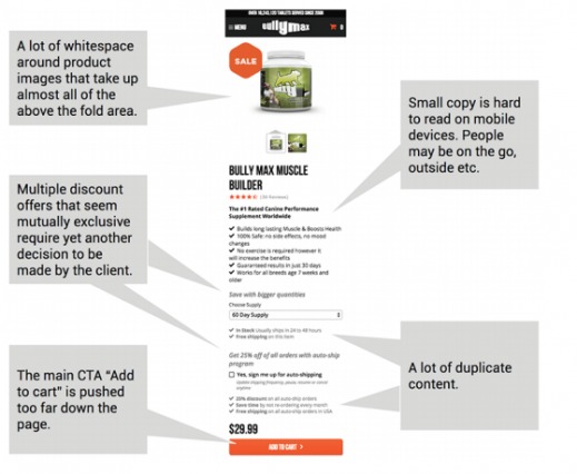
You can see from a heuristic analysis that their CTA is rather low on the page, buried underneath a lot of content, and it’s not super prominent. You can also see that the product image contains a lot of white space that, on mobile, is taking up prime real estate above the fold.
All of the pertinent information for deciding whether or not to purchase is hidden well below the fold, and scrolling isn’t fun for anyone.
So, we did some more investigation using the ResearchXL process, and found some common threads in what users were frustrated about…
According to four mobile user tests, we discovered that people pretty unanimously found the product page to be confusing. In conjunction with a heuristic analysis, we found some key issues to hone in on.
First, the space above the fold wasn’t being utilized well. Most of it was white space around the product, and that forced pertinent information to be pushed down the page.
Then after scrolling down, visitors had trouble reading the small text (even more difficult when using a mobile phone on the go), and they were confused by multiple discount offered as well as a lot of duplicate content. All of this was above the CTA, which was pushed too far down the page.

Here’s their desktop product page for reference:

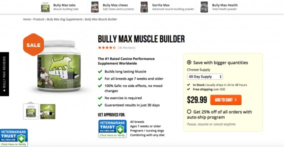
Now, you can see that on their desktop page, the call to action is prominent, above the fold and clear. You can also see the product information is clearly laid out, and the ‘get 25% off’ discount is pretty intuitive. Everything that needs to be on page is noticeable and above the fold. Not so with the mobile page. So we set up some tests to attempt to increase conversions. But first, let me tell you about why mobile optimization is a little different than desktop…
Mobile Optimization and Why It’s Difficult
Why doesn’t mobile convert? Everyone has an explanation. The most common is that smartphones are more of a browsing platform than a buying one. But, as UserTesting put it, “that’s like saying that an egg is round because it doesn’t have sharp corners: It describes the situation but doesn’t explain why it’s happening.”
Some of it is inherent with the technology. As Scott Jenson put it “there is something deeply inadequate about mobile.”
Jenson listed a few tradeoffs with mobile UX, and the main one that’s applicable here is text precision…
Text Precision
Most people wouldn’t write a novel on mobile. Most people have trouble filling out forms that are too long, for that matter. The reason is simple: text manipulation is harder on mobile. Scott Jenson listed some microinteractions that are more difficult on mobile:
- Cursor positioning conflicts with autocorrect suggestions
- Accurate cursor placement is hard
- Autocorrect still causes all kinds of embarrassing errors
- Tapping the screen is a big context switch (compared to arrow keys)
- Copy/paste is a cumbersome task
The implications here are that you should make things as easy as possible for users to complete actions on mobile. Any extra effort and you risk abandonment. Lots of lengthy text on a checkout, lots of tapping to switch fields, etc, will make things more difficult for users on the run.
How To Make Mobile Convert
Michael Mace from UserTesting wrote an article for our blog a little while ago that echoed similar thoughts as Jenson. He, too, mentioned that some problems are inherent to mobile. But, he says, that’s not the dominant factor. Through thousands of user tests, they’ve found that the experience on mobile devices is poor, because we as an industry haven’t adapted our sites to the needs of mobile.
How, then, do we adapt our sites to the needs of mobile?
Improving conversions on mobile is no easy feat, but it is a large opportunity area. Some of the problems are inherent to mobile, but some problems are fixable with a good process. And there’s still no playbook on how to get mobile UX right every time. Actually, even experts are still generally not in agreement about best practices.
However, UserTesting offers ten tips to increase mobile conversions. Here are a few of the tips I like…
Optimize for two paths.
Because people are generally on the go with mobile, there intentions aren’t always as clearcut as someone on a desktop. They may be browsing recreationally, they may be ready to buy. Try to get some sort of qualitative insight that lets you make inferences on your audience, and optimize for their intentions instead of your simplistic goals:
Also, even if users are recreationally browsing, there are elements more suited for mobile that can make the purchase process smoother.
Take advantage of what mobile does best.
Mobile is naturally good at clear cut goals and easy actions. If it takes a lot of effort, it’s an uphill battle. So instead of trying to swim upstream, go with the flow of mobile and implement elements for conducive to the medium. As User Testing suggests, “Test flash sales and instant ordering. If you have brick and mortar stores, ask how mobile can enhance the in-store experience.”
Sometimes the goals are different on mobile. Sometimes you may want to just capture and email with a targeted discount and remarket to them down the line. Sometimes you may want to convert them right there with instant ordering and an easy process.
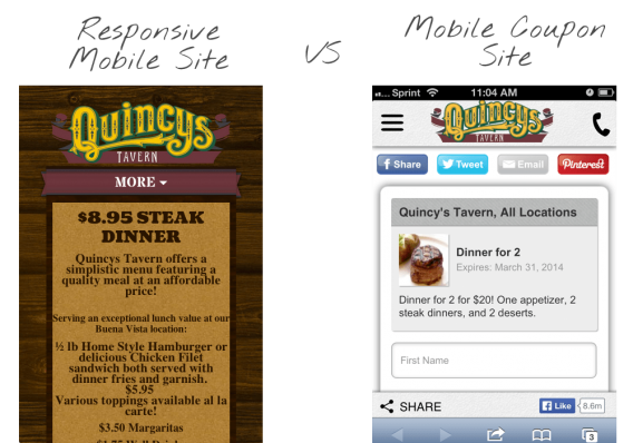
Convince and Convert gave the following example about the differences between your plain responsive site and a mobile site with a clear purpose:
Responsive sites, though better than really old school unresponsive sites, tend to have too much information and clutter for today’s mobile user. Instead, you should generally live by the principle of ‘less is more.’ Any friction or distraction can cause a mobile user to close their browser (and actually lift their head up to interact with the world). Not as often a problem on desktop, but on mobile you really have to hone in on what you want people to do.
Assume nothing; test everything.
Of course, best practices aren’t always the best for your audience, so testing is imperative. There’s no better way to discover effective mobile user experience than to run tests on mobile (separately from desktop, too). You may find that your assumptions are wrong and the opposite works. You may also find that what you thought worked did. Point is, it’s usually a toss up, so testing is the way to go.
So that’s what we did. We spun up a variation and tested it against the control. Here’s how that went…
The New Variation and the Test
We formed a hypothesis: a UX upgrade on the product page will improve clarity and focus, and therefore lead to more purchases being made using a mobile device.
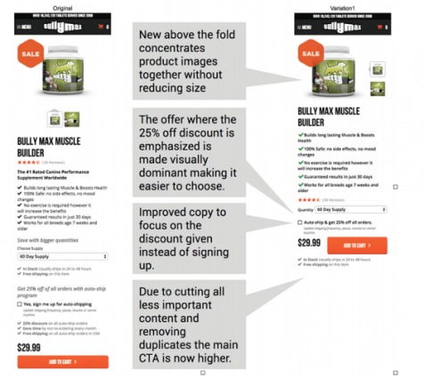
So we created a variation that had much less white space on the top. It concentrated product images without reducing their size. We added prominence and clarity to the 25% off discount and improved the copy to reflect the discount, as that was the focus.
Finally, we cut out a bunch of less important content and removed duplication information to bring the CTA higher on the page.

You can see that the variation is much simpler, with much less information. What were the results?
The Results
After four weeks we detected a purchase conversion rate uplift of 24.5%. This is a statistically significant finding supporting our hypothesis that better UX on mobile devices matters and has a direct impact on the conversion rate.

Looking at the purchase goal results on the graph below, it is clear that the conversion rate difference has stayed the same throughout the whole testing period:

In addition to purchases, the second primary goal revenue also reached statistical significance by showing revenue improvement of 68.1%.

Conclusion
Mobile user experience is important, and for a variety of reasons, it’s hard to execute. More difficult than, “make it responsive,” at least.
But little things do count. Just by making the product pages a little simpler, a littler easier to navigate, and a little more clear, we were able to significantly boost conversions and revenue on mobile – which represents a significant amount of traffic for Bullymax.
What experiences do you have optimizing for mobile traffic? Troubles, successes, stories? I’d like to hear them!
![Improving Mobile UX to Boost Conversions 24.5% [Case Study]](https://cxl.com/wp-content/uploads/2016/02/mobileux.jpeg)


Interesting!
I’m curious if a greater uplift would occur on mobile if product reviews were pushed above the fold.
Also, Bully Max Dog Muscle Supplement 60 pills received 4 1/2 stars with over 318 reviews on Amazon. Curious if showing this on their own hosted store would also create an uplift. In my perspective, social proof is paramount when purchasing products online.
Keep up the great work Alex.
Thanks Matt, glad you liked the article. I always seek out social proof and reviews when I buy things online (one of the biggest reasons I love Amazon), so I like the idea.
Great results from what appears to be a rather un-radical change, really interesting!
We’ve got a few of these tests running currently, it’d be interesting to hear what others are testing on their clients’ mobile product pages too!
Sometimes all it takes is bringing prominence to desired actions and cutting out things that distract from that. Let me know how your tests go!
Sweet Post Alex! I am looking for other bloggers to share backlinks with. Check out Flux.la and shoot me an quick email at: [email protected] if you’re interested!
I’m going to have to give you a hard No on the sharing backlinks thing. Thanks anyway, Steve.