The global email marketing market continues to climb and is projected to reach nearly $17 billion by 2027.
For B2B marketers, this means bigger budgets, sharper competition for the inbox, and higher expectations from decision-makers who’ve seen it all.
But most B2B email copy still badly underperforms: average open rates hover around 20% and click rates 2–3%, despite email remaining one of the highest-ROI channels.
According to Experian, targeted emails generate roughly 58% of all email revenue, yet close to 9 in 10 marketers still send the same generic content to their entire list. The gap between mediocre and exceptional is almost entirely about execution, not knowledge.
This guide shows how to craft B2B email campaigns that actually work.
Table of contents
B2B email marketing strategy
Practice these email marketing tactics. Each represents a specific lever you can pull to improve opens, clicks, or conversions without rebuilding your entire strategy.
1. Write subject lines that demand attention
The subject line is the single most important factor in whether your email is opened. No matter how strong the content inside, if the subject line fails, the message is ignored.
In many programs, up to 40% of your email performance can be traced back to the subject line alone, so these few words deserve disproportionate attention.
There are a few proven approaches that consistently perform well:
- Curiosity gap: “The surprising reason most CRM implementations fail”
- Value proposition: “CRM setup in hours, not weeks” (vs. weak: “New features now available”)
- Personalization: “[Name], quick question about [Company]”
- Social proof: “How we increased demo bookings by 47%” (vs. weak: “See what’s new”)
- Urgency: “Your competitors are already doing this”
- Loss aversion: “Stop losing leads to poor form design” (vs. weak: “We’re excited to announce”)
Length also matters more than most marketers think. Subject lines should stay under 45 characters to avoid being cut off, particularly on mobile. The first 25 characters are especially important, so prioritize key details at the front rather than burying them.
Testing from practitioners like Jen Jennings has shown that putting the offer, benefit, or personalization in those first 25 characters can drive lifts of 40%+ in response rates, simply because that’s the part of the line most reliably seen on mobile.
Business audiences filter emails differently than consumers. They look for signals that a message will save time, solve a problem, or create an advantage. Specificity is essential. Focus on pain points, measurable gains, or exclusive insights.
Emojis, if you use them at all, tend to be neutral in performance for B2B: they don’t magically boost opens, but they don’t tank them either as long as they fit your brand voice. What does hurt is stacking multiple emojis before any text—screen readers will read each one out loud by name, which is a painful experience for accessibility users.
The right approach includes relentless testing. Most platforms make A/B testing easy, and subject lines are the lowest-effort, highest-leverage variable to experiment with.
And if you’re doing cold outreach, hyper-personalized subject lines tied to real company news can outperform generic templates. It takes more research, but it can multiply your response rates.
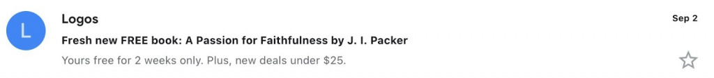
Like this example from Logos, if you have something to offer, like a freebie, say it right away. After all, who looks past the word “free”? The preheader can share extra details or highlight another offer.
2. Get the most from your preheaders
The preheader is the short line of text that appears next to your subject line in most inboxes. Rather than filler, it should be seen as an extension of the subject and a preview of what’s inside.
When the subject line and preheader are intentionally paired, rather than written in isolation, brands routinely see engagement (opens and early clicks) nearly double versus emails where the preheader is boilerplate or empty.
Too often, this space is wasted with default text like “If you can’t see this email, click here” or left blank. A quick scan of your inbox will likely show how common this mistake is.
How preheaders display depends on the platform:
- iOS Mail (iPhone): up to around 99 characters
- iOS Mail (iPad): closer to 75 characters
- Gmail (desktop/browser): around 90–140+ characters, depending on window width
- Outlook (desktop/web): approximately 35–55 characters
- Gmail mobile (Android/iOS apps): about 37–40 characters
- General mobile range across most email apps: 30–55 characters
There are three effective ways to use this space alongside the subject line:
- Extend the subject line and continue the story or add context.
Subject: “3 pricing strategies that increased revenue”
Preheader: “Without losing a single enterprise customer”
- Emphasize scarcity or time sensitivity.
Subject: “Your custom growth assessment”
Preheader: “Only 5 spots left this month”
- Offer a hint of what’s inside.
Subject: “Q3 SaaS Benchmark Report”
Preheader: “See how your growth compares to competitors”
When preheaders are too short, email clients often fill the space with leftover boilerplate text—like “View in browser.” This Nintendo example shows how even branded emails can lose impact when that space isn’t fully optimized.
In cases where your preheader needs to be longer, start with the most important message. Then add invisible spacers to push technical texts out of view. This keeps the preview focused on what matters to the reader.
Do an occasional “preheader audit” of your own sends and competitors’ sends—count how many are burning this slot on template text. It will also give you an immediate set of “what not to do” examples.
3. Make your body copy clear and easy to scan
Most people spend only a few seconds with an email. They don’t read every line. They skim for value, and your job is to make that value easy to find.
Eye-tracking research suggests that readers often give you just 4–8 seconds of initial scanning time, which means your visual structure (headings, bolding, bullets) carries as much weight as your sentences.
Formatting helps with this:
- Keep paragraphs short, no more than two or three sentences.
- Use bullet points to highlight important details.
- Bold lines that you want readers to notice at a glance.
- Break up sections with clear subheadings.
- Add visuals that communicate ideas quickly.
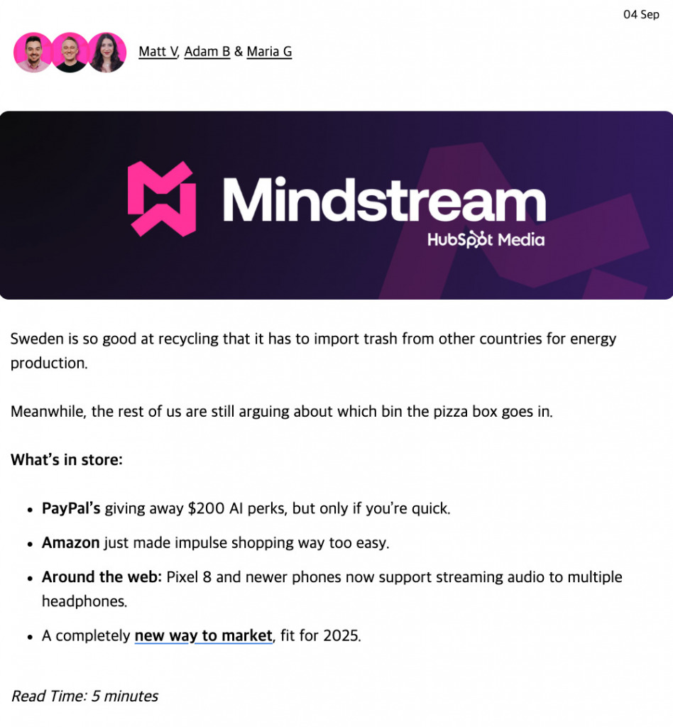
Above is a snippet of an email from HubSpot Media that shows how strong formatting makes content easy to scan. It uses bold text to highlight key points, pairs messages with simple graphics, and keeps the layout clean and easy to follow.
Brands like Orbit Media Studios do this especially well: their emails use bold first lines, simple visuals, and tight paragraphs so a 5-second skim still delivers the core value.
Clarity also means knowing when to stop. An email doesn’t need to cover every detail. Its job is often to earn the next click. Leave the deeper explanation for the landing page, where you have more room.
When it comes to copy, proven frameworks help you stay sharp. The right one depends on where your reader is in the funnel.
| Funnel stage | Framework | How it works | Example |
| Top of funnel | Problem–Agitation–Solution (PAS) | Identify the pain, show why it matters, and present your solution. Focus on education and broad industry problems. | “Your sales team is wasting hours chasing unqualified leads. That lost time costs more than missed quotas. Our lead-scoring tool helps them focus only on prospects ready to buy.” |
| Middle of funnel | Before–After–Bridge (BAB) | Describe the current state, show the better future, and explain the way forward. Share solution comparisons and practical use cases. | “Right now, reporting takes your team days. Imagine cutting it to minutes. With automated dashboards, you can make that shift immediately.” |
| Bottom of funnel | Question–Answer–Explanation (QAE) | Ask a question, give a direct answer, and expand briefly. Highlight ROI and customer success stories. | “Struggling to keep demos on your calendar? Our scheduling tool removes the back-and-forth so prospects book time instantly.” |
Language matters as much as structure. Words like discover, unlock, prevent, proven, and exclusive prompt action because they signal clear value.
Think in terms of funnel intent: top-of-funnel emails should feel primarily educational and problem-oriented, mid-funnel emails should lean into use cases and implementation, and bottom-funnel emails should surface ROI, pricing, proof, and clear next steps.
When you write offer or update emails, you’ll want to front-load each paragraph. If you only get someone to read the first sentence of each, they should still understand your core message.
4. Design click-worthy call-to-action buttons
Buttons almost always outperform text links. Our eyes are drawn to blocks of color that stand apart from body text, making buttons the natural choice for driving action.
The copy inside the button matters just as much as the design. Simple, direct language like “Buy Now” or “Learn More” usually works better than clever alternatives. Avoid cramming too much into a button—one financial brand once used a button that included a full phone number and operating hours. It looked more like a banner ad than a clear action.
For promotional emails, test button copy that highlights the value: “Save $5 Now” is more compelling than a generic “Shop Now.” But if the offer is complex, keep it simple with phrasing like “Get the Offer” or “Start Your Order.”
Clarity is always more effective than cleverness. Readers scanning quickly should know exactly what happens when they click.
Several factors influence button performance, including:
- Size and prominence: Buttons should be large enough to tap easily on mobile, with space around them so they stand out.
- Color contrast: Choose a high-contrast color that separates the button from surrounding text and background.
- Position: Place your primary CTA “above the fold” so it’s visible without scrolling. In longer emails, repeat the same CTA later to capture more clicks.
- Action language: Start with strong verbs—Download, Get, Access, Start, Try, Buy, Order.
- First-person phrasing: Copy like “Reserve My Spot” or “Start My Free Trial” often feels more personal and motivating than second-person phrasing.
In testing across B2B programs, making buttons roughly 45–57px tall with 10–15px of whitespace around them improves tap accuracy on mobile, and high-contrast colors (reds/oranges/greens vs muted blues/greys) often generate 20–30% more clicks.
Repeating the same primary CTA 2–3 times in longer emails can lift total clicks by 25–50%, and first-person phrasing like “Start My Free Trial” has produced lifts of 25–90% in some experiments.
These are small, compounding wins.
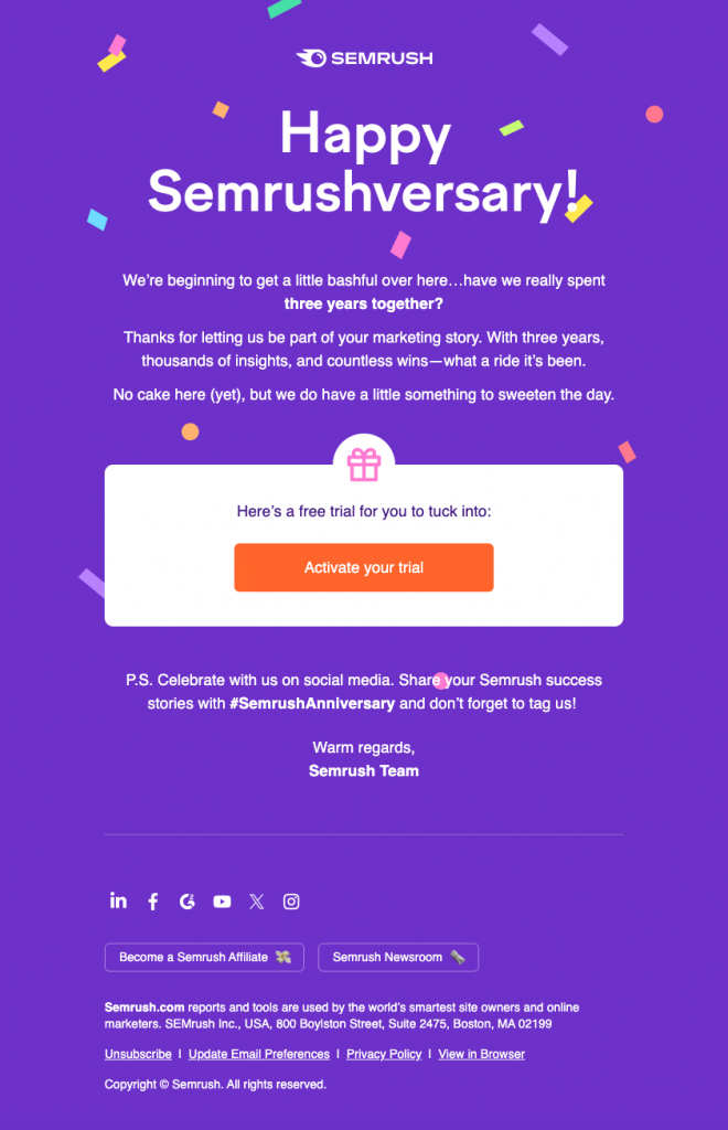
Semrush shows how to design an email CTA you simply can’t miss. The button stands out clearly, the wording is direct, and the placement makes it the obvious next step.
Treat CTA copy and design as ongoing experiments. Small adjustments—whether in size, wording, or placement—can add up to significant performance gains across your campaigns.
4. Use media wisely without hurting deliverability
Images can make an email more engaging, but they can also work against you if not handled carefully. Email providers watch the balance between visuals and text. Too many images raise spam flags and break your message when they don’t load.
Some subscribers have images disabled by default, so your email should communicate its main message clearly without them
A good rule of thumb is the 60:40 ratio of text to images. This keeps deliverability high and ensures your content still makes sense even if visuals are blocked.
This guideline also reflects practical reality: many deliverability teams have seen image-heavy templates routed to promotional or spam tabs more frequently. And with roughly a quarter of subscribers still blocking images by default, your copy must survive even if every image fails to render.
When adding images, keep these technical details in mind:
- Alt text: Every image needs descriptive alt text for accessibility and context when visuals don’t appear.
- Blocking tests: Always preview your email with images turned off. If the meaning disappears, shift more content into HTML text.
File formats: Use JPG for photos, PNG for transparent graphics, and GIFs only when they truly add value. Avoid WebP since it isn’t universally supported. - Dimensions: Define width and height to prevent layout shifts. For mobile, keep images within 600–650px wide.
- Buttons: Build CTAs with HTML/CSS rather than images. “Bulletproof buttons” remain clickable even if visuals don’t render.
Use rich media sparingly. GIFs can improve clickthrough rates when they fit your brand, but stick to one or two per email. Always design the first frame to tell the whole story, since some readers will only see that still image.
For video, embed a thumbnail with a play button that links out. Embedded video rarely works across inboxes, but thumbnails can increase clicks.
Internal and third-party tests have found that well-placed animated GIFs can drive 40%+ higher clickthrough rates compared to static imagery. Video thumbnails with a clear play icon can lift clicks by 50%+ versus plain image links—provided the underlying offer and audience targeting are already strong.
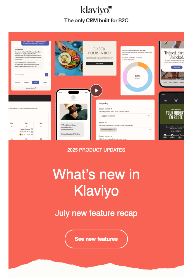
This Klaviyo email snippet shows how video in email doesn’t need to be complicated. The image is visually appealing, the play button signals exactly what to expect, and the link-out makes the experience seamless. You get the engagement benefits of video without the deliverability risks of embedding it.
Image-light emails can feel polished and visual. Strategic use of typography, background colors, and layout often delivers the same punch without compromising deliverability.
5. Design emails that work on every device
B2B audiences read emails across devices—desktop, tablets, and mobile—so optimization isn’t optional.
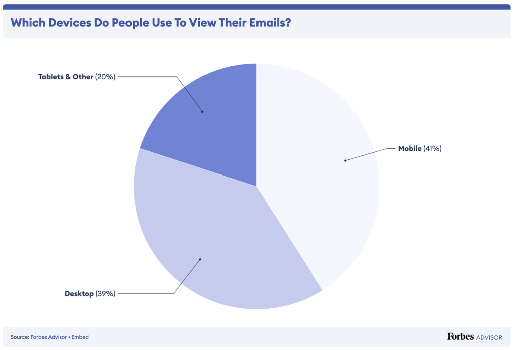
Mobile accounts for 41% of all opens, desktop for 39%, and tablets for 20%.
Across broader datasets, B2B often sees 30%+ of opens on mobile (and up to 80% in some B2C contexts), and executives routinely spend 3–4 hours a day in email on their phones. If your message only “works” on a laptop, it effectively doesn’t work for a big chunk of your audience.
The fundamentals are straightforward but critical:
- Use 14-point font minimum for readability
- Make buttons 40–45 pixels tall for easy tapping
- Stick to single-column layouts that stack cleanly
- Add generous white space around clickable elements
- Minimize images since they often fail to load on mobile networks
Each extra second of load time on mobile can increase abandonment by double-digit percentages, so image weight and template bloat are not cosmetic concerns, they’re revenue concerns.
Beyond basic formatting, five specific issues can kill mobile performance:
- Touchability problems: Adult fingertips cover 45–57 pixels on the screen. Links crammed together create frustration and missed clicks. Give interactive elements room to breathe.
- Content hierarchy: Mobile screens reveal only one-third of desktop content initially. Pack your most important message and primary CTA into the first 350-400 pixels of vertical space.
- Load speed: Mobile connections are often unstable or slow. Keep total email size under 100kb and compress images aggressively to ensure quick loading.
- Responsive layout: True mobile optimization means your email adapts to screen size. Text reflows, images resize, and less critical elements may hide entirely on smaller displays.
- Dark mode compatibility: Be mindful of dark mode users when choosing colors and designing graphics. Test how your brand elements, logos, and images with transparent backgrounds appear in dark environments.
Consider your audience’s reality: CEOs spend roughly 24% of their time on email according to dated Harvard Business School research tracking nearly 60,000 executive hours. Much of that happens on mobile during brief windows between meetings. Design for these quick interaction moments, not lengthy reading sessions.
More B2B email copywriting tips
Here are more strategies to strengthen your email copywriting.
6. Use stories to connect with decision-makers
Human-centered narratives drive engagement in ways that feature lists never will.
Smart brands understand the power of emotional storytelling. Even technical B2B products have compelling human stories—you just need to find them.
Companies that share human moments—remote teams collaborating across continents, small businesses achieving breakthrough growth, teams using new tools to solve critical problems—see dramatically higher engagement than those pushing discounts and features.
Mine these story sources within your organization:
- Customers whose problems you’ve solved in unexpected ways
- Team members who built breakthrough features after personal frustrations
- Founding moments when you realized the market need
- Real-world impact your solution creates beyond obvious metrics
- Industry insights discovered through customer interactions
Even highly technical products have human elements. The engineer who worked nights to solve a critical bug. The customer service rep who turned an angry client into a champion. The implementation that prevented a company from going under.
These three narrative frameworks resonate particularly well with business decision-makers who need both logical justification and emotional confidence in their choices:
| The transformation narrative |
| Customer faced significant challenge → Tried multiple solutions without success → Discovered your approach → Overcame obstacles with measurable results → Achieved meaningful transformation |
| The contrast reveal |
| “Before” scenario with specific pain points → “After” scenario with resolved problems → Critical turning points that made the difference → Measurable outcomes that resulted |
| The industry insight |
| Common industry belief or practice → Why conventional wisdom fails → Better approach your company developed → Proof points demonstrating superiority → How readers can implement |
Stories work especially well in complex B2B sales. They create emotional connection, simplify complex ideas, stick in memory longer than feature lists, and address objections within the narrative.
Research on narrative processing suggests that stories can be up to 22x more memorable than isolated facts, and email tests have shown campaigns featuring customer stories generating 50%+ higher clickthrough rates than product-first emails with identical offers.
In email campaigns, you can use short story snippets—condensed narratives that highlight the outcome upfront and drive clicks to the full case study. For example: “How [Company] cut implementation time by 67% using an unconventional approach.”
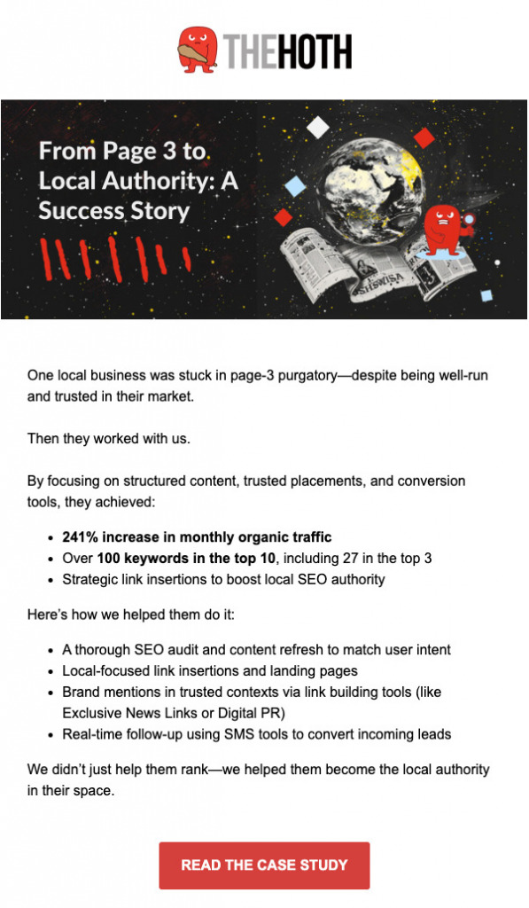
This email snippet from The HOTH is a good example of effective storytelling. From the header image to the content, it frames the problem, shows the result, and closes with a clear CTA to read the full study.
7. Lead with the outcome, not the process
If your copy explains how something works before it shows what it delivers, you’ve already lost attention. Flip the order. Lead with the outcome your reader actually wants—just like in the storytelling approach.
Weak: “Our advanced machine learning algorithms analyze your data to identify patterns and generate insights.”
Strong: “See which leads will close this month before your sales team wastes time on dead ends.”
When you open a paragraph, start with the benefit and let the method come later. When you write a subject line, promise the result, not the content. And when you craft a CTA, focus on the transformation that happens after the click—not the click itself.
Outcome-focused copy gives your reader an immediate answer to why this matters. Process-focused copy makes them work to connect the dots, and most won’t bother.
8. Replace weak qualifiers with confident assertions
B2B copy often hedges with phrases like “might help,” “could potentially,” or “may improve”—language that undermines credibility and dilutes your message. Confident copywriting states benefits directly and backs them with proof.
Common weak qualifiers to eliminate:
- “We believe” → State it directly
- “Potentially” → Use specific outcomes
- “Up to X%” → Give typical results instead
- “Should help” → “Will” or “Does”
- “Try to” → “Will” or remove entirely
This doesn’t mean making false claims. It means presenting verified benefits with certainty rather than hiding behind cautious language. If you can’t write confidently about your solution’s impact, you need better proof points, not weaker copy.
Decisive language signals expertise and builds trust faster than hedged statements that sound unsure.
More B2B email marketing tips
Subject lines and mobile optimization cover the fundamentals, but there are smaller decisions that most marketers overlook. The execution details seem minor but compound over time.
These tactics won’t rescue poorly targeted campaigns or weak value propositions. They will, however, help you squeeze more performance from emails that already have solid foundations.
9. Segment your email list
Email segmentation means dividing your subscriber list into smaller groups so you can send more relevant messages.
This is important in B2B because a procurement manager at a Fortune 500 company has completely different concerns than a startup founder, yet many B2B marketers send them identical emails and wonder why engagement stays flat.
To improve your metrics and impact the actual business conversations that follow, here are some practical ways to segment your email list:
- By job title or department: Send technical content to engineers, ROI calculations to finance teams, and strategic insights to executives
- By company size: Enterprise prospects need compliance and integration details, while small businesses want quick wins and easy implementation
- By engagement level: Your most active subscribers can handle more frequent emails, while re-engagement campaigns work better for dormant contacts
- By content preferences: Some people love detailed case studies, others prefer brief industry updates or product tips
- By sales funnel stage: Early prospects need educational content, while qualified leads want pricing and demo information

To add: track which specific problems or pain points each subscriber has shown interest in through their email behavior. Someone who consistently opens emails about “reducing manual processes” is telling you exactly what keeps them up at night. You want to create segments around these revealed pain points.
10. Build meaningful automated sequences
Email automation removes manual work from repetitive messaging while maintaining personal touchpoints throughout your prospect’s journey.
Instead of sending one-off blasts, automated sequences trigger based on specific behaviors or timeframes, delivering relevant content exactly when prospects need it most.
Automation handles the follow-up you’d otherwise do manually. When someone downloads your whitepaper, a sequence can introduce your company, share case studies, and eventually offer a demo—all without your involvement. When a prospect visits your pricing page but doesn’t convert, follow-up messages can address common objections and provide social proof.
Multi-step email sequences (sometimes called flows in eCommerce) guide prospects through your sales funnel systematically. B2B sequences require different triggers and messaging approaches than their consumer counterparts.
Focus on high-impact sequence types first.
A welcome email sequence, for example, is a chance to engage new leads right away by introducing your value proposition and setting expectations. When you do this, spread value across multiple touchpoints and use case studies to build credibility.
Other B2B email sequences include:
- Trial expiration: Convert prospects nearing the end of a trial, demo, or evaluation period. Address implementation concerns, showcase unused features, and create urgency.
- Nurture: Keep long-term prospects engaged during longer buying cycles. Share educational content, industry insights, and periodic check-ins. Focus on awareness, not instant conversion.
- Re-engagement: Win back inactive subscribers or clean your list. Use exclusive offers, content roundups, or direct questions to re-spark interest.
These sequences are especially valuable in long B2B sales cycles, where decisions may take months. Each one should feel natural and helpful rather than pushy.
The goal isn’t immediate conversion but staying relevant and top of mind. The most effective automated sequences solve real problems and deliver value at each step, so when prospects convert, it feels like the obvious next move.
11. Time your emails well
Email timing matters. Your perfectly crafted message means nothing if it arrives when your prospect is rushing between meetings, buried in afternoon emails, or checking messages at 11 PM while half-asleep.
B2B buyers have predictable rhythms throughout their workday and week, and hitting them during those focused, decision-making windows dramatically increases your chances of getting genuine attention rather than a quick archive.
The sweet spot for most B2B emails falls between Tuesday and Thursday, typically arriving between 9–11 AM when people are settling into their workday but haven’t yet hit the afternoon crunch.
Avoid Mondays when inboxes are overflowing from the weekend, and skip Fridays when minds are already shifting toward personal time. Make sure to experiment with sending times for different segments. In no time, your subscribers will start expecting and looking for your emails when they arrive on a predictable schedule.
Layer on industry realities too: for example, finance or enterprise IT might respond well to early-morning sends, while busy operational roles (like construction or logistics) might see better engagement just after lunch when people are back at desks. The “best time” is rarely universal—test it per audience.
As dark mode usage climbs, test simplified header variants that still look good when backgrounds invert—heavy, image-based headers with subtle gradients can turn into muddy blocks in dark mode clients.
12. Make your headers work harder
A header is the image (often paired with text) that sits at the very top of your email. Not every email needs a header, but when used well, it can establish your brand, frame the message, and guide the reader into the content.
Best practices for headers:
- Keep it simple; a header shouldn’t overwhelm or distract from your core message.
- Use consistent branding so readers instantly recognize your emails.
- Match the header to your goal—product shots for offers, visuals for case studies, or minimal design for updates.
- Make it mobile-friendly with responsive sizing and clear text contrast.
Not every email needs a header, but when used well, it can establish your brand, frame the message, and guide the reader into the content.
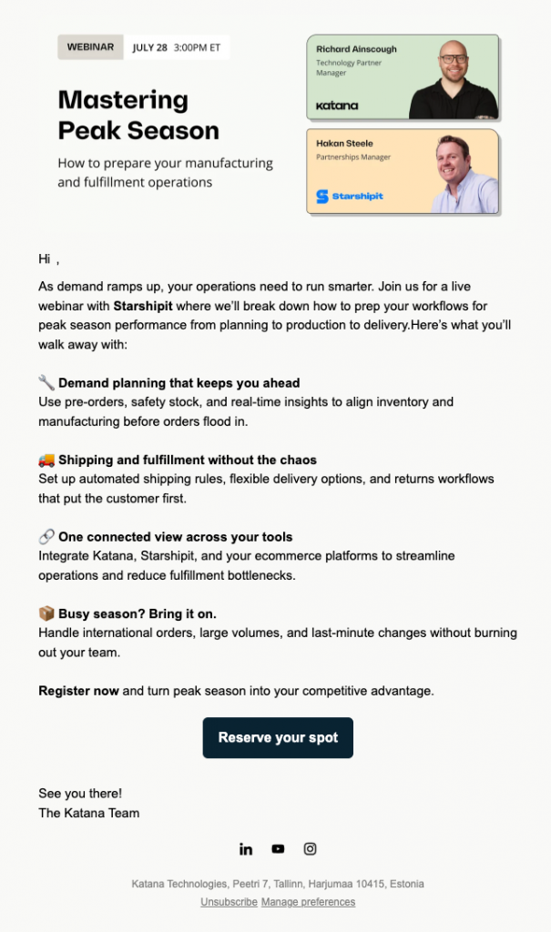
A good example of an email header from Katana is shown above. It immediately delivers the key event details such as the schedule and speakers, so readers know exactly what to expect.
13. Design your emails to guide attention
Every visual choice either helps your message land or makes it easier to ignore. In B2B email, strong design means guiding the reader’s eye, reinforcing your copy, and making the next step obvious.
Start with the core design principles that guide how effective B2B emails should look and feel:
- Inverted pyramid: Start with broad elements at the top, then narrow toward a focused CTA. This mirrors the F-pattern scanning behavior, which is where people skim horizontally near the top and then scan down the left side, pulling the eye downward toward your button.
- Urgent cues: Use color blocks, banners, or highlights to break the visual flow. These pattern interruptions grab attention and emphasize key offers or deadlines.
- Price anchoring: Show original pricing crossed out next to the current offer. The contrast makes discounts feel more valuable and drives faster decisions.
- Face placement: Use images of people looking toward your CTA. Readers instinctively follow line of sight, so faces can subtly direct clicks.
- Data visualization: Turn statistics into charts, graphs, or simple graphics. Visual comparisons communicate results much faster than text.
Beyond the basics, you can also apply advanced design techniques to make your emails even more effective:
- Visual hierarchy: Emphasize priority through size, weight, color, and spacing so the right content always dominates.
- White space: Breathing room around key points improves comprehension and prevents layouts from feeling cluttered. (shown to improve understanding by 20%+ in usability tests)
- Line length: Keep text line lengths roughly 50–75 characters per line; this tends to maximize reading speed and comprehension.
- Contrast ratios: Strong contrast between text and background improves legibility on any device (at least 4.5:1).
- Typography emphasis: Use bold or semibold over ALL CAPS, which slow reading by around 10% and feel heavy-handed, which is the last thing you want in a 10-second skim.
Along with all these, you need to respect brand guidelines and optimize for performance. Treat email design as its own system within the brand, flexible enough for clarity in the inbox and consistent enough to feel on-brand across every device.
14. Test one variable at a time (and test what matters)
Some marketers either don’t test at all, or test everything simultaneously, making results impossible to interpret. Effective testing isolates single variables to generate actionable insights you can apply to future campaigns.
Start with high-impact elements that directly affect your core metrics:
- For open rates: Test subject line length, personalization approaches, or send times by day of week. Avoid testing sender names unless you’re seeing deliverability issues.
- For click rates: Test CTA button copy, email length (short vs. detailed), or value proposition positioning. Don’t waste time testing button colors until you’ve optimized the message itself.
- For conversions: Test landing page alignment, offer types, or urgency language. These changes often produce 20-30% swings in results.
Once you’ve nailed the basics, you can explore more advanced testing patterns:
- multivariate tests (for large lists) to understand how variables interact;
- segment-specific tests to see how different personas respond to the same creative; and
- time-based tests that compare performance for early-morning vs late-morning vs afternoon sends for the exact same email.
Run tests for statistical significance—typically requiring at least 1,000 recipients per variation and a 95% confidence level. Most email platforms calculate this automatically, but don’t call winners too early just because one variation pulls ahead initially.
Document your results in a testing log. “Personalized subject lines increased opens by 18%” becomes valuable institutional knowledge that informs future campaigns across your entire team.
Stop perfecting, start sending
Most B2B marketers know these tactics, but execution is where they stumble. Progress comes through methodical iteration and steady improvement.
Start small: refine a subject line, test a button, add one strong customer story. Measure results, then layer on the next improvement.
With discipline, those small wins compound into a repeatable system that separates campaigns left unread from campaigns that generate pipeline.
To get a comprehensive guide that walks you through copywriting, segmentation, sequences, timing, and testing strategies, explore CXL’s Email Marketing Course.
Related Posts
-

Are you in B2B / lead gen? Qualifying leads a challenge? There's a new (non-enterprise)…
-

Email marketing remains one of the highest-performing B2B growth channels, delivering $36 for every $1…
-
Digital Marketers wanting to land B2B deals are often optimizing for the wrong metrics, focused…
-
B2B marketing has changed. Most marketers haven’t. Most B2B marketers still think in funnels. Buyers…