You’ve only got a small window of time to capture a user’s attention.
The best websites subtly persuade users to explore and convert. They’re complex to design but should be simple to navigate. Every element must be intentionally placed and work coherently.
In this article, you’ll learn how to use the psychology of web design—along with concrete elements like colors, spacing, layout, typography, and shapes—to prompt the desired action from users.
TL;DR
- Web design psychology can help explain how people notice, interpret, and interact with elements on a page.
- Reduce unnecessary choice, make important actions easy to interact with, and use visual hierarchy to direct attention.
- Gestalt principles can help users understand which elements belong together and how information is structured.
- Color, spacing, typography, layout, and shape can influence perception, but psychological associations are not universal rules.
- Some popular design theories, including the Golden Ratio and Zeigarnik Effect, are more nuanced than they are often presented.
- Use psychology to form design hypotheses, then validate them with user research and experimentation.
Table of contents
- Why is user research important in web design?
- 8 psychology principles that can prompt action on your site
- How to use 5 web design elements to influence user behavior
- How should you apply psychology to web design?
- Frequently asked questions about web design psychology
- Improve your understanding of user behavior
Why is user research important in web design?
Psychology can suggest how people may respond to a design, but user research shows how your actual audience understands and uses it.
When it comes to your site’s design and usability, your opinion doesn’t matter.
Customer research, data-driven insights, and web psychology principles should dictate the design—not your biased perspective.
The only people that matter are website visitors. Which aspects of the web page appeal to them? Which functionality is confusing? Is your design persuasive enough to keep them interested?
If you want to design a truly customer-centric user experience, you’ll need direct feedback and data.
We can break down user research into two main categories:
- Quantitative
- Qualitative
Quantitative user research gives you measurable data from sources like multiple-choice surveys, polls, and questionnaires.
Qualitative user research lifts the hood on people’s opinions and motivations through mediums like interviews and open-ended surveys.
Quantitative research can show patterns in what users do, while qualitative research can help explain the motivations, expectations, and problems behind those patterns. Both can inform better design decisions.
8 psychology principles that can prompt action on your site
These principles help explain how choice, target size, grouping, hierarchy, distinctiveness, unfinished tasks, and sequence can affect how people interact with an interface.
Why do we behave the way we do? What motivates us to make specific decisions?
Even user research can’t fully penetrate subconscious decision-making—because, a lot of the time, people don’t know the answers themselves.
Great websites prompt action from users because they rely on intuitive design. These eight web design principles informed by human behavior and psychology can help:
1. Hick’s Law
Ever wondered why you struggle to choose what you want to eat from a huge menu? Hick’s Law describes how decision time tends to increase as the number and complexity of choices increase.
Named after British and American psychologists William Edmund Hick and Ray Hyman, it describes the time it takes for someone to make a selection based on the number of options.
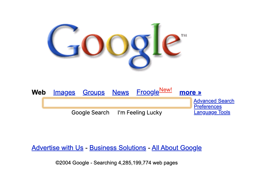
Look at Google’s homepage from 2004:
By 2023, Google’s homepage had become much more stripped back:
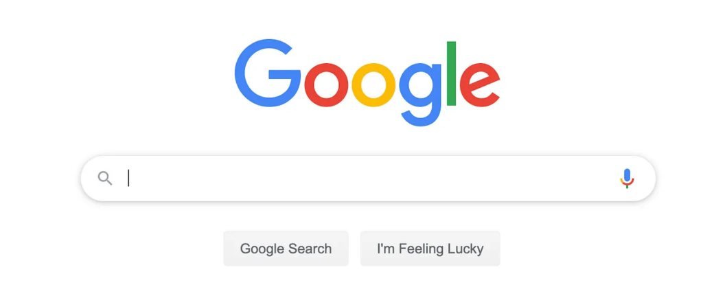
Many of the visible links had been removed or moved elsewhere, reducing the number of competing choices on the page.
The same applies to a big library of products. The antidote? Filters. This design element can cut down on the amount shown and help reduce the time spent on decisions.
Fashion retailer ASOS sells thousands of products with an advanced filter system that begins on the navigation menu and extends through every product page:
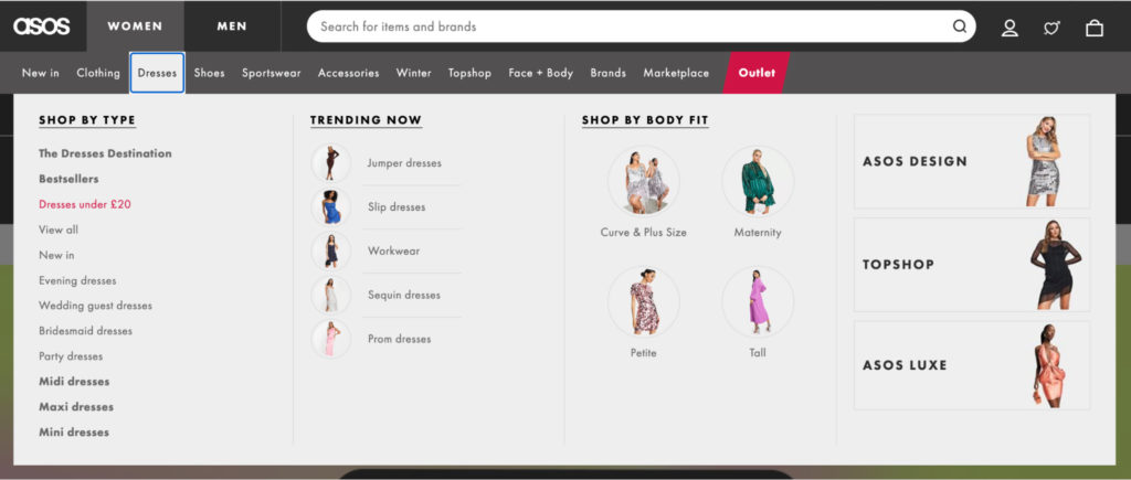
This allows customers to quickly pinpoint the section they want to browse and further narrow down by price, occasion, and sizing.
You can also provide the option to jump ahead. For example, Clarke’s Cakes & Cookies offers an “Add to cart” button when you hover over a product:
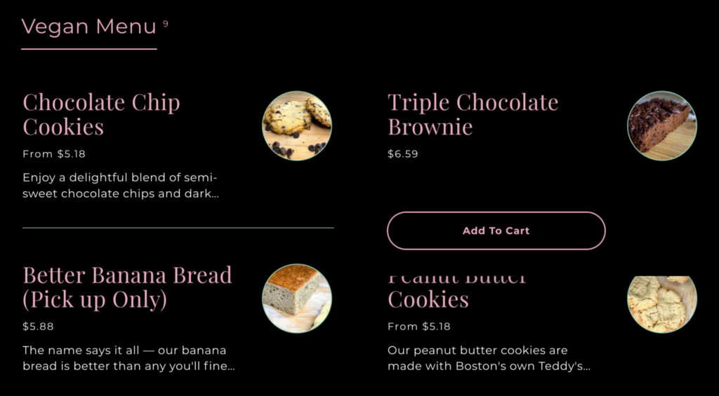
Users don’t have to waste time clicking into each product page to make a purchase.
If you don’t simplify decision-making, you could lead users to the “Paradox of Choice”. They take too long to decide, may not choose anything, and leave unsatisfied.
2. Fitts’ Law
Fitts’ Law states that both the size of a target object and its distance from the starting point impact user engagement. The bigger and closer an element is, the easier it is to interact with.
Fitts’ Law is a staple in human-computer interaction. But it was created long before web design was even born.
Psychologist Paul Fitts understood that human error wasn’t always down to personal mistakes. It could be a result of poor design.
It’s why Spotify makes the “Play” button far more prominent than any other on the screen:
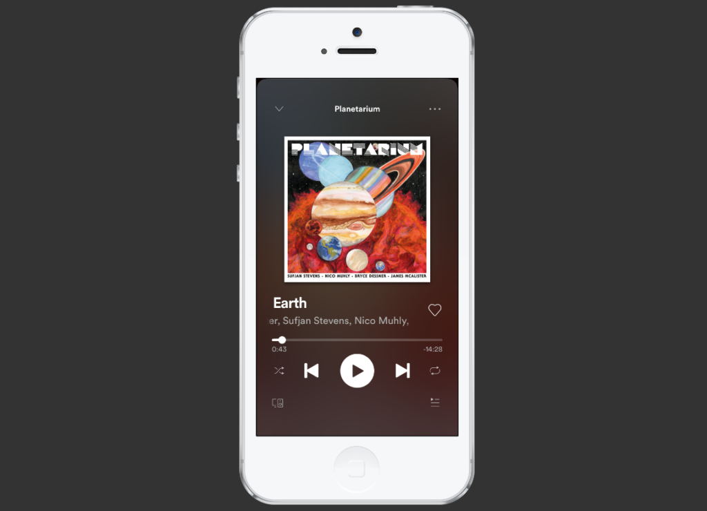
Button placement is also carefully considered: on mobile, it’s closest to where users’ thumbs naturally rest.
Target size also matters for accessibility. WCAG 2.2 introduced a Level AA minimum target-size criterion of 24 × 24 CSS pixels, with defined exceptions for factors such as spacing and inline controls.
3. Gestalt design laws and principles
Humans have an engrained need to find order in disorder.
“Gestalt” psychology developed around the idea that people perceive organized patterns and relationships rather than processing every visual element independently. “Gestalt” is a German term meaning form, shape, or configuration. Psychologists including Max Wertheimer, Kurt Koffka, and Wolfgang Köhler were central to the development of the field.
Through a series of tests, they discovered the mind “informs” what the eye sees. In simple terms? Humans view separate objects as a whole before focusing on their smaller parts.
Gestalt psychology has a number of laws and principles that apply to web design:
Proximity
If objects are near each other, we’ll view them as a group. Social media scheduler Hootsuite overlaps these screenshots, colors, and icons to show they’re all related:
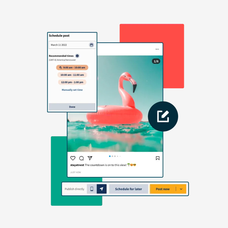
If these visuals were further apart, it might not be clear they’re part of the same feature.
Similarity
We naturally group similar items based on common elements. For example, educational app Moneywise separates sections by color in the navigation menus:
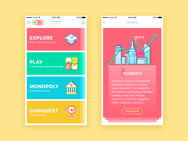
It then carries them over to each card’s background to help users understand where they are and get oriented faster.
Closure
We fill in the gaps of shapes that aren’t closed or parts of images that are missing. The World Wildlife Fund (WWF) logo of the panda is a popular example:
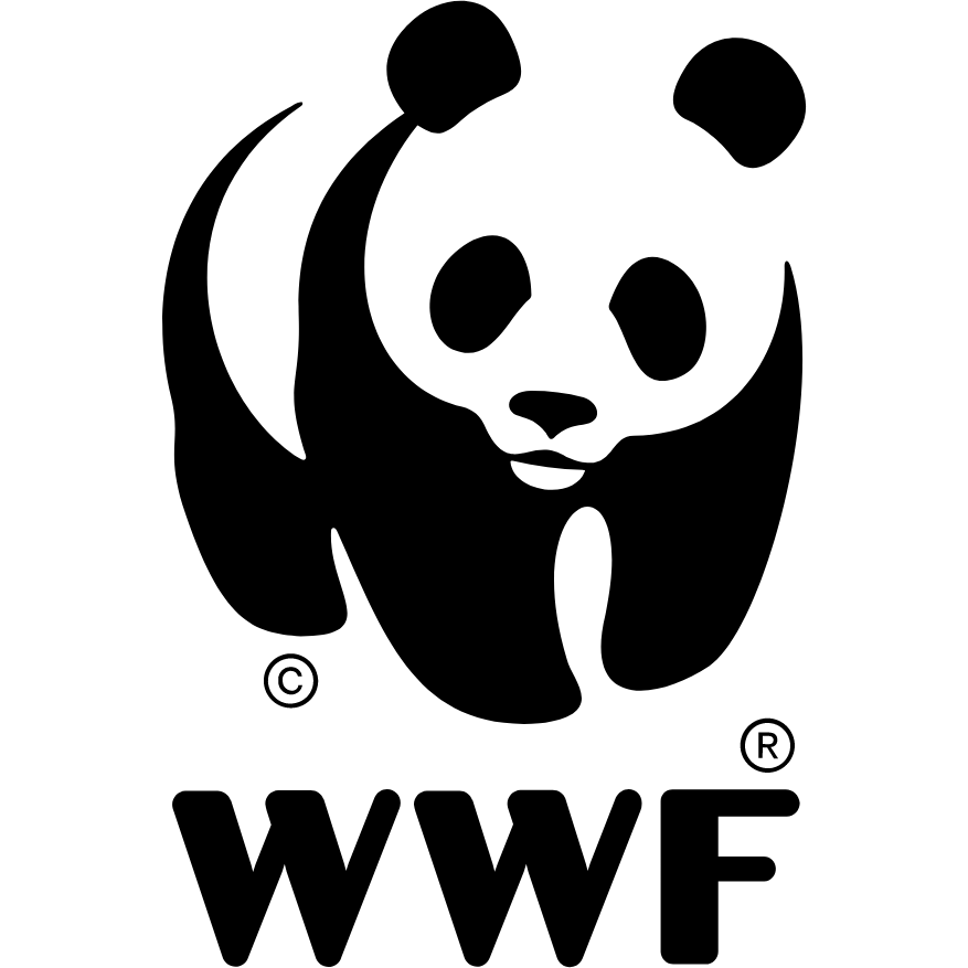
While the body and head are unfinished, our mind closes the gap to see the full animal. Rather than a more complex design, the principle of Closure makes simplicity interesting.
Common fate
Objects moving in the same direction look like they belong together. Common fate is most clearly applied when multiple visual elements move or change together, causing users to perceive them as related.
The Buildium example below uses motion differently: the page moves while the form remains fixed, creating contrast that keeps the form prominent.
Symmetry
When two symmetrical elements are separated, our mind connects them to form a coherent shape. Gucci used this tactic for its SS18 campaign website
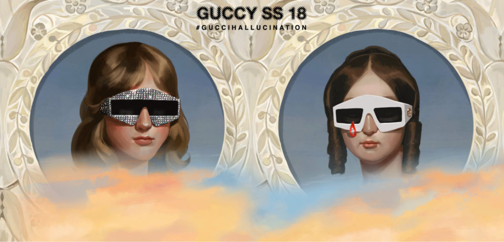
Symmetry is everywhere in the natural world. Using it on a landing page can help it to feel balanced and familiar for users.
Continuity
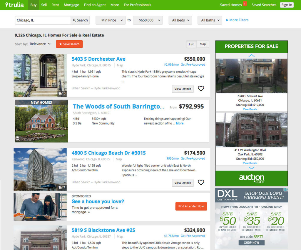
Elements arranged on a line or curve look as though they’re related. You’ll see this on most mobile app product pages where space is limited to encourage users to keep scrolling. Trulia uses the same tactic on its desktop site to show there are more properties below:
Amazon is one of the best examples of using this principle in a logo. The arrow takes the eye from A to Z to subtly suggest the huge range of products on the site:

It also doubles as an orange smile (we’ll cover colors soon), which prompts warm, positive feelings.
Common region
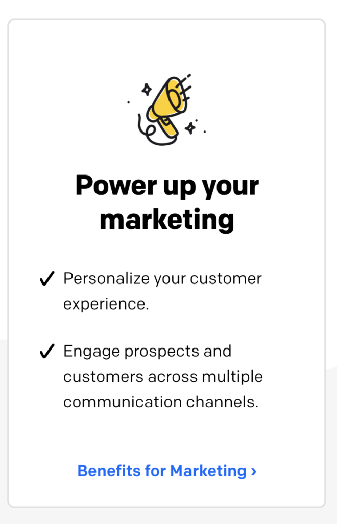
When objects are within the same closed region, we group them. Like Chatbot, you’ll see this type of organization on most landing pages:
Here are all of the above laws in action:
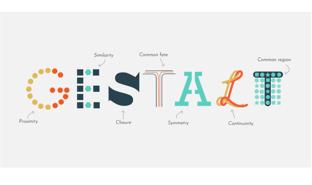
You’ll see Gestalt principles everywhere in web design. Use them to organize your content and UI to make it easier for users to intuitively understand and navigate.
4. Visual hierarchy
Which part of a web page do you read first?
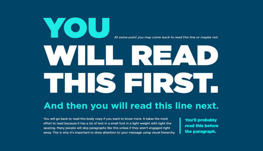
Visual hierarchy is the order in which we view and process visual information. It also stems from the Gestalt theory of wanting to bring order to chaos.
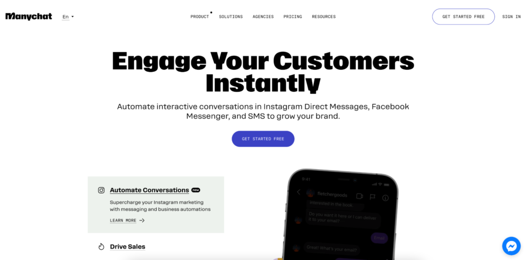
You want to draw attention to specific elements on your site first (e.g., calls to action and forms). Chat marketers Manychat uses size for this:
Marketing automation solution Ortto uses color and shapes:
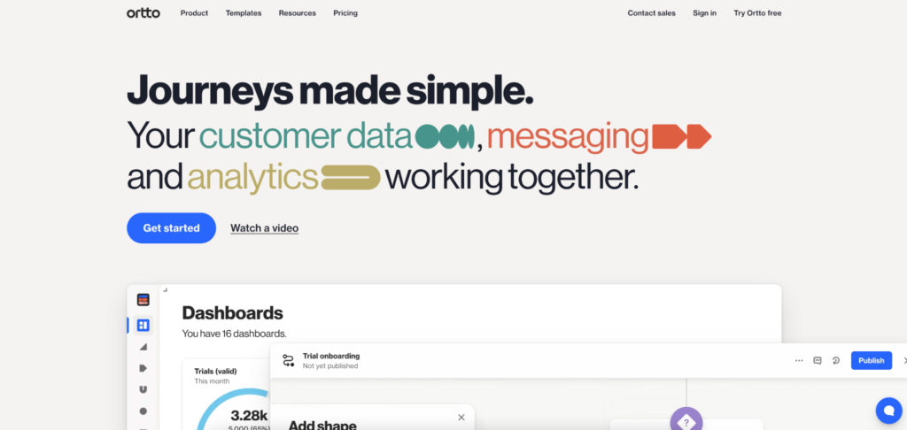
You could also use animation or contrast for the same effect. In web design, it’s all about proportions.
Take for instance the Golden Ratio—1.618. The Golden Ratio, approximately 1.618, is one proportional system designers sometimes use to structure layouts. But it should not be treated as a formula for aesthetically superior web design.
Experimental evidence is mixed. One study comparing different proportions in mobile devices and web pages found support for a Golden Ratio preference in mobile-device designs, but not in the web-page designs. Other research has also failed to find a universal preference for the ratio.
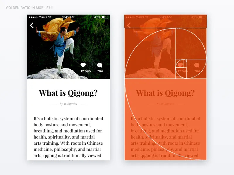
Use it as a compositional option, not a rule. Visual hierarchy still depends on factors such as size, contrast, spacing, positioning, and the importance of the information itself.
5. Occam’s Razor
Occam’s Razor favors explanations or solutions that do not introduce unnecessary complexity. In interface design, if two designs accomplish the same task equally well, unnecessary elements are usually worth questioning.
This comes in handy when choosing between design prototypes. But it can also be used when narrowing down CTAs. Intercom’s homepage gives the user two options:
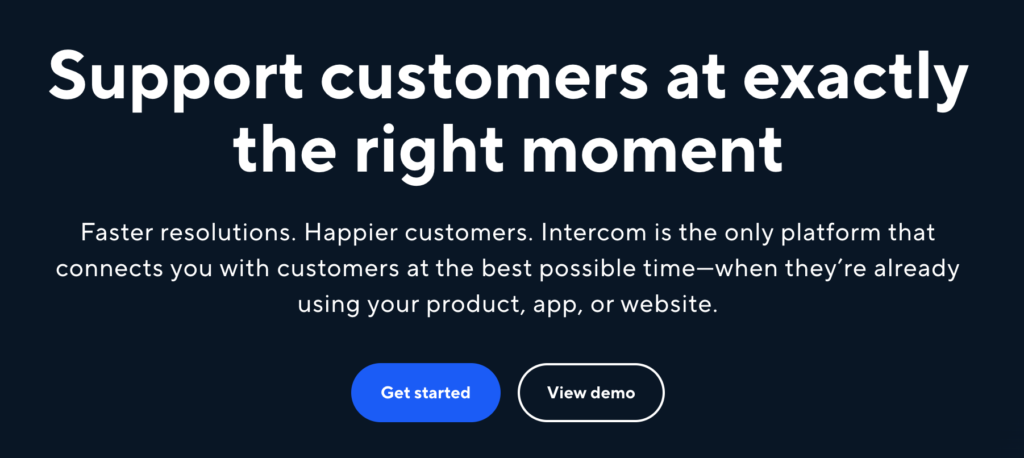
Get started and View demo. One route for those needing more information. One for others ready to start. Simple solutions remove friction and keep people moving.
6. The Von Restorff Effect
Certain elements on a landing page are designed to jump out at you. Why?
Behavioral scientist Hedwig Von Restorff found distinctive items are more likely to be remembered than ordinary items. With so many visual elements on your site, you need a way to make important items stand out.
You find this theory used often on pricing pages. Basecamp has a red outline and orange overlay highlighting its Pro package:
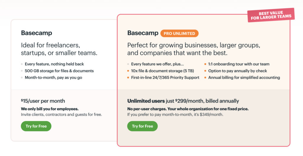
Brands can use this technique to draw attention to a particular package or recommended option.
This psychological principle is always used for CTA buttons too. These are bigger, brightly colored, and isolated to make them visually distinctive to improve conversion rates.
Whatever you want to stand out most in your web design, make it distinctive.
7. The Zeigarnik Effect
Ever wondered why TV show cliffhangers play on your mind so much? That’s the Zeigarnik Effect in action.
It’s named after Russian psychologist Bluma Zeigarnik (whose professor was a Gestalt psychologist).
Zeigarnik’s original work proposed that interrupted or unfinished tasks are remembered better than completed ones. But newer evidence makes that claim much less certain.
A 2025 meta-analysis found no reliable overall memory advantage for unfinished tasks. It did, however, find a general tendency for people to resume interrupted tasks. The researchers concluded that the classic Zeigarnik memory effect is not universally valid and appears to depend on context and individual differences.

Progress indicators can still be useful in onboarding and other multi-step experiences because they show users what they have completed and what remains. Just don’t assume unfinished tasks are automatically remembered better.
8. The Serial Position Effect and Peak End Rule
When reciting memorized items in a list, most people start with the first and last few they heard.
Coined by renowned psychologist Hermann Ebbinghaus, the Serial Position Effect is dictated by the location of an item in a sequence. Those at the end and beginning are most easily recalled. The middle items are remembered least often.
The Instagram interface shown below placed Home and Profile at opposite ends of the navigation:
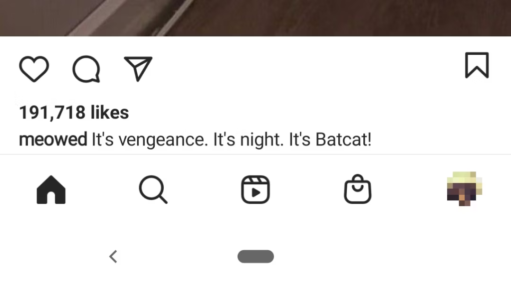
Similarly, the Peak End Rule suggests we remember the most emotionally intense points of an experience and the end better than the rest.
Duolingo regularly shares goal progress with fun illustrations, bright colors, and positive associations to encourage users to keep interacting:
By understanding the sequence of your UI and the impact of the Serial Position Effect, you’ll be able to minimize the loss of information in those middle stages.
You can also use the Peak End Rule to create emotional highlights with your content. This will include any negative experiences too. So, try to mitigate these. Otherwise, you risk losing your users’ trust and, potentially, their business.
How to use 5 web design elements to influence user behavior
Color, spacing, layout, typography, and shape can influence what users notice, how easily they process information, and how they interpret an interface.
Your website design can be someone’s first and last touchpoint with your brand.
Get it right? Your first impression can lead to loyalty. Get it wrong? Money down the drain.
Pair these five main web design elements with human psychology principles to influence user behavior:
1. Colors
Color psychology is a principle in itself. It’s the foundation of your brand design. You’ll carry this through all of your digital marketing. From your content and ads to your landing pages.
The color scheme you choose isn’t just about brand recognition. It should help you stand out. But it’s so much more than that.
People do associate colors with emotions, but those associations are not one-color-to-one-emotion rules. A 2025 systematic review of 132 studies involving more than 42,000 participants across 64 countries found recurring patterns, but most colors were associated with several emotions rather than one fixed response. Lightness, saturation, and hue also changed those associations.
For example, red was associated with high-arousal emotions, while blue and green were more often associated with positive, lower-arousal emotions. Context still matters.
Emotions influence customer behavior and purchasing decisions too. Here are some fundamental colors used in web design and the emotions they represent:
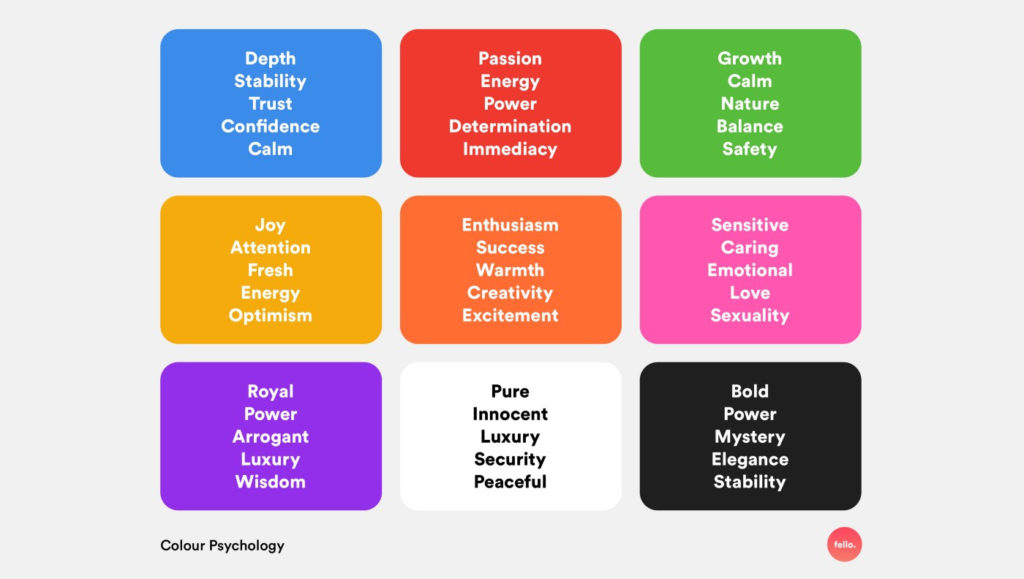
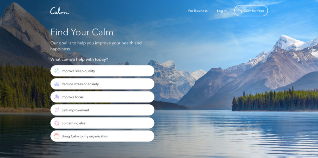
That lower-arousal association fits the blue palette used by meditation app Calm:
Accessibility should not depend on choosing a supposedly “safe” hue. Use sufficient contrast and avoid using color as the only way to communicate meaning, state, or an action. WCAG explicitly requires information conveyed through color to have another visual or textual cue.
Color is often used to make CTA buttons stand out. Productivity app Notion uses the classic red to draw attention to the sign-up call to action:
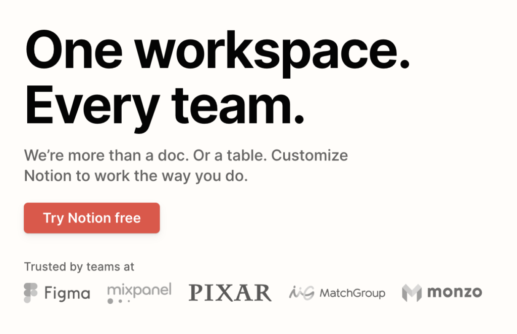
It’s also the only element above the fold with color (the Von Restorff Effect—distinctive), which makes it pop.
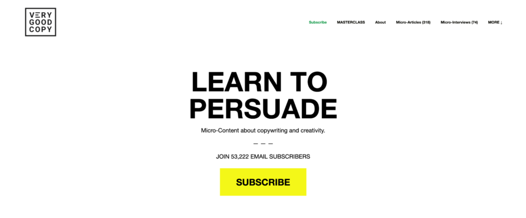
The popular email marketing newsletter, Very Good Copy uses a similar black and white landing page with a big (Fitts’ Law) yellow button to direct the user to their one and only (Hick’s Law) CTA:
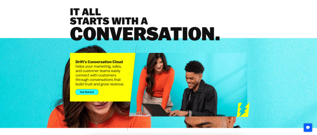
You don’t have to stick to one color, either. Conversational marketing tool Drift uses vibrant colors, overlays, and shapes to position itself as a youthful, innovative brand:
Companies that use multiple colors usually offer a wide choice of products and services. (Think Google and Microsoft.) ResourceGuru uses complementary tones of different colors to symbolize how it brings many distinct elements into one management software:
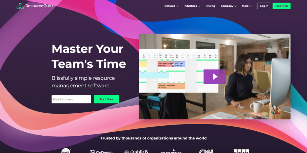
These colors are also used in the app itself (Gestalt Similarity) to make it easier for users to segment information.
The takeaway? Don’t let your web design colors be an afterthought. Think about the emotions they evoke and how to factor that into your UX.
2. Spacing
“Negative” is usually a bad thing. But it’s an important element of good web design.
White space (negative space) refers to the portions of a web page that are “empty.” Confusingly, it can still be part of a larger image or color. But this is the space between your main visuals, lines of text, and margins.
Recipe subscription ckbk uses one main background image to act as negative space between a heading, descriptive line of text, and CTA button:
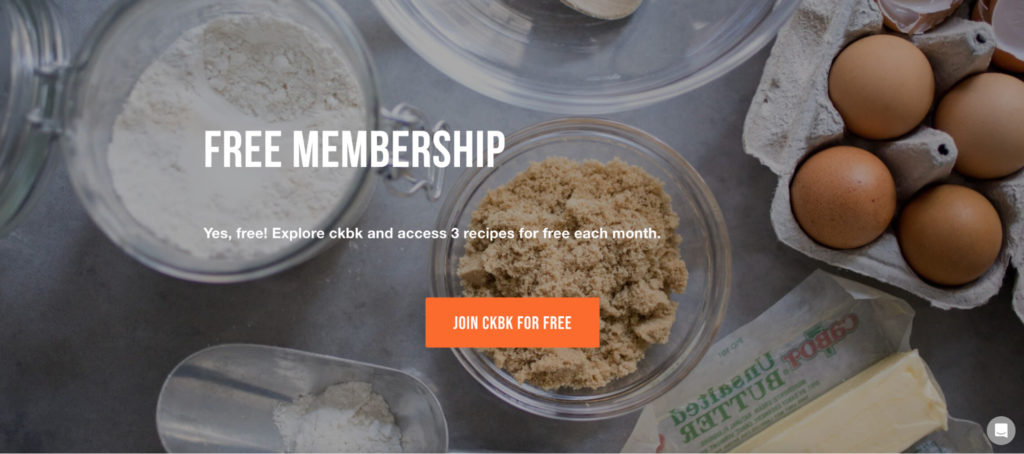
When used well, it draws attention to your most important information. Used wrong, designs can look “off.”
Microsoft demonstrates the effect it can have between lines of text:

Too little line spacing can make text harder to read, but there is no single spacing ratio that works for every typeface, size, or audience.
For accessibility, make sure the layout still works when users override text spacing. WCAG 2.2 requires content to remain usable when line height is increased to at least 1.5 times the font size, along with specified increases to paragraph, letter, and word spacing.
This example from WordStream also shows how a lack of negative space can make an ad seem “cheap”:
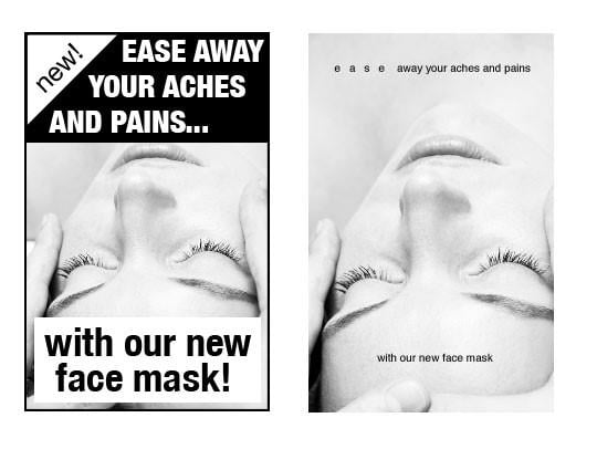
This is especially important for healthcare products where you need to work harder to earn people’s trust. If you’re trying to sell people something that’ll impact the most precious thing they have (their health), your design needs to be high quality.
Small business CRM Keap uses it well below the fold. It focuses all attention on each of its features with plenty of white space surrounding them:
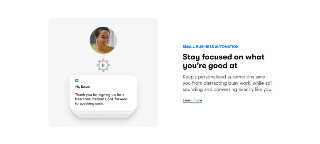
Cluttered pages are tough to read. Most people won’t bother trying. Studies confirm, most of us skim when we read. That’s why simple websites are scientifically better. Set yours up for skimming with clean design, and you’re more likely to hold people’s attention for longer.
3. Layout
The layout of your landing page is as important as the copy. If you want optimal results, the two need to be aligned.
According to this paper on cognitive landscaping, the layout of your site has to work together to make the user feel in control. Being distinctive from other sites with memorable elements also contributes to this feeling.
Negative space has a huge part to play. But you’ll see most sites using a mix of the Gestalt design laws, too:
- Proximity. Unbounce’s ecommerce landing page groups a heading, icon, description, and link close together to show they’re all connected without needing a border:
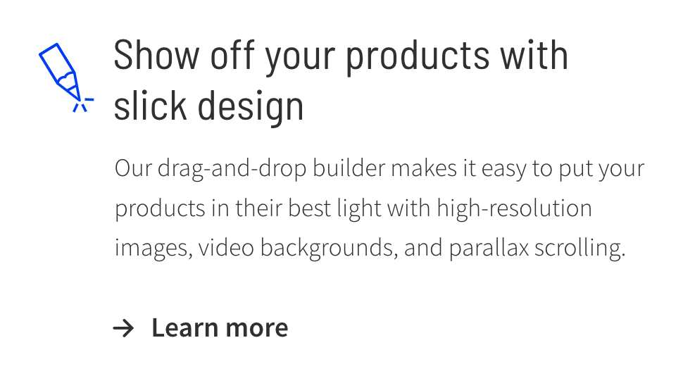
You’re also looking at visual hierarchy (with the size of the text) and Hick’s Law (one link to simplify choice) in action.
- Common fate. Marketing analytics tool Singular makes the company icons of its users stand out on the homepage by moving them in one direction:
This draws attention to the huge brands already using their service. It also shows there are too many to fit on one screen. That’s effective social proof.
- Continuity. Futuramo’s dashed line is a popular choice in web design for connecting two elements:
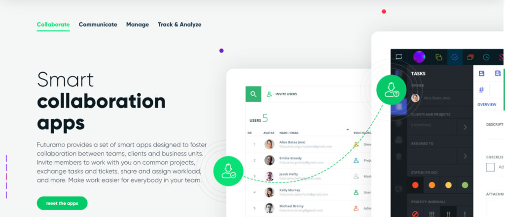
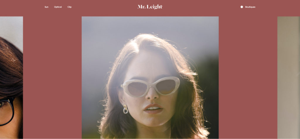
- Symmetry. Mr Leight eyewear uses symmetry on its homepage to focus all attention on the main hero image:
- Common region. Trello’s homepage uses closed boxes to group screenshots, benefits, and explanations of specific features together:
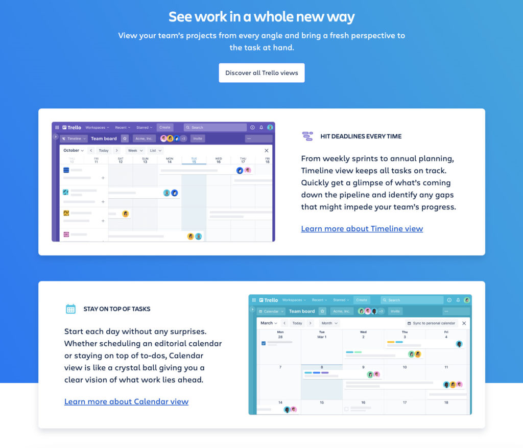
Along with different colors to separate them further, there’s less likely to be any confusion about which screenshot relates to which feature.
The same goes for drop-down navigation menus. Timberline Tours categorizes all related content in closed white boxes:
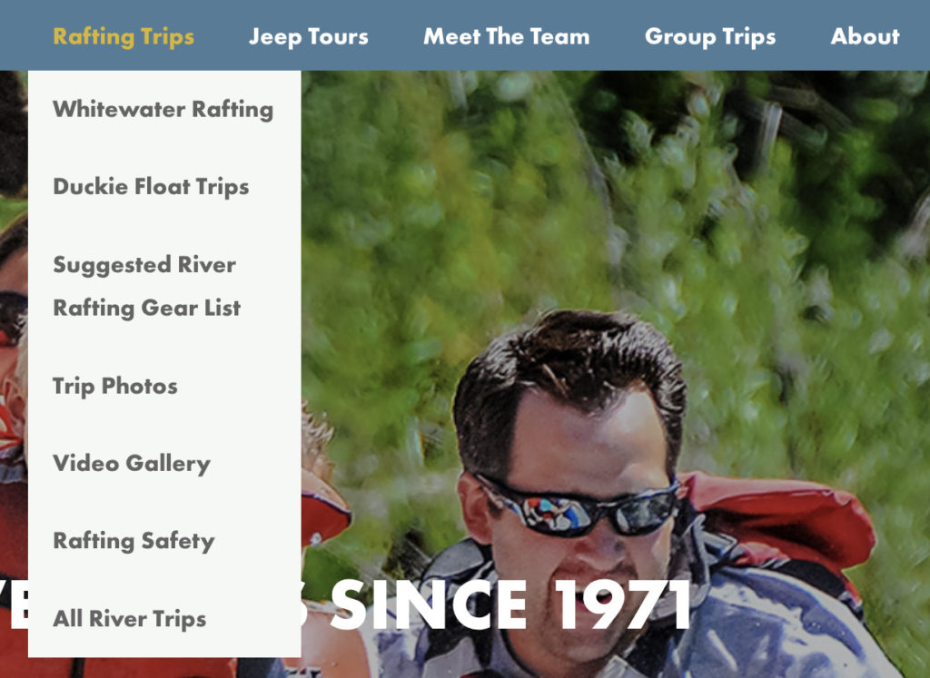
The layout of your site should connect all elements in a slightly complex way. Not too convoluted, so users can’t navigate themselves. But enough to keep them interested and motivated to keep exploring.
4. Typography
Typography has a few terms that are often confused.
- Typography is how text is arranged to be visually appealing;
- Typefaces are the design styles applied to letters, symbols, and characters;
- Fonts are different styles applied to typefaces. (For example, bold or italics.)
Like colors and shapes, different typefaces and fonts can help to express your brand’s personality. Serif is the more classic, traditional style. While sans-serif feels more modern and clean.
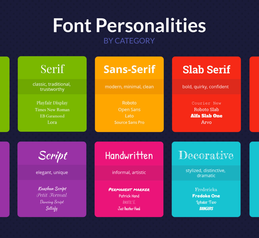
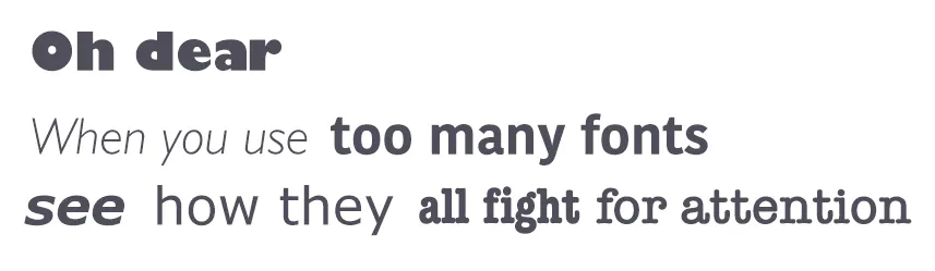
Script, handwritten, and decorative styles can all show a unique personality. Just be careful they don’t affect readability. Using too many at once might also seem quirky but can cause confusion:
Wondering which is scientifically best for your site? Sorry. There’s no single answer. While Garamond was the best on average in a 2022 study, it wasn’t the same for all users.
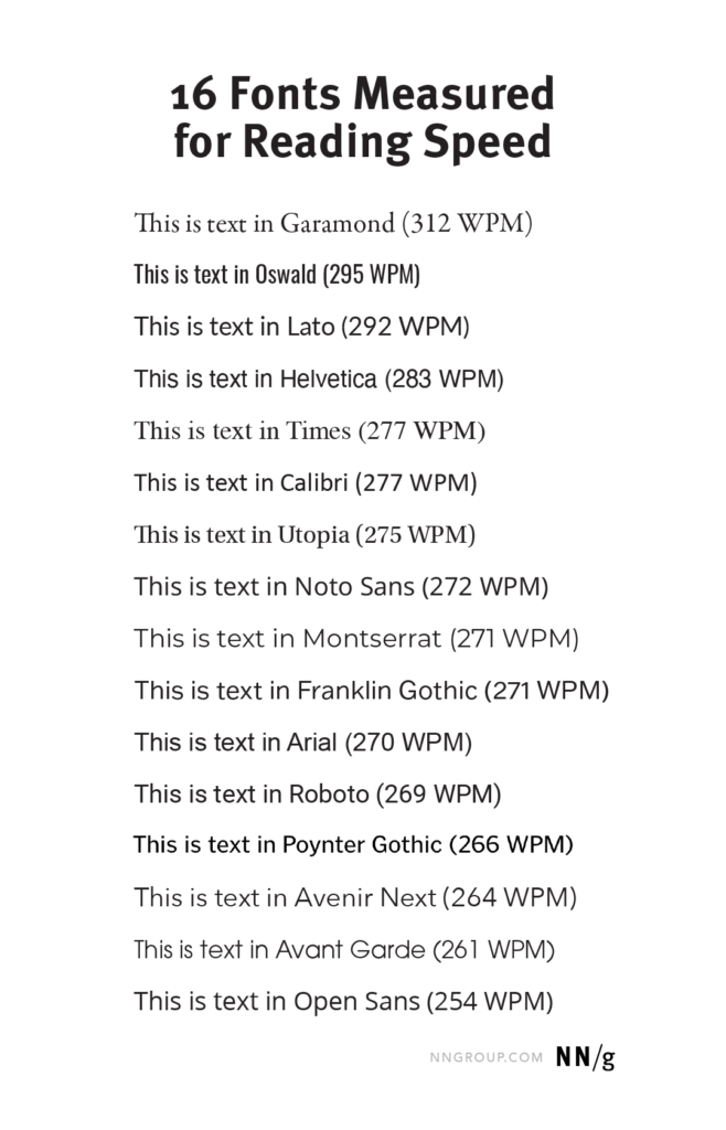
There were substantial individual differences among participants. Most relate to age differences. What Nielsen did recommend from the results was “cutting 11% more words if large parts of your audience are 50 years or older.”
While there’s no correct answer for every user, it does prove that font has to be chosen wisely to aid reading speed and accessibility.
Color and spacing psychology all come into play with typography. But consider the size of the text too.
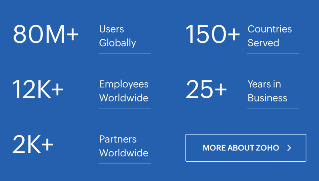
Zoho uses larger numbers to make its social proof stats stand out (Fitts’ Law):
Semrush does the same but adds unique colorful shapes to separate each stat further (the Von Restorff Effect):

Whatever your web design text says, make sure it’s properly spaced, uses colors thoughtfully, and is sized systematically to draw attention to the important parts.
5. Shapes
Shapes don’t just have a huge part to play in logo design. They can also be used throughout your site. As well as setting a mood, they can lead user flow around the design, or create depth and movement.
Shape associations are tendencies, not universal meanings. Research has found that curved forms are often associated with more positive or pleasant qualities, while sharp, particularly downward-pointing, angular forms can carry more negative or threatening associations. Context and the rest of the design still affect how a shape is interpreted.
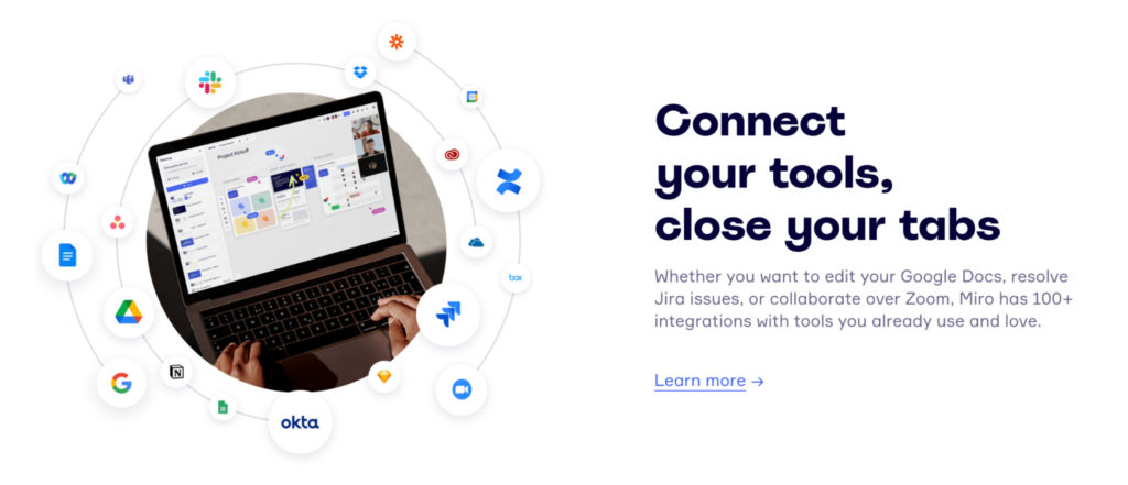
- Circles and ovals suggest harmony and inclusion with no sharp edges. Visual collaboration platform Miro uses circular shapes (and Gestalt’s Closure principle) to suggest connectedness:
- Triangles are powerful shapes that can suggest power or direction. Jazz FM radio uses one to symbolize the “Play” button:
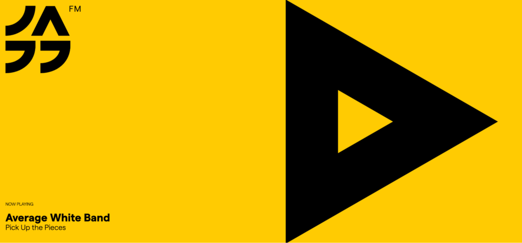
You can also see a huge reliance on negative space to keep things clean and modern.
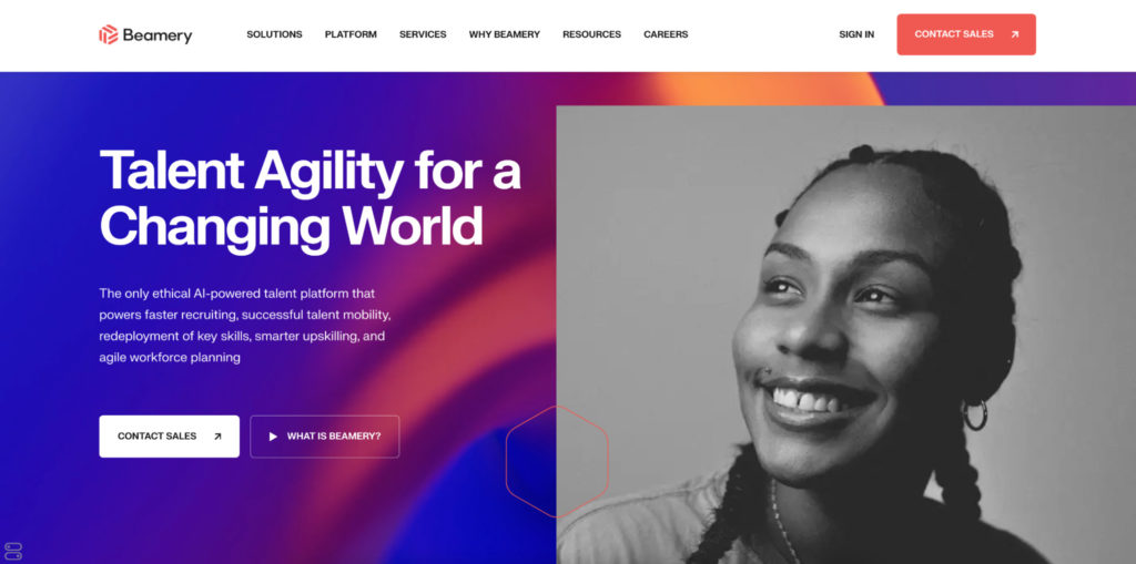
- Polygons (shapes with more than four sides) feel vibrant and can grab users’ attention. You’ll see this more on sites that are pushing tech and innovation. AI-powered talent platform Beamery subtly carries the hexagonal shape of its logo through its user interface:
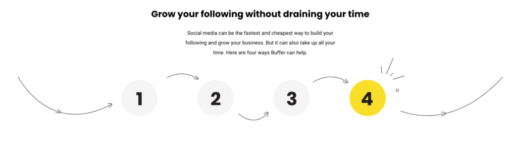
- Curves and waves can calm the user with their motion and natural flow. Buffer combines this tactic with arrows (Gestalt Continuity and Common Fate) to direct the user’s line of sight through the four ways the team’s service can help:
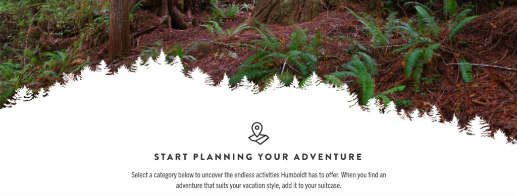
You can be more abstract with your shapes too. Visit Humboldt uses the silhouette of the county’s famous Redwood trees to blend the hero image into the information below:
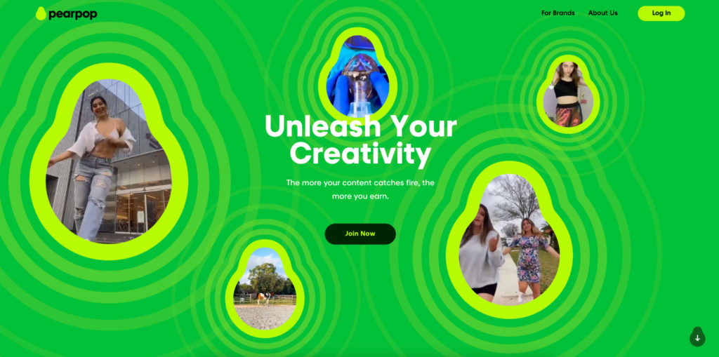
Social media collaboration platform Pearpop uses its pear-shaped logo throughout the site to show it’s a youthful, down-to-earth app:
Nonprofit Surfers Against Sewage uses shape differently. Instead of a solid outline, a messy eraser brush rubs out the image of the ocean in the background to make way for the heading:
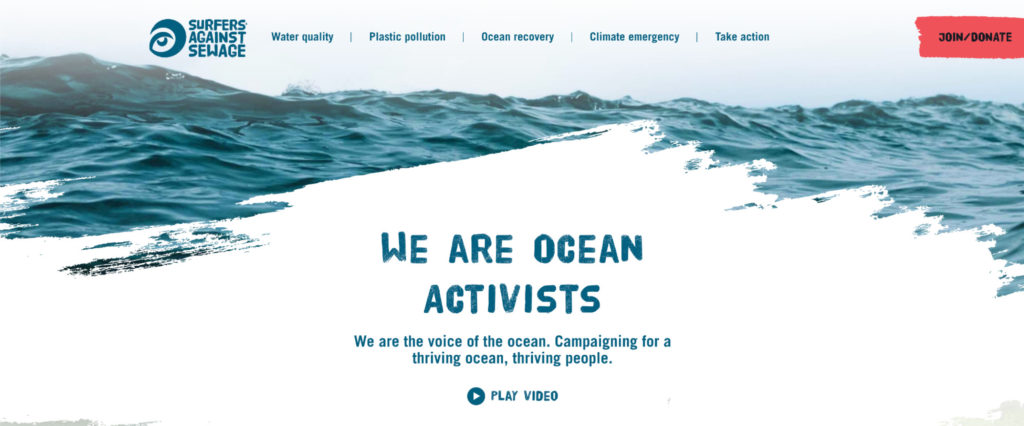
This powerful warning message is more of a texture than a shape. But it does its job by grabbing your attention and making you think.
If your logo has a shape, think about how you could incorporate it into your web design. If not, consider a feeling or message you may want to symbolize with one.
How should you apply psychology to web design?
Use psychology as a source of design hypotheses, not as a substitute for research and testing.
Web design isn’t an exact formula, but there are theories behind it.
None of the examples of effective websites above use just one principle of psychology. Each overlaps several coherently.
Whether you’ve got a web development team or it’s just you, the strategy is the same. If you think you’ve got something that works, test it. Optimize it. Then test again.
Repeat this process regularly, and you can adapt your design as user behavior, expectations, and evidence change.
Frequently asked questions about web design psychology
What is web design psychology?
Web design psychology applies principles from psychology and human-computer interaction to understand how people perceive, navigate, and interact with digital interfaces.
What psychological principles are used in web design?
Common principles include Hick’s Law, Fitts’ Law, Gestalt principles, visual hierarchy, the Von Restorff Effect, Serial Position Effect, and Peak-End Rule.
How does psychology affect website conversions?
Psychological principles can help designers reduce friction, direct attention, structure choices, and make important actions easier to understand and complete.
Is color psychology reliable in web design?
Color-emotion associations exist, but they are not universal one-to-one rules. Context, culture, lightness, saturation, contrast, and surrounding design all influence how colors are perceived.
Does the Golden Ratio make web designs better?
Not necessarily. Research on the Golden Ratio in interface and web design has produced mixed results, so it should be treated as one possible composition tool rather than a universal design rule.
Does the Zeigarnik Effect mean unfinished tasks are remembered better?
Not reliably. A 2025 meta-analysis found no general memory advantage for unfinished tasks, although people did show a tendency to resume interrupted tasks.
Should psychology replace user research?
No. Psychology can suggest hypotheses about behavior; research and experimentation determine whether those ideas actually work for your users.
Improve your understanding of user behavior
Psychology can help explain why a design might influence attention or decision-making, but the strongest optimization process combines behavioral principles with customer research and experimentation.
Apply behavioral science to marketing and UX: CXL’s Digital Psychology & Persuasion Minidegree covers behavioral psychology, persuasion, cognitive biases, attention, motivation, and designing experiences that influence action.
Understand how real users experience your site: The User Research course covers qualitative and quantitative research, usability testing, interviews, and identifying friction in digital experiences.
Validate design changes with evidence: The CRO and Experimentation course covers finding conversion problems, forming hypotheses, prioritizing opportunities, and running structured experiments.
Related Posts
-

Don't design your own website. No, really. It will suck. You might think that since…
-

Website design affects how quickly visitors understand a page, what they notice first, which elements…
-
People judge books by the cover and other people by their looks. Take a look…
-
Knowing how to create an emotionally compelling site that draws in users by understanding their…