Blending data with storytelling is not just a technique; it’s an art. Effective data storytelling conveys complex information in a way that’s both relatable and engaging, creating a memorable experience that motivates informed decision-making. But this is easier said than done.
Imagine a fitness brand launching a campaign to promote a new line of health products. They show a list of ingredients or statistics about how their products improve health—and that’s it. Not very compelling, is it?
Now imagine “Sarah,” a busy mom looking to increase her energy levels by making small changes to her daily routine. The brand then takes the audience on Sarah’s journey of transformation, layering in data—showing how a balanced diet, proper hydration, and small bursts of exercise can dramatically increase energy levels and productivity.
By weaving together a relatable story and powerful insights, the brand captures attention, inspires trust, and drives action—motivating viewers to buy the products and start their own health journey.
This is the art and power of data storytelling. By humanizing data, marketers are able to turn facts into relatable narratives, connect with their audience on a deeper level, and turn insights into impactful outcomes.
Table of contents
- What is data storytelling?
- Why is data storytelling important?
- Elevate data storytelling with insights
- Elevate data storytelling with visualization
- Elevate data storytelling with communication
- Utilizing data storytelling to influence decision makers
- Engage audiences and drive action through data storytelling
What is data storytelling?
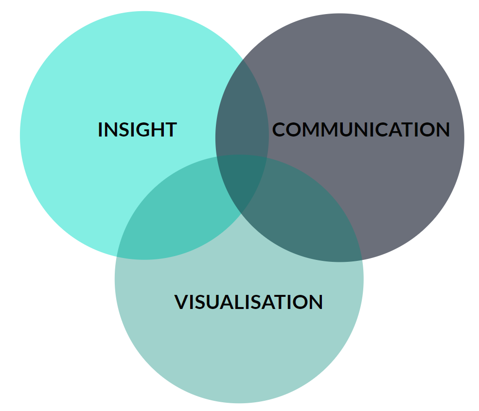
Data storytelling is the art of turning data insights and visualizations into a compelling narrative that drives action.
The three essential components of data storytelling are visualization, insight, and communication. And here’s why:
- Insights that are clear and concise grab your audience’s attention, giving your data story action and purpose;
- Effective data visualization increases your audience’s engagement in your data story, helping to reduce cognitive load;
- Communicating your data story in a structured way provides your audience clarity and confidence in your data story.
Ineffective data storytelling is a symptom of one or more of these components being missed or not considered fully.
When visualization, insight, and communication work together harmoniously within this framework, it results in highly effective data storytelling that engages your audience, builds trust, and, subsequently, drives action.
Why is data storytelling important?
Analyzing and presenting data have become critical components of your role in marketing, making data storytelling an essential tactic regardless of the marketing discipline you operate in.

Focusing on the marginal gains to be made in insight, visualization, and communication will elevate your data storytelling capabilities, leading to increased engagement and action from your audience. In other words, data storytelling helps you and your teams improve marketing performance.
Research suggests the human brain is highly engaged and receptive to stories.
Stories increase cortical activity within the human brain. When listening to a story, you contextualize it to your own experiences and ideas while creating a neural connection with the storyteller. This leads you to feel highly aligned and engaged with the story.
Listening to stories also leads to increased hormone release into the human body.
- Dopamine levels increase, helping you to recall key facts and information within the story;
- Cortisol levels increase, helping you to maintain attention to the story;
- Oxytocin levels increase, helping you develop empathy with the storyteller and the story content.
When you combine the science of storytelling, with your need as a marketer to tell stories with data, it makes data storytelling an essential tactic in delivering marketing performance.
Elevate data storytelling with insights
Data storytelling based on well-crafted insights will grab attention, increasing your audience’s engagement and action.
However, it is common for observations and analysis to be mistaken for insights, leading to ineffective data storytelling and a disengaged audience.
Understanding the differences between observations, analysis, and insight can be thought of as layers that make up a pyramid, which is key to effective data storytelling.
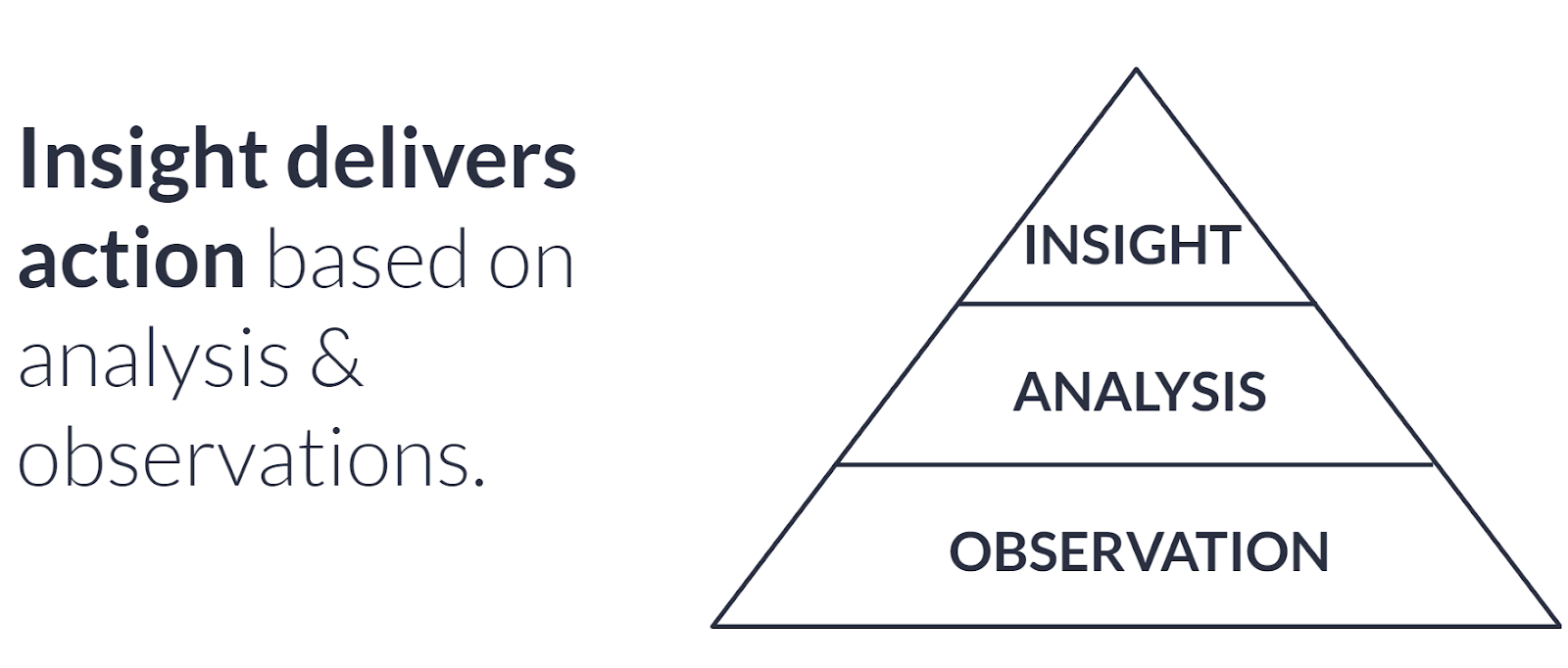
Observations
At the base layer of the pyramid are observations. Observations are factual and state what has happened. Observations can be found quickly and easily through pre-built reporting available within web analytics or marketing platforms.
For example, within the Google Ads dataset, you review brand spend and revenue metrics. You will observe that revenue increases as branded paid search spend increases.
Analysis
The mid layer of the pyramid is analysis. Analysis combines multiple observations to provide context.
Let’s expand the observation above from Google Ads by using the Google Analytics dataset to look at search in totality. When you analyze the total search landscape in Google Analytics, you continue to observe a high level of correlation between brand spend and revenue from total search.
From this analysis, you develop a hypothesis that branded paid search delivers incremental revenue.
Insight
At the top of the pyramid is insight. Insight delivers action based on analysis and observations.
Taking your hypothesis that branded paid search delivers incremental revenue, you decide to run an incrementality test that, let’s say, proves branded paid search delivers $10,000 of incremental revenue. This becomes the insight that shapes and forms your data story.
Understanding the difference between observations, analysis, and insight results in well-crafted insights that grab attention, increase engagement, and drive action from your audience.
Elevate data storytelling with visualization
As the saying goes, “A picture paints a thousand words” and that couldn’t be truer when it comes to data visualization.
Effective data visualization is powerful. A well-thought-out data visualization increases your audience’s engagement and reduces cognitive load.
When data visualizations are ineffective, it is because users rely on the default visualization settings that tools such as Google Sheets or Excel provide.
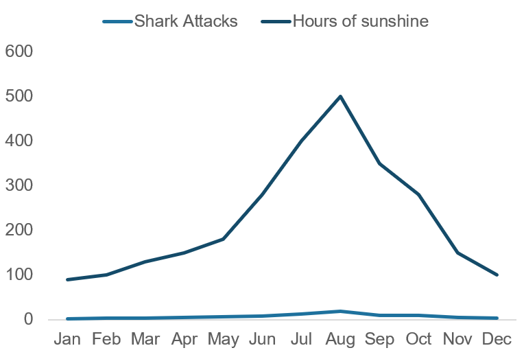
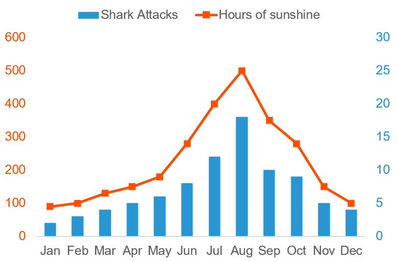
Let’s take the example data visualization below, where you plot two datasets using the default line chart settings in Google Sheets.
As you may be experiencing right now, understanding this visualization requires a high cognitive load, reducing its effectiveness and impact on your audience.
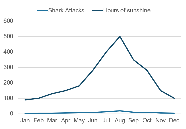
The patterns, insights, and trends in the visualization above are not clear, and your audience will have to work hard to process and understand the visualization, vastly increasing their cognitive load.
The more difficult it is for your audience to understand and process a data visualization, the less engaging it becomes in your data storytelling.
Thankfully, there are simple techniques you can adopt to elevate this visualization to reduce cognitive load and increase engagement among your audience.
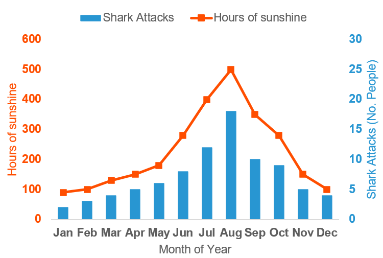
To begin, ensure the background color of your visualization matches the background color of the slide or page on which your visual is being shown. This makes your visualization feel more integrated and creates an initial cognitive shortcut helping to reduce cognitive load in those first few vital seconds.
The grid lines on your visualization provide a distraction, as the additional lines increase cognitive load. Removing the gridlines allows your audience to focus on the trends and patterns of the two datasets, creating another cognitive shortcut.
In your visualization, there is vast scaling between the two datasets, which makes it difficult to process cognitively. By adding a secondary axis to your visualization, your audience can better understand the trend of each dataset and more easily identify patterns or correlations.
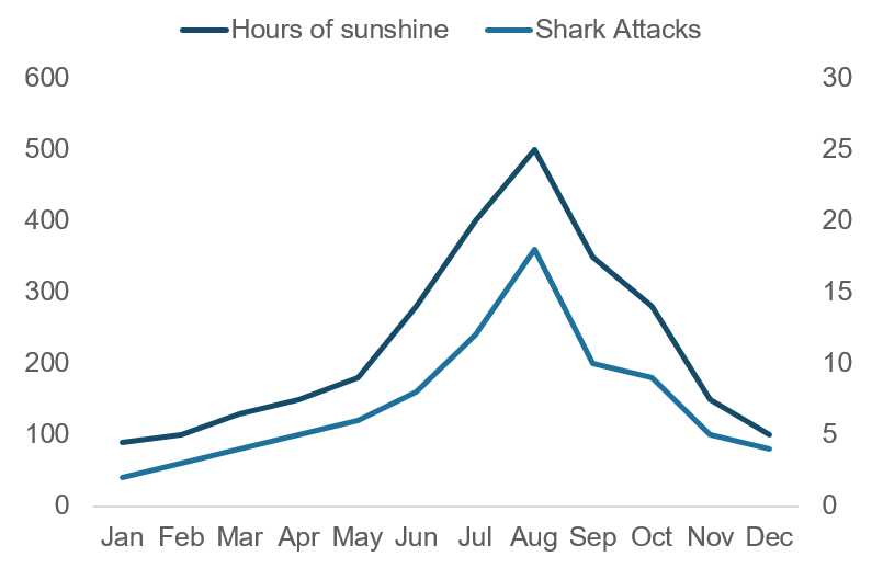
Your visualization now shows two similarly correlated datasets. But it now takes a high cognitive load to understand which dataset is which, as your audience will have to continually refer back to the legend.
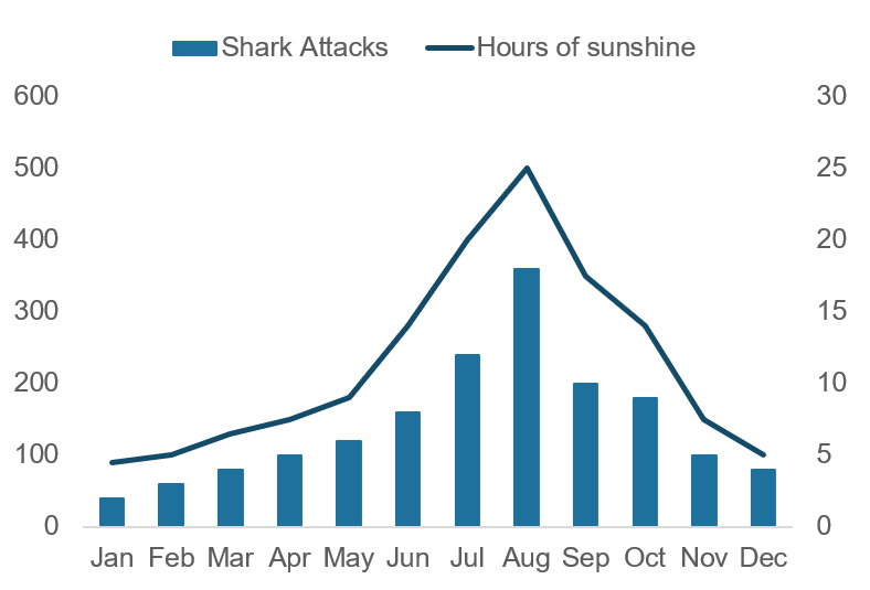
Varying the visualization types is an effective way to create a cognitive shortcut that allows your audience to quickly identify each dataset, while still identifying the strong correlation and patterns.
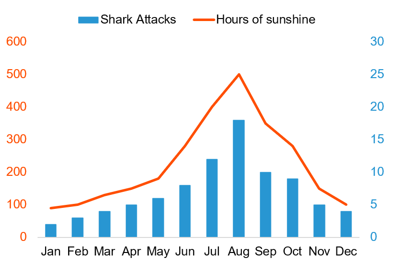
Providing additional distinction using color and color by association is an effective technique to reduce cognitive load.
For example, you associate sunshine with the color orange, so you color the hours of sunshine dataset orange. You associate sharks with the sea and the color blue, so you color the shark attack dataset blue.
Coloring the labels of the axes relative to the dataset they belong to, makes it even easier for your audience to understand the visualization. Anything on your visual that is orange now relates to the hours of sunshine data. Anything on your visual that is blue now relates to the shark attacks data.
For the line chart in your visualization, adding data markers will aid pattern and trend recall.
The human brain loves spotting patterns, so data markers provide another cognitive shortcut for your audience, which increases engagement in your data visualization.
Using labels and bolding effectively helps to provide further clarity on your visual and remove the guesswork.
Ensure each axis is clearly labeled to provide clarity, and then bolding the actual values on your axis distinguishes between the labels and the values themselves.
Don’t be afraid to use a title to land the insight of your data visualization. Use the title to tell your audience what the insight is, and then your data visualization simply becomes a way of evidencing the insight that you have referenced.
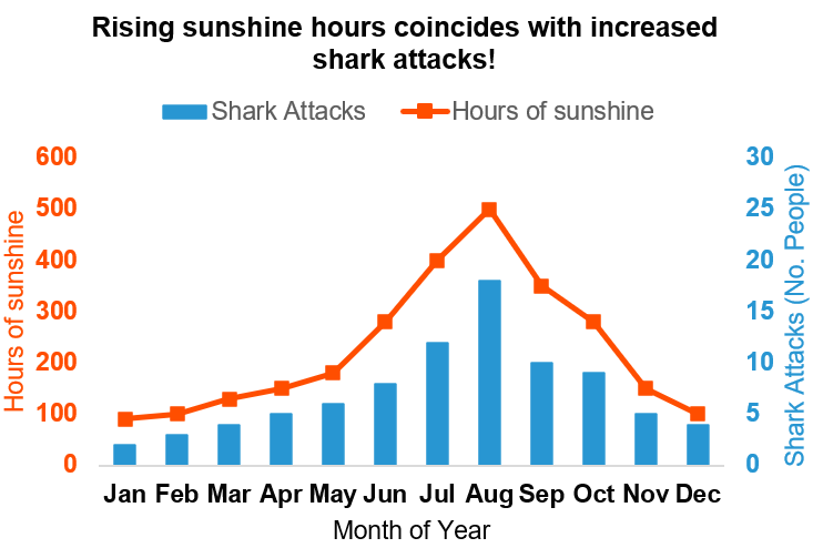
By adopting these data visualization principles, you have significantly enhanced and transformed the data visualization.
The before and after comparisons are very noticeable, as demonstrated below.
Before
After
Both data visualizations have identical underlying datasets, but the way the data is visualized can transform your audience’s engagement, impact, and action.
Elevate data storytelling with communication
The communication of your data story is critical in engaging your audience.
Data stories communicated clearly, concisely, and effectively will be easy for your audience to understand. This, in turn, increases engagement and drives action. However, communication is also the most difficult component of data storytelling to master.
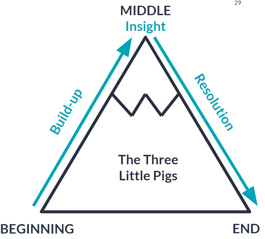
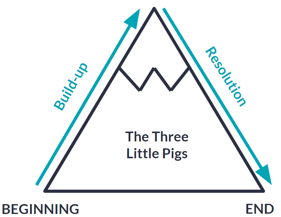
Using the concept of a story mountain is a highly effective way to communicate your data story.
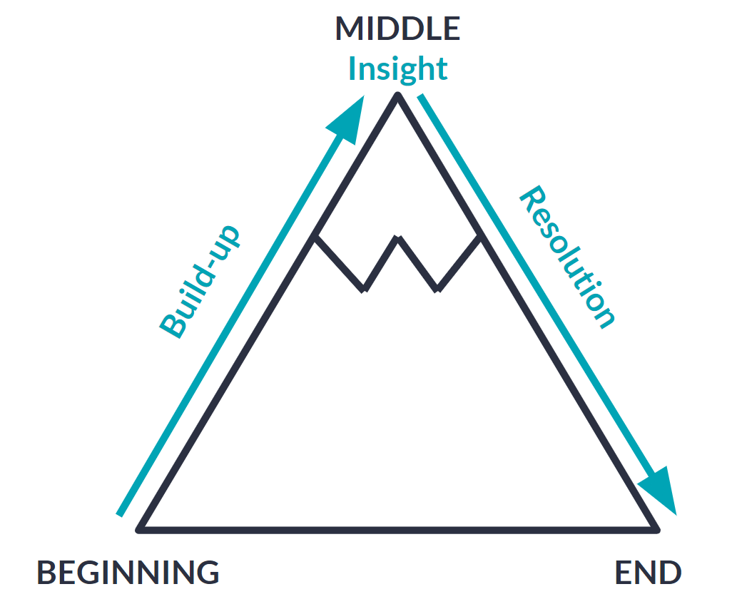
As the saying goes, “Every good story has a beginning, a middle, and an end.” The story mountain concept is grounded in these principles.
There is a tendency to jump straight to delivering the insight when data storytelling, but this leads to confusion amongst your audience.
The story mountain counteracts this by ensuring build-up and context to take your audience from the beginning of the data story to the middle. You then land the insight in the middle of your data story and provide clear action or a resolution to take your audience to the end of your data story.
Most stories follow this structure to enable clarity. Take a moment to think about your favorite story, and it will likely follow the story mountain concept.
The human brain is familiar with the story mountain structure, so using it in data storytelling will resonate well with your audience.
When elements of the story mountain are missing, it disrupts communication, makes your data story lack clarity, and provides a frustrating and confusing experience for your audience.
Let’s use the story of the three little pigs as an example to demonstrate this.
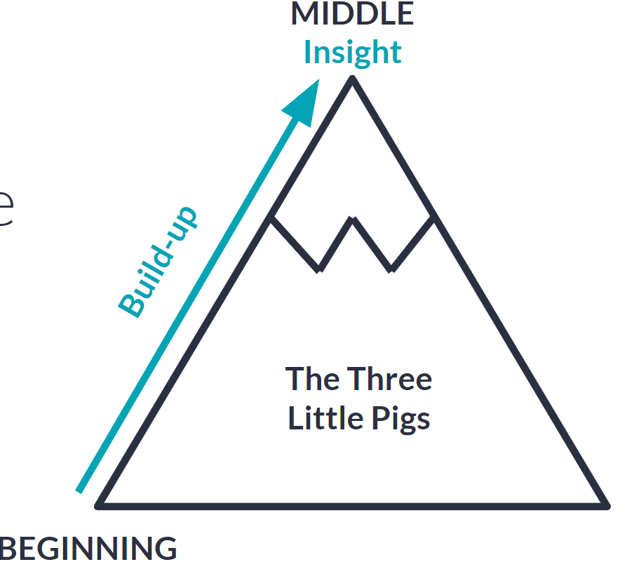
Build-up and context are vital in storytelling. One of the biggest and easiest mistakes you can make in data storytelling is that you arrive at an insight, you get really excited by that insight, and you want to tell the audience about the insight straight away without any build-up or context.
You can easily forget that your audience does not have the context you have as a data storyteller because your audience has not analyzed the data like you have in creating your data story.
When the build-up and context are missing from your data story, it creates confusion.
In the example of the three little pigs, let’s imagine you open your story with ‘the wolf couldn’t blow down the house made out of bricks’ and then end your story with ‘the pigs live happily ever after.’
This version of the story is confusing because it misses context. Your audience does not know the role of the wolf in your story, they do not know the materials that were used to build the houses, and they do not know whether all the houses stayed upright, or whether they were blown down by a gust of wind or by the wolf.
Missing this vital context leads to a confusing story, which, in turn, lowers your audience’s engagement.
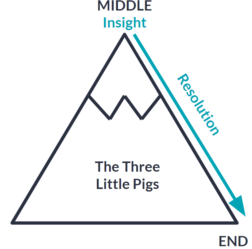
When insight is missing from your data story, it means your story lacks a purpose and an action.
Taking the example story of the three little pigs, let’s imagine you do have your build-up and context. Your audience knows there are three pigs and they are building their houses out of straw, wood, and bricks. They also know that there is a wolf in the story. But you then jump straight to the end, where the pigs live happily ever after.
This version of the story lacks action, purpose, and a ‘so what?’ Your audience will be questioning the point and purpose of the story because there is no insight at the peak of the story mountain. Consequently, engagement in your story will be low. A story without insight is not a story at all.
When your data story lacks a resolution or ending, it creates a sense of frustration for your audience.
Taking the example story of the three little pigs, imagine you do have your build-up and context. Your audience knows there are three pigs and they are building their houses out of straw, wood, and bricks. Your audience also knows that the wolf tries to blow down the houses and is successful in blowing down the houses of straw and wood, but cannot blow down the house made of bricks.
And you end the story there.
This version of the story is going to be a frustrating experience, and your audience is going to have a lot of questions.
What happened to the wolf? What happened to the two pigs whose houses were blown down? What happened to the pig who built the brick house? All these questions and unknowns lead to confusion and frustration amongst your audience, which lowers the engagement of the story.
Using a story mountain enables you as a data storyteller to ensure your story has a beginning, a middle, and an end. Clear and effective communication will provide a positive and engaging experience for your audience. Discover more strategies for improving your communication over here.
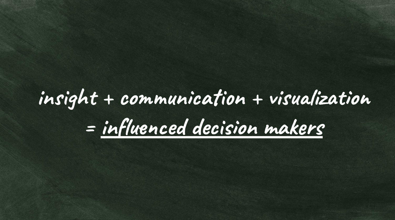
Utilizing data storytelling to influence decision makers
Utilizing the data storytelling principles of insight, communication, and visualization is a winning formula to build trust and influence decision makers.
When any of these principles are missing it creates a lack of clarity, casting doubt and reduced trust among decision makers. This makes it difficult for decision makers to exert influence with confidence.
Compelling data storytelling takes decision makers on an engaging journey, enabling them to develop clarity, trust, and confidence which will drive influence and action toward a specific goal or destiny.
Let’s imagine your business has a comprehensive dashboarding suite, built within a platform such as Looker Studio, Power BI, or Tableau. Your dashboarding suite provides decision makers a solution to visualize performance KPIs in a consistent and uniform way, with all the information they need at their fingertips.

This consistency and uniformity in visualization provide clarity, building trust and influence across decision makers. But it is not the complete solution.
Each decision maker will have a different perspective on the insights from your dashboard, and each will have different styles of communicating these insights to your business.
This creates many inconsistencies, leading to a lack of clarity which creates doubt and reduces influence among decision makers, preventing action from being taken.
This is where the role of data storytelling comes in. It starts with creating clarity, consistency, and trust in the insights being extracted from your dashboard suite.
This happens when you combine the depth of expertise of your channel experts alongside the breadth of capability of your analytics specialists. This trusted combination ensures clear, coherent, and consistent insights based on robust observation and analyses.
With visualizations in your dashboard suite resonating with decision makers, and clarity gained in the insights being drawn from your data, the final piece of the data storytelling puzzle is to communicate this in a way that takes decision makers on a journey towards your desired actions and recommendations. Analytics specialists typically communicate insights back to decision makers, as their role in the process is seen as unbiased and impartial.
Communication is often delivered using a story mountain, where data storytelling is built on a foundation of build-up and context to set the scene, robust insights to grab attention, and clear recommendations and resolutions that influence action and change.
Data storytelling ultimately builds trust and confidence amongst decision makers, influencing them to follow your recommendations to drive action and change in a way that is simply not possible through a dashboarding suite alone. Improve your persuasion to enhance your storytelling to influence decision makers, can be found here. Discover additional insights on improving your persuasion and storytelling to influence decision makers here
Decision making is just as much about the journey as it is about the destination. Data storytelling can be seen as the map that guides and influences decision makers toward a desired destination or endpoint.
Engage audiences and drive action through data storytelling
Effective data storytelling is a crucial skill for marketers of all disciplines.
Effective data storytelling happens when the core components of insight, visualization, and communication work together in harmony.
Understanding the difference between observations, analysis, and insights will result in well-crafted and effective insights that will provide the foundation for your data story.
Investing the time in improving your data visualizations will ensure your audience is engaged with your data story.
The impact of an effective data visualization is significant, as demonstrated below:
Before
After
Using the story mountain concept will ensure a clear communication structure, with your data story having a beginning, middle, and end.
A well-structured and clearly communicated data story will inspire confidence, clarity, and engagement in your audience. Data storytelling is also effective in providing clarity and trust to decision makers, taking them on a journey that will influence action and change based on your insights and recommendations.
Making these marginal gains in the areas of insight, visualization, and communication will elevate your data storytelling capabilities while engaging and driving action amongst your audience.
Data storytelling done well and effectively will result in an enjoyable and enriching experience for both you as a data storyteller and your audience.
Ready to take your skills to the next level?
Check out our Guide to Storytelling: How to Captivate Your Audience or enroll in our Become great at storytelling course to sharpen your delivery and engage more effectively with your audience.
Related Posts
-

Do you need to be a big company and need large volumes of traffic to be data…
-

You have your CRM, web analytics, email marketing tool, payment processors, survey tools and so…
-

Over the last years, Google Data Studio has evolved from an appealing but clunky application…
-
What is the most common problem with websites? What should you change? Make better decisions…