
The endgame of optimization begins when the local maximum has been found for the most relevant pages on your website. At this point, uncovering more gains can become a greater challenge.
How can you deal with such a scenario?
The first thing to realize is that this is not a typical situation to be in.
Most businesses are still learning their way around the fundamentals. Despite the rise in popularity in the recent years, growth optimization is a fresh discipline as far as online marketing goes.
Even companies that have the internal knowledge and firepower to run continuous optimization initiatives can reach a dead end and start having troubles to keep growing beyond the law of diminishing returns if they rely solely on traditional approaches.
This article is meant to help you expand your optimization arsenal and give you ideas to push beyond the current limits of your optimization tactics. I will share three methods I found good success with when scavenging for uplifts in highly optimized digital properties. All three come with their own templates for implementation.
Table of contents
Method #1: Optimize for customer lifetime value
Seasoned experts suggest that you should optimize for a metric which can affect the bottom line of your business. A number capable of signaling growth, like absolute count of conversions, conversion rate, total revenue, revenue per visitor, cost per acquired customer, among others.
These metrics ensure that most of your efforts can be tied to monetary values. Uplifts in your KPI would mean that at the end of the day your company is more successful than before.
Focus on long-term effects
However, even with such good metrics as your northern stars, you might still miss out on potential long-term value that could be added to the business. The downside that all those metrics have in common is that they only measure the short-term effects gained with your tests.
Optimizing for customer lifetime value (LTV) remedies that by offering you a broader view on how much monetary utility a customer can bring over a more extended period of time, as opposed to the more immediate results you expect to observe with tests aimed at improving traditional KPIs.
Pick a model to calculate customer lifetime value (LTV)
The first step is to decide on a model to measure the current LTV of your existing customers. There are good examples around that are simple to use and will arm you with everything you need to start tracking this metric.
Google Analytics offers a lifetime value report out of the box for those who want to go this route as fast as possible. It comes with limitations (e.g.: the model only projects the LTV up to 90 days into the future), but it’s still one of the most accessible ways to get started into the LTV world.
Implement user ID tracking
Since you will be monitoring the behavior of people over a longer time frame (their entire lifespan as customers of your brand), you will need a reliable way to keep track of this data.
Google Analytics is a good example to illustrate why this is a concern. The tool relies on cookies to determine what a “returning visitor” is – this is a fragile structure as people can delete cookies at any point in time and, in doing so, they will show up as new visitors in your reports.
Imagine the same person comes to your website and buys from you repeatedly. Without the aid of user IDs, Google Analytics will see one new visitor every time this person deletes their cookies and then comes back to your website again. All the experiences prior to the cookie deletion will not be used in the calculation of the CLV.
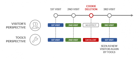
Most tools will not be capable of identifying the same user across different devices or browsers, diluting the value of customers who have multi-device journeys.
Given those trade-offs, the best practice is to match customer data to user IDs in order to calculate lifetime value. Emails can also be used as identifiers in cases where your website doesn’t offer users an interface through which they can log in.
Not having user IDs is not a complete deal breaker though. You can still optimize for LTV using cookie-based data, but the numbers you’ll see will be less reliable.
Create customer segments according to purchase behavior
Optimization for long-term effects promotes different results if compared to optimization focused on traditional short-term metrics. With LTV as your KPI, tests will create ripples that you may only see in the future.
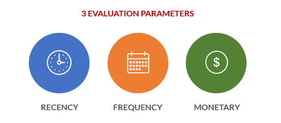
Segmenting your customers into cohorts can be useful to track and capitalize on those effects. This can be done in many ways – one of the most flexible and simple to understand is the RFM analysis.
RFM is an analysis model created to group customers according to three parameters evaluated across the span of the last 12 months:
- The recency (R) of their last conversion, usually measured as months;
- The frequency (F) with which they convert, also measured as months;
- The monetary value (M) they generated so far for your business in their lifespan as customers.
How RFM splits your customer base into cohorts
Your customers get evaluated and receive scores for each parameter using data from the last 12 months. Every customer is then assigned to a tertile (a bin containing 33% of the total population) according to the numerical scores they received in the parameters.
The scores for each of the three parameters range from 1 to 3, with 1 being the best score (assigned to the top 33% customers for that parameter) and 3 being the worst (assigned to the bottom 33%).
The individual customer scores for each parameter are then concatenated, becoming a sequence of 3 numbers: the recency score, the frequency score and the monetary score (R-F-M). This concatenation will create the cohorts.
RFM cohort examples
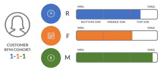
Example #1: A customer who is in the top 33% for all three parameters would belong in the “1-1-1” cohort.
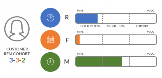
Example #2: Another customer who’s in the bottom 33% for Recency and Frequency, but in the top 66% for Monetary Value, would then go to the “3-3-2” cohort.
Interpreting the cohorts
The customers in the 1-1-1 cohort are supposed to be your best ones. They are in the top 33% of your customer base for the recency of their last purchase, the frequency with which they buy from you and also for the amount of money they spend with your company.
On the other end of the spectrum, 3-3-3 should represent your worst cohort, the bottom 33% in each parameter. Those customers haven’t converted in a very long time, don’t convert frequently and didn’t spend as much money as others.
Cohort cutoff decisions
It’s a common practice to use quintiles instead of tertiles for RFM analysis. This creates cohorts with higher granularity, allowing you to conduct more detailed analysis for each, but the downside is that you’ll also have more cohorts in your hands to analyze. Tertiles are a good starting point because the end result is more straightforward to deal with.
To illustrate: using cutoffs on tertiles, you end up with 3*3*3 = 27 cohorts, a number that should be manageable for most businesses. Using cutoffs on quartiles, you get 64 cohorts. Quintiles give you 125 cohorts. Running in-depth analysis on such a big number of groups is not feasible for most teams.

Remember that just attributing scores to each customer and building the cohorts is not enough. You will still have to dig into them and figure out which ones to address and how to do it.
The more cohorts you have, the more work will be required to maintain an analysis process that makes good use of the information they provide. This does not mean you should never do it – companies with a significant amount of customers may benefit more from a more microscopic approach with more cohorts, even if it takes more effort to do so.
Understand what cohorts have the highest LTV
Your RFM cohorts will be complementary to the LTV numbers that the model you chose before (or Google Analytics) is giving you. Theoretically, customers with the highest LTV values should also be the ones in the best RFM cohorts, but it doesn’t always play out like that.
The cohorts can be explored for different insights, but some can help you make money more quickly than others.
Start by ordering your list of customers by lifetime value. Then check to what cohorts the 10% of your customers with the highest lifetime value belong. Those cohorts are an indicator of the purchase activity behavior that your most profitable customers have.
Finding repeatable patterns
Now you need to find patterns in those cohorts for each of the RFM parameters. This will generate some rules of thumb that can be used to craft future tests and campaigns capable of making customers in different cohorts replicate the same purchasing behaviors of the customers in the most profitable ones.
With Recency, you can find the optimal window of time that can pass between conversions in order for customers to achieve high lifetime value. Use this information to create campaigns and optimization experiments that can convince people to convert again within this window.
This can be done in many ways: activation via email / push notifications with relevant content (to get people to visit your platform and potentially convert); limited promotions for customers who are close to leave the timeframe threshold between conversions; exclusive offers with items these customers previously added to their shopping carts, amongst others.

Frequency shows trends in the number of times valuable customers buy from you. Dive into the purchasing history of those customers and try to find patterns in what they’re buying. What do they do that is different from customers who don’t purchase as often? What kinds of promotions do they react to?
You may find out that the optimal strategy is not always to promote items with a high average ticket, but instead get people to do smaller transactions, keeping them active and converting repeatedly.

Connected to that, Monetary Value will define the ticket size in the selection of offers you should present to your customers. Try to find out what is the average ticket size in the transactions from long-time customers that have high Monetary scores and good lifetime value – this will help you understand the buying patterns that can be replicated for other customers.
Customers with high scores in the Monetary parameter will not necessarily be the ones with the highest lifetime value. It’s possible that a customer bought from you a couple times, spent a lot of money and have a big Monetary score because of that right now, but if he/she never comes back to buy again, that won’t translate into high a lifetime value.
Adding navigation data to the analysis
You now know:
- The optimal window of opportunity to get a user to the highest LTVs;
- How often the most profitable customers purchase from you;
- What is the optimal ticket size you should try to push for each cohort…
…but the behavior your visitors have when they navigate your digital properties to trigger those RFM patterns is still unknown.
Here’s a set of questions you can try answering after exploring the RFM segmentation to connect what you observed there to what is happening on the pages of your website:
- What are the navigation patterns of the customers with highest LTV?
- What is the one action users do that has the strongest correlation with repeated conversions?
- Are there patterns in the actions of customers who are about to churn/belong to cohorts with low lifetime value?
- How many touch points with your growth funnel do the customers who converted twice have?
- What were those touch points?
- What about customers who converted three / four / five / N times?
- What customers are more likely to react to a promotion?
- What customers are more likely to buy in bulk given a certain trigger?
- What types of promotions/offers have the highest chance of making a customer buy on the fly, regardless of ticket size?
- How many times, on average, do the most profitable customers visit your platform?
- When they visit, what are the most common pages they go to?
Push more customers into the profitable RFM cohorts
You now have a more developed notion of what the conversion patterns of your most profitable customers are like. You identified the user journeys in your pages that net you the highest lifetime value.
This information can be used to create experiments throughout your entire growth funnel that will get more customers to replicate the patterns you learned.
This draws a close resemblance to the growth marketing concept of the “a-ha moment”, but instead of speeding customers to the point in the journey where they realize the value in your product, you’ll find the right triggers that make users come back and fall into the profitable patterns the RFM model helped you identify.
Short-term vs Long-term profitability
Optimizing for LTV could mean you will make less money in the short-term. It’s possible, for example, that users who have lower monetary values attributed to their initial conversions will be the ones who will become repeated buyers in the future. Their behavior translates into less revenue now but will become gradually more profitable over time.
Whether this is something desirable for your company or not depends on your goals. Short-term vs long-term profitability trade-offs need to be evaluated on a case-by-case basis.
LTV optimization adds value to your entire funnel. It promotes higher order effects. Including this in your arsenal will expand the options you have for long-term optimization initiatives.
The RFM analysis template
You can get it here. Remember to make a copy of it for yourself.
The template contains two sheets:
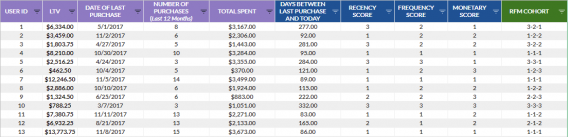
“User Data & RFM Scores” Sheet
This is the sheet where you will plug all your customer data to get the RFM scores. It’s where you see in what cohort each of your customers falls.
Dummy data was kept to make the usage easier to understand – delete the values in the purple columns before you start using the template.
In column L, towards the right side of the document, you’ll find instructions on how to insert your data to get the cohorts. For each customer you will need:
- The user ID
- Lifetime value (gotten from your model of choice or Google Analytics)
- Date of last purchase
- Number of purchases
- Total money spent
Plug the data into the Purple fields, and the other fields will be automatically calculated.
“Overview” Sheet
Contains the distribution of your cohorts, with how much they represent of the total and what is the average LTV for each. Use this to identify your most profitable groups.
Method #2: Track and mitigate uplift decay
After tests are finished, it’s common for optimizers to conduct analysis in order to understand the results, document the learnings and proceed to take the necessary measures to roll out the tested variant in case it was a winner.
With that part done, the preparations for the next experiment in the pipeline already starts. Repeatedly going through this cycle results in missing the fact that sometimes the uplifts found in the tests are not permanent.
This deserves attention since it eats your gains in the long run and could be harmful to your optimization program.
As an example, this is how the outcome of two separate tests that I ran last year for pages of an e-commerce looked like (both were statistically significant at 95% confidence level):
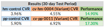
With such results, both variants were immediately rolled out.
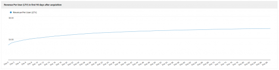
Uplift decay after rollout
The control page was kept online for a tiny fraction of the traffic even months after the test winners had been rolled out. This made it possible to compare the performance of the optimized variants versus the pages they had beaten months before.
To make a similar comparison, rerun the exact same test setup where you found the winner whose performance declined over time.
You will lose the ability to see the performance variation over time, but you’ll still have a picture of what’s happening right now. What matters is whether the winning variant can still beat control sometime after the rollout.
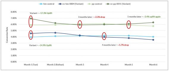
As shown in the chart, the conversion rates were not looking so good anymore five months after the initial test results. The added performance started vanishing on months 3 and 4. Variant cv-hm-0004 (the dark blue line) never recovered from the dip.
No other relevant variables in the growth funnels had changed after the winning variants went live. There was no apparent reason for the performance to go down.
Why did uplift decay happen regardless and what could have been done to mitigate it?
Novelty effects
If you suspect that a winning variant is not performing as it should, the first step is to rule out novelty effects.
Promoting changes in pages can make the experience feel fresh for your visitors, but this feeling fades away with time. Your audience might already be used to the old version and their reaction to some elements in a variant could be happening just because what they see is different from what was there before.
Segment your results by splitting the audience into new vs returning visitors. If novelty is causing the effect, new visitors should be immune to it, and it will show in the numbers.

Imaginary uplifts
Ensure that the statistical parameters and the duration of your test have been properly calculated. Follow at least the most common best practices: run your test in full business cycles, keep your significance level at around 95% if you have the traffic to do so and wait for the necessary sample size to be reached (statistical significance is not a stopping criterion).
Tests that violate best practices can end up generating imaginary uplifts. This is a case where the gains were never there to begin with – it just seemed like it because you didn’t collect enough samples or didn’t respect other basic testing rules.
Technical implementation
If your process involves building and testing your variant using a page builder from tools like Unbounce, verify the technical implementation of the variant when it’s being tested versus when it goes live.
When you use your own technology stack to rebuild winning pages before rolling them out permanently, the versions you build must look identical in the front-end when compared to the versions that were tested. Otherwise, you could introduce confounding effects that may become the cause for performance decay after rollout.
Environmental factors
Look for environmental changes that could be responsible for the decay. Some items to check:
- Are there any indications of shifts in customer behavior?
- Did you acquire new audiences after the test rollout?
- Is it possible that something is not working correctly from a technical perspective?
- Have any new competitors entered the market or started campaigns?
- Are the previous and next pages in the journey still the same as when you initially ran the test?
- Where there any other tests running at the same time? Could they have influenced the results?
Follow-up decay test and analysis
If you already made sure that these factors are not the cause, categorize the occurrences where uplift decay was observed. You will have to build a structure that enables you to spot and learn from patterns.
Answering all points in the list below for every variant where decay happened will help you think critically about the potential reasons behind the effect:
- Decay research
- How much performance (in %) was lost from the time the winning variant went live to the time when the follow-up test ended?
- What was the time gap between the original test and the follow-up test?
- Is the decay steeper for tests in specific pages/touchpoints of the funnel?
- Were any micro-conversions / other steps in the funnel also affected?
- Did the average time spent on page change dramatically?
- Test features research
- What page was affected by the winning variant?
- What elements were affected by the winning variant?
- Do other winning tests for similar pages / elements also show such decay?
- What part of the conversion journey did the test affect?
- Did other tests that affect the same part have a similar decay?
- Is the journey to a conversion the same as it was when the test won?
- What emotional drivers were affected by the test (if any)?
- Can you spot decay trends for other tests where similar drivers were affected?
- Audience (demographic and behavioral) research
- Were any new marketing channels introduced in the acquisition initiatives after the test roll-out?
- Is the decay the same for different user segments? Check:
- Region
- Browser
- Device (more journeys starting on mobile after the test rollout is a common culprit)
- Time of the day
- Traffic sources
- RFM cohorts (if you have them)
Your approach to decay analysis will be heavily shaped by the context in which the decay is happening.
You won’t always get a clear answer to explain why the performance of a winning variant decreased over time, but documenting the findings from those questions can bring patterns to the surface, which you can take into account when designing tests in the future in order to make them more resistant to decay.
The uplift decay analysis template
This template will help you organize your follow-up tests when you identify uplift decay. Click here to get the file. Make a copy of it for your own use.
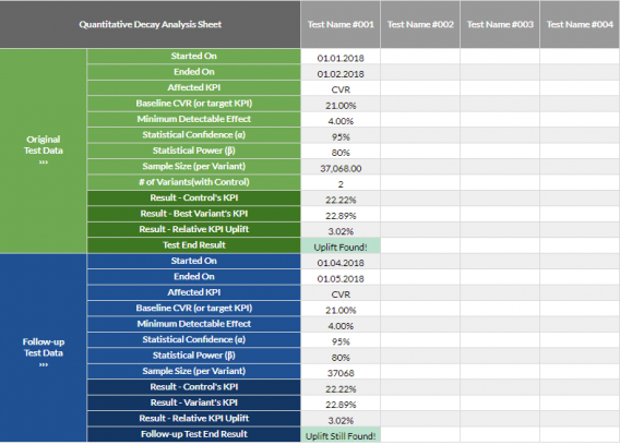
You will find two sheets (tabs) in the file: one for quantitative analysis and a second one for qualitative analysis.
In the quantitative analysis sheet, fill all the parameters for the original test and for the follow-up test. Having them laid out in their proper fields will assist you in understanding how different the performance from now is from when the original test run happened.
In the qualitative analysis sheet, you’ll find the exploratory questions to help you uncover patterns in the variants that showed decay. It can be difficult to see trends you can capitalize on when you only have one test in there, but patterns will gradually become more visible as you conduct more follow-up tests.
Method #3: Optimize competitively
Your brand is being compared to competitors all the time. It’s inevitable that customers who buy from you will also buy from other brands every now and then.
Analyzing pages in competitor’s websites is a powerful way to throw some light onto the problems these competitors are trying to solve. There’s a chance that they found solutions you didn’t think of for specific parts of their conversion funnels.
This is a fertile soil to get test concepts from. Maybe you can successfully replicate some of the solutions your competitors implemented in their pages, fueling your backlog of ideas with some new material and potentially saving research time.
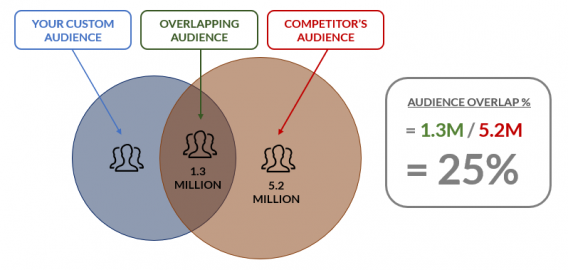
If you consider a brand to be a competitor, this probably means that your audiences overlap to some extent. This overlap can be used to help you determine what competitors you should analyze in more detail – you want to be sure that the solutions you’re looking at have good potential to work for your audience too when used for inspiration to create tests in your pages.
Measuring audience overlap
Let’s start with audience overlap. We’ll use that as a criterion to pick what competitor or group of competitors to analyze.
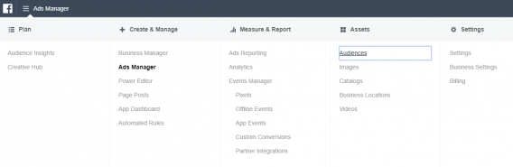
To get a feel for how much of your audience is shared with a competitor, one tactic you can employ is to use Facebook’s audience overlap tool. Note that this will only work if the competitors you’re analyzing also have a public Facebook page.
Here’s how you do it:
- Go to your Facebook for Business account and into the Audiences interface.
- Import lists of contacts you gathered before into Facebook as audiences. Lists of remarketing targets or newsletter subscribers are good examples to be used here. If your company has an active profile on Facebook or Instagram, you can build an Engagement Custom Audience with the followers and use that in your evaluation too.
- Now create a new ad. The ad won’t run, you’ll just need the options that are available in the ad creation screen.
- Skip all the settings and go directly to “Detailed Targeting.” Type the name of your competitor and select their name from the drop-down (don’t pick any of the specific interests like “Owns: iPhone 6” in the screenshot below).
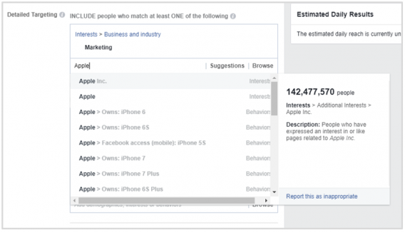
- The number on “Potential Reach” will be updated. Write it down. This is the size of the competitor’s audience on Facebook.
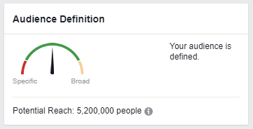
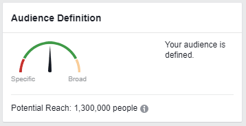
- Now, while still inside the ad creation box, find the “Custom Audiences” section and add the Audiences you built on step 2.

- You’ll notice the “Audience Definition” number on the top right will change. Write it down again. This is the number of overlapping people between your competitor’s audience and your own.
- Now, divide the size of the overlap that you found in step 7 by the size of your custom audiences.
In our example, this would mean dividing 1.3 M / 5.2 M. The ratio you’ll find is the estimated percentage of overlap between the audiences of your brand and this specific competitor’s. In our case, 1.3 M / 5.2M = ~25% audience overlap.
This method comes with some caveats. One of the biggest is that you can’t use it unless your competitors have a presence on Facebook. Still, it’s a cheap and quick way to at least give you a ballpark that you can use to decide what competitors are worth your time.
Alexa recently launched a tool that can evaluate the amount of overlap with your competitors too. It has a 7-day trial you can use to test in case the Facebook tactic did not work.

Why calculate audience overlap?
The more your audience overlaps with those of your competitors, the more likely it is that ideas they implemented can also work for you. My rule of thumb is that if the overlap with the audience of a competitor is of at least 10%, I’ll have a look at their website and see if I can get ideas to test.
If this process nets one variant that works for roughly 1 out of 10 visitors of the website, there’s at least potential for that idea to be explored differently. The learnings could be adapted and transformed into global changes capable of bringing uplifts for the rest of the traffic.
Be aware that not everything is meant to be copied. Your competition makes mistakes too. Do your homework on competitive analysis to avoid getting inspiration from bad sources.
Selecting competitors to get test ideas from
Based on the overlap data you just calculated, pick a competitor from your list, the one you feel is doing the best job with their website. Find a page you have in common (e.g.: the homepage, product pages for e-commerces, “about” pages for blogs, etc.)
Give preference to pages with many differences between your version and the version of the competitor. Those will give you more ideas for tests where you change many elements at the same time, with a higher likelihood to generate bigger impact in your target metrics.
Finding useful elements for test inspiration
In order to learn from competitors, you’ll have to assess a series of quantitative and qualitative features on their pages. Check elements like:
- Count and characteristics of buttons
- Other interactables
- Count and choice of words
- Forms and form fields
- Images and videos
- Content blocks, their structure and how they are organized
- CTAs
- Emotional drivers
- Themes and styles
The downloadable template at the end of this section will help you with this evaluation.
Having decided on a set of elements from the competitor’s page to use for inspiration, create a new design (variant) of the page you want to test implementing all the ideas your competitor gave you. Then set up the variables in your tool of choice and run the test.
Test analysis
When the test is finished, evaluate and segment the results to look for more details. You may need to plan for this before running the test as there are many pitfalls to be avoided.
Ask yourself why your competitors’ approach worked or didn’t work for the audience you’re analyzing. This will bring learnings on how to communicate with different groups of users – you can use the RFM cohorts for that evaluation too.
Similar to the uplift decay analysis method, it can be difficult to say something about the “whys” behind the results with just one test based on competitors’ ideas. The more competitor-inspired tests you run, the easier it will become to uncover uplift patterns that can be generalized to your entire audience.
This procedure can be repeated for all your most important site sections. Don’t limit yourself to just one competitor – analyze all known players whom you consider to be direct competition.
The competitive optimization template
You can get it here. Don’t forget to make a copy for yourself.

Select the pages you want to analyze in more detail, paste a screenshot of them and fill the blanks that go below the screenshot. The template file contains a sheet with instructions on how to fill it.
In the quantitative analysis, you will mostly be separating the elements that exist on the page you’re observing and counting how many of those elements are present. This can be very useful to expose differences that are hard to notice without any structure to do so.
The qualitative analysis helps you think about the emotional motivators, choice of words and any other mechanisms being used on the page to get visitors to successfully complete the tasks the page is meant to enable. Write as much as you see fit for each of the evaluated criterion.
Conclusion
No matter how far you go with growth optimization, there’s always something new to be done. My goal with this post was to illustrate some non-orthodox ways to push beyond the limits of your current optimization program and find growth through different means.
You’ll have an easier time implementing the methods in this article if you get the free templates that were created for each. All of them can be downloaded on this page. If you have any questions or thoughts on the topics presented here, please leave a comment below.
Related Posts
-

Testing in an enterprise is truly a team sport. If a testing program was a…
-

Conversion optimization is hard; it’s constantly changing and you need to know a lot about…
-

You're working to increase your online profits, and you perform conversion optimization. That's great. But…
-

Learn how to run conversion optimization experiments the right way. In this video, I sit…


I’m diggin’ your breakdown of the Facebook’s audience overlap tool, André. I have never seen a visual aid as good as yours actually, so now I’m intrigued to test out the waters myself – even though social media marketing is not my department.
But to be a great marketer, you’d gotta know a little about a lot sometimes. Am I right?
Thanks JL, glad you liked it!
Don’t be afraid to get your feet wet with the audience overlap tool. Except for a couple spots here and there, I think Facebook has made it rather intuitive.
And I agree – the best marketers I know are T-shaped, having solid fundamentals in almost every core discipline while being masters in one or two.
Andre, the competitive template is great. We have a benchmark routine over at my company and the structure you suggested will really help us a lot since it is so simple to use. After a brief test we already found differences in how we created some pages compared to how competitors did theirs, which got us some test ideas to try.
Do you think the template still works if we use it to compare app layouts instead of pages???
I have to say your idea for the audience overlap tool is brilliant, there’s so much you can do with it. I checked what happens if I plug in some competitors that we constantly have to worry about and the overlap was greated than 20% for all of them (>70% with our main competitor). I don’t think it’ll work all the time but it’s for sure a great filter to have, even more so if you have many lists to upload.
Thanks so much for the post.
Thanks, Melissa! I’m happy your company is making good use of the methods :)
The competitive optimization template will still work fine for app layouts.
However, I think the placement of elements needs to receive more attention in that scenario. Mobile devices are used in all kinds of crazy ways and there’s almost always a finger covering a part of the screen when an action has to be taken (other than just reading).
I recommend that you use a real mobile device to look at the pages instead of simulating the smaller resolutions on your browser. It will help you get a better feel for what users deal with when they navigate the apps you’re looking at.
For the quantitative analysis, my initial suggestion was to measure the vertical length with the Chrome add-on “Page Ruler”, but that won’t work on mobile. You can use an app like “Pixel Ruler” instead.
I find it useful to check the length between the top of the screen and the element where the most important action can be performed (e.g., the “Add to cart” button). I found uplifts in the past by making that distance consistent throughout the user journey. This way you condition users to always know what part of the screen they have to look at / tap when they want to proceed to the next step.
You’re right about the audience overlap tool – it won’t work for everyone, but it can be very powerful when it does. Glad you liked the idea!
Hi André,
I like your thoughts on the topics and they help us to improve our conversions.
Thank you very much for your report!
Best,
Dennis
Thank you Dennis! I’m glad you found it helpful :)
I think that might be the best CRO article I’ve read in the last year. Really enjoyed that and am sharing it with my entire team.
I really appreciate it Andrew, thanks for sharing the article with your team too!
The first step is to decide on a model to measure the current LTV of your existing customers. There are good examples around that are simple to use and will arm you with everything you need to start tracking this metric.