
The m-commerce share of total e-commerce spending continues to grow at a steady pace. In the US, as many as 71% of total digital minutes are spent on a smartphone or tablet. In Indonesia, 91%.
All of which confirms that launching dedicated mobile lead generation campaigns is no longer an option but a necessity.
This post will discuss how one online retailer used mobile popups to start targeting and converting their smartphone visitors, what strategies they’ve used and which ones delivered the strongest results.
Table of contents
What’s the Size of the Current Mobile Opportunity?
Fact: We live in a primarily mobile world.
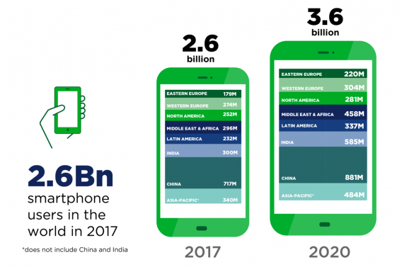
Over 2.6 billion of us already own a smartphone (this figure does not include China and India). And in the next two years, the number of global smartphone users is supposed to reach 3.6 billion.
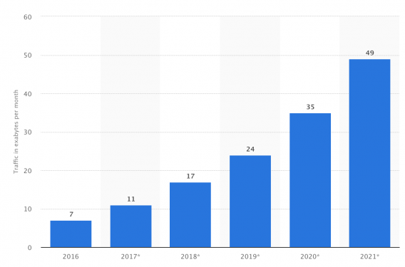
And we’re not shy to use those devices a lot. Statista predicts the global mobile traffic to grow at an astonishing rate.
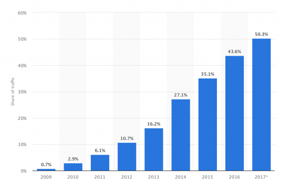
Similarly, traffic to web pages served to mobile devices is already high and growing fast.
In fact, as Nick DiSabato pointed here on CXL a couple of months ago:
“[…] all internet traffic growth came from mobile last year.”
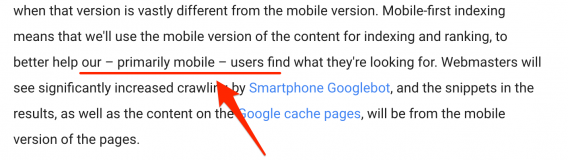
Even Google signified the importance of the mobile market to me in one of their announcements, in which the search engine openly referred to their users as primary mobile.
All of which signifies that mobile visitors offer an incredible business opportunity.
- They are already accustomed to their devices,
- They also feel comfortable with initiating (and often completing) a purchase on a smartphone,
- And are willing to engage with brands on mobile devices too.
However, there is a problem.
From conversations with customers, support emails we receive and general feedback we can see that converting smartphone visitors into leads proves continuously challenging.
Why is mobile so challenging for marketers?
I’m sure you’ll agree with me on this:
Strategies for capturing emails on the desktop are quite mature at this stage (not to mention oversaturated and significantly less effective, compared to only a few short years ago.)
It doesn’t matter if it’s a popup, slide in, landing page, some lead magnet strategy, we already know what works and even how to boost those results even further.
And that’s regardless of the market, product, and countless other factors that differentiate one business from another.
Mobile traffic, however, presents an entirely new set of challenges.
Screen size is one.
Smartphone screens offer an incomparably scarcer real estate that desktops or even tablets.
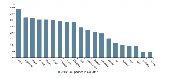
For example, the most common screen size is still 780 x 1280 pixels.
As a result, the amount of space you have available for your lead capture campaign is tiny.
In fact, considering that Google’s recommendation for mobile popups to take no more than 25% of the screen, then on an average screen, they should be no bigger than 320px high.
That’s the entire space you can devote to:
- The headline,
- Additional message,
- Any visuals you might want to include, and
- The opt-in form.
Lack of comfortable input device is another.
Smartphone keyboards are hardly an input device customers prefer.
That’s the conclusion of research conducted by Amanda L. Smith and Barbara S. Chaparro, published in The Journal of Human Factors and Ergonomics Society that analyzed the performance and perceived usability for five smartphone text input methods – physical Qwerty, on-screen Qwerty, tracing, handwriting, and voice.
The researchers concluded:
“Both younger and older adults preferred voice and physical Qwerty input to the remaining methods.” (source)
Nick DiSabato points to a similar factor. He writes:
“There are numerous barriers [to conversion]: shipping, payment, and filling out forms are all harder to parse and act on.”
Network speed plays a huge role in lower conversions.
Connection speed affects user experience too.
(And let’s face it, for many of us, mobile bandwidth still lags behind fixed broadband.)
Finally, the user behavior on mobile is different too.
Smartphone users tend to multitask, and their attention span is much shorter.
But as it turns out, often, it’s the device itself that causes interruptions.
As researchers, Henry H. Wilmer, Lauren E. Sherman, and Jason M. Chein wrote in their paper, “Smartphones and Cognition: A Review of Research Exploring the Links between Mobile Technology Habits and Cognitive Functioning,” published in Frontiers in Psychology last year:
“Exogenous interruptions occur when some environmental cue captures the user’s attention. This often involves an alert coming directly from the smartphone itself, but can also involve some other external event that triggers subsequent smartphone use, such as noticing someone else interacting with his or her phone, or being reminded during a live conversation (either explicitly or implicitly) about an activity that can be accomplished on one’s smartphone (email, information search, etc.). Importantly, smartphones are capable of interfering with focused attention even when the user attempts to ignore them.”
All of the above means that any task you want a person to take on their smartphone must be:
- Relatively easy,
- Based on a simple workflow,
- Quick to complete.
Otherwise, you might lose their attention.
But in the context of our conversation, all this begs the question:
Why even consider mobile popups then?
Why not skip lead generation altogether, and focus on improving cart conversions instead?
For one, as we’ve discussed already because the business opportunity is too great to miss.
But also, because mobile popups match a new user behavior.
As many research projects have proved, we often begin the buying process on a smartphone. And this could happen at home, work, bus or even the privy…
Here’s one finding showing how we use our devices (research by Google):
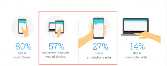
Note that over a quarter of buyers would use only their smartphone, nearly twice as many as those who use only their computers.
Moreover, smartphones have become our primary device when searching for information:
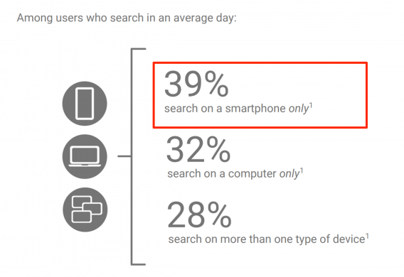
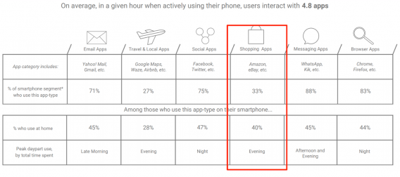
Finally, a third of us use smartphones for shopping, both away and at home.
All this suggests that smartphones have become the main device for initiating a purchase.
As Michael Mace pointed here on CXL last year (note, the emphasis in bold is mine):
“People will usually come to a mobile commerce site for one of two reasons:
- They want to shop recreationally, by browsing through products; or
- They want to go directly to a particular product they’re considering.”
And here’s a great example Michael shared in the same article:
“For example, a user might have received a smartphone message from a friend mentioning a pair of shoes. During the day the user might check them out on a notebook computer. Then in the evening, over a glass of wine, the shoes are ordered via tablet.”
Note how a message from a friend led to product awareness, and potentially, a quick visit to the store.
And so, their first exposure to your brand would have happened on the smartphone.
Naturally, there could be countless other scenarios for that person to visit your store.
However, a considerable portion of shoppers who are only entering the buying process, a time where they’re the most susceptible to your lead generation efforts, would visit your site on smartphones.
If you don’t convert them right at that point, you might be pretty much handing them over to the competition. Which brings us to the story how one company used mobile popups to boost their signups and revenue.
Mobile Popups Case Study – Skechers
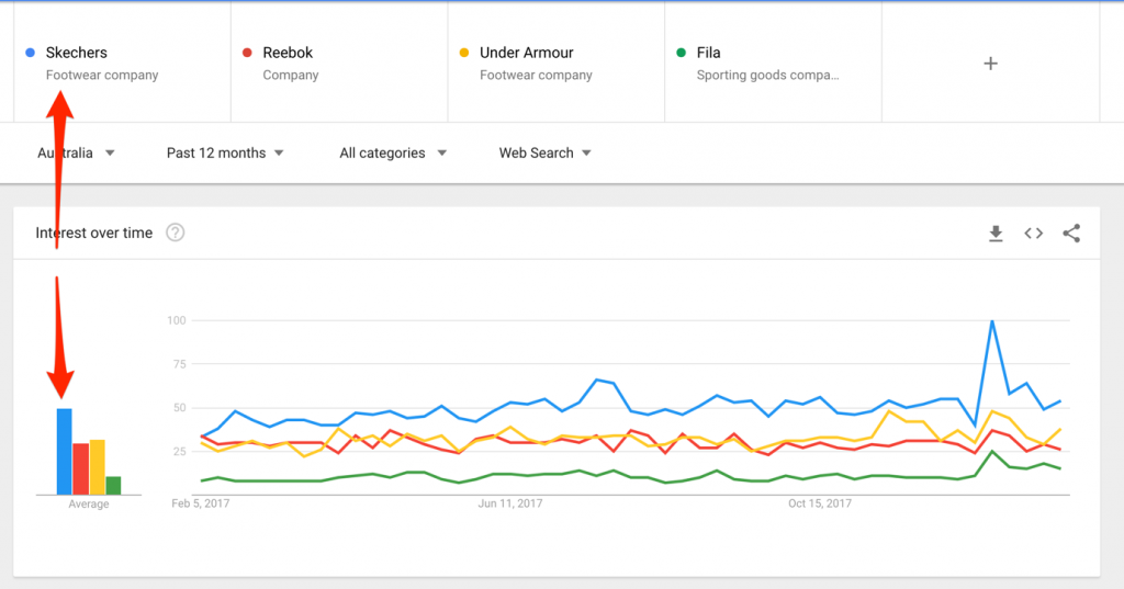
Skechers.com.au is the well-known performance shoes brand’s online retail outlet in Australia.
And it’s big in Oz.
A quick check on Google Trends reveals that the store’s online popularity beats their major competitors significantly.
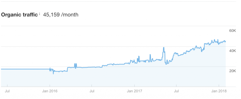
And a quick look at the Ahrefs data reveals that the company’s web traffic has been growing continuously too.
Now, let’s compare that with the Australian ecommerce opportunity.
The Asia-Pacific region is the most-significant online market globally, and Australia is one of Asia Pacific’s most highly developed ecommerce markets.
In fact, according to a data by eMarketer, online retail sales should have reached AU$32.56 billion by the end of last year.

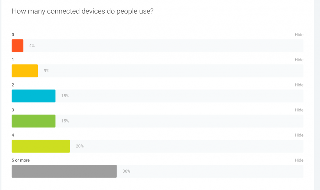
What’s more, Australians are a highly connected audience. As it turns out, the average person owns three devices, and many as many as 5. See the most current data from Google Consumer Barometer.
Also:
- 14.9M of Australians use their smartphones every day. (source)
- Smartphone ownership grows by 2% each year. (source)
- And 45% of consumers admit having purchased a product via a mobile device. (source)
What’s important, all this reflected in Skechers data.
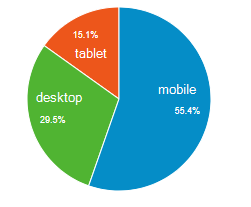
For example, over 55% of the company’s traffic comes from mobile devices.
As Catherine Aliotta, Skechers Ecommerce manager points:
“Our Online Skechers customers are predominately aged between 25-34 yrs, so it is no wonder that more than half our traffic comes from mobile devices, which is why a seamless and user friendly mobile experience is so important for us!”
Taking all of the above into consideration, it’s almost unbelievable that Skechers had absolutely no lead capture campaigns targeting smartphone users specifically.
So, here’s what they did to turn this around.
Concerns for the Campaign
One of the main considerations Skechers had before launching mobile popups strategy was its impact on SEO.
In short, the company didn’t want the campaign to affect their rankings negatively. And given Google’s stance on what it called “intrusive interstitials,” the threat of a search engine’s penalty was real.
So, from the outset they designed their popups to pass Google’s criteria for mobile popups:
- They would take up no more than 25% – 30% of the screen, and
- And be easily dismissible by the user to allow them to return to continue viewing the content.
Campaign Scenarios
To comply with the search engine’s requirements while still using best UX practices for popups, Skechers decided to test three distinct mobile popups.
Note, this wasn’t an A/B test. Each version ran independently, and they differed by a number of criteria:
- The timing of the display,
- Popup size,
- Position on the screen,
- Display scenario.
Another important factor – there was no distinction between what a user had seen, only when they saw and how a popup appeared on the screen. All three popups featured the same headline, copy, form, and call to action.
Option #1: A popup displaying immediately after a person landed on the site
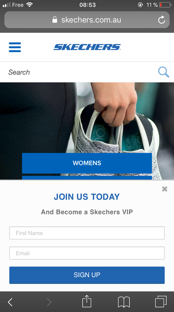
The first popup appeared at the very moment a person entered the site, regardless of the page on which they’ve landed.
It had no background overlay and displayed at the bottom of the screen, obstructing only a small portion of the page’s content.
A visitor could easily dismiss the popup by clicking on a clearly visible “x” button or simply anywhere outside of the popup and return to viewing their content.
Option #2: A full-size popup displaying on the second page visited
The second version targeted engaged visitors who continued viewing the site beyond their landing page.
Skechers set up this popup to display on the second page a person has visited.
Moreover, they used a design that displayed a popup at the center of the screen and covered its remaining parts with a semi-transparent background overlay. This prevented a visitor from viewing the content without clicking the popup off. (Note: In the first version, a person was able to still scroll the content without closing the popup.)
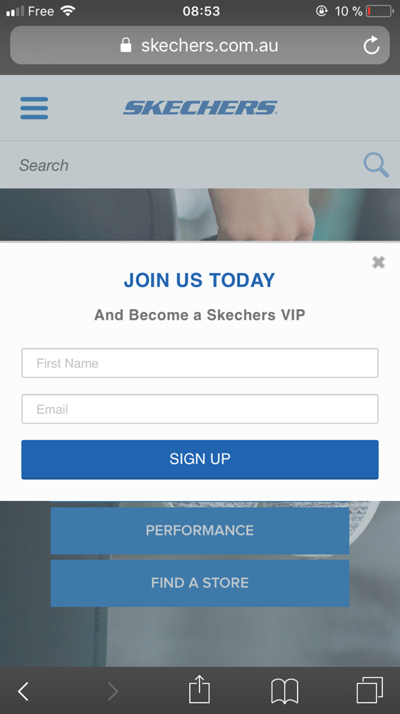
Option #3: Hidden popup triggered by users through a call to action.
With the final version, however, the company decided to try a unique approach. In this option, the website didn’t trigger the popup at all.
A visitor did.
Unlike the other two versions, where a popup would display automatically either on landing or after a visitor has taken a specific action (i.e., visiting more than one page), this option hid the popup until a person has triggered it by themselves.
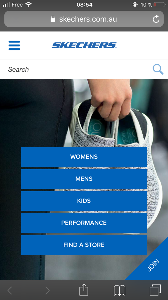
For this, the company used an option to add a “Tab” – a call to action prompting the visitor to launch the popup.
The call to action appeared on every page on the site, except for the checkout, giving a person the opportunity to act on it at the time they felt right for them.
You can spot the Tab at the bottom right corner of the image above – it’s the little corner button that says “Join.”
Once a person clicked on the CTA, the popup would act similarly to the second scenario – appearing in the middle of the screen, covering the rest with semi-transparent overlay.
Campaign Results
The third option, using a call to action to allow visitors trigger the popup collected a staggering 48% more emails than the second-best version. And that’s in spite of the fact that its popups displayed significantly fewer times than the other two.
Here’s the full breakdown of the results:
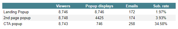
Things to note:
All versions displayed to roughly the same number of visitors.
The number of displays varied between each version. But this was largely due to different display scenarios Skechers used for them.
For example, a popup triggered on landing would naturally display significantly more often than the second option. And the third option relied on a visitor to actually trigger the popup.
And yet, it’s the option with the call to action generated the highest conversions (34% vs. 3.9%.)
As Catherine Aliotta concludes:
“Mobile customer acquisition has been difficult to acquire for Skechers as there were so many factors to consider and we were blown away by the results from this study, proving that our customers prefer simplicity and are more likely to sign up to our database when they are not being disrupted during their browsing journey. It was amazing to see the difference in results just by changing small factors such as pop up timing and display whilst keeping with the same layout and copy. Key takeaway for us: Prominent and bold pop-ups and call to actions that work for us on desktop aren’t always the answer when it comes to mobile lead generation!”
Conclusions from the Case Study
Although each market, product, and audience are unique, there are certain conclusions we can draw from the Skechers example:
#1. Focusing on providing great user experience trumps all
Skechers test clearly confirms that for smartphone users, UX beats everything else.
In spite of the first two popups being bigger and more prominent, it’s the inauspicious call to action that delivered results.
It would suggest that mobile visitors seem aware of the limitations of their devices and respond better to lead generation strategies that do not disrupt their browsing experience.
In fact, Nick Babich, UX expert admits that on mobile, there’s an accrued need of simplicity:
“Cluttering your interface overloads your user with too much information: every added button, image, and line of text make the screen more complicated.”
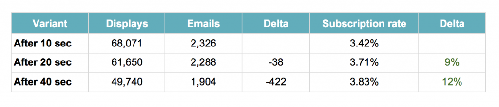
#2. Timing of the display affects conversions
True, it’s tempting to just set up a popup to appear right when a person lands on your site and leave it at that.
However, if you trigger the offer too soon, you might just be disrupting visitors. They’ve only landed on your site, and most likely, become irritated at the interruption.
At the same time, if you leave displaying the popup for too long, you might end up missing a lot of potential leads – users who might have left the site before the popup would even show.
Here’s another example from one of our customers that illustrates this well. Note how, for this company, delaying a popup to allow a person to familiarize themselves with their content first gave a boost to conversions.
Naturally, not all popups should display after a time delay. For one, there are other ways to define when to trigger a popup – user activity on the page being one of them. For that reason, you should always test and find the best scenario for the particular segment of the audience you’re targeting.
#3. Testing is the key to your campaign’s success
Skechers example clearly demonstrates that to figure out what engages your audience; you need to test anything from different versions of the popup, size, copy to display scenarios, timing, and a lot in between.
And that’s still just the top of the iceberg.
In other words, testing is your key to unlocking your audience’s preferences and identifying what would spring them into action.
Conclusion
Given the size of the mobile traffic opportunity, it’s clear that unless you’re actively targeting it with lead generation strategies, you’re pretty much handing over the business to the competition.
Doing what Sketchers did – testing different popups approaches to discover what engages mobile visitors is the most effective way to overcome this and start converting this traffic into leads or sales.
Related Posts
-

While running A/B tests on all your traffic at once is often tempting, it's best to…
-

You know that a good user experience leads to more conversions. You also know there’s…
-

There are an almost limitless number of mobile usability gotchas that need to be identified…
-

Let’s talk about a collective marketing pain: Pretty much everyone’s mobile conversions suck. This isn’t…


Interesting article and learned a lot, thank you for writing it. Sketchers, is still a brand/recognizable name. I would be curious if the results would be similar for a new company/website, trying to obtain email address if the conclusions would be similar.
Thanks for your comment Jason.
We had the same results with smaller brands.
The main difference lies in the volume: Skechers gets so many visitors that when they convert 8.5% of them into subscribers, they generate a lot of leads.
What tool was used for the popups/tests?
Hi Luis, we used WisePops.
In addition to the concerns you mentioned, SEO is also a challenge after Google’s mobile popup penalty rollout. Is there anything you are doing to make sure that your experiments are in compliance with Google?
Hi Arun, yes! If we display a popup on the landing page, we make sure it doesn’t take more than 30% of the screen.
Basically, we follow the recommendations that Google shared here: https://webmasters.googleblog.com/2016/08/helping-users-easily-access-content-on.html