
If you’re Amazon or Apple—congratulations! You don’t have any credibility issues. Most of us aren’t so lucky. Almost all but the biggest of companies have an uphill credibility battle every time a new visitor lands on their site.
Table of contents
What’s website credibility? And why is it important?
BJ Fogg, the world’s leading researcher on web credibility, has said that website credibility is about designing your website to make it appear trustworthy and knowledgeable.
Your website is often the first point of contact for customers, responsible for first impressions and, of course, revenue. Companies that design for credibility have a strategic advantage over the competition.
Fogg says there are four types of credibility:
- Presumed credibility is a general assumption. A brand we’ve heard of is more credible; an unknown brand is less credible.
- Reputed credibility is a third-party reference. For example, your wife said Product X is good, or your friends said Service Y sucks.
- Surface credibility is what we find on simple inspection. A website may “look” high quality or “seem” confusing.
- Earned credibility is personal experience, like through friendly customer service or, in contrast, copy full of typos and factual errors.
In this post, I’ll focus on what you can do right now to boost the credibility of your site.
“Would you like a new iPhone? It’s just $20?”
Let’s say you’re walking down the street. A twenty-something dude comes up to you. “Hey, are you interested in a new iPhone? I’ll sell it to you for $20.” He pulls it out of his pocket, and it looks legit. What do you do?
My guess is that you won’t buy it—even though the price is amazing, and you know it’s a good product. Why not? Because of a lack of trust. Does it work? Is it stolen? What if it breaks the next day? Why so cheap? You’ll have all these questions in your head, and since you don’t know the guy, you’ll probably pass.
The same goes for your website. Your goal is to talk about your offer in a way that makes people feel that they’re getting an iPhone’s worth of value for just $20 bucks (not by deception but through communicating the value of your product). If you’re credible, you have yourself a customer.
Credibility leads to money. Four in five users say that being able to trust the information on a website is very important to them. You don’t buy from someone you don’t trust, do you?
A credible website makes people:
- Trust what it says.
- Feel comfortable sharing their personal data.
- Be confident that it’s worth spending their money.
Website credibility checklist
Go over this list and see which of the following items you could add to your own site to boost credibility.
- Web design matters. People judge the book by the cover and your website by its design. If you designed your website yourself, and you’re not a designer, it sucks. Like many others before him, Dr. Brent Coker studied the impact of attractive websites on human behavior. This is what he said: “As aesthetically orientated humans, we’re psychologically hardwired to trust beautiful people, and the same goes for websites. Our offline behaviour and inclinations translate to our online existence.” Websites that are more attractive create a greater feeling of trustworthiness and professionalism for consumers.
- Make your address and phone number visible at all times. Include it in the footer (a must) but, depending on your site, also in the header (especially if your business depends on incoming calls) and on the sidebar, in the microcopy.
- Make it very easy to contact you. The “Contact” link should always be always in your navigation menu as the very last link.
- Message relevance and tailoring. A website that displays relevant information to the visitor is instantly more credible in their eyes. If possible, use content tailoring based on user profile and behavior.
- Simple language. People don’t trust what they don’t understand. Write like you talk using the same language your customers do.
- Correct spelling. Broken grammar and incorrect spelling certainly make you seem less credible. It’s more forgivable in blog posts, but unacceptable on your homepage, product pages, and other more static pages.
- Link to external websites that reference your organisation. If The New York Times or TechCrunch has written about you, link to those stories. It doesn’t have to be a well-known outlet (though that helps). What matters is that somebody other than you has written about you and possibly said some good things.
- Provide staff bios and photos. People don’t trust anonymous websites. If you don’t show your photo, are you hiding something? Is it that you don’t want people to recognize you on the street? People want to look you in the eye. Enable it. Always use photos of the actual staff.
- Show photos of your office. If you have a real office with real people and stuff inside, I’ll believe you more. You don’t need to make yourself appear to be a bigger company than you are.
- Avoid cheesy stock photos. Nothing says “I’m fake” like suits shaking hands or smiling customer service people with a headset.
- Visible return and refund policies. What happens if I’m not happy with your service? People want to know in advance before making a purchase.
- Email policy. What will you do with my email address once I give it to you? Will you rent it, share it, sell it, spam people?
- All statements and claims should be backed up by third-party evidence, neutral experts, or verified (i.e. scientific) studies. List sources.
- Avoid superlatives. Don’t say you’re “the best.” No one is going to believe you anyway. Be specific, (e.g. Instead of “Fastest pizza delivery in town,” use “We deliver your pizza in 10 minutes”).
- Detailed product information. Some 50% of online purchases are not completed due to insufficient information. Are there enough details for a reasonable conclusion about the information?
- Show prices. Many companies (not just B2B) don’t reveal their prices, and make people get in touch instead. People always want to know how much a product or service costs. If your competitors publish their prices, they’re getting the business.
- Show a client list. This is social proof. Nobody wants to be the only idiot buying your services.
- Mention the number of your clients. If you have an impressive number of customers, say it out loud for social proof (e.g. “12,457 happy users”).
- Show a link with a reputable organization. Are you somehow connected to a university, a government agency, a research lab, or another reputable organization? Perhaps you’re a service provider, reseller, partner, sponsor, advisor, or what not. If yes, tell the world.
- Use testimonials. Testimonials work well if they’re by real people. “Real people” means that there are photos, full names, what they do, their employer, etc. Well-known people are even better. Video testimonials are the best.
- Case studies of your work. Use case studies to prove the benefits of your services and to show off your expertise. Both make you more trustworthy.
- Put customer reviews on your site and elsewhere. People still trust them. It’s the upper hand Amazon has on everyone else.
- If you take credit cards online, is it safe? Provide the information about your secure channels (e.g. “256-bit encryption”).
- Display trust marks. Use the Verisign seal or an equivalent. If people opt-in to your email list, put a TRUSTe privacy seal on your site. Find out the most-known trust mark on among your customers and use it.
- Maintain a blog or a “Latest News” section. This does two things: It shows that your site is constantly updated and provides free information to prove your expertise. A note of caution: if your last news item was published two years ago (“We launched a new website!”) or your last blog post was written a year ago, it can have a negative impact. If you can’t regularly update your news section or blog, remove the section or the publication dates.
- Get an authority to recommend you. When Oprah recommends a website, it’s instantly credible. Get someone your audience knows and trusts to “approve your message.”
- Articles in (online and offline) publications. Credibility is also what people read and hear about you before they get to your site. If they’ve seen or read articles by you in different magazines or newspapers, you have more credibility.
- Guest blog. This is basically the same as the previous point. If your users have come across your posts on blogs they read, you’re more credible. Also, you can mention and link to blogs that published your posts.
- A jobs page. You must be a real company if you’re hiring. :)
- Make sure it works. Dead links, non-functional forms, and everything else that might seem broken will take away from your credibility.
- Have a social media outlet. If you have an active Twitter account or Facebook page, it reinforces the fact that there are real people behind the organization.
- What does WOT say about you? The WOT user community has rated millions of websites. Some people might check you out there.
- Your brand on Google. When potential buyers Google you (and they will), what will they find? Besides searching for just your brand, they’ll probably also check “[yourbrand] reviews” and possibly something like “[yourbrand] sucks.” Make sure you like your search results.
- No hype, blinking banners, nor pop-ups. If your site looks like a Christmas tree, you need to change that. Make sure the copy is hype-free, nothing blinks, and just know that people hate most pop-ups.
- Keep ads to a minimum. Too many ads kill the user experience and communicate that the user doesn’t come first. They might also make you seem desperate. If your main income doesn’t come from ads, don’t use them at all.
- Website speed. If your website is slow and takes forever to load (10+ seconds), people will have doubts and leave. Use caching or a CDN. I personally use Cloudflare and am very happy with them.
- Ranking in Google. If you rank high in Google (say in the top five), you must be there for a reason (Google says so!).
- Signs of community. If you have a busy forum, lots of comments on your blog posts, or any other visible signs of an active community, you’ll come across as more credible (i.e. “People must be hanging out here for a reason!”).
- Be a good and honest person. If you’re an a** and treat your customers badly, it will come out eventually. Be friendly, generous, and honest—always.
Sources
- Stanford Web Credibility Research;
- Webcredible;
- Why Visitors Trust Some Websites More Than Others (Yell Business);
- Econsultancy;
- Prove It: What Makes You Trust a Website? (Lorelle on WordPress);
- What makes a website credible? (Stanford);
- Attack Resistant Trust Metrics (Raph Levien, UC Berkeley)
- Understanding How Internet Users Make Sense of Credibility (Miriam J. Metzger, UC Santa Barbara);
- Personal, hands-on experience
Don’t overdo it
Note that you don’t want to crowd your pages with credibility elements. It will have the opposite effect.
The other day, I hired a cleaner from Craigslist. She came over, and her first words after I opened the door were, “Don’t worry, I’m not gonna steal anything”. Guess what my first thought was? “Is she gonna steal something?”
I wasn’t even thinking about theft, but she planted the thought in my head. Now, I started to look for clues to confirm my theory—and her tattoos didn’t help my suspicious mind.
The same applies to your website. If you scream, “Trust me! I’m not gonna rip you off!”, people will get suspicious even (or especially) when they weren’t before.
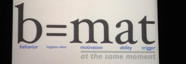
Everything in moderation. What’s the right quantity? Follow BJ Fogg’s maxim for credible design:
To increase the credibility impact of a website, find what elements your target audience interprets most favorably and make those elements most prominent.
How do you personally determine whether you trust a site or not? Have you given it any conscious thought?
Related Posts
-

Do you want to make your website better? There are many ways to optimize a…
-

In today's review I'm assessing whether websites in question could do anything to better get…
-

If your site isn’t credible, you’re scaring off many would-be buyers. But credibility is contextual,…
-

List building is a top priority for a blog. In this review we look at…


Why have you got a pop up “Get the Conversion Guide”, lower right, when point #34 says “just know that people hate all kinds of pop-ups.”?
Just asking, as breaking rules sometimes works, and I’m wondering about a slider to give a ‘cool’ element I think (will test) my audience wants, although mt research says sliders increase page time but lower conversion.
Thanks for asking. First of all popup is not a scroll triggered box (which is what I use). Popup is intrusive and covers the whole content. The box here is only activated when you scroll down (proven interest) and it does not cover the content. (And it works very well).
Image sliders are proven conversion killers.
Peep, Can you say more about image sliders killing conversion? it would seem that they are main staple of websites these days.
Indeed they are! But not because they work :) They weren’t developed by conversion people, that’s for sure.
They don’t work because
* They’re usually too fast and people can’t read the text on them
* A single message works best – image sliders try to pass on many messages at the same time which doesn’t work
* Human eye reacts to movement, so they won’t pay attention to other – way more important parts. It’s like a screaming monkey in the corner, demanding constant attention.
An article on this:
http://www.widerfunnel.com/conversion-rate-optimization/rotating-offers-the-scourge-of-home-page-design
Are you using the dreamglow scroll triggered box? If not, which one do you recommend?
I use Qoate, but they’re both perfectly fine.
Great list – Something I’d change though – 10+ seconds is generous when most people will click away after 1 or 2 if a website isn’t loading… I don’t have citations but have read it in many places. Search a few references out, but all the SEO blogs have great research on that.
Yeah sure – 10 seconds is the last drop. This number comes from the studies Jakob Nielsen has done (http://www.useit.com/alertbox/response-times.html).
Thanks for taking the time to write this post. It’s a good reminder.
That said, there’s a spelling error in yogur list. Look at #25.
Thanks! Fixed.
Thanks for this great article!! I am currently busy boosting credibility on some of my sites, so your article came just at the right time ;-). I am glad that I signed up to your newsletter in the past!!
That’s awesome.
The stock photos get me every time. Can’t stand them!!
Yeah! Of course, there are quality stock photos as well, but most of them are indeed overly cheesy and obviously fake.
Excellent article!
Concise will plenty of awesomeness!
Thanks Mark
Nice article, thank you for posting, agree with all points! Keep it up ;)
Cheers Igor.
Nice article Peep,
From the very beginning, I didn’t get very far into the list at all before coming across 2 that I can work on right now. Points 2 and 3. Once that’s done, I can work my way through last list. Great list by the way.
Hi Peep,
Thanks so much for this list. I was looking at my website and just I drop by your website and saw your latest post. Perfect timing!
Quite a long list but all make sense to me as I look for the same things when looking at a website.
Thanks again.
Chetz
Glad you found it useful!
Peep,
Thanks for a very thorough post.
I like your design. Clean, for sure.
I’m always trying to improve my main site and main blog.
Great suggestions.
The Franchise King®
Nice article Peep,
I would like to know what you think about websites using hand-me-down templates? Do they have a chance at all to reach a good credibility?
Regards,
Christian
You mean like WordPress templates you find on Themeforest and stuff? Template per se matter less for credibility (it has to look good), the important stuff is the content on your website.
Thanks for the article. It’s very usefull.
I just discover your blog and it’s a goldmine.
A wonderful factors & very important factors cover in small article. Some of factors are never comes in my mind. So, according to me it’s awesome.
Hey Peep, this is going straight into the ‘must keep’ swipe file. It’s all common sense stuff that often gets overlooked. I’m overhauling my personal site as I’m about to start full-time consulting and want to show I can walk the walk. These invaluable tips will help a lot. Thanks!!
Excellent! There were about 32 on this list I never even thought of. :)
This is a great list of compiled tips for website credibility. We have re-branded our company ( website and all…) and have been focusing on this subject.
This is your website description in Google for “website rating checklist”.
Our downloadable website checklist includes over 120 elements in 12 categories that you can check to ensure you have a good quality … “Rated Excellent”
Somehow, after reading the entire article, and it’s a good one, and the comments, I still have not found the download.
Awesome list! I’ve always been torn on #18. What some may consider an impressive amount of clients others may consider laughable.
Luckily Content Experiments can decide for us.
Good checklist. But regarding your first point I am not sure that for some audiences content is still more important than design. If the content is good, the design is not so important.