How you design a survey will affect the answers you get. This includes the language you use, the order of the survey questions, and, of course, the survey scale: the default values and ranges you use.
Survey response scales can be embedded in the survey (e.g., 1–5, 1–10, etc.), chosen via a drop-down menu, or included as part of the survey language.
No matter how you choose to display the scale, the default ranges affect the precision of your data. For example, if a survey asks your age, a default range of 20–25 instead of 20–30 has an impact.
Table of contents
Get your survey questions correct
Before you worry about which response scales you’ll use, you need to figure out what you want to know. Sit down and decide what data you’re actually trying to collect. Then put together some good survey questions that can help your audience give you that data. This will put you in a good position to design useful responses.
How to design survey rating scales
Surveys are a great source of insight into your visitors’ attitudes. Certain surveys also allow you to compare yourself with the competition. But as Jared Spool notes, the nuances of survey scale design add challenges:
“My point with this example is that scale design and anchor choice will influence respondents’ ratings—both higher and lower.
This is a key reason why I’m skeptical of the cross-company comparison data sets where each company is using a different survey instrument. So many variables are in play that legitimate comparisons are quixotic.
Jared Spool
So what can you do to get accurate data? It starts with understanding some of the differences and shortcomings of survey scales.
3 types of survey response scales
When designing surveys, there tend to be three different models for survey response scales:
- Dichotomous;
- Rating scales;
- Semantic differential scales.
We’ll look at each, with some survey scale examples to help you visualize them.
1. Dichotomous scales
Dichotomous scales have two choices that are diametrically opposed to each other. Some examples:
- “Yes” or “No”.
- “True” or “False”.
- “Fair” or “Unfair”.
- “Agree” or “Disagree”.
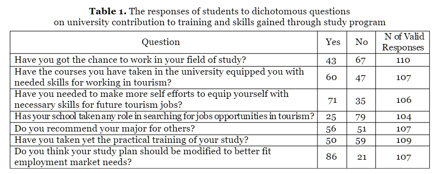
There’s no nuance, and there’s no way for a respondent to be neutral. But there’s a lot of value in the lack of a neutral option.
Sometimes, especially in long surveys, you’re subject to what’s known as the error of central tendency. Answers gradually regress to the middle of the scale—the neutral options.
A dichotomous scale gives you a clearer, binary answer, but it can also fall prey to fatigue. When that happens, respondents lean toward positive answers.
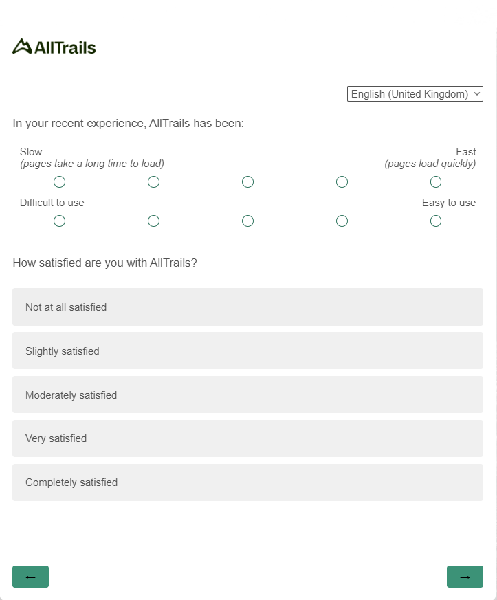
2. Semantic differential scales for questionnaires
So even if satisfied and dissatisfied are “common practices,” they may not be “best practices”—especially in user experience research. You’re trying to delight customers, not just “satisfy” them.
Semantic differential scales gather data and “interpret based on the connotative meaning of the respondent’s answer.” These scales usually have dichotomous words at either end of the spectrum.
They measure more specific attitudinal responses. Here’s one I received from AllTrails (a hiking app) recently:
According to Balon, “Ironically, when you factor analyze semantic differential scales, they basically break out into two factors: positive and negative. There is really no need for seven steps.”
3. Rating scales
You’re probably most familiar with rating scales (e.g., “On a scale of 1–10, how satisfied were you with our service today?”). The three most common rating scales are:
- 1–10
- 1–7
- 1–5.
Is there a difference in the outcome based on which scale you choose? Totally. There’s more variance in larger scales, like the 1-10 scale rating. This is usually undesirable; making the 1-5 Likert scale the most common survey scale.
Dr. Rob Balon advises to “always use the 1–5 scale, with 5 being the positive end and 1 being the negative end. NEVER use 1 as the positive end.”
Likert’s 1 to 5 scale for surveys
While this is the most common Likert scale, you can also create a 1-7 or 1-10 Likert scale.

Another great point from Spool’s talk touches on Likert Scales. He rails against the labels we use on scales (satisfied and dissatisfied) instead of the scale itself:
It’s about how we create the scale. We start with this neutral point in our scales. This is how a five-point Likert scale works.
We add two forms to it—in this case, satisfied and dissatisfied—and then, because we think that people can’t just be satisfied or dissatisfied, we’re going to enhance those with adjectives that say “somewhat” or “extremely.”
Okay, but extremely satisfied is like extremely edible. It’s not that meaningful a term.
What if we made that the neutral, and we built a scale around delight and frustration? Now we’ve got something to work with here. Now we’ve got something that tells us a lot more.
We should not be doing satisfaction surveys; we should be doing delight surveys. We need to change our language at its core to make sure we’re focusing on the right thing. Otherwise, we get crap like this.
Jared Spool
Likert’s scale of 1-10 is most useful in scenarios where you want to see a lot of variance, and your survey audience will want to provide a high degree of precision in their answers. For example, if you ask UX experts to give a site scores for various attributes like ease of use and accessibility, a 1-10 scale might actually work well.
Which survey scale should you use?
After all these examples of survey rating scales, you might be wondering which to use. They all look useful. However, it depends on the type of data you want, and what survey questions you’re asking. Good survey questions will help inform your rating scale choice.
Dichotomous scales (“yes” or “no”) are great for precise data, but they don’t allow for nuance in respondents’ answers. For instance, asking if a customer was happy with an experience (yes or no), gives you almost no insight into how to improve the experience.
A Likert Scale or Net Promoter Score (NPS) is better for that task because of its increased range. Although—and this is a big point—says Spool, “Anytime you’re enlarging the scale to see higher-resolution data, it’s probably a flag that the data means nothing.”
The more quantifiable the information is (behavior questions, for instance), the smaller the range should be. When you want to measure attitudes or feelings, using a 5- or 7-point semantic differential scale is a good strategy.
Likert scales (satisfied vs. dissatisfied) are a little generic for attitudes.
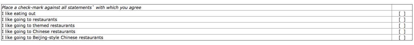
There’s also an older scale, the Guttman scale, that puts a twist on dichotomous and Likert scales. You ask a series of questions that build on each other and escalate in intensity. Here’s a great example from changingminds.org:
Spool talked about the Guttman scale in its relation to customer surveys, saying:
If you’re not happy enough to recommend the product, you’re not going to be confident, and you’re not going to feel it has good integrity if you’re not confident, and you’re not going to have pride in it unless they have good integrity, and you’re definitely not going to be passionate about them unless they do everything else.
This can be a useful tool for measuring satisfaction.
Ordinal and interval scales
Developed by S.S. Stevens and published in a 1946 paper, there are four types of these scales:
- Nominal;
- Ordinal;
- Interval;
- Ratio.
There’s perpetual debate about ordinal and interval scales.
Ordinal scales are numbers that have an order, like “a runner’s finishing place in a race, the rank of a sports team, and the values you get from rating scales used in surveys or questionnaires like the Single Ease Question.”
With ordinal scales, if you’re asking a customer how satisfied they were on a scale of 1–5, a 4 doesn’t necessarily mean they were twice as satisfied as a 2. The difference between a 1 and a 2 isn’t necessarily the same as the difference between a 4 and a 5.
Interval scales establish equal distances between ordinal numbers—for example, when we measure temperature in Fahrenheit. The difference between 19 and 20 degrees is the same as between 80 and 81.
According to Jeff Sauro, Founder of MeasuringU, rating scales can be scaled to be interval:
Rating scales can be scaled to have equal intervals. For example, the Subjective Mental Effort Questionnaire (SMEQ) has values that correspond to the appropriate labels.
You can see the distance between the numbers is equal, but the labels vary depending on how people interpreted their meaning. (translated from Dutch)
Jeff Sauro
What’s the practical difference?
There are two arguments.
The classic stance, from S.S. Stevens, is that you can’t compute means on anything other than interval data. As Sauro explains it, “he said that you can’t add, subtract, much less compute a mean or standard deviations on anything less than interval data.” Sauro continues:
This restriction is a problem for many academics and applied researchers because rating scale data is at the heart of marketing, usability, and much of social sciences research.
Jeff Sauro
If we cannot use means and standard deviations, we also cannot use most statistical tests (which use means and standard deviations in their calculations). Even most non-parametric tests convert raw values to ranks (ordinal data) and then compute the mean or median.
However, the other argument, set forth by Frederick Lord (inventor of the SAT), says you can. According to him, it doesn’t matter where the numbers come from, you can work with them the same way. Jeff Sauro gave a great example:
Here are six task times (ratio data):
7,6,4,2,9,10
Here are six high temperatures in Celsius from a northeastern U.S. city (interval data):
7,6,4,2,9,10
Here are six responses to the Likelihood to Recommend Question (ordinal data):
7,6,4,2,9,10
Now here are six numbers that came from the back of football jerseys (nominal data):
7,6,4,2,9,10
Jeff Sauro
Does it matter whether your data is interval or ordinal?
Outside of academia, there’s not a lot of debate. While the magnitude of the difference is important, too, what’s most important is the evidence of improvement.
Jeff Sauro explains the practical implications:
In applied research, we are, in most cases, interested in determining which product or design generates higher scores, whether these be on satisfaction, usability, or loyalty.
The magnitude of the difference is also important—a two-point difference is likely more noticeable to users than a quarter-point difference.
But even if you were to commit the error and say that users were twice as satisfied on one product, you’ve almost surely identified the better of two products even if the actual difference in satisfaction is more modest.
Jeff Sauro
And, according to Balon, “Outside of academia there is virtually no argument. Most online surveys utilize descriptive statistics and simple banners or cross tabs that can be analyzed using Chi-square, which is a non-parametric analytical tool.”
Anyway, it’s impossible to evaluate the validity of ratings of human perception. So, in general, you can feel good about working with ordinal data.
The limitations of survey scales
Even if you design the perfect survey with the appropriate scales, there are limitations. This is especially true if you run a limited range of surveys or conduct surveys sporadically (and without other forms of conversion research).
The meaning behind the numbers
When you run a scale like, say, the Net Promoter Score, you get a number. You can compare that with your competitors and your past scores, but there are limitations to how much it can tell you about your user experience.
I haven’t heard a better explanation than from Spool’s talk on design and metrics:
I was so disappointed when the people at Medium sent me this: ‘How likely are you to recommend writing on Medium to a friend or colleague?’ It’s not even a 10-point scale. It’s an 11-point scale, because 10 was not big enough.
This is called a Net Promoter Score, and with Net Promoter Scores, if you look at the industry averages that everybody wants to compare themselves to, the low end is typically in the mid-60s and the high end is typically in the mid-80s.
You need a 10-point scale because, if you had a three-point scale, you could never see a difference. Anytime you’re enlarging the scale to see higher-resolution data, it’s probably a flag that the data means nothing.
Here’s the deal. Would a net promoter score for a company like, say, United, catch this problem?
Alton Brown bought a $50 guest pass to the United Club in L.A. and had to sit on the floor. I wonder what his Net Promoter Score for that purchase would be? It probably wouldn’t tell anybody at United what the problem is.
But that’s a negative. What about the positive side?
What’s actually working well? Customers of Harley-Davidson are fond of Harley-Davidson, so fond that they actually tattoo the company’s logo on their body. This is branding in the most primal of definitions.
Jared Spool
It also depends what you’re selling. As Caroline Jarrett, author of Forms That Work, said:
Just from the point of view of using a Net Promoter Score as a question in a survey, we have to ask whether that question means as much to the people answering it as it might to the business.
There are some things where ‘I’ll recommend this to a friend’ is a really important thing that people would actually do. But there are other things where you’d never recommend it to a friend because you don’t do recommending, and you certainly don’t do recommending of those type of things.
So you might actually be very enthusiastic about the product, but you just might not ever feel the urge to recommend hemorrhoid cream to your pals, you know?
That’s not then giving a true measure of the value of that product. I have my skepticism about Net Promoter Score.
Caroline Jarrett
All of this is to say that ratings scales can tell you a lot, but they can’t tell you everything. Be skeptical when people tell you there’s one question that will tell you how your company is doing.
Little tweaks, big differences
Almost any factor can influence the outcome of a survey, which is why Spool highlights the difficulty of accurate benchmarking data.
GreatBrook, a research consulting firm, ran an experiment with a client in which they created a bunch of surveys with the same attributes, just different scale designs. They gave the questionnaires to 10,000 people and found some interesting things:
- Providing a numeric scale with anchors only for the endpoints (i.e. a 1–5 scale presented verbal descriptions for only the 1 and 5 endpoints) led more people to choose the endpoints.
- Presenting a scale as a series of verbal descriptions (e.g., “Are you extremely satisfied, very satisfied, somewhat satisfied, somewhat dissatisfied, very dissatisfied, or extremely dissatisfied?”) led to more dispersion and less clustering of responses.
- A “school grade” scale led to even more dispersion. A school grade scale asks the respondent to grade performance on an A, B, C, D, and F scale.
Using appropriate language and scales
For certain information (e.g., age), there are many ways you can ask for it. Each produces a different level of precision.
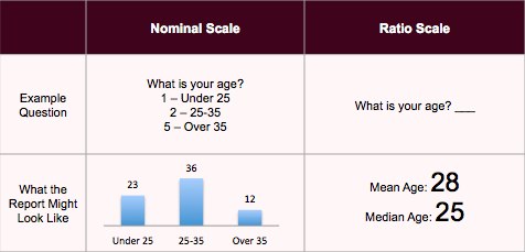
According to MyMarketResearchMethods.com, if you want to report an average age, use a ratio scale instead of a nominal scale.
Since the ratio scale is more accurate, why do survey makers use ranges for this question (and questions like income)? Because these are personal questions.
Some people are sensitive about disclosing their exact age or income. A range makes people feel more comfortable about sharing information.
According to Balon, “You almost have to ask age, income, ethnicity, etc., using a nominal clustering approach. Otherwise, you run a great risk of a non-response error.”
Grouping survey responses based on known characteristics
For certain information, like age or salary, you want to group survey responses based on known characteristics. In other words, the way you group incomes depends on the population you’re studying.
If it’s college students, the ranges will be lower. If it’s the general population, $20k or less is a good first rung; $21–39k is next; from there: $40–69k, $70–99k; $100–150k; and $150+.
As Balon advises, “For whatever population you’re studying, make sure those income breaks line up with the known characteristics of the population. Not doing this can create additional bias.”
Similarly, writing surveys in your customers’ own language is important. Use the phrases, jargon, and emotions that your customers are familiar with.
How do you do that? You get on the phone and talk to your customers. Or run focus groups. Or run some on-site surveys.
Best practices for demographic insights
With sensitive information like demographic info, how do you establish which defaults to use, which words to use, which scale to use, etc.?
Other than focus groups and interviews, there are some general guidelines and best practices (listed here). If you follow these, your respondents will likely have taken surveys like it before and, therefore, will know how to answer questions based on past experience.
For example, the guideline for age ranges is the following:
- Under 18 years;
- 18 to 24 years;
- 25 to 34 years;
- 35 to 44 years;
- 45 to 54 years;
- 55 to 64 years;
- 65 or older.
You can also have an experienced market-research consultant come in and tell you if you’re running things well. But, of course, that’s a another expense.
Ultimately, you have to balance the level of specificity you want with the comfort level of your audience.
Conclusion
Even though default ranges for survey questions seem arbitrary, there’s a lot of thought and design behind them. Whether you use a Likert scale, a dichotomous scale, or a semantic differential scale depends on what you’re trying to learn.
In addition, when trying to obtain sensitive information like age or income, asking for exact numbers just won’t work (non-response bias), so use nominal clusters (e.g., 18–24).
Before designing a customer survey, learn:
- Survey scale best practices;
- The words, phrases, and ranges your audience will respond to best.
Now that you know how to choose the right survey response scale, make sure your survey forms are optimized for better response rates. Check out these form design best practices.
Working on something related to this? Post a comment in the CXL community!
Related Posts
-

As you almost certainly know, copy is what sells. That’s true in print, and it’s…
-

Don't design your own website. No, really. It will suck. You might think that since…
-

Ghost buttons are transparent calls to action found on websites and apps. They tend to…
-
“Surveys are the most dangerous research tool," says Erika Hall, author of Just Enough Research.…