
When designing a website or landing page, success often hinges on the finer details—the nuances that make your digital experience more intuitive and engaging.
In his recent video, Paul Boag, a renowned UX strategist, explores how micro-interactions—those seemingly small but impactful design details—can elevate user engagement and enhance conversion rates.
Drawing inspiration from brands like Apple, Paul outlines how these elements, when implemented thoughtfully, contribute to a polished and compelling user experience. Let’s dive deeper into the insights shared and learn how you can harness the power of micro-interactions for your website.
Table of contents
What are micro-interactions?
Micro-interactions are subtle, interactive design elements that guide, delight, or provide feedback to users as they navigate a digital interface. They can take the form of animations, transitions, or small haptic effects.
While their impact might seem negligible at first glance, they play a pivotal role in how users perceive and engage with your brand.
According to Paul, micro-interactions can be categorized into three primary types:
1. Delighters
2. Functional Interactions
3. Feedback Loops
1. Delighters: Creating memorable moments
Delighters exist purely to elicit joy and make users smile. They may not directly improve usability, but their psychological impact is profound, leveraging what psychologists call the halo effect. As Paul explains:
“If you can make people smile at your website, if your website impresses them, they’re going to feel positive about your product or service. And by extension, that’s going to improve your conversion rate.”

Micro interaction example 1: Arc Browser
Paul highlights the Arc browser on iOS. When users close all tabs, they’re greeted by the Arc logo, which functions like a digital fidget spinner. Users can spin or shoot the logo across the screen, receiving satisfying haptic feedback. While this doesn’t improve the browser’s functionality, it creates a delightful, memorable association that encourages repeat use.

Micro interaction example 2: Smashing Magazine
On Smashing Magazine’s website, hovering over the author’s photo triggers playful animations. These quirky details surprise and engage users, fostering a sense of delight that enhances their overall perception of the site.
Takeaway: Incorporate whimsical, creative elements that make users pause, smile, or explore further. These moments may seem minor, but they build a positive emotional connection with your audience.
2. Functional interactions: Enhancing usability
Functional micro-interactions streamline navigation and prevent cognitive overload by presenting information progressively rather than all at once. Apple’s website provides an excellent case study.
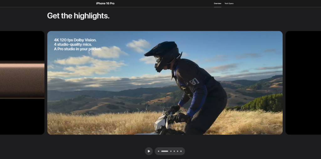


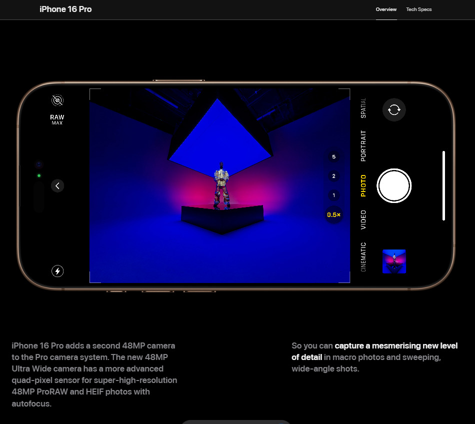
Micro interaction example 3: Apple’s landing pages
Paul points to the **iPhone 16 landing page**, where features are introduced one by one using carousels. This method prevents users from feeling overwhelmed while allowing them to digest content at their own pace.
Similarly, when browsing Macs, users can click on brief overviews to delve deeper into details. This layered approach to landing pages ensures users remain in control of their experience.
“Micro-interactions break up information and make it much easier to digest,” says Paul.
Takeaway: Implement design elements like carousels, accordions, or expandable content to break up complex information, making it more manageable for users.
3. Feedback loops: Building confidence
Feedback interactions inform users about the consequences of their actions, ensuring clarity and confidence in their journey. Paul emphasizes their value:
“They give the user confidence they’re heading in the right direction and doing the right thing.”
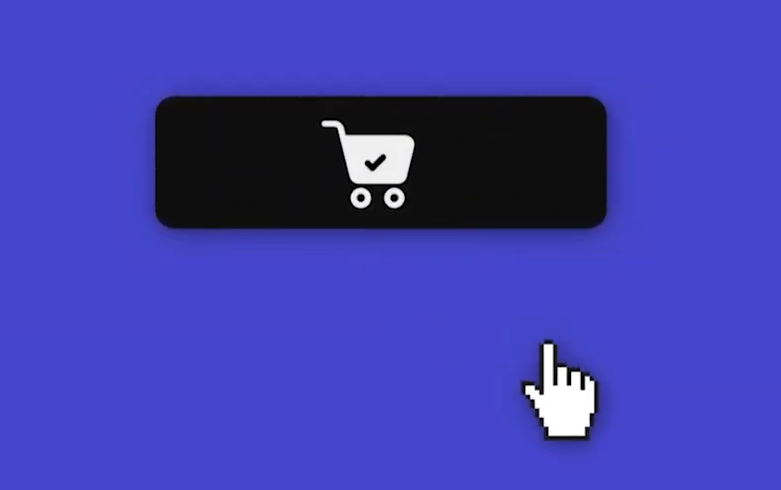
E-commerce website: Screenshot of animation when an item is added to cart

Screenshot of animation when password is hidden

Screenshot of animation when password is revealed
Micro interaction example 4: E-commerce forms
On many e-commerce platforms, progress indicators, animations, or error notifications guide users through complex forms or checkout processes. By visually acknowledging completed steps or flagging errors, these interactions reduce friction and build trust.
Takeaway: Add visual cues—progress bars, checkmarks, or animations—that affirm users’ actions and reduce ambiguity.
The risks of overusing micro-interactions
While micro-interactions are powerful, Paul cautions against overuse:
“Not every interaction is worth implementing. Some can become distracting or feel superfluous.”
Key considerations include:
- Performance Impact: Heavy animations can slow down your site, frustrating users.
- Accessibility: Ensure micro-interactions are user-friendly and align with the needs of your audience.
- Distraction: Avoid consistent interaction elements running on a loop, which can distract users.
How to get started
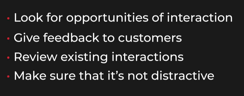
1. Audit Your Website: Identify opportunities to add micro-interactions where they enhance usability or engagement without overwhelming the user.
2. Prototype and Test: Use tools like Figma or Adobe XD to prototype interactions and test them with real users to ensure they’re intuitive and effective.
3. Measure Impact: Monitor engagement metrics and conversion rates to evaluate the success of your implementations on all devices, whether desktop or mobile.
Conclusion: Small details, big results
Micro-interactions may seem minor, but their impact on user engagement and conversion rates is anything but. As Paul Boag demonstrates, the right blend of delighters, functional interactions, and feedback loops can transform your website into an intuitive, high-performing digital experience.
By drawing inspiration from industry leaders like Apple and experimenting with thoughtful design choices, you can create a site that not only attracts visitors but also leaves a lasting impression.
Embrace the potential of micro-interactions—they’re the key to turning casual browsers into loyal customers.
Ready to optimize your website? Learn how to master the art of persuasion through copy and design and take your digital strategy to the next level.