What’s the value in a logo?
It’s a question that’s been asked a lot lately, especially with companies like Instagram, Uber, and Google drawing both ire and admiration from their new logo changes.
We all have an opinion (some have strong opinions) on these changes, but no one really measures their effectiveness – which is what matters really.
How do we answer the question: is your logo actually working?
Some articles try to address the why behind the logo change, but no one talks about if the changes are working.
In 2016, we made an study to seek a more objective answer. Since we have the power of a visual engagement platform, we were able to break down the differences in brand recognition and recall, and see how logo changes affected perceptions.
Regardless of how you feel about your favorite company’s logo change, this article will breakdown original research on how the brands you know and trust are really performing.
We conducted two experiments, which we’ll refer to as (1) Logos Mixed in a Crowd and (2) Side by Side.
Although this study uses data from 2016, most companies still use these redesigned logos as their latest iterations, except for Facebook.
Experiment 1: Logos Mixed in a Crowd
First, we wanted to measure attention – essentially, which logos stand out from the crowd?
So we placed ten recently-changed company logos in a grid (position randomized for each respondent to avoid placement bias).
The companies we analyzed were as follows:
- Foursquare
- Airbnb
- Uber
- Coors Light
- Paypal
- Yahoo!
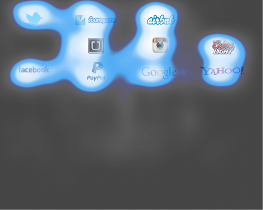
Here are the old logos:
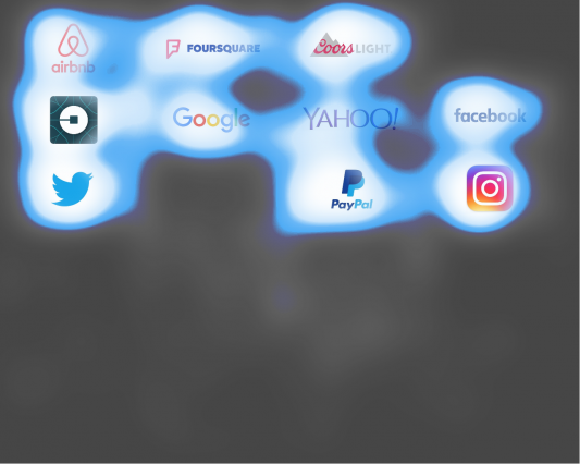
And the updated logos:
Methodology
We started by showing one group of 100 people the new logotypes intermixed randomly and another group of 100 people the old logotypes. The logotypes were shown for ten seconds in a grid where the order of them was randomized (shown differently to each respondent) to avoid placement bias.
By tracking people’s gaze paths we can determine what they look at, in what order and for how long. That tells us what catches the most attention, and then we can calculate the average “branding seconds” for each logotype.
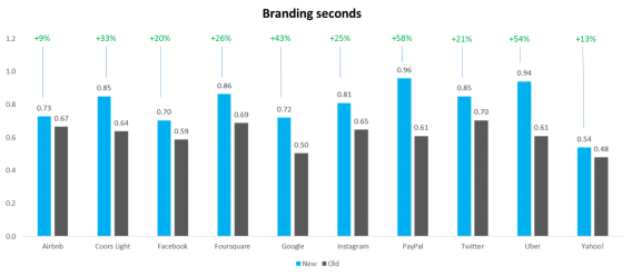
Branding Seconds is defined as the percentage of people who see the logotype multiplied with the average time they spend on it. This is a compound metric that shows how much attention the logo earns which is a predictor of likability.
In previous Sticky study, we found that increasing branding seconds 4x leads to a 1.7x increase in likability.
Participants were then asked to list from memory the companies that they remembered, which tests brand recall. Participants were shown either the new logos or the old logos, but not both. The grid displayed for ten seconds to all participants.
There are limitations to this methodology, as will be discussed below.
Results
You can see all of the results from the ‘grid experiment’ here:
All new logotypes got more branding seconds than the old ones.
The Biggest Winners of the Study
PayPal’s new logo garnered 0.35 more branding seconds than its old logo, a 58% increase, and it also received the most overall attention at 0.91 branding seconds. Paypal ranked #1 both in amount improved and total branding seconds.
Uber ranked second in both total branding seconds and amount improved from its old logo, with an improvement of 54% from 0.61 to 0.94 seconds.
While Google ranked seventh in total branding seconds with its new logo, it ranked third in amount improved. Its branding seconds increased 43%, increasing from 0.5 seconds with its old logo to 0.72 seconds with its new one.
Foursquare’s new logo clocked in at 0.86 seconds, up from 0.69 with a 26% gain.
Coors Light won big, as well, with 0.85 branding seconds at a 33% improvement from 0.64 to land in fourth place in both.
Twitter deserves a mention, too, tying Coors Light at 0.85 branding seconds, and improving by 21% against its old logo.
Experiment 2: Old vs. New Side by Side
In the second experiment, 100 people were shown the old and new logos side by side. The left/right positions were randomized to avoid placement bias and the logotypes were displayed for 5 seconds. This was to test whether the new or old logos garner more attention, which we can measure by tracking people’s gaze paths.
Let’s see how each logo did…
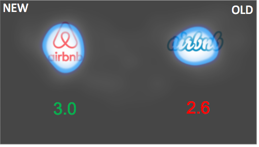
Airbnb
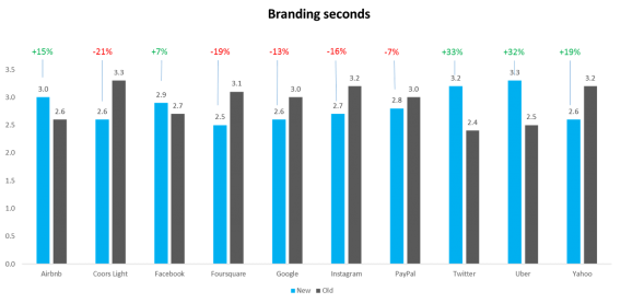
Side by side, the new Airbnb logo earned more attention than the old one.
Coors Light
The old Coors Light logotype, with a focus on the bold typeface, got 0.7 more branding seconds.
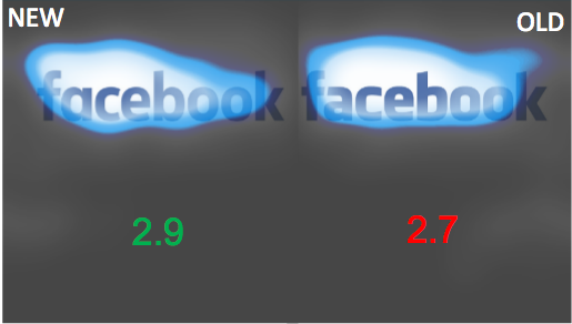
Facebook’s new logo is a slight improvement on the old one, beating it by 0.2 seconds.
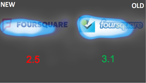
Foursquare
Foursquare’s new logo received quite a bit less attention than the old one.
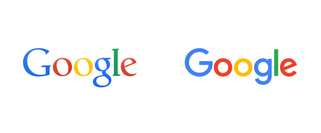
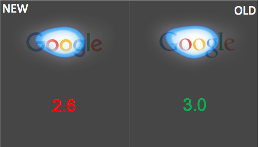
Google’s old logo earned more attention than the new one when placed side by side.
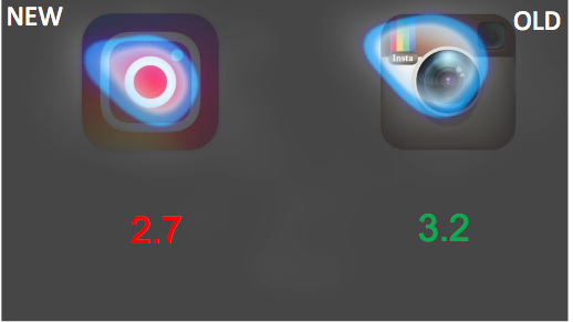
Looks like the haters were right: Instagram’s old logo won by a decent amount, receiving .5 more branding seconds. The focus landed primarily on the text in the upper left-hand corner.
PayPal
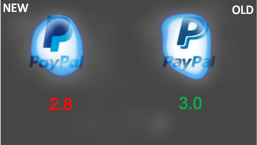
PayPal’s updated logo is very slightly less attention gathering than the old one.
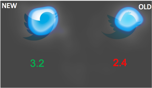
Twitter’s new logo is a grand improvement with 133% more branding seconds compared to its old one.
Uber
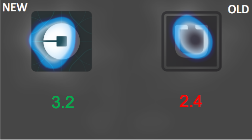
Uber’s new logo had the same improvement as Twitter’s new logo – a 133% increase in branding seconds. By the way, Uber’s logo change – one of the most radical – received quite a bit of hate when it debuted.
Yahoo!
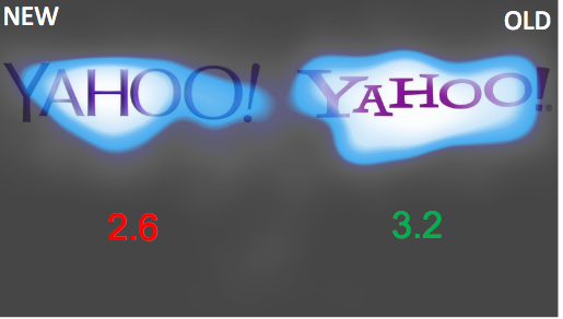
Yahoo’s new logo performed quite a bit worse.
See all of the results here:
Takeaways: What Matters?
Some logos garnered more attention in the mixed crowd compared to the side by side test, like Coors Light, Paypal, Foursquare, and Google. But what does this actually mean? What does it mean that Twitter and Uber’s new logos beat their old ones in terms of branding seconds and attracting attention from the crowd?
What it comes down to is recall – will people remember seeing the logo, and upon remembering the logo, will they know the company?
While brand recall from logotypes is just one aspect of a brand’s image, analyzing brand recall is a useful metric because even if people spend hours looking at your logo, it doesn’t mean anything unless they remember seeing it and remember which company it belongs to.
In order to test brand recall, we asked the participants of the grid experiments to list which brands they remember seeing without any assistance. Again, participants were only shown either the old or the new logos in a grid, but not both.
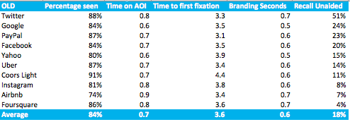
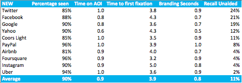
The results of the recall tests are below:
While, on average, the new logos were less able to be recalled than the old logos, some did better than others.
Facebook, Google, and Twitter were the big winners in the recall test with unaided recall percentages above 15% for each of them. However, Facebook did the best because its recall percentage actually increased, from 20% to 21%. Google’s went down, but only slightly, from 24% to 19%, and Twitter’s actually decreased the most, from 51% to 24%. Twitter had the most room to spare though, with a 27% lead on its nearest competitor to the old logo, and it maintained its top spot.
Coors Light deserves an honorable mention for keeping its recall percentage consistent at 11%.
The biggest loser was Uber, with the lowest recall percentage at 2%, dropping from 14% for its old logo. Airbnb, Foursquare, and Instagram were all close behind at 4% recall. Paypal also deserves an honorable mention for dropping from 23% to 8%.
Overall Biggest Winner and Loser
Biggest Winner: Facebook
Even though Twitter had slightly better brand recall, Facebook’s was the only one to improve with the new logo (Twitter’s decreased by about half even though it kept the top spot). Facebook also experienced an 8% increase in branding seconds in the side by side test and an 18% improvement in the grid test.
Biggest Loser: Uber
Uber made great strides in both the grid test (increasing brand seconds by more than 50%) and the side-by-side test (increasing branding seconds more than 30%), but these improvements don’t matter unless people recognize it as Uber’s logo. Because Uber had the absolute lowest brand recall score at 2%, we know that they don’t recognize the new logo as Uber’s, so all the branding seconds Uber’s been racking up are essentially useless.
However, there is hope: As people use the app more and grow accustomed to the icon, they will surely begin to recognize it as Uber’s. It would be interesting to run the test again in a few months to see if Uber’s brand recall score improves.
Limitations
These experiments come with certain limitations, which we want to disclose upfront:
- In our set-up and analysis, we don’t account for the brands strength (e.g. it’s easier for most to remember Facebook than Uber).
- We didn’t test the logos in a real life context. It’s a ‘competition’ with other logos and they might work differently on say an ad or on a web page.
- We only tested two different versions of the logos. That makes it harder to understand what draws and holds attention compared to if we could test several radically different iterations of the logos.
- We tested the old logos side by side the new logos, which is a situation that hardly ever appears in the course of normal, daily life. Once a company changes their logo, they won’t leave the old logos up as a comparison point.
- Because some of the companies had very similar results, it’s hard to draw conclusions because the differences are within the margin of error, e.g. the difference between 2-4 or 45-50.
Therefore, the results are indicative of a pattern but not hard and fast proof of any objective truth. It’s a good starting point, but more studies should be done.
Conclusion
In summary, companies that are looking to change their image shouldn’t be afraid to start with their logo – every new logo did better in the crowd experiment compared to the old logos. However, there are a few things to keep in mind…
Initial brand recognition is important. Before any big logo change, it’s necessary that people can recognize the old logo in order that the new logo holds any sort of sway or brand recall with the initial customer base.
And, related to that point, in general it’s best to keep logo changes grounded in the old logo. When changing the logo drastically, e.g. Uber, brand recall falls tremendously. If the new logo bears a basic resemblance to the old logo, people will still recognize the brand, as in the case of Google, Facebook, Twitter, and Coors.
Logo changes can be a great way to communicate internal change to the general public. If a company’s culture, value or internal structure changes, it might be a good idea to change the logo as well.





Interesting post, i didnt know this kind of experiment for logos. Is there a (e)book the get more deep knowlegment about this?
Hi Carlos!
There is indeed an ebook available — please sign up for free access at http://www.sticky.ai!
In addition to talking to someone with on-site support, please feel free to reply to this comment or email me if you have any trouble.
Best,
Jean
Intriguing results. I wonder if some of the results like attention could be due to the complexity of the design. Side by side maybe the new Instagram logo is more quickly recognized and understood, where the old one takes more time to soak in. It looks like there is a slight bias to that tiny “Insta” text.
Likewise with brand strength, as you mention, could have a big impact. Everyone knows Google. It’s so ubiquitous that perhaps we gloss over it because we know it…or vice versa?
Either way, very interesting data to ponder!
Thanks.
A facinating study. I’m wondering if there any any benefit to doing something similar with a new logo redesign project, and if in reality it would add any true value. Definately something to think about…
I’ve always respected something Michael Bierut frequently says when a new logo is released… that “a logo redesign is a marathon not a sprint” – only time will tell us the true value of the new logo.