Banner ads, webinars, email marketing automation, social media promotions, SEO, content marketing. You invest in a variety of digital marketing channels to get in front of new audiences and drive traffic back to your site.
Your landing page is the make or break of these efforts. It’s the point where effort spent on creative and dollars spent on ads culminate in a successful conversion—or not.
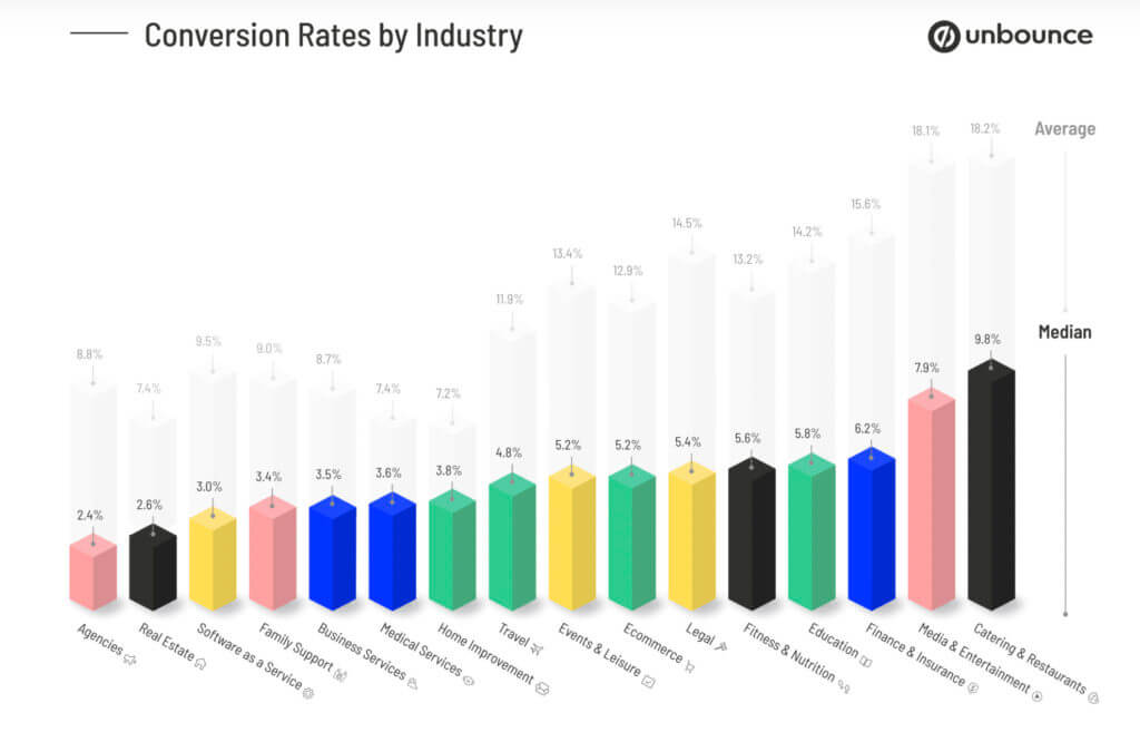
Unfortunately, most landing pages are ineffective, with an average conversion rate of only 4.6% across all industries.
Landing page optimization is the process of continuously testing, amending, and retesting the effectiveness of your web pages to improve conversion rates.
It’s the difference between being in the majority and being one of the top pages that converts.
Tactics such as A/B testing are crucial for evaluating the efficacy of your landing pages, but won’t move the needle unless you understand what contributes to a high converting landing page.
To illustrate, we’ll break down seven great landing page examples to show you what works and why.
Table of contents
1. Memberstack
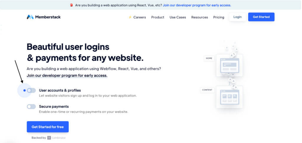
Secure login and payments SaaS company Memberstack is a great example of how interactivity, movement, and customization can create a unique landing page experience.
The top of the page is set up to deliberately guide the visitor to the flashing blue dot on the left side.
When we hit either of these toggles, the animation on the right side changes, visualizing the change in workflow instigated by using Memberstack.
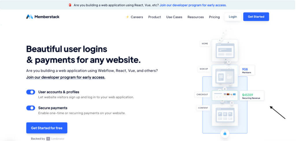
This is a clever way of demonstrating how the product works. It’s also a tactic to reduce bounce rates and encourage user engagement.
Studies show that interactive content can be up to twice as effective at engagement as static content.
The steadily climbing revenue and membership numbers also subtly leverage psychological priming, creating the unconscious connection that Memberstack means more members and more revenue.
The hero section effectively places CTA buttons at the top right and bottom left corners, two areas where eye-tracking studies have shown most gazes gravitate to when they first look at a landing page.
Below the lower CTA, Memberstack has hinted at the security of their platform using a social proof-based friction remover “Backed by YCombinator.”
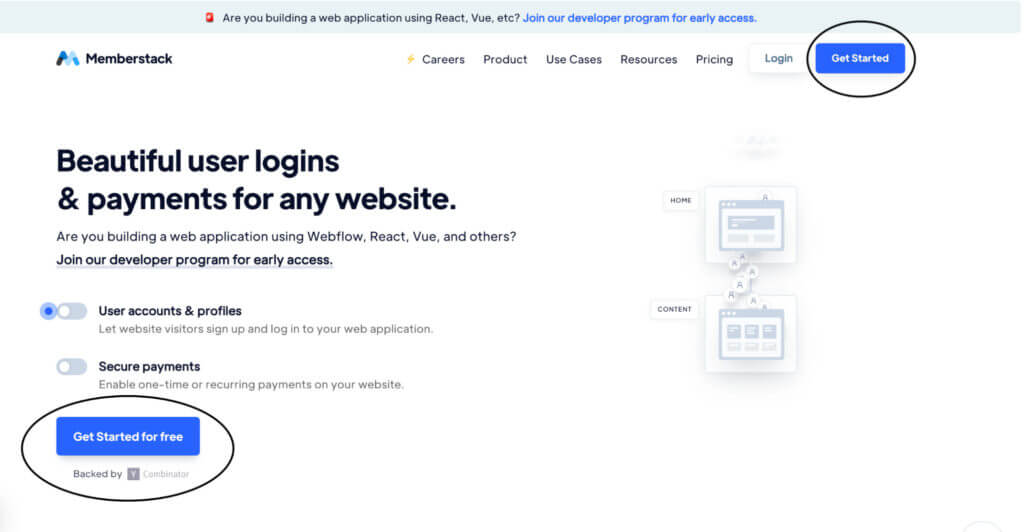
Memberstack’s B2B audience are familiar with YCombinator.
This is a clever piece of copy that answers the objection: “How secure is Memberstack’s payment application?”
Scrolling below the fold, Memberstack builds trust further by introducing a subheading with some important figures to demonstrate proof of results.
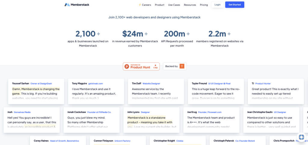
Notice how Memberstack places the larger numbers toward the center, with smaller figures on the outside.
This borrows from a well-known preferential bias that consumers have for the middle option when presented with a left-to-right array of choices.
Memberstack reinforces credibility with a second use of the YCombinator logo, as well as a call-out to Product Hunt, another household name for the brand’s core audience.
Memberstack’s use of testimonials is interesting here.
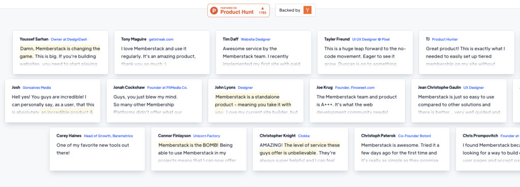
Most landing pages tend to use two or three contextually placed testimonials. Memberstack has loaded up on reviews, most of which can’t be read without clicking through to another page.
This may work in their favor if they’ve tested and validated that the quantity of social proof (the sheer number of positive reviews) is more compelling than the quality (the content of what reviewers are saying).
Scrolling further, we have a simple 3-step process on how the software works.
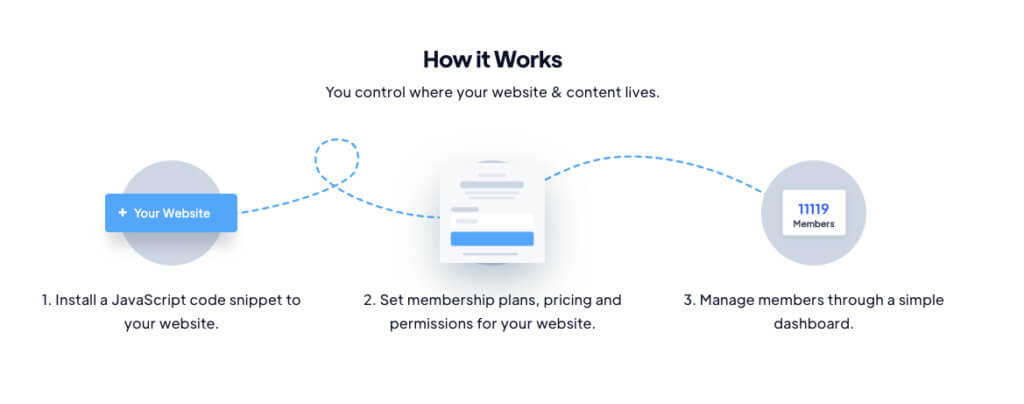
Memberstack keeps it brief, which is ideal. Low-intent pages like the home page don’t need to get too complicated.
The “Plug & play user accounts” section is a great example of how interactivity on a landing page can turn engagement into investment.
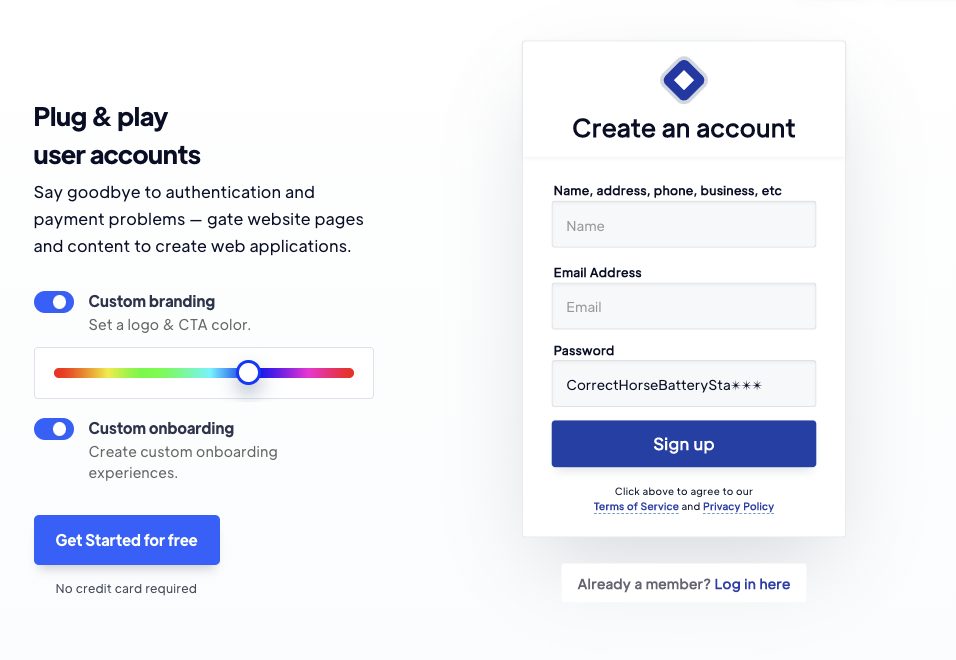
Using the slider and toggle buttons, users can customize the form on the right with colors and additional fields. They also have the opportunity to do this in the next section.
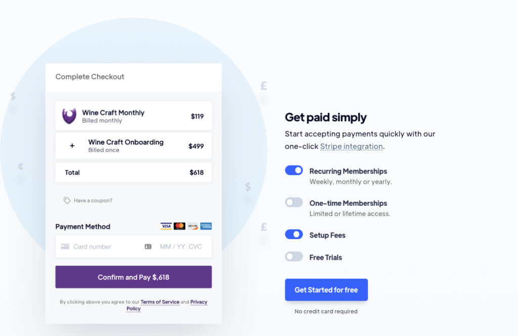
By exploring the features of Memberstack’s product in a limited way, viewers get a taste for exactly what they can do with it and how it can impact their lives.
This is influenced by a psychological principle known as mental ownership, a commonly used technique in direct sales (e.g., test driving cars before purchasing).
Engaging with the content helps users feel like it’s already theirs (and thanks to loss aversion, it means they don’t want to lose it).
The bottom of the page concludes with a final CTA section, which includes several friction removers:
- Get started for free;
- Unlimited trial;
- Upgrade when you’re read;
- No credit card required.

Focused copywriting like this is key to building high-converting landing pages. It speaks directly to common sales objections and solves them before they convince customers to abandon the sale.
2. Zendesk
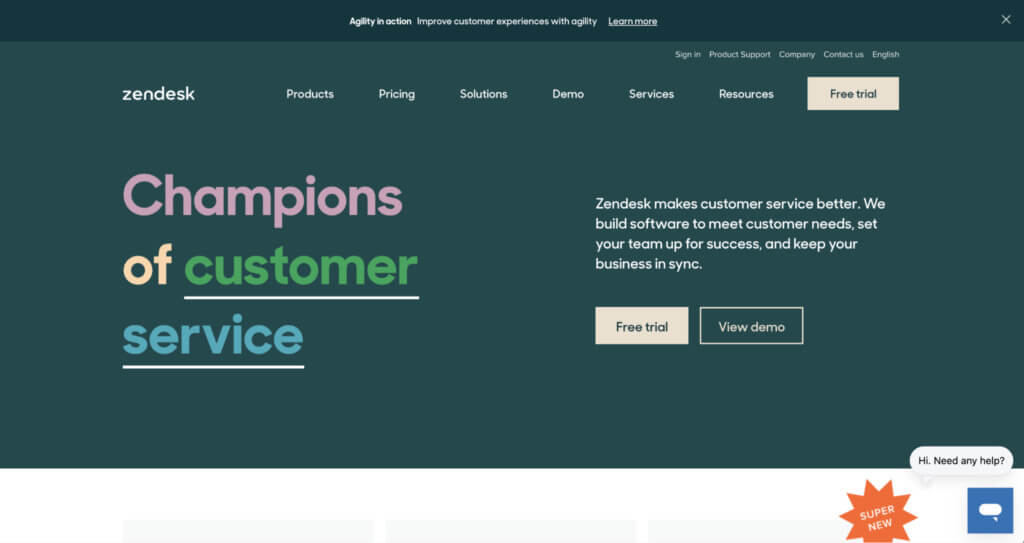
This landing page from Zendesk is a great example of matching page length and style with the target audience’s intent and awareness levels.
Conversion copywriter Joanna Weibe discusses how long or short landing pages should be.
“There’s no point in saying ‘long copy always beats short copy’… or ‘long copy doesn’t work on me’… or ‘web users will only tolerate short copy’…
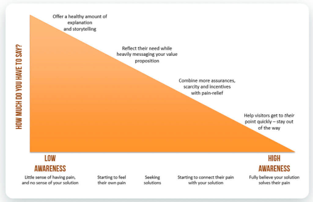
Rather, your page needs to be as long as is necessary to make the argument that will address the prospect in their state of awareness. If you don’t know how aware they are, you need to find out in order to shape your argument.”
She illustrates the interplay between awareness and intent in this chart.
Zendesk does just that.
The copy used in the homepage header is free of jargon and product-related language.
Zendesk jumps straight over “How it works” to “What’s in it for me?”.
The answer? Better customer service.
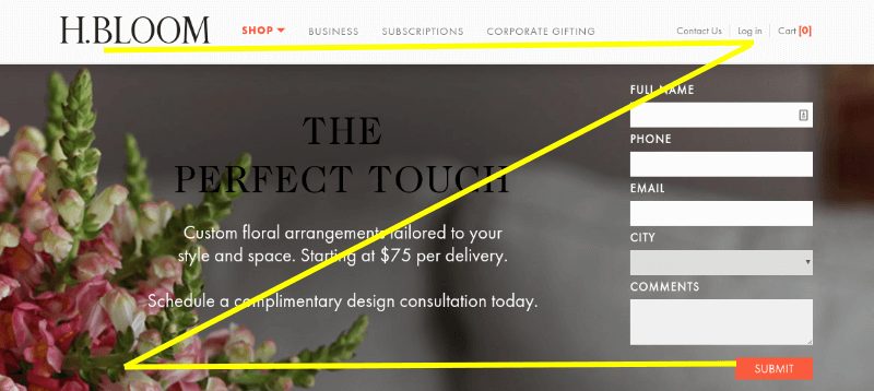
You’ll notice a clever design cue at the bottom right-hand corner too. This bright contrasting badge encourages visitors to scroll down and uses the classic Z-shape layout (also developed off the back of eye-tracking studies):
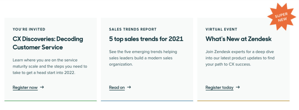
Scroll below the fold, and we’re straight into resources.
Zendesk knows that this landing page’s primary goal is to guide visitors down the marketing funnel using informative, valuable content.
The next section provides contextual information on what Zendesk does and the results it helps users achieve. It also provides social proof through short testimonials.
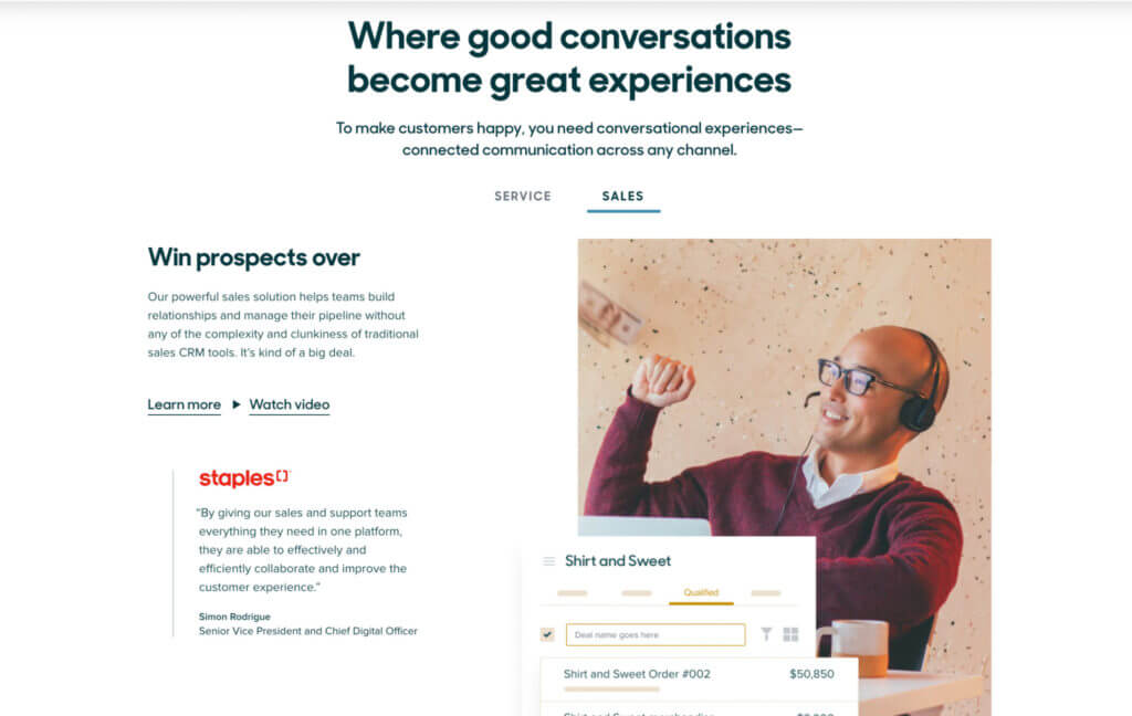
Notice how Zendesk serves two target audiences, service and sales teams, while maintaining an uncluttered aesthetic. They do this by using a simple toggle device.
Here’s the view for service teams:
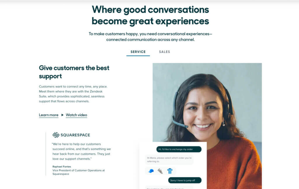
And for sales teams:
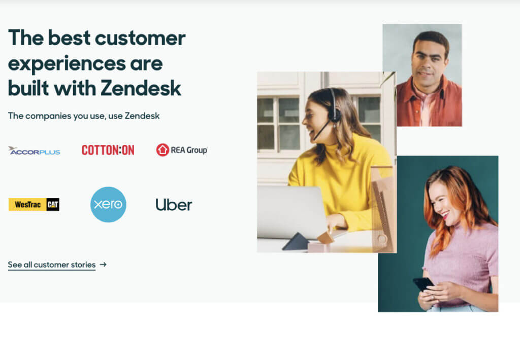
The next section leans a little more on social proof. It links to long-form case studies that tell customer success stories.
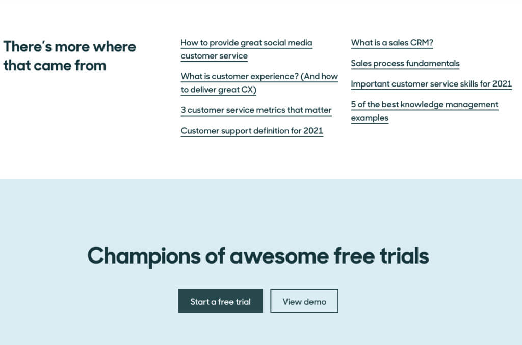
The landing page signs off with a collection of links to other resources (designed to keep visitors on their site and learning) and a no-fuss CTA section.
This landing page does two things well:
- Provides social proof, appealing to our susceptibility to the influence of others.
- Delivers value to top-of-funnel users through various resources and begins the process of engagement and lead nurturing.
3. Latana
This landing page from AI-powered brand tracking platform Latana is a powerful example of how to promote lead generation-focused guides.
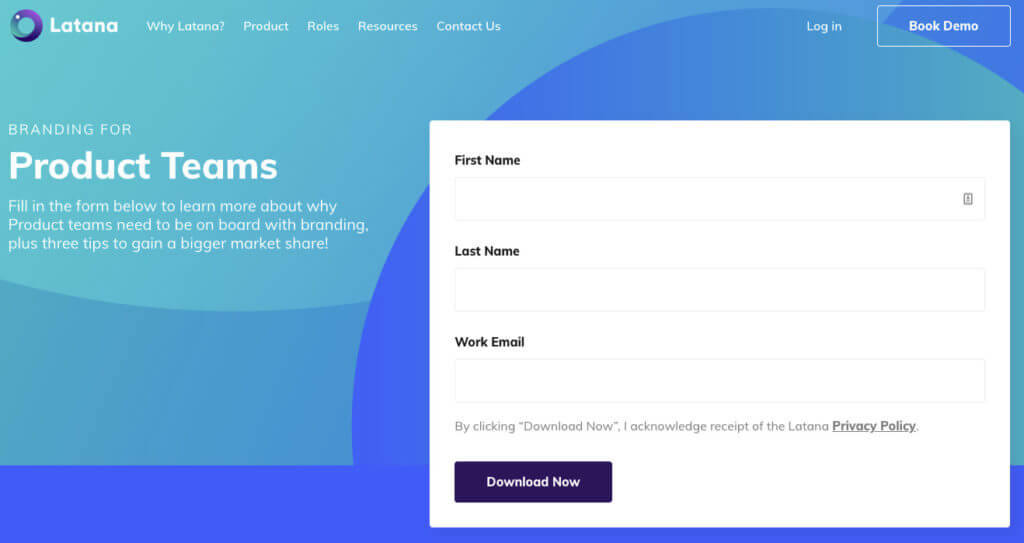
Latana keeps things simple above the fold. It assumes visitors are landing on this page to download their guide and makes it easy to opt-in and do that.
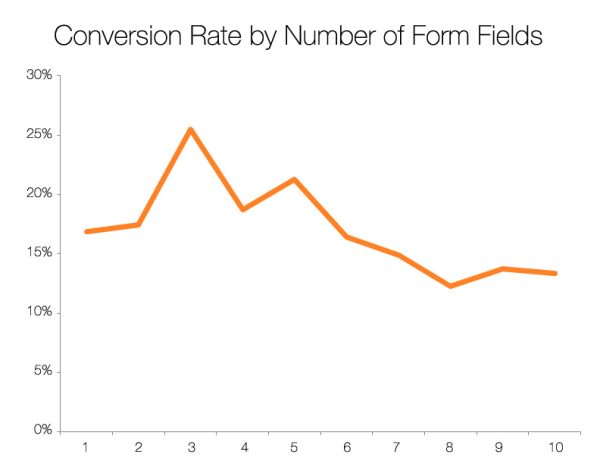
Secondly, Lantana keeps the signup form fields to a minimum.
It’s documented that conversion rates drop significantly with each additional field, with three fields being the golden number.
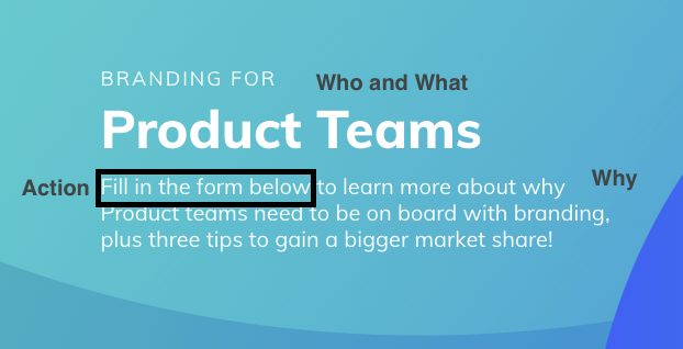
Third, the hero copy that accompanies the form is well-executed.
It answers the who and what: “Branding for Product Teams.”
The why: “to learn more about why Product teams need to be on board with branding”.
And the what’s-in-it-for-me: “gain a bigger market share.”
Lantana also slips in a simple action cue: “Fill in the form below.”
For those who need a little more convincing, the section immediately below the fold follows a simple yet effective storytelling formula: Here’s the problem, here’s why you should care about it, here’s how we’re going to help you solve it.
Then, it pushes the reader to action: “Download to find out how.”
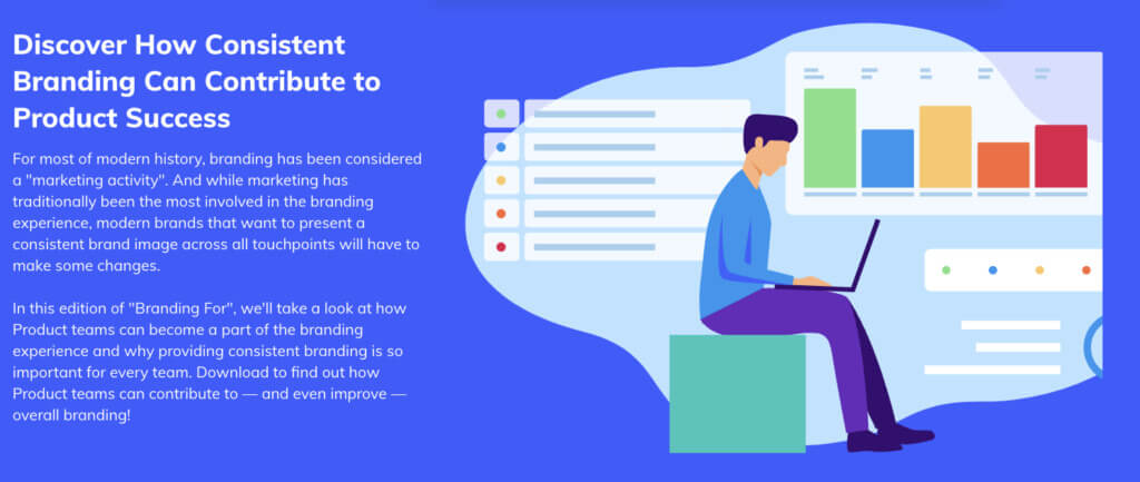
The landing page then answers visitors’ core questions again, this time with absolute clarity. It also uses an effective design cue that contrasts the rest of the page in style and color (designed to stop scrollers).
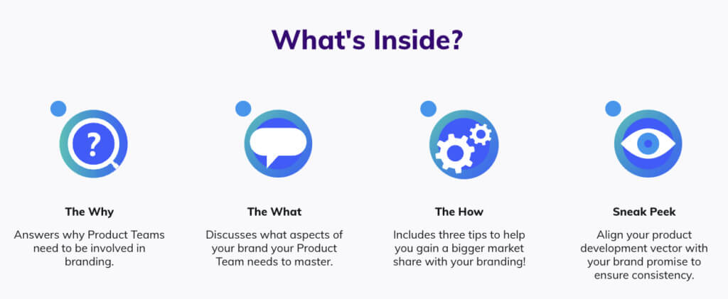
Latana also makes good use of social proof through the inclusion of well-known logos.
Though logo sections are typically used to add gravity to product-focused pages, they can also be effective as a means of demonstrating authority (i.e. we work with these big brands, so we know what we’re talking about).
Throughout this entire landing page, Latana skillfully keeps things simple.
The copy is effective and uses simple language (“Fill in the form”). The layout of information is simple and obvious, and the page doesn’t stray away from the core intent or try too hard to sell.
4. Headspace
Headspace’s subscription signup page is a powerful example of how to design a landing page for bottom-of-funnel visitors.
It does three things incredibly well:
- Effective use of social proof;
- A well-executed interactive demonstration of the product;
- Leverage of memory-enhancing copywriting tactics.
Effective use of social proof
The landing page has two social proof sections positioned back to back.
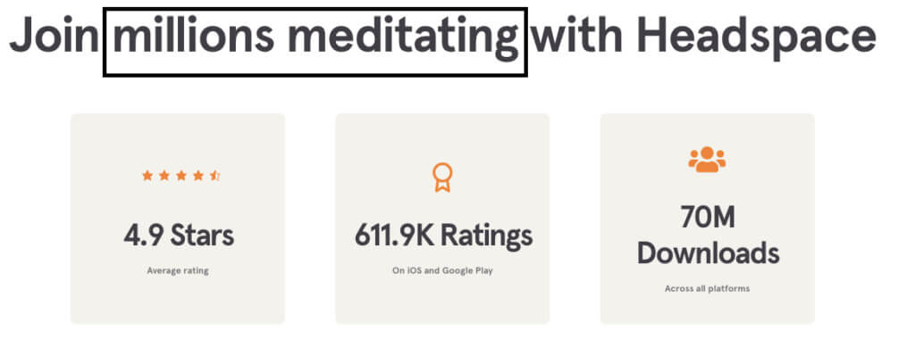
The first provides compelling evidence of widespread use (70 million downloads) and near-universal satisfaction (4.9 stars across 600k+ ratings).
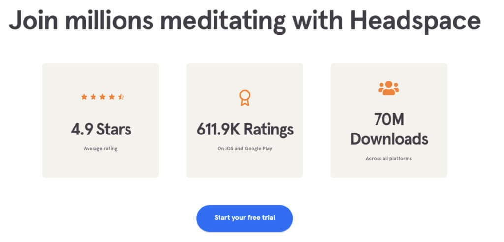
These impressive figures tell a story of a successful app. While convincing, the numbers alone lack the problem-solution-outcome framework that resonates with customers’ pain points.
And that’s precisely the proof that Headspace provides in the next section.
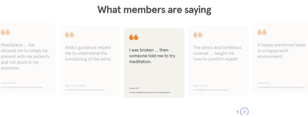
These are carefully-chosen testimonials that speak to common pain points experienced by Headspace’s intended audience (“stress and loneliness”, “broken”). And, to actual customer outcomes (“helped me to understand the functioning of the mind”).
A well-executed interactive demonstration of the product
This interactive demo of the product’s features solves a common barrier to app user retention and prolonged engagement.
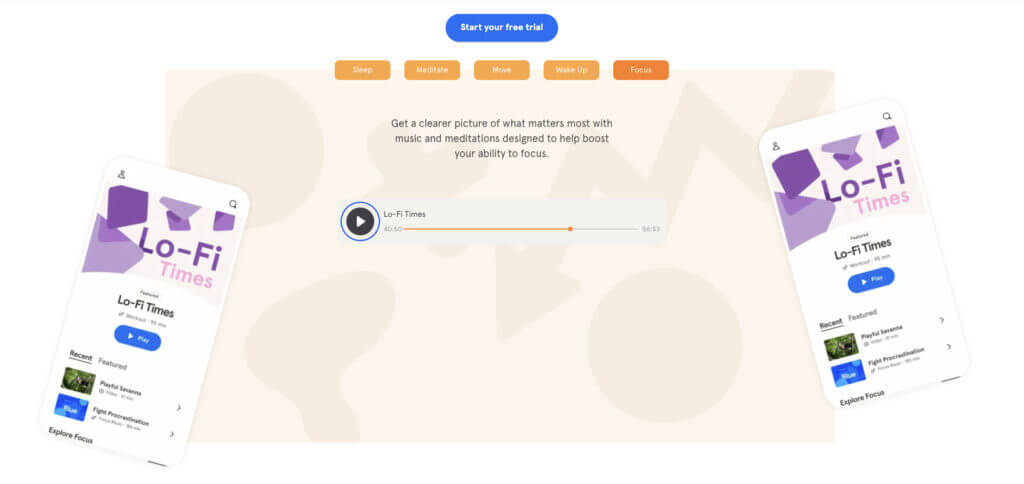
25% of apps are only used once before being deleted or abandoned. App store optimization (ASO) helps to maximize conversions, as do free trials.
But this interactive approach lets users test the product in a risk-free way; without pushing for a download before proving value. It also allows Headspace to guide users to specific features and demonstrate them using an explainer video.
In addition to the interactive demo content, they also offer a 14-day free trial. After interacting with the features, this free trial is likely to drive more subscriptions as the users truly want to learn more (rather than start fresh).
Leverage of memory-enhancing copywriting tactics
The copy on this landing page is filled with rhyming and alliteration, both of which are effective mnemonic devices.
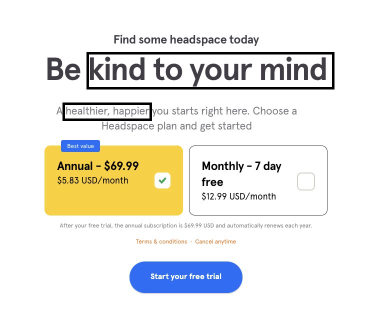
Using rhyme in your copy (e.g., “be kind to your mind”) leverages a psychological concept known as the Rhyme as Reason Effect, which loosely translates to “If it rhymes, it must be true.”
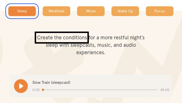
Similarly, alliteration (e.g., “Join millions meditating” and “Create the conditions”) is effective in improving learning and memory, even when statements are read silently.
These memory devices work to keep your brand front of mind when customers are ready to pull the trigger.
5. Lyft
With their “Become a Driver” landing page, ridesharing service and Uber competitor Lyft demonstrates exactly what it means to be in touch with your audience.
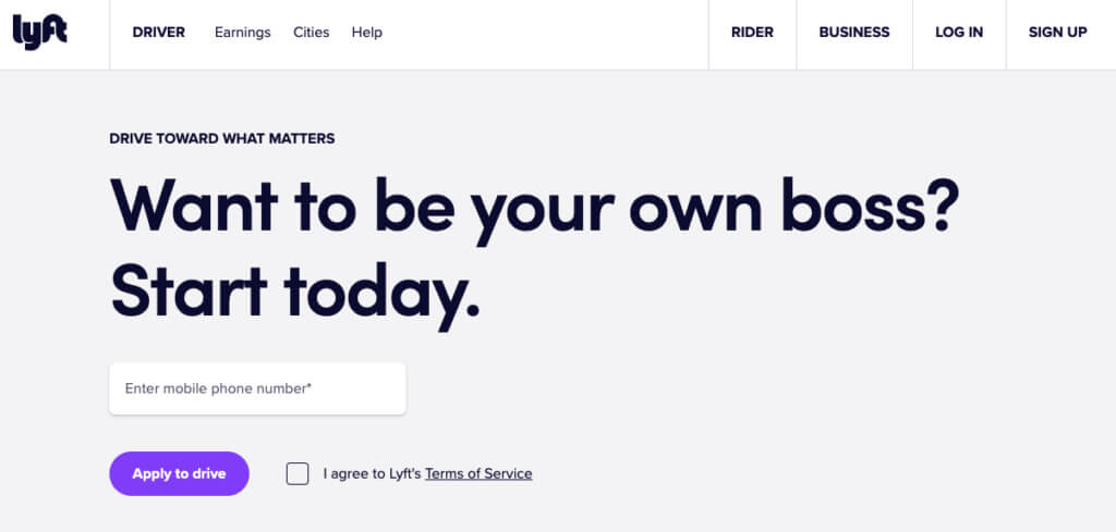
Note the copy in the hero banner: “Want to be your own boss?”
This message speaks directly to the shared desire of their target audience. Instead of saying: “Apply here to be a driver,” Lyft appeals to the emotional motivation.
The two sections that follow are about preempting objections. They allow readers to self-serve answers to pre-signup FAQs.
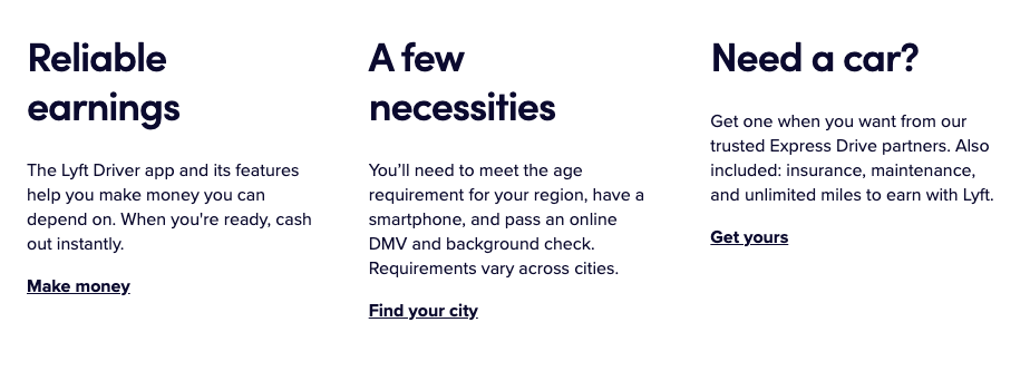
This section answers the most obvious questions, like “How do I get paid?”, “What are the requirements?”, and “What if I don’t have a car?”.
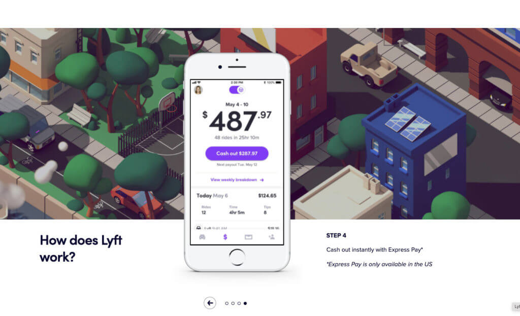
Below, a four-stage slider shows how simple it is to get started working with Lyft and get paid (a critical objection for potential drivers).
Lyft leverages social proof next, but not in the same way as the pages above. Lyft opts for a short video compilation of customer success stories to keep the space clutter-free.
Video captures engagement extremely effectively. It lets prospective drivers hear from real people, something that Lyft drivers typically find important.
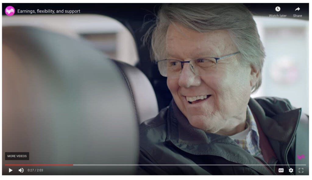
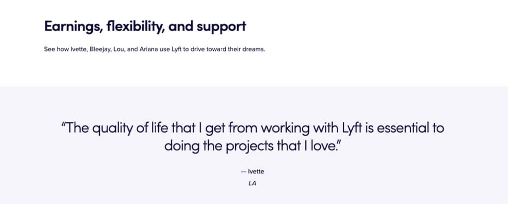
Lastly, a short segment of copy (and accompanying customer testimonial) reinforces the messages in the video: drivers are working with Lyft, not for Lyft, giving them the freedom and flexibility to earn on their terms.
6. Burrow
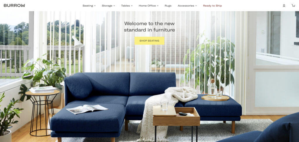
This landing page from ecommerce furniture retailer Burrow is an excellent example of using high-quality imagery and video to tell the story.
There’s very little going on above the fold as far as copy, links, and calls to action.
Instead, Burrow lets their photography do the heavy lifting. The high-resolution hero image demonstrates how their products look and feel in context, an important component of building mental ownership.
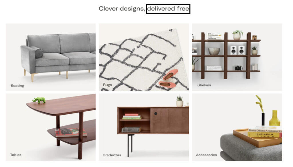
The second section takes a similar approach while directly addressing a common objection: the high cost of furniture shipping.
By prioritizing “delivered free” in the minimalist copy on the page, Burrow stresses its importance and helps it stand out in the white space.
In the next section, Burrow leverages the engagement lift of interactive content.
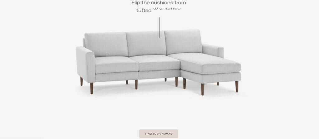
Burrow’s main value proposition is the competitor-crushing level of customization they offer for each product. For example, the sofa pictured below is available in over 200 configurations.
Rather than telling visitors about it, the landing page uses an animated video. Again, they draw attention and hold engagement by showing shoppers what customization means for them.
A second video answers another important sales objection: “How does this whole thing work?”.
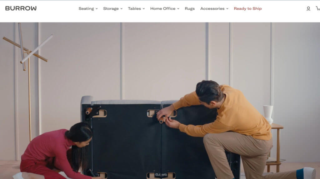
In 20 seconds, potential customers see exactly what they get out of the box. This demonstrates how simple it is to assemble their custom furniture.
Throughout this product landing page example, Burrow focuses on selling the experience, not their product.
Static images of isolated products can be viewed on individual product pages. But they don’t take pride of place on the landing page. Instead, Burrow uses in-context images and videography to show buyers what it means to be a Burrow customer.

They achieve this by displaying products in curated spaces and by leveraging the Instagram profiles of their real-life customers (doubling as social proof).
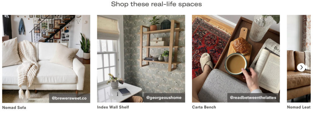
Burrow tops this off with a few intentionally-selected customer testimonials, which highlight the quality of the furniture (a potential lingering question).
They also speak to the target customers’ desires with the idea that customized furniture is a facet of identity expression and social influence.

Burrow’s landing page proves that high-quality imagery and videography can be a powerful persuasion tool. For the right product, it removes the need for copy-heavy page sections.
7. Klenty
Sales engagement platform Klenty provides a great example of a landing page built to capture competitor traffic.
Klenty operates in a competitive landscape, with its two top competitors Salesloft and Outreach owning a majority market share.
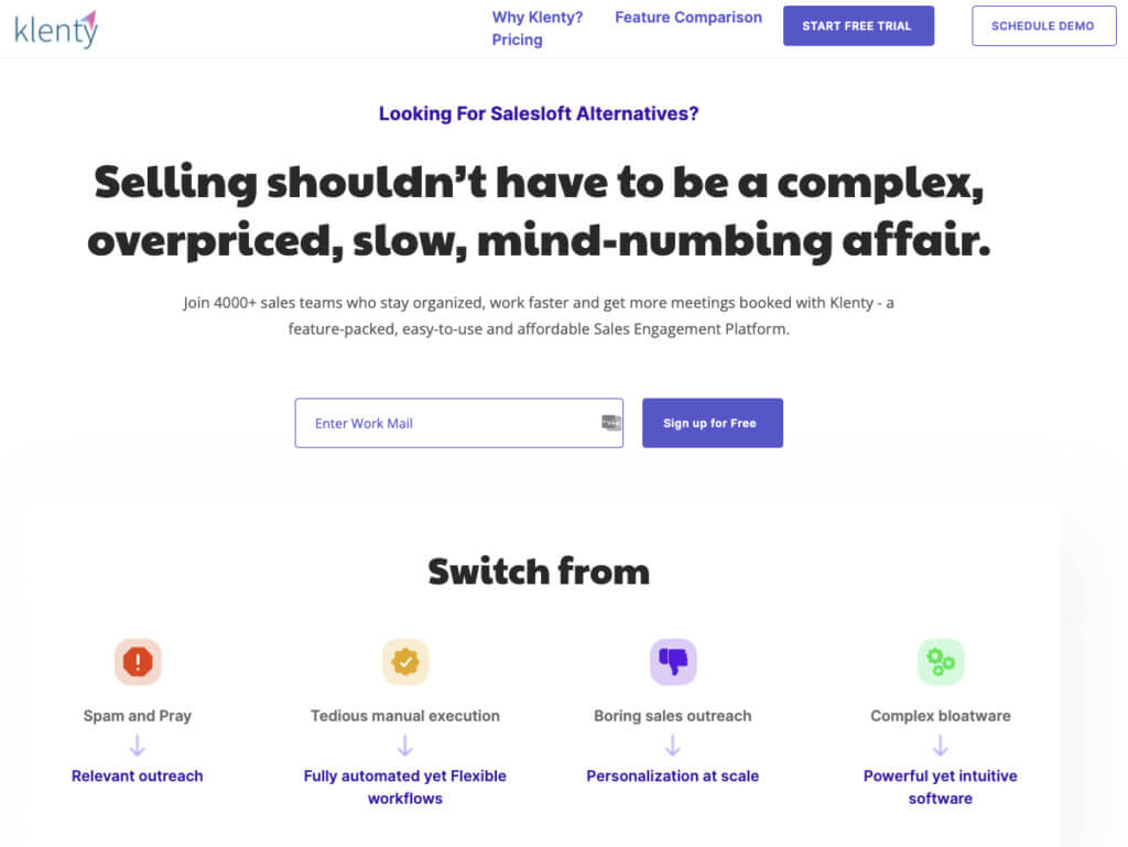
Klenty positions itself as a capable alternative and directs traffic to their landing page by targeting competitor keywords like “Salesloft” and “Salesloft alternative.”
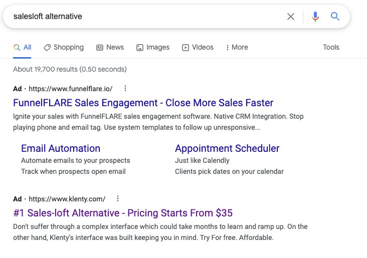
The landing page aggressively differentiates the brand from its competitors. It names them outright and lists their faults in the hero section.
This can be perceived as brazen and cut-throat, but Klenty is actually using an intent-focused strategy.
Readers are searching for alternatives to Salesloft, which infers there’s something they don’t like about the platform.
By listing their competitor’s alleged flaws, Klenty hints at their solution.
Below the fold, Klenty provides more context on the above pain points. They name Salesloft again and detail the key features where Klenty competes.
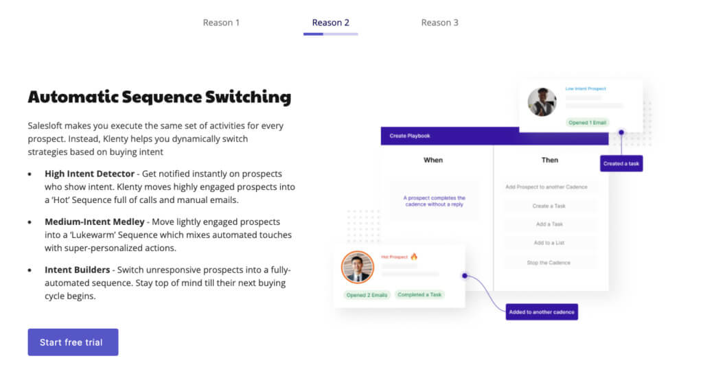
They maximize this space by organizing their top three benefits in an automated scrolling section.
This feature prevents the landing page from becoming too long or cluttered while providing some eye-catching movement via the progress bar and transitions.
A feature comparison section further down the page takes a similar approach. With its engaging interactive tabs, it manages to cover a lot of ground in a single fold.
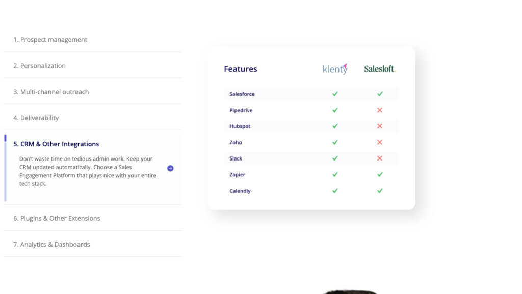
Klenty’s pricing information is also subtly positioned above Salesloft, and Klenty is given a larger logo as well as a more standout brand color.
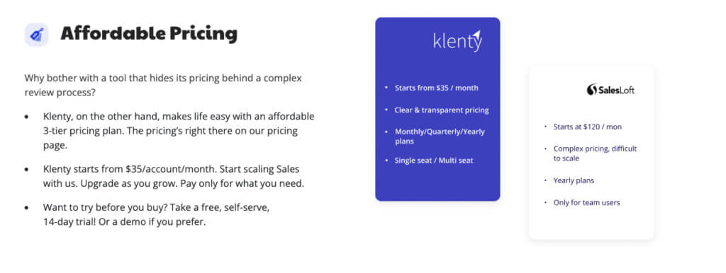
These design features are subtle, but intentional. Klenty uses visual hierarchy to reinforce the importance of their brand over their competitors.
Conclusion
A/B testing is critical to evaluate the effectiveness of your landing pages. But you need to know what to test if you want your resources to stretch further.
To get a head start on understanding what works for your audience, take advice from the pages above. Match your page to your target audience’s intent and overcome objections early and often.
Use tools like video and interactive content to organize information, leverage social proof, and stick in their memories to scoop up the less committed buyers later on.
To ensure you’re hitting the mark, use tools like Wynter to see if your messaging and strategy resonates with your target audience.
Landing page design and messaging is not a one-and-done affair. With consistent optimization, your page can reach its potential.

