Guidelines 192-197
When implemented correctly, accessories, recommended items, and related products are an easy additional profit.
Sometimes users really do need that additional accessory and you’ve simply saved them the hassle of looking for it. Other times they may not have initially planned on the additional purchase; due to the complementary placement of the item, however, it just seems like the perfect add-on.
These guidelines illustrate the potential of accessories, recommendations, and/or related products, and how to successfully add them to a product page.
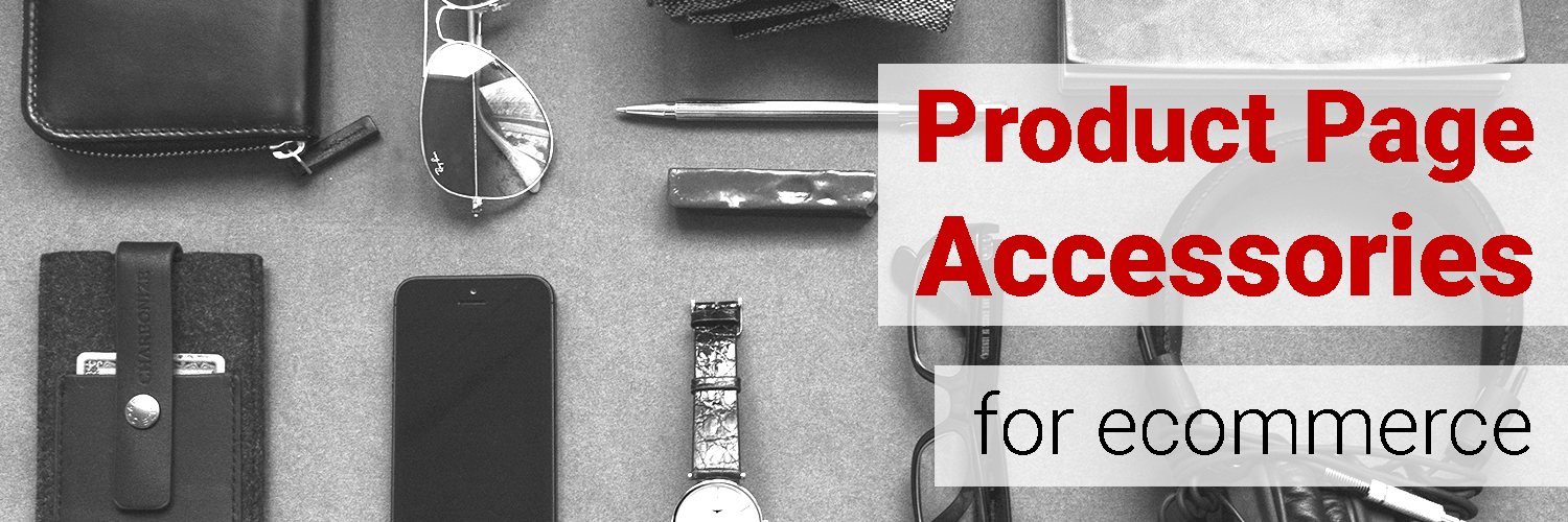
6 guidelines for ecommerce product pages, accessories & related products:
- Offer similar/recommended products to the product page.
- Offer accessories and add-ons to the product page.
- Link any other products to their rightful product pages.
- Similar products, recommended products, and accessories/add-ans should be in distinct and separate areas of the product page.
- Show “recently viewed items”.
- Allow users to clear or disable “recently viewed items”.
Guideline #192. Offer similar/recommended products on the product page.
Product recommendations (based on legitimate data) can have a powerful impact. MyBuys saw a 411% conversion rate increase when “smart” product recommendations were added to the product pages of 100 ecommerce sites.
Recommended -and similar- products should be relevant to the product page. If a shopper is browsing for a grey sweater, showing them similar sweaters on the product page can facilitate their journey and help them make the smartest purchase.
When executed correctly, sharing recommended products on the product page can increase purchases, items per purchase, and overall conversion rate.
How to do it RIGHT
Newegg
titles similar products, “Similar Items That Customers Also Browsed”. This collection provides social proof for the similar products in that these items have been viewed and considered by other customers.

Guideline #193. Offer accessories and add-ons to the product page.
Similar to the last guideline, accessories and add-ons complement the shopping journey. On the product page, they’re in the perfect location for an impulse buy. Again, these items should be chosen with care.
Recommended accessories and add-ons should be compatible with the product currently be viewed (e.g. smart phone screen protectors that are size-compatible with the smart phone product page being viewed).
If your customer is shopping for a large bouquet of flowers, there’s a chance they also need to buy a vase. Don’t show them a tiny, one stem trumpet vase, but something large enough to hold the entire bouquet they’re looking at.
Show a wide variety of accessories to increase the likelihood that shoppers will find a relevant accessory.
I also really liked the section that recommended things to go with the item of clothing you were looking at. That would really help someone who is not used to shopping for clothes feel more confident in their purchases, and might encourage them to stay on the site for longer.
How to do it RIGHT
Petco
On many of Petco’s product pages, users are shown this “your pet might also like” box just below the fold, linking to additional products complementary to the current product being browsed.

When browsing the product page for a gaming laptop, customers are shown “Combos” and “Recommendations” that are complementary and compatible to the gaming laptop. The “Customers Also Bought” description provides social proof, communicating that these are products that other people like. The Add to Cart CTAs make it almost too easy for shoppers to add a few impulse buys to their order.

Guideline #194. Link any other products to their rightful product pages.
What’s the point in advertising a product if people can’t figure out where or how to buy it? If you add any other products to the product page (similar items, accessories, etc.), make sure shoppers can navigate to each item’s respective product page by clicking on the product thumbnail.
Pottery Barn links to all the products in a product picture for a bench, even providing an “add to cart” CTA for those who are ready to buy the look:

What I enjoyed about the site was how you have the ability to actually view and purchase an entire “collection” or “look” of items that were identical to the ones that the model is wearing in given picture on the webpage.
How to do it RIGHT
J. Crew
offers a “Shop the Look” tool. When clicked on, it shows customers thumbnails of each product the model is wearing which direct them to the corresponding product page.

How NOT to do it
Forever21
Want the shoes to match the jacket? Users have to browse the site to find them.

Guideline #195. Similar products, recommended products, and accessories/add-ons should be in distinct and separate areas of the product page.
This guideline deals with the organization and appearance of a product page.
If you go to the trouble to curate a special collection of products or accessories, make sure the theme of the collection is understandable. Use ample whitespace, borders, and descriptive titles to separate these collections.
Using whitespace and a large title, Home Depot makes it clear:

The pages were too jam packed {with] internal ads for other products, in banners both above AND below the item being looked at. These were also all over the placeů so that I wasn’t even sure what was in my cart and what wasn’t.
I thought it was weird and distracting in a bad way that other items were displayed in the same size as the one that I was actually looking at.
Guideline #196. Show “recently viewed items”.
Showing recently viewed items can help shoppers in a few ways.
First, recently viewed items can serve as a search history. Shoppers can glance at them to remember what they browsed and what brought them to the current product page.
Other people use the recently viewed items section as a comparison tool, especially with visually-driven products.
A “recently viewed items” section can also serve as navigation. Instead of using the back arrow to revisit a previous product page, users can simply click on the product in the recently viewed items box.
Most importantly, recently viewed items have become a common feature and, for many reasons, people rely on them. Not having this feature hurts overall user experience.
Note: “Recently viewed items” should be session based, users shouldn’t have to log in to have access to this capability.
Guideline #197. Allow users to clear or disable “recently viewed items”.
People don’t always want their fellow computer users to know what they’ve been shopping for. For this reason, give users the option to clear the “recently viewed items” area history. Similarly, you can offer the ability to disable recently viewed items.