Guidelines 198-211
Customers will comparison shop. It’s what they do. After they decide on a specific product, they’ll open 10 tabs to compare 10 ecommerce shops, but before then, they’ll compare within a product category. This blender with these features compared to that blender with those features. That sort of thing.
It’s crucial that you allow them to do that well on your site. That way, they’re more likely to stick with you after they’ve picked what they want. So how to get them to stick with you? Design the comparison tool so that it’s (1) easy and (2) apparent.
The following guidelines are aimed at prototypicality of the comparison tool experience. There are many ways to implement it, but these guidelines should be the starting point for an acceptable comparison experience.
If you’re missing these, you’re hurting your conversions.
this site needs no improvement. It is very easy to find what you are looking for and it is so easy to compare products
I would make the “compare button bigger and the “Add to cart” button smaller
The only thing I noticed was the lack of side by side comparison. Or at least it wasn’t super obvious if there was one.
I loved the ability to compare up to four items side by side.
Also, how a comparison tool displays product information is crucial for getting the comparison shopper what they want.
Customers need to be able to interact with the comparison tool in an efficient and intuitive way. But they also need to get the right information, quickly, without the cognitive load of searching for it.
Comparison tables are popular in consumer electronics as these technical products have many important and comparable specifications that users need to know to evaluate one choice
14 guidelines for ecommerce product comparison:
- Pick the right comparison method for your situation: Compare Tool, Filter Method, or Standalone.
- Show notification when a product is added to comparison list, then tell users what to do next.
- Have the comparison select indicator be sticky or otherwise extremely accessible.
- Follow conventional design: Display a checkbox under or above the product image, indicate ‘select to compare’ or simply ‘compare’.
- Comparison tool should also be offered on search results pages.
- Add “add to cart” CTA for each product.
- “Close” or “Back to results” button should be visible.
- Allow users to email, print, & save comparison tables.
- Offer capability for users to mouse hover over technical phrasing/jargon to see a definition or description.
- Each product picture should be clickable, leading to product page.
- If there are many specs to compare, they should be organized, grouped, and easy to scan.
- Avoid product comparison if all differentiating product information is displayed on the product list page.
- Comparison page consistently shows the same specs for all products, consistent names, no empty cells, etc.
- Prominently include rating and number of ratings for each product on the comparison page.
Guideline #198. Pick the right comparison method for your situation: Compare Tool, Filter Method, or Standalone.
There are three common approaches to comparing products online:
- Select & Compare Tool – selecting “compare” checkboxes for two or more products and then clicking the (sometimes hard to find) compare button.
- Filter Method – an increasingly common method that allows more sophisticated filters to narrow down and do much of the heavy comparisons, via elimination, leaving the product list page to convey the rest.
- The Standalone table – doing the work for the customer, this is a pre-designed table that does well because it’s a dedicated landing page.
The rest of the guidelines in this “Comparison Tool” section refer mainly to the first approach, as the other two rely on either the filter/sorting of the product list and search pages (approach 2) or a stand-alone landing page (approach 3).
UXmag shares more on these three approaches.
I would have liked some kind of an option to compare on different items against each other. lust something where I could say add a couple of items and then click compare and have all the items on one page and I can just go through the different angles and views of each item without having to go back and forth between the results page and then details page for a specific item.
I felt it would be nice if there’s a compare button/option so I can make a comparison among 2-3 products.
Includ[e] COMPARE button/option to make comparison among different products on search results page.
The website absolutely needs an option to compare multiple products. Having to go back and forth between the search results page and item details page is unnecessarily frustrating.
How to do it RIGHT
Forever21
Forever21 doesn’t have a compare tool, instead allowing the filtering and images on the product list page to do the work for the comparison shopper.
This isn’t necessarily a bad thing, as user’s didn’t mention the lack of comparison as a problem often. Only 1 in 10 during user testing mentioned it as a frustration (see user quote below). And that’s considering we explicitly asked testers to compare products.
Experience goods like clothing and apparel are less spec-driven and, therefore, aren’t as reliant on people evaluating specifications before purchase (as they might for a hard drive or dishwasher).

I had a real problem trying to figure out how to compare similar items.
User quote on Forever21
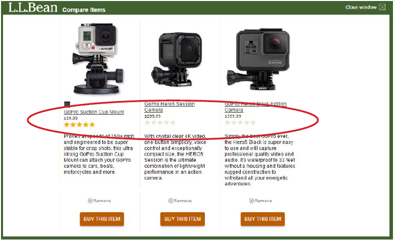
L.L. Bean
L.L. Bean uses the standard select-and-compare method, even for their apparel products. Many users commented that LL. Bean got it right with their comparison method.

I loved the ease of use for the compare tool. Out of all of the sites I utilized that tool on, I would say the ease of use was in the top 5 for this site. Very impressed.
User quote on L.L. Bean
Home Depot
Home Depot sells many products that can be relatively evaluated online without actually experiencing them. Because of this, they have the traditional select-and-compare tool, allowing users to compare up to four items at once.

I loved the ability to compare up to four items side by side.
User quote on Home Depot
Guideline #199. Show notification when a product is added to comparison list, then tell users what to do next.
A simple checkmark or X symbol in the checkbox is the first step, but people also need to know what to do next.
After an item is selected:
- Indicate that they must choose more items to compare.
- Indicate how many—what’s the max?
- Provide a prominent CTA to tell the shopper what to do when enough products are selected to compare.
Guideline #200. Comparison select indicator should be sticky or otherwise extremely accessible.
After the shopper selects one checkbox, they’re on the hunt for other products to compare, which means they’re going to be scrolling around. Make sure it’s easy for them to:
- Know how many more they need to compare;
- Find the compare button once they’ve found that number.
A simple solution is to have a sticky bar that lists the items in the comparison tool “queue,” along with a “Compare” CTA.
I would prefer not to have to scroll to the top or the bottom of the page to hit compare
How to do it RIGHT
Lowe’s
Lowe’s has one of the better solutions for allowing people to see items they’ve selected to compare, complete with sticky interaction, ability to remove items or clear all, a nice “Compare” CTA, and slick little product thumbnails. It’s all done while retaining a lot of whitespace, too.

Newegg
Newegg allows for an accessible “selected items” table by showing it whenever a shopper hovers over the checkbox next to the “Compare” button.
Wherever they are on the page, the box will display, and they’re able to easily remove items and click the “Compare” CTA. It’s a bit less apparent and obtrusive compared to a sticky bar. But it’s easy for a user to become familiarized.

I liked the comparison feature, it really helped to have a comparison table suggested to me.
User quote on Newegg
How NOT to do it
Hayneedle
See if you can find the “Compare” CTA on Hayneedle’s website. It took some of our test users a while to notice that the “Compare” CTA changes to a “Compare Now” CTA instead of a clearer indication like a “selected item” table. It may save space but isn’t as noticeable.
At least one user completely missed the comparison tool.

I would have liked to see an option to compare items side by side. It isn’t anything that, felt was missing but it would be nice to have.
User quote on Hayneedle
Guideline #201. Follow conventional design: Display a checkbox under or above the product image, indicate “select to compare” or imply “compare.”
This guideline applies to the select-and-compare comparison tool from Guideline 198.
Prototypicality is key here. The compare tool shouldn’t be overly complicated or difficult to navigate. Simple, intuitive, and typical design wins.
Place a select-to-compare CTA next to each product thumbnail on the product list. The CTA should be noticeable but less prominent than the “add to cart” CTA.
The only thing I saw from my short interaction was the lack [of] direct side by side comparisons of products. A user would need to use multiple tabs or the back and forward button to really compare stats.
How NOT to do it
TigerDirect
TigerDirect doesn’t allow comparison on some of their product list or search pages. And when they do, sometimes not every product is comparable. They do offer a “Tablet Finder” that allows comparison, but it’s separate from the product list page with its own icon and interface that the shopper must initiate.


Guideline #202. Comparison tool should also be offered on search results pages.
The search results page is effectively a product list page. The products displayed on the search results page are inherently related and thus should be comparable either via the click-and-compare tool, or by displaying product information consistently so that shoppers can easily scan products to find and compare relevant information.
REI allows comparisons in a very typical way via their product list pages, as well as on their search results pages. Here, after searching for ski jackets, we can readily see the prominent “compare” button below each item. REI knows we’re not going to add-to-cart from this display, so they make the CTA “compare.”
When selected, a screen popup appears from the bottom of the page directing users to select more products to compare. The one problem with this design is that there’s no apparent way to get to the product page. Customers are expected to know to click on the product picture.

How NOT to do it
Backcountry doesn’t offer comparison on their product list or search results pages.
Backcountry

Also, there was no compare tool that I saw so the only way I could compare items without leaving the search results page was just to eyeball everything and make a decision from there.
User quote on Backcountry
Definitely add a compare tool so that you can get a side by side comparison of similar items.
User quote on Backcountry
Guideline #203. Add “add to cart” CTA for each product.
People compare products because they want to buy one. Don’t make it difficult. Every product on a product comparison page (or within a popup) should have an “add to cart” CTA.
Typical placement is just below the product description:

I would allow for add to cart functionality from the compare screen to match behavior when shopping via a list of products.
How NOT to do it
REI
REI uses a “shop item” CTA instead of an “add to cart.” We’d be curious to know how their add-to-cart conversions and purchase conversions would change with a simple adjustment.
They do provide the CTA in a visually contrasting way, making it extremely apparent against all the tabular data presented.

Guideline #204. “Close” or “Back to results” button should be visible.
Clear navigation enables shoppers to browse products
fluidly. Any friction in the browsing experience results in the loss of potential buyers.
The product comparison tool is one where people need to know where they are, especially because they’ve taken a detour to get there and need a quick method to return to the standard funnel of search > list > product page.
Home Depot explicitly states how to get back to the product list, with the link placed where users look first: the top-left corner.

How NOT to do it
Newegg
Okay, Newegg, your breadcrumbs tell me that I’ve come from home, but I certainly didn’t. So not only do I not know how to get back to the product search I performed, but you’ve confused me about where I am on your site.

Crutchfield
Crutchfield offers a nice compare bar at the bottom, which is somewhat common. But they don’t have a clear way to cancel or go back, which created problems for some users during testing.

Definitely was the compare bar at the bottom. When I clicked the arrow, which I thought was going to bring it up more on the screen, it disappeared into the bottom and I couldn’t get it back.
User quote on Crutchfield
Guideline #205. Allow users to print comparison tables.
Though unlikely to hurt or help conversions, this is an often referenced feature of comparison tools. Users may want to print and share with a family member, or email to a colleague.
For whatever reason, people want the ability to extract the comparison information. We’ve seen examples where sites allow users to save or email the tables directly, but these actions can be done via print by PDF, and it saves the development of the save/email functions.
Most websites offer this function via a link in the upper right of the comparison tool. Like many websites with a select-and-compare feature, Lowe’s puts their print link in the upper right of the page.

Guideline #206. Offer capability for users to mouse hover over technical phrasing/jargon to see a definition or description.
What are ohms anyway? Is a high number good or bad? Do I really have to google this?
If people have to leave your site to look up a term, chances are you’ll lose them in the process. Explain what things are, as even intelligent shoppers don’t know all the jargon.
Newegg has a pretty techy comparison table for some headphones we selected to compare. It would be handy if they had hover-over windows explaining some of the features.

Also when i did the comparison of the products, having the headers like for the earbuds, the Input Impedance, i didn’t know if a higher ohms or lower was better
How to do it RIGHT
Crutchfield
Crutchfield does it better. They tell us exactly what impedance is, and how its units (ohms) affect energy consumption. Users can successfully compare the efficiency of selected headphones.

Guideline #207. Each product picture should be clickable, leading to product page.
This guideline is all about expectations. Most sites adhere to it.
Some sites like REI rely on this to get you to the product image from the product list page. Relying on this interaction may not be the best way to do it, but it’s certainly what many people expect.
The comparison is a step in the buying process. After assessing the differences, a choice is made. If they don’t click the “Add to Cart” CTA, then they’ll want to see the product page.
Within the comparison page, on product image hover, the product image/thumbnail should indicate that it is clickable. Once clicked, it should navigate to that product’s product page.
How to do it RIGHT
Cabela’s
Cabela’s comparison page shows small thumbnails of the products being compared, in this case fishing reels. The images are poor, but they indicate that they are clickable and navigate to the product page.

Guideline #208. If there are many specs to compare, they should be organized, grouped, and easy to scan.
Comparing technical products can be a hassle. There are potentially hundreds of specifications that could be be presented for products like computers and many consumer electronics.
Presentation of such large amounts of text and numbers is important.
Nicely designed comparison tables help people find what they want and don’t let anything get in the way of what the user is trying to do. Poorly designed tables put up roadblocks, create friction, and lose credibility.
How to do it RIGHT
Home Depot
For a dishwasher comparison, Home Depot’s design is well done, with relatively large font compared to many other in this subvertical, as well as indication (in blue background) of specifications where differences exist.

Lowe’s
Lowe’s is similar to other sites that provide two major groupings of product details: a primary area with the main info, and a secondary area with more specific, granular details, such as size specs and features.

Newegg
Newegg presents a wall of text in the “additional specification” section. Further, they don’t provide the same information across all four washers being compared, or provide groupings of specifications.
Guideline #209. Avoid product comparison if all differentiating product information is displayed on the product list page.
Many of the clothing and apparel sites we tested and benchmarked did not have select-and-compare functionality. The products don’t have many technical specifications that consumers would use to evaluate one pair of jeans over another, for example.
Therefore, these sites simply use filtering and sorting to allow customers to shop and compare products. Though not a hard rule, if you sell “experience goods,” the filter comparison method will suffice.
An easy way to evaluate if your customers would appreciate a dedicated comparison tool is to run a round of user testing on 5–15 users and setting a task to “evaluate” (don’t use the word “compare”) a few products. See if users have trouble with this task.
The compare feature was pretty bad. Basically all it showed me was product name, price, and overall rating. This was exactly the same information I could see while just browsing inventory.
Guideline #210. Comparison page consistently shows the same specs for all products, consistent names, no empty cells, etc.
This can be difficult for general merchandise sites or generally with sites that sell tons of products from tons of different manufacturers. It’s difficult to generate every field for every product efficiently.
That said, the better this is done, the more complete the comparison and the more credibility the site will have. See the examples below on Home Depot and Newegg in comparing washing machines.
The product details on the compare and product pages weren’t as detailed as I would want to really decide which product was best.
…one of the headphones I was looking at didn’t have a easy-to-read “specs” list. I could only rely on a paragraph to decide whether I wanted to buy the item or not.
How to do it RIGHT
Home Depot
Home Depot’s comparison page table provides details for every field for every product compared. Note the nice color scheme and grouping of dimensions and details.

How NOT to do it
Here is an analog to the above comparison of washing machines at Home Depot. This one is at Newegg.com. Notice that many fields are missing, and there are no fields in the fourth column.

Guideline #211. Prominently include rating and number of ratings for each product on the comparison page.
Reviews are a form of social proof. Both the quantity and quality matter.
When you’re looking at buying a book on Amazon, you want to know how many people bought the book, how many thought the book was excellent, and why those who rated it poorly did so. This information removes a little bit of the uncertainty of online shopping.
Reviews, as a Harvard Business School article put it, “fill in the gaps by providing a tremendous amount of information on which to base decisions.”
There are primarily two ways customer reviews are executed online:
- Internal word of mouth (WOM): Reviews located on the retailer’s website.
- External WOM: Reviews located on a third-party website (e.g. Yelp).
Whichever you have, use them. People expect them, and they can remove barriers to purchase. Include how many people reviewed the items, and allow people to read the reviews.
How to do it RIGHT
Cabela’s
Cabela’s provides both the number of reviews and the ability to read the reviews. Now we can see that the third reel has way more reviews than the first two. The high average rating for all reels makes a compelling case to stay on this site to pick one.

L.L. Bean
The site provides stars in their comparison tool display, but they fail to provide how many reviews make up the reviews. This comparison tells the shopper that the two cameras on the right are likely not rated at all, and the one on the left is likely rated by very few people, as a full 5-star rating is difficult to get if there are many reviews.