Guidelines 217-221
The checkout flow is where the money is at.
Think about it, random people leave the site before ever entering the checkout funnel, while motivated buyers come here to finish their order. Any small increase in this step usually has a direct impact on how much more money your site makes.
Example: An Ecommerce site that we analyzed recently had a payment page where 84.71% of the traffic proceeded to buy. We calculated that if we can increase that to 90%, that would result in 461 more orders and additional $87,175/month. That would be 23.94% growth in revenue. to yes — °small” gains here can be very big.
So, the question is how do we get more people to go through our checkout flow and complete purchases?
Specific tactics depend on your site, but the principles for coming up with the answer are universal.
And the principles are generally to make it simple, clear, and fast.
‘really enjoyed hew simple and quick the whole checkout process was, especially having the guest checkout option
Check-out process is long. Most websites these days have 1-2 step check-out process
5 guidelines for ecommerce Cart & Checkout Navigation:
- Checkout process should be linear and clear.
- For checkouts with many form fields, accordion format works well.
- Show progress indicators throughout checkout process.
- Avoid “reset” and/or “clear” buttons.
- Avoid contextual words for CTA buttons (e.g. ‘continue’).
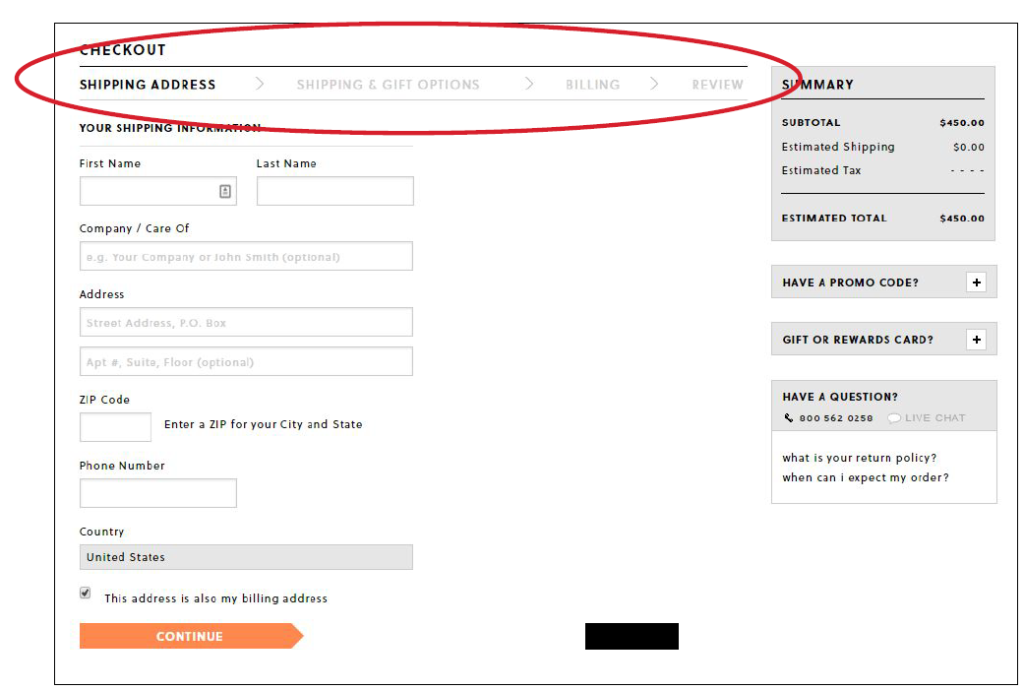
Guideline #217. Checkout process should be linear and clear.
The less clicks (the less pages), the better; simplify the checkout process as much as possible.
Most checkout processes are linear, and have been for quite some time. So when there’s an exception, it sticks out, and customers get either annoyed or confused.
Most of the time it happens when a site wants to force registration before checkout.
Here’s the path that some users had with H&M, where they were forced to register, and some users lost cart contents after registering, forcing them to go back and find the item. On top of this, even when registered and logged in, the checkout made users ‘register’ again as the first step in the checkout process.

The payment section is what frustrated me the most. I felt like the order of the steps was not very intuitive and quite confining.
The pages had too much information on them during checkout. It was overwhelming and distracting. (Free shipping several different places, images and links to other sections of the website, etc.)For checkout I want it to be clean and focused on me getting my products ordered.
Guideline #218. For checkouts with many form fields, accordion format works well (if done right).
Accordion style checkout processes are becoming more and more popular for good reason.
They allow a lot of fields to be organized and therefore processed easily. A checkout process is a commitment, so the easier it is the better.
Accordion checkouts are a take on an organized and dynamic linear checkout process, but the fields and data and content is chunked into manageable parts all without any page loads if implemented well with AJAX.
There are two important things to keep in mind when using them:
- Don’t completely hide info in the higher levels, provide summaries, and
- Make it apparent that the user is still on the same page and if they want to edit previous sections they’ll select an edit button instead of the back button.
the payment was too many pages long and quite slow to load.
It is a little cluttered with information at the checkout
I would have liked the checkout to be more simple and displayed on I page instead I felt like I had to go through 4 pages to complete it.
Make check-out task a one step process
I felt like having to click continue after ever section made the process feel more complex than it actually was. But if I reflect back an the content of those steps it’s not really asking me to fill out aummLipfpqmqgioff4han any other retail site wouldvbutkomehoWiOgoveere me that impression.
How to do it RIGHT
Gap
Gap (Banana Republic, Old Navy, and Athletica too) use this accordion style. Even though they require an email even for guest checkout, it’s obvious to the user what’s coming next. Note the smaller second figure where the summary of the previous inputted info is displayed.

Guideline #219. Show progress indicators throughout checkout process.
This can be implemented in many ways, but the goal is to orient the user and to not make them wonder where they’re at or that the process will take a long time.
The convention here is the progress bar at the top of each checkout page, indicating where they are in the progress.
Accordion-style, single page checkouts are increasing in popularity because it allows for all the steps to be on one page (no extra page load times) and allows the user to see where they are in the process and to go back and edit information if needed.
Show progress indicators throughout checkout process
How to do it RIGHT
J. Crew
Has a nice minimalistic site and checkout process. They follow convention here with the progress bar at the top of the each page through the funnel.
How NOT to do it
Forever 21
Doesn’t provide any indication of where in the checkout process we’re at relative to other steps. We see we need to add a shipping address, but why have a CTA for this, why not just ask me? And what’s going to happen after?

Guideline #220. Avoid “reset” and/or “clear” buttons.
The risk of accidentally resetting all the information outweighs the rare benefit of someone needing it.
Additionally, when information is partitioned with the increasingly popular accordion-style of checkout process, then resetting or clearing is needed less often, as simple manual edits work well.
Sometimes a cancel button is used with sensitive information fields in order to allow users to delete the critical information before abandoning. There’s an argument to be made that even here it’s not necessary, but if added it’s important to make any kind of cancel, clear, or reset button not obvious and certainly not placed near the submit button where a user would confuse the two.
Guideline #221. Avoid contextual words for CTA buttons (e.g. “continue”).
The issue with ambiguous words for the CTA is that they’re confusing.
‘Continue’ could mean submit and next step, or it could mean be confused with continue shopping, often used as well in the checkout process.
So the question is, Continue where? Next checkout step, or continue shopping?
Another example is “Back.” Back where? Back to the previous page? Back to the homepage, search page? Where? And how about “Proceed” or “Next” or “Apply”? Depending on the customer’s thinking and the context for how they arrived at the page, these contextual words mean different things.
Be clear. Tell them where they’re going. Don’t leave room for interpretation. Say ‘Shop More’, ‘Check out Now’, ‘Provide Shipping Info’, etc.