Guidelines 110-114
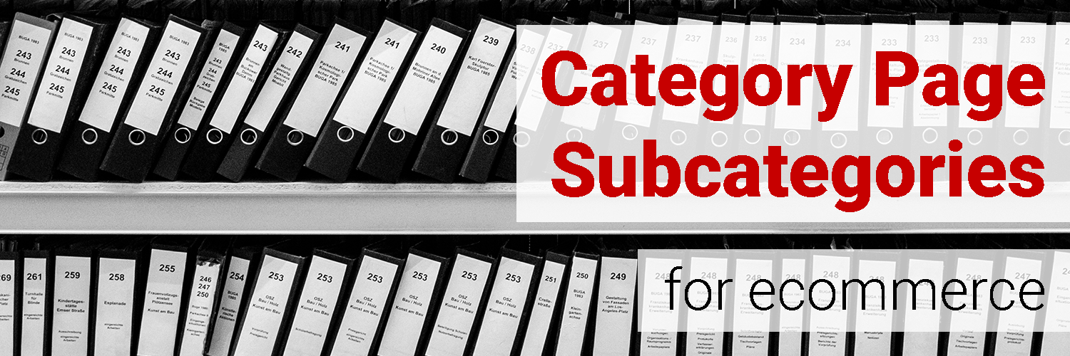
The purpose of a category landing page is to visually show how a site’s categories and subcategories are organized.
By providing a list and/or grid of categories and subsequent subcategories, users get an idea of where to find products.
The following guidelines provide insights on subcategory creation, design, and organization.
2 guidelines for ecommerce category landing page subcategories:
- Display both a left-hand vertical list of subcategories and a grid view with thumbnails.
- Offer thematic categories/subcategories (seasonal, sale, etc).
- Aim to have or less subcategories per category.
- Put subcategories under multiple categories when appropriate/necessary.
- Create an accessories subcategory for every category that has accessories.
Guideline #110. Display both a left-hand vertical list of subcategories and a grid view with thumbnails.
By displaying categories both as a list and as a grid, you’re facilitating intuitive search flow for many different intentions.
For users who simply want to look around, a grid showing categories and subcategories — complete with attractive photos — will nicely complement browsing behaviors.
For users who came to your site for a specific reason, a vertical list is most helpful. The utility of a quick, organized list helps to quickly move this group of users along to their search goal.
Hayneedle d
The rest of the subcategories are displayed in a secondary grid further down the page, clearly titled More Furniture Categories
The product thumbnails provide an intuitive representation of what users can expect to find within each subcategory.


Guideline #111. Offer thematic categories/subcategories (seasonal, sale, etc).
Create a space for special categories next to the permanent categories.
These can include sale items, holiday/seasonal categories, a mix of the two (“summer clearance”), or other groups that a significant number of users shop for on your site.
If lots of people come to your site to buy Christmas gifts, save them time and offer inspiration by curating a “Holiday Gifts” category, and displaying it front and center.
Rei adds a Gifts category during the holiday season:

Hayneedle shows a Gifts, Holiday Shop, and Sale category:

Love that a “gift” tab is available. I think this is a beautiful idea for those who are in need of a gift but aren’t really sure what to get the person (e.g., co-worker). Excellent option to have!
Offer a gift center with ideas that fall within various price ranges.
It would have been nice to see a ‘Gift by occasion’ section
I enjoyed that the website included multiple user guides and style guides in the product sections. Buying clothing online is difficult and gaining understanding on how the product would look on me is a major advantage over the competitors.
How to do it RIGHT
Pottery Barn
Pottery Barn has Holidays, Gifts, and Sale categories.
The Holidays category shows products for popular holidays in fall and winter seasons: Christmas, Thanksgiving, Hanukkah, and Halloween.

Guideline #112. Aim to have 10 or less subcategories per category.
Another general rule of thumb, this guideline aims to keep your site’s category organization on par. If you have 25 subcategories in one category, there’s probably an issue with the grouping and/or organization of categories.
Keep in mind that this is a rule of thumb. There are exceptions. For example, Petsmart goes over the limit of 10, but maintains high usability with a clean menu and clear category titles:

How NOT to do it
Outdooraction
The majority of subcategories here are types of jackets, and would be better grouped as sub-subcategories under a Jackets subcategory.
Some of the subcategories don’t even state what the product is (Heavyweight Fleece, Synthetic Insulated, etc), you have to assume they’re more jackets.

Guideline #113. Put subcategories under multiple categories when appropriate/necessary.
Category organization is not black and white. There are going to be subcategories that easily belong under multiple categories. Don’t fight this fact, instead work with it.
West Elm shows Trays under both the Accessories category and the Tabletop category:


The thing that frustrated me was the fact that I couldn’t find table lamp under furniture column.
I was a bit confused while searching for shirts because t-shirts and other shirts were not included in the shirts/blouses category.
Guideline #114. Create an accessories subcategory for every category that has accessories.
Instead of cluttering a product category with accesories (“why are there keyboard covers in the laptops category?”), create an accessories subcategory.
This simple move creates less confusion and more organization.
Cabela’s has either an Accessories subcategory or sub-subcategory for every main category:


When I was searching for a picture frame gift, there were several items appearing in the picture frame category that were not actual picture frames, such as wiring and hanging kits. While these are relevant, they don’t represent what I was looking for and it was a bit frustrating to have to sort through them.