
It took us six rounds of tests until we landed on a variation that was doing 79.3% better than the version our client had before coming to us.
Table of contents
Background
TruckersReport is a network of professional truck drivers, connected by a trucking industry forum. It’s a great community for drivers to share information and assist in each others’ careers. I guess it’s what you’d call a niche site—but that niche brings TruckersReport over 1,000,000 visits each month (close to 5 million pageviews).
One of the services they provide to their community is helping truck drivers find better job opportunities. Truck drivers fill out a one-time online resume, then choose between offers from pre-screened trucking companies.
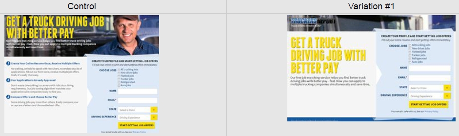
This was the landing page they had, our starting point:
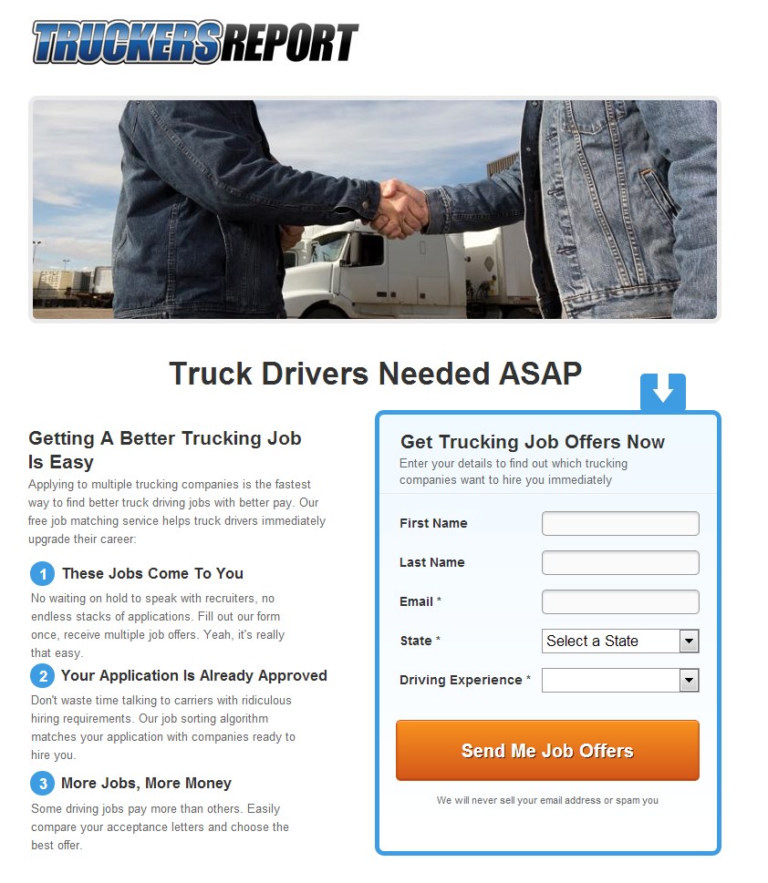
This landing page was converting at 12.1% (email opt-ins).
What followed after the initial landing page was a four-step online resume building flow. The primary request was to increase landing page conversions—to widen the funnel at the top—but also to increase overall funnel conversions.
Analysis
In addition to heuristic analysis, we analyzed the current page using Google Analytics, set up mouse tracking data collection (click data, scroll maps, attention heat maps) and started to record user session videos via SessionCam.
Next, we wanted to understand the audience better. We ran an online survey using Google Forms to get in the head of truck drivers:
- Why were they looking for a new job?
- What matters the most about truck-driving jobs?
- What were the main motivators, hesitations, and questions when considering a new job offer?
These were the top factors what we focused on:
- Mobile visits (smartphones + tablets) formed about 50% of the total traffic. Truck drivers were using the site while on the road! We need responsive design.
- Weak headline, no benefit. We need a better headline that includes a benefit and addresses the main pain-points or wants.
- Cheesy stock photo—the good ol’ handshake. We need a better photo that people could relate to.
- Simple but boring design that might just look too basic and amateur. We need to improve the design to create a better first impression.
- Lack of social proof, credibility. We need to add some.
- Drivers wanted three main things: better pay, more benefits, and more home time. Other things on the list were better working hours, well-maintained equipment, and respect from the employer. Many were jaded by empty promises and had negative associations with recruiters.
Armed with these insights, we proceeded.
New design
This was the new, fully responsive design we created.
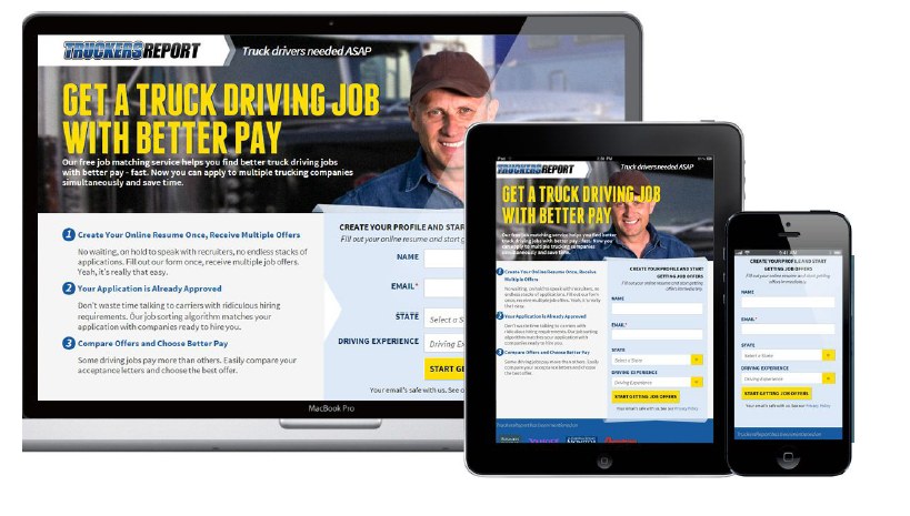
We didn’t want to change the layout dramatically. We wanted to isolate user issues more effectively. Heat maps and user session replay videos showed that the previous layout worked well in terms of usability.
Why this layout?
- Prominent headline that would be #1 in the visual hierarchy;
- Explanatory paragraph right underneath to explain what the page is about;
- Large background images tend to work well as attention-grabbers;
- Warm, smiling people that look you in the eye also help with attention;
- Left side of the screen gets more attention, so we kept copy on the left;
- As per Gutenberg diagram, bottom right is the terminal area, so that explains the form and call to action placement.
In the process, we also re-designed the funnel steps (also fully responsive).
Six tests to find a winner
Test 1
Hypothesis: Fewer form fields means less friction and hassle to fill out the form, resulting in more conversions.
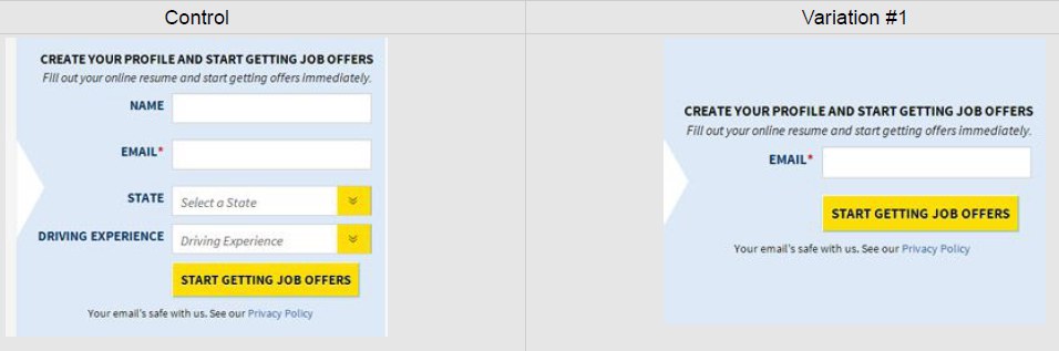
Results: The control beat the variation by 13.56%.
Insights: Although short forms usually outperform long forms, this did not apply here. More testing is needed to figure out why. Hypothesis: Added fields give more credibility or add relevancy; a plain email field can look “spammy.”
Test 2
Hypothesis: Copy that addresses the most common problems truck drivers face, using the the wording they actually use (taken from the customer survey), will resonate better with the audience.
We crafted a new headline and added bullet points full of benefits to address other stuff that came up in the survey.
Results: While there was no difference in landing page opt-ins, there was a 21.7% difference in bottom-of-funnel conversions—by the original. People lured in by big promises were less motivated to go through the whole five-step funnel.
Insights: Short, straight-to-the point language can work. Too many promises can look like hype or attract the wrong kind of people.
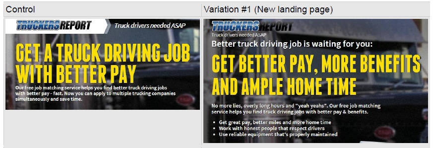
Test 3
In the first two tests, the average conversion rates were similar to the original landing page. But since traffic is ever-changing, we decided to test the original landing page versus the new landing page to make sure that the design was enhancing the site.
In addition, we wanted to test the absence of a “job match” page. By default, people who completed the opt-in landed on this page, which had some animation on it to help people perceive progress:
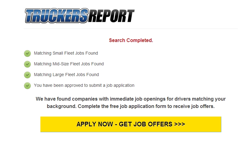
The idea behind this page was to help boost bottom-of-funnel conversions. Google Analytics showed us that there was a 10.8% drop-off rate on this page. So we wanted to test whether losing those people had a negative impact.
Results: Variation #1 (new landing page) resulted in 21.7% more opt-ins than the control at a 99.7% confidence level, and 24% more sign-ups from the whole funnel. The “Job match” page did not improve bottom-of-funnel conversions, so we removed it.
Test 4
We wanted to test more headlines.
Contestants:
- Original: “Get a truck driving job with better pay.” Straightforward.
- Question: “Looking for a truck driving job with better pay?” The idea here is that people always answer questions in their mind when they read a question.
- Three main benefits: “Better Pay. More Benefits. Respect for drivers.” The survey identified these benefits as the three most important.
- But you are free: “You can get a driving job with better pay. But, of course, you are free to choose.” The psychological phenomenon of “autonomy” is at play here; research has shown that it increases persuasiveness.
Results: Control outperformed all variations. The original headline beat out the second-best variation—”You are free to choose”—by 16.2%.
Insight: A simple, straightforward approach works best for this audience. So the question is, “How can we use this insight to make the page even simpler?”
Test 5
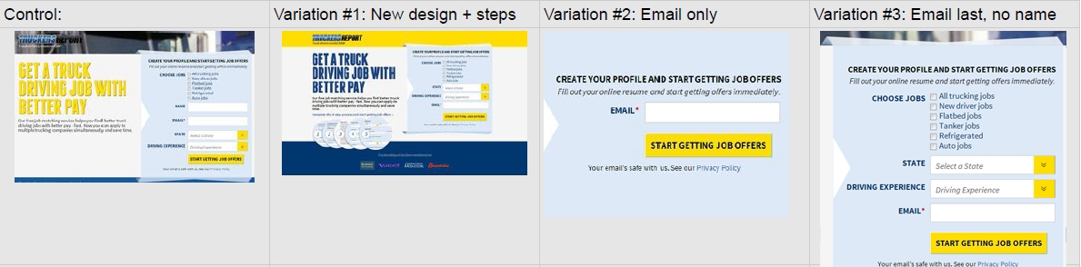
Building on the “simple” insight from the previous test, we created a shorter, simpler version of the page:
Results: Variation #1 with a shorter page layout and less copy outperformed the control and resulted in 21.5% more opt-ins at a 99.6% confidence level.
Insight: Learnings from previous tests proved right—a shorter layout and less copy resulted in more opt-ins. How could we now make it even simpler?
Test 6
We had many different hypotheses on how to simplify the page even more.
- A new design that’s built from the get-go for a more compact layout. Better content presentation typically helps.
- Remove all fields but the email field (the only mandatory field). Fewer fields typically helps.
- Get rid of the name field and make the email field the last one. The idea is that if people start with easy fields (e.g., drop-downs), it’s easier to get going, and by the time they reach the hard field—email—the user is thinking, “Oh well, I already started,” a known psychological phenomenon called “commitment and consistency,” identified by Robert Cialdini.
Results: Variation #3, with no name field and the email as the last field, resulted in 44.7% more opt-ins at a 99.9% confidence level.
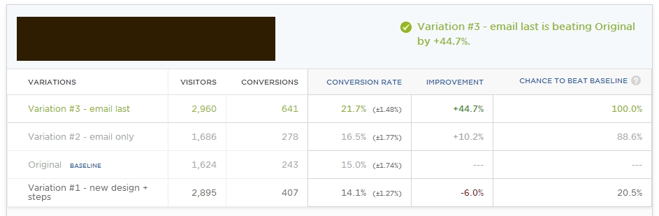
We achieved a 21.7% conversion rate (the margin of error was 1.48%, but no overlap with the ranges of other variations occurred), which is 79.3% better than the initial landing page.
Conclusion
When you start testing a page, don’t test just once and move on to testing other parts of the site. Don’t think of the process as one-off tests but as testing campaigns.
Learn from each test, make sure you send test data to Google Analytics, and segment the results. (I didn’t go into details here.) Keep iterating. Use insights from previous tests to drive upcoming tests. You won’t know what matters until you test it. Have a lot of patience.
If we had tested only the control versus the new landing page, we wouldn’t have reached 79.3%—and we were just getting started.
Note: This case study originally appeared in 2013.
Related Posts
-

We talk a lot about creating high converting landing pages, getting traffic that converts, and…
-
Navigation gives a user control, which is generally a good thing—but what about on a…
-
Do you want to make your website better? There are many ways to optimize a…
-
A landing page is the first page that visitors see after clicking on your banner…

