

Cialdini breaks down influence into six persuasion principles. What’s the best way to persuade somebody when talking to them? You have to be confident, talk fast, and swear a little, among other things.
But what about persuading somebody without words—possible?
You bet.
Researchers installed a ‘fly’ onto urinals across different airports around the world:
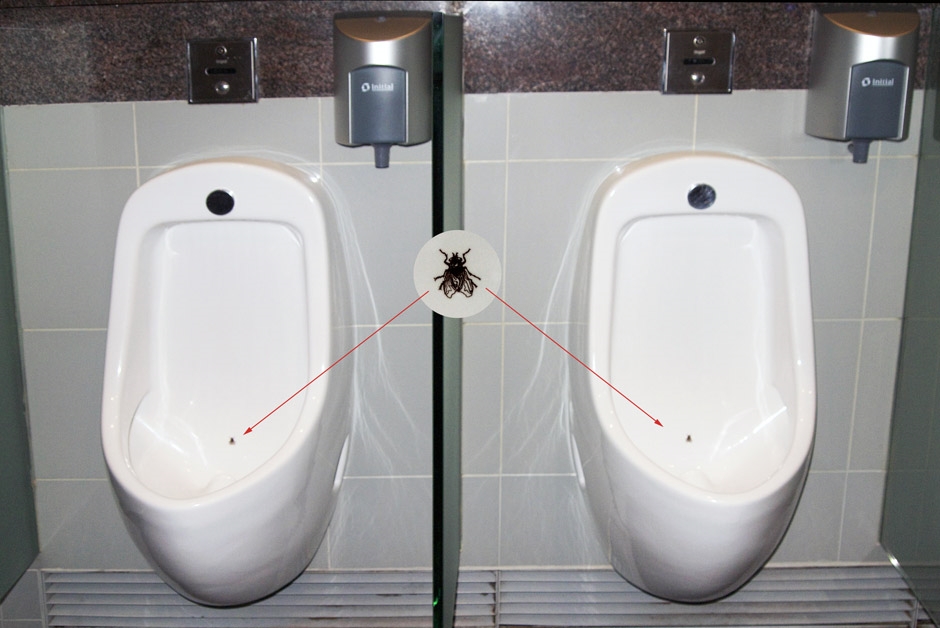
The presence of a fly in a urinal literally changes human behavior. How come? Apparently men have an instinct to aim. When flies were introduced at Schiphol Airport in Amsterdam, spillage rates dropped 80% (don’t want to know how they measured it).
This is a clear case of getting people to do what you want without using words. Persuasive design in action.
Are people in Denmark selfish?
This graph represents the number of people registered organ donors, divided by countries:
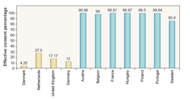
So only 4.25% of Denmark, but over 99% of Austrians—what’s going on here? Are Austrians more selfless than the Danes? Well, no. What’s really happening is, when the people represented with the yellow bars go get their drivers license, there’s a check-box on the application that says “tick this box if you want to become an organ donor.” In the countries represented with the blue bars, the check-box says “tick this box if you do NOT want to become an organ donor.”
People go with whatever is the default. Defaults are design, too.
Do people change software settings?
Here’s another tidbit. Back in the day, UIE analyzed people’s Microsoft Office settings. Less than 5% of the users we surveyed had changed any settings at all. More than 95% had kept the settings in the exact configuration that the program installed in. Key lesson: people do not mess with defaults (unless they’re designers or developers)!
If you’d like more people to take action, make the preferred actions ‘default.’ Of course, this can be abused—like RyanAir makes buying travel insurance a default option, and Vistaprint used to enroll people in their “membership” by default. That’s not a way to make friends.
That being said, there are lots of opportunities with designing for default.
Table of contents
We spend very little time on deliberate thought
Have you read Blink: The Power of Thinking Without Thinking (Malcolm Gladwell) or Thinking Fast and Slow (Daniel Kahneman)? You should.
Both of them present a compelling case on how we, humans, mostly operate on auto-pilot. We rarely stop to analyze and think when making decisions. We make snap judgments instead, and we don’t even know why or how we’re making those decisions.
When we have to justify or provide a rationale for our auto-pilot decisions, we bullshit. The truth is: we don’t know.
Our decisions change depending on how we think
The outcome changes when we decide on auto-pilot versus when we put some deliberate thought into our actions.
In one study, students were asked to taste different jams and rank them in the order of preference. No explanation was asked—students were using their auto-pilot mode. The results were then compared with rankings by food experts from Consumer Reports. The ranking results were very similar.
Now, they changed it around—they had the students explain their choices and provide a rationale—which made them use slow, deliberate thinking. The results were vastly different.
It was not just about jam either—they did the same with ranking college courses. The results were very different depending on whether people had to justify their choices or not. That’s auto-pilot vs. deliberate thought in action; we make different decisions depending on how we think at a particular moment.
Know your target audience
The point of all of it is this: you need to know the rational thinking of your customer, and you need to understand their subconscious and emotional decision making processes. You figure this stuff out through talking to them, user surveys, usability tests, and split tests. This post of mine will give you some ideas on how to do it.
You really need to understand how your product or service fits into the lives of your customers. Conversions will be at their highest when we offer something they need and want in the way that resonates with them.
Everything that follows will assume you have a pretty good idea about your target group.
5 key principles of persuasive web design
Follow these five principles for improved conversions.
1. Clarity above all
Our brain is a questioning organ. When we see something for the very first time, we instantly ask: “What is it?” (Can I eat it? Or will it eat me?)
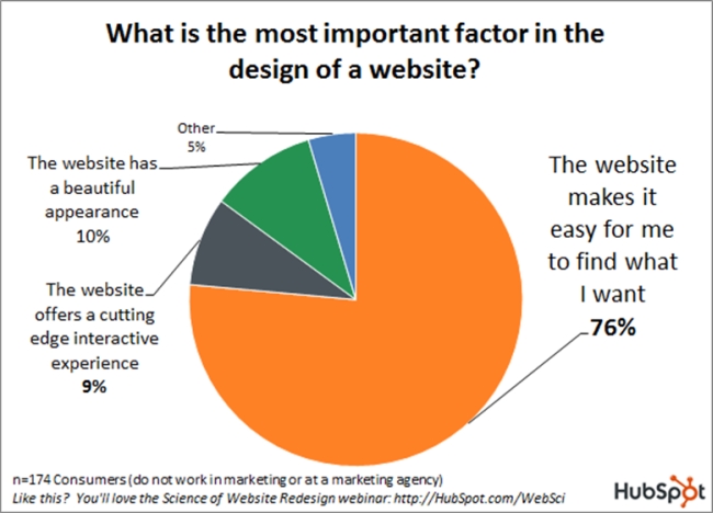
It’s no wonder that when people are asked what’s most important to them on a website, they say ‘finding stuff they’re interested in,’ according to a slightly dated but still relevant study from HubSpot:
When a visitor comes to your site, he/she needs answers, and needs them quick. The first thing they read needs to provide answers to questions like:
- What is this site?
- What can I do here? Is it what I’m looking for?
- Why should I do it? How is it useful to me?
Learn to craft a compelling value proposition. Your value proposition needs to answer this: why should I buy from you and not the competition?
It’s not just your home page that needs to be clear—all of it needs to be. Product pages, about pages, and so on.
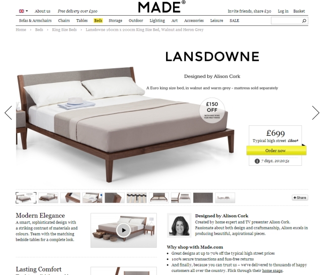
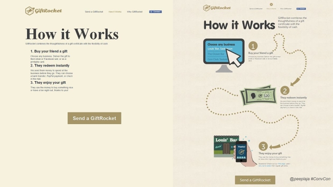
Clarity is by far the most important thing for every page on your site—is it clear and understandable? A previous version of Square’s homepage is as clear as it gets:
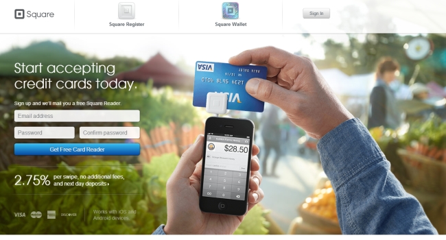
What is it: “Start accepting credit card today” + a clear, relevant image.
What can I do here: I can get a card reader.
Why should I do it: it’s free and just 2.75% per swipe.
My favorite bad example (can you tell what they’re selling?):
Our Point of Sale Systems Integrate Hardware, Software and Internet Social Media Marketing Into One Giant Revenue Super System.
Another example:
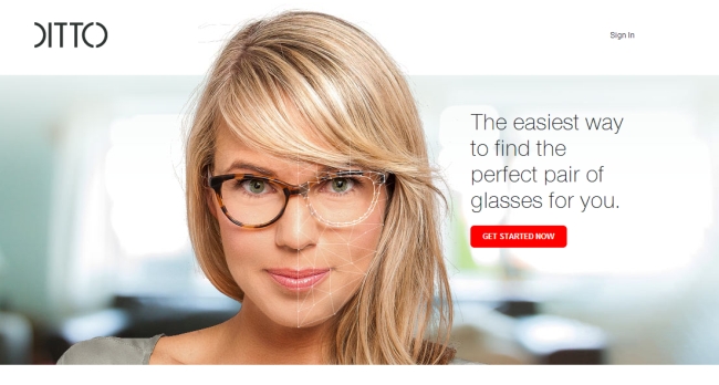
The good: they use visuals to communicate what they’re about. Human brain processes visuals 50 times faster than text. It’s a good idea to show what you’re selling.
The bad: “the easiest way to find…” People do not believe superlatives.
Be specific, don’t use superlatives
For some reason it’s tempting to start throwing around words like “best,” “easiest,” “fastest,” and so on. If it’s true, provide ample evidence (NY Times said so, this scientific study confirms it, etc.). If it’s your opinion—don’t say it.
Most of us see something like this every day:
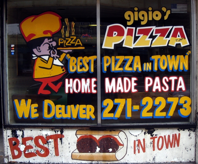
“Best pizza in town.” Does anyone buy it? Nope. What about the line underneath: “home made pasta.” Do we believe it? Sure do! Why? Because it’s specific and contains no superlatives.
So instead of throwing around a claim like “best,” they could say “we deliver your pizza in 20 minutes” and everyone would believe it. Makes a good value proposition if they’re in the business of delivering pizzas.
2. Visual appeal
Once people understand that they’re in the right place and what we offer is interesting, it’s our job to draw them further in and push them down the sales funnel.
First impressions matter
As I said earlier, people make snap judgments. It takes about 50 milliseconds (that’s 0.05 seconds) for users to form an opinion about your website that determines whether they like your site or not—whether they’ll stay or leave.
British researchers analyzed how different design and information content factors influence trust of online health sites. The study showed clearly that the look and feel of the website is the main driver of first impressions.
Of all the feedback the test participants gave, 94% was about design (complex, busy layout, lack of navigation aids, ignoring web design especially use of color, pop up adverts, slow introductions to site, small print, too much text, corporate look and feel, poor search facilities).
Only 6% of the feedback was about the actual content. Visual appeal and website navigation appeared, by far, to be the biggest influence on people’s first impressions of the site.
First impressions are important for these three reasons:
- First impressions lead to higher satisfaction.
- Visual appeal is more important than usability for user perception.
- First impressions can last for years (high school reunion, anyone?).
This is the new Tesla Model S:
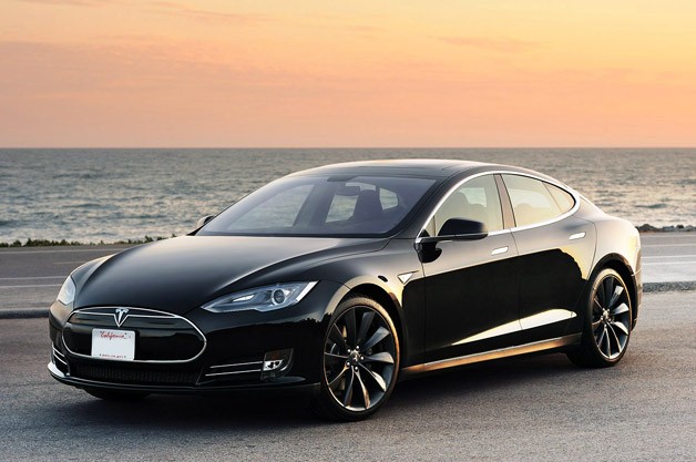
Most people haven’t seen it, but once they do, they conclude “it’s a good car,” solely based on its looks.
Same happens with your website. If it provides a good first impression, your job will become much easier. A negative first impression will be a drag and affect the whole perception about your products and services. If it looks like crap, must be crap!
What makes a web design good?
I like blue, you like green. So what makes a design good?
Google did the heavy lifting for us and determined that there are two key factors to “what makes people like a website.” The key findings from their study were that websites with low visual complexity (the simpler, the better) and high ‘prototypicality’ (how representative a design looks for a certain category of websites) were perceived as highly appealing.
Make your web design simple and familiar (follow conventions—e.g., people have a fixed idea of what an ecommerce site should be like). If you go for innovative, unconventional layouts, people are less likely to like them.
Here’s an “innovative” design I came across a while ago. You need to hover over a number to see what menu item it is. How stupid is this?

Since it’s not “prototypical,” most people are not going to like it.
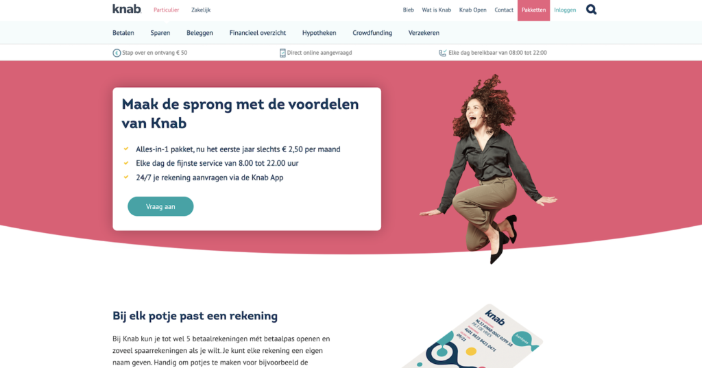
Here’s a site in Dutch. Even though you probably don’t understand anything on the site, you will find it appealing because it meets your expectations. You’ve seen many sites with a similar layout before.

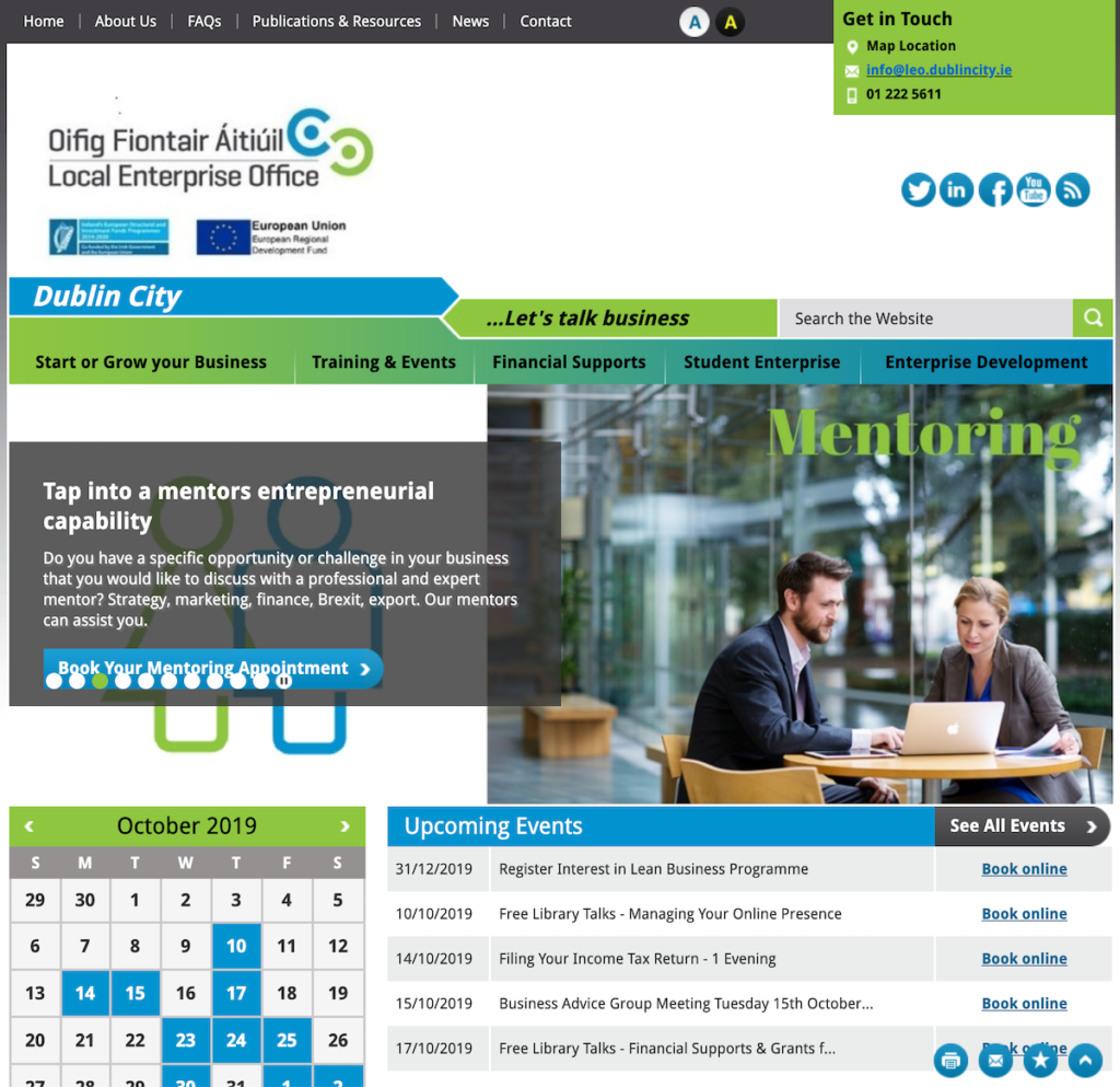
Here’s a website with complicated, busy layout. Most people won’t find this attractive:

Here’s the opposite. A site with a simple layout:

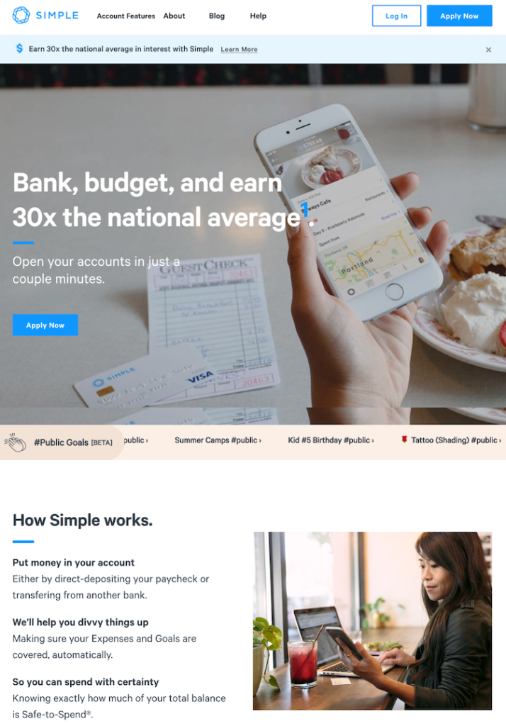
Most will find it appealing.
3. Strong visual hierarchy
Squeaky wheels get the grease and prominent visuals get the attention. Visual hierarchy is one of the most important principles behind effective web design. It’s the order in which the human eye perceives what it sees.
Here’s an exercise. Please rank the circles in the order of importance:
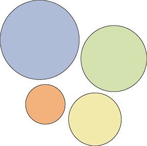
Without knowing anything about these circles, you were easily able to rank them. That’s visual hierarchy.
Certain parts of your website are more important than others (forms, calls to action, value proposition, etc.), and you want those to get more attention than the less important parts. If your website menu has 10 items, are all of them equally important? Where do you want the user to click? Make important links more prominent.
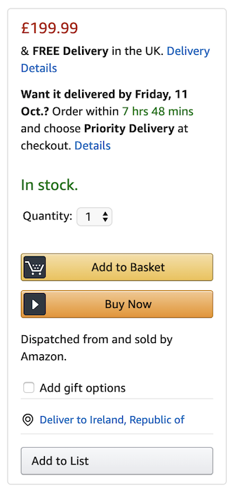
Hierarchy does not only come from size. Amazon makes the ‘Add to cart’ button more prominent by using color:

Start with the business objective
You should rank elements on your website based on your business objective. If you don’t have a specific goal, you can’t know what to prioritize.
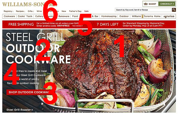
Here’s an example, it’s a screenshot I took of the Williams Sonoma website. They want to sell outdoor cookware.
The biggest eye catcher is the huge piece of meat (make me want it), followed by the headline (say what it is), and the call to action button (get it!). Fourth place goes to a paragraph of text under the headline, fifth is the free shipping banner, and the top navigation is last. This is visual hierarchy well done.
Here’s another exercise. Surf the web and consciously rank the elements in the visual hierarchy. Then go look at your own site. Is there something important (key information points that visitors are likely seeking) that isn’t high enough in the hierarchy? Change that.
It’s not about color
You see a lot of crap being floated around on the internet about which color converts the best. “Go with the big orange button,” some fools say. “Red is the best,” claim others.
This is the most widely spread color A/B test online:

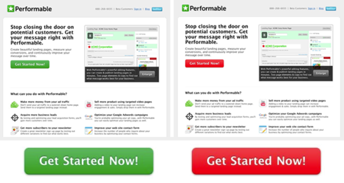
Their result was that the red button outperformed the green button by 21%.
What most people miss here is that it wasn’t about the color red—it was about standing out from the noise. As the dominant color on the site was green, red button got a higher place in the visual hierarchy. If your site is red or orange, you need to use a different color to make your calls to action stand out.
White space helps you emphasize what matters
The more space that is left unused, the more attention is driven to stuff that’s on the page.
Here, they want to sell you a bed. What gets your attention? The bed! It’s by far the most prominent thing on the page.
While it seems obvious, it’s not. Most ecommerce product pages are very different from this. They have much smaller images, more stuff next to the image, a menu, and so on.
People buy stuff based on what it looks like (don’t forget that), so emphasize product photos and relegate everything else in the visual hierarchy.
4. Conserve attention at all costs
Once people know that your website has something they’re interested in, the visual design of the site draws them in and through strong visual hierarchy they focus on what matters. It’s important to conserve the attention we got at all costs.
It starts with where you place stuff. Most of the viewing time is spent above the fold (and “the fold” gets lower and lower as screen sizes and resolutions increase) and on the left side of the screen (69% for people who start reading from left side of the screen).
Getting attention
Neuroscience research tells us that few things capture attention like larger than life images. The important thing is that you keep the images relevant to what you’re selling:

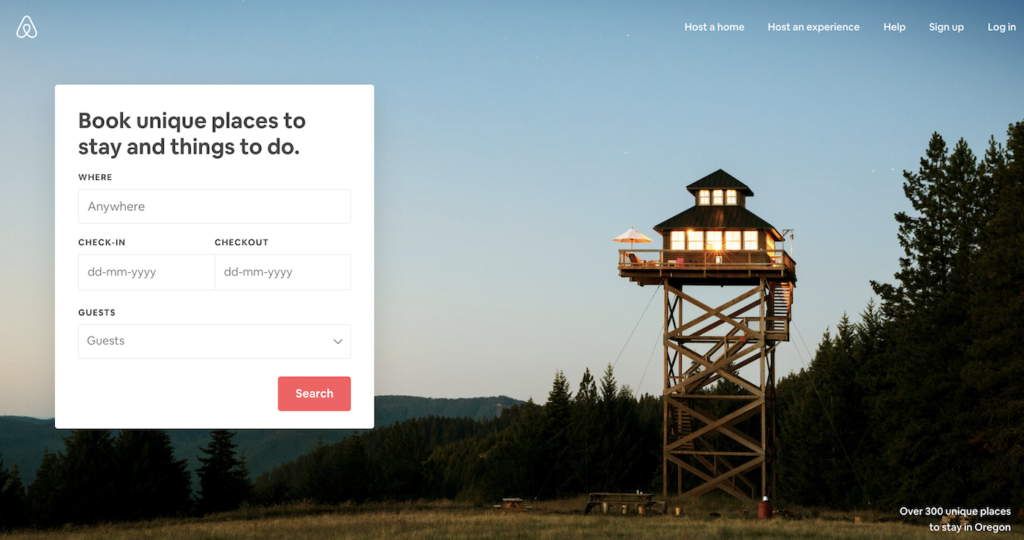
Someone I know once commented “I regularly go to Airbnb to look at the photos and dream of traveling.” Goal achieved!
Another great way is using photos of people, especially the ones that look straight at us. We always look people in the eye, it’s a surefire attention-getter.
Third good thing to use is contrast. Before & after. Then and now. Our minds are designed to spot the differences. In the primal age we constantly needed to scan the horizons to spot if anything has changed—is there a predator lurking in the shadows, an enemy approaching, or someone we can eat?


While it clearly works for dental work, hair cuts, makeup transformation, and fitness stuff, you can use this in almost every business. Show the value your business adds through contrast. Works great for attention.
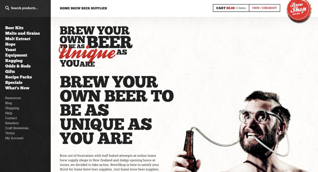
Another guaranteed way is using surprise. When we spot something we didn’t expect, we pay attention. Like here: “what’s with the weird guy?” Of course, you need to figure out how the unexpected fits with your brand.

It’s not just about images, but also copy. Unexpected copy makes you read closer. Let’s say you’re looking for a copywriting course. You narrow it down to these two choices. Now which of these would make you pay attention and read closer?
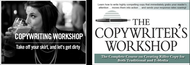
The one on the right is what you’d expect. The one on the left—not so much.
Conserving attention
Getting attention is not that difficult, sustaining it is.
What are the two easiest ways to kill attention?
#1: A wall of text. See this if you don’t know what it looks like.
#2: Irrelevant, ego-centric jargon. Like this:

- “Welcome to our website.” Complete waste of space that doesn’t resonate with anyone. Everyone is welcome on every public website on the internet.
- “Who We Are.” Who cares! People care about themselves and their problems. Not you.
- “Our Philosophy.” Seriously? No one gives a damn!
- Cheesy stock photos. So fake I want to flee instantly.
Although this homepage is no longer findable on the internet, instead of this crap, always be user-centric. WIIFM (What’s in it for me?) is a great principle to keep in mind at all times.
Your first order of business is to create relevant, interesting content. Then you have to present it well. Which of these two versions is more interesting to read?
Clearly, the one on the right! Stylize the text, add eye paths, use visuals, break the text apart, avoid patterns.
Human eye is constantly trying to recognize patterns. Once it identifies one, it will ignore it. This is why it’s critical to spice up any layout for improved attention.
Design for novelty
As I’ve written in several posts before—in order to make a lot of copy easy to digest and read, you need to design for reading. You need to provide novelty in every screen.
This means you have to constantly change the layout around to keep it interesting. Sameness equals boring and drives people away. There are lots of psychological phenomena at play that I’ve written about here.
- Neuroscientists say novelty promotes information transmission.
- Our minds seem to gravitate toward novelty. Not only does a novel experience seem to capture our attention, it appears to be an essential need of the mind.
Our brain pays close attention to patterns, and quickly learns to ignore anything that is routine, repetitive, predictable, or just plain boring. This makes room for paying attention to anything that’s different. So novelty is what gets people to pay attention.
Ever wondered why so many sites constantly alternate the position of text paragraphs (text on the left, then text on the right, text on the left and so on)? Like here:
It’s for the very same reason: novelty. It boosts the number of people reading the content. Subheadings and white space help to achieve the same goal.
This is what Jerry Seinfeld had to say about attention:

Anyone who’s followed Lost, Dexter, Game of Thrones, or other captivating TV shows knows what Jerry means. Now let’s be honest, your website is no Dexter. But, you always can improve the attention paid to your site. It’s important to keep in mind that it’s possible to sustain attention for a long time.
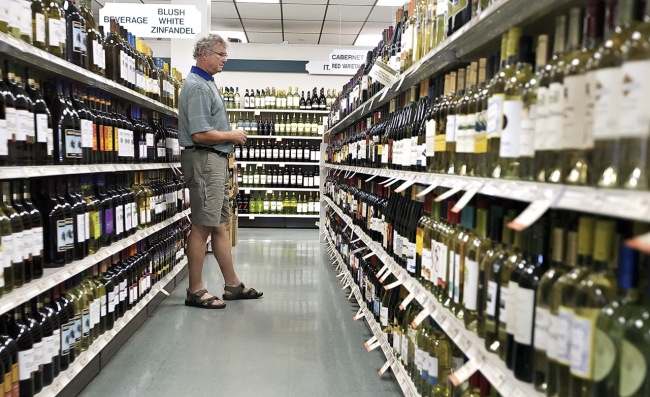
Help people choose something
Once you get users to browse your products, you need to help them choose something. Choosing is hard work. Too much choice paralyzes. We’ve all been there:
First step is helping people narrow down the selection. You do this by employing filters. The role of the filter is to make finding most suitable products easy.
Wine Library‘s filters do a good job:

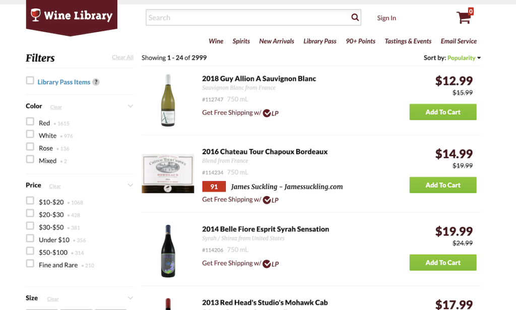
All of the filters don’t fit on this screenshot, there are more, such as country, year, region, varietals, and more.
If we can’t limit the choice, we need to make it easier to pick something. What stands out, gets picked. So let’s say the user narrowed down the selection to these four. Which of these stand out:

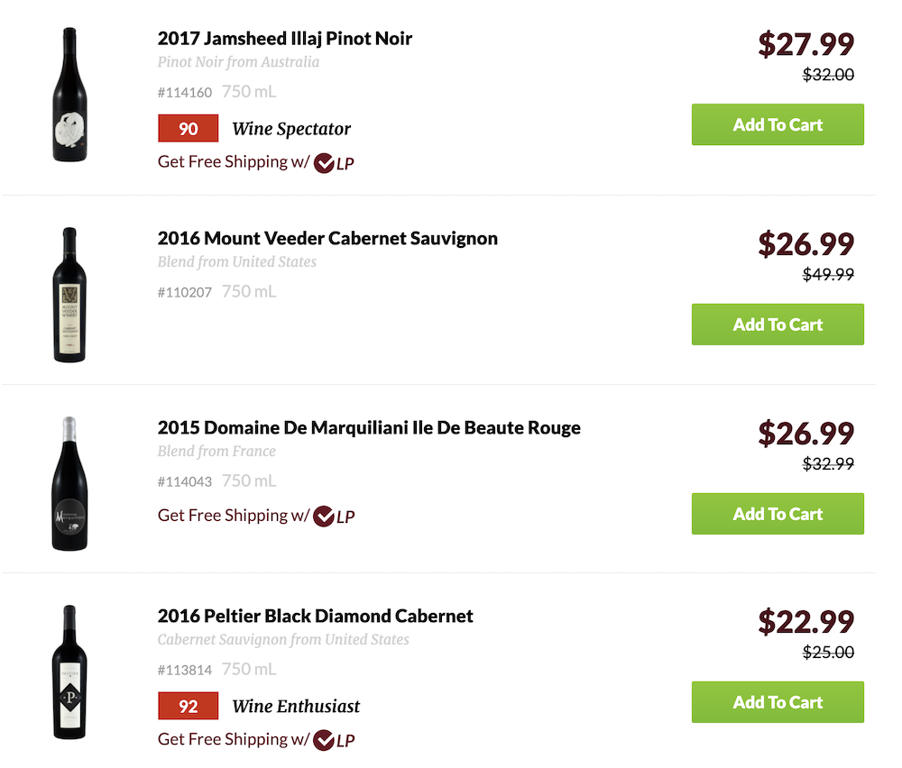
The ones with points, of course! Product badging is very effective. There are tons of case studies where it has repeatedly boosted conversions and sales.
Product photos
What’s the most important factor when it comes to picking out a pair of shoes, a new shirt or a wristwatch? The way the product looks, of course! You’re going to buy shoes that you like.
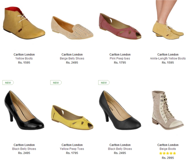
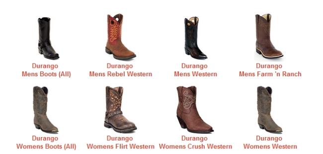
Most ecommerce category pages look something like this:
They make it hard to fall in love with a pair. It would be much more effective when it’d look something like this:
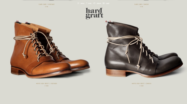
Help people find a pair to fall in love with! Large category images will help you get the job done.
We did this for a client a while ago. They used to have four products in a row on the category page:
We changed it to three products, and made the image larger:
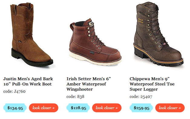
Result: 25% more sales.
The story of two chickens
This story will help you further understand why larger images work better.
Research participants were showed two photos. One was a nice looking, plump chicken. The other was a chicken that looked thin and sickly. Participants were told that the plump chicken was a natural chicken, and the thin chicken was genetically engineered.


The researchers informed half of the participants that natural chickens were healthy but less tasty, and genetically engineered chickens were tasty, but less healthy. The other half were told the opposite.
Overwhelmingly, both halves of participants preferred the nice plump chicken, but their reasoning was different. The first group claimed it was because they valued health above taste, and the second group said it was because taste was more important.
Neither group seemed to justify their choice based on how they felt about the chicken’s looks. They felt compelled to justify their emotional choices with non-emotional reasons, to the point that the two groups found completely opposite ways to justify the same decision.
Main takeaway? People were sold based on the picture. Product images are huge for conversions.
5. One action per screen, when they’re ready
You need to start with a clearly defined most wanted action for each page—and optimize them for it. This goes back to the clear message, visual hierarchy, and drawing attention to that one action.
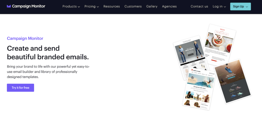
Campaign Monitor wants us to create a free account here. The single most wanted action is obvious:

Most of us will have secondary calls to action as well, and that’s perfectly okay—but they should be just that, secondary.
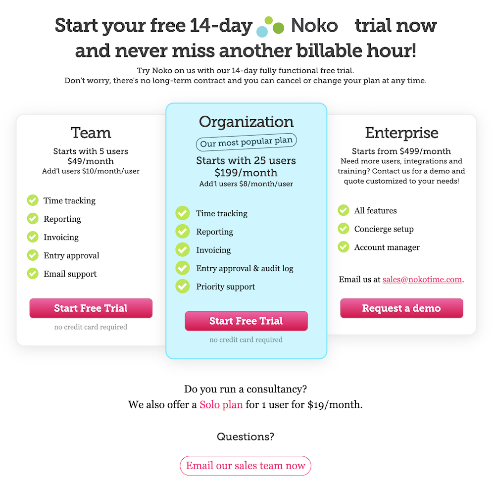
Here the primary call to action is to start a free trial, and secondary call to action is to email the sales team in case of any questions:

Okay, that’s all pretty much obvious, but when should you ask for action?
This site here has an obvious primary call to action:


Will you sign up? Didn’t think so! They’re asking you to register before even explaining properly what the site is about and how it works. Not a good idea on their part. You have to present the call to action when the customer is ready to act.
Here’s a case study by Marketing Experiments where they split tested a short landing page vs. long landing page. The only difference was the amount of information given before asking for a donation. Result: more copy before the call to action brings in 75% more money.
Guys at Zurb got a 350% lift in conversions just for burying the call to action button. There are many more case studies like that.
It’s not about hiding the button, but asking for action when the user is ready. IDC reports that 50% of purchases are not completed due to insufficient information—no wonder! People always want to operate with full information.
So when is the right time to ask for action? The rule of the thumb is that the more expensive and/or complex the product, the more information you need to provide before people are ready to take action. Start with this principle in mind and A/B test from here.
Fogg behavior model
This is explained well by Fogg Behavior Model: people will take action when you present the trigger (call to action) when their motivation is at their highest, and it’s easy to take that action.

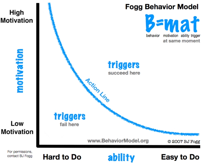
You want to aim top right (high motivation, easy to do, a trigger in place). If you have high motivation and low ability (difficult to do), what you’ll get is frustration. If it’s low motivation, but easy to do (e.g., take out the trash), you get annoyance.
So make it a priority to figure out when is the right time to trigger the audience.
Conclusion
You can influence people’s behavior without using words. Persuasive web design works.
These five principles leave you lots of freedom for execution, but if you implement around them, you will end up with a more persuasive web design. Keep them in mind whenever you start a new design project.
Related Posts
-
Your website design is more important for conversions than you think. You can implement every…
-
Here's part 2 of my annual free mini-reviews. See first part here. Again, the disclaimer:…
-
The easier your website is to use, the more people use it. An essential part…
-
People judge books by the cover and other people by their looks. Take a look…
