


A study by Google had two key findings:
- Users will judge websites as beautiful or not within 1/50th to 1/20th of a second.
- “Visually complex” websites are consistently rated as less beautiful than their simpler counterparts.
Moreover, “highly prototypical” sites—those with layouts commonly associated with sites of their category—that also had a simple website design were rated the most beautiful.
In other words, the study found that the simpler the design, the better.
But why?
In this article, we’ll examine the role of cognitive fluency and visual information processing theory, which play a critical role in simplifying your web design and can lead to more conversions.
We’ll also look at case studies of sites that simplified their design, how it improved their conversion rate, and show you how to simplify your site design.
Table of contents
- What is a “prototypical” website?
- Why does cognitive fluency matter in website design?
- Case study: a simple website design example
- Visual information processing and site complexity
- Why simple design is scientifically easier to process
- Every element communicates subtle information
- “Working memory” and the Holy Grail of conversion
- 7 tips to create a simple website design
- Conclusion
What is a “prototypical” website?
If I said “furniture,” what image pops into your mind? If you’re like 95% of people, you think of a chair. If I ask what color represents “boy,” you think “blue” (and girl, “pink”; car, “sedan”; bird, “robin”; etc.).
Prototypicality is the basic mental image your brain creates to categorize everything you interact with. From furniture to websites, your brain has a template for how things should look and feel.
Online, prototypicality breaks down into smaller categories. You have different but specific mental images for social networks, ecommerce sites, and blogs. If any of those websites lacks something from your mental image, you reject the site on conscious and subconscious levels.
If I said “trendy women’s clothing site” you might envision something like this:

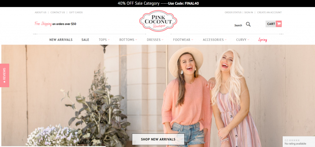
This follows the “online clothing store” prototype so closely that it shares many attributes with wireframes for other online clothing stores, even though they sell to a different demographic.

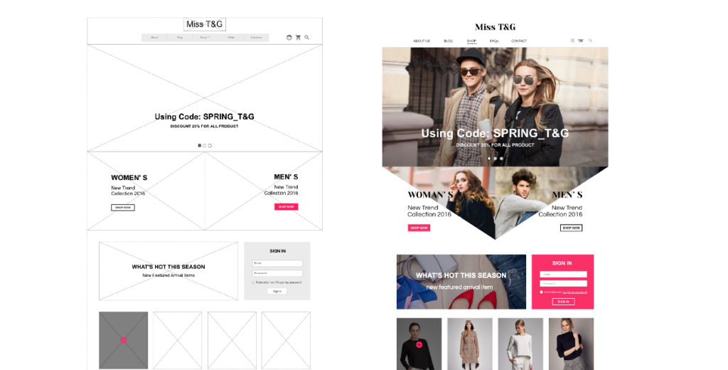
The similarities don’t mean that the sites lack originality or that they “stole” from one other. Instead, they’re playing into your basic expectations of what an ecommerce site should look like.
Why does cognitive fluency matter in website design?
The basic idea behind cognitive fluency is that the brain prefers to think about things that are easy to think about. That’s why you prefer visiting sites where you instinctively know where everything is and the actions you’re supposed to take.
As UXmatters explains it:
Fluency guides our thinking in situations where we have no idea that it is at work, and it affects us in any situation where we weigh information.
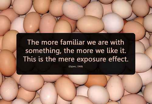
Cognitive fluency stems from another area of behavior known as the “mere exposure effect,” which states that the more you’re exposed to a stimulus, the more you prefer it.
Again, the rules are the same online. It’s “familiar” for blogs to have opt-ins on the right sidebar or for ecommerce sites to feature large, high-resolution images with an attention-grabbing headline and company logo in the top-left of the screen.
If your visitors are conditioned to certain site designs in your category, deviating from them might subconsciously put you in the “less beautiful” category.
This doesn’t mean, however, that you should just “do what everyone else is doing.” While it’s important to know which site design choices are prototypical for your category, it’s more important to find evidence that supports those design choices.
A lot of designers make bad choices. Without doing the research, you could make them, too. For example, many ecommerce sites use automatic image sliders to display products, but study after study shows that automatic sliders tank conversions.
Case study: a simple website design example
A site with a high level of fluency will feel familiar enough that visitors don’t need to waste mental effort finding the right product or button and can instead focus on why they’re on your site.
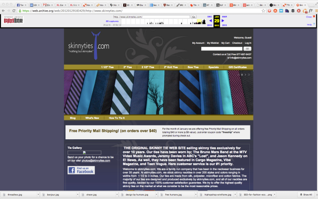
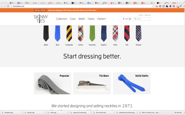
When the experience is dis-fluent however, you feel it immediately. Take online tie retailer, Skinny Ties, which didn’t really look like an ecommerce site until a redesign:
Before:
After:
A few key changes led to huge results:
- Followed prototypical ecommerce layout themes;
- Much more “open” by using whitespace;
- Images feature a single product with high-resolution pictures and contrasting colors.
Check out the case study on this particular redesign, as it shows what’s possible when updating a site to “fit” with prototypical standards. After just two-and-a-half weeks, these were their staggering results:
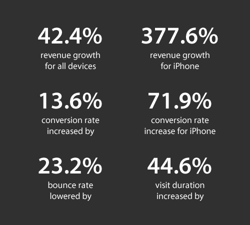
The redesign itself, while pretty, isn’t doing anything groundbreaking. It plays exactly into the expectations of what a modern online clothing retailer should be. It’s “open,” responsive, and has a consistent design language across all product pages.
Visual information processing and site complexity
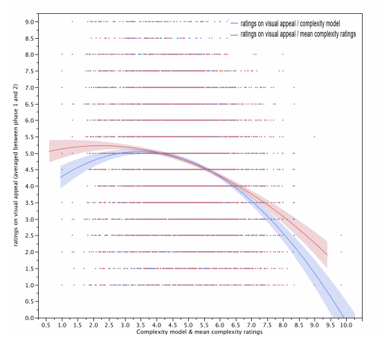
In this joint study by Harvard University, University of Maryland, and University of Colorado, researchers found strong correlations for “aesthetically pleasing” websites among different demographics. For example, participants with PhDs didn’t like highly colorful websites.
Ultimately, no specific, universal design guidelines emerged from the study. The only thing that was universal was that a more visually complex website had less visual appeal.
Why simple design is scientifically easier to process
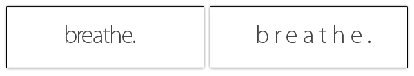
The reason less “visually complex” websites are considered more beautiful is partly because low-complexity websites don’t require our eyes and brain to work as hard to decode, store, and process information.
Watch this short video about how the eye sends information to the brain to understand what I mean.

Basically, your retina converts visual information from the real world into electrical impulses. Those impulses are then routed through the appropriate photoreceptor cells to transmit color and light information to the brain.
The more color and light variations on the page (i.e. the greater the visual complexity), the more work the eye has to do to send information to the brain.
Researcher Saul McLeod explains that
the eye receives visual information and codes information into electric neural activity which is fed back to the brain where it is “stored” and “coded”. This information can be used by other parts of the brain relating to mental activities such as memory, perception and attention.
Every element communicates subtle information

When designing a website, know that every element—typography, logo, and color selection—communicates subtle information about the brand.
When these elements don’t do their job, the webmaster often compensates by adding unnecessary copy or images, thus adding to the visual complexity of the website and detracting from the overall aesthetic.
Optimizing a page for visual information processing—specifically, simplifying information’s journey from the eye to the brain—is about communicating as much as you can in as few elements as possible.
While that’s an article all on its own, consider MailChimp’s logo redesign. When they wanted the brand to “grow up,” they didn’t add the usual “We’ve been doing email since 2001! Three million people trust us! Here’s why we’re awesome! Blah, blah, blah…”
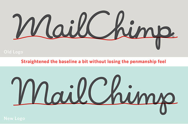
Instead, they tightened up the writing, simplified the website (the top headline simply reads “Send Better Email”) and added an even simpler explainer animation for the core product.
Mailchimp went through another logo redesign in 2018:


What were the guiding principles for the second major redesign? Simplicity was paramount:
The Freddie icon has long been our brand’s primary mark. We’ve simplified it a bit, with tweaks to its shape and fine details to make sure it looks great at any size.
[. . .] Through a process of iteration and refinement, we’ve developed a wordmark that lives in harmony with the Freddie icon to build equity for both.
“Working memory” and the Holy Grail of conversion
According to the famous research of Princeton psychologist George A. Miller, the average adult brain is able to store between five and nine “chunks” of information in their short-term or “working” memory.
Working memory is the part of your brain that temporarily stores and processes information in the course of a few seconds. It’s what allows you to focus attention, resist distractions, and, most importantly, guides decision-making.
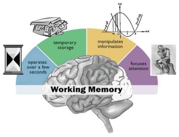
On a “low-complexity, highly prototypical website,” the five to nine “chunks” of working memory can process things like guarantees, product descriptions, prices, or offers—rather than wasting time figuring out where to click.
When you deviate from expectations—the price was higher than expected, the color scheme and symmetry were off, the site didn’t load fast enough, the photos weren’t high resolution—the working memory processes those disfluent “chunks” instead of what matters.
That’s because the working memory calls the long-term memory to use what it already knows to perform the task. When the long-term memory can’t aid in the processing of information, the flow is broken, and the working memory disengages and moves on.
That’s why it’s vital to understand your visitor’s level of exposure—not just for sites in your category, but for websites in general—if you want to “hack” their working memory with design.
The blogs they read, the sites they shop on, their browser, age, gender, and physical location all hint at what will seem familiar upon first impression.
7 tips to create a simple website design
- Research your audience and the sites they visit most. Look for case studies on design changes from said sites and how those affected key areas.
- Create a mashup for your own site with all the “working” components you uncover.
- Obey the rules of cognitive fluency when you lay out your design. Put things where visitors expect to find them.
- Rely on your own colors, logo, and typeface to communicate clearly and subtly. Don’t add copy or images unless they communicate something your visitor cares about.
- When in doubt, less is more. One large image is usually better than a bunch of little ones; one column instead of three; more whitespace instead of more “stuff.”
- Make sure your site fits the expectations for pricing, aesthetics, speed, etc.
- Retain originality. A “prototypical” site doesn’t mean that every aspect of your site should fit that mold.
Don’t think of your site as a one-of-a-kind piece of art. Instead, make it a composite of all the best stuff.
Conclusion
If the visitor can’t rely on their previous experience, they’re not thinking about how innovative your site is. They’re just left wondering why things aren’t where they’re “supposed to be.”
That’s not the best frame of mind if you want them to buy stuff. By creating a design with cognitive fluency, you allow visitors to process other things with their working memory that make it easier for them to say “yes.”
You’ll have a beautiful site, too.
Related Posts
-

Don't design your own website. No, really. It will suck. You might think that since…
-

William A. Foster once said, "Quality is never an accident; it is always the result of…
-
User flow is the path a user follows through your website interface to complete a…
-

How often does this happen: A company budgets for a website, it's built according to…
