

According to Dell, data is the new crude oil of modern society. It’s mined, it’s processed, and it’s valuable—when you know what to do with it.
Data visualization turns raw data into accessible charts, graphs, and maps to help you share it, learn from it, and make data-driven decisions. But game-changing campaigns are only possible if visuals present information in the right way. Get it wrong, and the message is lost.
In this article, you’ll see eight of the best data visualization examples to inspire your internal and external marketing efforts.
You’ll learn when to use them, what to avoid so you don’t overwhelm or confuse your audience, and five tips for creating these visualizations yourself.
Table of contents
4 data visualization examples to engage customers and shareholders
You’re not going to stop anyone from scrolling past a standard line chart or two-tone bar chart that looks like it was whipped up in a hurry.
This isn’t going to increase engagement, no matter what your findings indicate:

These graphs are outdated, boring, and, in the worst case, overwhelming. Many well-intentioned data visualizations take too much work to figure out what you’re looking at, and end up falling flat.
Your customers, followers, shareholders, and partners want to be impressed.
With the right tools, you can nail customer engagement with a highly visual, shareable data visualization. In a 2021 survey of marketers, Venngage reported that data visuals were among the best-performing visual content (along with original graphics and video content).
Let’s explore four audience-hooking data visualizations (that aren’t spreadsheets or pie charts) and why they work.
1. The median age of population radial graph

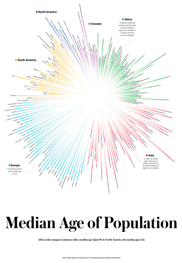
This could have been a standard bar chart.
However, Visual Capitalist chose to upgrade its data visualization and display its findings in a well-designed radial histogram.
This graph would be extremely long as a typical bar chart. It would be difficult to display and comprehend relationships on a large slide presentation, let alone on a smaller screen.
The ring shape also makes it easier to gain a basic understanding at a glance: European median ages are the highest, while Africa’s median age is the lowest.
From there, you can zoom in to get exact figures, and three short captions add key information.
Similar data visuals to display weighted comparisons include sunburst diagrams, bubble charts, heatmaps, and pictograms.
Best practices for using radial histograms:
- If you’re including a lot of data, like this example, go with high-resolution or interactive designs. It’s much easier to see the information on a smaller screen this way.
- Avoid using stacked bar charts in a radial histogram as it distorts the proportions you’ll see (we’ll cover stacked bar charts later).
- Start your origin at zero; don’t truncate it. For example, starting from age 18 in the graph above would make it look like some African countries don’t have a median age at all.
2. Phone brand switching chord diagram

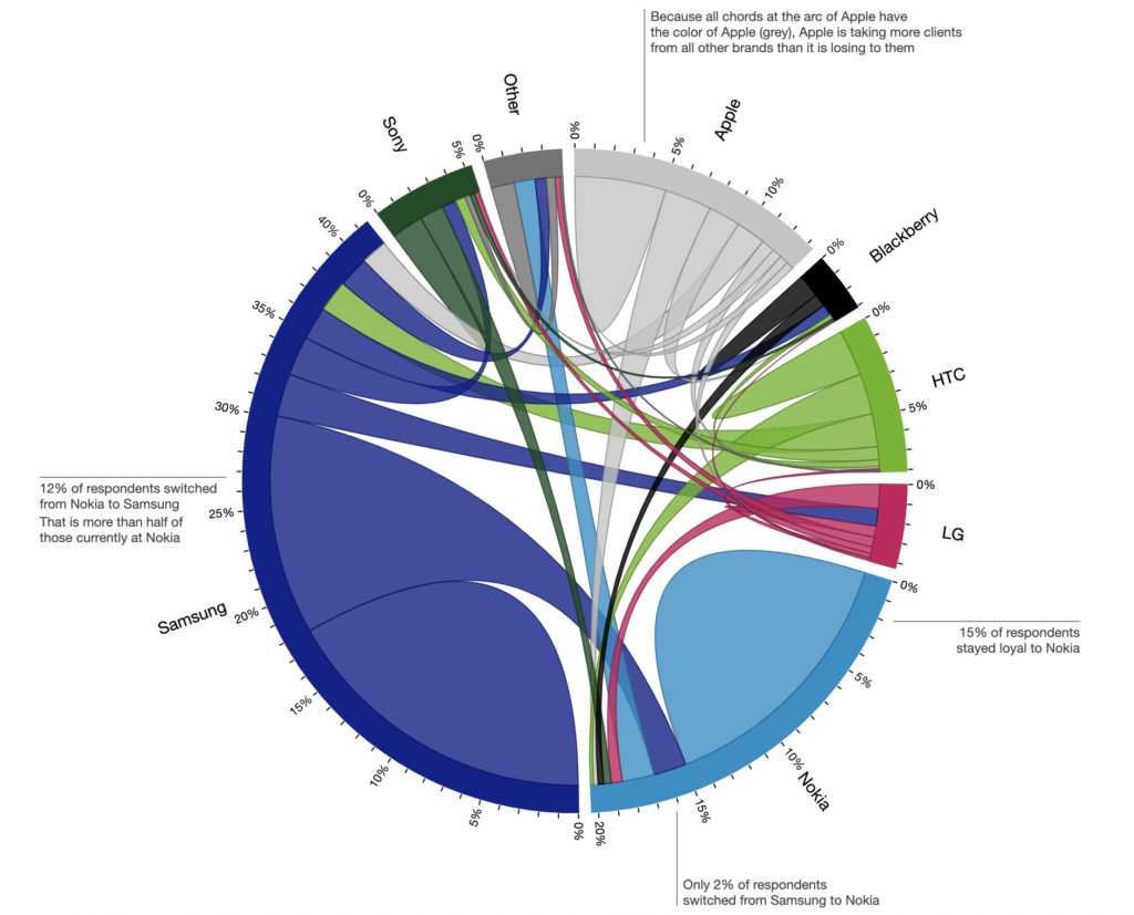
This example by data visualization designer Nadieh Bremer is a chord diagram representing a flow or connection between subjects and weighting that connection.
This diagram shows the relationship between cell phone service providers based on Deloitte survey data. It answers the question: when a user leaves a provider, where do they go?
In this example of data visualization, you can see which brands have a large loyal base (the self-contained hills) and where they tend to lose customers (the chords).
It’s also interactive:
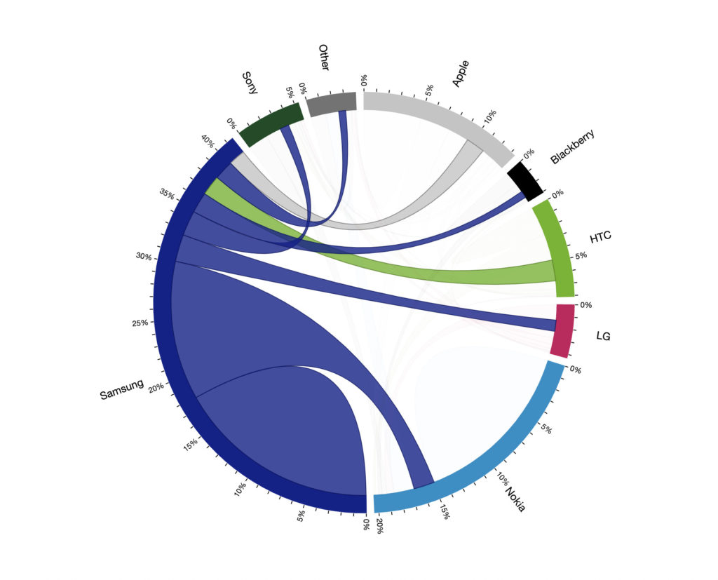
When hovering over a particular brand, the other chords are greyed out and the viewer can focus on the flow from the single brand. Here, we can clearly see that Samsung has a very loyal base of around 18% of the surveyed respondents. When it loses customers, it mainly loses them to Nokia.
Another great thing about this data visualization is the four data points explained in non-distracting captions, like this one:
Because all chords at the arc of Apple have the color of Apple (grey), Apple is taking more clients from all other brands than it is losing to them.
Adding captions like this helps to draw attention to key findings while also explaining how to read the graph.
Similar data visuals that show flow and relationships include alluvial diagrams, sociograms, and arc diagrams.
Best practices for using chord diagrams:
- Try to avoid too many chords crossing, especially if you forgo interactivity. This can make things far too complex, leading to overwhelm rather than intrigue.
- Include significant connections and leave out measly strings that don’t provide any insight.
- Choose your color palette carefully. You want the chords to be easily seen but still harmonious.
- Label your diagram with a few significant details to help users make sense of the relationships.
3. Survey results in a pictorial chart


Pictorial charts representing parts of a whole are extremely approachable. Done well, they stop viewers in their tracks to learn more about what’s going on.
This example by a Spanish creatives club is a pictorial fraction chart representing their survey data. It’s far more engaging than a pie chart, with the pickle drawing the eye and creating intrigue, and viewers can still glean the overall message quickly.
This is a great data visualization example for displaying survey results and study findings. The design does a lot of the heavy lifting to attract attention, but the data itself will be responsible for keeping it there.
Similar data visuals that can represent parts of a whole include pictorial stacked charts, unit charts, and waffle charts.
Best practices for using pictorial charts:
- Represent your segments as accurately as possible. Even though the team used a pickle in the example above, the segments appear roughly accurate.
- Don’t sacrifice data hygiene for design. The aim is to get your data’s message across, not convolute it. Keep your design crisp and simple.
4. A pandemic timeline infographic

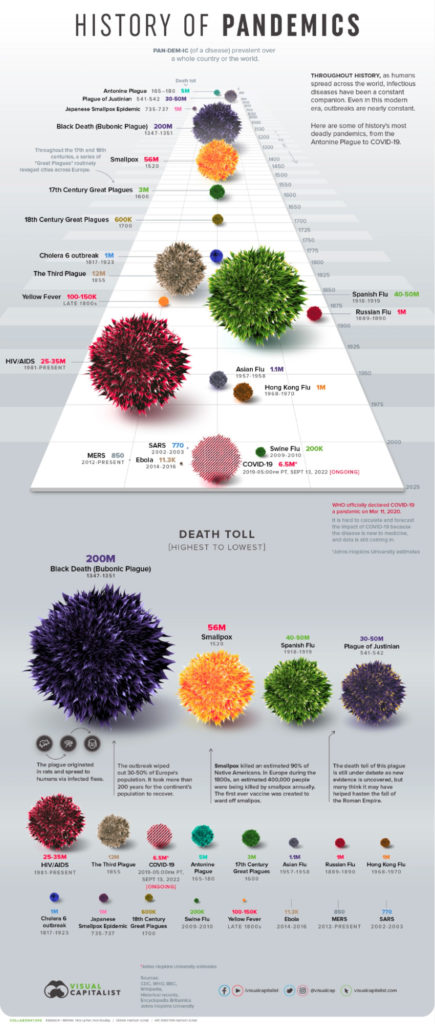
Part timeline, part size-order graph, this data visual packs a lot of information in one punch. Infographics are visual aids that can get across complex messages or large, difficult-to-comprehend datasets by combining data visuals.
This infographic tackles global death rates of infectious diseases over time. That means it has a time variable and a volume comparison.
Visual Capitalist chose to display this two ways: first, in a timeline to see where the diseases took place over history, and then in size order (like a proportional area chart) to see which diseases have been the worst.
Importantly, the team included key information, such as the ongoing nature of the Covid-19 pandemic and emerging evidence of ancient diseases.
These elements help the viewer understand complex data and the added context helps them put that information into perspective.
Infographics are widely used, and for good reason. Justin Beegel, CEO of Infographic World, revealed:
Given how dramatically the digital and social landscape has changed in recent years, we wanted to conduct a study on the state of infographics. What we found is that visual storytelling helps businesses, marketers and communications professionals reach their target audience in more meaningful ways than virtually any other type of medium.
Infographics are an ideal way to incorporate storytelling into your marketing. It allows you to give more context than most charts and graphs alone.
Similar data visuals to display trends over time include stream chart and bubble timelines. To display comparisons, similar visuals include bubble charts and radial line charts.
Best practices for using infographics:
- As with most data visualizations, it is possible to cram too much information into one design element. Be mindful of readability and clarity.
- Keep a cohesive color palette so that all elements make sense together. This graphic has a lot of components but the colors work together without being overwhelming.
- Maintain design consistency for elements that are the same. In the example above, smallpox is orange in the timeline and orange in the comparison section.
4 data visualization examples to impress internal teams
Presenting data to internal teams tends to be less visually dynamic than the examples above. But if you want to fuel decision-making, internal data visualization still needs to be digestible.
What makes perfect sense in a spreadsheet to your team might look like nonsense to another. Data visualization can help make that information accessible to everyone.
Look to your dashboards for data visualization inspiration. Many can export individual modules for use in slideshows, emails, handouts, etc. These auto-generated graphs can help you go miles beyond dated Excel spreadsheet and PowerPoint charts so you can get your point across and drive change.
Here are four great examples of data visualization for internal teams.
1. The humble line chart
According to Databox research, line charts are the most commonly used format for data visualization. Line charts help users understand and communicate performance over time, making them a good way to display trends in large datasets.
As it’s one of the most popular graphs out there, most data analytics platforms can display some sort of line chart. These days, you can go far beyond a single line going up and down.
For example, Perceptive Analytics’ Google Ads dashboard combines different methods of data visualization to deliver a 360-degree view of performance. Notably, it includes an interactive, multi-variable line chart:

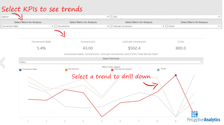
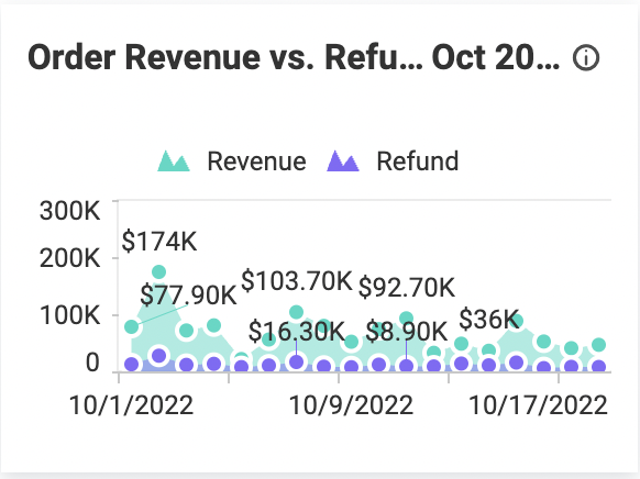
In this example, a steep rise followed by an immediate dip in cost per conversion highlights a point of further investigation that wouldn’t immediately leap out if data was presented as numbers in a spreadsheet.
The ability to select KPIs brings chosen data points into focus. This prevents multiple lines in a single chart from causing confusion, making it easier to analyze and understand one thing at a time.
Here’s what it looks like when a line chart is improperly formatted and you can’t focus in on a specific data point:

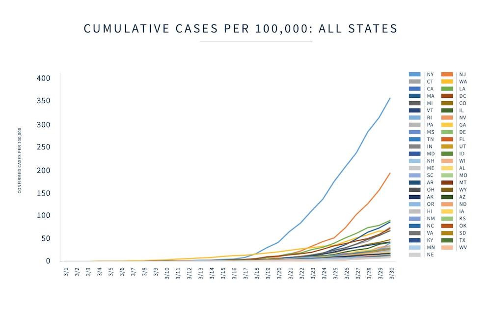
Any lines below the first two are jumbled together and basically meaningless.
Avoid overloading your line chart with too much information, including too many labels, like this example from Bold BI:

Here, the y-axis illustrates the dollar amount and you can hover over the bubbles to get the exact dollar value. So, there’s no need to include the text labels in the chart.
Best practices for using line charts:
- Don’t clutter. Keep your data points clear and obvious for understanding at a glance.
- Avoid overly designed charts, like 3D line graphs. These make your brain work harder to understand information that only needs two axes. The goal of internal data presentation is to communicate quickly and clearly.
- Start your y-axis at zero to represent data as accurately as possible.
2. When bar charts aren’t enough, use stacked bar charts
Stacked bar charts show how a category is divided into smaller subcategories by volume. This is especially useful for tracking how subcategories change over time.
Here’s an example of a stacked bar chart from Datapine that focuses on tracking contact volume over a period and separates into three categories:

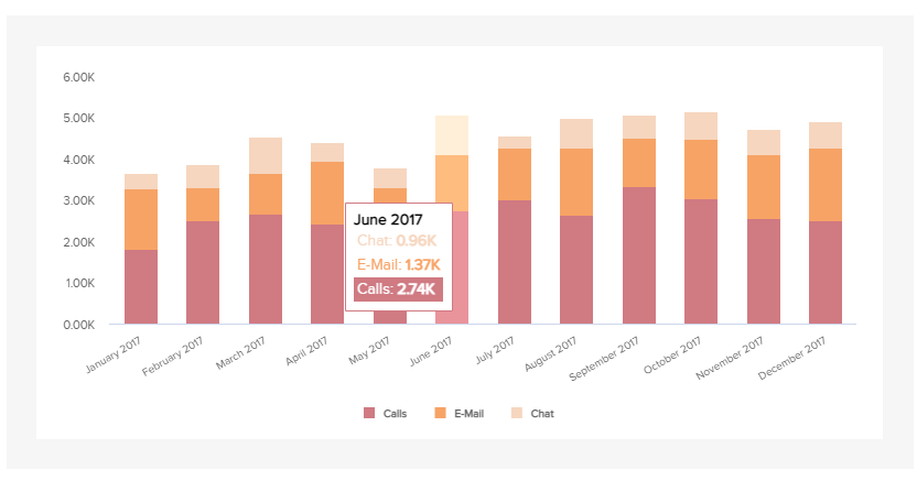
It breaks down total ticket numbers and how each method (calls, emails, and chat) contributes. By adding an interactive data visualization element, users can hover over the chart to see specific figures.
For example, it’s easy to see from the data that calls and email make up the bulk of tickets. It might make sense to move more live chat staff over to the phones to handle demand.
Stacked bar charts are best used for small data sets. The more data you include in a chart, the more confusing it becomes. Take this example from Microsoft Power BI:

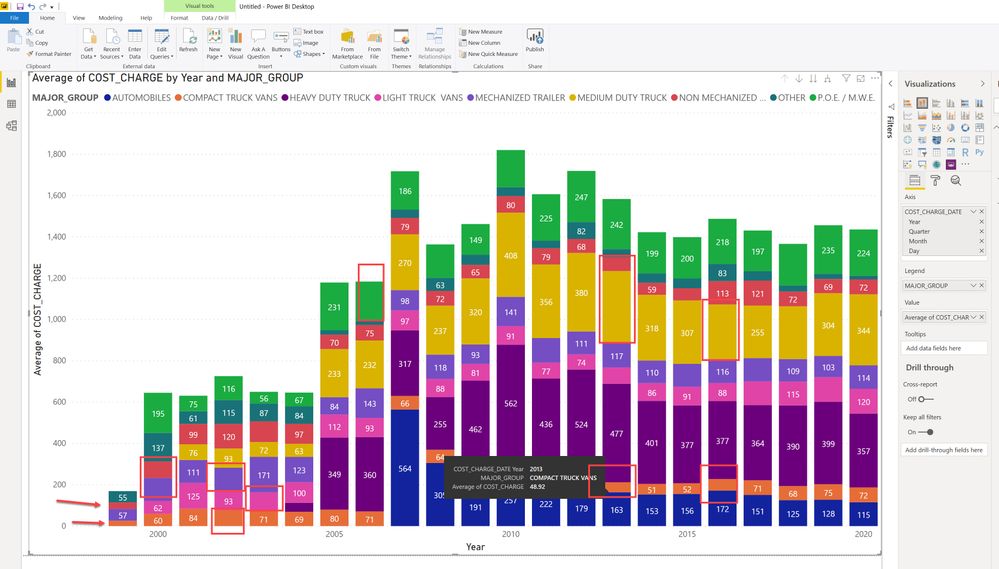
With up to nine data points across the chart, there’s too much information to consume and compare, making it difficult to tell the story. Multiple colors also make the chart overwhelming.
Many dashboard modules allow you to focus in on a variable, like this dynamic stacked bar chart from Excel Campus:

The stacked bar chart is ideal for showing how subcategories change over time within one or two categories.
Best practices for using stacked bar charts:
- Enable focusing on each variable, so users can tune out extra information.
- Use with small datasets only (ideally limited to three).
- Ensure date intervals are regular (e.g., include every month instead of Jan, Feb, April, September, etc.).
3. Spot your bottlenecks with funnel charts
Each step in a funnel chart filters-out data leading to the final step, which is the result of the process.
To help Victoria University better understand its consumers and get a clear snapshot view of students, The Datalabs Agency used Tableau to build a dashboard that focuses on simplicity. Within that dashboard is a funnel chart:

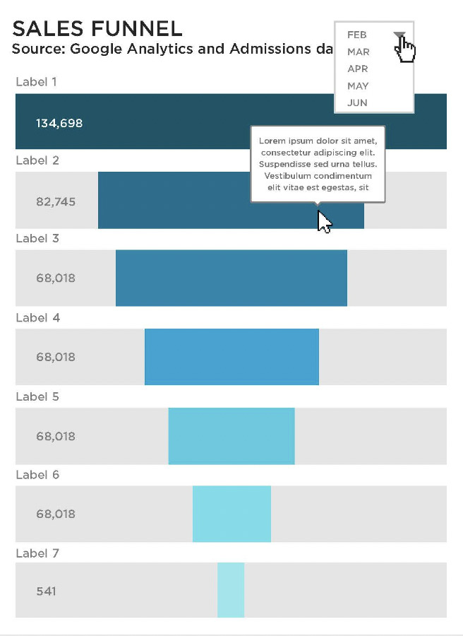
The funnel bar chart shows the number of users at each stage of the sales funnel. This gives users a high-level view of where there are significant drop-offs and acts as a starting point to dig for insights.
Here’s another good example from Chartio of how the data structure of a funnel chart might look:

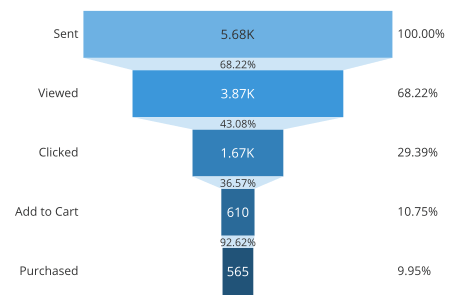
Following this structure, you can see that there is a noticeable decrease in how many people click on a product and how many add it to their cart.
With this information, you can examine your landing page. Are buttons clear? Are product descriptions doing a good enough job of selling the benefits? Findings can be used to provide context and solutions to stakeholders.
Best practices for using funnel charts:
- This is a chart that benefits from labels. Show the volume and the change percentage to paint an overall picture.
- Ideally, start your funnel with a value that is 100% and stick within the same conversion path. This way there’s no danger of mixing up data. For example, if you focused just on leads generated from an email campaign but your conversions data isn’t segmented by campaign, you won’t end up with an accurate data visualization.
4. Going geographic with maps and bubble charts
Geographic information is often key to marketing performance, a map chart presents a simple way to show how location impacts data.
Perceptive Analytics’ dashboards include maps that indicate conversions by region in the U.S.:

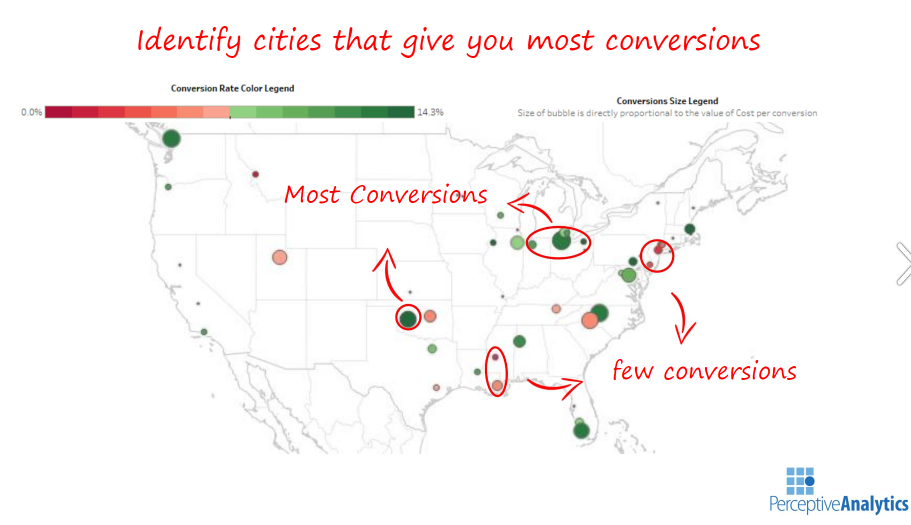
Perceptive Analytics uses color coding to display higher conversion rates. The map borrows data visualization techniques from the bubble chart, varying the size of each circle so that users can see where ads are most profitable at a glance. Larger circles equal more conversions in a particular location.
Paired with other data, marketers can support informed decisions and forecasts. For example, by understanding that conversions are higher at the end of the week with males in Texas, you can deliver a compelling case for increasing ad budget for those personas.
Best practices for using map charts and bubble charts:
- Pay attention to color psychology. Red can mean “bad,” “danger,” or “alarm.” Likewise, green can mean “good.” Choose your bubble colors carefully to avoid accidentally swaying viewers one way or the other.
- Keep it simple. The example above does a good job of showing which territories are converting and which aren’t. It doesn’t complicate it any further than that.
5 tips for creating compelling data visualizations
The aim of data visualization is to make complex data easier to understand. The end user should be able to look at a chart and easily spot key trends or information.
When your audience can do this, it becomes easier for you to explain why insights matter and make a case for change. Presenting the data in an aesthetically pleasing way also makes your audience more likely to share on social media, spreading your brand’s awareness.
Here are five ways to create visuals that get your point across and/or get shared.
1. Match visuals to the data
Good data can easily be lost in a bad chart. Award-winning data visualization designer Nathan Yau demonstrates that there are many ways to represent a data in his work visualizing one dataset 25 ways (his point is that not all of them are great):


To choose a type of visualization that showcases information without cluttering it, be clear on:
- The size of your data. Some charts lend themselves better to big data sets than others. A pie chart, for example, is a good way to visualize a small amount of data. But more than six data points becomes confusing as the segments get smaller. A better solution would be a line chart, combination chart, or scatterplot.
- The type of data. Use the kind of data to narrow down chart or graph types. For example, continuous data is best visualized in a line chart or stream chart, whereas categorical data is best suited to a tree graph or sunburst diagram.
- The audience. What story is your data trying to deliver and who are you presenting it to? Are you presenting trend data to stakeholders in a performance review or comparing landing page data to inform the next steps for the marketing team? Understanding why you’re collecting the data and who will benefit from it will make it easier to choose a visual.
2. Practice good data hygiene for your visualization
Don’t let your data get muddled up in the process of designing beautiful data visualizations. Ensure accurate data at all stages of the project, so you’re not misleading your audience in the name of a pretty image.
Follow some good practice advice for data visualization:
- Start your graphs at 0, or explain why it’s not starting at zero. (Learn what happens when you start your baseline elsewhere here.)
- Consider your line thickness. A thick line could make it unclear where the data point really is.
- Don’t overwhelm with data. Maybe you collected 50 data points in your research, but only 10 of them are significant. Pull out the most important data to highlight in your visualization.
- Label your axes, let people know what you’re measuring, but think carefully about where to place those labels (i.e. not anywhere that obstructs the data, like in the Bold BI example above).
3. Keep visuals simple
Strengthen data by removing noise from your visuals. The different examples of data visualization above have clarity in common: the data is easy to read and the message is easy to understand.
Strip back elements that became popular in the 20-teens, like drop shadows, 3D components, random icons, irrelevant labels, and unnecessary values that distract from the message.
This example from a presentation by Brent Dykes shows how unnecessary noise dilutes data and how much more effective its when stripped back:

Image Filename: example-from-a-presentation-by-brent-dykes.jpg
Alt Tag: Example from a presentation by Brent Dykes that shows how unnecessary noise dilutes data
Focus on the data that matters. As the author of Presentation Zen Garr Reynolds says:
You can achieve simplicity in the design of effective charts, graphs, and tables by remembering three fundamental principles: restrain, reduce, emphasize.
4. Choose the right tools to create visuals
Turning raw data into eye-catching visuals requires the help of data visualization tools. Software will read datasets and plot charts for you, so you’re not left relying on manual data mining to populate visuals.
Here are some popular tools to check out:
- For KPI dashboards: Geckoboard or Salesforce Einstein
- For visualizing web analytics: Google Analytics
- For visual report templates: Google Data Studio
- For simple charts: Google Charts
- For designing simple infographics: Canva
- For SMB data visualization and business intelligence: Microsoft Power BI
- For enterprise-level data visualization and business intelligence: Tableau
- For seasoned data scientists: Sisense
- For open-source data visualization: D3.js
These tools differ in features, pricing, and usability. If you’re working with a small budget, start with free tools like Google Charts and Google Analytics and scale up investment later.
5. Use visualizations to tell powerful data stories
Visualizations can help drive company-wide change. But to have the same impact with new audiences as they do with your team, data needs to be sold through story.
For example, to a marketer, the chart below from Bold BI’s web analytics dashboard shows that blogging is the biggest driver of revenue. It’s a clear indication that content marketing is working and the team should invest more in it.

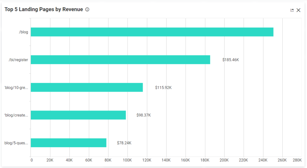
But to board members, it only shows that the blog brings in money. Why does it bring in money? What makes it so popular? Why is it bringing people directly to your website? These are the questions stories will answer.
Data storytelling capitalizes on the human brain’s want for stories to make insights interesting and memorable.


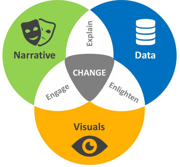
Through storytelling, you can present insights in simpler terms to sell your message and inspire action. It adds narrative to your data and visuals to engage, explain, and enlighten.

Taking the graph on landing page revenue, you can explain why the data matters. You can break down the elements of a blog post, how the blog has grown over time, and how your content marketing delivers value to your audience. This all builds a compelling case for further investment.
Think about your audience and what change you want to happen. Use this to uncover engaging stories behind the visuals.
Conclusion
Data visualization helps to bridge the gap between raw numbers and communicating insights at a glance. The examples in this article are a solid starting point for designing visuals and dashboards that you can present to teams and stakeholders.
Focus on visualizing data that is most important to marketing and sales goals. The metrics that relate to key performance indicators will help uncover new insights and tell engaging stories when visualized.
Check out our Data Presentation and Visualization course and learn how to get stakeholders to take action.
Related Posts
-
Marketers have access to more data than they need. Your time on this page has…
-

Do you need to be a big company and need large volumes of traffic to be data…
-

You have your CRM, web analytics, email marketing tool, payment processors, survey tools and so…
-
Over the last years, Google Data Studio has evolved from an appealing but clunky application…

