


Google Analytics is widely used. But most marketers only scratch the surface when it comes to reports.
You can find insights for conversion optimization from tons of reports—and the juicier reports are lesser known.
I asked some of my friends in the industry to share underutilized reports that they often turn to when looking for insights.
Table of contents
1. Advanced segments based on buyer personas

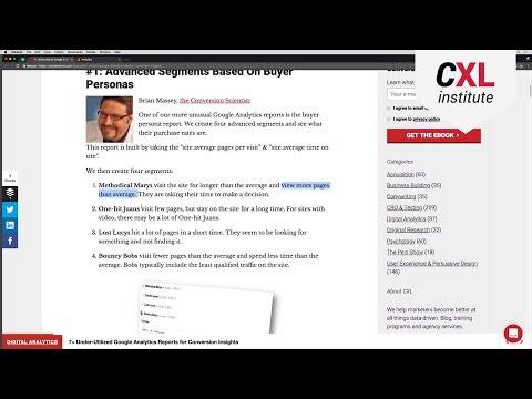
One of our more unusual Google Analytics reports is the buyer persona report. We create four advanced segments and see what their purchase rates are.
This report is built by taking the “site average pages per visit” and “site average time on site.”
We then create four segments:
- Methodical Marys visit the site for longer than the average user and view more pages than average. They take their time to make a decision.
- One-Hit Juans visit few pages but stay on the site for a long time. For sites with video, there may be a lot of One-Hit Juans.
- Lost Lucys hit a lot of pages in a short time. They seem to be looking for something and not finding it.
- Bouncy Bobs visit fewer pages than average and spend less time than average on the site. Bobs typically include the least qualified traffic.
Once we have the segments, we can examine their:
- Purchase rates;
- Page flows;
- Devices used.
It’s a way to start with segmentation as you begin to understand the visitors to your site.
2. Site speed reports


I’m a performance junkie—because I started life as a network and security engineer with routers, TCP/IP, and lots of cool tools for analyzing and fixing problems.
I carried this into my life as a UX and CRO practitioner. Performance—and the perception of performance—plays a vital part in how people rate their experience. By fixing performance issues, you avoid sucking millions of hours of productivity from people’s lives as they wait for your stuff to load and make lots of money.
In the past, people used to use synthetic tools—bots placed on the Internet to measure your site. Now you have something much better. Real user performance monitoring of how long pages took to load and render. Where? In Google Analytics of course.
Go to Behavior > Site Speed > Page Timings. At the top of the report, click on the “DOM Timings” tab.

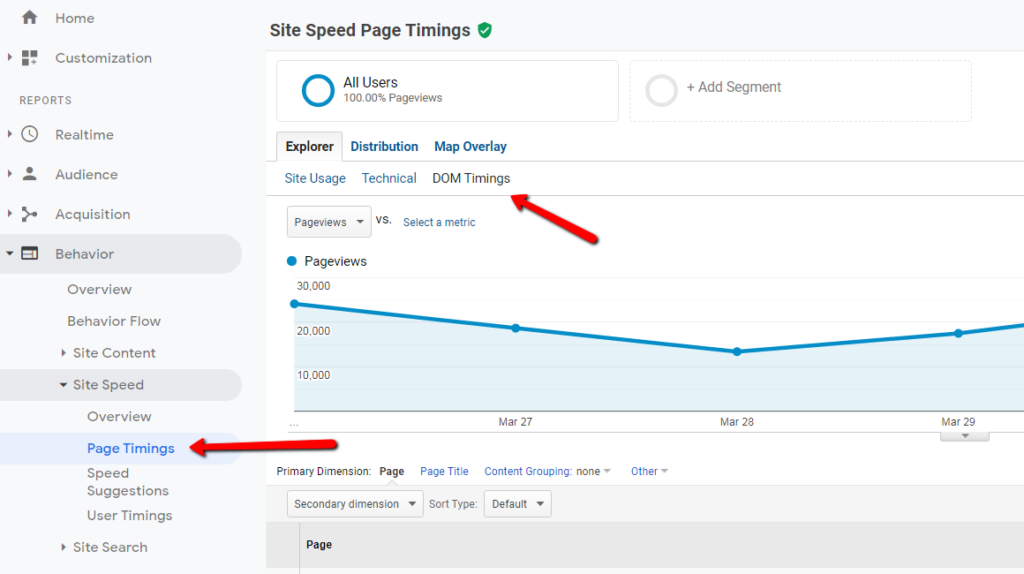
In the drop-down menus in the second and third columns of the report, you can now see three metrics:
- Avg. Document Interactive Time. This is the time it takes the browser to start handing control back to the user. This metric is really important because it’s when people can start navigating, clicking, and scrolling.
- Avg. Document Content Loaded Time. Depending on how your website builds pages, you may need to use this measure instead. Basically, this measurement refers to running scripts in the page. If you’re using stuff that blocks a lot of user interactions until all scripts load, this may be a better metric. I tend to look at both.
- Avg. Page Load Time. This metric—the “entire time” to load everything on your page—is less useful these days. It gets skewed by all the third-party tags, tracking stuff, and social buttons you might have on your site. It simply isn’t reliable for real performance metrics (IMHO), but it does tell you if you’re loading heaps of crap on slow connections.
By focusing on these metrics and creating a “Suck Index” report, you can start to chip away at things. Create the index simply by ranking each page with the formula Pageviews x aAvg. Document Interactive Time. That way, the slowest and most used pages will bubble up to the top.
Running performance reports around the pages that really suck in delivering a fast load time will do wonders for your bounce rate, user delight, and conversion rate. If you want to prove all this to the boss, the resource list below has everything you need.
Resources on performance and materials to convince your boss:
- The mother lode of tools and tips, from Google;
- A/B testing software Always Slows Down The Site;
- For desktop and tablet experiences, WebPageTest. (Note: Please use the timeline photo feature—it’s ace.)

3. Flow reports

Google Analytics has an inordinate number of reports, both standard and custom, that when considered as an abstraction of your customer behavior, they can be overwhelming to interpret.
In fact, many Analytics users don’t examine all reports because they think them either unnecessary, not worthwhile, or irrelevant to their business goals.
While that may or may not be true, there are several standard reports that are “lesser known”—and, thus, used less frequently, even though they can be helpful to the analyst.
These reports yield additional insights if understood properly and in context. On such example requires a bit of history to understand. In traditional “web analytics,” the notion of a “path”—the discrete series of clicks (i.e the clickstream) taken by a visitor—was disdained as not very useful years ago.
Even then, the nascent analytics industry criticized pathing reporting because constructs like identical links on the same page couldn’t be pathed accurately. Rich Internet experiences (where there was no pageview) were becoming a popular replacement to static sites, and pathing couldn’t capture these events.
Google Analytics addresses these concerns and more in “Flow” reports. While Analytics doesn’t name its “Flow” reporting as “pathing,” the concepts, presentation, and utility of it is reminiscent of traditional pathing.
Yet, Google Analytics recasting and evolution of “pathing” as “flow” has made this type of data representation and visualization more usable and helpful. As such, the following “Flow” reports make my cut for useful, lesser known reports, especially when combined with custom segments:
- Visitor flow is another representation of traditional web analytics pathing but with more features. This reports lets you see where visitors came from and their next and subsequent interactions. You can hover over a page for more information (and select to view the flow from a particular page). A nice feature is the ability to segment the flow by available dimensions and custom segments. This report is helpful for marketing analysts.
- Behavior flow is also a representation of where visitors started on the site and where they went next. The report is pre-configured to begin with landing pages (first page in visit) instead of acquisition sources (like visitor flow). Thus, it’s helpful for landing page optimization and to verify that your audience is viewing the best possible content.
- Goal flow is almost identical to visitor flow but contains the Goals you’ve configured as part of the conversion funnel. In this sense, Goal flow is similar to the funnel visualization report; however, it provides more information and enables deeper exploration. Hovering on a Goal also provides additional information (as in all flow reports).
- Event flow is represented like the Goal, behavior, and visitor flows but represents Events configured in Analytics to represent page-less events within an interaction. This report is particularly helpful when you want to see how people interact with a rich application that doesn’t generate pageviews. This type of flow is helpful for product managers.
Multichannel Funnel Analysis reports are also helpful—and lesser known. They have some complexity in concept and data interpretation, which I cover in another post.

4. Site search insights

The “Site Search” section in Google Analytics can identify major areas of opportunity. This can be useful for any site in any industry, as long as the site search is used often.
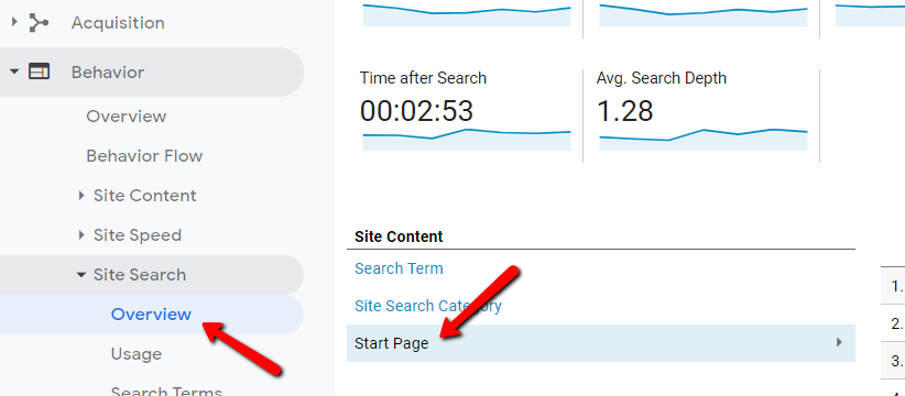
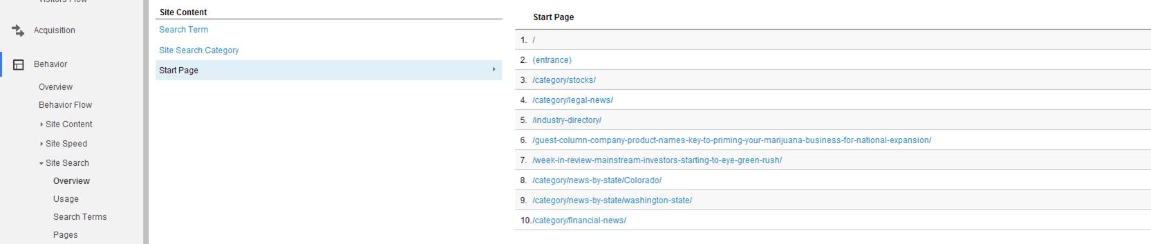
On the “Overview” section, select “Start Page.” You get the top 10 pages where searches occurred.
People who search for content or items on your site are more likely to consume that content or purchase a product if they can find it on Page 1 of results.

This simple report lets you know if you’re missing critical pieces of content on a page, especially if you notice trends.
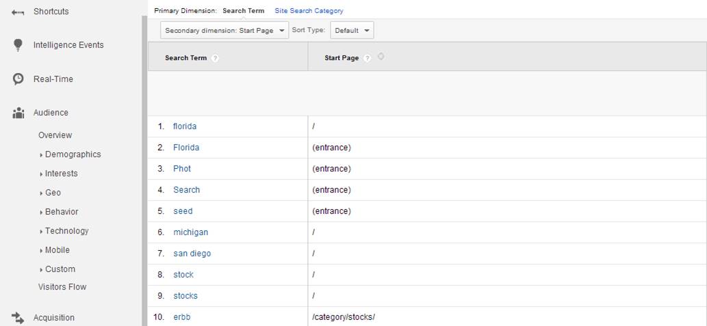
To spot search trends, select “Search Terms,” which displays all the search terms that have been typed into your search box. Here, I like to do two things:
- Select “Start Page” as a secondary dimension to see the keyword next to the page that spawned the search:
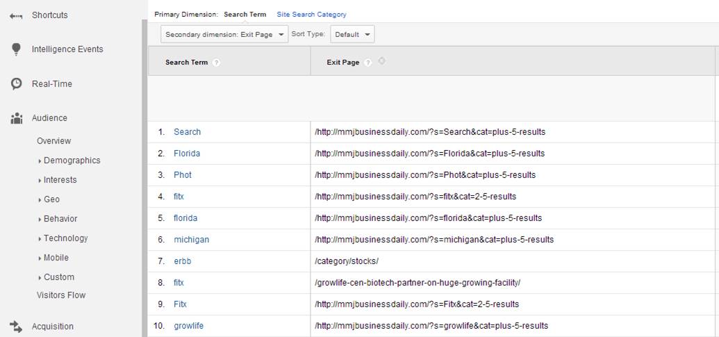
- Select “Exit Page” as a secondary dimension. If they left on a search results page, I know they couldn’t find what they needed. On the other hand, I can see what pages people did end up navigating to if they didn’t exit.
If you get a ton of queries, I highly recommend making a custom report. Include the “Start Page,” “Exit Page,” and maybe even a “Conversion Goal.”

5. Content grouping

The built-in features for content grouping in Google Analytics are powerful and flexible. Even if I have to resort to using daisy-chained, hard-coded rules to get a structure that works, the effort is worth it.
The reason the effort pays off is because these functions now appear in so many places in the Google Analytics Behavior (content) reports.
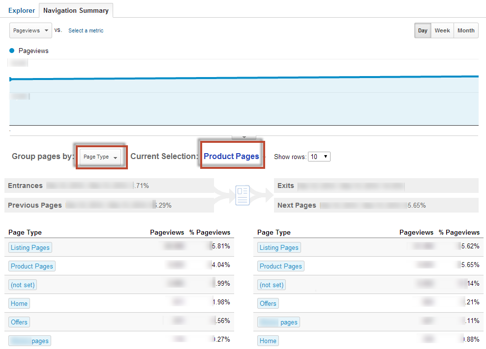
Here’s an example of a “grouped” view when applied to a Navigation Summary report to illustrate just how useful grouping can be. The Navigation Summary used to be good for deep-dive forensics on a particular page, but with grouped content, it starts to make aggregated user-journey reporting more efficient.
This feature is built right in to standard reports, which is great if you’re more interested in what people do on a sites and not concerned only with getting more people to the site.
Conclusion
When you’re looking for insights in Google Analytics, be ready to put in the hours. Whenever I start to analyze a new site, I easily spend two full working days in their analytics.
The reports mentioned here will help you find more insights faster.
Featured image by Thomas Luthard
Related Posts
-

The success of an online business is measured by various indicators. The data required comes…
-
Google Analytics helps us identify conversion uplift opportunities. Traffic is precious, and we don't want…
-

"Statistics are like bikinis. What they reveal is suggestive, but what they conceal is vital,"…
-

This post is not a dry feature-by-feature comparison, nor does it include a winner-take-all verdict.…
