


We talk a lot about creating high converting landing pages, getting traffic that converts, and making the most out of your conversion points.
But what we don’t talk about often are outside-the-box landing page strategies you can use to increase conversions right away.
Similar to the banner blindness phenomenon, sticking to traditional methods (e.g., linking to your homepage from your Twitter bio) is too predictable—leading to what I call brand blindness.
What follows are 12 unconventional landing page strategies that, if used well, disrupt visitor expectations, making them more receptive to what they find on the page and leading them through a flow on your site.
For these strategies to work, it’s vital to consider where the visitor is coming from and the conversion you’d like to take place. These pages bridge specific gaps; without serious consideration, you’ll create extra real estate without seeing any results.
Table of contents
- 1. “Start here” page
- 2. Coming From (Social Network)
- 3. Custom landing pages for guest posts
- 4. Blog comment landing page
- 5. Post-subscription sign-up page
- 6. “Thank you” page with entry-level offer
- 7. “Thank you” page with “Refer A Friend” call to action.
- 8. “Thank you” page with a survey
- 9. Social media hub page
- 10. The resource library page
- 11. Clever unsubscribe page
- 12. Email signature page
- Conclusion
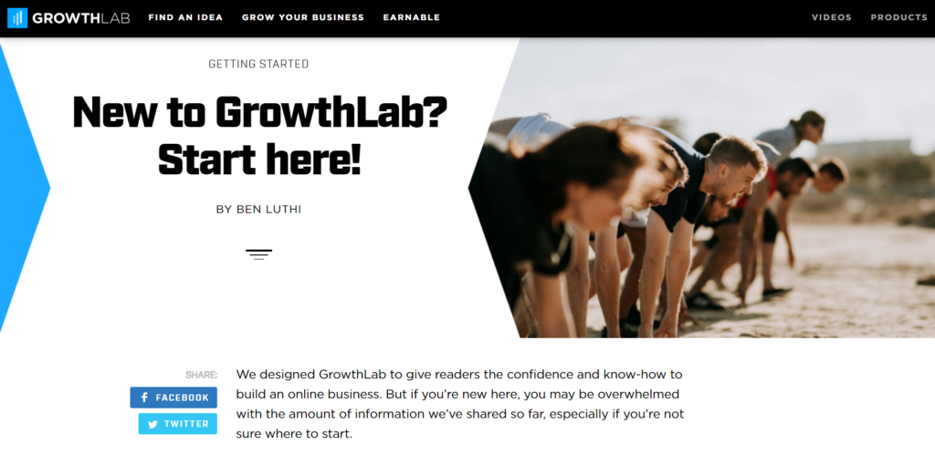
1. “Start here” page
It’s easy to find the first page your visitors land on. Check your analytics, and you’ll see all sorts of “first visits.” But what’s the second page these visitors go to?
This is where the “start here” page comes in. Think of it as an anchor for visitors who liked what they saw but don’t quite know where to go next.
Your start here page is great real estate to communicate the mission of your website, offer an irresistible lead magnet, and start your relationship with your new visitor.

2. Coming From (Social Network)
High-converting landing page Rule #1: Never send traffic from an ad to your homepage. Pointing your ad directly to your homepage is common knowledge among PPC professionals, but somehow that same rule never caught on with social networks.
But isn’t social media just a dynamic ad for your business?
Consider how people get to this page: They like what you have to say, click on your profile, read your bio, and click the link. Why not capitalize on this interest?

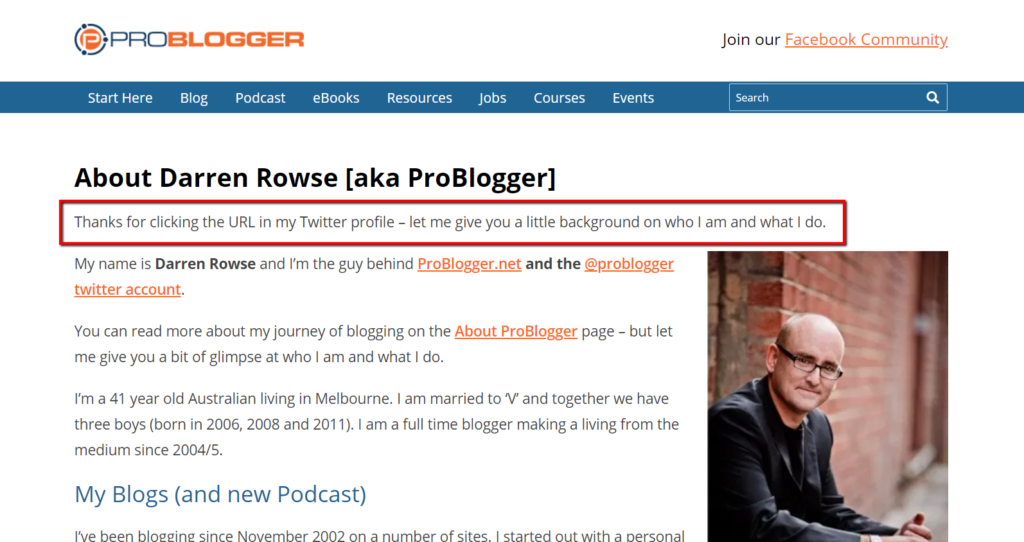
The main point of this page, and many others in this post, is to give extra context, acknowledge where the user is coming from, and convert that reader into a subscriber.
This page by Problogger does a great job at giving visitors a quick look at the most important sections of the site:

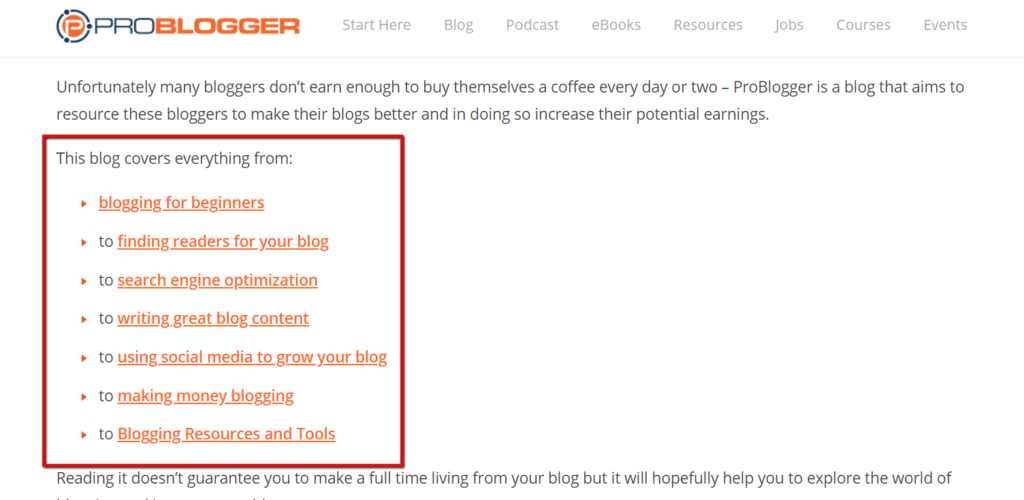
Now, this is just my opinion, but I believe this page has too many links. Realistically, a visitor coming from social media won’t stay long—the switch from fast-paced social media to long-form content is too jarring.
Still, it’s worth using “Coming from [social network]” as a way to offer a resource related to the social network (and your business) in exchange for an email address.
Either that, or offer fewer options and link to the best stuff on your site to guide visitors to a stronger point of conversion.
3. Custom landing pages for guest posts
The principle of this landing page is similar to the last two. When you guest post, instead linking to your homepage in your bio, link to a custom landing page specifically designed for the visitors of that site.

This tactic is especially useful if your bio mentions a lead magnet that solves the problem your guest post explores.
In this post, Neil Patel talks about getting 1,000 subscribers in 60 days by guest blogging:
I’ve seen registrations jump over 10% with personalized landing pages like that.
That personalized landing page is a critical piece…so don’t skip it. It’s truly the best way to maximize all of your hard work!
4. Blog comment landing page
When you leave a comment, you often leave a name, email address, and URL. But if you’re linking directly to your homepage, you’re not making the most of your comment.
Realistically, you won’t have landing pages for every site you comment on. But if you have landing pages for the sites you comment on the most, you can quickly orientate people after they’ve clicked your link.
To do this, acknowledge the site your visitor is coming from in the headline.
“Liked my comment on CXL?”
Introduce who your site is for, how it helps, and include a brief blurb about you. Most importantly, curate a list of links that are contextually relevant to the site you’ve commented on.
For example, if you’ve written great UX tutorials, and you’re commenting on a UX post, your landing page should include links to your best UX work to draw people deeper into your site.
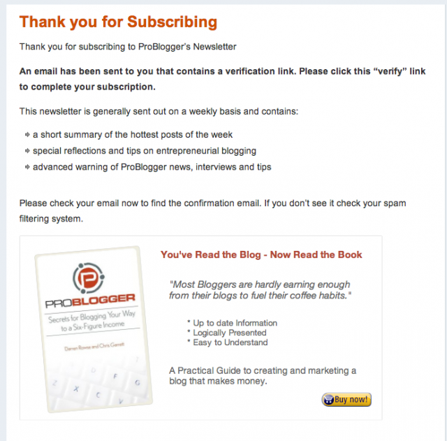
5. Post-subscription sign-up page
If you want email subscribers to consume your content, the first step is to get them to confirm their subscription. Where do you send your visitors after they complete an initial opt-in?
Ramit Sethi of I Will Teach You to Be Rich uses a few age-old practices to drive new subscribers back to their inbox and complete the double opt-in.

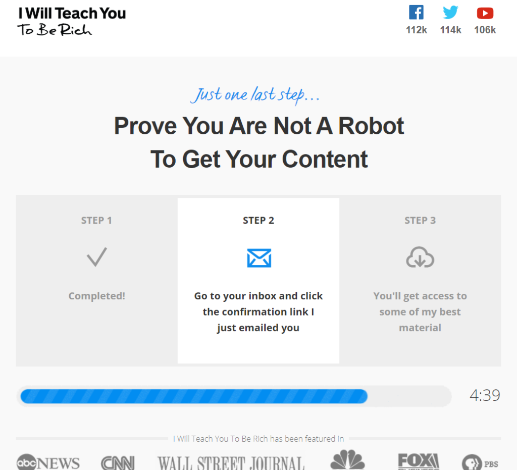
While there are a few things going on on this page, the stand-out element is the timer.
Research shows that when timers are introduced in “low impact” decision-making, the added urgency compels people to take the path with the least resistance.
On this post-subscription landing page, the path is laid out clearly, as well as the reward for finishing the process.
6. “Thank you” page with entry-level offer
Thank you pages are one of biggest missed opportunities online.
When designing for user flow, you lead your user through a series of steps to encourage them to sign up for your email list. But why stop there?

Now that a user has committed to getting a free thing, it’s much easier to apply basic upselling psychology to get them to buy into the paid thing—if that paid thing has a lower cost and is a logical extension of the path your visitor took to get there.
Depending on your paid offer, it’s worth playing with different pricing strategies or product bundles.
This page could also be used to convert higher priced offers if that offer acts as a shortcut (e.g., free 20-week course on Facebook marketing with an offer for a private hour-long consultation).
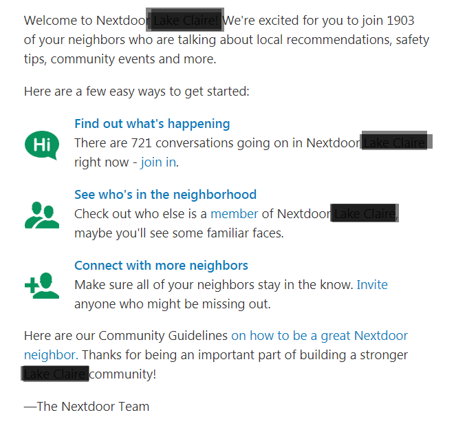
7. “Thank you” page with “Refer A Friend” call to action.
Nextdoor encourages freshly subscribed visitors to invite others in their neighborhood:

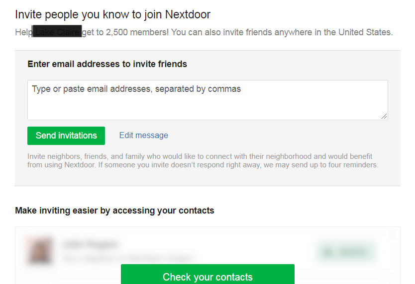
The email link then takes users directly to a landing page where they can invite others, or even import email contacts:

Research by marketing professors Andreas Kaplan and Michael Haenlein suggests that for something to go viral, three basic criteria must be met:
- Right message;
- Right messengers;
- Right environment.
In this case, the “refer a friend” thank you page is the perfect opportunity to encourage new subscribers to share with their friends and increase your viral quotient.
If applicable, make the deal even more irresistible—offer a discount in exchange for referrals.
8. “Thank you” page with a survey
What better way to learn about your customers than to ask them a few questions right after the conversion takes place?

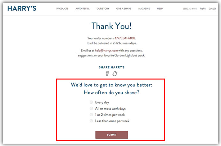
While this doesn’t directly affect conversions, the feedback you gather in this survey can be critical to creating new offers or addressing design flows in the long run.
Don’t know quite what to ask? Learn what makes a great survey question.
9. Social media hub page
At some point, you’ve heard the phrase “curate interesting content.” But doing this only through social media channels does nothing to improve your email subscription rate (directly).
If email newsletters are a part of your overall strategy, a hub page that includes everything you’ve found share-worthy builds credibility for you as an editor and industry authority.
For several years, Rand Fishkin regularly updated his list of “10X” content. These were usually articles he shared first on social, then added to his list:

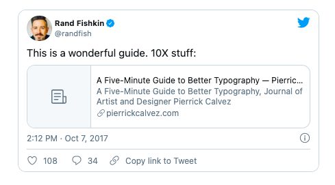

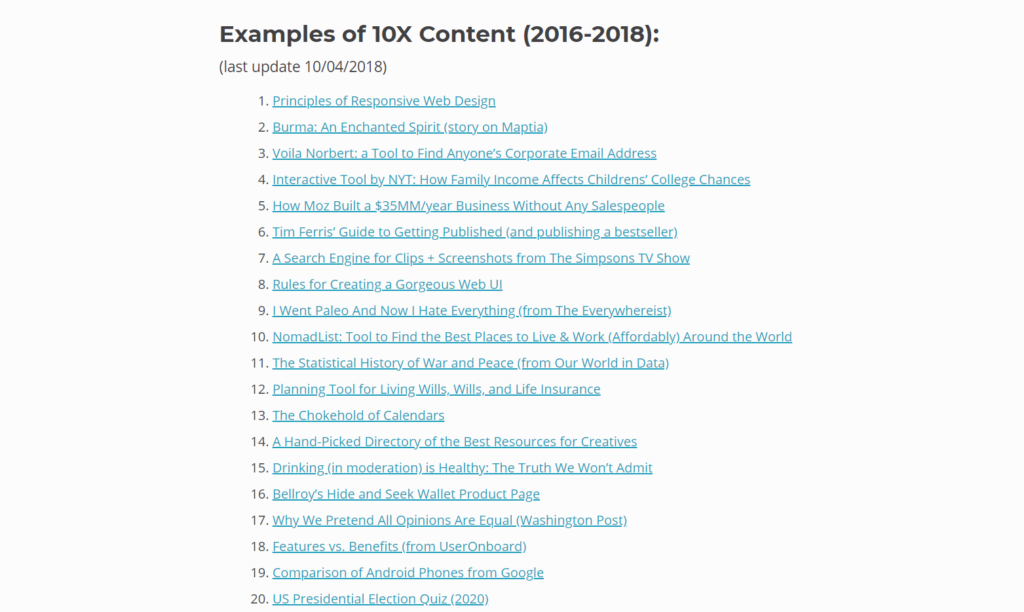
If you have a similarly curated list, you can use it to motivate users to follow through on a call to action like, “Want me to email you only the best of what you see here?” It’s a great reminder that you take filtering the best seriously.
10. The resource library page
If you find yourself recommending the same books and resources over and over again, the resource library page lets you compile all of your most commonly used resources.

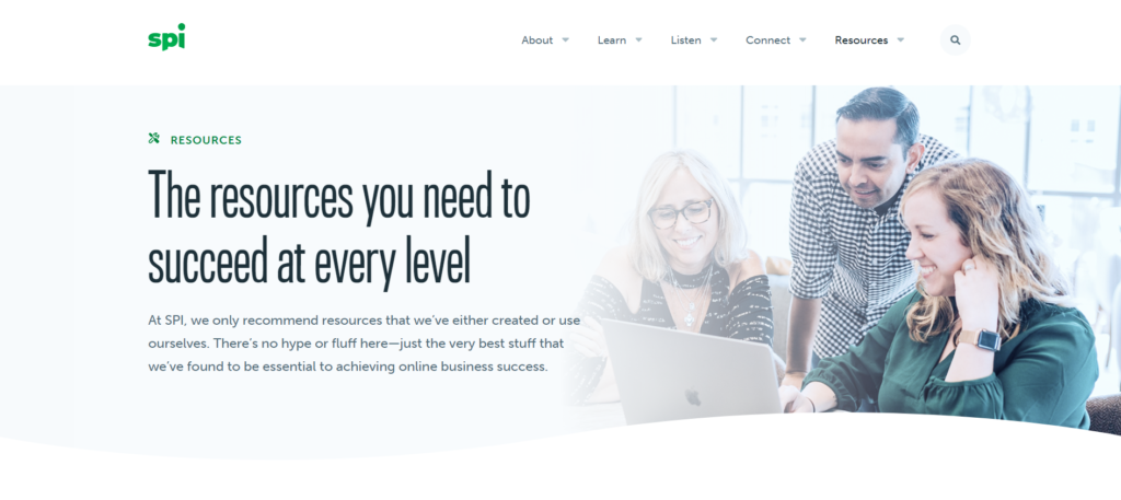
This page is sometimes used to publish various affiliate offers, such as software, books, courses, or physical products.
Comparing January’s income report of Smart Passive Income against the resource page, you’ll notice that 14 of 25 items on the income report are found on the resource page, making this page something to consider.
If you haven’t gotten started with affiliate marketing yet, you can get up to speed with this post.
11. Clever unsubscribe page
What’s the most common reason people give for unsubscribing to your email list? Too many emails, right?
This clever unsubscribe page from the Obama campaign didn’t let email subscribers get away easy. Instead of making email an all-or-nothing deal, users had the option to receive fewer emails.

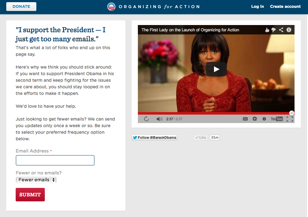
Also, notice the social media buttons under the video? By giving an alternative to email, you’re respecting users’ decision while subtly reminding them that they don’t have to shut you off entirely.
12. Email signature page
When someone clicks on the name in your email signature, where do you send them?

For most people, the link takes you to the homepage. But what if you could take this opportunity to introduce who you are and what you’re passionate about?
The person clicking on this link already has your email—you’re at a different point in your relationship compared to, say, somebody who’s just passively checking you out on social media.
Use this opportunity to add a more personal—and bottom-of-funnel—touch to your communication.
Conclusion
By putting just a little extra thought into where your visitors are coming from, you can create additional real estate on your site that breaks expectations, increases conversions, and maximizes reach—with minimal effort.
Related Posts
-
It took us six rounds of tests until we landed on a variation that was…
-
Navigation gives a user control, which is generally a good thing—but what about on a…
-

Most businesses struggle with their product pricing strategies. Are you charging too much or too…
-
A landing page is the first page that visitors see after clicking on your banner…
