


I’m sure you’ve come across dozens, if not hundreds, of image carousels or sliders (also called “rotating offers”). You might even like them. But the truth is that they’re conversion killers.
So if image carousels aren’t effective, why do people use them? Two reasons:
- Some people think they’re cool. But “cool” doesn’t make you money—at least not this way.
- Different departments and managers want to get their message on the homepage. Web design by committee never fails to fail.
Table of contents
Should you use image carousels and sliders?
Let’s get straight to the point: in 2023, you shouldn’t be using sliders and carousels on your site, and should replace them with static images instead.
This is supported by pretty much any conversion optimization expert that does a lot of tests:
We have tested rotating offers many times and have found it to be a poor way of presenting home page content.
Chris Goward, Wider Funnel
Jakob Nielsen (yes, the usability guru) confirms this in tests. They ran a usability study where they gave users the following task: “Does Siemens have any special deals on washing machines?”
The information was on the most prominent slide, but the users didn’t see it—totally hit by banner blindness. Nielsen concluded that image carousels get ignored.
Notre Dame University tested it, too. Only the first slide got some action (1%!). Other slides hardly got clicked on at all. Are 1% of clicks worth it for something that takes up (more than) half the page?
Rotating banners are absolutely evil and should be removed immediately.
Tim Ash, Site Tuners
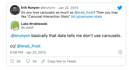
Product design guru Luke Wroblweski summed it up like this:

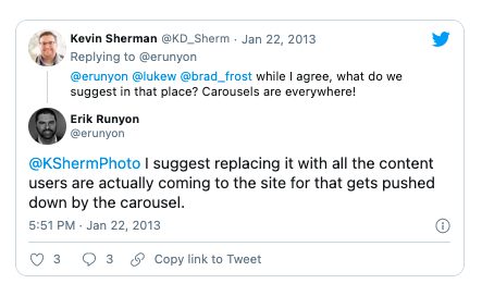
There was a discussion about image carousels on User Experience Stack Exchange as well. Here are some of the things people who tested them said:
Almost all of the testing I’ve managed has proven content delivered via carousels to be missed by users. Few interact with them and many comment that they look like adverts and so we’ve witnessed the banner blindness concept in full effect.
In terms of space saving and content promotion a lot of competing messages get delivered in a single position that can lead to focus being lost.
Adam Fellows
Carousels are effective at being able to tell people in Marketing/Senior Management that their latest idea is now on the Home Page.
They are next to useless for users and often “skipped” because they look like advertisements. Hence they are a good technique for getting useless information on a Home Page (see first sentence of this post).
In summary, use them to put content that users will ignore on your Home Page. Or, if you prefer, don’t use them. Ever.
btw these views are not my own, but are based upon observing thousands of tests with users.
Lee Duddell
In all the testing I have done, home page carousels are completely ineffective.For one, anything beyond the initial view has a huge decrease in visitor interaction. And two, the chances that the information being displayed in the carousel matches what the visitor is looking for is slim. So in that case the carousel becomes a very large banner that gets ignored. In test after test the first thing the visitor does when coming to a page with a large carousel is scroll right past it and start looking for triggers that will move them forward with their task.
Craig Kistler
![Do Image Sliders and Carousels Increase Conversion Rates? [Research-Backed Answer]](https://i.ytimg.com/vi/NMFwLeqpPMc/hqdefault.jpg)
Here are two main reasons why carousels and sliders don’t work.
Reason #1: The human eye reacts to movement (and will miss the important stuff).
Our brains have three layers. The oldest part is the one we share with reptiles. It’s mostly concerned about survival. A sudden change on the horizon could be a matter of life and death.
Hence, the human eye reacts to movement—including constantly moving image sliders and carousels.

That’s good, right? Not exactly.
Unless the image slider is the only thing on your website (bad idea!), it’s not a good thing. The slider takes attention away from everything else—the stuff that actually matters, like your value proposition, the content of your site, products, etc.
Reason #2: Too many messages equals no message.
Image carousels fall victim to banner blindness, and most people won’t pay attention to them, but even those who do can’t really get the message.
A visitor lands on your site. They see a message on the carousel and start reading: “This fall you get to…” Bam! Gone. Often, the carousels move so fast that people can’t finish reading them, even if they want to.
Focusing on a primary message and action is always more effective.
The user needs to be in control.
Carousels often have terrible usability They move automatically (often too quickly) and have small, if any, navigation icons. A key rule of user interface design is that users need to be in control.
These days, so many ecommerce sites use rotating offers, not because they tested it but due to herd mentality—”Other sites have it, so we should, too.”
Here’s Forever21, guilty as charged. They rotate between three offers that change every four seconds:
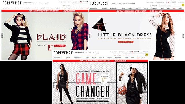
If the very first offer people see is not what they like (i.e. not relevant), then what? What if they don’t like any of the three? That’s not going to improve your customer lifetime value.
To their credit, once you touch the slider arrows, the automatic rotation stops. Not only that, but when you come back to their site at a later time, it opens up the slide that you wanted to see. (Since this article was first written, they’ve ditched the slider altogether.)
I recommend that instead you have a single, static offer. Here’s J.J. Buckley with a static offer—a focus on a single message so that it gets delivered:

(They’ve since switched to an auto-play video. Go figure.)
Some former carousel users, like Adobe, Gap, and Hilton, have also switched to static messages.
Adobe:


Gap:

Notice that Hilton has an image slider, but it does not move automatically. If you’re gonna do it, that’s the way to go:

Conclusion
If you can, avoid them. Don’t follow the (waning) fad. Follow the money instead.
Still, as Brad Frost acknowledged, “Even though carousels aren’t that effective, I somehow don’t think they’re going away any time soon.” Frost wrote this piece on how to make the carousel work better.
If you can ditch your image slider, either use static images or do this:

What’s your experience with image carousels—both as a website owner and a user?
Working on something related to this? Post a comment in the CXL community!
Related Posts
-

The design of your website is more important for conversions than you think. First impressions…
-

Back in 2013, Nielsen reported in its “Trust in Advertising” study that online banner ads…

