


We see somewhere between 4,000 and 10,000 marketing message per day. To get conversions, you must first grab attention, and the headline is what everyone sees first.
But to grab attention, you must learn how to speak to customer problems and understand the noise they endure. You can do this with customer development, feedback loops, qualitative studies, and smart social media marketing strategies.
Only after you have a core understanding of why people are clicking should look into adding the characteristics below to your headlines. All too often, people employ these techniques while failing to understand the deeper reasoning as to why these headlines work.
The information you’re about to read is powerful, but I need to offer two disclaimers.
- All these techniques don’t work all the time in every situation. Nonetheless, the data does point to these headline characteristics as being effective most of the time.
- Different techniques work better for different audiences. Studies may say one thing, but your mileage may vary. You know your audience best.
Here are five characteristics of high-converting headlines.
Table of contents
1. The headline includes numbers.
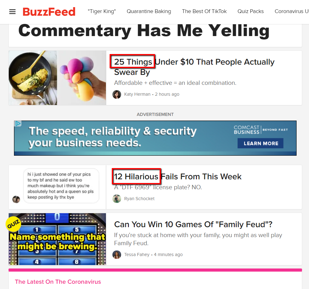
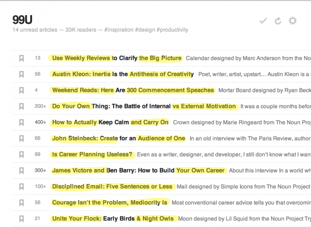
Numbered-list headlines can have astronomical click-through rates. You probably see dozens of articles like this every day.
There have been plenty of studies, split tests, and discoveries that dig into the data. Headlines with numbers are clear winners every time.
As I wrote this article, I went over to Twitter. Sure enough, ten entries from the top, here was what I saw:


I went over to Facebook. Same thing. Seriously, my friends are sharing stuff like this?

As it turns out, numbers plain work. Just ask Jonah Peretti. He’s the guy responsible for starting Buzzfeed—and wasting approximately 2.8 hours of every professional’s time each day.

Numbers are everywhere.
The Content Marketing Institute reports that headlines with odd numbers have a 20% higher click–through rate than headlines with even numbers.
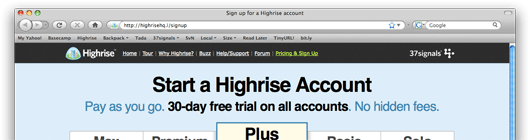
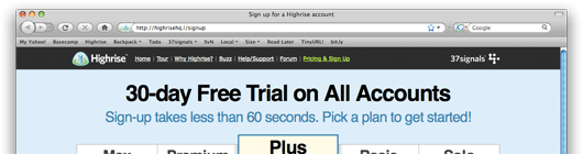
Years ago, Highrise tested their landing page headline. The results? The headline with a number had a 30% higher conversion rate:
No number in main headline:
Number in main headline (winner):
Heck, I even used this technique for the article title you’re reading now. But why are numbers so effective?
This is more complicated question. A whole branch of psychology and behavioral economics studies how numbers influence perception.
What it comes down to is the context and how the numbers are used. For example, many cultures around the world are conditioned from a young age to infer that a larger number means more of something.

This is why companies like to harp on the numerical increase. These numbers are more appealing than smaller numbers, of course, but they’re also more compelling than details about what those channels show—who cares, as long as the number is bigger, right?

However, there is also the effect of unitosity, whereby larger numbers are more comforting in future-oriented or abstract contexts. A loan payment of $100/month for the next 180 months might be more agreeable than paying the same loan for the next 15 years.
Researchers Monga & Bagchi of the University of Chicago have published a paper on their findings, which you can check it out here.
Another interesting thing about numbers, which researchers Amos Tversky and Daniel Kahneman found, is that the order in which you present them can influence perceptions. In their study, when the larger benefit was presented first, it “anchored” the viewer’s perception of that benefit. In other words, 100 albums for $5 each is perceived as a better value than $5 each for 100 albums.
The brain perceives the larger benefit first and assigns a larger value to the rest of the sequence. A similar effect is found in countdowns (going from 10–1) instead of count ups (1–10), as it builds anticipation for the best thing to come last in the sequence. (I could’ve done that for this article, but it makes more sense for a post like this one.)
Hans Villarica of The Atlantic has a great piece that goes into more detail on how numbers influence our perceptions.
2. The headline is between 5 and 9 (or 16 and 18) words.
Outbrain reported that headlines or titles with eight words performed the best.
Our research showed titles with eight words had the highest click-through rates, with these headers performing 21% better than average—so consider the length of your title if you want to get clicks.
Why eight? Why not seven? Or 35?
I don’t know. My hypothesis is that is has something to do with the limits of the human brain. One of the most highly cited works in psychology is the 1956 research work by George A. Miller of Princeton.
The name of the paper is “The Magical Number Seven, Plus or Minus Two: Some Limits on Our Capacity for Processing Information.” The whole point of his research was that “the number of objects an average human can hold in working memory is 7 ± 2.”
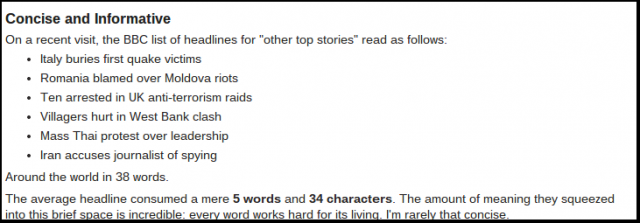
Combine that with usability research by Jakob Nielsen that has found that users typically scan all web content, paying the most attention to the first and last three words of a headline:
Moreover, the first two words—specifically the first 11 characters—make the most difference in getting people into the content. In an analysis of the BBC’s website, Nielson had this to say:
But this strategy isn’t always fool-proof, and its effectiveness may vary depending on whether the headline is for a sponsored article.
In another study by OutBrain, looking only at paid links within their network, the ideal length of a headline increased to 16–18 words.
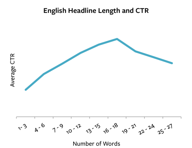
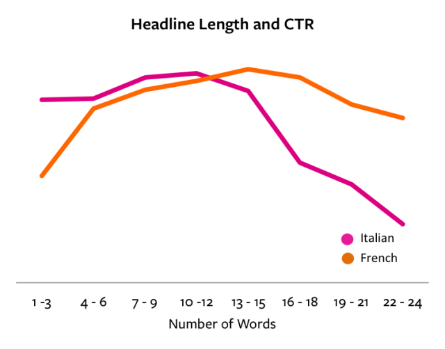
Though the “ideal length” changed, this trend repeated across other languages, too:
So why are top-performing headlines for paid links nearly double the word count as non-paid links?
My guess is that promoted content on the Outbrain network is clearly marked, and users may have an inherent click fear that comes with visiting a site they don’t instantly recognize.
A longer headline, however, gives paid advertisers more “real estate,” so to speak—an opportunity to describe the content in more detail and reduce friction.
The difference may seem minor, but if you’re trying to attract people who have no idea who you are, longer, more descriptive headlines are worth an experiment.
3. The headline is negative.
For a long time, headline writers assumed that a positive framing was better for click throughs, shareability, readability, and conversions.
It turns out, that’s not quite true.
To make sure you understand this point, the following are considered “positive” and “negative” words:
- Positive: Always, most, best;
- Negative: Never, worst.
How do they perform in testing? Here’s Outbrain’s findings:
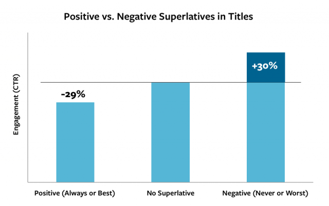
Negative superlatives in titles perform 30% better than the control—and more than 60% higher than positive ones! Why is this the case? Here’s how Outbrain summed it up:
Audience aversion to positive superlatives may simply be a product of overuse, or it could be because readers are skeptical of sources’ motives for endorsement. On the flip side, sources of negative information may be more likely to be perceived as impartial and authentic. Whereas positive superlatives may have become clichéd through overuse, negative superlatives may be more unexpected and intriguing.
It gets worse. Startup Moon research found that words like “lose,” “kill,” “fear,” “dark,” “bleeding,” and “war,” outperform their more innocent or positive counterparts.
Positive superlatives, in contrast, don’t sell. A Moz/Conductor study came up with the same findings:
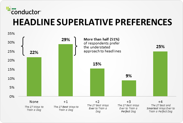
The takeaway is “be dismal, or be neutral.” But don’t go frothy and Pollyanna with a title.
4. The headline has two parts.
Successful headlines are an act in two parts. They have a beginning and an ending—a thesis and antithesis, a head and a tail.
CMI claims that “A colon or hyphen in the title—indicating a subtitle—performed 9% better than headlines without.”
Peep puts it this way:
A good headline alone is not enough—it needs help [. . .] Include a sub-headline to boost clarity.
Here’s what that looks like on Moz’s homepage:

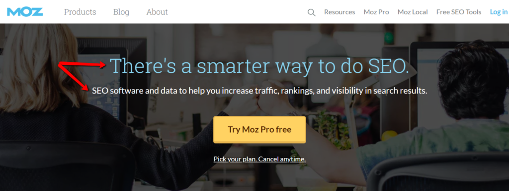
The sub-headline re-affirms why your reader is on the page and acts as a primer for the story that the page is going to tell.
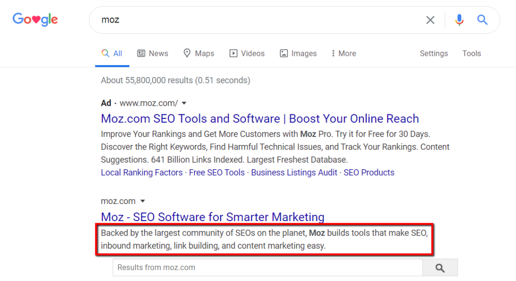
The idea of a “second” headline isn’t new, either. It’s just like the meta description on search engine results pages:

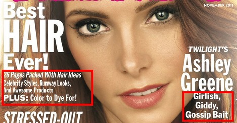
Or the microcopy on magazine covers:
Or the extra bit of description on a book cover that can make or break our interest:
Think this is arbitrary stuff? The team over at Timetrade.com might have too, until they switched their main headline with their sub-headline—which was more benefit-driven, anyhow—and saw a quick conversion increase of 85%.
Before:

After:

5. The headline is crystal clear.
Great headlines leave no ambiguity.
Questions, as it turns out, aren’t all that appealing. Sure, there might be a bit of curiosity, but it’s not the best method of engaging or converting site visitors.
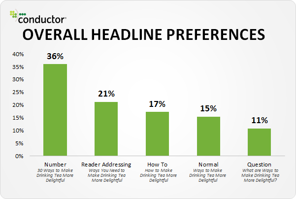
One study surveyed the five most common title types and discovered that the more clarity the headline had, the more appealing it was.
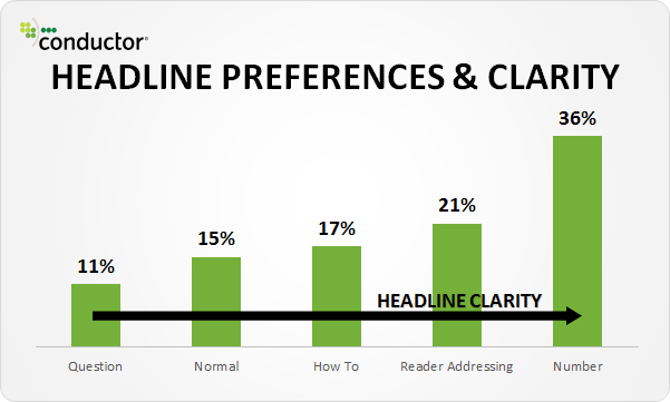
Here are the five headlines types tested in that study:
- Normal: “Ways to Make Drinking Tea More Delightful”
- Question: “What are Ways to Make Drinking Tea More Delightful?”
- How to: “How to Make Drinking Tea More Delightful”;
- Number: “30 Ways To Make Drinking Tea More Delightful”;
- Reader-Addressing: “Ways You Need to Make Drinking Tea More Delightful.”
Jayson DeMers discusses the importance of benefits in a headline:
They have to be specific—as specific as possible to your audience. For example, “How to Write for Social Media and Double Your Click-Through Rates in Thirty Days.” The headline’s focus and promised benefit are clear. As a reader I am able to form an expectation of what’s to follow. The benefit is also crystal clear: develop a skill and get more visibility.
Nobody craves ambiguity or uncertainty, especially when looking for answers, solutions, products, or to spend money. People want clarity.
Be as clear as you possibly can.
Conclusion
If you want to improve your value and impact, do this: Get really good at writing headlines.
Here’s what works:
- Use numbers.
- Use around eight words if people are familiar and up to 18 if they’re not.
- Use neutral or negative words; avoid positive superlatives.
- Use a two-part model—headline and sub-headline.
- Be very, very clear.
The better your headline, the better your marketing. Use these five characteristics, and I’m very confident that you’ll improve your conversion rates.
Related Posts
-

Read any copywriting manual or article, and it'll tell you that the headline is the…
-

Note from the editor: We talk a lot about conversion rate optimization, and how it's about…
-

The best UX is the one you're not aware of, the one you don't even…
-

There's one thing that influences user engagement on your website more than anything else. It's…
