

So you have a landing page – or maybe 87 of them. Too bad you’re screwing them up.
Landing pages are easy – in theory. In the real world, landing pages optimization is really hard. Now that it’s getting more and more difficult to make money via AdWords and other PPC channels, boosting conversion rates on your landing pages is more important than ever. Hopefully, you can identify some of the mistakes you’re making so you can fix them.
All the examples below are taken from active landing pages (I clicked a bunch of ads on Google to find them). Some of them are not exactly typical landing pages, but since they drive paid traffic to pages where visitors land, they’re landing pages all right.
Here are 21 landing page tips to make sure you don’t make the same mistakes these jackwagons did.
Table of contents
- #1 The headline sucks
- #2 You have no clear value proposition
- #3 Your copywriting is terrible
- #4 People don’t get what you offer
- #5 There’s no scent
- #6 Your call to action is poor
- #7 You’re using cheesy stock photos
- #8 You have exclamation marks!!!
- #9 You have too many offers
- #10 You lack credibility
- #11 Your landing page has irrelevant stuff on it
- #12 You ask for too much information
- #13 It looks like my grandma designed it
- #14 It’s not optimized for mobile devices
- #15 It’s slow!
- #16 It’s the same landing page template 5,462 other companies are using
- #17 You have too much or too little copy
- #18 You don’t follow the customer thought sequence
- #19 You don’t do proper customer research
- #20 You focus on social media sharing
- #21 You don’t measure landing page performance
- Get a landing page makeover – by people who live and breathe this stuff
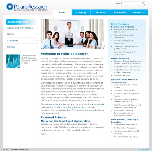
#1 The headline sucks
Everything starts with the right headline. This is the first thing the visitor sees. It’s your one chance to communicate what you’re about, create curiosity, explain your intentions and lure them in.
Here’s how this guy is doing it:
Biggest problems:
- The headline sucks! What the hell man! That’s your headline, really?
- Totally unclear and missing a value proposition
- Your offer to get people to fill out the form is so you can snatch their phone number? Oh how irresistible (NOT!)
- Poor call to action
- Uncredited testimonial
#2 You have no clear value proposition
A value proposition is a promise of value to be delivered. It’s the primary reason visitors should take action on the page. It’s the most critical piece of the landing page. People will only take action if they understand and want the value that you offer.
Biggest problems:
- There is no clear value proposition.
- How is this better and/or different from other similar offers?
- Not enough information to get people to take action.
- Submit? Oh no.
#3 Your copywriting is terrible
Great copy is very important. A landing page without copy is like a mute salesman trying to peddle his wares- not very effective. The words you use make a huge difference.
The best kind of copy is clear about the benefits, geared to a targeted audience, makes a compelling case for the value the visitor is about to receive and gets the visitor excited.
Let’s be honest, not all of us are good with words. I know many people who struggle with saying even the simplest things. Like these guys:
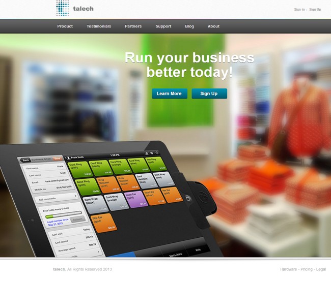
“Run your business better today” is the best you could come up with?
Biggest problems:
- What are you offering here?
- Be specific, always be specific
- Get me to agree with a problem or make me want the end-benefit
- You can’t ask for action after one sentence
#4 People don’t get what you offer
How much time does it take to figure out what you are offering? If the answer is not “immediately”, you need to do better. Clarity above all! People don’t buy what they don’t understand.
This is a landing page I was sent to after clicking an ad for the keyword “business”. Wow. These people don’t really know what landing pages are for, do they? Yet, they’re spending a bunch of money on an expensive keyword.
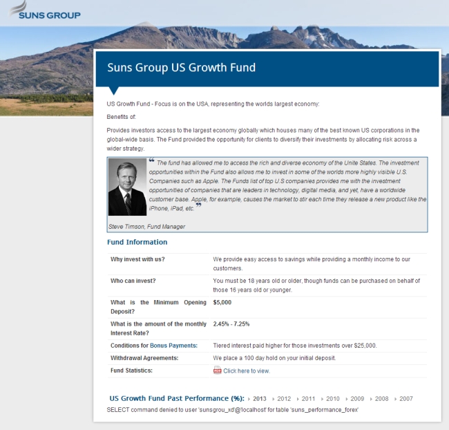
Biggest problems:
- What the hell is this thing!?
- That’s your headline? Do you even have one?
- No context, no content, no credibility, no call to action, no nothing…
- SQL error at the bottom to finish it off. High five!
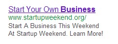
#5 There’s no scent
Pre-click message (what the ad says) needs to match post-click message (what people see after they click on the ad).
Humans track information in a similar fashion to the way animals follow a scent. If the scent is sufficiently strong, the user will continue to go on that trail. But if the scent is weak, they stop and hit the back button – figuring “this is not what I wanted”. Scent is very important for conversions.
I saw this ad:
I clicked on it and this landing page revealed itself:
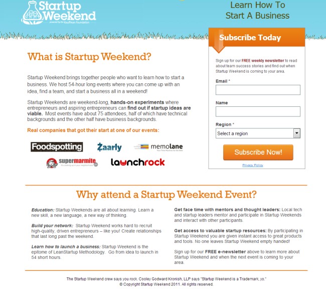
Biggest problems:
- “What is Startup Weekend”? But the ad said clearly “Start your own business”? It did mention startup weekend in the 3rd line of the ad copy – but it’s not enough. The scent is weak. “Learn how to start a business” in the top right corner is basically invisible.
- “What is Startup Weekend” is your headline? It sucks.
- “Subscribe Today” is a terrible sub-headline for the email capture box and “Subscribe Now!” is a terrible CTA. What’s in it for me? Focus on user benefits.
- They are generally confused about the goal of this page. Is it to get email subscribers or to sell the idea to attend the event?
#6 Your call to action is poor
Your call to action should be a trigger. It should stand out and make people want to click on it. The best kinds of calls to action avoid click fear, are worded clearly and/or loaded with a benefit. It has to be clear what happens after I click the button.
What do you think about this one:
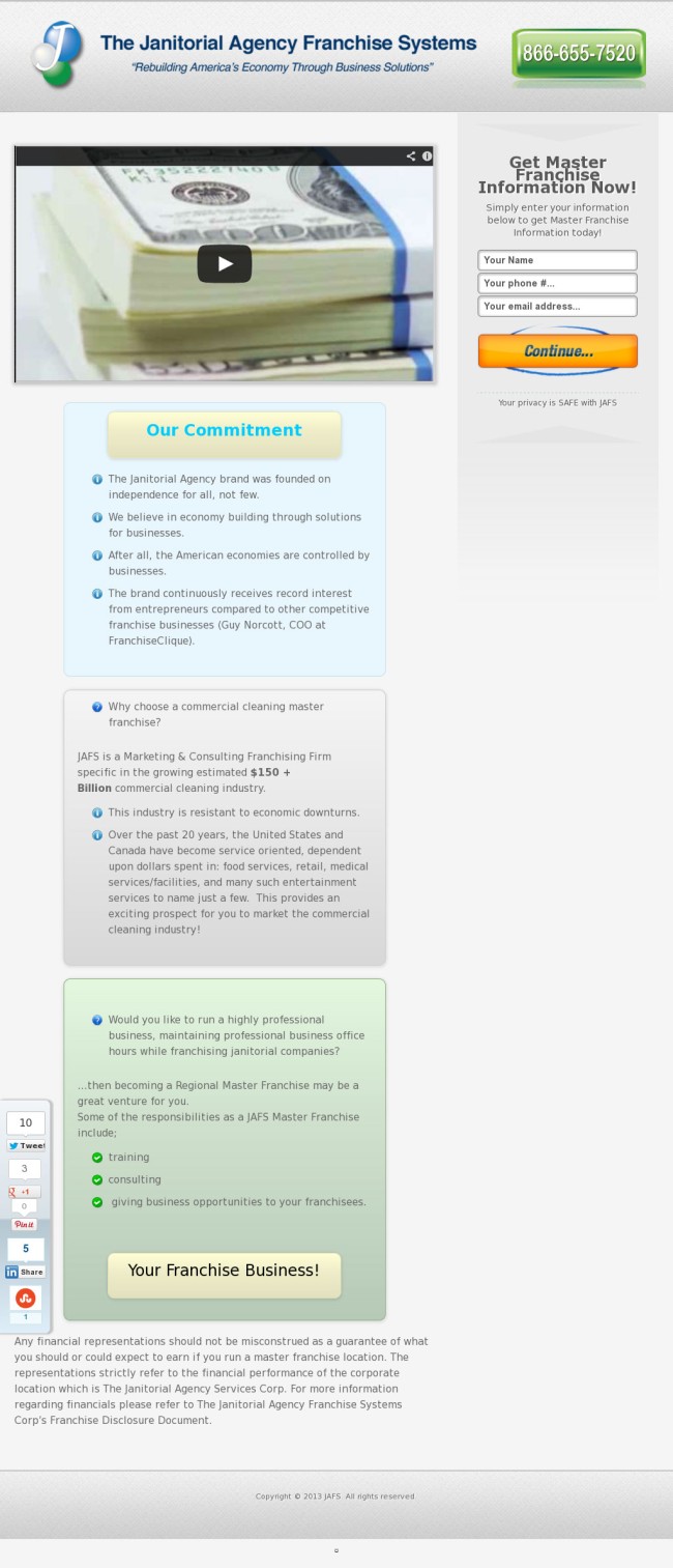
Biggest problems:
- “Continue” is the main call to action. While it’s better than “submit”, it still sucks ass. Why would they want to ‘continue’? Be specific about the value they’re going to get.
- Phone number at the top, “Our commitment” (who cares!) and “Your Franchise Business!” also looks like a button, but it is not.
- For a long page like this, your call to action should be repeated at the bottom.
- Social media sharing widget? Come on! Nobody shares a landing page offer. Get rid of it.
- Copywriting couldn’t get much worse.
- Looks like your 12-year old cousin designed it.
#7 You’re using cheesy stock photos
Men in suits shaking hands? Multiracial workers smiling? Chick with a headset? They’re all out to get you – and kill your conversions. Cheesy stock photos hurt your credibility and show the world you’re… ignorant.
These guys might want you to think that this is their actual team, but most people can smell fake from a mile away:
A simple Google search will bring up tens and tens of other websites using the exact same image. Business intelligence my ass.
#8 You have exclamation marks!!!
Don’t use exclamation marks. People won’t take action because you shout at them. Cheap!!! won’t make people think your stuff is any cheaper. It will just make you look dumb.
Copywriting tip: Imagine you can only use 10 exclamation marks in your whole life. Use them sparingly.
#9 You have too many offers
The best landing pages focus on a single offer. They’re ultra-specific and ultra-targeted. This will also make your ad CPC lower, CTR higher and your landing page will have a better conversion rate since you’re bringing targeted people to the page.
Always make it about a single problem, single product, single offer. These guys don’t:
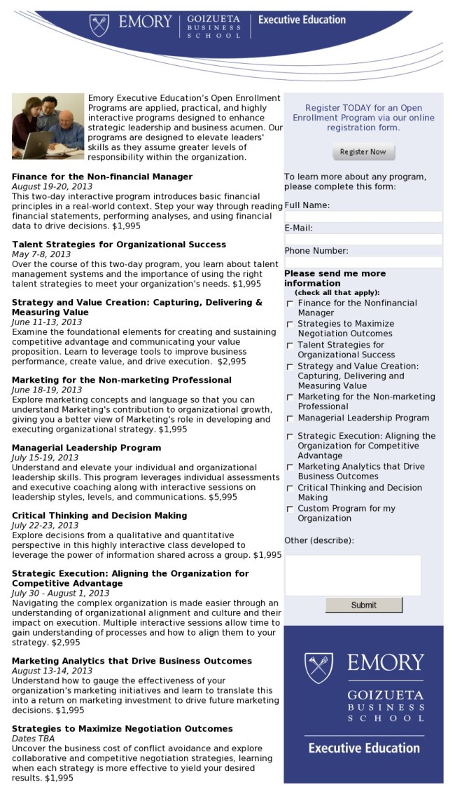
Biggest problems:
- 9 offers! Achala maquina. Take this landing page (actually don’t – it sucks) and split it into 9 specific landing pages. Once you get the lead in, you can sell them additional courses over email / phone.
- Where’s the headline?
- “Register today for an open enrollment program via our online registration form”. Wow what a sentence! You must need a degree from Emory in order to understand it.
- Submit? Who wants to submit?
#10 You lack credibility
If you’re offering a solution to my problem, you need to make a case for why you are the right company to solve it. Why should I believe you? What proof do you have? Credibility is very important.
This page wants to solve a certain problem:
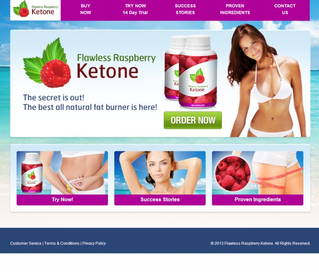
The best all natural fat burner? Says who? The model on the stock photo? This has “scam” written all over it. Besides, people don’t believe superlatives. You need to learn to write in a way that makes people believe you.
#11 Your landing page has irrelevant stuff on it
Know your goal: what’s the one thing you want people to do on your page? Focus on that thing only, and remove everything that does not directly contribute to people taking action toward that goal.
Expensive ‘lose weight’ keyword points to this god awful page:
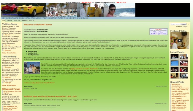
Biggest problems:
- Complete lack of focus
- Terrible headline
- No call to action
- Totally useless sidebars
- Sports cars, really?
- Looks like vomit
#12 You ask for too much information
Behavior = Motivation + ease of taking action + trigger. The less information you ask, the easier it is to take action. In most cases you don’t need more than their email address. Maybe first name. MAYBE phone number. You can always ask for the rest once you get their contact info.
If you have a form like this on your landing page, you’re screwed:
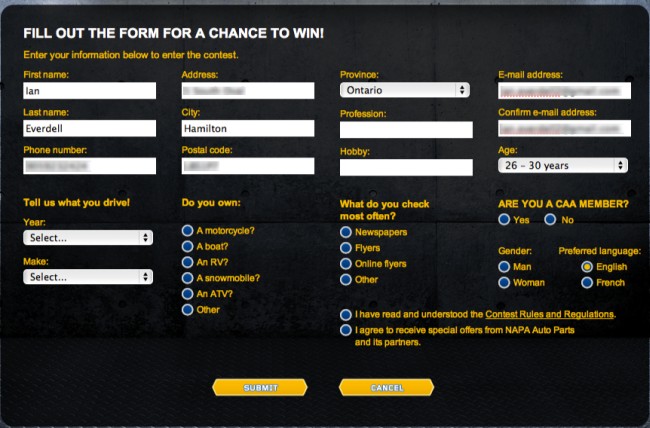
Also – don’t ever use multi-column forms.
#13 It looks like my grandma designed it
Translation: looks like crap.
Crap doesn’t sell too well. First impressions matter. Great visual design helps conversions a whole bunch.
An actual Google ad took me to this site, yikes:
Biggest problem: everything.
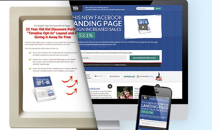
#14 It’s not optimized for mobile devices
It’s only a matter of time when tablets will become the main device for surfing the web. The trend is clear. Soon absolutely everyone will have a smart phone in their pocket – and they will use it. I’m already seeing a lot of sites where mobile traffic is close to 50%.
So your landing pages should be built with mobile users in mind as well. Since responsive design boosts mobile conversions, that’s the way to go. But also bear in mind that ‘device is a mindset’. What we’re seeing is that while tablet users usually behave like desktop/laptop users, smart phone users have very different mindsets and behavior patterns. You might want to have totally different offers for people on mobile phones!
Here’s a company that could certainly afford mobile responsive landing pages, but they’re screwing up. This is a screenshot I took with my phone:

Biggest problems:
- It’s not optimized for mobile devices! Too small to read, too difficult to fill out the form
- Crappy headline
- Your CTA is Submit?
- Why on earth do you have a ‘cancel’ button? Do you want people to cancel?
- The text that matters is smaller than legalese at the bottom
#15 It’s slow!
People are impatient. They have better stuff to do than to wait until your landing page loads. Slow site = poor conversions. Often quoted research on this subject includes an Amazon study that showed a 1% decrease in sales for every 0.1s decrease in response times.
You need to make sure your page is fast.
#16 It’s the same landing page template 5,462 other companies are using
Do you like the landing page below? At least 1,486 people do who’ve bought it from Theme Forest (and probably use on their multiple sites).
So what’s wrong with using templates? Maybe nothing. I use templates too, occasionally.
It all depends on your goals and brand. Your landing pages are an extension of your overall brand. Sometimes, they’re the very first point of contact with your brand.It has to match the look and feel of your main site. And it just could be that your brand is classy enough that it doesn’t want to look like everyone else’s.
#17 You have too much or too little copy
There’s a somewhat easy rule when it comes to the amount of copy you should have on your landing page: the more complicated and/or expensive the offer, the more copy you need. Landing pages generally don’t ask for money, but signing up for something – but that’s a cost too. The more information you ask (more form fields), the higher the mental cost.
In most cases landing pages don’t need a whole lot of text, but sometimes they might. It’s important to nail the right amount of content. Say too little, and people don’t have enough information to act. Say too much, and you bore them + distract from taking action.
Here’s a case of too little information:
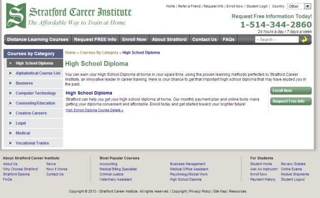
Biggest problems:
- You’re offering high school diplomas to people who dropped out of school at some point. It’s quite a complicated product, I’d say. Yet – you offer only 2 paragraphs of text and ask people to Enroll based on that? Not gonna happen.
- Well it’s not exactly a landing page, is it!? Then why are you driving traffic here! Create a proper landing page for PPC traffic.
#18 You don’t follow the customer thought sequence
You need to understand the thought process your prospects are going through. How do they choose products in your niche? What do they care about? What’s the first thing they want to know? And so on.
In the end it’s about optimizing thought sequences, not just landing pages.
Let’s look at this example. You land on this page, and they ask you to sign up right away.
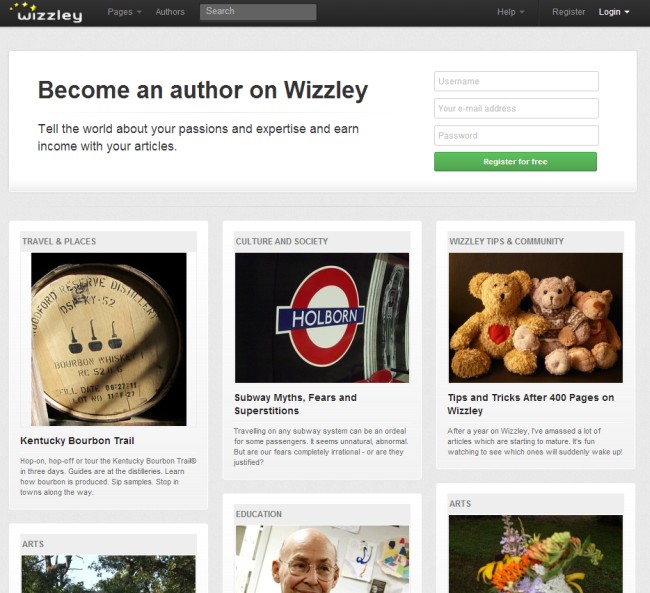
So their hypothesis seems to be that the thought sequence is as follows:
- I’m interested in becoming an author on a website. Where else can I be an author? Oh look – here’s a website where I can be an author.
- What do I tell the world about? Oh, my passions! That’s a good idea.
- I will earn income? Sign me up!
Is that a realistic thought sequence in the prospect’s mind? I don’t think so.
Granted I have not done any customer development interviews here, and I’ll just go with what I think. But here’s what’s a more likely thought sequence in my opinion:
- What is this place?
- What can I do here?
- How is it useful to me?
- How does it work? How exactly will I earn money and how much?
- I need more details
If we’d create the the page with this flow in mind, I bet we’d have a much better result.
You can only figure out the right thought sequence by talking to people, running surveys, observing people interacting with your site and testing.
#19 You don’t do proper customer research
How do you go about creating the offer, copy and layout for the landing page? Just start writing? Study best practices? Both are wrong answers.
Any proper web job starts with conversion research. You need to figure out who your audience is, what they want, how they talk, what drives them and what turns them off.
#20 You focus on social media sharing
“Add social sharing buttons so your landing page can go viral!”. Yeah right.
Remove all social sharing buttons. You want people to buy/opt-in/fill a form, and not tweet or like. Social sharing buttons usually serve as a distraction, and reduce conversions.
Besides, people only share content, not products (unless it’s something really cool and innovative, like Google Glass). Nobody wants to share your marketing message, be real.
#21 You don’t measure landing page performance
You can only improve what you can measure. Once you have your landing page up and running, make sure you have goal tracking properly configured in Google Analytics or whatever you use. I know it’s obvious, but every month I run into businesses that drive blind. No kidding.
And, your landing page is never done. You need continuous optimization. Build, measure, learn and repeat.
Get a landing page makeover – by people who live and breathe this stuff
Conversion optimization is a science and you’re better off using proper scientists to help you. Same goes for landing pages – it’s a science too. Data-driven design and an evidence based approach are a must if you want to be successful.
You’re busy running your business and you don’t need to be a landing page expert. You need results, and someone else to take care of getting the landing page right. That’s why we created a new service.
Announcing: LandingPageMakeover.com

If you run any kind of paid campaigns (PPC, banners, email etc) and you drive the traffic to a landing page, you absolutely need it to work. ROI is no joke.
Go to landingpagemakeover.com right now and see what it’s all about.
P.S. Since we build landing pages by hand, and with lots of love, we can only take on 4 clients per month for now. If you want our help, book your spot now.
Related Posts
-
It took us six rounds of tests until we landed on a variation that was…
-
Navigation gives a user control, which is generally a good thing—but what about on a…
-

We talk a lot about creating high converting landing pages, getting traffic that converts, and…
-
A landing page is the first page that visitors see after clicking on your banner…
