Color is an essential part of how we experience the world. But do colors really matter for conversion optimization? Can a button color guarantee better performance for a call to action (CTA)?
No single color is better than another. Ultimately, what matters is how much a button color contrasts with the area around it.
This post explains what really matters for website CTAs and button colors. The “definitive” studies you’ve read are far from definitive, and a superficial approach to testing (i.e. try any random button color) won’t help you build a rigorous experimentation program.
Different colors can lift us up or bring us down. There’s also a psychological side to colors—certain colors are associated with different qualities and emotions.
People from tropical countries respond favorably to warm colors; people from northern climates prefer cooler colors, and so on.
It’s also said that, in North American culture, the color blue creates a feeling of trust, but also encourages appetite. Green supposedly means nature, freshness, growth, and money. Yellow brings with it sunshine and happiness.
There’s some truth to these interpretations, but can we translate these supposed associations into conversion lifts?
Experiments with color usage
Red can make you a winner…
Almost universally, red means stop. Red means danger. Red means hot. And by analyzing the results in the 2004 Olympics, researchers found that red also means dominance.
They examined boxing, taekwondo, Greco-Roman wrestling, and freestyle wrestling, basically all of the one-on-one sports. In those sports, competitors are randomly assigned red or blue outfits, so no rigging is possible.
Competitors in red outfits tend to perform (slightly) better at the Olympics, even when colors are randomly assigned. (Image credit)
In 16 of 21 rounds, those wearing red won. Similar tendencies were found in the 2004 European Soccer Championship. Researchers are careful to point out that the effect is subtle at best. And that red can be a deciding factor only among evenly matched competitors—but it still exists.
“We find that wearing red is consistently associated with higher probability of winning,” University of Durham researchers Russell Hill and Robert Barton wrote.
…or a loser
Researchers at the University of Rochester found that the color red can also keep us from performing our best on tests. In their experiments, they wanted to find out if the perception of red would affect the results of IQ tests or major academic exams. In an academic context, the color red is traditionally associated with marking errors.
Four experiments showed that just a brief perception of the color had a negative impact on the results. ““It led people to do worse without their knowledge,” said Elliot, one of the authors.
The findings showed that “care must be taken in how red is used in achievement contexts,” the researchers reported, “and illustrate how color can act as a subtle environmental cue that has important influences on behavior.”
Color and the taste of hot chocolate
What makes that hot chocolate so good? It may be the color of the container you drink it from. (Image credit)
It turns out that the color of the container in which food and drink are served contributes to the perceived taste. That’s true, at least, for drinking hot chocolate, explains researcher Betina Piqueras-Fiszman.
Piqueras-Fiszman and her research partners had 57 participants sample hot chocolate served in containers of four different colors: white, cream, orange, and red. All were the same size, and all were white on the inside.
The flavor of the hot chocolate served in orange- and cream-colored cups was judged better by the participants. However, the sweetness and the aroma was judged to be similar, no matter the color.
“There is no fixed rule stating that flavor and aroma are enhanced in a cup of a certain color or shade,” recognized Piqueras-Fiszman. “In reality this varies depending on the type of food, but the truth is that, as this effect occurs, more attention should be paid to the color of the container as it has more potential than one could imagine.”
If color can impact our athletic performance, academic achievement, and perception of taste, can it also affect our decision to click?
What is the best color for CTA buttons?
Red might increase your chances of winning in sports. Your next hot chocolate may taste better in an orange cup. But what does this have to do with conversions on the web? Does red really give you an advantage for your CTA button?
Green vs. red: A call-to-action button war
Over the years, there’s been controversy about which color converts best for your CTA button. Unbounce declared that the future of CTA buttons was “BOB” (Big Orange Buttons).
There are also a number of interesting A/B testing case studies in which an orange or mostly red button was tested against other colors, often green.
When you think about it, green is mostly associated with positive emotions. When the traffic lights turn green, it means you can drive. Vice-versa with red. The color is mostly associate with negative emotions.
So what you think? Which button color won? Here’s what the case studies had to say.
Case study 1
Dmix wrote about about a test of green and red button colors. In their testing with 600 subjects, they found that conversions increased by 34% when they used a red button.
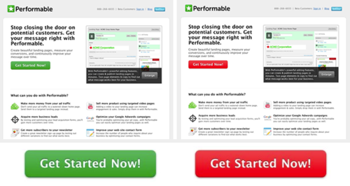
The next test comes courtesy of HubSpot. They ran a similar test with green and red buttons on a client site. They ran the test for a few days and, in total, had more than 2,000 visits.
Their result? The red button outperformed the green button by 21%.
The third test comes courtesy of VWO. Their client was an ecommerce site selling mobile phones and accessories. They tested “Buy Now” button colors on the site. The competition included a white button with green text, green button with white text, and red (dark orange) button with white text.
And the winner was—you guessed it—the red button, this time with a 5% conversion lift.
This study, instead of comparing reddish versus green buttons, looked at an orange versus blue button. In their tests, the blue button won, producing a 9% lift.
Despite that “upset” by blue buttons, red or reddish buttons were dominant, a trend supported by other studies as well.
And yet, didn’t Peep write the following about colors in web design in this post:
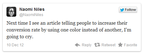
I liked this tweet by Naomi Niles:
I couldn’t agree more. This kind of narrative gives people the wrong idea about what testing is about. Yes sure – sometimes the color affects results – especially when it affects visual hierarchy, makes the call to action stand out better and so on. But “green vs orange” is not the essence of A/B testing. It’s about understanding the target audience. Doing research and analysis can be tedious and it’s definitely hard work, but it’s something you need to do.
In order to give your conversions a serious lift you need to do conversion research. You need to do the heavy lifting.
Serious gains in conversions don’t come from psychological trickery, but from analyzing what your customers really need, the language that resonates with them and how they want to buy it. It’s about relevancy and perceived value of the total offer.
Why you should be skeptical of button color case studies
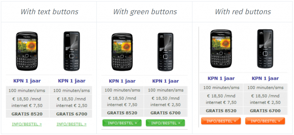
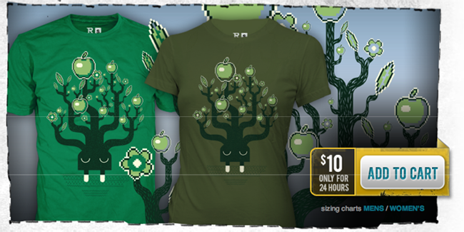
Let’s take a look at one last example, which will help this make a whole lot more sense. RIPT Apparel tested the color of their “Buy Now” button to see if it would make any difference to their bottom line.
To no great surprise, conversion numbers went up. Looking at the previous cases, one could say that if they changed the button to red it might convert even better. Well, not quite.
Take a look at the original again. Do you see something that should be there but isn’t? The original is missing a button! The “Buy Now” CTA gets lost in the design. You can see the new button clearly, regardless of whether its green, red, yellow, or any of several colors.
This, unfortunately, is how the great controversy of button colors got started. You see amazing results that suggest that one color always converts the best. That is, until you look closer.
More often than not, these tests reveal that, previously, there was no button, or the button is just much more prominent. It stands out from the rest of the page and converts better because it’s a high-contrast color, not any single color.
Monetate, which ran the blue vs. orange button test, had this to say:
But, if you dig into the results, you’ll see that orange buttons were almost always tested against a control of no button at all. In cases like these, it’s hardly a surprise that orange buttons make a difference. Of course they do … when compared to no button at all! Practically any button will make a difference, regardless of color.
In the case of RIPT Apparel, they tested one final version, with a yellow button:
Conversions went up a further 6.3%. So yellow beats green? No, no, no.
The CTA button color makes little difference on its own
The color of the button has little-to-no effect on its own. What’s more important is how it changes the visual hierarchy of the page and how it makes the call-to-action stand out.
It also depends on what we’re used to seeing. Bing increased their revenue $80 million by finding the exact color of blue for their links. People are used to seeing blue links. When the World Wide Web first came to be, blue was the color of links. (Microsoft engineers working on this also admitted that “…it was a shade of blue quite similar to the one used by Google.”)
There is no best color for conversions. In the yellow button’s case, they also added urgency (“$10 only for 24 hours”), which has been demonstrated time and time again to lift conversions. In the case of Bing and blue, it was the power of convention in action.
Back to HubSpot
The same can be said for the HubSpot’s example. Take a look at it again:
Do you notice anything that might contribute to the red button being a better choice? Something in the overall design of the page?
Green is one of the main colors of the site! And what happens when you add a green button to the mix? It won’t stand out. They could have tested green against almost any other bright color and would have seen the same “amazing” results.
To HubSpot’s credit, they to say in the case study that they “cannot generalize these results to all situations.” But still, a green button on a page with a dominant green design? Really?
Conclusion
Color matters for your calls to action. But saying that one color converts better than another doesn’t hold. There is no universal best color. What works on one site doesn’t necessarily work on another.
Visual hierarchy matters. So does making your CTA buttons stand out with a high-contrast color. The “green vs. red” debate is less about color per se and more about whether the color helps the button stand out.
Working on something related to this? Post a comment in the CXL community!


![Which Color Leads to a Higher Conversion Rate? [Color Matters, but Not in the Way You Think]](https://i.ytimg.com/vi/xXg3ql42Suk/hqdefault.jpg)