


Want to know how to deal a serious blow to your landing page conversions? Have the landing page look different from the online advertisement the consumer just viewed and have the landing page contain a different message/keywords.
In other words, one of the best ways to improve landing page conversions is to create and maintain scent: make pre-click advertisements and post-click messages look and feel the same. There needs to be “scent”. The ad they see or the email they read needs to smell like the landing page they land on. You have to maintain the same scent.
Table of contents
The concept of scent was first introduced by Bryan Eisenberg in Always Be Testing.
“When you abandon your scent trail, you strand visitors and destroy the persuasive movement on your site.”
While so many landing page optimization efforts go toward better structure, copy, design, and/or call to action – it’s often the missing scent that’s the culprit.
A great example to show “scent” is the remarketing ad and landing page for Highrise:
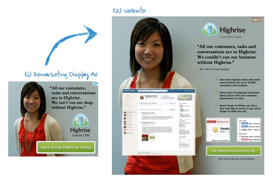
They match! It’s like they coordinated!
Same girl, same design, same call to action look, same copy. Great stuff.
How to maintain strong scent
It’s very easy, you only need to keep a few rules in mind:
- Ad copy (or email copy, or copy of whatever promotional channel you use) needs to match the landing page copy. The closer, the better. Verbatim would be best.
- While your landing page can fit much more content than a display ad, make the ad message the central piece of the landing page message.
- Ad design (or email design, etc) needs to match landing page design.
That’s it! If you follow these three steps, you’re rocking.
Yes, that means you should have a tailored landing page for each ad. No, you don’t need to have 1000 different landing pages that you manually created – you can use dynamic copy.
A simple example would be displaying different content for each of your query strings [query string – the stuff in a URL that starts after the question mark (?)] : Ad #1 takes you to somesite.com/?ad=1 and ad #2 takes you to somesite.com/?ad=2. Any 6th grader can write a script that would serve different content based on the query string. Ask your developer, (s)he knows how. No excuses.
Don’t forget trigger/key words
While people are browsing your site, they’re having a silent conversation in their mind. They’re asking themselves ‘where is X?’ or ‘how do I solve my problem Y?’. In most cases, people are looking for a specific wording.
Trigger/Key words are the words and phrases that trigger a user into clicking and visiting your landing page. So when the user types “invoicing app” into Google search, that’s the trigger word in their mind. That’s what you should use in your ad copy AND on your landing page copy. Trigger words are powerful.
Lets review some actual ads and landing pages
Yes I clicked on some ads and wasted somebody’s precious ad budget. But I will compensate it with a lesson.
First some AdWords ads:
I googled “business”, and saw the ad on the left. Clicked on the ad, and the landing page on the left appeared.
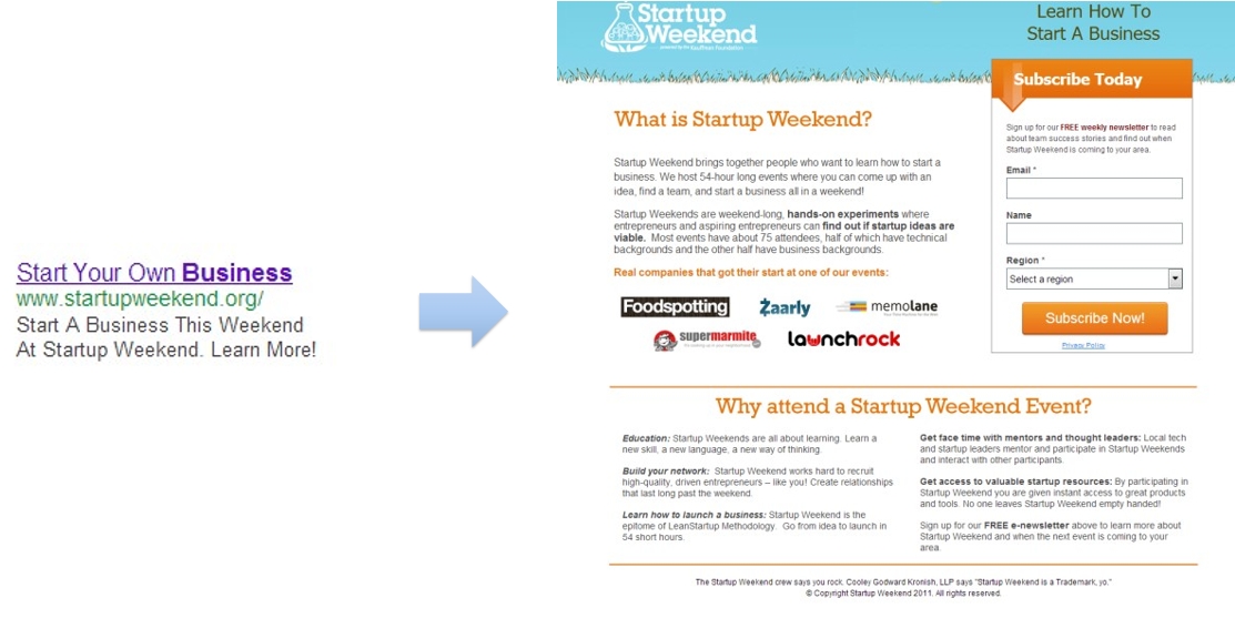
“Start your own business”, the ad said. But the landing page says “What is Startup Weekend?” Total disconnect. I wanted to read about starting a business! I guess I’m in the wrong place. I might finally see the text on the top right, or read the full copy (probably won’t), but the scent could be much stronger here.
Verdict: the scent is weak.
Same story here.
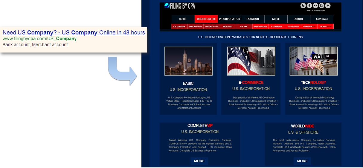
The key message in the ad was “Need US Company?” and “US Company Online in 48 hours”. The headline on the page is “US Incorporation packages for Non-US residents / citizens”, and it immediately offers 5 packages to choose from. What they should have done is to repeat the ad copy in the headline, perhaps add a longer lead, and then lead us to some options. 5 is overkill, 3 could work , but since the product is complicated (and probably not cheap), collecting emails would be a better idea than asking someone to read more.
Verdict: the scent is weak.
#3 Zara Consult
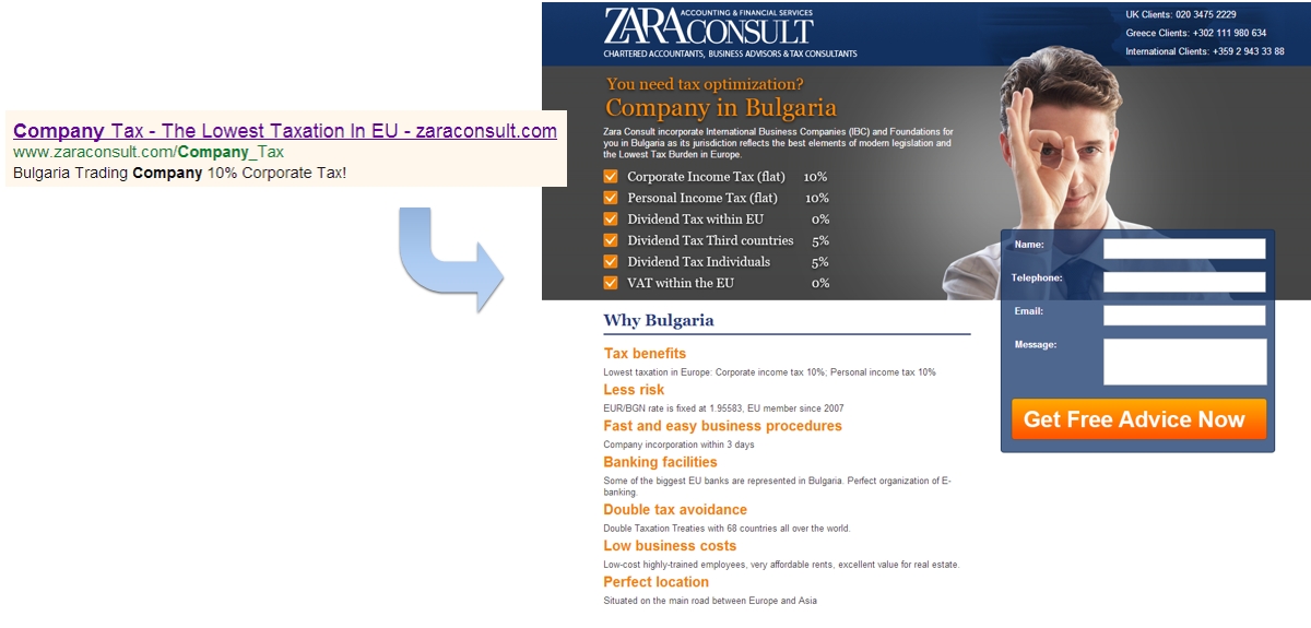
I guess you’re starting to see the trend here. Ad copy says “Lowest taxation in EU” – but the landing page talks about tax optimization and Bulgaria. Did not expect to see this. It takes a while to understand how its connected. Ultimately, it depends on what the searcher was looking for.
Verdict: the scent is average.
#4 Dzooom
I used to live and work in Dubai (2005-2007). That helped me figure this out quicker than some, but it’s a pretty good “never do this” example.
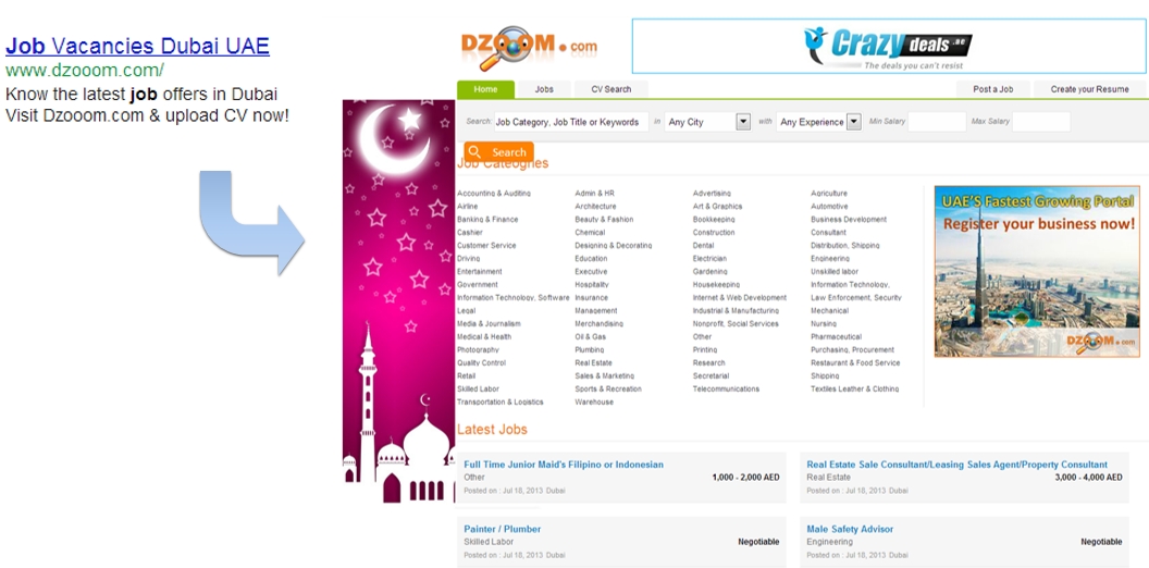
“Job vacancies Dubai UAE”, says the ad. What does the website say? Nothing! Absolutely nothing. The only scent about Dubai are the 2 ads, and the 4 job listings below which mention AED – the local currency. If you haven’t been there, you wouldn’t make that connection. And it’s not a proper landing page. And the css is funky.
Verdict: no scent. They’re wasting their money.
#5 FineGoldBars
These guys direct traffic to their home page, dios mio. Even gold bars can’t buy brains.
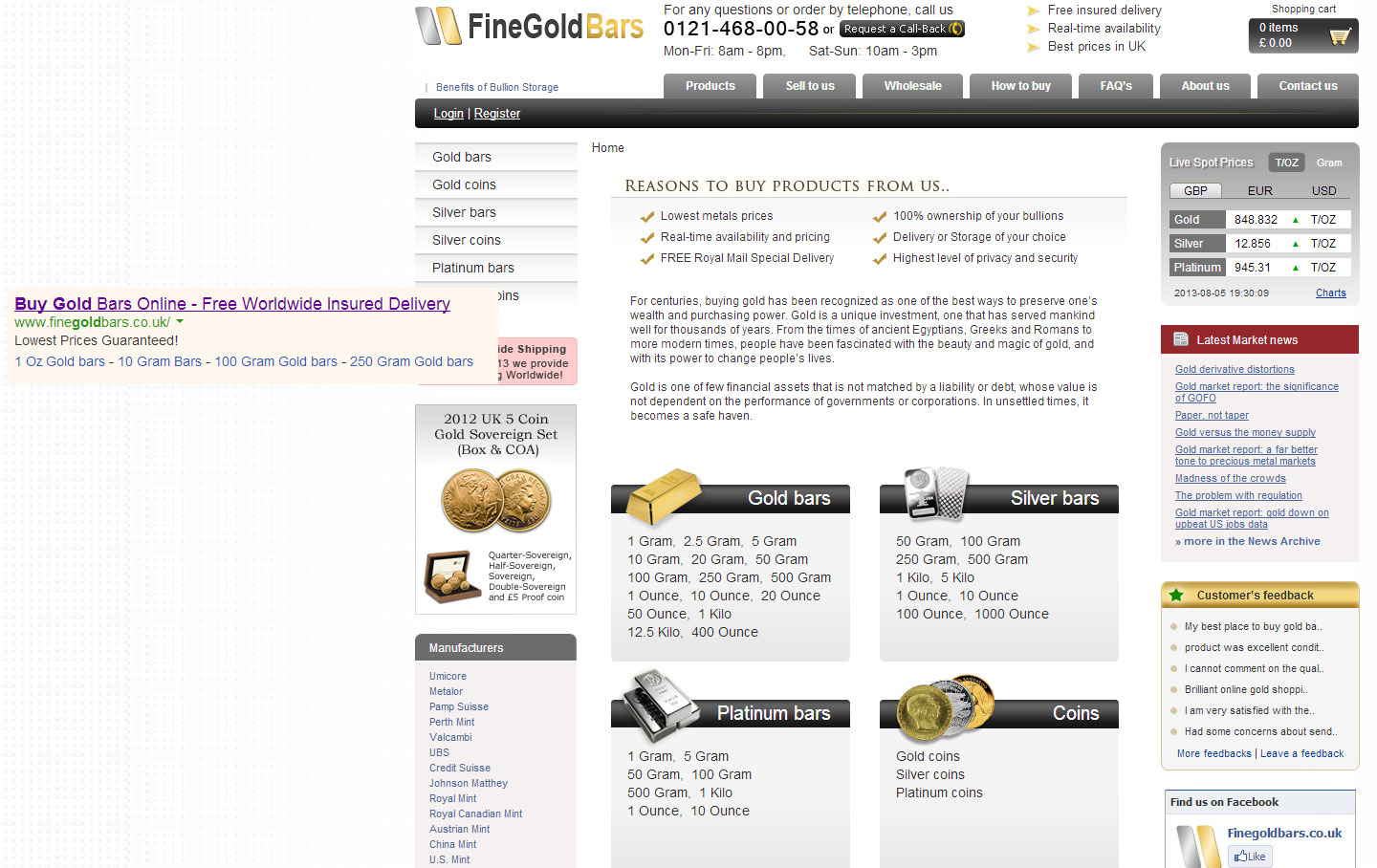
The ad is about buying gold bars online and “free worldwide insured delivery”. What does the home page say? Not much. No value proposition. No headline. The only hint about the nature of the site is through the logo and the design elements. Crappy job, my friends.
Verdict: the scent is weak.
#6 Kitewing
This is from a Facebook ad.
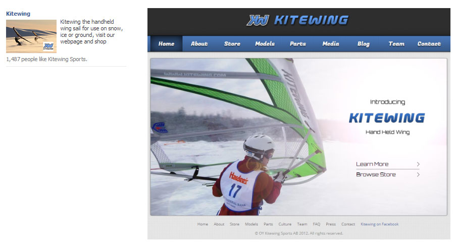
The only thing that matches here is that it’s the same type of product on the photo, but it’s not the same photo (should be). The page has an automatic slider, too (more loss of scent). Landing page has no copy except for the product name.
Verdict: the scent is weak.
#7 Kashflow
What about some of these newer, more modern companies?
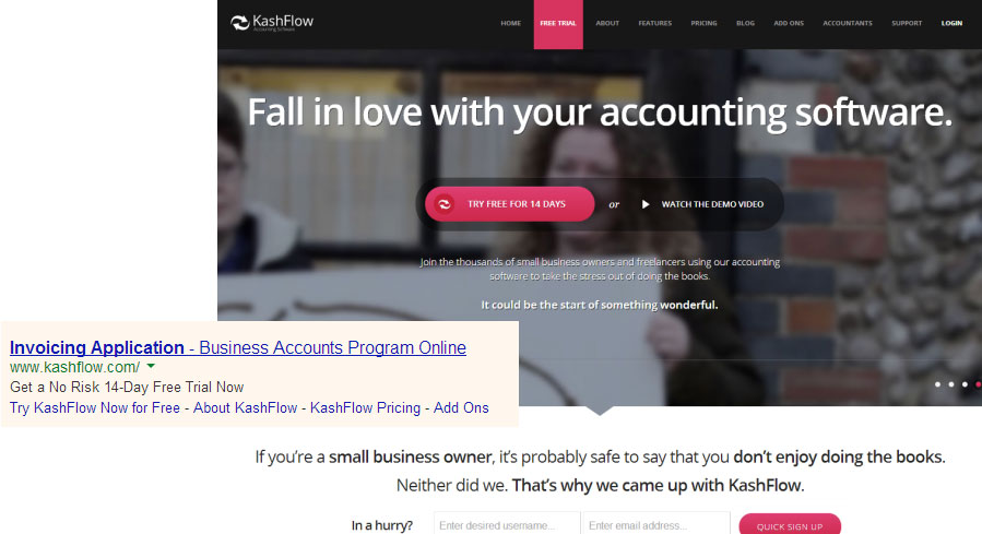
Same damn story. “Invoicing application” vs “fall is love with your accounting software”. They didn’t even say “invoicing application” which is what I searched for and what the ad said.
Verdict: the scent is weak.
#8 Freshbooks
Surely these guys must know what they’re doing since they’ve got me as their client.
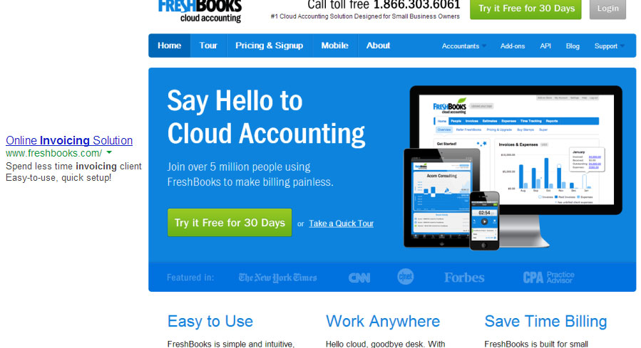
No such luck. “Online Invoicing Solution” vs “Cloud Accounting”. Yes, there’s “painless billing”, but it’s not the word I had in my mind. Can do better.
Verdict: the scent is weak
#9 Swedbrand
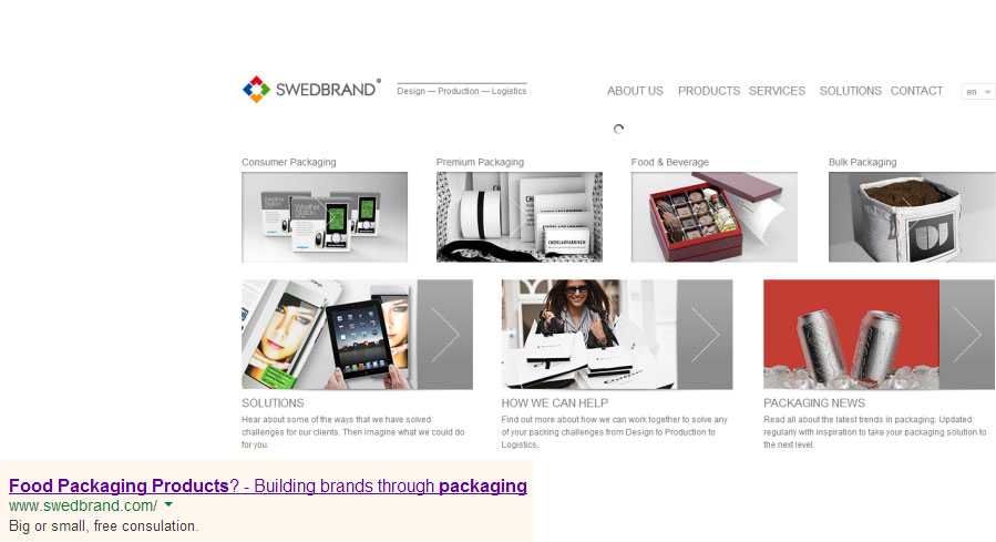
Branding through packaging – maybe. But through ads and landing pages – not so much. I searched for “food packaging products”, like the ad shows. However, the landing page says nothing about it. Yes, one of the 7 categories is “Food & Beverage”, but that’s not enough. Why the hell is the user landing to a generic page when the search was specific?
Verdict: must do better.
#10 Ginzametrics
A metrics company! Finally. Saw their ad on Mashable, and clicked on it. The green one was the banner ad:
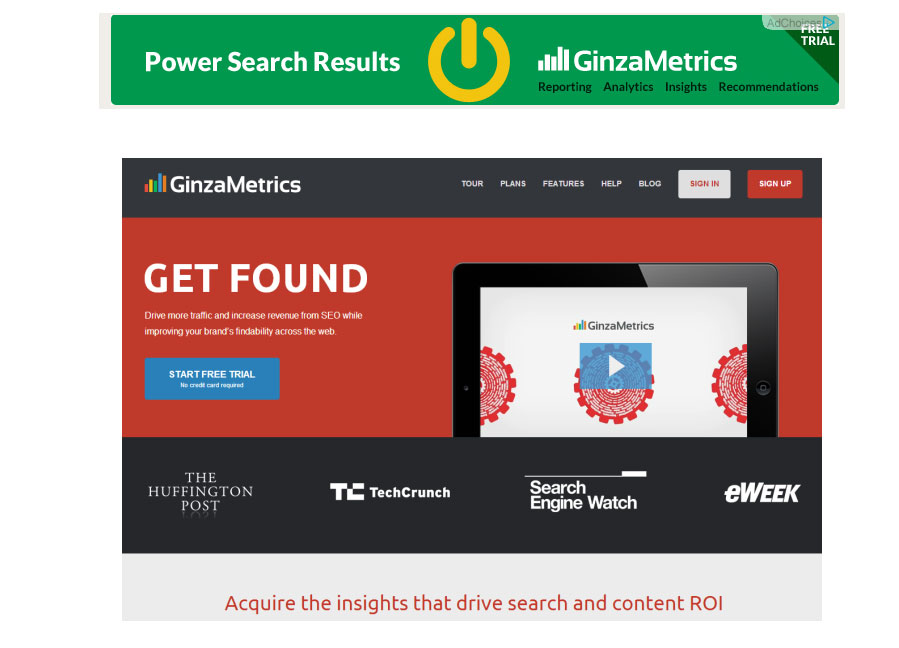
Whoa, really? Green/orange banner and dark gray / red landing page? Talk about disconnect! Also: “Power search results” vs “get found”.
Verdict: no scent.
Conclusion
Scent is important and will help your conversions. Lack of scent creates confusion and hesitation. That’s bad. Still – when you look around the web, so many companies don’t “get it”. Too bad for them.
From now on, always make the pre-click message match the post-click message (look and feel too), and watch the conversions grow.
Related Posts
-

.... That concludes the list. Instead of looking for a quick fix, you have to…
-
People hardly buy anything without seeing it. Usually, they also want to touch it, hold…
-

Knowing how to measure content marketing ROI, like measuring optimization ROI, is hard. And complicated.…
-

What is the impact of upselling in ecommerce? According to Forrester research analyst Sucharita Kodali,…

