


Have you ever wished for a tap to call button on a mobile site? Or struggled to tap a tiny link? Have you ever wondered what would happen after you clicked a button on a site? Or, worse, wondered what to do next on a site?
If you answered yes to any of those questions, you’ve experienced a UX mistake. They’re more common than most people realize. Why? Perhaps it’s the curse of knowledge, ego or laziness. Whatever it is, it’s paramount that you learn to avoid (or fix) these mistakes.
Table of contents
What Is UX, Really?
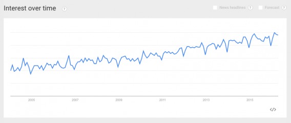
If you’re reading this article, chances are you know that UX stands for user experience. According to Google Trends, interest in user experience has been steadily increasing for years…

Knowing you should be optimizing your user experience is one thing. It’s another to know how to measure usability and optimize the user experience.
The first step is to understand the key principles of UX. Unfortunately, there’s some debate around what those principles are. Here are the five UX principles Jordan Julien of Hostile Sheep Digital Experience Lab swears by…


Jordan Julien, Hostile Sheep Digital Experience Lab:
- “Be contextual—It’s often easy to think of a user journey like a storybook. If you open most books to any given page and select a word, you’ll be met with an abundance of context on the page. You’ll usually see the title of the book, the chapter, the page number, and the word will appear contextually within a sentence, paragraph, and page. Ensure that users are contextually aware of where they are within their journey.
- Be human—Be approachable, trustworthy, and transparent. Provide human interactions over machine-like interactions.
- Be findable—Establish a strong information scent. Provide wayfinding signs.
- Be easy—Reduce the user’s cognitive workload whenever possible. Be consistent and clear, and establish a strong visual hierarchy.
- Be simple—Establish a strong signal-to-noise ratio. Avoid distractions, jargon, and long loading times.” (via UXmatters)
Leo Frishberg of Phase II, on the other hand, describes three principles of UX, as originally explained by a Roman engineer, who was alive during the 1st century BC…

Leo Frishberg, Phase II:
“The fundamentals of all great design go back to Vitruvius, the Roman engineer who introduced three principles to guide architectural design:
- Venustas—Beauty, or Delight
- Firmitas—Firmness, or Soundness
- Utilitas—Utility, or Commodity
We can easily map these three principles to the BTU model—Business (Commodity), Technology (Soundness), and User (Delight)—which is in common use. Once you have addressed each of these areas, you can attain the level of elegance, in which you apply the fewest resources for the maximum gain. World-class UX design rests on and is synonymous with world-class system design—as long the system spans both the foundation technology and the people who benefit from it.” (via UXmatters)
While different experts use different words to define UX, most are saying the same thing…
- Conduct UX research to identify points of friction.
- Look for opportunities to reduce distractions.
- Look for opportunities to add clarity.
- Look for opportunities to improve relevancy.
- Look for opportunities to make the experience more intuitive.
What’s the Difference Between UX and UI?
Often, I see UX and UI (user interface) being used interchangeably. It’s a shame because they are two very different terms.
Here’s how Don Norman and Jakob Nielsen of Norman Nielsen Group describe the difference…
It’s important to distinguish the total user experience from the user interface (UI), even though the UI is obviously an extremely important part of the design. As an example, consider a website with movie reviews. Even if the UI for finding a film is perfect, the UX will be poor for a user who wants information about a small independent release if the underlying database only contains movies from the major studios.
So, UI is only a small part of the overall UX.

What Are Common UX Mistakes?
Here are some of the most common UX mistakes that may tank your conversion rate:
Mistake #1: Designing For Yourself
This mistake defies the principle of conducting research.
Too often, you design for yourself. Just as you have to write the copy your audience needs, you have to design a user experience your audience needs. Always design for the people who actually use your site. Chances are, they don’t want or need the same things you do.
Jerry Cao of UXPin explains the problem with this “genius mentality”…

Jerry Cao, UXPin:
“We’ve all been guilty of the ‘genius mentality’ at some point. When you work in a creative field, you form strong opinions and always try to filter facts through your own experience.
But to be a successful designer, you must isolate passion from ego. You’re not out to prove anything with your design, your only goal is to help the user while creating a memorable experience in the process.
Of course, it’s not always easy to distance your wants from the needs of the user. Designers feel an almost parental sense of responsibility over their creations, but you must make sure the responsibility is to users and not your ego.” (via TheNextWeb)
Without usability testing and other forms of conversion research, you’re leaving money on the table. At best, you’re making educated guesses about your UX. Here’s how Adam Fairhead of Fairhead Creative puts it…

Adam Fairhead, Fairhead Creative:
“iPhone users had a tough time with the keypad when they launched iOS7. And it angered a lot of iPhone users because the space bar was too small and difficult to use.
Apple later corrected this in later iOS releases, of course. But the damage had been done for that release. Since Apple is secretive, it’s not really known to what extent they do or do not do usability testing. But this is a good example of why usability testing is so important.” (via TheNextWeb)
Start early, continue forever. No UX is perfect.
The Fix
- Conduct quantitative research to identify problem areas. Where are users dropping off? What are they spending a lot of time on? What pages are they pressing “back” on?
- Conduct qualitative research to define the why. Why are users dropping off? Why are they getting hung up on the page? Why do they need the “back” button?
- Prioritize the issues you’ve identified based on impact and ease of fix. Does it need to be tested (e.g. improving search results) or just fixed right away (e.g. making a button more contrasting)?
- Create hypotheses for issues that need to be tested and begin testing.
Mistake #2: Clever at the Expense of Clear
This mistake defies the principle of clarity.
You want your site to be beautiful, to be innovative. Unfortunately, that’s not always what’s best for conversions. Why? Because many designers (and optimizers) sacrifice clarity for cleverness.
As Adam confirms, clarity should be prioritized above creativity…
Adam Fairhead, Fairhead Creative:
“Creativity is all well and good. But when you’re clever for the sake of being clever, you risk confusing your users more than guiding them.
That radial-navigation idea […] that you’re thinking of using on that marketing website? The one you’ve had on paper for what feels like forever, and you finally have the chance to use?
Now, it may be super clever. But users might not get it.” (via TheNextWeb)
The expectation-reality gap is real. Your users click on a button expecting one thing only to receive another. They expect your site to work one way, but it works in another. They expect an icon to do X, but it does Y.
Clarity closes that gap.
The Fix
- Using the ResearchXL model, you’ll conduct heuristic analysis. Take an objective look at your site and decide what is unclear.
- When conducting user testing, ask users to perform the key tasks within your conversion funnel (e.g. login, find product X, add product X to cart). What path do they take? How different is it from the intended path? Why?
- Where are users hesitating? This indicates there may be clarity issues. There’s comfort in knowing exactly what will happen when an action is taken. If users aren’t sure, they will likely hestitate.
Mistake #3: Click and Scroll Jails
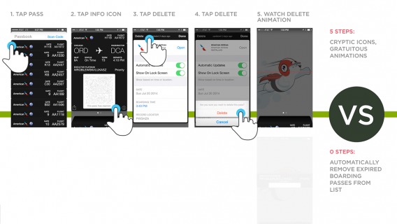
This mistake defies the principle of being intuitive.
Have you ever visited a site and found it nearly impossible to navigate or even leave? Ad over ad over ad. Ok, how about in the last 10 years?
It’s more common than you’d think. In an effort to get users to take their most wanted action, optimizers are bombarding them with calls to action.
Here’s a screenshot I just took from Neil Patel’s Quick Sprout…


That’s my entire screen. There’s nothing else in view. And I’m in the middle of an article.
Something similar happens when sites use auto or smooth scroll. Is it really making it easier for the user to navigate your site or does it just seem cool? Does it work as well in practice as it does in theory?
The Fix
- If you’re looking to build your brand and a long-term relationship with leads (and you should be), don’t sacrifice experience to capture an email or implement something “cool”.
- A good UX means the user is well aware of the most wanted action without you overwhelming them.
- If you go too far in the opposite direction, you won’t be much better off. Make your most wanted action clear, make the ability to scroll obvious… just don’t throw user experience out the window to do so.
Mistake #4: Ignoring Prototypes
This mistake defies the principle of being intuitive.
It’s likely that you’ve become familiar with certain prototypes. For example, here are three random sites from Landingfolio…

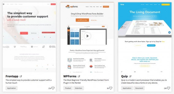
The prototype is clear. Navigation at the top (featuring a call to action in a contrasting color), one to two (with one more muted than the other) calls to action above the fold, a headline and a subheadline (featuring a value proposition), etc.
While the designs are very different, all three sites follow a very specific prototype.
If they were eCommerce sites, you’d expect to see the Cart in the top, right-hand corner. If they were mobile apps, you’d expect four navigation options along the bottom of the screen.
Sometimes people want to break away from these prototypes. Adam explains why that isn’t necessarily a good idea…
Adam Fairhead, Fairhead Creative:
“Designers can sometimes feel like they’ve ‘done it wrong’ if their interface isn’t exciting and different, throughout the whole design, every single time. But it’s OK to put clarity and simplicity over complicated and creative.
The thing about standards is that they’re just that — standard. There’s clarity in standards, which users will appreciate.” (via TheNextWeb)
Prototypes make the user experience simple. Things are where the user expects them to be based on past experiences with similar sites.
Why does that matter? Well, as Heydon Pickering of The Paciello Group explains, complexity is the ultimate enemy of UX…

Heydon Pickering, The Paciello Group:
“Complexity is the most prolific enemy of good user experiences, blighting all kinds of users. Complexity is also one of the hardest things to fix after the fact.
The only way to “fix” complexity is to axe features, so being the anti-complexity tzar means telling people their work has to be destroyed. Not an easy job. Good planning and the willingness to say “no” in the early stages of a product’s life are the best way to reduce complexity.” (via Medium)
If you find that you’re relying heavily on text to explain, it’s likely that you’re not capitalizing on an existing prototype.
Example: The Norman Door
The Norman Door is defined as “a door where the design tells you to do the opposite of what you’re actually supposed to do; a door gives the wrong signal and needs a sign to correct it.”
Whenever you embarrass yourself by slamming into a door you’re supposed to pull or yanking on a door you’re supposed to push, you’ve run into a Norman Door.
Vox recently took to YouTube to explain in more detail…

In the video, Don talks a bit about discoverability…

Don Norman, Nielsen Norman Group:
“There are a couple of really simple, basic principles of design. One of them, I’ll call discoverability. When I look at something, I should be able to discover what operations I can do. It’s amazing with many of our computer systems today… you look at it and there’s no way of knowing what’s possible. Should I tap it once or twice or even triple tap? So, discoverability… when it’s not there, well, you don’t know how to use something.
So many times, there’s no feedback. You have no idea what happened or why it happened.”
Discoverability has a lot to do with simplicity. Prototypes make discoverability easier. For example, do you think you should push or pull this door?


There are clues that tell your brain the door should be pushed. When those clues (or prototypes) are missing, you end up with a Norman Door.
Why Is Simplicity So Complex?
Luke Wroblewski of Google offers an explanation for why “keep it simple, stupid” can be such difficult advice…

Luke Wroblewski, Google:
“While there are many reasons why keeping things simple is difficult, I’ve encountered the following three causes quite frequently: Perceived simplicity can often conflict with actual simplicity of usage. Actions that provide real value—and drive revenue—often have formidable learning curves. Gradual engagement, the most frequently cited solution for managing complexity, is actually quite difficult to design and build.” (via UXmatters)
The Fix
- Don’s process looks something like this: observe people using it, prototype it, test it, repeat. You can do something similar with user testing.
- You can also look to other sites in your industry (or other sites that your users frequent) for existing prototypes.
- No one is saying you should copy your competitors blindly. But you should be aware of frameworks that exist within your users’ brains.
Mistake #5: Assuming the Rules Are the Same on Mobile
This mistake defies the principle of relevancy.
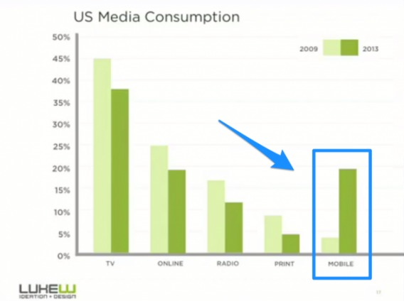
I shouldn’t have to tell you that mobile media consumption is on the rise…

You also don’t need another article to tell you that mobile traffic behaves differently than desktop traffic or that long forms are a bad idea or that tiny links / buttons are a conversion killer.
There are, however, a few things you should know about mobile…
- Cross device testing is a must. Make sure your site works properly and loads quickly on all devices. You might not have an Android, but I’m willing to bet one of your users does. Quality assurance is highly necessary.
- Test mobile and desktop separately. Your mobile UX and your desktop UX are completely different. Thus, they should be tested as such.
- The fewer taps, the better. As Luke points out, sometimes the best UI is no UI. The fewer taps you require from users, the better. Why take users through multiple screens (e.g. an onboarding flow) if you can condense it to one?

It’s also important to consider legibility on mobile. With a smaller device comes more readability issues. Bojan Janjanin of Yesterdayishere explains why thin font may be sabotaging your mobile UX…

Bojan Janjanin, Yesterdayishere:
“Thin type may look good on your display and you may not have a hard time reading it, but be aware of the fact that you are not your user. Invest in usability testing to find out if your real users are happy with the typography on all major devices: desktop computers, laptops, tablets and smartphones. While doing mobile testing, have your participants use your website on mobile devices in daylight — your real users will not always have perfect browsing conditions. If you had to read something on a mobile device on a sunny day, you probably know how difficult it can be.” (via Toptal)
In summary, your mobile UX is different than your desktop UX. Hell, your iPhone UX might be different than your Android UX. Don’t assume research and test results can be generalized across devices.
The Fix
- Treat each device’s user experience separately. That means separate research, separate analysis, separate issues, separate prioritization, separate tests, etc.
- Focus on optimizing the UX for the specific device. Your goal is to deliver the most relevant experience for each device. That means the call to action might change, the checkout flow might change, etc.
- Quality assurance is key. Test your UX on all devices. Where’s the friction? Does the page load slowly? Does anything load improperly? Are images missing? Are images too big? Are links easy to click? Is the call to action relevant? For best results, don’t just test the most recent operating systems… not everyone is quick to upgrade.
Mistake #6: Forgetting About Performance
This mistake defies the principle of conducting research.
When you think of UX, I’m willing to bet one of the last things you think of is the performance of your site. That’s unfortunate because, as Brad Frost of Brad Frost Web explains, it can have a big impact…

Brad Frost, Brad Frost Web:
“Performance is perhaps the most crucial aspects of a user experience, but unfortunately it’s largely ignored.
And it’s largely ignored because it’s invisible. Teams spend a lot of time polishing the aesthetic experience and enjoy diving into the latest development tools, but ultimately neglect how fast the experience loads and performs. It’s up to us to prioritize performance in our projects in order to better serve our users.” (via Medium)
Speed, specifically, can heavily impact conversions. We’ve written on that extensively before, so for more information, check out 11 Low-Hanging Fruits for Increasing Website Speed (and Conversions).
Another site performance measure to consider is errors. If users are receiving errors, something is broken on your end. Either the site itself (e.g. server issues) or the UX (e.g. people are ending up where they shouldn’t).
You have to fix even what you can’t see because in UX, what you can’t see is certainly felt.
The Fix
- Check your analytics tool to identify the errors that your users are triggering. Start with the errors that are triggered most often. Why are they being triggered? What can you change to ensure they’re being triggered less? User testing and qualitative conversion research can answer these questions for you.
- Now check your analytics tool to identify pages with slow load times. Start with the pages furthest down the funnel. Why are they loading slowly? Are your images or videos too large? Are third-party apps slowing down your site overall?
Conclusion
While this increased interest in UX is positive overall, it means that mistakes are even more likely to occur. An understanding of the core principles of UX will help guide your analysis and optimization efforts.
But here are some specific guidelines to follow…
- Design for your actual users, not yourself or ideal users.
- Don’t sacrifice clarity in the name of being clever or creative.
- Don’t bombard users with calls to action or implement a “cool new thing” without testing its usability.
- Embrace existing industry prototypes and use them to your advantage. Simplicity is king.
- Mobile is a different beast. Your mobile UX is different than your desktop UX. Your iPhone UX might even be different from your Android UX. Act accordingly.
- Don’t ignore site speed or error reports. If your site is slow or your users are encountering a lot of errors, it’s your responsibility to be aware and fix the problem(s) quickly.
Related Posts
-

What's user experience (UX) got to do with conversions? Everything. Great user experience is a…
-

Have you ever forgotten a password for a site? What about a security question? Have…
-

In Advanced Google AdWords, Brad Geddes wrote, "Wouldn’t you like your ads to be sought…
-

Your users will make mistakes. It’s inevitable. That’s what error messages are for—but so many…
