

Your conversion rate is not what it could be – and you know you need to do something about it. Should you redesign the whole website? Maybe. Probably not though. It depends. But if you are going to do it, you need to tread very lightly. Website redesigns only work if they are carefully managed and data-driven.
Table of contents
Careful – radical website redesigns often backfire
If you just go ahead and redesign your site, chances are that it will fail – conversions / revenue per visitor actually go down. You decided to redesign for higher conversions, but ended up with a lower performing site. Might not – but the odds are against you, happens all the time. In addition to poor results, redesigns often become a resource black hole. The development takes way longer, and ends up costing way more.
So you spend ALL that time, and ALL that money – and the result is that things either get worse or stay the same. Seems like a shitty deal, doesn’t it?
The most typical scenario is that there will be no difference in terms of performance. The reason is that some things get better, some get worse – and they cancel each other out. And since you changed everything at once, you don’t know what made it better or worse.
This happens when visual designers decide what your site should be like, or worse yet – you use design by committee. It’s sad, but most sites are still built the stupid way – based on a committee meeting (no conversion analysts involved – just clueless marketing execs chatting) or the HiPPO (highest paid person’s opinion).
And this isn’t something new. User experience guru Jared Spool was talking about the dangers of radical redesigns already back in 2003, Louis Rosenfeld was ranting against it in 2002, and so on.
This happens to big sites too
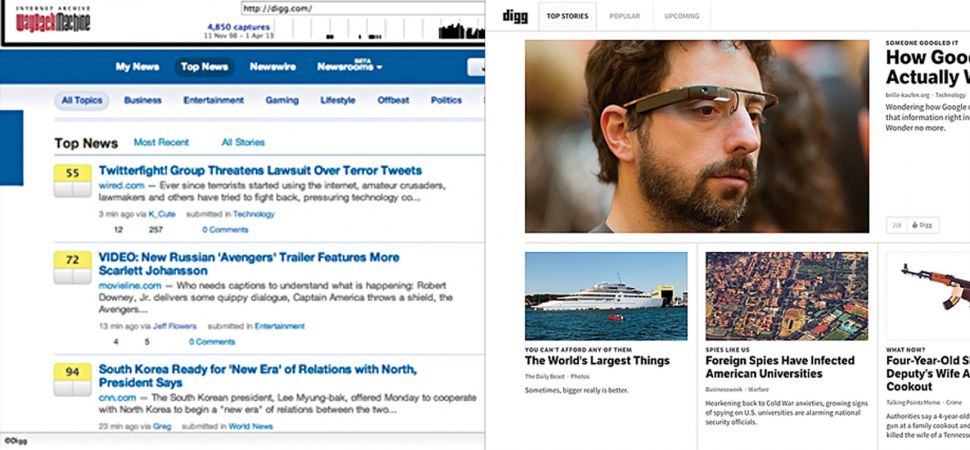
Target redesign in 2011 resulted in less revenue + a myriad of technical problems. Remember Digg.com? Their redesign might be why you don’t. When Digg went through a radical redesign in 2010, it suffered a whopping and mind-blowing 26% loss of site traffic. For a social news site, that was it.
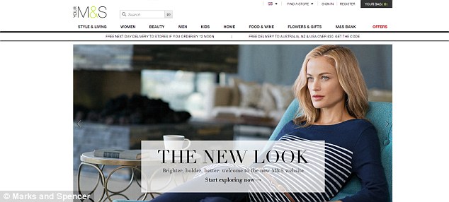
Marks & Spencer spent 2 years developing their new site – and reportedly spent an enormous £150m on it. By the time it launched, it was already outdated. Furthermore, its online sales plunged by 8.1% in the first quarter following the launch of its new website.
Slow development times are a common problem with redesigns. And – an 8% drop would never happen at smart internet businesses such as Amazon, because they would have spotted it at 1% or less, and rolled back to a better-performing version.
“But people say they really like it!”
What people say and what they do are different things. You’re in the business of making money, not compliments. “like it better” and “spends more money” are not the same things.
In 2008 Wal-Mart asked customers if they would like less cluttered stores, and the answer was “Yes, please.” The retailer spent hundreds of millions redesigning stores for a cleaner look. Customers said they loved the change. Yet they spent less. Year-on-year, same-store sales tanked, and they have been negative for eight quarters now. The company lost $1.85 billion as a result of the Project Impact redesign.
Research actually shows that cluttered and crowded store sends a signal that shoppers unconsciously interpret as “cheap stuff!”. And “speed bumps” in the aisles – boxes of merchandise on your path – offer increased surface area for impulse buying.
Listening to people is a good idea, but you have to pay attention to the metrics. People are terrible at predicting how they will behave, especially when it comes to spending money.
Optimization is the better, safer route to take
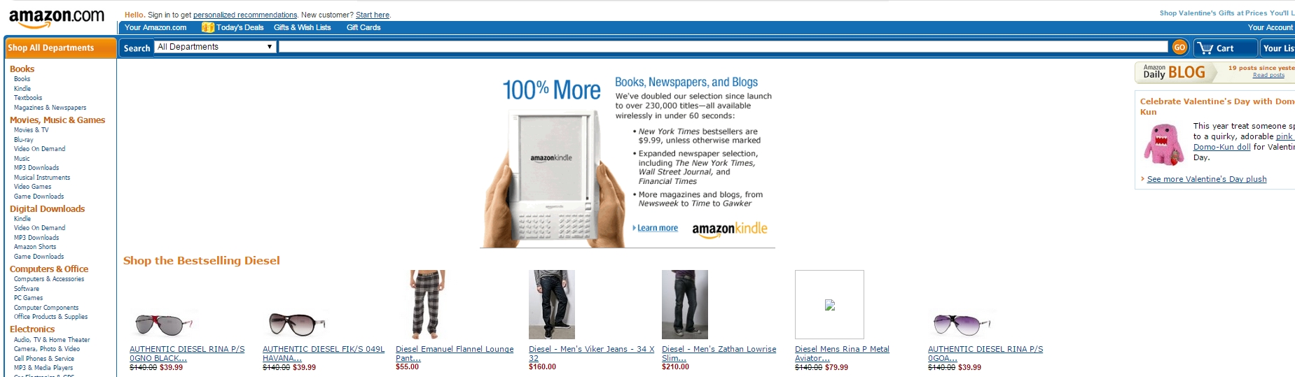
When was the last time that Amazon did a radical redesign? Most companies change their site every 3 years or so. This is Amazon 5 years ago:
Not that much different from today. All the changes are iterative. They’re improving their layout through testing. When they change something, they *know* it works – because they have (repeatedly) tested it.
This is Amazon in 2005:
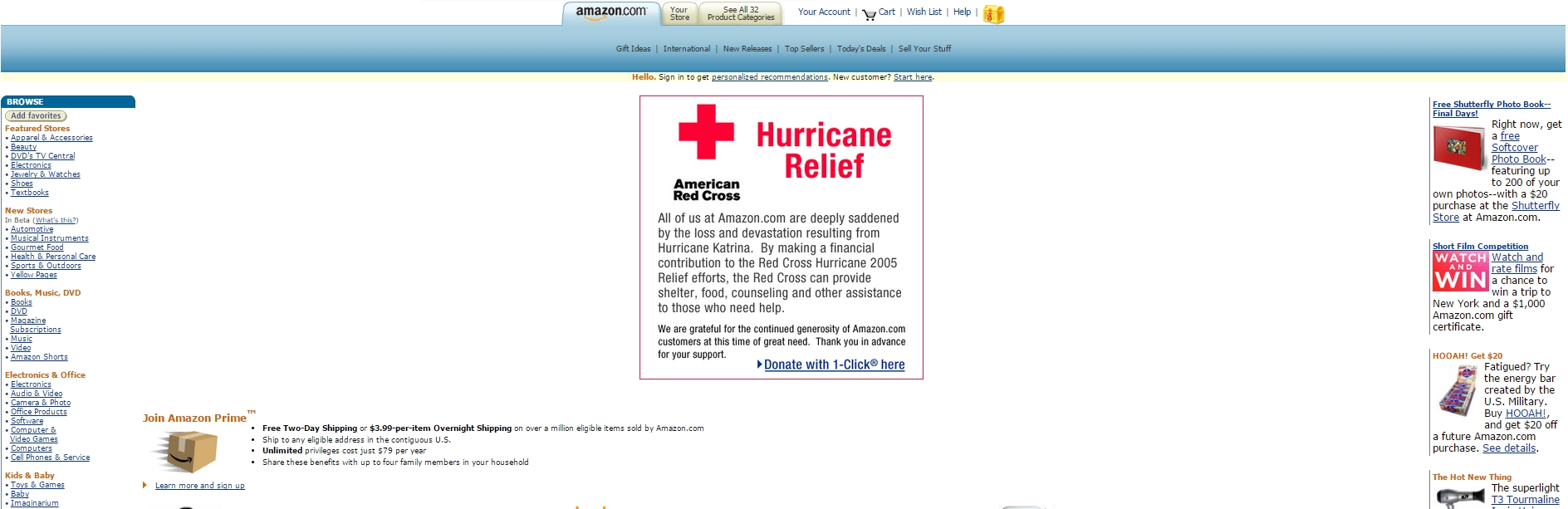
Yes, different – but not radically different. You can still recognize it.
Using continuous optimization for your site “redesign” is the safer, better route – cause you KNOW what is working, and what is not, and you can find something that works better through testing. Optimization ensures that you’re constantly improving, not changing things for the worse.
My friend Chris Goward calls it Evolutionary Redesign, but you can also call it continuous optimization or what not. The name doesn’t matter.
If you just redesign your site every 3-4 years:
- you’re falling behind the competition as the world is in constant motion,
- your site gets outdated and you’re not maximizing the money you could be making,
- it costs a lot of money to manage the redesign: especially the development portion of it,
- new design often backfires: either no difference in results, or even a drop in conversions.
Continuous optimization ensures that you know what’s working, and what’s not, and you can be confident in the changes – while not risking a sudden drop in revenue.
When to use a radical website redesign?
There is a time and place for a radical redesign. If your brand or company direction changes, you probably need a makeover. But if your brand remains the same, it’s not a simple decision anymore.
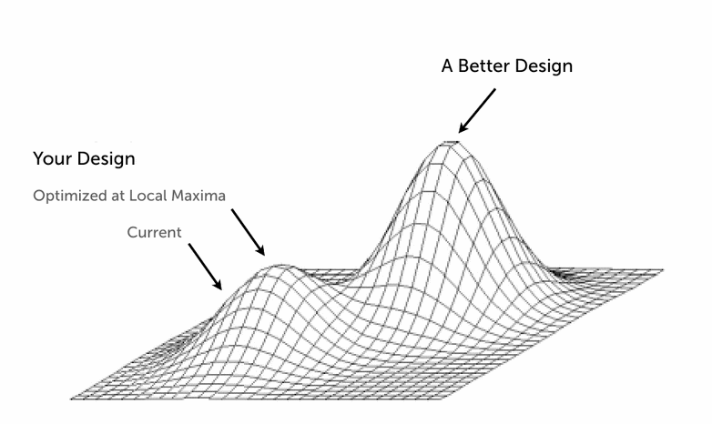
The website you’re working on might reach a point when despite your evolutionary design approach and making lots of little changes (running tests) to it over time the gains are either very small or non-existent. That point is called Local Maxima.
Local Maxima diagram by Joshua Porter
It’s when you’ve hit the limit of the current design …and it can’t get much better even if you make 100 tweaks you can only get so much improvement; it is as effective as its ever going to be on its current structural foundation. But always be hesitant about declaring that you’ve reached Local Maxima. Go for optimization until you reach a point of diminishing returns: design until changes just aren’t having a big effect. Then, stop optimizing and return to other kinds of analysis to figure out the next steps.
When radical design is better:
- You’ve hit the local maxima (and have tried tons of optimization to get there (testing random crap doesn’t count)),
- The technology is severely outdated (uses Flash and/or other outdated technology, not usable on mobile devices, backend system / website engine is obsolete etc),
- The design of the site is amateur (looks like your grandma designed it), it causes negative first impression in most people,
- There’s very little traffic, and conversion analysis reveals so many problems that it’d take years of A/B testing to fix it item by item.
When evolutionary approach is better:
- The existing design is “good enough”, no major technology issues,
- There are a lot of returning visitors who are used to the existing design,
- You have enough traffic to run tests in a reasonable time (at least 1 test / month).
Evolutionary design approach is what you should want to use when you can. That should be your default option.
Before redesign, conduct full conversion research
If you decide to do a radical redesign, you need to be smart about it.
There are always things that are working well on your current site, and you need to know what those are. Keep the parts that are working (e.g. if the checkout page drop-off is under 5% – keep the same layout), just polish them (improve look’n’feel while keeping what goes where the same). If the product page performance sucks (e.g. less than 2% add product to cart), completely re-think it. You need to figure out WHY the performance sucks. What specifically on those pages is broken?
Figure out how people use the site, what the problems are – and understand the people who’re using the site. What are people trying to accomplish? What are their higher-level goals? What aren’t people doing that we want them to? What causes friction? This level of insight will allow you to make those bigger changes.
ResearchXL as framework for conversion research
You want to be as confident as you can in your design decisions. So you need data about WHAT are the problems, WHERE and WHY. I’ve developed a framework to figure this out, and I use it with every client. I call it ResearchXL:
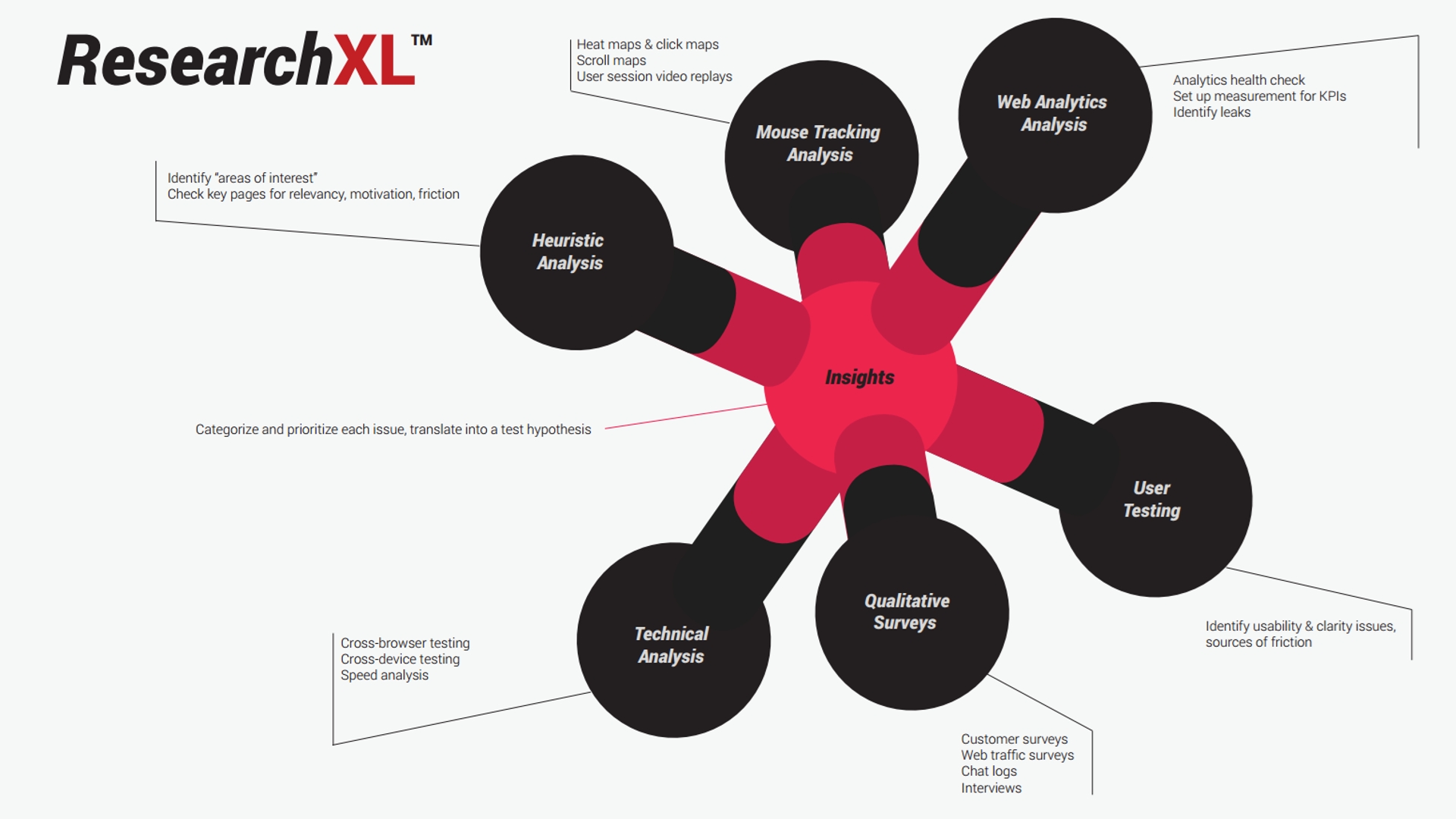
You need data that you can turn into insights. While you could create an in-house user research lab and track 5000 metrics across 500 segments, that would be massive overkill and a waste of precious resources. The best bang for the buck research you have to do before a redesign include the following:
- Heuristic analysis: identify “areas of interest” on each key page type (e.g. product page, category, cart etc). Assess each page for friction, clarity, motivation (value), distraction. Now look for data to support your findings.
- Qualitative research: run customer surveys, put surveys on your website, analyze live chat transcripts, conduct interviews with customers, talk to sales people about common questions they get.
- User testing: recruit people from the target audience, and have them use your site while commenting everything out loud.
- Mouse tracking analysis: what are people doing and not doing on pages? How far down do they scroll? Watch session video replays to see how people actually use your site.
- Digital analytics analysis: where are you leaking money? What other insights can you get for optimization?
Once you go through all of this, you’ll have a huge list of identified issues that you can use to base your design decisions on. And that makes a huge difference.
You know what the actual problems are, and where they are, and why they are problems. Compare that to a marketing team brainstorm, design by commitee or designers’ creative vision. No contest.
Involve designers. Later
Designers are very important, but they should not decide stuff on their own – especially when it’s about what goes where. Designers typically don’t know what improves conversions – at least not on the same level as a conversion analyst. You will significantly minimize risks by having conversion people create the wireframes for the new design (designers can be involved in the process).
In most cases you’ll want to bring in designers to the project once you have the first set of wireframes / mockups done. They can then challenge your stuff, help you think about interactions and create a final versions of wireframes – before they actually get started with the visual design.
Data vs Intuitive Sense
Of course – redesigns are not just about data, in fact it’s next to impossible to create a brand new design solely based on data. Because redesigns brights forth changes that are much larger than a single design element you can effectively test, making a change to them requires making a daring design decision. Conversion analysts and designers have to take a chance based on the data they have available + their intuition: what they think will work based on what they know about the business and their customers.
When you design through the local maximum, you need a balance between data-backed methodology, the intuitive sense designers use when making big changes and design heuristics (stuff that usually works well – like large product images). You need to intelligently alternate between innovation and optimization, as both are required to design great user experiences.
And keep in mind that before you roll out the new site make sure to conduct user testing (and fix all identified issues) and cross-browser + cross-device compatibility issues (most comm0n with new sites).
Slow start? Keep optimizing
Even if you manage the redesign project well, it might have a slow start. What I’ve often seen is that upon launch a well-managed redesign it still doesn’t improve conversions much. Some people get very nervous. But there are typically only a few major issues that are holding it back. Since you changed so much, it’s hard to know what the problematic things are – so full conversion research followed by testing are needed again.
You can figure out those items in a month or two if you’re diligent. First of all you need to make sure that you’re measuring everything, and know the impact of each feature, action, step on your site. That enables you to identify the issue, and test a better way to go about it.
Conclusion
Radical redesigns are risky, and should generally be avoided. If you still need to do it, conduct full conversion research first. You want to keep what’s working, and re-think what’s not – but in order to do so, you need to know what’s going on – in detail.
Related Posts
-
Do you want to make your website better? There are many ways to optimize a…
-

What we know today as a "website redesign" isn't what it used to be. ‘Radical’…
-
In today's review I'm assessing whether websites in question could do anything to better get…
-

Website speed matters. Fast-loading sites perform better on all fronts: better user experience, higher conversions,…


