6 Conversion Rate Optimization Case Studies With Surprising Results
Ott Niggulis
In the world of conversion optimization it’s always a good idea to keep your eyes open for case studies that you can learn from, adapt to your needs and go test it.
Here are six studies that had some pretty surprising insights.
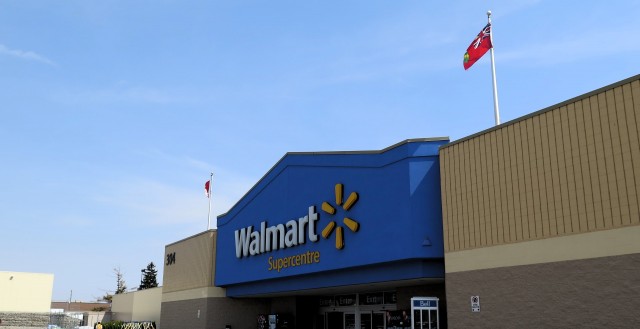
Though responsive web design has gotten easier over the years, it can still take a lot of time and money to implement effectively. For Walmart Canada, it took nearly a year to make their site fully responsive, but as their results will show—it essentially paid for itself within months thanks to improved revenue from mobile devices.
The research
Seeing a significant amount of traffic coming from mobile, mainly tablet devices, Walmart recognized that their current solution did not really work on mobile devices.
The problem was two fold: first the overall look and feel of the site on mobile was awful, secondly it took forever to load.
So they went to work to make the overall experience faster and responsive to whatever screen size or device it was being run from.
Their prior research gave them plenty of data about which screen size and browsers were used most.
The execution
Walmart used hands-on usability testing on both old and new designs, A/B tested various elements on the site and did overall speed improvements throughout the site.
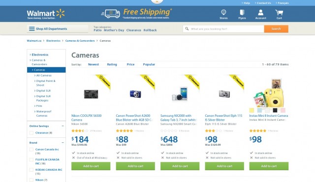
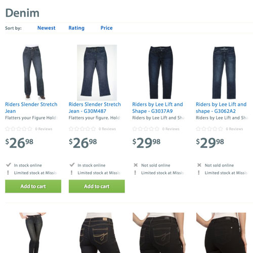
This is the result viewed on a big screen PC:
And this is how it looks on a mobile device with an smaller screen:
In the end, with their new design Walmart achieved an overall conversion boost of 20% on all devices. On mobile, orders went up by 98%—not bad!
But perhaps the most surprising insight from testing was connected with presentation of product availability. By removing the “View Details” button for products that were not available for purchase online, they saw a boost in conversions.
Isn’t it interesting how sometimes the smallest things can make a difference?
Walmart Canada saw that a lot of visitors on their homepage used tablet devices and then made the decision to go for a fully responsive design.
By getting rid of distracting buttons and other elements that do not add value or help with conversions, by removing “View details” button, Walmart actually increased conversions.
2. Image outperforms video, increases monthly revenue by $106, 000
With all the talk about how explainer videos have the ability to increase conversions, it’s hard to believe that there are cases where a static image has the ability to outperform the video—and as always things aren’t always so straight forward, one-size fit all.
The research
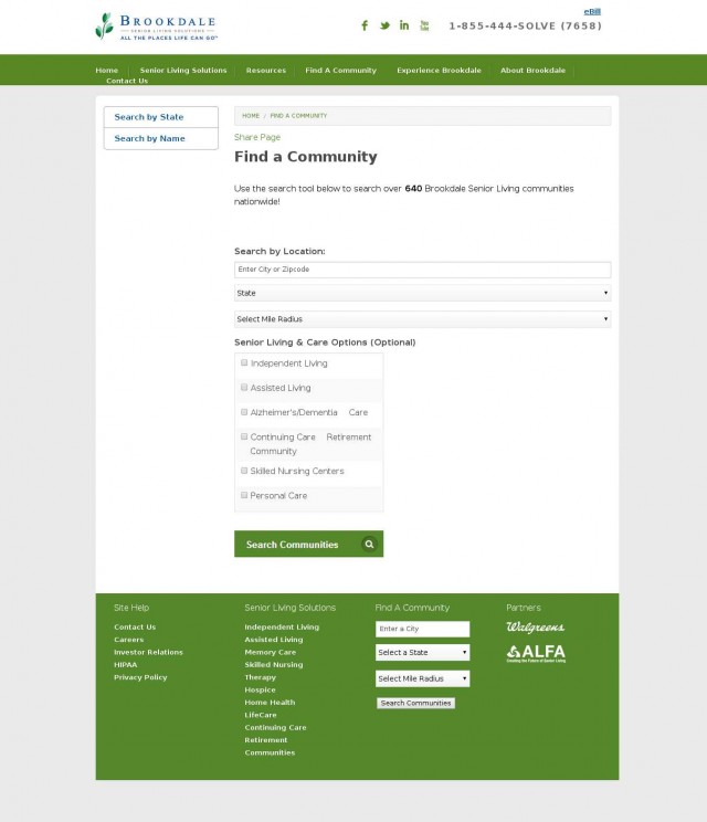
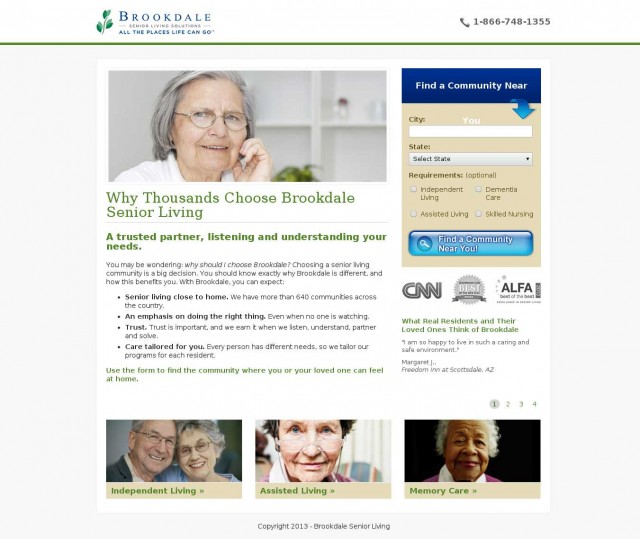
BrookdaleLiving.com offers various community living solutions for senior citizens. Their initial page was unbelievably basic and had just the bare-bone structure with no graphics, testimonials or really any content at all that would encourage the visitor to convert.
Brookdale hired Fathom to optimize their “Find a Community” page. As there was little to work with on the current site it was decided that complete redesign is in order that included adding more content, testimonials, credibility logos, USPs and the like.
The execution
After a complete redesign, Fathom came up with two variations that were tested against the original basic page.
The first variation included a photo of an elderly woman. Like this:
And the second variation had a 1 minute 56 seconds video instead of the photo. In the video many elderly people talk about their positive experiences with Brookdale. Everything else remained the same.
After testing all three designs (the original and both variations), it was found that the image version outperformed all others with an increase in conversions of 3.92%, while the video got just an 0.85% lift over the original.
Although the 3.92% lift seems very modest indeed, it resulted in more than modest $106,000 additional revenue for the company.
Why did this happen?
There are many possible reasons why these results are what they are, but Fathom and Visual Website Optimizer (provider of the testing software) share three likely reasons:
Brookdale was already an established brand and the video acts as a distraction;
Most of their users fell into the spontaneous customer type. As
Here’s what Matt from Fathom shared, “We were wrong. We now understand our customers better: they aren’t interested in marketing videos so much as they want to convert quickly and easily on the page”
3. The target audience had a slower internet connection, so videos might not work for them.
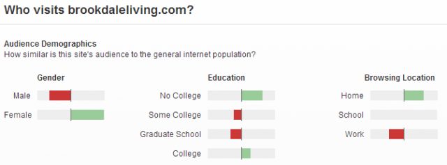
According to Alexa data, Brookdale’s target audience is over-represented by women who didn’t go to college, and according to various reports people who didn’t go to college have slower connection speed at home.
Another possibility is that elderly people in general are afraid of “new” things, or things that do something unexpected (like an auto-playing video) and left the page.
Additionally, data has the power to prove wrong all your instincts, gut feeling, intuition and the like. It doesn’t matter what you think, results matter.
“If it disagrees with experiment it is wrong. In that simple statement is the key to science. It does not make any difference how beautiful your guess is. It does not make any difference how smart you are, who made the guess, or what his name is – if it disagrees with experiment it is wrong. That is all there is to it.”
Richard Feynman – world famous theoretical physicist, winner of the Nobel Prize in Physics
While this case study is a somewhat dated, it’s generally accepted that making the checkout flow as effortless as possible will result in better conversions and more sales.
As everyone is logged into Facebook most of the time anyway, why not use Facebook Login to streamline the checkout process even further, right??
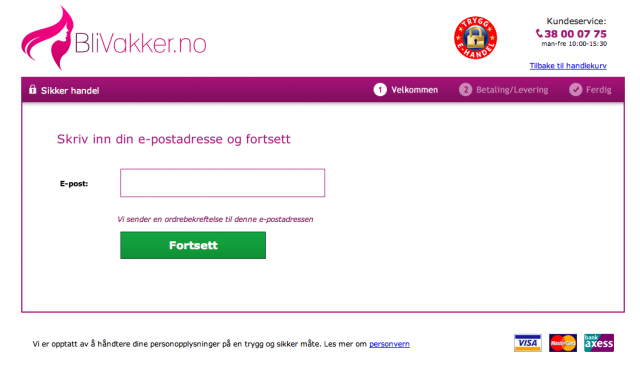
The research
BliVakker.no is one of Norways leading online cosmetics retailers with 20,000 visits per day.
They wanted to optimize their checkout process by making improvements based on findings from usability tests, well known best practices, different A/B tests and their data from analytics.
The execution
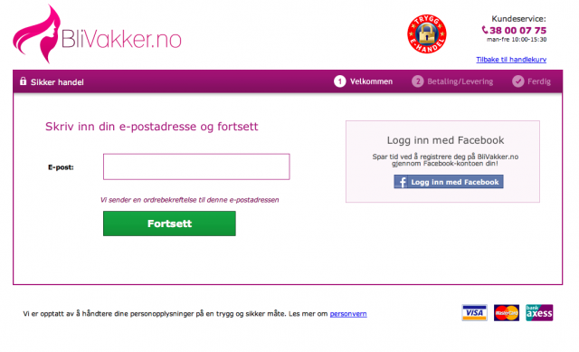
One of these tests involved using Facebook Login on checkout pages. They used Visual Website Optimized to run the test on 8000 visitors.
With Facebook login:
Without Facebook login:
The checkout page without Facebook increased conversions by 3%, which at their scale meant about $10,000 in extra revenue per week.
Actionable advice
Although BliVakker acted according to best practices and common knowledge they still got it wrong thinking that Facebook Login increase conversions. Using best practices is not enough.
Always, always, always do your own testing, don’t let anyone else’s data dictate on what you do with your page.
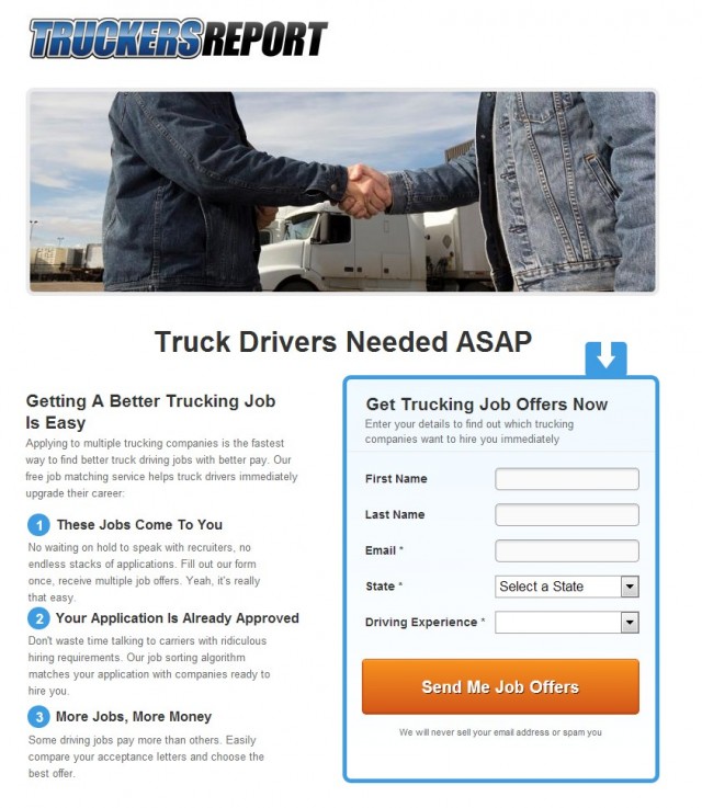
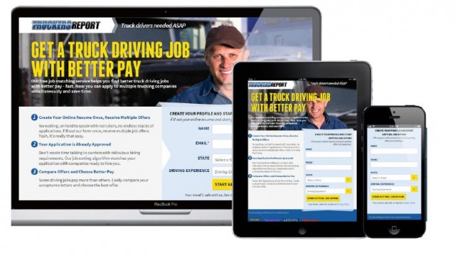
4. How Truckers Report improved landing page conversions by 79.3%
With Truckers Report it took us six rounds of testing to finally land on a variation that converted 79.3% better than the original.
The research
Truckers Report is a network of professional truck drivers, connected by a trucking industry forum. It’s a great community for drivers to share information and assist in each others’ careers.
One of the services they provide to their community is helping truck drivers find better job opportunities. Truck drivers fill out a one-time online resume and then chose between offers from pre-screened trucking companies.
We used Google Analytics, set up mouse tracking data collection (click data, scroll maps, attention heatmaps) , started to record user session videos via SessionCam and ran online surveys using Google Docs to really get in the mind of the truck drivers.
Factors to focus on
After going through all the data, session logs and surveys, these were the factors we decided to focus on:
Mobile visits (smartphones + tablets) formed about 50% of the total traffic. Truck drivers were using the site while on the road –> Need responsive design
Weak headline, no benefit –> Need a better headline that includes a benefit, addresses main pain-points or wants
Cheesy stock photo, the good old handshake –> Need a better photo that people would relate to
Simple, but boring design that might just look too basic and amateur –> Improve the design to create better first impressions
Lack of proof, credibility –> Add some
Drivers wanted 3 things the most: better pay, more benefits and more home time.
Armed with all the data and our check-list of focuses we proceeded to testing phase.
The execution
We didn’t want to change the layout dramatically, we just wanted to better isolate user issues and work on them. Data from heat maps and user session videos showed that the overall usability from the original version worked well, so we didn’t change that.
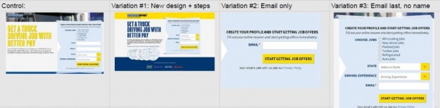
Again, this is what it looked like before we started:
And this is the new, fully responsive design we created:
Next, time for testing.
Test #1
Hypothesis: Fewer form fields = less friction and hassle, resulting in more conversions.
Results: Control beat the variation by 13.56%
Test #2
Hypothesis: Copy that addresses most common problems truck drivers are facing, using the the wording they actually use (taken from the customer survey) will resonate better with the audience.
Results: While there was no difference in landing page opt-ins, there was a 21.7% difference in the bottom of the funnel conversions—original won. People lured in by big promises were less motivated to go through the whole 5-step funnel.
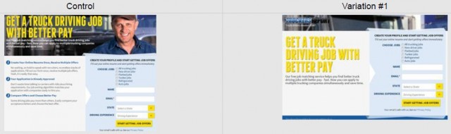
Test #3
We decided to test the original landing page vs. the new landing page to make sure the design was enhancing the site.
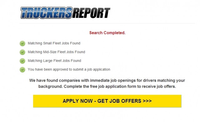
In addition, we wanted to test the absence of a “job match” page. By default people who completed the opt-in, landed on this page, which had some animation on it that made people feel progress in the background:
The idea behind having this page was to help boost bottom of the funnel conversions. Google Analytics showed us that there was a 10.8% drop-off rate on this page. So we wanted to test whether losing those people would have a negative impact.
Results: Variation #1 (new landing page) resulted in 21.7% more opt-ins than the control at 99.7% confidence level, and 24% more signups from the whole funnel. “Job match” page did not help improve bottom of the funnel conversions, so we decided to remove it.
Test #4
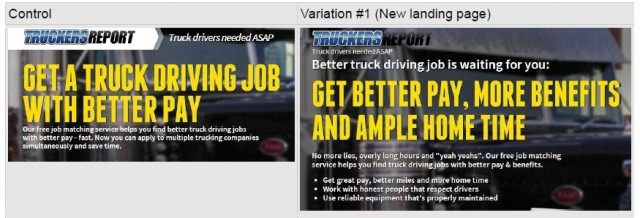
Then we tried even more headline testing.
Contestants:
“Get a truck driving job with better pay”. Straightforward.
“Looking for a truck driving job with better pay?” The idea here is the notion that people always answer questions in their mind when they read a question.
“Better Pay. More Benefits. Respect for drivers.” These benefits came from the survey as the 3 most important priorities to the audience.
“You can get a driving job with better pay. But, of course, you are free to choose.” The psychological phenomenon of “autonomy” is at play here and is widely researched to increase persuasiveness.
Results: Control outperformed all the variations. The original headline won the second best variation—”You are free to choose”—by 16.2%.
A simple, straightforward approach works best for this audience. So the question is—how can we use this insight to make the page even simpler?
Test #5
Building on the “simple” insight from the previous test, we created a shorter, simpler version of the page:
Results: Variation #1 with a shorter page layout and less copy outperformed the control and resulted in 21.5% more opt-ins at a 99.6% confidence level. Shorter layout and less copy resulted in more opt-ins. How can we now make it even simpler?
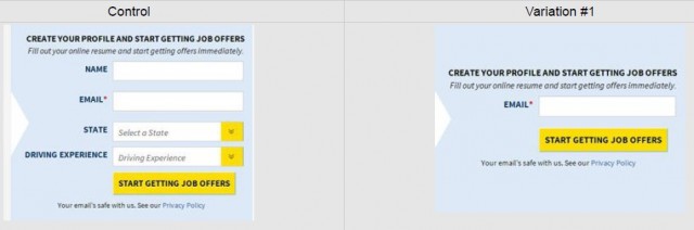
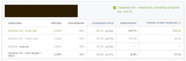
Test #6
This time we tested 3 different simplified designs against the control.
Results: Variation #3 with no name field and email as the last field resulted in 44.7% more opt-ins at a 99.9% confidence level.
The idea behind variation #3 was for people to start with easy fields (dropdowns) so that by the time they reach the hard field—email—the user is thinking “oh well I already started” (a known psychological phenomenon called “commitment and consistency” by Cialdini), so we’d be riding on momentum.
In the end we achieved a 21.7% conversion rate which is 79.3% better than the initial landing page we started with.
Actionable advice
Testing is an iterative process. Don’t test just once and move on to other parts of the site. Don’t think of testing as one-off sprints, think of it as testing campaigns.
Learn from each step and use the gained insights to get better results and to use as data to drive upcoming tests.
Have a lot of patience. it took us 4 tests before we figured out that simple, straightforward approach works best with this audience. And having that insights allowed us to finally arrive at 79.3% boost.
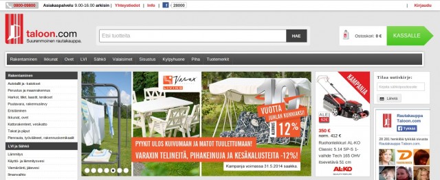
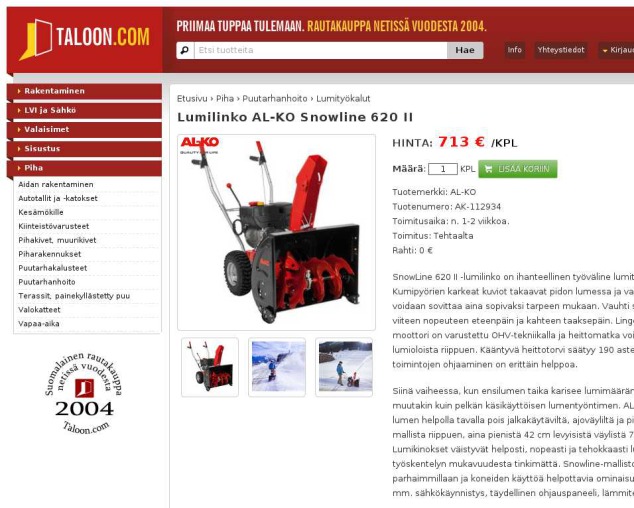
Taloon.com is a Finnish based hardware eCommerce store that sells plumbing, electrical, gardening and other similar things. They wanted to increase sales on their product pages and so turned to testing.
The execution
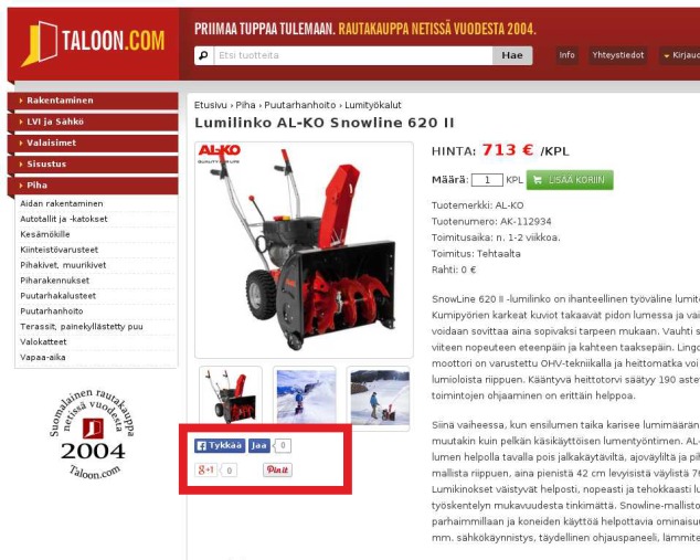
Going against popular notion that social buttons are good, he tested product page with social buttons and another without to see if it makes any meaningful difference.
The challenger, a.k.a the one without sharing buttons increased conversions (clicking on Add To Cart) by 11.9%.
Actionable advice
This seems to go against common practice, so what’s going on here?
Two things:
Negative social proof According to the sites owner, number of shares on most of the product pages was zero, this acts as a negative social proof. Making the customer distrust both the company and the quality of products.
Distraction from main goal Product pages have only one goal – for people to buy! By adding more elements that potentially distract the user, you drive them away from that one action. Don’t do it.
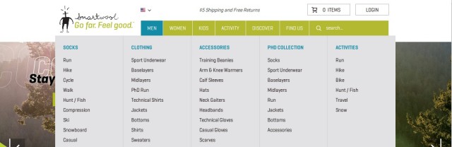
It’s relatively easy for experienced conversion optimizers to make a bad site perform noticeably better, but what about when your client already has a well designed one that nails all the best practices?
This was the case for Blue Acorn when SmartWool came to them for help with boosting conversions.
The research
Fortunately the team over at SmartWool was open to testing different page layouts and the like to find the ones that perform the best. One of the first pages that was tested was the category pages. This was partly because it received a lot of traffic which made getting results from tests quicker.
The execution
The Blue Acorn team came up with a brand new design that was both unique and aesthetically pleasing. It showed product images in varying sizes and breaked up the repetition of images aligned in equal boxes.
To make sure that this new unique design actually worked, they tested it against a more tried and tested variation of using repetitive images all equal in size in rows which enables better eye tracking when scanning through products.
They used Optimizely to set up the test and get results. In the following image, A is the unique one and B the more traditional.
After testing 25,000 visitors and with a statistical confidence of 95%, the variation a.k.a the more traditional category page won by increasing revenue per user by 17.1% against the baseline
Actionable advice
Making an product image bigger may lead to more clicks on the product, but not necessarily to more paying customers.
More visitors might end up on more product pages they don’t actually want or need and thus getting to the product they do need takes extra clicks, time and adds overall friction.
As always, without testing you truly cannot know what works, and what doesn’t. Test, test, test.
To really get the maximum out of all these different case studies, find the ones from the list that are relevant to you and your side. And try to come up with ways to make it work for your site, with your traffic.
As we said before—think of testing as a longer campaign that you will continually run over a longer period of time. It’s not a sprint for that small lift.
To really be successful, you need to understand that there rarely are big easy wins, but most often results come when running many smaller tests and taking learnings from them and testing again. And again. And again. A marathon, not a sprint.