

With product pages, it’s often way too easy to lose sight that the goal is to actually persuade people, and instead, at least from what I can tell on 99% of the eCommerce sites I see, the pages are treated with a very clinical approach.
“Here’s the product sir, I sure do hope you buy it.”
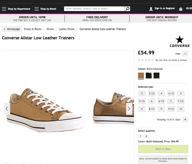
I mean, this page hits the right notes; discounts, large product photos, reviews & testimonials, recommended products… But is there anything particularly persuasive about this page? Nah.
If the goal is to get the person on the other side of the screen saying, “I need this, and you can’t get it into my cart fast enough” then the product page needs to take into consideration all of the tiny things that go into a buying decision.
While there are many aspects that go into being more persuasive (Cialdini’s principles of persuasion are a great place to start), for the purpose of this piece, we’ll be looking primarily at the research behind the visual aspect of compelling product pages.
Making a Strong First Impression
For starters, I want you to consider that research has found that it only takes about 0.013 seconds (13 milliseconds) for the brain to process an image, and that it processes visual information 60,000x faster than text.

Or how about it only taking 0.003 seconds to derive the meaning of words (when the brain is tuned into a need) or that it only takes about about 0.005 seconds (50 milliseconds) for a website to make a first impression?
To put this impossibly fast window of time into into perspective, 50 milliseconds is about how long it takes for a bee to flap it’s wings 10 times.
Now go take a look at your product pages real quick and be honest with yourself, are they really that persuasive?
Even something as unremarkable as an electric toothbrush becomes more appealing if the site that sells it actually tries to more persuasive.
Given that the visual element is such a big part of the customer experience & buying process, I’d like to deconstruct how one of my favorite eCommerce sites uses visuals (and a few others along the way) as well as explore some relevant research in order to help you be more persuasive in your own product pages.
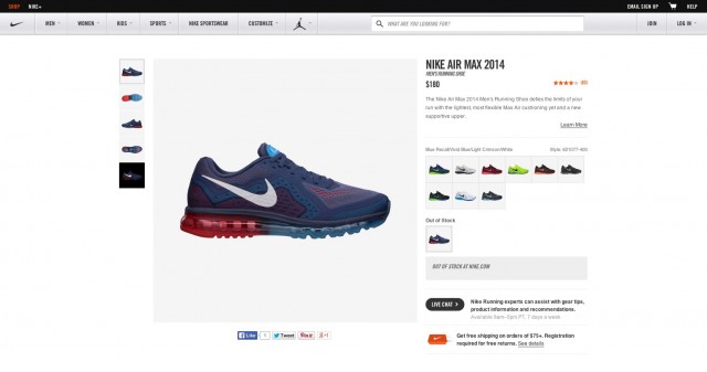
Deconstructing Nike.com’s Product Page
Nike.com has been recognized for an exceptional user experience by several different award juries including Cannes, The Webby’s, Digiday & London International.
In the last 2 years alone, it has been a nominated for over 17 awards and has won 12, including the 2013 Webby for Best Shopping Experience.
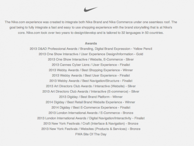
To give you an idea of the competition, Nike beat out Fab, Target, Warby Parker, Gucci, Sephora & a bunch of other sites with outstanding User Experiences – so I think the Nike.com product page is well worth a look.
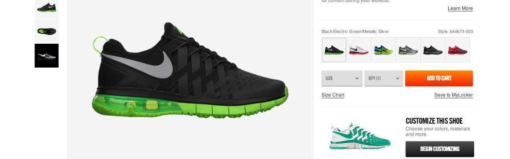
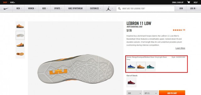
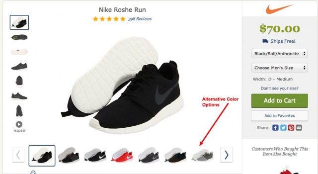
Right away, you can see the page has a very clean and uncluttered layout that creates a great first impression that instantly draws attention to the product.
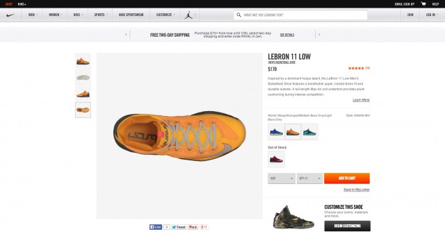
Something I really appreciate about this site is how the top navigation allows you to glance by it, yet has all of the critical elements clearly labeled and in familiar locations. The navigation is there when you need it & out of the way when you don’t.
This allows your eye to be instantly drawn to the product, which is exactly what should be the main focus on a product page.
What I like about this page the most however is how it draws your eye to the call to action almost immediately after by using a target color, then next to the testimonial overview (which uses the same color). This is a great demonstration of Fitt’s Law in action.
As your eye travels to the key areas of the page, it’s exposed to the additional information, such as:
- Detailed copy is below the review area
- “Customize this shoe” is clearly under the Add to Cart button…
- …which also has sizing, quantity & a “save for later” functionality surrounding it.
- Extra color options are sandwiched between the description & CTA
- As well as additional product photos next to the main product image.
In other words, this product page understands what draws focus, then surrounds those areas with all of the additional information you need to make a purchase decision. Everything seems to “unfold” as your eye moves across the page. All this within 10 flaps of a bee’s wings.
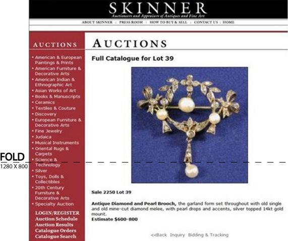
In the event you’re one of the 20% of people who scroll below the fold, because maybe you want to see additional information & whatnot, there’s plenty waiting for you to satisfy your curiosity.

So far so good, right? But what happens when you contrast this to a product page tries to cram as much information above the fold as possible?
How’s that for a first impression?
Understanding Why We Say “Use High Resolution Product Photos”
In case you’ve been losing this fight with your boss, or client, let me reassure you, large and high resolution product images aren’t just about looking pretty. Instead, they make it easy to review all the fine details and get a sense of the physical product itself.
Same goes for Zoom functionality too. From what I’ve seen, there are tons of sites that use zoom, when really it serves no purpose.
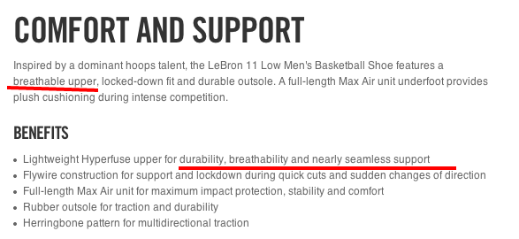
But check out how Nike does this below, they’re not just giving you a closer look, but rather reinforcing the claims made in the body copy.

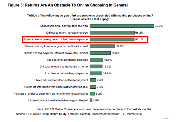
It’s easy to overlook, but when you see that this study by Forrester & UPS, found that the number 3 reason people don’t buy online is because they would prefer to examine items in person…
…and that this paper on “The Effect of Mere Touch on Perceived Ownership” shows how tactile & perceived tactile interactions can greatly increase the desirability and sense of ownership of an object, suddenly detailed photographs and “zoom” become really powerful selling tools that anchor the entire buying and research process.
In my experience though, many eCommerce sites are only looking images as an aesthetic thing, debating internally on how a larger image sizes could mess with the “look & feel” of the page.
Our colleague Justin Rondeau of Which Test Won points out in his article on eConsultancy blog, that there are several cases where increasing the size of the “hero shot” increased conversions; in Skinner Auction’s case, they were able to get 63% more people bidding on an item!
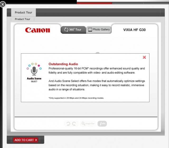
Realizing these images are used to put a product under the microscope, something Nike could experiment with to take their product photos a step further, would be clickable targets – like what Canon does with some of their 360 degree product tours on their site.
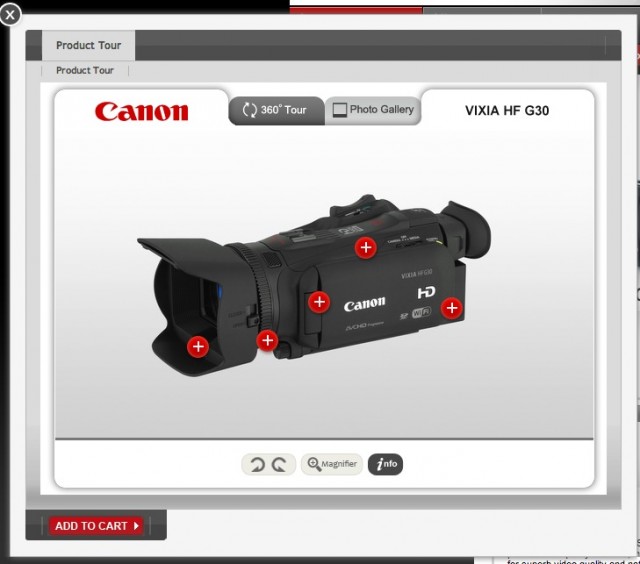
In this example, each target opens up a dialog that goes into detail about each feature & provides deeper insight right within the product photo.
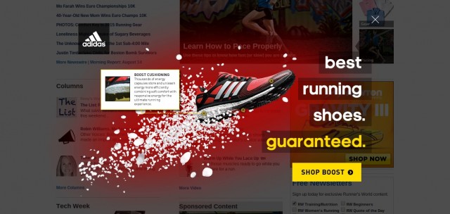
I was pleasantly surprised to see Adidas doing something similar to this in an ad unit on Runnersworld.com, yet was a little curious as to why it’s not being utilized on their product pages.
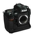
Some companies, like B&H Photo, are taking this even a step further by allowing shoppers to view full on 3D models and inspect the product from every angle imaginable. Software vendor Maybe3D, claims their customers see a full 10-20% increase in conversions.
Click the Nikon image for a demonstration & make your own assumptions.


There’s a ton more research on how images affect conversion rates, and should absolutely be taken into consideration when increasing the persuasiveness of your product pages.
Multiple Product Images Should Provide Context A Deeper Information
Because your visitor can’t pick the object up themselves, it’s up to your photos to be their eyes and show them the things they care about & give them as much visual information as possible to assist with their buying decision.
However, just like “have high resolution photos” shouldn’t be taken at face value, neither should be the additional shots you provide.

In the example above, Nike has included an additional view of the shoe with a greyed out background and dramatic lighting to give the viewer a better sense of what the grip of this shoe is like. For the experienced athlete, the sole & tread of the shoe means a great deal when it comes to performance.
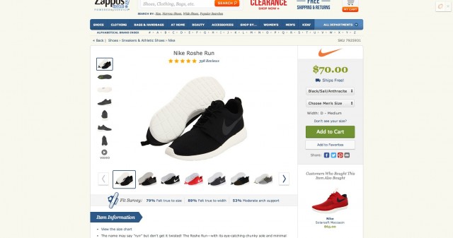
Compare this to a similar product even on Zappos.com, and it’s easy to see why making sure those small details don’t get lost in the background.
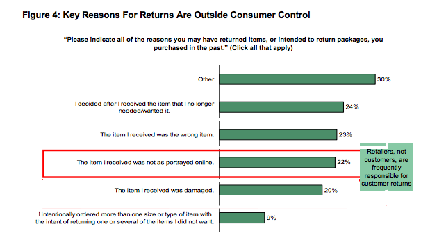
This is important to pay attention to, especially because Forrester found that around 22% of people are making returns because the item they received was not as it was portrayed online.
There are also functional reasons for having multiple views, for instance, when an image can provide “at a glance” answers that might be buried in detailed product descriptions – such as “what kind of inputs are on this television?”.
Or on this page, what better way to demonstrate that the phone is:
- Waterproof
- Available in multiple colors
- Smartphone sized?
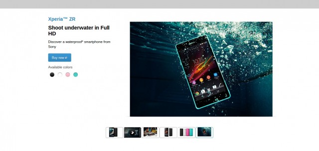
Seriously though, In situations where the fine details matter or how an item is displayed are important to the buyer, it’s the multiple product angles that really end up selling the product.
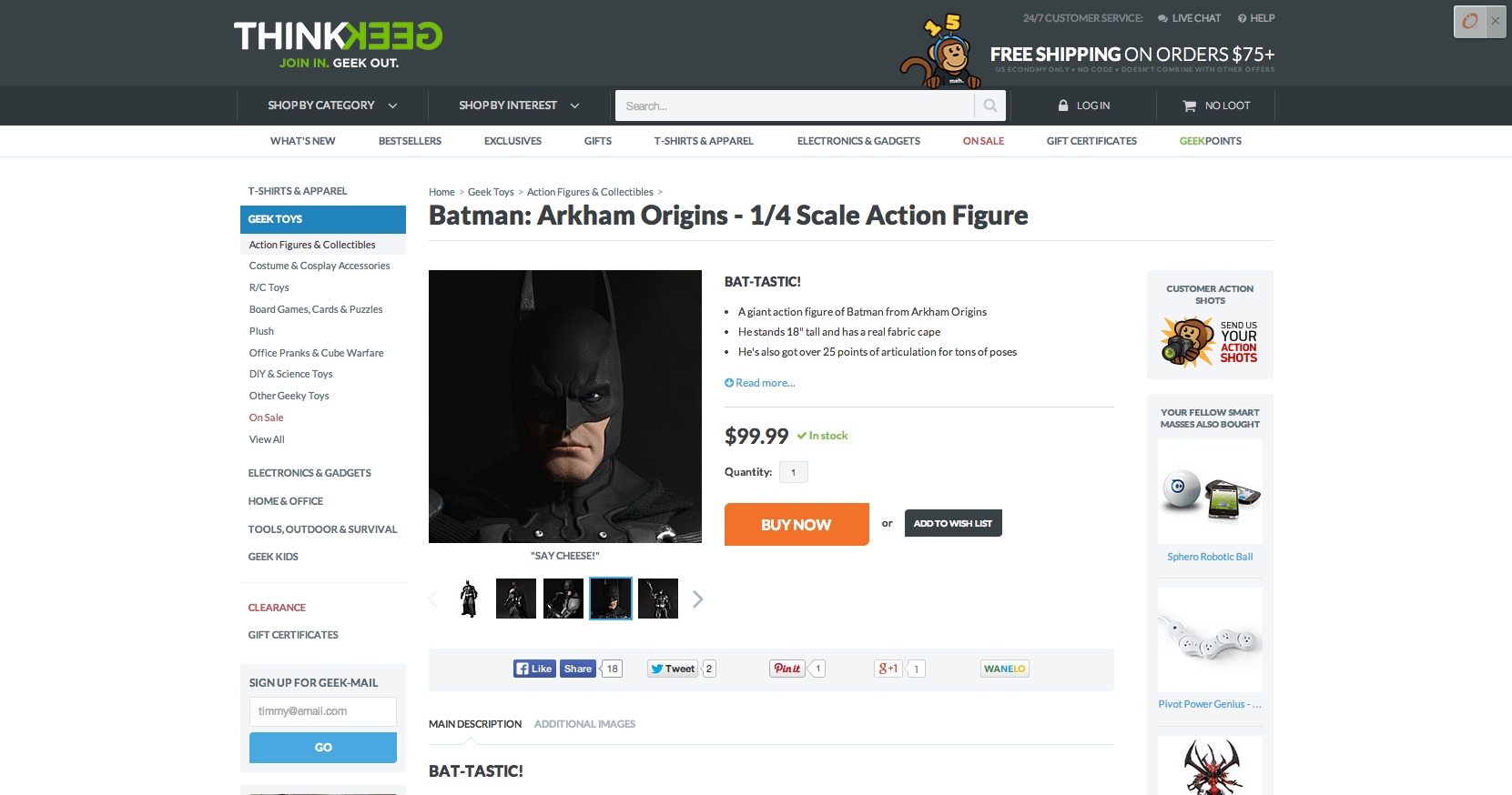
For example, this statue of Batman uses various images to showcase detail & realism of the sculpture as well as various poses you can put Batman in.
For more functional products, sometimes the persuasion comes from giving your visitor some sense of scale so they can see if/how the product will fit into their lives.
Which would you trust more:
- Knowing that your Macbook can fit in a padded laptop compartment that is 16” x 13.5” x 1.5”
- Or this photo of someone stuffing a bunch of stuff into the bag
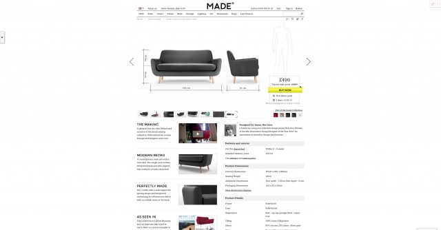
In this next example on Made.com, there’s a small amount of text that tells you “The model in this diagram is 5’8”, helping you to get a better sense of size of the furniture.
Keep in mind, because we’re talking about multiple product photos these photos should be serving a real purpose beyond just getting the visitor to go “ooh pretty”.
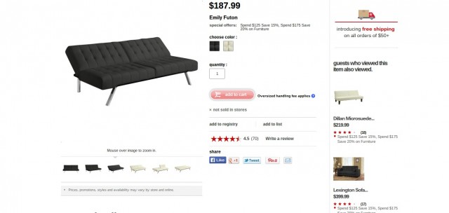
This was a trap I personally fell into when ordering a futon that turned out to be simultaneously too big for my office & too small for my body.
Depending on the context, multiple product photos can also infuse the site with a sense of “culture” that layout, copy, or a single photo don’t easily do on their own.
CXL readers DollsKill, for example, use various images of their models to very quickly let you know who their site is (and is not) for.

Using one of the additional photos to show the product in a real environment can also help to visitor to visualize the product in their own space.
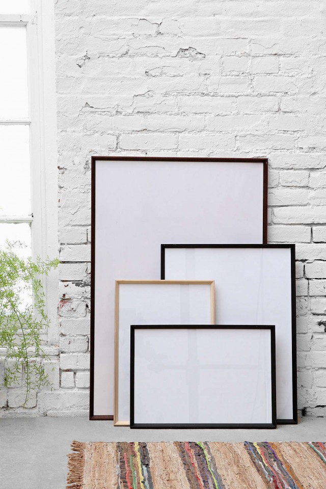
Urban Outfitters for instance, makes something as unexciting as a wooden art frame interesting by inserting it into an environment that represents their ideal customer’s apartment.
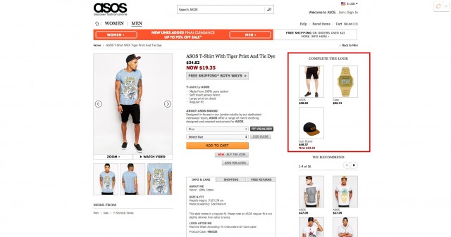
As a side note on contextual images, if you’re showing multiple products within the image, make it easy to find the other items in the image directly from the product page.
Usability researchers over at Baymard institute found that it “frustrated users to no end” when they had to hunt down the other products in the photo, and in many cases lowered their perception of the website, stating it was clear the owners didn’t use the website themselves.
“I want this. What do I do?… I want this one,” one subject said, laughing out of despair while pointing and clicking at a coffee table shown in a contextual image on IKEA.”
This is easy enough to do by including something like the “Complete The Look” area on Asos’s product pages.
Make It Easy To Find & View Alternative Versions Of The Same Product
To me, there is nothing more frustrating than a generic color swatch that doesn’t closely resemble the product being sold.
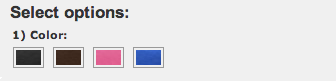
Even more infuriating though is when I’m not able to find the color or size that I want for the product I’m viewing.
Going back to the Nike.com product page, displaying alternative versions of the same product is something they do exceptionally well.
What I enjoy about this is that you can see very easily just how alternative versions of the product look without having to chose from some drop down of additional colors…
…like you do on the Ikea website.
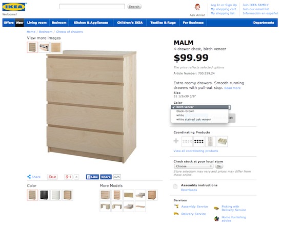
On second glance, there are actually little thumbnail images of what the color options look like, but they’re under the share icons on the bottom left, in a not so noticeable place.
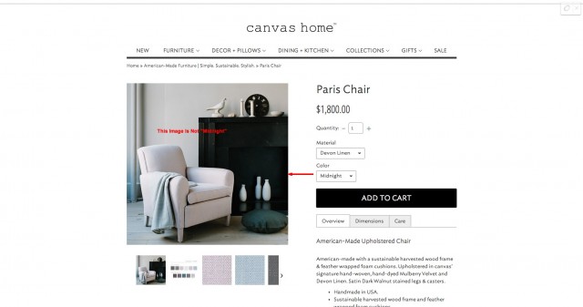
That’s not nearly as irksome however as selecting a color option & not having the product photo update to show what the product looks like. Looking at you CanvasHomeStore.com.
What I also enjoy about how Nike displays it’s alternative color options is the tiny bit of microcopy above the colors that let you know what the alternative versions of the shoe you’re looking at is called.
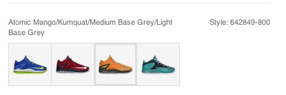
It’s a minor thing, but if I were to be persuaded by slightly different colors, it makes a big difference.
Looking at the Zappos site, the alternative color options seem to blend right in. At a quick glance, all 5 of the dark colored options look exactly the same. The only one that really stands out is the bright red pair (and I’m not buying those).
You may be thinking right now “I already have size & color options available” but looking at sites like Ikea & Zappos, I know you’re not immune to having your product variations tucked away in some place that gets overlooked.
People can’t click what they can’t see, so I think the next question you should ask is, “yeah, but are your product variations easy to find?”
There has been research that shows when merchants expand their existing product options (colors, sizes, better/lesser models, etc) that sales can increase. In auto sales this has been shown to increase sales around 5%.
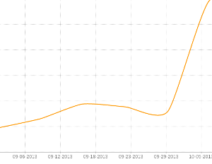
According to shopping cart company Wish, this graph shows the increase in products sold when one of their customers added more size & color variations to their existing products.
Though I wasn’t able to find an instance where conversions increased as a result of making the alternative options more visible, it stands to reason that if I can’t find the product in the size or color I want, I’m not going to buy it.
Here are some other examples of sites that do a phenomenal job showcasing their variations.
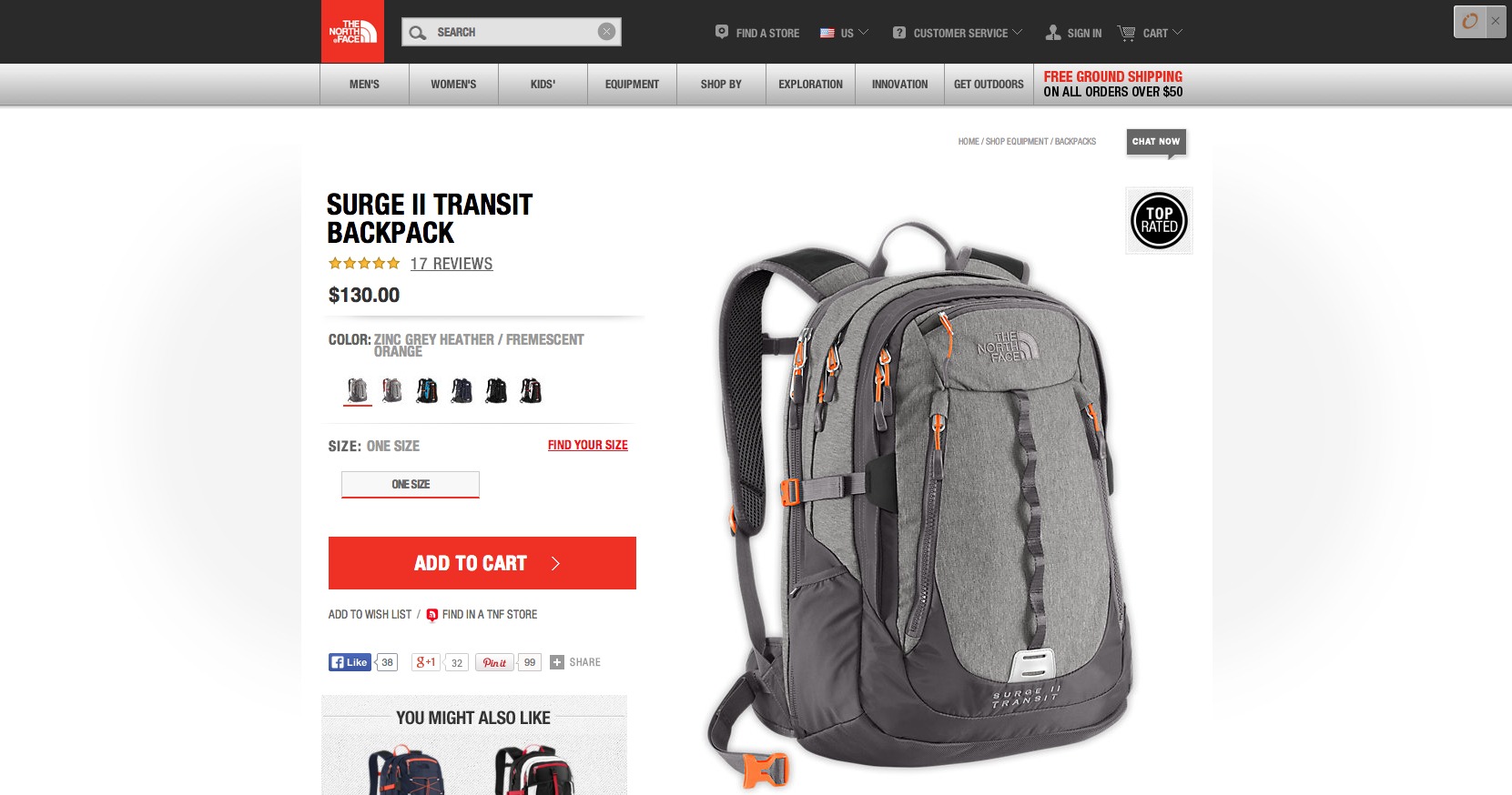
The North Face

Free People
There are two things I really like about Free People’s color options. The first is that the product photos completely update – often featuring different models with hair & skin types.
This is important as researcher Harry Farmer has found that “when a person looks similar to ourselves, we automatically believe they are trustworthy”
The second thing I like is that when choosing a color option, sizes are automatically highlighted or de-emphasized based on their availability.
House of Fraser
House of Fraser makes the color options easy to see, and what I really like is how they use real color from the photograph, instead of selecting from a generic color palate.
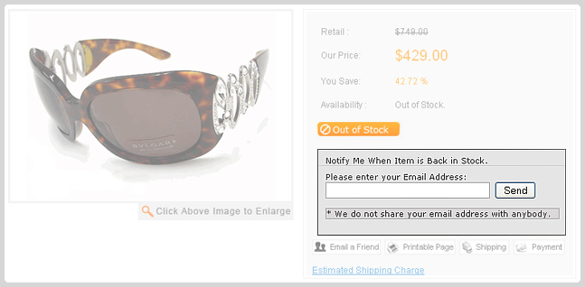
Highlight Out of Stock Products (& Give Them A Way to Get More)
Clearly highlighting when a product is out of stock sets the expectation for your visitor, and if done right, can actually provide you an opportunity for future sales.
Nike does an great job by showing what additional styles are out of stock near their additional options area…
… however missing out big time by not allowing visitors to be notified when this product comes in later.
For example, this Yahoo store plugin allows for “Buy Now” call to actions to automatically change over to an “Out Of Stock” button, giving the visitor the opportunity to sign up via email to be notified.
As my colleague Gagan Mehran pointed out to me, having this switch automatically can be costly as it would require your inventory management software to be able to update in real time.
However, having this mechanism in place might help to recover revenue that might otherwise be lost.
In this case study on MarketingSherpa, Jim Moore of Birkenstock Central talks about how their “Out of Stock” email campaign was able to recover 22.45% of sales that would have been lost due to the customer going to a competitor site.
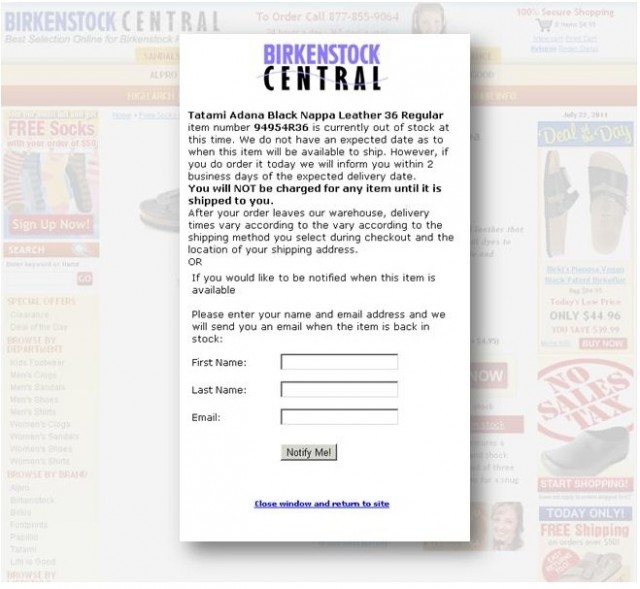
One of the things that was so effective about their strategy was having the visitor commit to the purchase, even though the product wasn’t currently in stock.
The “Back-In-Stock” email has also been able to generate over $13,000 in sales for UsedCardboardboxes.com, simply by letting previous viewers know when the company has had a big shipment of boxes that have come in.
Conclusion
If you’ve been wondering “where should I start with conversion testing?” dig into your data, and find out if these are areas where you could stand for some improvement.
Obviously these tactics are only a small fraction of how to make your product pages more persuasive, but hey, it’s a start.
- First Impressions Matter – The Importance of Great Visual Design
- How To Write “Compelling” Copy
- 17 Lesser Known Ways To Persuade People
- How to Use Cialdini’s 6 Principles of Persuasion to Boost Conversions
- 9 Things To Know About Influencing Purchasing Decisions
But if you really want to dig in, I highly recommend you check out the articles above for in- depth research, case studies, examples & actionable advice.
H/T to Gagan Mehra the help with the article.
Related Posts
-

If you're selling in a competitive market, you must live & die by the little things…
-

In today's review I'm reviewing 2 different ecommerce product pages. Watch this 5-minute review: Pages…
-

What happens when ecommerce sites run out of stock? Cue crowds of angry (would-be) customers…
-
Here's part 2 of my annual free mini-reviews. See first part here. Again, the disclaimer:…
