
If you’ve looked at enough SaaS websites, you’ve probably noticed a bit of a theme: home pages designed to act as landing pages.
They have minimal top navigation. Or in some cases, they have none at all. Their intent is to get their visitors to take a very specific action – usually sign up for a free trial of a service.
For conversion purposes, they can be a dream come true. Having a page that funnels people directly from offer to customer means less steps in the website journey process for them to get lost.
At least, that’s what they’re designed to do – making them a desirable option for any business that wants its visitors to take one action on the page.
The problem is writing copy for them can be a confusing process because it’s too easy to forget they often function more like a long form sales page than a traditional home page.
Table of contents
How much is enough copy?
Time and time again I get asked this along with its corollary: “How do I decide what’s most relevant to include in my copy?” It’s the classic long copy vs short copy debate.
My stock answer: It depends.
In fact, it depends on a lot of things – things like what you want your visitors to accomplish on the page, what information they need to make a decision to take action, or how aware they are of the solutions that exist to their problems.
And, you’ve got to consider all of these things while taking into account the fact that…
People don’t read online… except, when they do
This question of how much is enough copy keeps cropping up because conventional wisdom along with past research tells us that we’ve become a generation of scanners.
Back in 1997, the Nielsen Norman Group conducted the first study to determine how users read on the web. In their words, “They don’t.” 79% of the people in their study scanned, taking in only bits and pieces of the content on the page.
They tested how manipulating the copy on a particular website would improve users’ ability to perform assigned tasks. They found that by making the copy more scannable, concise and devoid of marketing hype, usability increased by 124%.
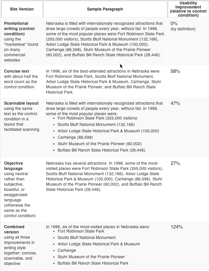
Measured usability of improved web copy from Nielsen Norman Group study
More recently, the same group analyzed 1.5 million eyetracking fixations from hundreds of sites to find out why certain pieces of copy do get read. They concluded that a combination of good information architecture, good page layout, and good writing were critical to converting scanners into readers.
Website visitors will read when they can quickly find the information they’re looking for and it’s presented in such a way that provides them with what they need.
Eyetracking example from Nielsen Norman Group study
Make the page as long as it needs to be, aka The Goldilocks Principle
So you’re probably thinking, if people only read what they want to read and scan the rest, keeping your online copy as brief and to the point as possible is the way to go.
Unfortunately, it’s a bit more complicated than that.
For conversion purposes, it requires as much copy as is necessary to help people complete the task at hand.
So if you’ve got a landing page directing people to opt-in to your mailing list, you’ll need to provide them with the words necessary to move them through the decision making process to share their email.
As the eyetracking studies show, just because people scan doesn’t mean they don’t read. Giving your visitors too little information or not enough of an argument to convince can be as much of a turnoff as being too wordy. The key is striking the right balance.
Which begs the question: “How do I figure out how much copy is just right?”
Start with identifying 4 key components
The length of your page is determined by a combination of what action you want your ideal customers to take and what information those people need to achieve their goals.
Your first step in making that determination is an understanding of the following:
#1. Goal of the page
Every page needs to have a reason for being – without one it just takes up space. Whether it’s an independent landing page designed to generate sales of a particular product or a cart page on an ecommerce site, each has a purpose.
Getting visitors to take action – or complete the goal you’ve set out for them – will require a different level of persuasive argument simply by virtue of what you’re trying to get them to do.
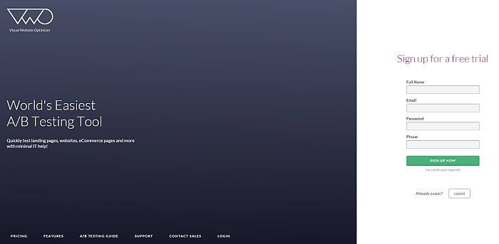
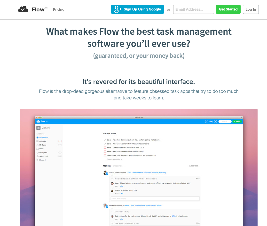
Take a look at Flow’s homepage. Flow, a task management software solution company, has made signing up for their service the overriding goal of the page.
While signing up for Flow is free, it still comes with the expectation that an account will be created and a service used. That entails a much larger sense of commitment than simply agreeing to be on an email list.
Scroll down the page and you can see how the amount of copy reflects this. The copy sets up the argument about the benefits of task management solutions and then gives the reader all the reasons why Flow is the one to choose.
#2 Your customers’ motivations
Know what makes your customers tick. It’s the cornerstone of all conversion rate optimization. And, it’s critical when determining how much copy you have to include to persuade your visitors to trip that trigger.
Why? Because without speaking to what brought your visitor to your page in the first place, there’s no way you’ll be able to tap into what they need to take action.

Whether you subscribe to developing customer personas or the “Jobs to Be Done” framework, using a tool that helps you get to the heart of why your customers want what they want will give you an insight into what and how much information to provide in your copy.
#3 Your customers’ fears, hesitations, concerns
Alleviating friction is an important part of increasing conversions. Friction associated with the copy on your page arises when you don’t adequately address the impediments to your visitors taking action.
This can be as simple as including a couple of bullet points near a button letting people know that a software trial is free and doesn’t require a credit card. Or, it can involve multiple paragraphs of body copy to back up your argument.
For instance, the folks over at Basecamp have made a point to nip common concerns about project management software in the bud on their page.
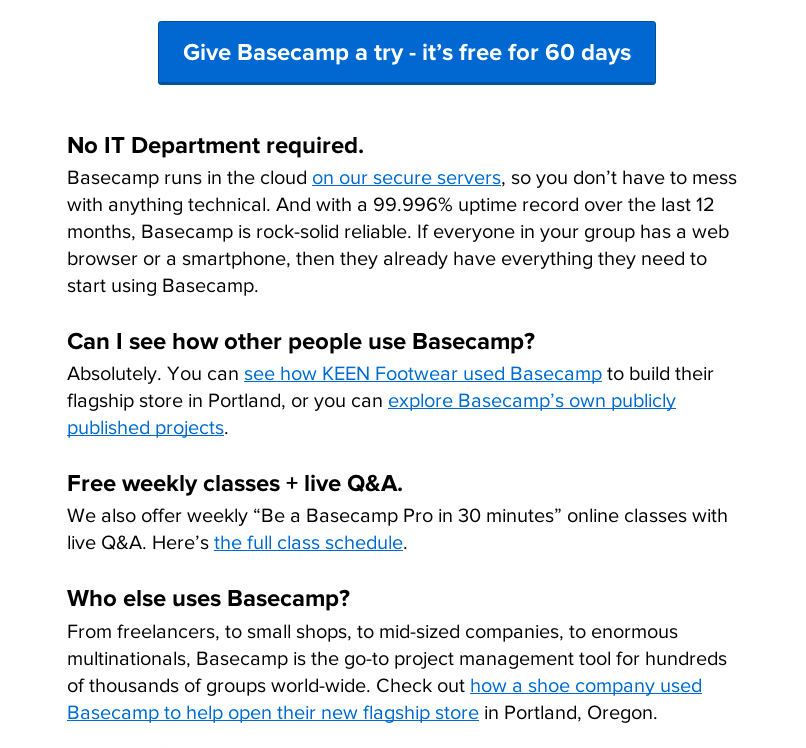
Clearly, they’ve found that people considering signing up for their service worry about ease of use, reliability, if others are happy with it.
#4 Your customers’ state of awareness
The last item to consider is how aware your ideal customers are of both their problem and the solutions available. How much persuasion involved in convincing a farmer that lives in Iowa to purchase an app that predicts rainfall will be far different than a surfer who lives in LA.
The famous direct response copywriter, Gene Schwartz, laid out the primary states of awareness that customers have in his book Breakthrough Advertising. Brian Clark of Copyblogger does a nice job in his synopsis of them:
- The Most Aware: Your prospect knows your product, and only needs to know “the deal.”
- Product-Aware: Your prospect knows what you sell, but isn’t sure it’s right for him.
- Solution-Aware: Your prospect knows the result he wants, but not that your product provides it.
- Problem-Aware: Your prospect senses he has a problem, but doesn’t know there’s a solution.
- Completely Unaware: No knowledge of anything except, perhaps, his own identity or opinion.
Thinking in terms of our farmer and surfer, the farmer is Most Aware while the surfer is more likely Solution Aware.
We need far less of an argument to convince the farmer of the utility behind knowing precipitation amounts. His livelihood depends on the whims of the weather growing crops in an unpredictable climate. The surfer… not so much.
Needless to say, this will directly impact how long our copy is.
For an extremely helpful way of looking at customer states of awareness, check out Aaron Orendorff’s post on using it to craft headlines.
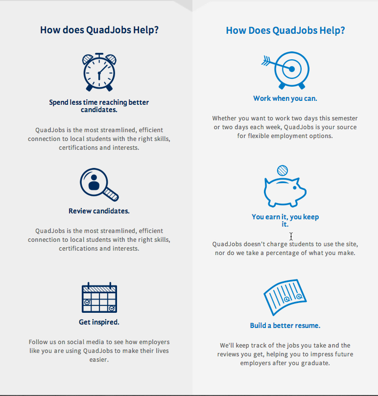
Real world application: Analyzing the Quadjobs home page
My good friend Betsy – partner at the startup, Quadjobs – kindly agreed to let me use her home page as an example. I’ve been giving the group feedback on their site’s copy since its launch a few months ago.
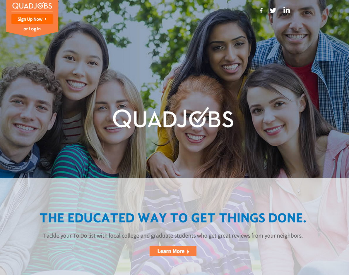
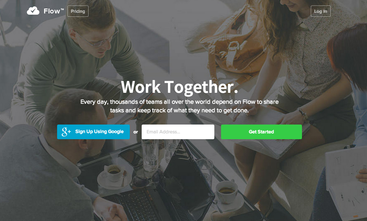
Quadjobs home page above the fold
The Quadjobs home page is similar in structure to a long form landing page as home page model. There’s no upper navigation and it moves the visitor down the page through a series of sub-headlines and design elements. There is meant to be one overriding call to action – namely, signing up for an account.
Breaking the copy down, point by point
Point #1: Defining the goal – getting employers and students to sign up
Quadjobs has one service – connecting students with part-time and odd jobs that individuals and small businesses post on the site. The primary call to action they want their visitors to take is signing up for the service.
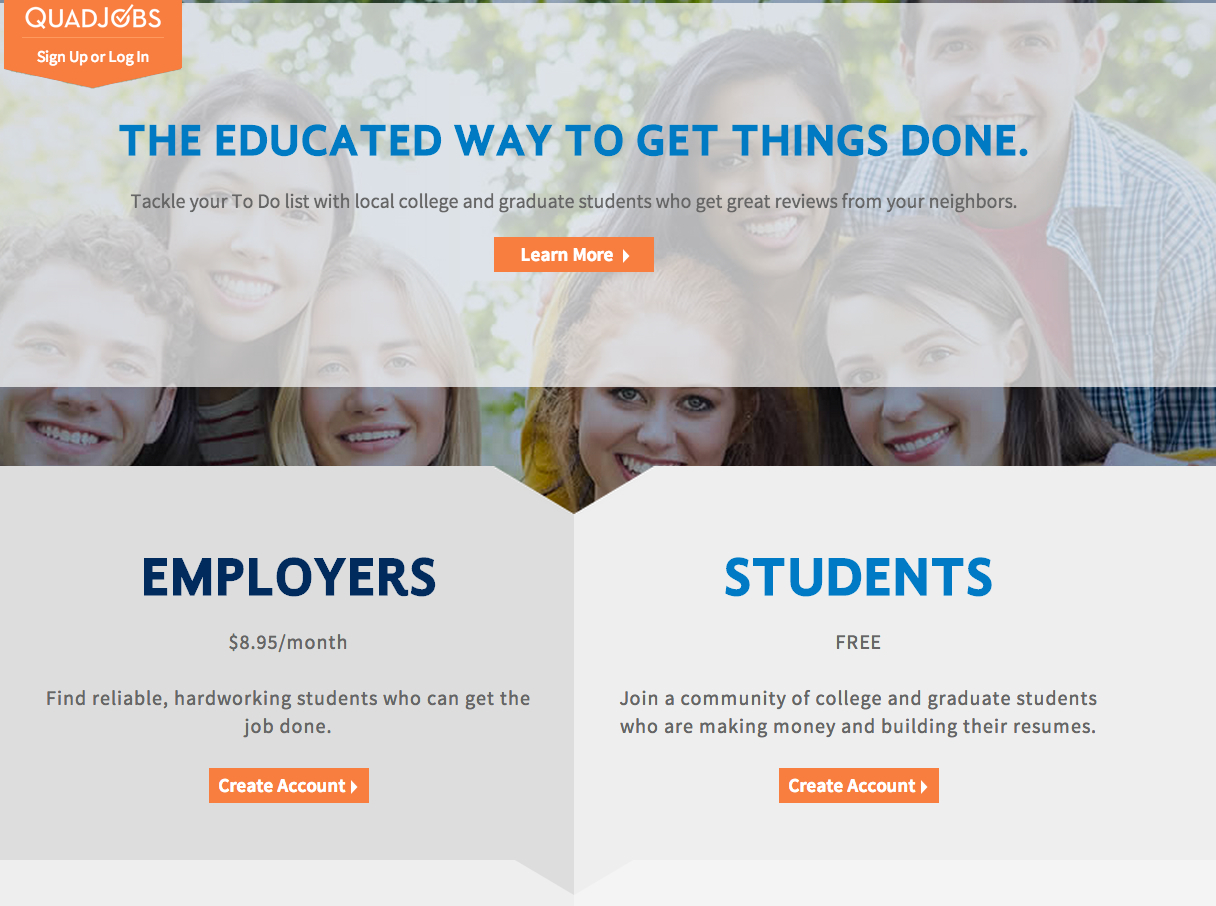
Scroll down just below the fold to see the main call to action.
The challenge for Quadjobs or any other business that needs to speak to two distinct audiences on one page is making it clear what you want each to do (I could write an entire post on this.) Suffice it to say, they take the route of dividing the page down the middle – addressing each equally.
And, they do it well.
Where the copy can be improved?
They have placed a “Learn More” button front and center in the hero section above the fold. Click the button and you’re taken to their About Page. This takes their visitors off the straight line to account creation.
Solution: Build the argument for taking action on the Home Page and get rid of the “Learn More” button
Because these types of home pages act as a kind of sales landing page, you’ve got to do a bit of “selling” if you expect people to take action. The Quadjobs About Page does some of that by laying out the why behind the business and the benefits of using it in more detail.
Unfortunately, to get that information you have to leave the path you’ve already started down. Altering course leads to distraction, which inevitably leads to compromised conversion rates.
I would suggest reworking the copy on the home page so that it better tells each audience what that they need to know to move on to the sign up page. This would include how Quadjobs:
- Understands their problems
- Has a solution that will fix them
- Is the best solution out there
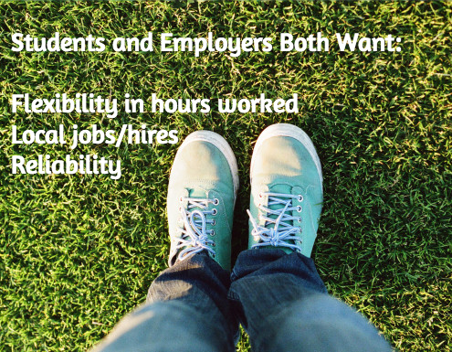
Point #2: Keying into what motivates employers and students while alleviating their concerns
So far, the majority of the traffic to the site has been warm with nearly 60% of it direct. Bounce rates are fairly low which means visitors have a good idea of where they’ve landed and what they will be doing there.
Move further down the page for benefits of signing up
Where the copy can be improved?
While visitors aren’t necessarily bouncing off the home page, employer sign ups are lagging behind those of students. Feedback via email and through a network of friends and family using the service has made it clear that employers want to know 3 things before they give up their credit card numbers:
- How many students are on the site
- What schools do the students attend
- What kinds of jobs are being booked
While all three touch on anxieties about using the service, they also go to a confusion about how the service works and the motivating factors behind using it.
Solution: Tell employers how others are using Quadjobs and highlight real students
One of the biggest places where the site falls down is a lack of testimonials, stats on user counts, and photos of real customers. Simply by adding in photos of employers describing the types of jobs they have had done and the positive outcomes, motivation and hesitation could be addressed.
As well, I would consider adding bullet points at the beginning of the Employer section that tell visitors who should be using the service, i.e. busy moms and dads, small business owners, etc. This provides context and makes it clear who the ideal customer is.
2 sets of prospects with 2 states of awareness
The partners ran a series of focus groups and informal interviews to pin down who their ideal customer would be and the best way to target them before developing the website.
While I haven’t looked at data from the research, my sense from our conversations about it is that we’re dealing with one set of prospects that are Solution Aware (students) and another that is Problem Aware (employers.)
The students are more likely to have used a similar service to find part-time work, while individuals interested in posting jobs have not. This means students need less of an argument and verbiage on the value in signing up.
Where the copy can be improved?
Not only does the headline and sub-headline in the hero section not adequately reflect Quadjobs’ value proposition but it doesn’t balance what’s most important to both audiences.
Writing a great headline isn’t easy. When you have to speak to two audiences at the same time, it can be more than a little challenging.
This is where looking at the overlap between the needs of both the students and the people hiring them occur.
Solution: Give both sets of visitors a value proposition they can sink their teeth into so they keep moving down the page
What makes Quadjobs unique is also what makes it so appealing. Finding someone to take on an odd job either around the house or in your small business – that’s intelligent and reliable – is easier said than done.
I would consider a headline/sub-head combination along the lines of:
The Place to Find Hardworking College Students
for the Jobs You Need to Get Done
From babysitting to catering… and everything
in between… tackle your to do list with flexible and smart help right in your backyard
By pulling together the attribute that sets Quadjobs apart and the problem it fixes in a new headline, it gives their visitors a more compelling reason to move down the page.
Once they do, it’s a matter of building that argument discussed in Point #1.
Conclusion: Sometimes less is more… and sometimes it’s just less
Whether you’re writing copy for a straightforward landing page or one of these hybrid home pages, there’s no one size fits all. It all depends on what you want your visitors to do and what they need to do it.
So before you decide the copy for your page should fit on one side of a Post It note, make sure you know what motivates and concerns your visitors first. Understand their state of awareness and how that might affect what to include or cut from your copy.
In the end, it’s not about short or long copy. It’s only about writing just enough to get the job done.
Related Posts
-

Which is better? Having a long home page with lots of copy, or a short…
-
In this post I'm reviewing 5 websites, analyzing their home pages - and mostly their…
-

When you’re putting together copy for a website you may not have the luxury of…
-
The home page of your website is the most important page. When you look at…

