

You know those sales pages that are really, really long? They’re great, but they mostly suck. I mean, the way they’re usually implemented sucks.
Long-form sales pages have their place, and they can increase online sales in many circumstances. (Hell, we use them.)
Think about it. The reason you have a website is because you want to sell something. If you have only a single product, there’s no real reason to have more than one page. The only information you need to have on your site is what helps the user understand the product (i.e. its benefits and use cases).
This helps consumers come to a decision as to whether the product solves their particular problem quickly. Clicking through several different pages only gets in the way.
Some call that format a mini site; some say one-pagers. Same same.
If you’re using landing pages to capture PPC traffic, and you want users to buy something, you’re probably (or should be) using a sales page, too.
Table of contents
Do you need long copy on a sales page?
The amount of copy you need depends on the complexity and cost of the product. The more complicated and/or expensive the product, the more you need to explain, show, educate, convince.
If you’re selling a box of matches for $0.25—and I need one—I don’t need to read any copy. I just buy it. The product is simple and cheap.
On the other hand, if I’m in the market for a new car or house—both complicated (many things to learn about them) and expensive—I will take weeks and months to do research, read, and compare.
If you’re selling something that costs, say, $300, I don’t need weeks, but I do need enough information before I can justify (to myself, to my wife, to my boss, etc.) such an expense.
Buyers are readers
Worried that your copy is too long? Don’t. If somebody is ready to buy after just a brief skim (having just read ~20% of the copy), they can just skip ahead and click “Buy.” No problem.
But if somebody reads all the text on your site and still has questions and doubts, then you’ve got a problem. This is why long-form copy works well for sales pages.
True, most people will not read the whole sales copy, and that’s okay. It’s not a novel. The consumers who do are the ones who are actually going to buy. As Ramit Sethi explained in an interview:
“My sales letter for Earn $1k is 47 pages long, but it converts very well. And when people read it, they will do things like this, they will nod their heads as they are reading the entire thing. We’ll see them stopping and we’ll see them resuming again. They’re really thinking about it.”
Are long-form sales page cheesy and scammy?
This is the reason I said that they mostly suck. I agree—most of them are ridiculously cheesy and scammy. You’re absolutely right. This is why a lot of people hate them.
Bad examples of long-form sales pages
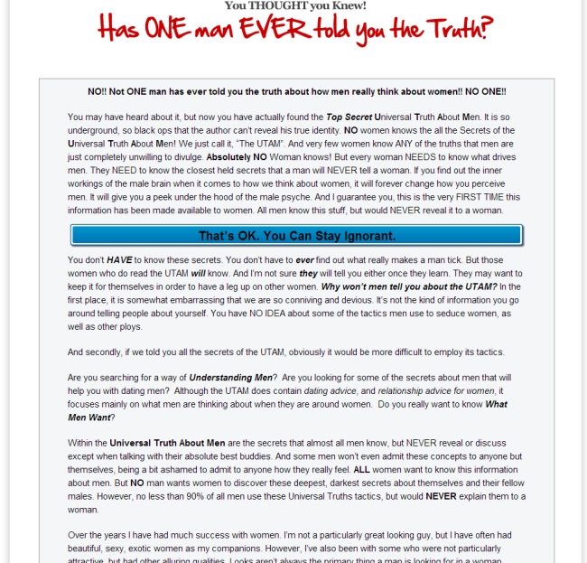
I went over to Clickbank and picked some random products from their marketplace. Here are three typical long-form sales pages:
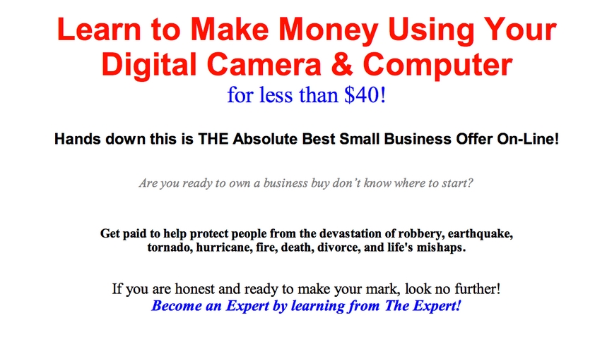
Bad example of a long-form sales page #1
Exclamation marks! Check. Hype! Check. THE Absolute best! Check. This must be selling like crazy. (In case you were wondering, it’s not.)
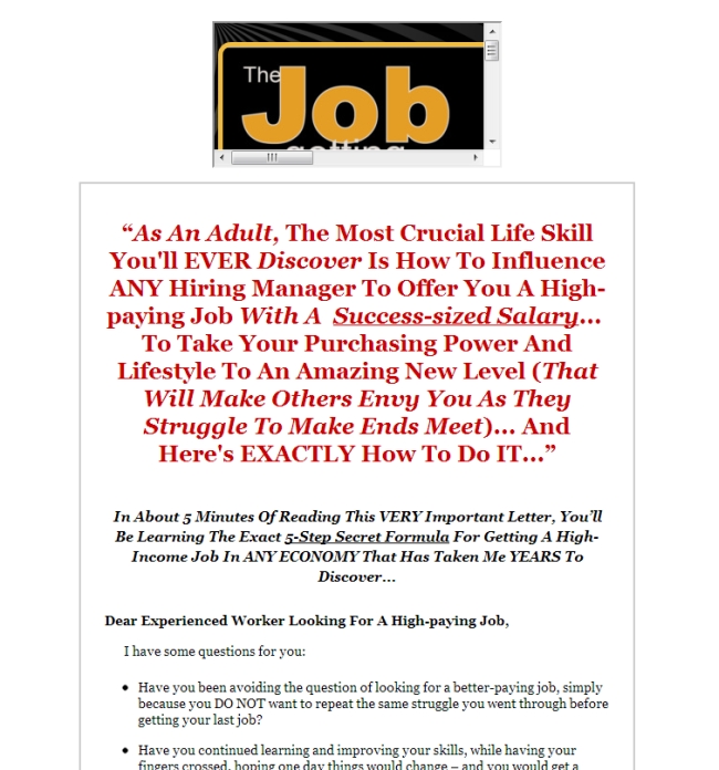
Bad example of a long-form sales page #2
They couldn’t even get their logo display right, and the headline is unreadable.
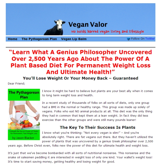
Bad example of a long-form sales page #3
Another case of a “proven” headline formula at work.
Some cold, hard truths about long-form sales pages
- Most of them look like vomit. Worse, actually.
- The copy is written by idiots who think that adding exclamation points and hype into every sentence boosts sales. (Grow up.)
- A lot of the products sold via long-form sales pages are actually scams. It looks like the easiest business—just create a PDF and start selling it. That’s why it attracts a lot of losers. The barrier to entry is extremely low, so any idiot can get started.
If you Google long-form sales copy, you’ll find lots of critical blog posts, such as this one, but you’ll also see that the criticism is all about implementation.
I want to remind you: It’s not the format that sucks. It’s the execution.
- Long-form sales pages can look great.
- It’s possible to hire somebody that can write great copy.
- Great products can be sold with long-form sales pages—not just shady infoproducts.
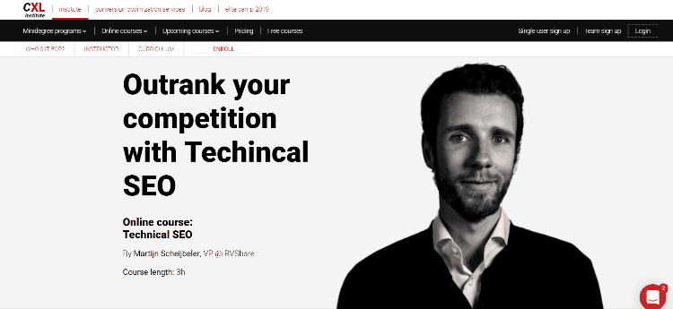
Here’s an example of a long-form sales page we use for CXL Institute. The copy isn’t cheesy. It’s not a high-pressure sales pitch. The page looks good.

6 tips for designing long-form sales page
Follow these tips if you want to craft a long-form sales page that converts:
Copy matters—it’s first above all else
Long-form sales pages are mostly about the content. To close the sale, you need really good copy. You don’t start to design before you have the copy in place. Content first.
You can write excellent copy only if you understand your target audience and master the “little things”—like knowing your way with words, understanding persuasion, sales psychology, and using proven frameworks.
Jerry Seinfeld should assuage your fears about long copy—if it’s good:
There is no such thing as an attention span. There is only the quality of what you are viewing. This whole idea of an attention span is, I think, a misnomer. People have an infinite attention span if you are entertaining them.
While Jerry was talking about television, his insights apply to sales copy. No one is going to read it—no matter the length—if it’s boring crap. It needs to join the conversation in the mind of the customer, target their problems, and show them how you’ll help them achieve their desired outcomes.
I’ve written a thorough article called “Quick Course on Effective Website Copywriting”, but note that this article is more about the process and less about the style or techniques.
Be careful about picking a copywriter
I’ve used a ton of copywriters for various projects. My best advice: Anyone worth hiring starts at $1,000 (usually much more, in the $2,500–5,000 range). You’re better off learning copywriting and writing your own copy than hiring somebody cheap. People who are cheap are cheap for a reason. (They usually suck.)
Of course, price alone doesn’t tell you the quality of the copywriter. There’s a myriad of jargon-loving “professional copywriters” out there (and I’ve had the misfortune of using several). If they’re using stuff like “leverage” and “our principals are standing by” in their portfolio copy, run!
A lot of them are also ego-driven (which is understandable—they’re human). But that makes them poor at taking feedback, fierce about justifying their choices, and results in mediocre copy (at best). Still, great copywriters do exist.
Decide what kind of copywriter you need
Another thing to remember is that brand copywriters and direct response copywriters are very different. We once hired a brand copywriter who had an impressive resume and had worked with all sorts of big brands in the past. She completely failed at writing direct response copy. She just couldn’t figure it out.
If you’re doing copywriting in-house, I strongly recommend this book. It teaches an awesome technique for improving copy through synergy and a systematic approach—without anyone’s feelings getting hurt.
It’s (almost) all about readability
So you’ve got good copy. Congratulations? Not quite. If it’s not structured and designed well, people aren’t going to read it.
First, there’s how you structure your text:
- Large font size (minimum 16px);
- Short lines (40–80 characters per line);
- New paragraph every 3–4 lines;
- Use lists, quotes, tables—mix it up;
- Sub-headlines every 2–3 paragraphs.
This is basic but oh so critical. No one is going to read a wall of text like this one:
Sub-headlines are completely missing. Most users will read only the headlines—they use it to garner the entire story from start to finish. Scanners will scroll down the page, stop at headings that grab their attention, read that content, and resume scanning.
Use novelty to keep users engaged
To make a lot of copy easy to digest and read, you need to design for reading. Provide novelty on every screen.
You have to change the layout constantly to keep it interesting. Sameness equals boring and drives people away. There are lots of psychological phenomena at play, which I’ve written about here.
- Neuroscientists say novelty promotes information transmission.
- Our minds gravitate toward novelty. Not only does a novel experience seem to capture our attention, it appears to be an essential need of the mind.
Our brain pays close attention to patterns and quickly learns to ignore anything that is routine, repetitive, predictable, or just plain boring. This makes room for paying attention to anything that’s different. Novelty is what gets people to pay attention.
Ever wondered why so many sites constantly alternate the position of text paragraphs—text on the left, then on the right, then back on the left, and so on?

It’s for the very same reason I just mentioned—novelty. It boosts the number of people reading the content. Sub-headlines and white space help to achieve the same goal.
Test a video version
Video can boost conversions, and long-form sales pages are no exception.
While video-only sales pages can be successful at times, in most cases video should be supplemental for the text. Most people will not watch the video. (The most interested people might.) The text content should be created with this in mind.
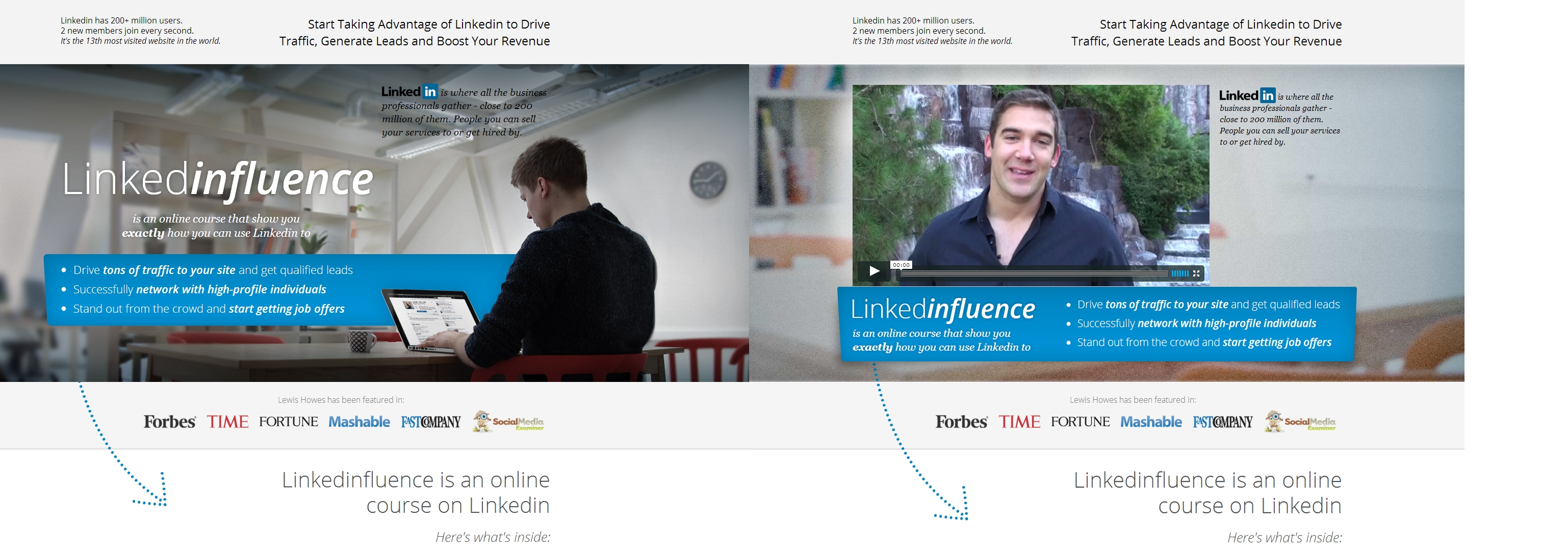
A while ago, we tested two “text-only” vs “video+text” long-form pages against each other. In the first test, sales pages were identical except for one thing—one had an image above the fold (left), and the other had a video (right):
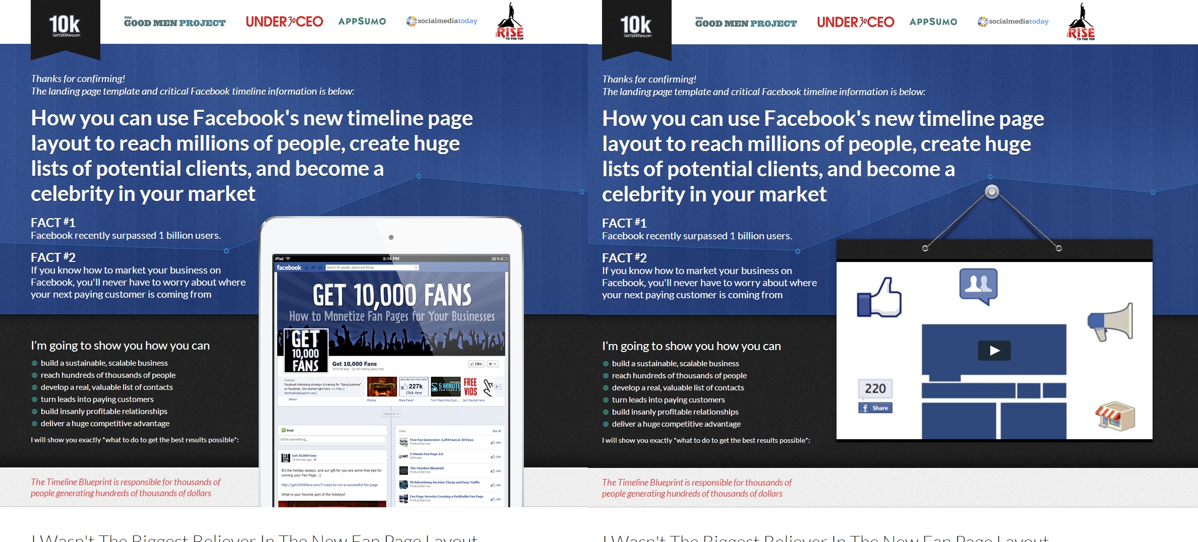
Result: The video version drove 46% more sales.
The second test was similar. Everything was the same except for the above-the-fold area.
Result: The version with the video got 25% more sales. (And, hard to believe, but auto-play converted 13% better here than “click to play.”)
Don’t make users leave the page
Sometimes, you have additional information that’s useful to some, but not all, readers. On “regular” websites, you could just link to a deeper page, but on mini-sites you can’t (or shouldn’t). So here’s what to do instead.
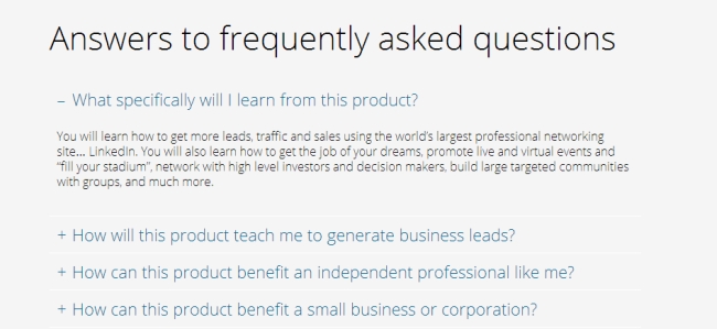
Expand/collapse information
In this example, a mini-site is used as a one-page FAQ. When you click on a question, it expands to show the answer. This design helps you make the page shorter and also makes it easier to find the question and answer readers might be looking for.
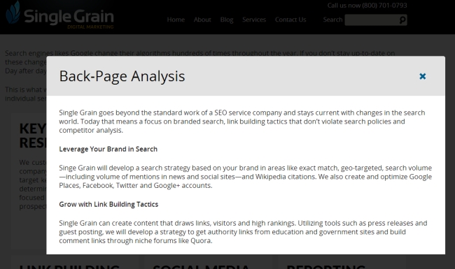
Open info in a lightbox
You can “hide” information behind a click, but instead of navigating away, open it in a lightbox:
Great visual design matters—a lot
Oh, where do I start. Design is half the marketing-and-sales battle. Great design builds trust and guides the reader. It also highlights important information and minimizes secondary content.
If your site looks like crap, the perception of your product will also be crap. Look at the three examples near the top of this article. Would anyone on the planet see those pages and say, “Yeah, these look like trustworthy sites”? Don’t think so.
Good design isn’t about bells and whistles. Great conversion-optimized design serves only one goal—getting people to buy. Any part of the design that doesn’t support this goal has to be changed or removed.
I’ve seen blog posts touting the idea that “ugly websites convert better.” In every case where this was claimed and where the “good design” version was actually shown, the good design sucked.
Here’s a screenshot from a forum thread:

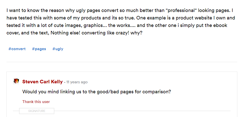
The thread starter never posted the pages for comparison, so a part of me thinks this is all made up, But, let’s look at what’s being said here. “Professional looking,” “a lot of cute images, graphics… the works.” Oh my god. Perhaps we should be thankful that they didn’t post screenshots. I can only imagine.
It looks like the reason that some people think ugly sites convert better is because they think sites full of business porn and image sliders typify “good design.” They just don’t know what good design looks like.
Let’s look at some of the arguments made for “ugly” design and against “good” design.
- “If your website looks BMW-fancy your visitor is going to assume BMW-pricing.” Give me a break. They can see the actual pricing. If BMWs came with Suzuki pricing, everyone would drive one. So if your site looks like BMW—but the product costs like Isuzu—you’ve got a winner. Also, iPads are still the best-selling tablets around. Ever seen their site (and the price tag)?
- “Trust – Nobody likes advertising.” Yes, trust is uber important. But it’s the other way around. Great design builds trust; crappy design kills it. The connection between great design and advertisers is stupid.
- “Accessibility – Build for technology two cycles back.“ The claim that good design is somehow not accessible is silly. Good design is most definitely built with accessibility in mind.
- Google, Amazon, eBay, Craigslist are ugly. First of all, they’ve never been “ugly,” always “good enough” (except for Craigslist). And in case you haven’t noticed, Google has undergone a design revolution and takes design very seriously. Both Amazon and eBay got a face-lift relatively recently. Craigslist is a unique case (there’s always one), and it’s a success since it’s always been like that. Try starting a new, unknown site today that looks like Craiglist and see how far you get.
- “Ugly websites are simple.” This is a non-argument. No reason why beautiful websites can’t be simple. Look at Simple, Blossom, Customer.io. There are a gazillion simple-yet-beautiful websites.
- “The content should always be the highlight of the website – not design.“ Yes, indeed. Design is always there to support content. But design helps users read the content, not the other way around. In fact, in ugly websites, the ugliness gets in the way of the content.
- “I tested ugly vs. a newer more sophisticated version and the ugly one won!” Without seeing the “better designed” version, it’s impossible to comment. My guess is that the better version had automatic sliders, stock photos, and other superfluous stuff. No wonder then. Until I see the ugly vs. good design side by side, these arguments are worthless.
- “See – here’s a case study.” In this case, the answer is given at the end of the article: “It has everything to do with providing the CTA in the correct place in the thought sequence.” The “pretty” version gives you very little text (poor copy, too), then asks for money. No wonder it didn’t work. The “ugly” version actually sells you the idea before asking for anything. Now, if they’d take the copy and structure of the ugly site, but make it look good—I bet we’d see improvement.
- “But this ugly site sells well!” I bet it would sell even better with a good design!
Any cherry-picked ugly site that converts well does not support the claim. The logic of “If X is ugly and sells a ton, then I’ll make an ugly site and sell a ton, too,” is a causal fallacy. What about all the beautiful sites that convert well. Oh my, a contradiction!
We’ve improved conversions on every long-form sales page we’ve worked on. Sometimes, by changing only the design! Give me an ugly page, and we will make it convert better.
People judge everything they see. We meet somebody new—we judge them by their looks. We go to a new place—we make up our mind about it based on its looks. Your friend gets a new car—we decide whether we like it based on the shape of the frame.
When people see your website, they form their opinion in less than 50 ms—and create a long-lasting impression. (If it’s ugly, it will haunt you even if you re-vamp your site. I wrote a whole post on the importance of first impressions that I recommend you read.)
These impressions have a strong influence on conversions.
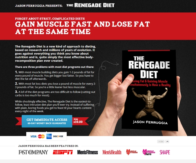
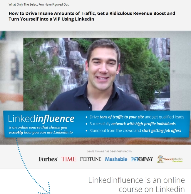
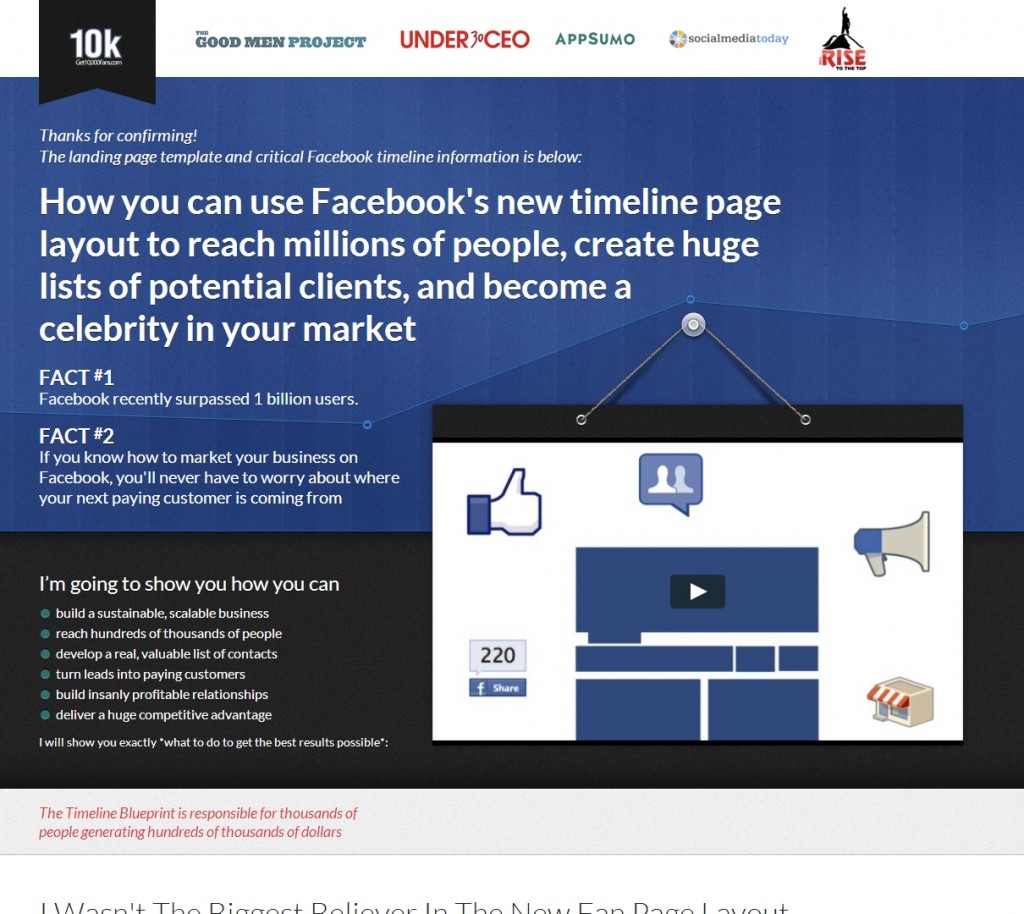
Three examples of awesome (and high-performing) long-form sales pages
Every single page converts very well. How do I know? We built them.
One of the best-selling fitness products.

LinkedInfluence
Notice that this version is slightly different than the one I showed above in the video test example. This one converts more than double compared to version they had before we came along.

The Timeline Blueprint
This was built in conjunction with a high-converting email capture page.

Conclusion
Long-form sales pages have their place. If you have just one product or service—or use a PPC landing page where you want people to buy something right away—it’s a good idea to use one.
Most long form pages suck. But it’s not the format—it’s the execution. Strong research, great copy, and good visual design have to go hand in hand to drive conversions.
Related Posts
-
Guest post by Pratik Dholakiya. If you practice CRO, you already know that the debate…
-

Don't design your own website. No, really. It will suck. You might think that since…
-
In today's review I'm assessing whether websites in question could do anything to better get…
-
In today's review, Tommy is assessing the visual complexity of a cabinet hardware eCommerce site…
