

Your users will make mistakes. It’s inevitable. That’s what error messages are for—but so many companies fail to follow best practices, and they’re pissing off potential customers in the process.
So, how can we better design error messages to improve the user experience and increase conversions?
Table of contents
How error messages affect UX
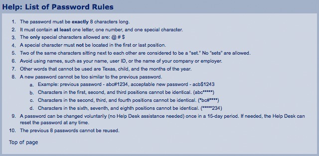
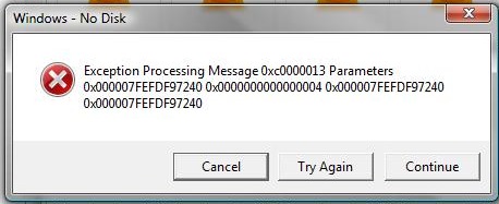
Error messages can be frustrating. How many times have you gone to fill out a form or create an account, only to receive a message like this?
It makes you want to drop what you’re doing and break something, right?
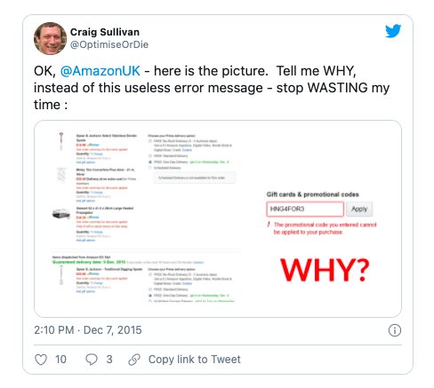
Another terrible experience is when error message text is ambiguous, prompting you to ask, “Well, why was that wrong?!” Craig Sullivan has a great example from Amazon:

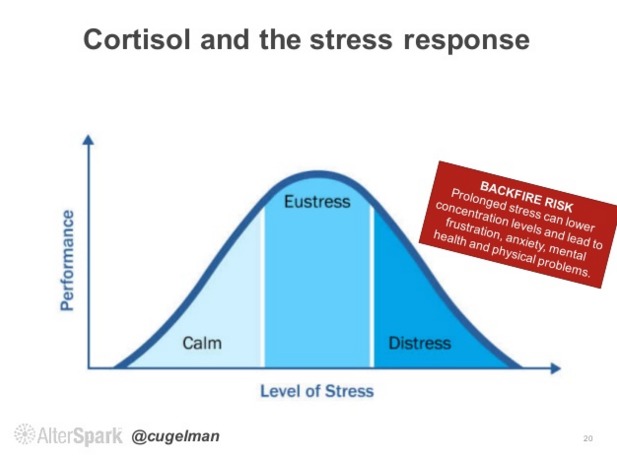
Error messages trigger cortisol, a well-known biomarker of psychological stress. That cortisol buildup can turn into anxiety and, eventually, cause a user to give up.
Sometimes, the damage isn’t only the lost conversion. It also turns someone into an active detractor for your brand. Investing in a better user experience tends to work in the short term (increased conversion rate) and over the long term (increased retention, brand loyalty, word-of-mouth, etc).
While error messages seem like a dry topic compared to value proposition optimization or gamification, you can vastly improve your user experience just by avoiding a few common mistakes.
Case study: Poor error message design
Ever booked a flight with Spirit Airlines? It’s not the best customer experience (to put it lightly). It warmed my heart to note that their error messages were also subpar.
I started by messing up everything on the registration form:
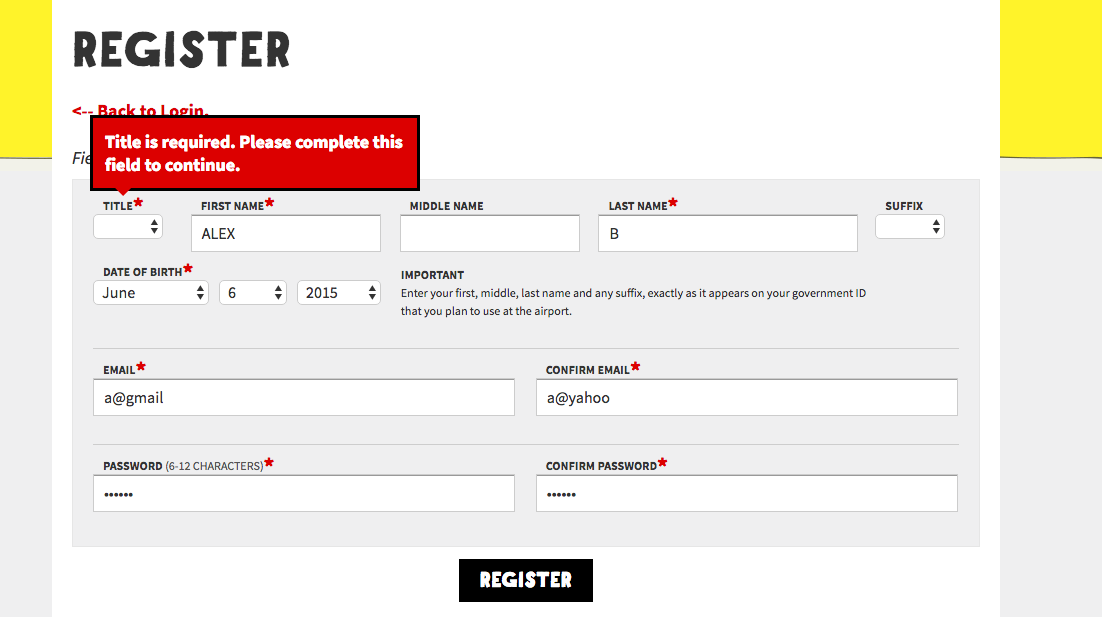
Uh oh, I didn’t inform them I was a “Mr.” Well, I fixed that, but then I was informed that I had another error:
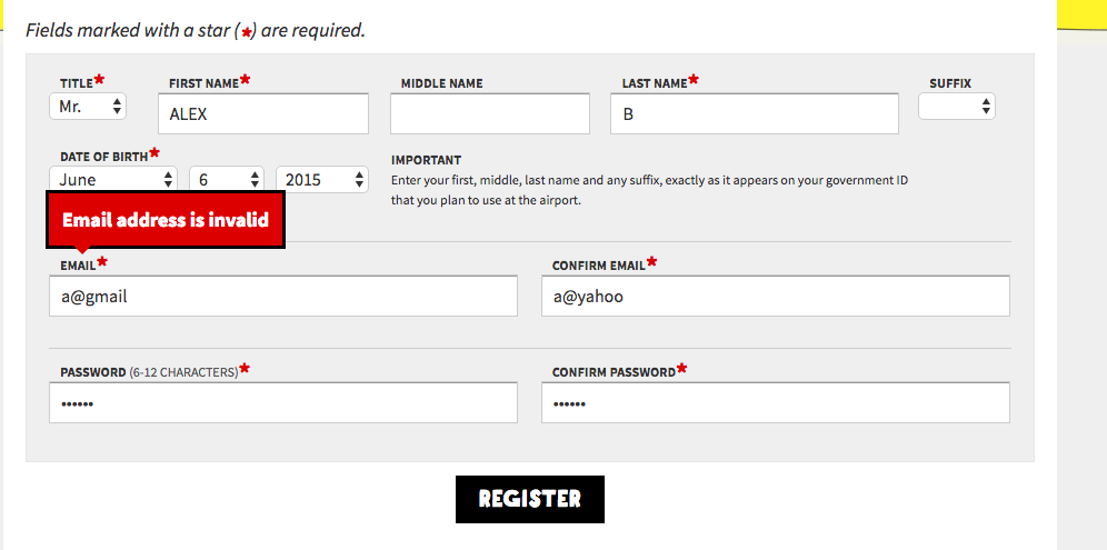
Email invalid? Good call. Forgot the “.com.” That’s a quick fix, but…
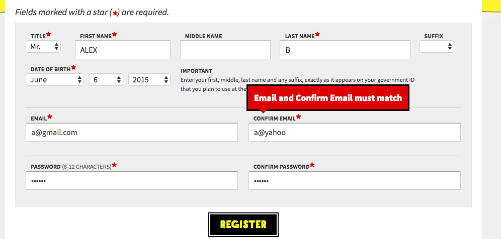
What is this? I also seemed had a typo in my matching email. I wish they had informed me about that when I was fixing my first email.
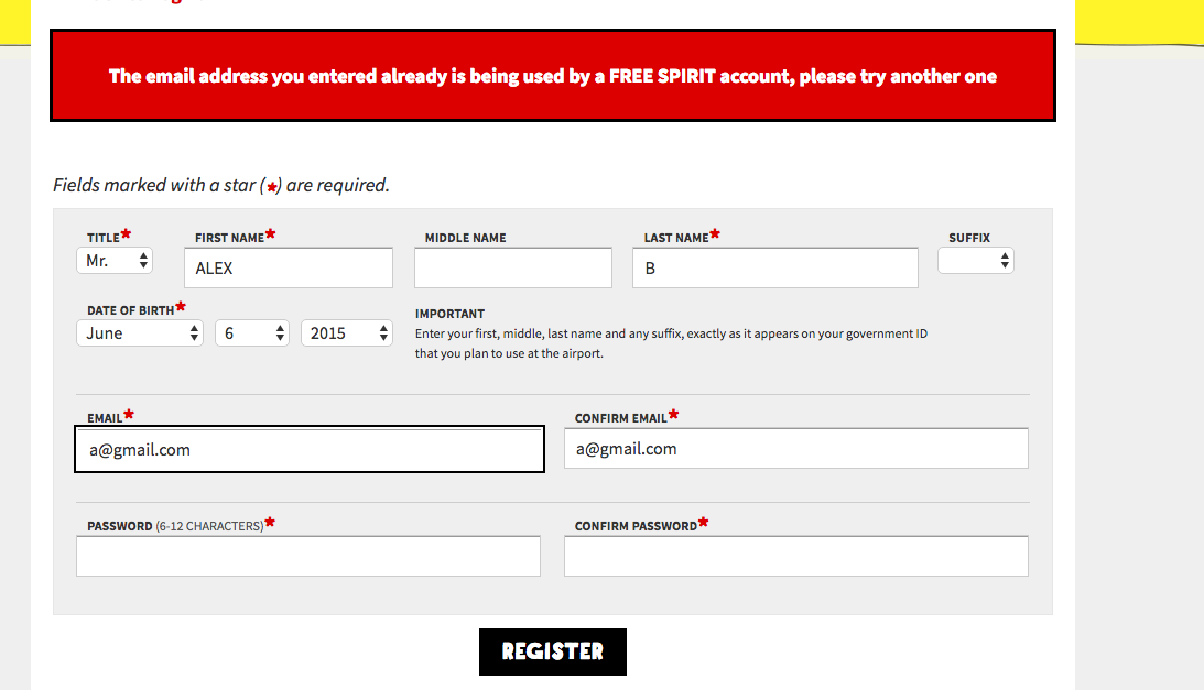
Well, apparently, someone signed up with my email already. I guess that’d be okay, but I wish they’d have given me a “password recover” option in case that was my email. Oh, and maybe they could have kept the passwords I tried to enter in the fields below. Dammit.
Not all forms are that bad, but many have the same common mistakes. Avoid them, and you’ll be ahead of much of your competition.
4 common mistakes with error messages
1. Ambiguity
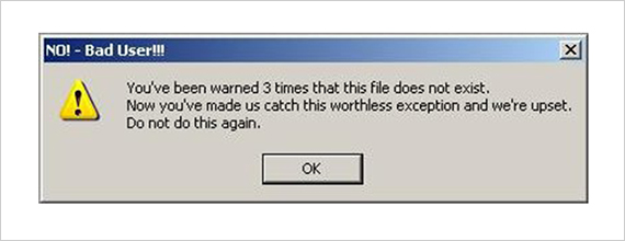
Your error messages should clearly define the problem. Ever gotten a message like the following?

Why? What the hell do I do now?
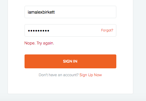
Below, Bitly tried to be “conversational” but failed to give me specifics. What’s not right? Username? Password? Both? Who knows. “Nope” also sounds condescending—almost mocking my mistake.
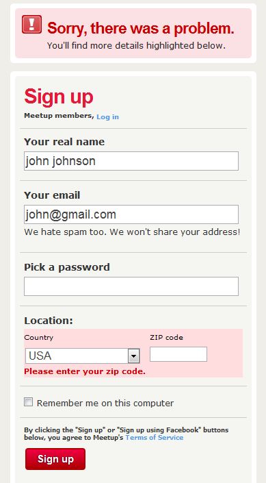
That’s a common one. A form should clearly demarcate your errors and tell you what to do, like Meetup does:
The bottom line is “don’t make your users think.” Let them know exactly where the error was, why it happened, and what to do about it. Improve your clarity.
2. Condescending language/blaming the user
Don’t scare the user into thinking the problem is worse than it is. Don’t make them feel stupid, either. It’s not their fault.
As Usabilla put it:
It is also important to be humble, admit you’ve made a mistake if you have. However, even if it is a user error we’re dealing with, NEVER blame the user.
They even gave a hyperbolic example:
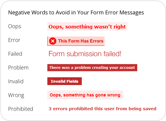
UX Movement cautions against using negative words: “negative words can make users feel like they’ve made a huge mistake, leading them to think the situation is worse than it is.”
They offer a few words to avoid:
3. Poor placement of error messages
UX Movement talks about this in their article on making error messages more reassuring:
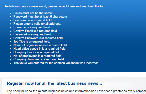
Error summaries magnify the seriousness of the mistakes when they’re grouped in a long bulleted list. When most users see that many errors at once, they’ll likely give up and forget about fixing them.
What’s more intimidating than seeing something like this after you hit “Submit”?
I like inline validation to solve this one. You get instant feedback, which is great for learning (more on inline validation later).
If you’re not planning to use inline validation, make it clear where the error occurred. The positioning of error messages is important but rarely considered. Here’s how Usabilla put it:
Finally, the positioning of your error messages are key. This all comes down to good User Experience design practice. Logical positioning not only saves you further detailing the situation, but also allows the user to quickly see where they are going wrong and – that word again – recover!
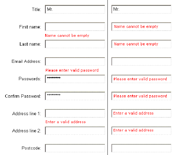
The following example is better than placing it all at the top, but it’s still ambiguous (e.g., “name cannot be empty” is between the first and last name):
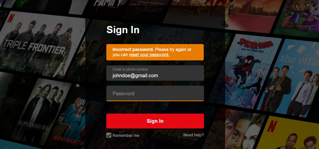
Users need to know where the error occurred. As Hazel Bolton noted, Netflix displays error messages above the form and only underlines the error field in orange. As she said, “the error could be missed or the fields hard to locate.”
Material Design has some documentation on this.
4. Unclear expectations
This mistake is so common—and so important to get right. Even if you have a nice, apologetic message, place it in the right spot, and make it clear what went wrong, you’ll still anger users if it’s unclear what they’re supposed to do next.
Many error messages don’t give you a solid next step. Take the example from Spirit Airlines. They could’ve given me a few options such as “Account recovery” or “Have an account? Log in here.”
Instead, they just said my email had already been registered.
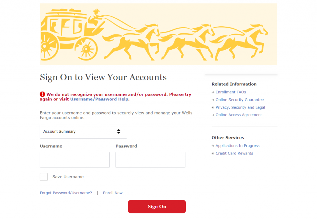
A better option comes from Wells Fargo (surprisingly):

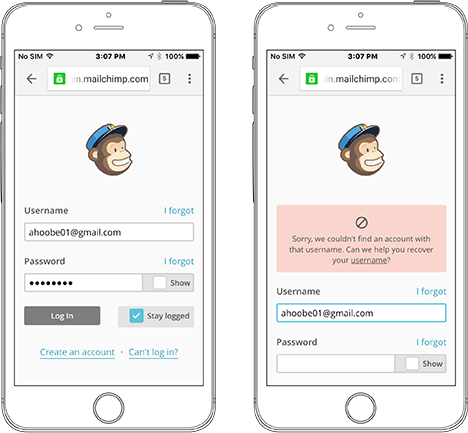
A superior error messages educates the user on how to fix it. Look at how MailChimp suggests a solution to the problem:
Even better, if you’re not flexible with the format of certain data, like phone numbers and zip codes (which you should be), it’s nice to let users know what to expect upfront. To do that, you can write some microcopy.
Use microcopy to prevent errors
Microcopy is defined as “the small bits of text/copy that help instruct and alleviate the concerns of your users.” It can help prevent form errors before they ever happen.
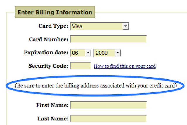
For example, Joshua Porter noticed that he got a ton of form errors on the “enter billing information” page. So, he added a tiny bit of copy to remind users to enter the billing address associated with their credit card. The errors went away, “thus saving support time and increasing revenue on the improved conversion.”
We recently experienced another example where microcopy could have helped. Peep was trying to fill out a form on a venue’s website to get a quote for an event.
However, he got a big red message saying, “There was a problem with your submission.” at the top of the page—a message plagued with ambiguity.
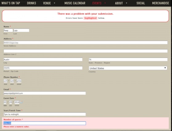
The error? He had entered a range of guests (rational choice, seeing as it’s hard to state an exact number of guests), but the form accepted only a single number. Of course, they didn’t mention this before he hit “submit.”
Microcopy that told users to enter a single number could’ve helped. (Though, with this example, their form has bigger problems than a lack of microcopy).
Error message best practices
Good error messages and bad ones result in wildly different user behavior. Read this anecdote from UX pro Jennifer Aldrich:
One day I had two users sitting right next to one another in a lab, one of them working in a 3rd party program and another working in our product. They happened to error out simultaneously. The 3rd party product displayed a giant red X, with the word ERROR in all caps and a pile of crazy script beneath it. The user gasped, closed the browser and shot back in his chair like the screen had tried to bite him.
The user who received the error in our product read a message similar to, “Something weird just happened on our end, sorry about that. Please refresh your screen and try that again.” The error code was listed in small text below the message, as well as an expand option for folks to view the error details if they so desired.
She grinned at me and said, “Oh boy, you’re in trouble now!” And refreshed her screen and continued editing.
Jennifer Aldrich
While I can’t tell you exactly what text, placement, color, timing, etc., will work on your site, I can tell you some design staples and best practices. Then, you can dive into some usability research, form analytics, and testing to figure out what works best.
NN/g offered the following best practices for error messages nearly two decades ago. This is still a good answer if you’re wondering what the parts of good error messages are:
- A visible and highly noticeable design, both in terms of the message itself and how it indicates which dialogue element users must repair.
- As much user’s work preserved as possible. Let users correct errors by editing their original action instead of having to do everything over again. For example, in presenting search results, show a search box with the user’s original query terms to facilitate revisions. If no hits were found, let users search a wider scope with a single click.
- Advice on how to correct the error with the least amount of work needed. If possible, guess the correct action and let users pick it from a small list of fixes. For example, instead of just saying “city and zip code don’t match,” let users click on a button for the city that matches the zip code they entered.
How to write good error messages: The 4 H’s
UXmas has a helpful framework for error messages that they’ve dubbed “the 4 H’s.” Error messages need to be:
- Human;
- Helpful;
- Humorous;
- Humble.
1. Write for humans (be understandable)
UXMas says the number one rule “is to make sure your error messages sound like they’ve been written for humans.” In other words, don’t do this:
Sounds like a robot wrote it.
Also, avoid jargon and technical/nerd speak (unless that’s your audience, I guess). Here’s what that looks like:
2. Make sure the message is helpful
According to UXmas, three factors go into making an error message helpful:
- Is it visible?
- Does it explain clearly what went wrong?
- Does it help the user recover?
We talked about this above. Position your error messages in an intuitive way. Make them red and clearly visible. Explain the problem. Offer a solution.
3. Use a touch of humor
UXmas says “keeping your tone light-hearted can help to keep the user on-side—especially if this suits the tone of your brand.”
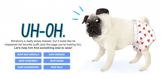
However, humor is contextual. It might frustrate them if you make light of their errors. It might work well. A 404 page is a great place to add some light-hearted humor (and a strategic redirect):
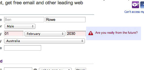
Yahoo has an amazing example of humor in their form validation:
4. Be humble when assigning blame
This one is easy: Don’t blame the user. We already talked about this above. Take the blame. Apologize and offer a solution.
What about inline validation?
Inline validation is a beautiful way to find, alert, and correct errors in real time. Instead of waiting until you press “submit” to learn of an error, you find out right away.
Here’s an example of inline validation:
The research on inline validation is solid. Luke Wroblewski tested inline validation (in 2009) against a control (after-submit validation). Though the sample was small, he found the following results with the inline version:
- 22% increase in success rates;
- 22% decrease in errors made;
- 31% increase in satisfaction rating;
- 42% decrease in completion times;
- 47% decrease in the number of eye fixations.
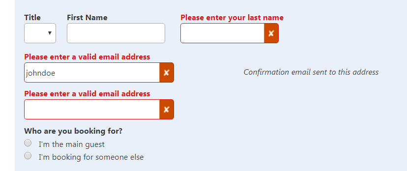
Not bad. Look into inline validation for your forms. A good example of inline validation is Booking.com:

How to track form errors
It’s nice to implement best practices, but it’s even nicer to figure out where people are falling off on your specific form. How do we do that? Well, we have to set up some way to measure form analytics, error messages, abandonments, and completions.
If you’re using a tool like Zuko, it’s relatively straightforward, just check out the Form Data view:

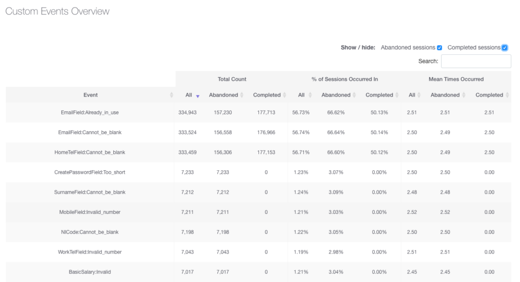
You can use the average corrections per form starter as a baseline. The goal, of course, is to reduce the number of corrections on a form field (and thereby reduce friction).
Tracking in Google Analytics
Use Path Explorations to see what your users are doing. Repetitive steps can indicate issues with form errors.
You can also set up scripts to track JavaScript errors on your page, which you can send to custom events in Google Analytics.
Conclusion
Designing error messages is all about limiting the frustration users feel with your form. If they’re too stressed—too much cortisol builds up—you risk them giving up to go watch Netflix or something. There are too many better things to do than deal with a crappy, complex, condescending form.
So, yes, do usability research yourself, but start with these error message best practices:
- Don’t blame the user.
- Write like a human, not a robot.
- Make sure errors are clear and messages are positioned intuitively.
- Make sure users know how to fix said errors.
- Don’t list all errors at the top of the page. Inline validation is a good solution.
Working on something related to this? Post a comment in the CXL community!
Related Posts
-

Have you ever wished for a tap to call button on a mobile site? Or…
-

Thinking about emailing influencers to ask them for backlinks or tweets? Most people are terrible…
-

In Advanced Google AdWords, Brad Geddes wrote, "Wouldn’t you like your ads to be sought…
-

If there’s a consensus about anything in the mobile market, it’s that mobile ecommerce conversions are…

