It’s a well known that most people do not buy from you on their first visit. In fact, a study from Episerver showed that “92% of consumers visit a brand’s website for the first time to do something other than make a purchase.”
While there are many factors that go into getting consumers ultimately purchase, popups can be quite effective at getting your visitors to buy but are quite controversial.
Whether you personally love it or hate it, the truth is, sticking a big ole pop-up in their face can be one of the most effective ways to jolt their attention & grab their email for a return visit.
Why?
It’s related to a persuasion technique known as the “pattern interrupt,” which is basically when something unexpected happens after the brain has become lulled into a rhythm. You’ll experience this frequently in negotiations, while watching movies & when watching comedians.
In the context of email & content marketing though, it’s particularly effective when the “interruption” proposes to solve the problem that the the reader has been tuned into, or programmed to expect given the nature of the service.
For example, our friends at Made.com offer a free £10 voucher in exchange for your email, because they know 1) everyone likes free money & 2) £10 is a small price to pay to have continuous contact through email.
In fact, according to ExactTarget’s data “Email” is far and away the preferred permission-based marketing channel by consumers. A staggering 77% of consumers prefer e-mail over other channels.
So maybe pop-ups might not be a bad choice after all?
NO, NO… popups suck, everyone hates them & they don’t work… right?
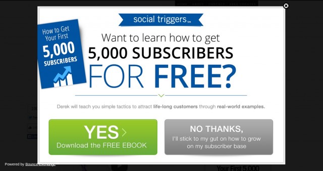
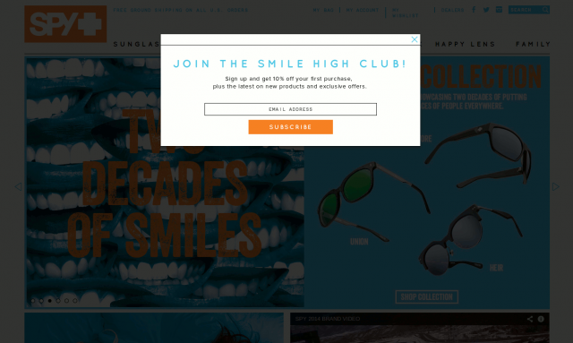
Don’t you just hate when you land on page and the first thing that happens looks something like this:
You may or may not know what’s on the site but are already bombarded with these popups. Definitely not a good first impression.
Ideally, I would want a few minutes to see what you’re all about before being forced to get my “FREE Traffic Generation Guide”, “FREE EBOOK” or hop on your newsletter.
Personally I hate when that happens, and the arrogant language like “NO I have enough traffic” and “NO THANKS i’ll stick to my gut on how to grow on my subscriber base” is not helping anyone either.
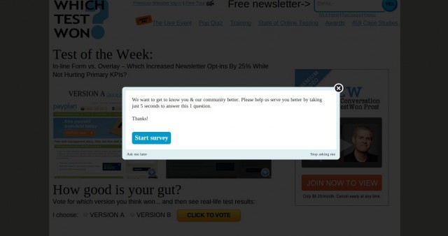
My personal preference aside, Exit Intel’s Matt Cimino disagrees:
Almost across the board, asking if they want it in a “Yes/No” fashion is almost always going to win.
It’s not about being snarky. We’ve tested “No, I don’t want to save money,” but the value is getting someone to accept or decline, not to feel unintelligent for not taking the offer.
Of course, there are exceptions. Here are the results of a pure “no thanks” test. The only difference in the creative was the copy.
Email Capture – No Thanks Copy
Unique Impressions
Email Captures
Capture Rate
No Thanks, I prefer to pay full price for my clothing.
165,416
9,928
6.00%
I am not interested.
165,625
7,961
4.81%
No Thank You.
165,021
7,616
4.62%
No Thanks!
166,072
7,433
4.48%
We’re looking at a lift as high as 34%. Variations all ran simultaneously to the same cohort of traffic, and for the same date range, at 25%/variation.
So… since this is an CRO blog, so let’s be a bit more scientific with this whole popup thing. Haters gonna hate, but numbers might have a different story to tell.
Let’s go ahead and see results in the wild of people who are using popups in various disguises and exactly the results they are seeing.
WP Beginner is a beginner’s guide to WP and on a normal day they would get 70-80 new subscribers from their different lead generation efforts from around the site.
Still, as is the case with most other online business, the more subscribers you have the more successful you will become. So they tried different lead-gen plugins until they found one that made a significant change to their bottom line.
So what did they do?
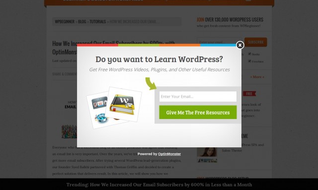
Using OptinMonster they designed a popup with exit-intent—which means that the popup only displays when you are about to leave the site. It uses mouse tracking and other variables to figure out when you’re about to leave and then BAM, displays the oversized popup like this:
What were the results?
Using exit-intent popups on only single posts and not site-wide on every page they saw an increase of sign-ups by 600%. They went from typically 70-80 daily new subscribers to 445 – 470 new subs per day.
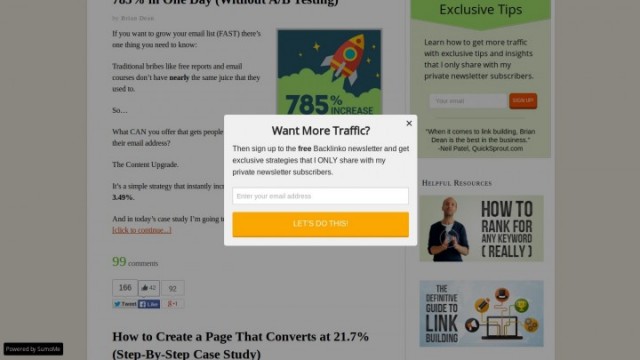
And they are not alone in this. Brian from Backlinko had an SEO training and link building blog that was getting a sizable amount of traffic The only problem was that conversion read for email sign-ups had dropped to an all time low of 1.73% .
So he messaged a friend who he knew could probably help him— Noah Kagan, and help he did indeed! He suggested using List Builder app in SumoMe— essentially a hybrid of different popup plugins that includes exit-intent technology.
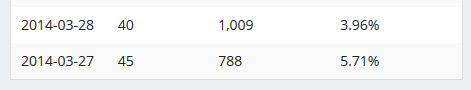
Remember how the conversion rate was hovering around 1.7% before using List Builder?
This is what the stats looked like after running for just 2 full days:
Over just 2 days, conversion rate went from under 2% to an average 4.83%.
In a world where we’re seeing case-study after case-study of 100% lift, 200% lift, 1300% lift a measly 3% doesn’t even seem something that should be mentioned really.
Let’s dig a little deeper and see what that 3% really means for Brian Dean & Backlinko.
3% Increase, Pffft… So what?
First off, Brian understands that by having his own email list, he hasdirect access to his customer base. With direct access he’s able to create content that serves his readers,& occasionally pitch a product or a service here and there.
That last bit is crucial, the occasional pitch helps makes his average list subscriber worth $15.
So a little math tells us that by adding 15-ish more subs every single day thanks to popups they are making $225 every single day which otherwise would be lost.
Stretched out over a year that makes $82,125 more. Not bad for something that took 2 minutes to set-up…
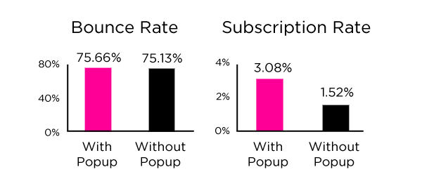
Popups impact bounce rate and overall user experience…Right?
One of my first thoughts when it comes to popups used to be that surely they will increase bounce rate—more people will simply close the window and move simply because of the popup.
What the guys over at WPBeginner discovered though, was that their bounce rate stayed the same with or without the exit-intent stuff. So no change, interesting. Same story with Brian from Backlinko—no change in bounce rate.
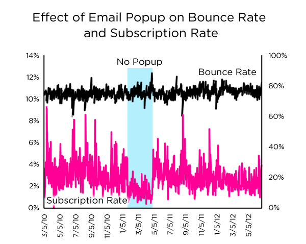
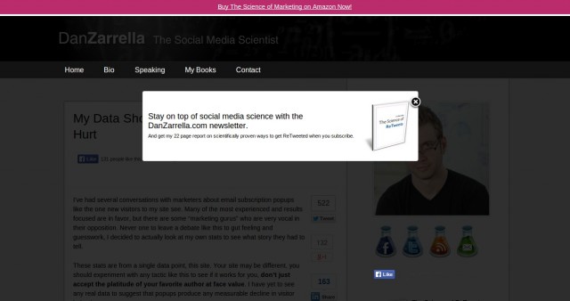
In fact, Dan Zarrella came to the exact same conclusion running tests with or without popups on his own personal page:
The only thing that really changes was that he got around 50% less subscribers thanks to not running any popups.
And when it comes to user experience…
…. Visitors don’t seem to really care about it at all. “We had absolutely zero user complaints” said the team from WPBeginner.
“NO ONE cared about the nano-second interruption. I’ve had the form on my site for almost a month now and no one has said a word about it.” added Brian from Backlinko.
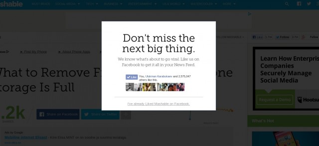
And when you think about it, it actually makes sense. Yes, it is frustrating to see something like this when I click through from Facebook to Mashable.com:
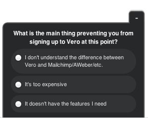
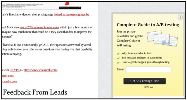
If I’m really smart I can actually use popups to enhance UX like Vero does. When you stay for longer than 30 seconds on their landing page and don’t take action a popup in the right corner of your browser window will appear asking “What is the main thing preventing you from signing up to Vero at this point?”
Popups can even be used to give the user an even deeper experience than they could have on their own. In this study, Garret Moon of Todaymade.com talks about how he created even more in-depth material for the high traffic/high bounce pages on his site.
Having this in place allowed Garret to have even more alignment with the user’s intent & resulted in him doubling the conversion rates.
Imagining this from the user’s perspective, this would actually be a pleasant experience, because this guide could very easily say “your search for this information is over.” especially if the quality of other information out there is lacking.
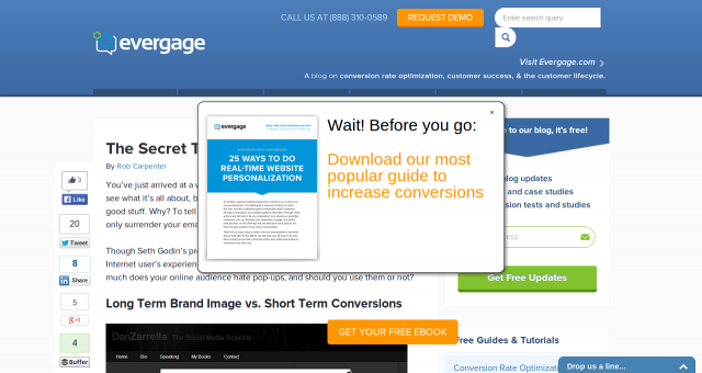
Still, you can’t just put any old popup over a page and think it will convert. When you don’t make the popup clearly visibly from the rest of the page, it will ruin the user experience:
I was about to leave their site and BAM! Can anyone tell me what just happened? It looks like their devs properly messed up their site—a CTA button in the middle of the page. What’s going on here?
Aaa, it’s actually a popup overlayed on a page that is not dimmed out. Not good.
Funny thing about EverGage is that that popup appeared on an article that is talking about making popups clearly visible. Funny people those EverGage guys…
When you don’t make the popup clearly visibly from the rest of the page, it will ruin the user experience—as simple as that.
I Was Wrong, And It’s Ok
It turns out, I was wrong about popups. As annoying as they sometimes can be, they turn out to be damn effective. There’s no denying that if something makes you more successful and brings in more money with little to no negative effects you probably should be using it.
How to make popups work for you
Before we go into the inner workings of popups, let’s first see what are the different types of popups one can run.
These look like the above one—they take over the whole screen, dimming the background and making the popup the only clearly visible element on the page.
The trend has been to use as big as possible popups and they are the ones that you see most often. Still, Dan Zarrella uses one that dims the background but is not as big as one might expect:
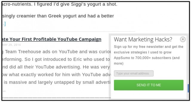
User scrolling triggered popups
User scrolling triggered popups are the ones you see on blogs most often. They show up when the user has scrolled down on the page to a certain extent. They’re ridiculously effective.
Thinking behind that is that the user has had the opportunity to see the quality of your work and then it appears on the left hand side.
We use them on CXL. About half the subscribers join our list this way.
When you have gone through about half the article it will appear like this:
Depending on the software and/or plugin you’re using to display it, it’s possible to experiment with the scroll depth – e.g. how far or long the user must reach for it to appear.
Another way for triggering popups is by time on site. But instead of triggering on some random, arbitrary time interval, check your average time on site for “non-bounce” traffic, and trigger the popup at the “sweet spot” in the data.
For us, this would be be somewhere right around the 6o second mark.
This is where most people make the decision whether or not they’ll leave or stay, so by triggering the popup right at the moment of truth, where people are either engaged or disinterested, we can capture the attention of those who might want to build a relationship with us, and not even bother with those who wouldn’t sign up anyways.
Data from AppSumo (makers of SumoMe) and eConsultancy show that benefit driven headlines and button copy do the best in terms of getting people to take action on your popups:
Everything we wrote in the Mastering The CTA article applies here since, well, all an popup really is an CTA to get more leads/subscribers/customers. So do yourself a favour and read that one before you go into testing your own popups.
Is there A best time to display popups?
In this section will cover mainly timings for big ass overlays as they have more options and possibilities to play with the timing. With user scrolling triggered popups it’s pretty straight forward – you simply choose the time and that’s that.
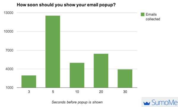
When it comes to testing timing of big ass overlays— data from SumoMe shows that with their users find that the best time by far is 5 seconds. Meaning the overlay appears after visitors have been in the site for 5 seconds.
When WhichTestWon started experimentingwith overlays they tested showing it 15, 30 and 45 seconds after the visitor had landed. In their testing the winner was 15 seconds which beat 30 seconds by 11% which beat 45 seconds by 50%.
And if they would had tested showing it even earlier they would have seen ever better results – right???
No “Best” Time For Popups. Test It, Stupid
As with pretty much EVERYTHING in CRO – there is no substitute for testing it out on your product/service on your visitors.
Unbounce says that best time is 60 seconds so I should use the same? No.
Mashable shows popups right away when I click through from Facebook but not when I land from other sources so I should do the same? Wrong again.
Their data might work for you, it most likely will not. Test it.
And while we are on the subject of testing, one obvious thing to test to start off is if the damn popups even work for you or not.
Dan Zarrella did that and found that not running the overlay cost him half of his email subscriptions:
Everything I said about when to display popups also applies to the how many times question.
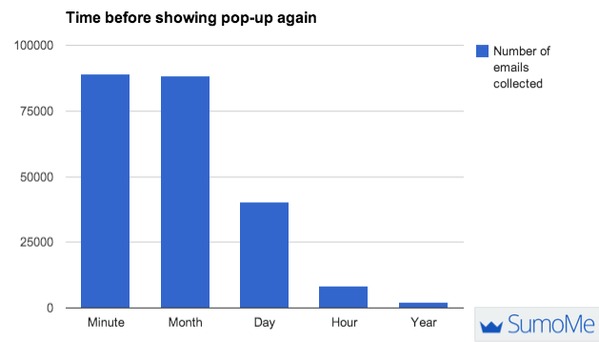
Data from SumoMe might tell you that there is no significant difference between showing it all the time and showing it once per month. But in reality, it again depends on too many variables to say for certain.
At best those “best times” for anything are a good starting point for running your own tests.
Almost The End—Software Options For Running Your On Popups
So far we have covered everything from types of popups that exist down to timing after visitors land and how many times to show it during a session.
So now, finally, let’s list sumo of the most notable providers of software that make it all possible.
Pop-ups can work, very well. For us at CXL they account for 30% more subscribers each month. That’s ridiculously huge amount of additional subscribers every 30 days. Open rates, CTR rates are the same for people who joined through a static form design.
Another interesting tidbit—the more email capture mechanisms, the better. We already had static forms and scroll triggered boxes. When we added popups to the mix, we got +30%. It’s insane, I know.
Do they work on every site? Of course not. Do your own testing.