
AMP for email is, at this point, a trend. Will it become a standard practice?
There are pros and cons. The latter, in particular, relate to the still-in-progress status of the technology and required skills for implementation. But there are potential benefits, too.
This post walks through everything you need to know.
Table of contents
What’s the point of AMP for email?
AMP is an abbreviation for Accelerated Mobile Pages—an optimized HTML framework to speed up web pages on mobile devices. The project started in 2015 and was a collaboration that included Google, Twitter, Pinterest, LinkedIn, and WordPress.
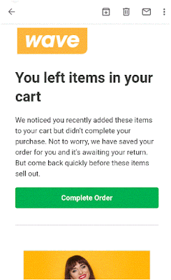
The idea of applying AMP to email came a bit later. In this case, the goal wasn’t about performance but interactivity. AMP lets senders embed image galleries, add feedback forms, and insert product cards to buy right inside emails.
Moreover, senders can refresh content in real time—AMP allows for dynamic data. Imagine an inbox message where prices, available products, and active discounts change according to the current situation, just like landing pages on a website.
Several email service providers support AMP implementation, and some HTML template builders offer AMP-powered features to increase engagement and conversions.
A year has passed since the release. Yes, we all see AMP emails in our inboxes. Still, adoption is lower than expected. Why?
AMP email: drawbacks, risks, and workarounds
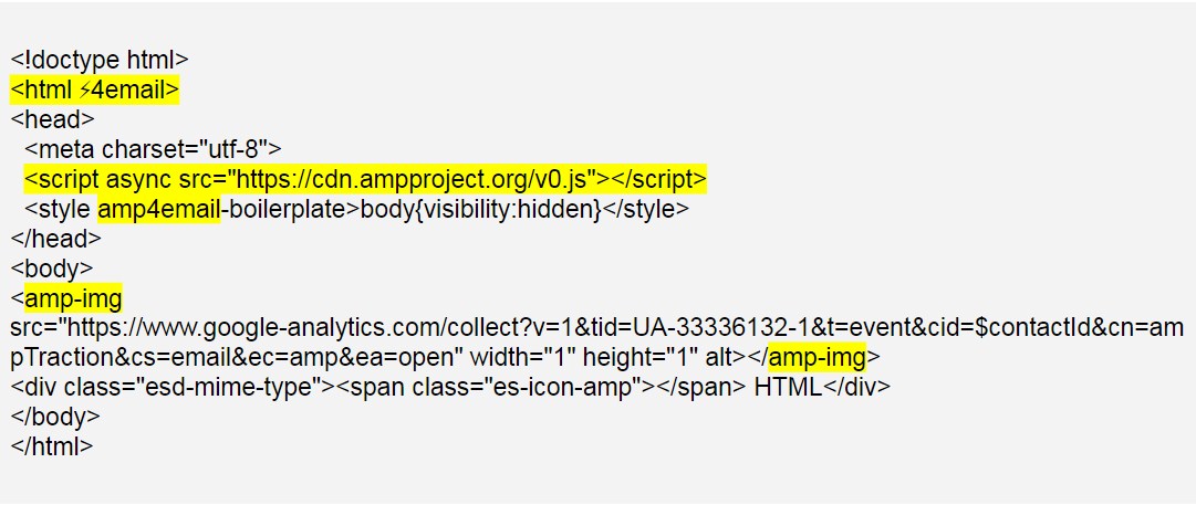
First, AMP email is a new framework. It requires senders to add a new MIME-type to email code.
This problem is on the senders’ and services’ sides but can be managed with email tools that automate the creation process with:
- Ready-made templates and blocks;
- Required MIME-types and AMP HTML code fragments;
- Web-safe fallbacks.
So let’s skip this one and dive into the thornier issues.
The anti-AMP crowd
AMP for email isn’t without its detractors. As Devin Coldewey writes in Techcrunch:
AMP is, to begin with, Google exerting its market power to extend its control over others’ content. Facebook is doing it, so Google has to. Using its privileged position as the means through which people find a great deal of content, Google is attempting to make it so that the content itself must also be part of a system it has defined.
Further, Coldewey continues, email isn’t supposed to have an interactive component, which fundamentally changes what email is and risks undermining what it offers: “It works reliably and as intended on every platform, every operating system, every device. That’s a rarity today and a hell of a valuable one.”
The critiques were present with the web-based rollout, too. As Barry Adams argues:
People use Google to find content on the web. Google is just a doorman, not the destination. Yet the search engine has epic delusions of grandeur and has started to believe they are the destination, that they are the gatekeepers of the web, that they should dictate how the web evolves.
[. . . ] Google wants a cleaner, tidier, less diverse web, and they will use every weapon at their disposal to accomplish that. Canonical AMP is just one of those weapons, and they have plenty more.
The reality, of course, is that adoption follows marketing opportunity—we may not like AMP, but if AMP results dominate the first page of Google search, taking a principled stand that has sharp economic downsides is a hard sell.
The same is likely true with email: Regardless of whether you think it’s a good idea, others will make use of it. Even if you decide to be a last-call adopter, you should keep an eye on the value others get from it.
Security breaches
To understand this problem, we need to visualize how AMP-based transfer works. Dynamic content is stored on servers, not in the email body. Consequently, all the changes and updates are done outside the email.
Some types of AMP content are safe, like imagery in AMP carousels. But it becomes risky when content requires feedback interactions and sharing customers’ data.
Embedded AMP blocks function as receivers and transmitters. They connect to servers (endpoints), where all dynamic content is processed. AMP blocks in the email only display the information and provide recipients with options to interact and send feedback.
The chain looks like this: device > AMP email > external server. While it seems straightforward, a threat lurks within:
The AMP element may become a backdoor. By default, embedded transmitters have permission to connect to endpoints. Moreover, they have the potential to access credit card info, passwords, and other confidential information when recipients confirm an action, click a CTA element, fill out a form, etc.
Phishers and hackers could spread AMP-based malware that copycats trusted emails, letting such elements masquerade as “legitimate” requests while, in reality, stealing confidential data.
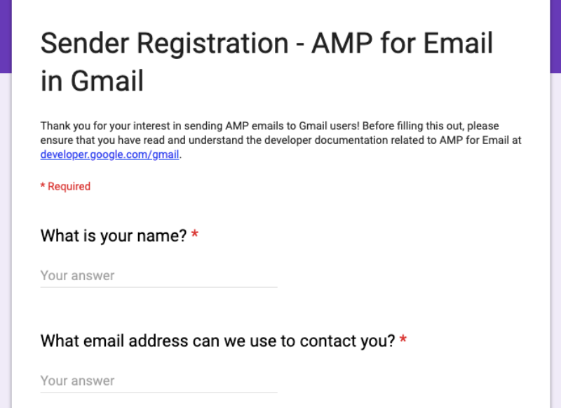
There’s an effective solution that Google, Outlook, and others use. But it requires whitelisting.
Whitelisting and its sequence
For security, there’s a strong advantage when an email service whitelists senders and gives them permission to send AMP campaigns. It prevents the aforementioned cyber crimes.
Those who are going to implement AMP in their strategies may be annoyed by this process, but whitelisting is a one-time challenge. Completed successfully, you’ll have lifetime permission to send AMP emails.
The process looks like this:
- Create a message that represents your unique brand and includes at least one AMP element.
- Choose the AMP-friendly email service provider you’re going to use.
- Verify your AMP HTML code—it should contain no bugs or syntax errors. There are AMP validators, like this tool.
- Authenticate your sender’s settings. On Google, Outlook, etc., you can find the detailed descriptions of SPF/DKIM/DMARC.
- Verify your sender name.
- Check your XHRs destination.
- Prove sender history. You have to provide proof of your sender’s reputation and low spam rates.
- Send your first AMP email to Google/Outlook/etc.
- Fill out the registration form.
When all the stages are complete, be patient and wait. After a few days, you’ll receive an answer. The approval is human-based, so it takes time.
Should you bother? Here’s a rundown of what you’d be able to add to your emails.
7 AMP-powered email elements you can use
Let’s go through the types of AMP elements frequently used in email marketing today.
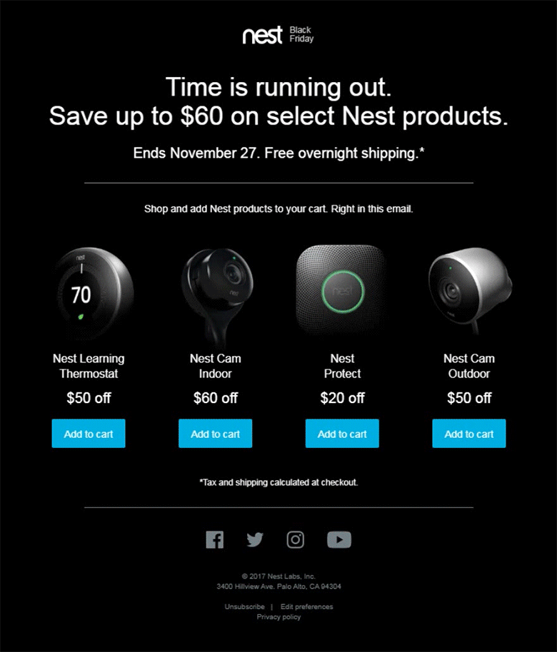
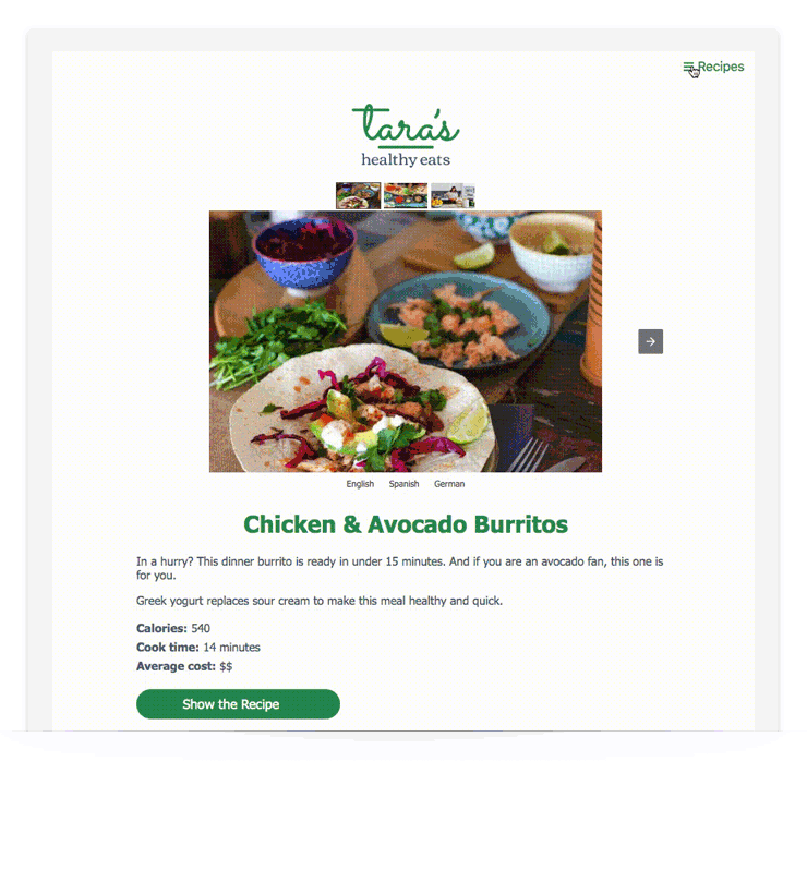
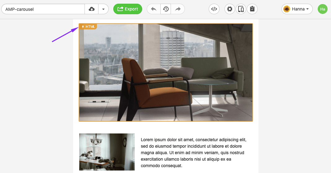
1. AMP image carousel
A convenient, visually pleasant, and space-saving block to showcase several images.
Image carousels—while a bad idea for homepages—can be a good solution to present, for example, multiple images of a home for sale or to arrange product setup instructions in a sequence of visualizations.

2. AMP accordion
The accordion feature can organize content in a structured way. It saves space and can be used for product categories, content menus, FAQs, etc.

3. AMP sidebar
A collapsible, accordion-style menu gives you the potential to deliver multiple content ideas (e.g., a slate of recipes that use similar ingredients) in a single email.
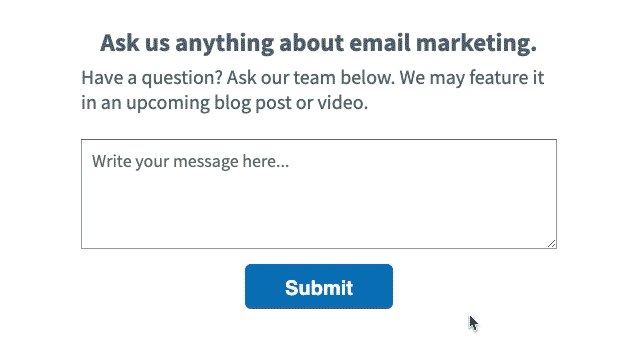
4. AMP form
This one is a specific block to collect user feedback right in the email. If you’re trying to gather survey data, it may help with response rates by saving users a click.
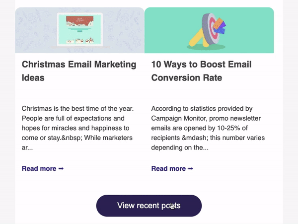
5. AMP list
In this block, users see the content refreshed in real time. This tool makes emails not only informative but also long-lived. You can update content or offers in perpetuity.
You’ll save user frustration and customer service time spent explaining why a promo is no longer valid or product no longer available.
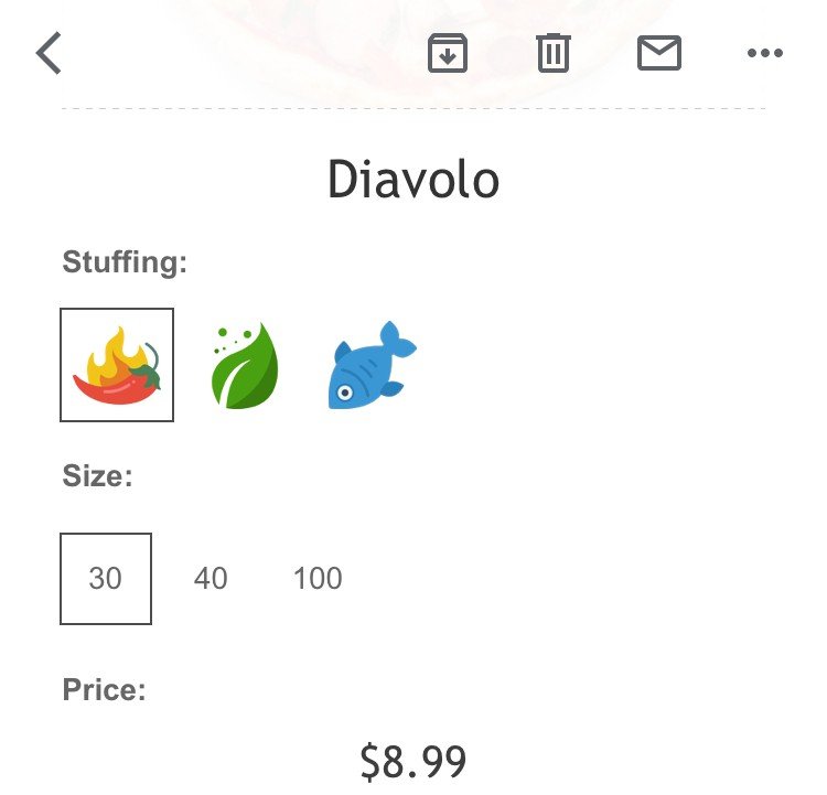
6. AMP selector
The selector allows users to choose the same items by size, color, etc. For instance, you could let users pick out a color of shoe or smartphone modification right in the email—no need to insert dozens of product cards.
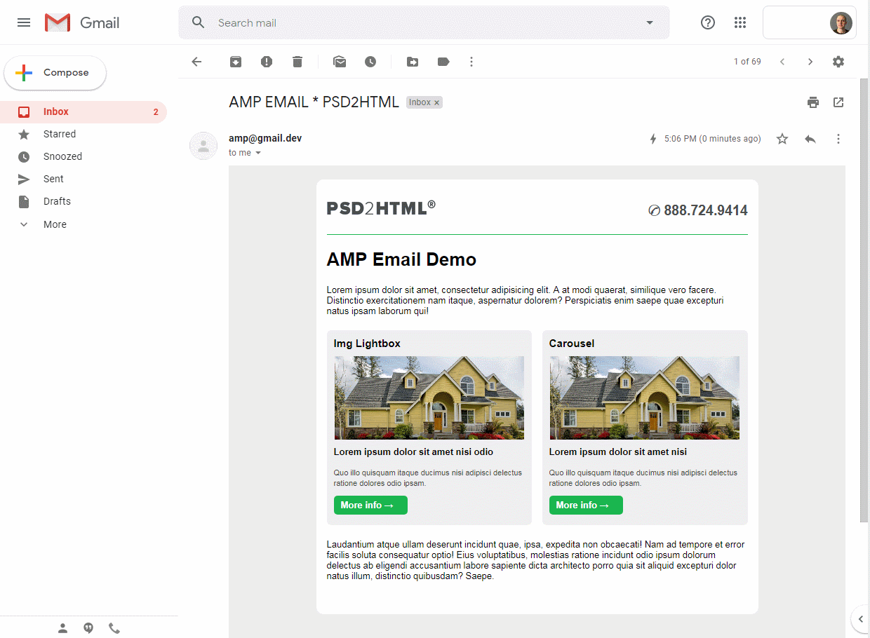
7. AMP lightbox
This visual block, in theory, offers users the ability to zoom in on an object or highlight the result of a certain action.
But, in practice, it turned out to be pretty buggy. So buggy, in fact, that Gmail announced that it was dropping lightbox support. We bring it up here only in case you see it pitched elsewhere—don’t do it.
How to craft an AMP-powered email campaign
Features are features. To add value, you need to know which ones actually matter and how to integrate them into your email campaigns.
Tools and services
There are three ways to craft AMP emails. The first and stoniest path is to write the code manually:
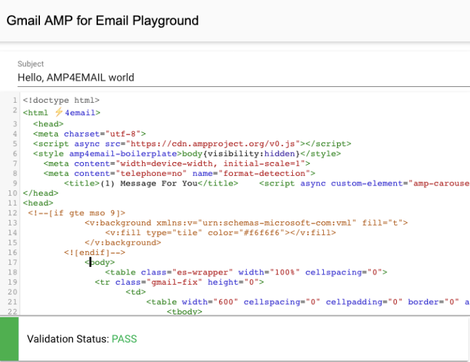
If you don’t have coding skills or resources, there’s a second option: Google Email Playground, where you can easily create a required block, copy its code, and embed it in your email template.
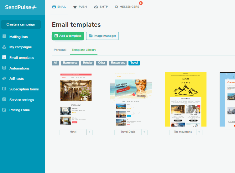
The third option is to choose an editor that offers AMP blocks and ready-made templates. You’re responsible for content and design, not the underlying tech.
Make sure your email service provider supports AMP
Not every email service provider can handle AMP HTML. Here are some common ones that can manage AMP emails:
- AWeber;
- eSputnik;
- Mailgun;
- Amazon SES;
- SparkPost;
- SendGrid;
- Adobe Campaign;
- Maileon.
The list continues to grow.
Use AMP when it matters—and don’t when it doesn’t
Use AMP wisely—no reason to be an AMP maniac. Does a feature really fit your current needs, or are you doing it because it’s new and trendy?
A major knock on homepage sliders is that they’re often an excuse not to refine an offer. Three executives have three opinions, so it’s easier to add all three instead of persuading the other two.
AMP is similarly tempting, but remember: Simplicity is always stylish.
Providing web-safe fallbacks
Gmail, Outlook, and Mail.ru are already AMP-friendly. But not all recipients are, and non-supporting clients may fail to render your emails effectively.
Provide recipients with web-safe fallbacks that render in any email system. Advanced email editors add and activate these fallbacks automatically; otherwise, you need to code these yourself.
AMP carousels’ fallbacks are structures composed of banners, image rollovers, or a set of pictures. With accordions, typical menus come to the rescue. (From a development perspective, an easy solution is to add a link that takes recipients to a web-page version of the email.)
How to test AMP-powered emails
Testing is essential. For AMP, Litmus or Email on Acid can’t help you. The only way is to send the test message to various gadgets and email clients. Yes, AMP testing is still manual.
Except for endpoints. With data transfer, you can use mock servers. They’re priceless when it comes to mutual communications like AMP forms and other elements designed to send data to external servers.
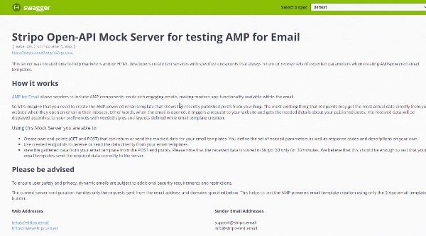
The mock server creates the endpoint simulation (i.e. emulates the real server and tests how feedback is delivered). This technique lets you test the functionality of AMP emails before developers set the real endpoints.
Conclusion
Here’s what you need to know about AMP emails:
- The email-oriented branch of AMP provides advanced interactivity and dynamic data—not speed.
- There are potential cyber threats and deliverability issues that you can mitigate with whitelisting.
- Think twice before you implement AMP emails, and use its features only when it makes sense.
- If you’re not an experienced coder, tools can ease your work. If you’re coding AMP emails manually, make sure you provide robust fallbacks, which most other tools offer by default.
AMP emails aren’t a perfect technology. But their potential means they’re unlikely to disappear. The bugs will get worked out. Make sure you’re ready to take advantage of the opportunity—in small doses now, or comprehensively later.
Related Posts
-

Don't design your own website. No, really. It will suck. You might think that since…
-

According to digital marketing firm Lyris, you should expect to lose 30% of your email subscribers every…
-
Think about every lead magnet you've ever signed up for. Of all of those free…
-

Have you ever received an email from a "noreply@" address? Of course, you have! This…


