


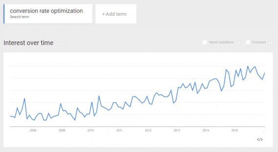
According to Google Trends, the term “conversion rate optimization” is an official “breakout”, meaning “searches for that phrase have jumped by +5,000 percent” over the last few years.

While this proliferation of all things CRO is good news for the industry, it does have one painful drawback.
For most websites, the biggest barrier to CRO lies in one of its most fundamental commandments: thou shall test.
The question becomes… what do you do if you don’t have enough traffic to run valid tests? What if you don’t have the resources?
In the absence of testable traffic and the necessary resources, qualitative research and these nine principles will set you on the right path. Note that these principles are among thousands you should consider and are merely examples of low-hanging CRO fruit.
Note: if you can’t test, best practices and guidelines help. See a ton of ecommerce guidelines & testing ideas in our comprehensive ecommerce guidelines report (247 guidelines specifically for ecommerce).
Table of contents
1. Speed
Back in 2009, Google conducted experiments which demonstrated that slowing down the search results page by under half a second resulted in 0.2% to 0.6% fewer searches.
Those might not sound like big numbers, but for Google — which processed roughly 40,000 searches every second — that resulted in 14,400 less searches every minute.
Today, people have become a lot more impatient.
After reviewing cumulative data, CXL highlighted just how vital speed is to conversions:
- “57% of visitors will abandon a page that takes 3 seconds or more to load.”
- “47% of people expect a web page to load in 2 seconds or less.”
- Even a mere 1 second delay can result in “11% fewer page views, a 16% decrease in customer satisfaction, and 7% loss in conversions.”
Given speed’s prominence, it’s no wonder that Capital One’s eCommerce platform, Spark Pay, identified “loading time” as the number one thing we can learn from them:
It may not be the most glamorous facet of selling online, but it’s clearly one of the most important. Amazon carried out their own research in this area and discovered that, for every 100ms of page load time, there was a 1% decrease in sales.
Put simply, people are in a hurry, and aren’t likely to hang around if your website under-performs.
As evidence of the difference speed can make, back in 2013, Walmart.ca increased conversions by 20% across all devices and orders on mobile by 98% simply because they invested in speed and responsiveness. What’s more, just last year, when Walmart.com lowered its load time from 7.2 seconds to 2.9 seconds, every second saved increased their overall conversions by 2%.
How to Load Fast

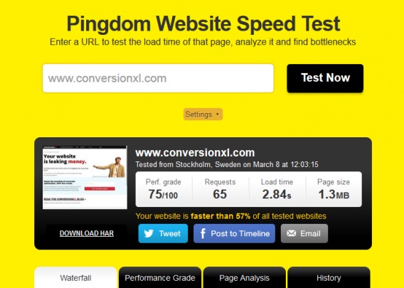
- Check the speed of your website with a free tool like Pingdom. Pingdom provides a graded scale, time, and a list of what to improve.
- Use a caching plugin for WordPress websites or install one at the hosting level; W3 Total Cache works for both.
- Reduce image file sizes with a plugin like WP Smush for your existing images or use Optimizilla before you upload them.
- If your site receives a high volume of globally distributed traffic, third-party solutions can be a tremendous help. For AWS users, a network optimization tool such as Datapath.io on average improves latency by 60%, thereby decreasing RTT (Round Trip Time) from 3.7 seconds to 1.6.
- Likewise, for non-AWS users, Peep’s number one “low hanging fruit for improving site speed” is “start using a CDN (Content Delivery Network).” And his second low-hanging fruit follows suit: “Host your static files in the cloud that uses a CDN.”
2. Singularity
Many landing pages contain multiple offers.
They shouldn’t.
Why?
On the email marketing front, Whirlpool went from four separate CTAs down to just one and improved their campaign’s click-through-rate by 42%.
The takeaway here is simple: less is more.
Less distractions, less options, less roads out… all equal more conversions.
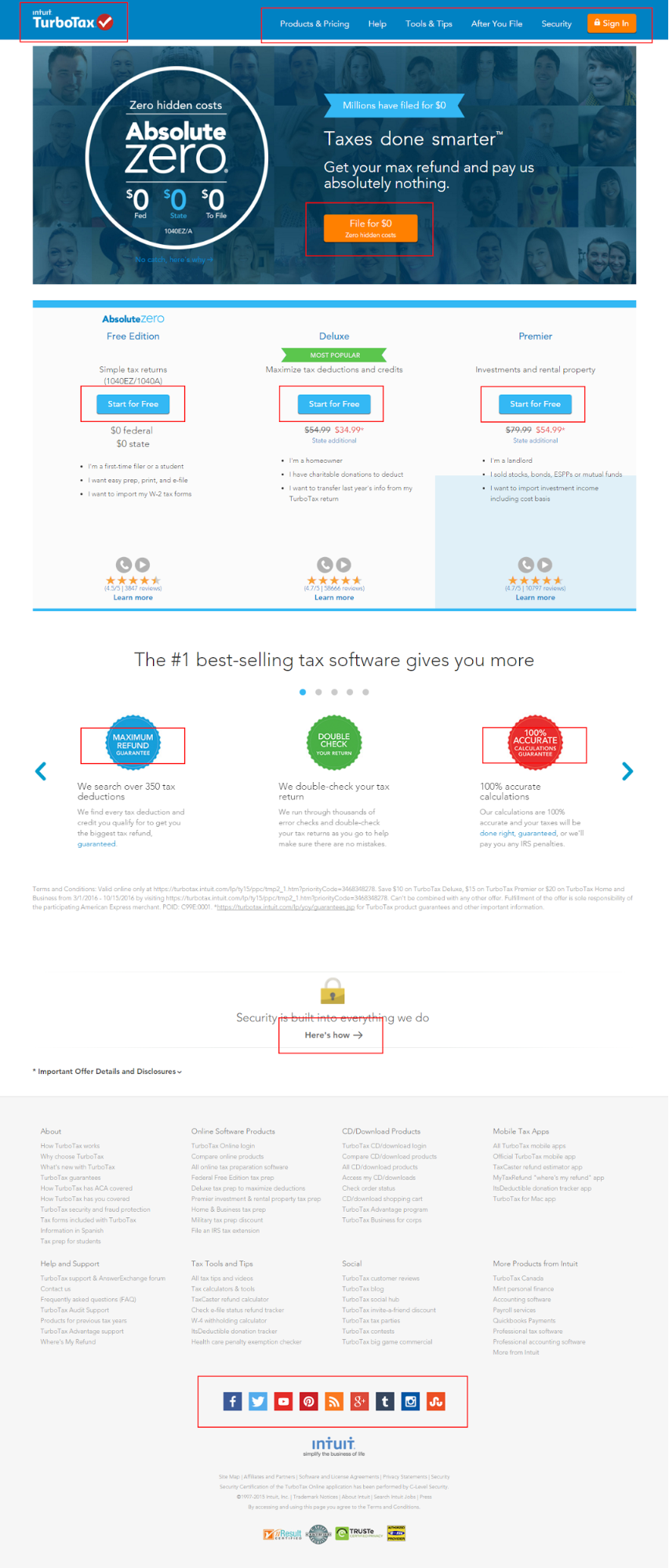
Unfortunately, despite “just one CTA” being something of a self-evident truth in CRO, bad examples are everywhere. Just take Intuit’s TurboTax landing page for the search term “file taxes for free”. Not only do they retain the site’s overall navigation bar, but there are 15 separate options to click (not counting the footer):
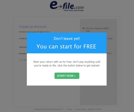
Now compare that to E-file’s landing page for the search term “free online taxes”. Pay special attention to how relentlessly E-file focuses on, first, the search terms themselves and, second, one goal (to “Start”):
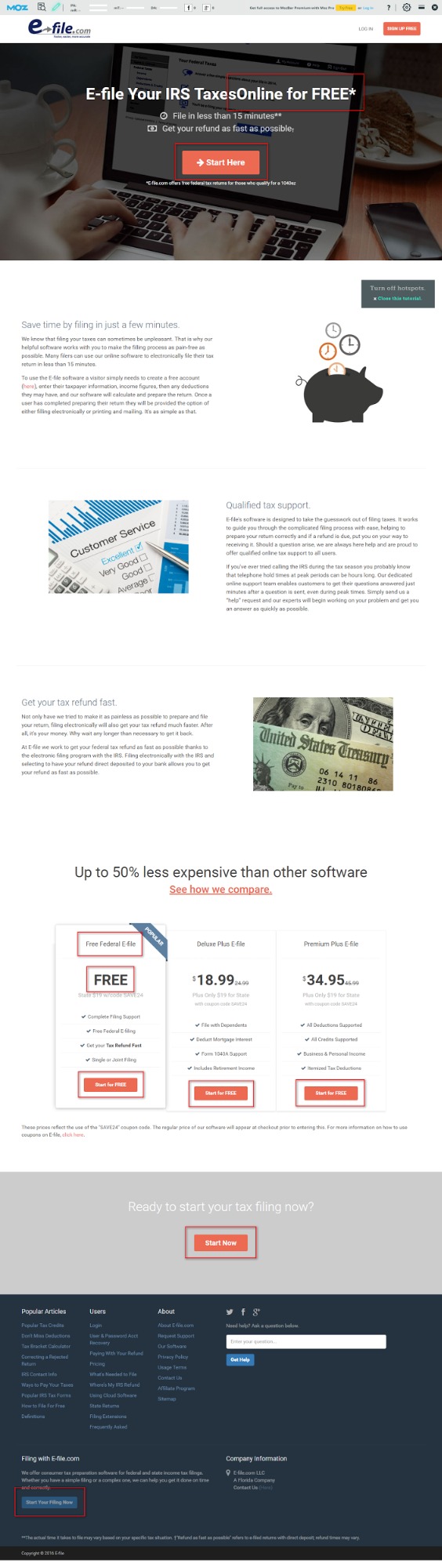
By way of critique, I’d recommend E-file remove the header “Log in” option as well as the entire footer. Additional elements like that dilute the central CTA.
However, what makes this example shine is that while there are multiple CTAs, they all aim at the exact same goal, directed toward the exact same “Create an Account” page. That page even includes the exact same exit pop up on it… all driven by the exact same keywords that got me to the page in the first place:

How to Be Singular
- Before you do anything, identify exactly what your own one goal of the page or email will be.
- Don’t give your readers any other actionable options other than that one goal.
- Be careful using social buttons. Test to see whether conversions increase or decrease with varied numbers.
- While you can certainly have multiple CTAs in the sense of having multiple buttons, each and every CTA should direct visitors toward your one, central goal — the next step in your funnel — and be built around the keywords that got them to your page or email list to begin with.
3. Simplicity
This next principle — simplicity — flows out of singularity: do not add clutter to your pages or emails for “what if” moments:
- What if a reader wants to like my Facebook page?
- What if the user would like more information about my services?
- What if they want to read more about my testimonials or case studies?
For example, if your page’s goal is to get visitors to subscribe to your email list or actually buy something, then that’s all you should focus on.
Every element on that page needs to support that one goal and pass the ruthless test: does this get my visitor closer to action?
The most notorious place for clutter is the homepage. Given the diversity of audience your homepage gets, the desire to give them plenty of “what if” options is natural.
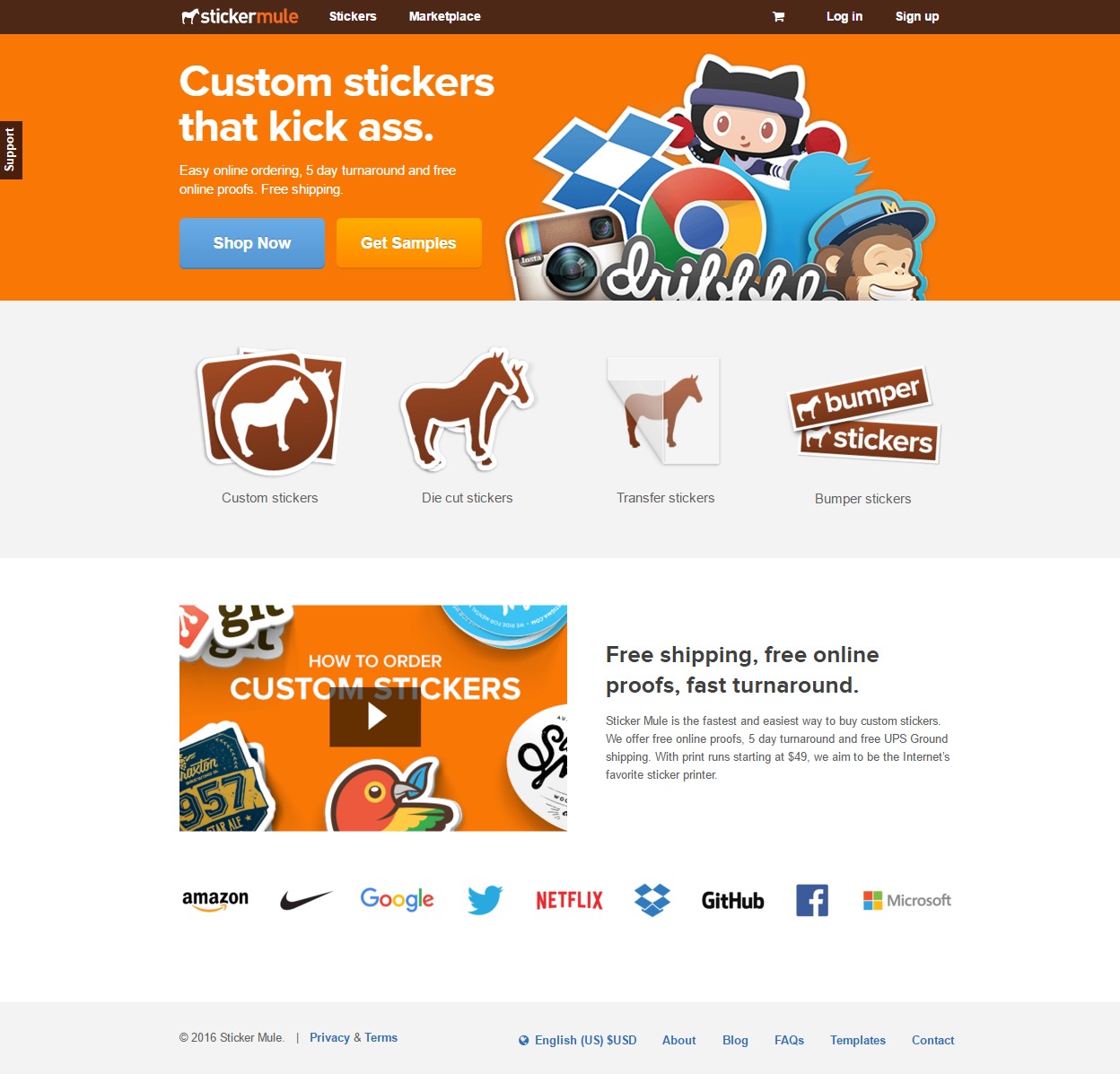
Sticker Mule’s original homepage (featured below) contained just four top-tier products… and everything essentially lived “above the fold”. This gave visitors a simple choice of options:
In an effort to highlight their multiplicity of product offerings and increase conversions, Sticker Mule created a variant of their original homepage and added all 18 of their products in addition to the usual header navigation, initial CTA, and video at the bottom of the page:

The results? Adding all of their products to the homepage hurt revenue by nearly 48%. As Tyler Vawser, VP of Content at Sticker Mule told me, the old version won all of their tests and remains their current homepage.
Irrelevant images are the bane of low-converting product pages and ads. T-Mobile learned this lesson the hard way when they featured Catherine Zeta-Jones predominantly in a series of ads.

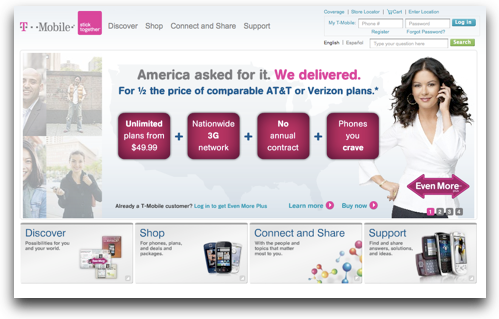
Why didn’t Catherine work? Because…
One older shopper, interested in buying a phone with easy-to-press large buttons, became frustrated when she couldn’t discern the button size in any of the pictures. When she spotted Catherine Zeta Jones holding a phone she liked, she became exasperated. “She’s a very pretty woman,” the shopper told us, “I just wish I could see the buttons.”
Bear in mind, all this talk of simplicity isn’t about the length of your page…there are winners on both sides of the long copy vs. short copy debate. Instead, it’s about sticking to the point: the action, the whole action, and nothing but the action.
How to Be Simple
- Know your one goal…and then ruthlessly cut anything that distracts from it.
- Be especially ruthless with products and product images: prioritize relevant visuals (namely, high-quality product images) over stuff that’s just “pretty” (e.g. people and places).
- Make purchase decisions easy on your audience by giving them pre-set options rather than something fully customizable.
- Lastly, the golden rule of simplicity is to add plenty of whitespace to every design.
4. Clarity
Pages need to be built around two aspects:
- The reason the person arrived there in the first place, and
- The target audience’s needs.
The funny things is… those two aspects are really one: people.
In other words, CRO is about them, not you. And who exactly are they?
Quoting NYU professor of philosophy Jim Pryor, Demian Farnworth defines “them” like this:
“Pretend that your reader is lazy, stupid, and mean.”
Quite an assessment.
Clarity means never assuming your audience knows anything. In fact, we’ve immortalized this principle in the cute acronym KISS: keep it simple, stupid.
Why is clarity so vital? Because until someone truly understands, you don’t stand any chance of converting them. Attention and desire speak to the heart. Clarity addresses the mind.
This means the first step toward clarity is meeting your audience’s expectations head on.
If you’re driving traffic to a page using PPC, then your headline must also include the same keywords that your ad contains. This is often called “scent” and creates a clear trail of connection between your visitor’s search, the ad, the landing page, and the CTA.
While this might sound like common sense, terrible examples abound. For instance, I did a Google search on “lose weight”, and this ad was one of the results:

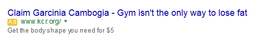
Besides the clarity killing first three words — I have no idea what Garcinia Cambogia is — the rest of the ad does address one of my keywords (“lose”). It creates the expectation that upon clicking, I would find out how to lose weight without the gym and for just $5.
Instead, this is where I landed:
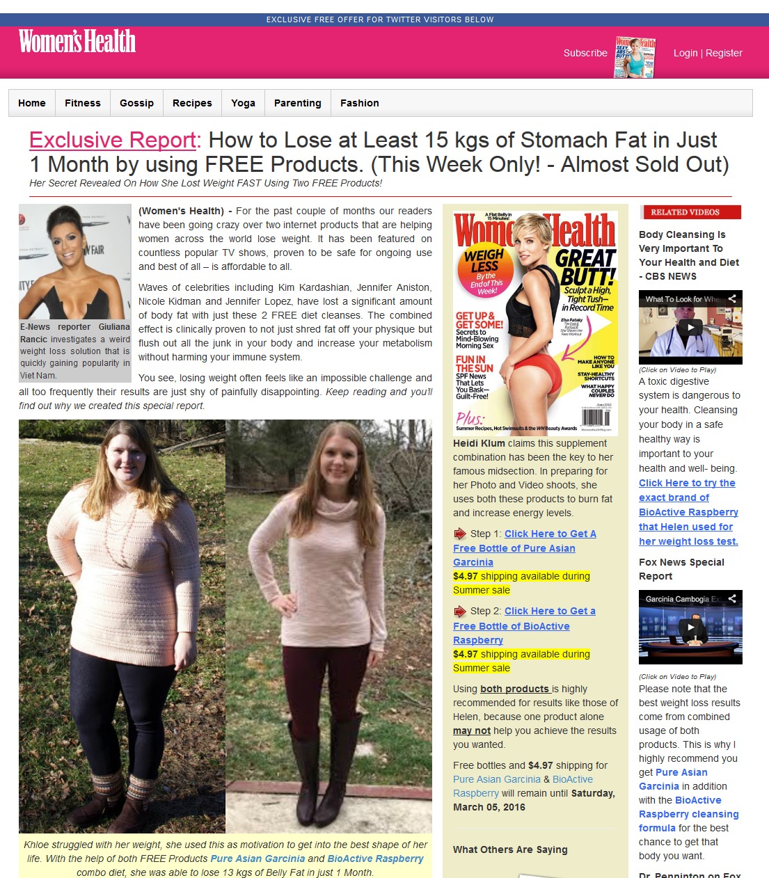
My immediate response?
Total confusion.
Notice the complete lack of clarity between what I was looking for (the search), what I was promised (the ad), and what I got (the page). The ad was about losing weight without the gym via a $5 solution and yet the page itself — a page that the company is paying to drive traffic to — contains nothing about weight loss without exercise or the $5 solution.
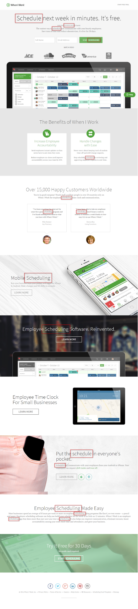
Now, take this example from When I Work for the search term “easy scheduling app”.
First, the ad:


Then, the landing page. 17 times the keyword “schedule” or “scheduling” appears in the headline, the subheads, the body copy, the CTA buttons, and both of the testimonials.
Don’t underestimate the converting power of clarity.
The second step in clarity is explaining… everything. This is especially key in technical industries.
Justin Jackson highlights this in his aptly titled We are not normal people. Speaking directly to developers like himself, he explains:
The problem [with enthusiastic statements like, “I could build this on the Twilio API” or “I could learn that new CSS framework”] is that all of this is focused on us, the creator, and not on the customer, the consumer.
Repeat after me:
“We are not normal people.”
Say it again:
“I am not a normal person.”
We’re not. What’s “normal” for us is often alien to our customers. If we’re actually going to sell products, we need to quit thinking about what’s cool to us, and focus on what customers actually need.
This doesn’t mean you can’t use technical language on high-converting pages.
But it does mean you have to lead with the real-world benefit before noting the features… and always explain those technical elements in words your “lazy, stupid, and mean” audience will understand.
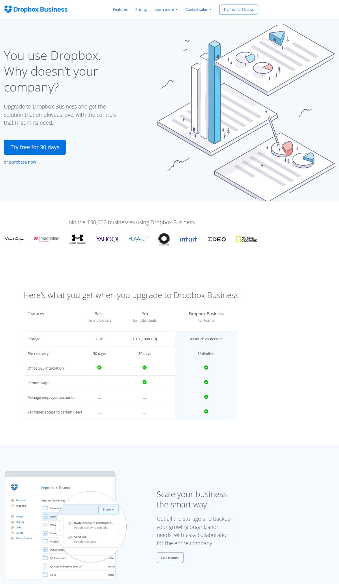
Dropbox Business does this beautifully. On their landing page, technical jargon has been eliminated almost completely. Unlike a great deal of B2B sites, the page communicates like one human talking to another.
Instead of getting bogged down in dense compatibility issues, security features, or IT nonsense, it appeals directly to its intended audience — current personal Dropbox users — while at the same time allowing “IT admins” to drill down where needed.
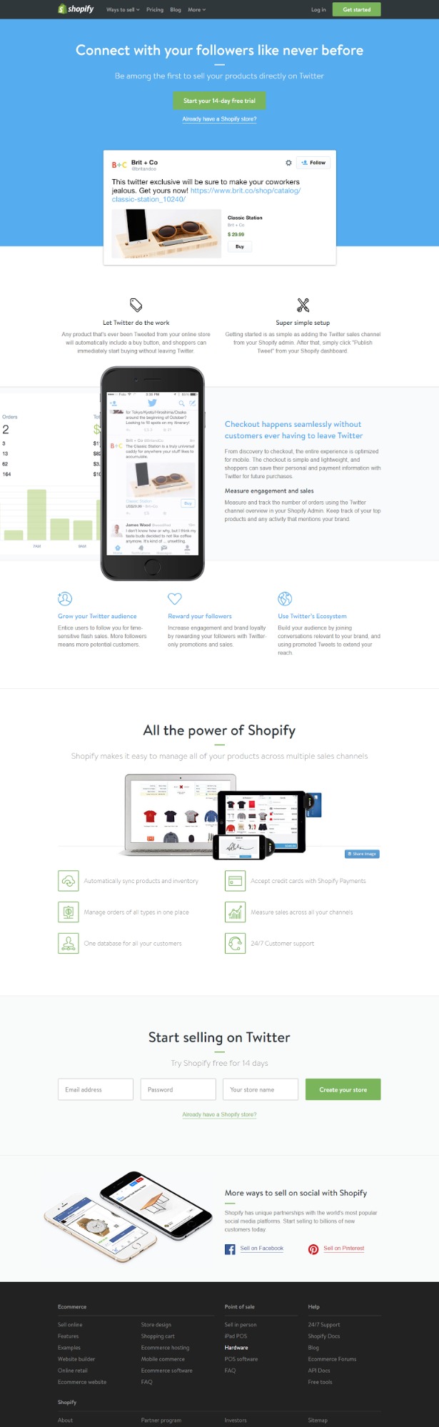
Shopify’s “Sell on Twitter” page does the same thing. The temptation to use words like API and omnichannel marketing isn’t always avoided on Shopify, but here they ditch the jargon and stick to language and a tone that focuses on the benefits, highlighting functionality in action:
How to Be Clear
- Meet your audience’s expectations by creating a strong “scent” between the keywords in your ad, email, or original CTA and the page they’re directed to.
- Don’t get too clever: call products what they are.
- Avoid technical language and jargon as much as possible.
- Lead with the benefits… then unpack the features or, even better, offer “To Learn More” links, pop ups, or page expansions.
5. Identification
If “clarity” is rooted in the truth that CRO is about them not you, then “identification” is where that truth comes to life. More than that, the next three principles — attention, desire, and fear — are deeply rooted in first identifying the right people.
To identify with the right people, you must know them. After all, the reason why sales and marketing exist in the first place is to address one group of people, not all people.
Knowing your audience’s aspirations, lifestyles, attitudes, and opinions are non-negotiable. This means researching your audience before putting anything on paper… or on a screen.
Peep Laja stresses just how vital this step is to conversions:
If you want to increase conversions, you have to figure out who exactly is your primary target audience, what they want, what matters to them and what the sources of friction are for them.
And as Kevan Lee from Buffer told me:
One way we try to approach our audience with empathy is by actively participating in the community and feeling their needs — be this in the support inbox, in the comments section, or on social. It’s hugely helpful to turn the questions we get from customers into blog posts and landing pages with answers.
The easiest way to get to know your audience is to visit the websites they frequent, hang out on social platforms they spend time on, pay close attention to the keywords they use, and pay even closer attention to the words they use in forums, comments, and reviews.
This deserves special emphasis… it’s what’s known as review mining.
By digging into customer reviews on sites like Amazon, Yelp, Angie’s List, TrustRadius and your own customer feedback, you get word-for-word scripts from the people you’re trying to reach.
Jen Havice walks through this process in How To Write “Compelling” Copy When You Don’t Have An Audience.
What’s more, Jen’s new book — Finding The Right Message — as well as her CXL article, How to Boost Conversions with Voice of Customer Research [Case Study], both revolve around turning “voice of the customer research into irresistible website copy.” Her message mining template walks you through how to do it for yourself:
I employed this same principle for a client that sold Spanish and ESL curriculum kits to elementary schools. Unfortunately, we didn’t have access to a wide variety of our own customer feedback, so instead we dug into the reviews of our competitor’s products on Amazon.
What we discovered was that customers weren’t writing about the various teaching methods, learning styles, or student test scores. Instead, their number one complaint was that the “free samples” they’d been given didn’t actually match the curriculum they bought.
The former belief about what our audience wanted produced generic ads with .25% and .11% CTRs:
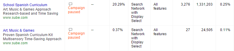
The new ads we created — which centered on the customer reviews from Amazon — looked like this:

From the lowest CTR of 0.11%, to the highest of 6.85%, those audience-driven changes generated a 6,127% increase in click-throughs.
The lessons are clear:
- If you know who your target audience is, you’ll know how to address them.
- If you know how they think — especially their objections and pain points — you’ll understand how to write and prioritize your copy.
- Most importantly, if you understand how their life will become better because of what you offer, you’ll know how to enter the conversation already taking place in their mind… as well as their heart.
How to Know Your Audience
- Every page or email must have a single target market… just one.
- Get to know that single target market by spending time on the sites and social platforms they already frequent. Pay special attention to their comments.
- Dig deeper by pulling out word-for-word scripts from review sites like Amazon, Yelp, Angie’s List, and TrustRadius.
- Conduct your own voice of customer research through surveys and questionnaires either on your site or via email.
6. Attention
It’s now common knowledge that every page has roughly 8 seconds to grab attention. If you fail, your target audience will be whisked away by a simple click. In other words, your pages need to grab your audience by the throat… and keep hanging on all the way to the click.
Shanelle Mullin puts it like this:
Conversion optimizers are in the business of attention management, just like magicians.
And Oli Gardner echoes that truth:
Attention is a state of mind that you can’t assume your visitors will even enter if you don’t give them the right conversion experience.
A good conversion experience is one in which your visitors are compelled to pay attention and ultimately interact with your conversion goal – clicking the Call-To-Action (CTA).
Grabbing and maintaining attention means more than just making sure your pages have one driving goal and eliminating everything else.
Attention is about emotion.
In fact, we can go further than that and get theological: high-converting pages — regardless of the industry — are about salvation, not sales.
Think about it like this:
- What hell will this page save my reader from?
- What heaven will it deliver them unto?
In practice, the headline is the most important element to engage your target audience. Be specific (use keywords), clear about the benefits — hell versus heaven — and, as a general rule, stick to less than 20 words.
I’ll dig directly into the two sides of attention — desire and fear — later, but less obvious psychological triggers are no less effective:
- Surprise
- “Warning: Unattended items in your shopping cart may be eaten by gnomes” (Modcloth)
- “Why Your Copy Needs to Pick a Fight with the Other Guy (Instead of Smiling and Shrugging)” (Copy Hackers)
- Questions
- “What Should Your New Password Be?” (BuzzFeed)
- “Why Are So Many Blog Post Headlines Framed as Questions?” (Kapost)
- Curiosity
- “The Countries Where It’s Easiest to Become a Self-Made Billionaire” (Business Insider)
- “They Laughed When I Sat Down at the Piano…But When I Started to Play!” (John Capes)
- Negatives
- “10 Ways the Internet Is Destroying You” (ListVerse)
- “Oracle Makes More Moves to Kill Open Source MySQL” (Tech Crunch)
- How To’s
- “How to Be Unique (Even If You Don’t Feel Special)” (Henneke)
- “How to Use Customer Experience Maps to Develop a Winning Content Marketing Strategy” (Copyblogger)
- Numbers
- “Why Content Goes Viral: What Analyzing 100 Million Articles Taught Us” (OkDork)
- “The PPC Food Pyramid: A 211 Point PPC Marketing Strategy” (KlientBoost)
- Audience Reference
- “Finally: You Can Open and Process Raw Images in your Browser” (The Next Web)
- “Bloggers! Are You Leaving Traffic on the Table?” (SumoMe)
- Specificity
- “Uh-oh, Your Prescription is Expiring” (HubSpot)
- “10 Portland Brews You Should Drink Right Now: Ten Reasons The Beers In Your Fridge Right Now Just Don’t Cut It” (AskMen)
After your headline comes your initial subhead and all the accompanying subheads throughout the page. In my Copyblogger post, I explain how killer subheads come down to four questions:
Connection: Does your subheadline retain and support the same thought, concept, or dominant emotion in your headline?
Qualify: Does your subheadline narrow your audience by adding qualifications?
Intensify: Does your subheadline amplify the one dominant emotion from your headline?
Push: Does your subheadline push the reader into the first sentence to find an answer, solution, or explanation?
As a model for attention-grabbing and throat-holding subheads, check out just a few of Yotpo’s subheads on their homepage geared at introducing eCommerce store owners to integrating reviews and user-generated content into their online marketing and sales:


Each subhead unpacks a specific benefit of a specific product feature. Additionally, each subhead goes after a separate, but interrelated heaven associated with eCommerce: sales, marketing, and search.
My only critique of Yotpo would be that its subheads lack directness. While the body copy speaks to the reader conversationally, none of the subheads include the magical word “you”.
How to Grab Attention
- Answer the two fundamental questions (from your user’s perspective): “What hell will this page save me from?” and “What heaven will it deliver me unto?”
- Use keywords in your headline and subheads.
- Ensure your subheads “connect, qualify, intensify or push”.
- Always write directly to your audience by using the word “you”.
7. Desire
Naturally, desire is a subset of attention. Think of it as the bright side of the coin as opposed to the dark side.
But what exactly is desire?
In his 1966 classic, Breakthrough Advertising, the legendary Eugene Schwartz defined desire — “mass desire” — as “the public spread of a private want”.
His point was that desire — not your actual products or offers — is what makes people buy:
The power, the force, the overwhelming urge to own that makes advertising work, comes from the market itself, and not from the copy.
Copy cannot create desire for a product. It can only take the hopes, dreams, fears and desires that already exist in the hearts of millions of people, and focus those already existing desires onto a particular product.
This is the copywriter’s task: not to create this mass desire — but to channel and direct it (3).
What Schwartz says about “copywriters” is equally true of CRO experts.
To optimize conversions, two types of desire stand out:
- Individual: “What’s in it for me?”
- Social: “What are the people I like doing?”
A legendary CTA formula comes from Joanna Wiebe, which marries these two incentives in a single phrase:
“I want…”
Never introduce work in your CTA copy.
It doesn’t matter that, in fact, they will have to sign in to watch the video; all that matters is what the end user wants. What do they want? To watch the video. So test CTA copy that reads something like “Watch the Video” (and then add a few words about the value of doing so).
Whatever finishes the phrase “I want…” shouldn’t just inform the copy on your CTAs, it should inform your entire page.
To illustrate what not to do, let’s look at what is perhaps one of the worst landing pages of all time.
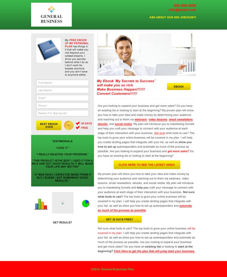
In addition to a host of design issues — stock image hero shot, left-aligned opt-in box, inattention to “space dimensions”, too many CTAs — the real sin of this page is its absolute inability to cultivate desire.
What Makes It So Lifeless?
The headline is blatantly self-serving and grabs — nay, gropes — at the lowest common denominator: greed. The rest of the copy screams, “Get rich quick!” through the use of empty superlatives, empty testimonials, and empty keywords littered in red.
While the body copy uses phrases like “proven,” “show you,” and “help,” no proof is offered and no explanation unpacks exactly how the reader will be shown and helped.
Lastly, on top of too many CTA buttons, each of the buttons seems to trigger a different action and result — “Ebook”, “Best Ebook Ever”, “Click here to see the latest video”, and “Get 30 Days Free!!” — and none of them complete the phrase “I want…”
In contrast, consider these desire-driving pages.
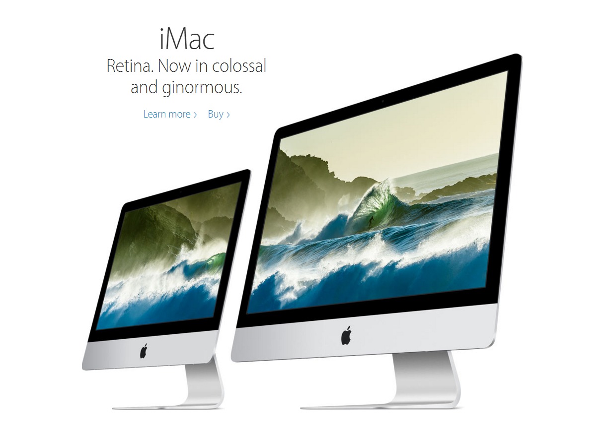
Apple is famous for their ability to create desire, even for products you didn’t know you wanted.

Even the product display images they use on their sales pages scream desire.
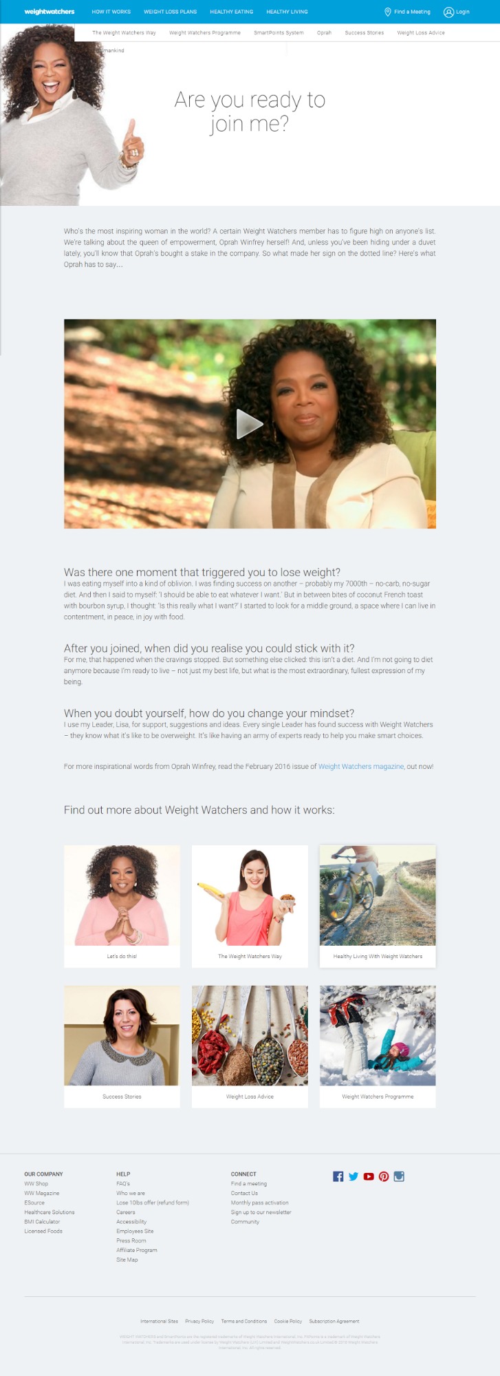
Similarly, Weight Watchers channels all of Oprah’s enthusiasm, optimism, and authenticity.
The question and answer format — along with the personal video — creates a narrative built around the idea, “If she can do it, so can you.” The page also leans hard on both individual desire — “What’s in it for me?” — as well as social desire — “What are the people I like doing?”
The only thing missing from this page is a CTA button that answers the headline’s question… “Yes, I’m ready to join you.”
How to Create Desire
- Leverage individual desires by answering the question, “What’s in it for me?”
- Lean on social desire — i.e. likability and social proof — by featuring testimonials that are either story-driven or backed by data.
- Use hero images that vividly enflesh the desire your product or service aims at.
- Add logos of prominent customers. Again, this creates the social desire to be associated with successful brands.
8. Fear
Fear is the dark side of attention.
Why focus on fear? Because fear is the most primal and powerful human motivator; fear has helped our species survive for millennia.
The last 50 years of empirical research on fear-arousing messaging has shown evidence that high fear messages are generally more effective than low fear messages in changing people’s actions, intentions, and attitudes.
In the modern environment, too, a “fear appeal” posits the risks of using and not using a specific product, service, or idea such that if you don’t “buy,” some particular dire consequences will occur.
Because of this, fear does all sorts of wild and deeply physiological things to both our brains and our bodies. Using fear for CRO goes right back to the second of the two overarching theological questions from attention: What hell will this page save me from?
What will happen if your reader doesn’t take the action you want them to take? Break out in hives? Embarrass themselves in front of their clients and colleagues? Lose business? Declare bankruptcy?
What current pain will they be forced to continue living with if they don’t take action? Will they be damned to loneliness, ignorance, or failure?
Those are extreme examples — and you can’t overplay your fear hand — but you do want to put the thought in your reader’s mind that if she doesn’t take action right now, she’s going to lose out big time.
The easiest way to do this is through Dan Kennedy’s PAS formula, a formula he calls the “most reliable sales formula ever invented”:
- Problem
- State the problem succinctly and clearly. Provide just enough information — most notably in the headline and subhead — to make your audience say, “That’s right. I do struggle with that.”
- Agitation
- Then, amplify the problem in your opening paragraphs.
- In Kennedy’s words: “Tap their anger, resentment, guilt, embarrassment, fear—any and every applicable negative emotion. You should have readers mentally wringing their hands, pacing the room, saying, ‘This has got to stop! I’ve got to do something about this! What can I do about this? If only there were an answer!’”
- Solution
- Only after forcing your audience to see their problem in all its horrifying glory, do you then present the solution.
In fact, Copy Hackers increased their daily email opt-ins from double digits to triple digits with the addition of a “negative consequence” button:
In addition to good-old-fashion terror and pain, urgency and scarcity are two more negative emotions with huge converting upsides. However, you have to leverage them without the sleaze.
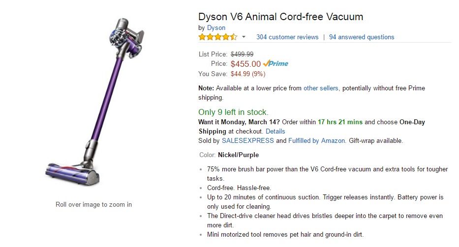
Amazon implements both by including two countdowns on their product pages: (1) an availability countdown — “Only 9 left in stock” — and (2) a delivery countdown — “Want it Monday, March 14? Order within 17 hrs 20 mins and choose One-Day Shipping at checkout.”
How to Terrify
- Structure your page or email around the PAS formula: problem, agitation, solution.
- Write the copy for your “painful” button — the opt out — using negative consequences.
- Add scarcity and urgency using countdowns for availability and time.
- Beware of manufacturing and overusing scarcity and urgency. Always be honest, otherwise you risk coming off as disingenuous.
9. Trust
Trust is a big deal online and extends way beyond eCommerce.
To make matters worse, visitors will determine the trustworthiness of your site in less than a blink of an eye. People form an opinion about a website in about 50 milliseconds.
What’s more, in a study conducted by Consumer WebWatch, a company’s perceived “credibility” overwhelmingly came down to something that at first, sounds incredibly superficial.
In Peep’s words:
The data showed that the average consumer paid far more attention to the superficial aspects of a site, such as visual cues, than to its content. For example, nearly half of all consumers (or 46.1%) in the study assessed the credibility of sites based in part on the appeal of the overall visual design of a site, including layout, typography, font size and color schemes.
Key takeaway: Great design gets people to trust you and to stick around. Poor design creates mistrust and makes people leave.
So, how can you optimize for trust?
Peep covers 39 Factors in his Website Credibility Checklist; I’ll narrow that down to just three.
1. Get Shallow
As lame as it sounds, people will trust you if you look good. That’s true in life and it’s true online.
In Influence: Science and Practice, Robert Cialdini’s very first tip on getting people to like you in the famous “know, like, trust” chain is to be “attractive”. Design matters: “People judge the book by their cover and your website by its design. If you designed your website yourself and you’re not a designer, it sucks.”
2. Get Available
Being available doesn’t mean offering 24-7 tech support. Nor does it mean returning every email by hand or never unplugging from your cell phone. But for CRO, it does mean making your contact information prominent. In fact, Peep gives availability both the number two and number three slots in his checklist:
- “Make your address and phone number visible at all times. Include it in the footer (a must), but depending on your site also in the header (especially if your business depends on incoming calls) and on the sidebar, in the microcopy.”
- “Make it very easy to contact you.”
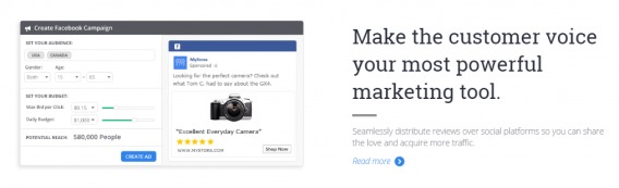
3. Get Other People
You are not your own best salesperson; the people your audience already trust are.
Going back to Cialdini, this is what’s known as social proof, something we touched on under desire.
However, other people are so vital to trust — and trust is so vital to CRO — that it bears illustrating.
What forms can these “other people” take? In Is Social Proof Really That Important?, Shanelle identifies 9 separate kinds of social proof: 6 “traditional types” and an additional 3 “new types”. Again, I’ll boil that down to less than a handful.
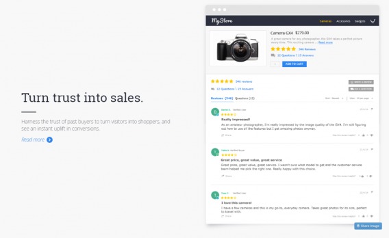
InvestorCarrot is one of my favorite examples of “other people” done right. While testimonials often boil down to little more than empty statements — “I like this thingy. You’ll probably like it too.” — InvestorCarrot’s endorsements all come from real people and include real, data-based benefits:

Next, “other people” don’t actually need to be people. They can also be companies. This includes client logos:

Or case studies with logos:

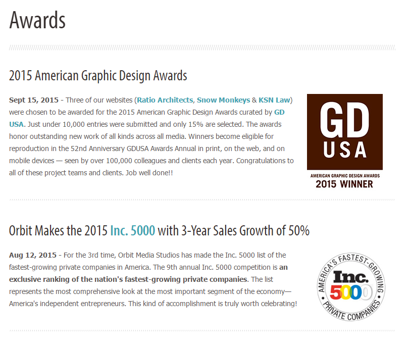
Or award logos:
Or lastly, press coverage logos:
How to Be Trusted
- Prioritize and invest in professional design: clean, uncluttered, and (to drive home just how shallow your visitors are)… pretty.
- Make your contact information constantly visible and available.
- Use other people in the form of testimonials and logos to establish social proof.
- While I wish it could go without saying, it can’t. The final ingredient is actually being trustworthy.
Conclusion
Conversion rate optimization is complex. Professional optimizers follow specific processes, which you can learn about here. But when you’re just starting out, without the traffic or resources to run a valid testing program, principles like these can be a lifesaver.
After all, there’s more to CRO than A/B testing.
To get started, optimize your site based on nine simple principles…
- Speed
- Singularity
- Simplicity
- Clarity
- Identification
- Attention
- Desire
- Fear
- Trust
Related Posts
-

If I were to tell you - what would you do with that information? Honestly,…
-

What's a good conversion rate? A conversion rate that's better than the one you currently…
-

Here's something that won't come as a shock to people who work for big companies: not…
-
Learn how to run conversion optimization experiments the right way. In this video, I sit…

