


Managing shopper experience for mid-sized eCommerce businesses presents a lot of opportunities for conversion testing, and the ability to see real and immediate revenue results when tests are successful…
My favorite conversion tests are those that can be abstracted from the specific website audience and applied to larger populations of online shoppers.
In this post I will review 5 changes, ranging in difficulty from easy to hard (hard means it will require some programming), but each of which can have a large and immediate impact on increasing conversions and generating more revenue.
Since page load times and number of form fields are inversely related to conversion rates, the faster your load times and less fields your require, the higher your conversion rate.
Taking this a step further, think about what else you can do to speed up the process of gathering information required for a visitor to make a purchase. If you’ve maxed out the number of fields that you can remove, and are left only with your hard requirements – how do you go about further optimizing your form?
Automate.
Every form field with a static population of options presents a chance to automate acquiring the required information.
Some of the easiest places you can do this are addresses (cities and states specifically), and shipping options.
Even if you only reduce a form by one field, or decrease the average speed to checkout completion by 5 seconds, these tweaks can positively impact revenue.
Table of contents
Automate The Ordering Process Where Possible
Hack #1
Difficulty level = moderate
Against what you may have seen on popular pattern libraries, break the common pattern for address design, moving from City, State and Zip code,
to Zip, City and State.
Here’s what it looks like:

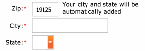
By moving the zip code field above the city and state fields you can automatically fill in the city and state once the zip code has been provided, since these are static options.

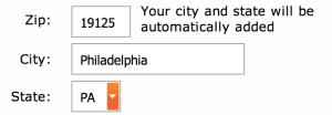
This can be done with a static lookup file using a little bit of javascript, and as an added bonus to your bottom line, can help you avoid ‘address match’ penalties often charged by shipping companies (like UPS, FedEx, ABF, etc).
For this tweak to be effective, the cursor needs to move to the next required field after populating the city and state, to avoid potential keystroke errors by the shopper.
Also, since you are going to be auto-populating information many users are used to typing, you should pro-actively manage user expectations by adding some simple language next to the zip code field:
“your city and state will be automatically added”
We implemented this on our one-page checkout at TrafficSafetyStore.com (the source of the screenshots) and saw an immediate 38.74% increase in conversion rate, from 2.22% to 3.08% in less than 2 weeks (went live on July 29th with steady improvement through August 8th).

This one small change led to an additional 110 orders, bringing in an additional $43,230 in revenue in a 2 week period.
Along this same line of thinking, using a bit of customer psychology can go a long way, and help to speed up the process of option selection and decision making, by suggesting the most obvious options by default.
Hack #2
Difficulty level = easy
Automatically select the cheapest shipping method by default.


You still want to offer any expedited shipping options you support, but make sure shoppers can see and verify that the option selected is the least expensive.
This goes beyond supporting the most common behavioral pattern, and let’s shoppers know that you understand they are looking for the best value for their money; defaulting to the lowest cost option.

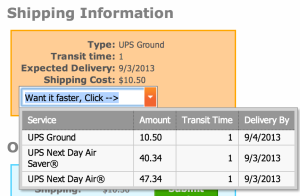
Another way to do this is to display all available shipping options up front so the shopper knows they are getting the lowest priced option:

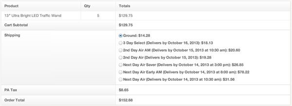
This change also had an immediate impact on our top-line, resulting in a 19.31% increase in shipping revenue within the first week of roll-out, producing $17,059.46 in shipping revenue over the prior week’s $14,298.26.

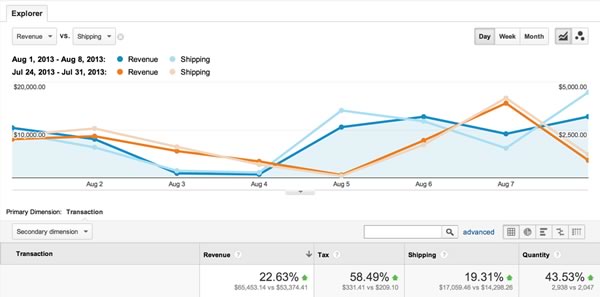
Not to mention the general lift across top-line revenue, tax revenue, and overall quantity.
Save As Much Order Information As Possible
This seems like a no-brainer, but I still only see a few ecommerce sites effectively using it; save your user’s order information.
Not only to speed up future orders, but to show your users that you care about their time and can provide a full picture of their order history.
Hack #3
Difficulty level = hard (but not for a developer)
Persist past orders and order history to allow for quick and easy re-ordering.

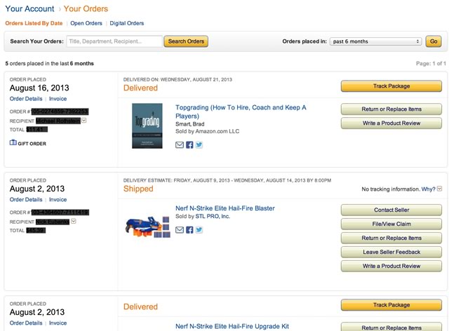
Source: Amazon.com
We are currently working to get this implemented on our website as part of a major re-design process, here is what it will look like once it goes live:
Don’t Just Save Orders, Save Credit Card Numbers
This tip comes from Peep himself, but storing credit card details can significantly increase the velocity or purchases, especially from mobile devices.
Beyond ensuring your PCI compliant by encrypting all client-side authorization data behind a secure-socket layer, there is a significant benefit to not asking shoppers to re-enter this data.
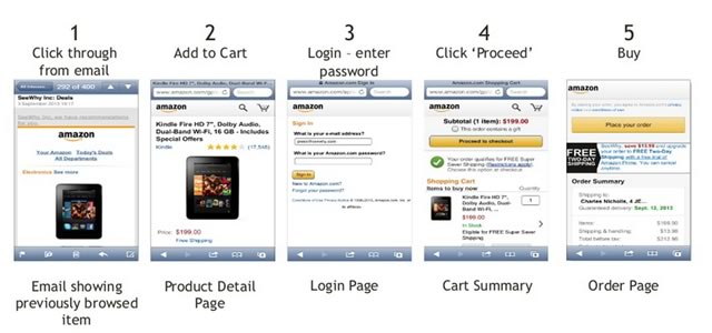
As detailed by Charles Nicholls from SeeWhy in his presentation from Conversion Conference, Amazon does this exceptionally well: when you receive a promotional email from Amazon, you open it to see an item that is either suggested to you based on your buying profile and recent behavior, or you are sent items you recently looked at but didn’t purchase.
If you decide you want to make a purchase, the only information Amazon requires is your password. That’s it.
Here is the slide from Charles’ presentation detailing the actual workflow on Amazon’s mobile commerce application:

In addition to automating as much of the re-order process as possible, it is equally important to give thorough consideration to how errors are handled; beginning with the interface components down to the language, it must be simple, and it must be clear.
Graceful Error Handling
Another checkout experience that is often overlooked or not given sufficient consideration is error handling.
Think about how frustrating it is to lose your work on a computer and we’ve all been there, often times while in the middle of trying to make a purchase.
You spend the time typing in your billing and shipping addresses, type in your credit card information, click submit – and there’s an error, and now the form is blank.
You have to go back, enter in all of the information again, and at this point you are slightly annoyed and a bit frustrated, but there’s a better way.
Instead, Cache The Collected Data
Hack #4
Difficulty level = moderate
As form information is entered, cache it in the form fields, so shopper’s don’t have to retype it; speeding up the checkout process.

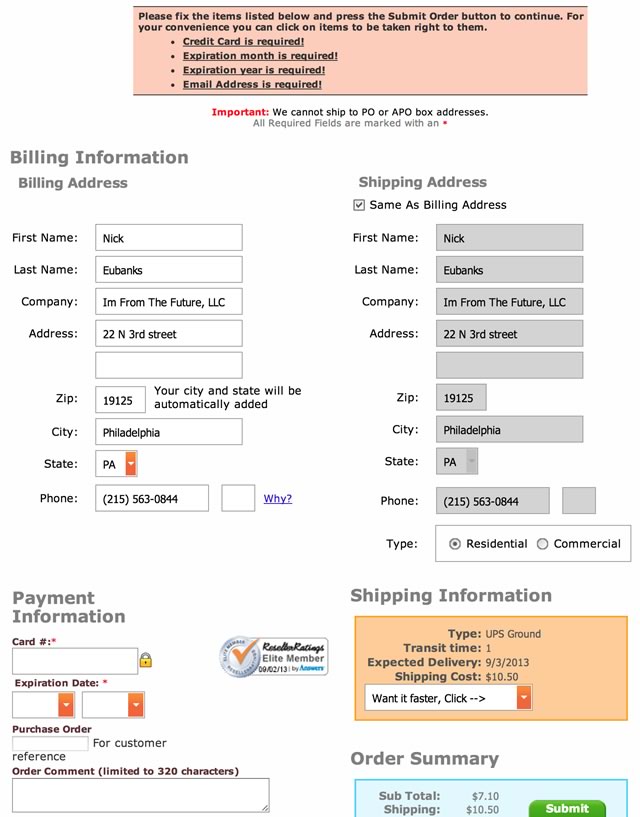
You can see in the above screenshot that I forgot to enter my credit card information and email address, but instead of starting from scratch, the form has cached all the information I entered, making it much faster to simply fix the validation errors without having to retype all of my information.
Bonus tip: allow for quick fill of shipping address using a ‘same as billing address’ checkbox.
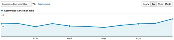
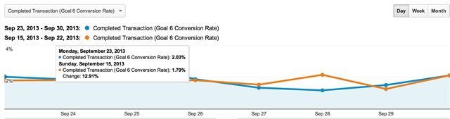
We pushed field data persistence live on Sunday September 15th, and within the first week we saw a 12.91% lift in completed transactions on our checkout page:

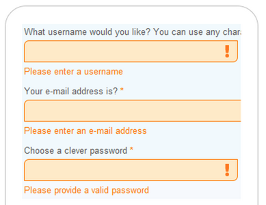
Also it is worth mentioning that psychological studies have shown that red is not always the best color as it is considered to provoke ‘intense’ and ’alarming’ reactions, instead it is recommended to consider a yellow or an orange for highlighting errors, for example:

Lastly, on the note of handling errors gracefully, it is considered a best practice to avoid using negative language, negative trigger words such as:
- Failed
- Problem
- Invalid
- Wrong
- Prohibited
Which can evoke negative emotion, and can instead be addressed by simply stating what is still required without painting it in a negative light, for example, instead of “Oops, there was an error,” stating “Please fill in a valid email address.”
The last change that I am going to recommend has to do specifically with human computer interaction, and more specifically for people shopping English language websites.
“Reading on computer screens is tiring for the eyes and about 25% slower than reading on paper” and “79% of web users scan rather than read,” as reported by Nielsen Norman Group.
Knowing this is half the battle, but also means you can take steps to arrange important components of your Ecommerce website to leverage this behavior.
Adjust Page Layout to Support Common Behaviors
Hack #5
Difficulty level = easy
Sort Navigational Elements by Popularity
For English language websites this means arranging your navigational elements from left to right, and from top to bottom.
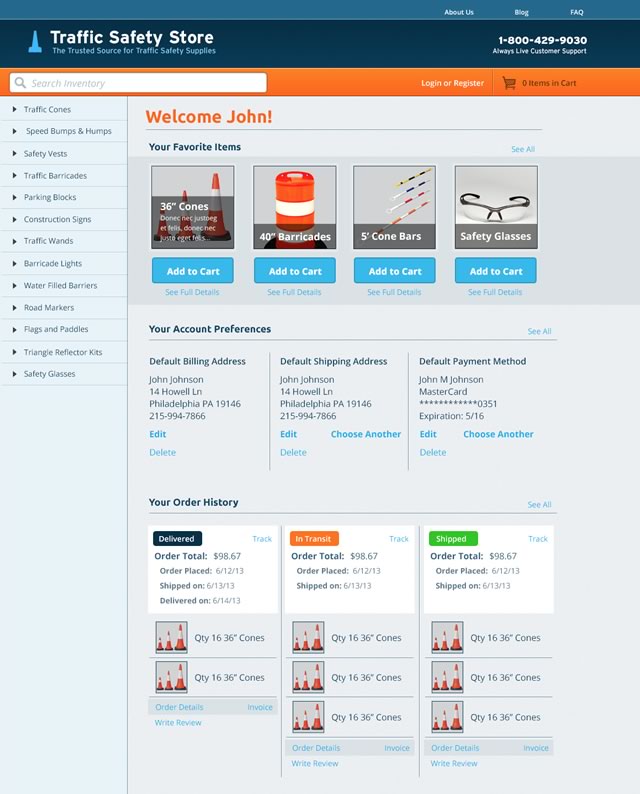
For the Traffic Safety Store this meant stacking our category navigation not in alphabetical order, as it had once been, but in the order of our highest order volume items – making it as easy as possible for shoppers to navigate to our most popular product categories.

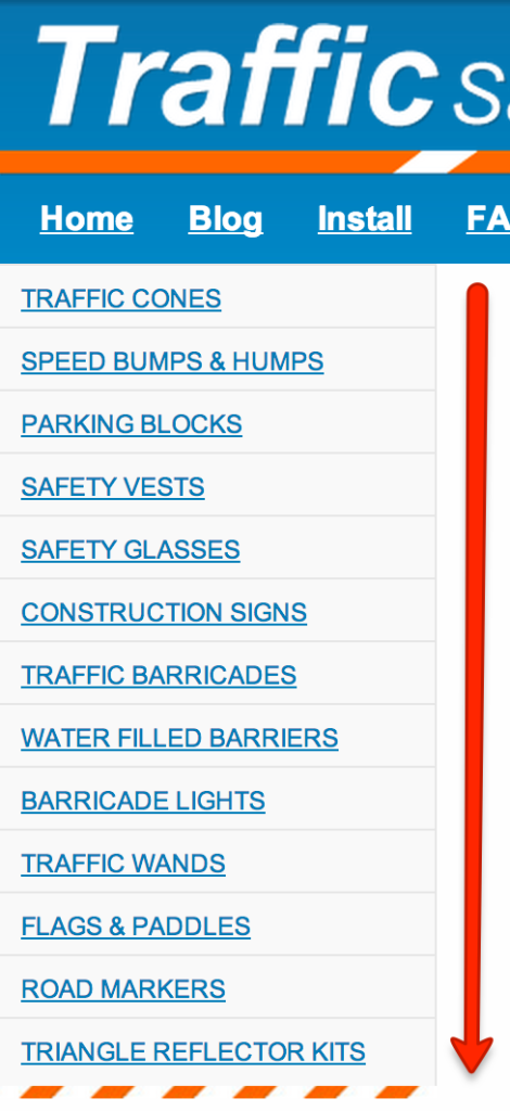
You can see this in action in the above screenshot, with traffic cones leading the pack followed by our other most popular product categories in descending order.
We based this layout on a combination of historical sales data and projected product category goals.
So right now the top 3 category’s represent our current product sales leaders, but our goal is to increase the top-line sales for both safety vests and safety glasses, so while these are not currently our 4th and 5th place product sales leaders, we are positioning them so that shoppers looking for other products will have to see them as they scan vertically down the navigation.
We then mirrored this approach on our sub-category pages from left to right;

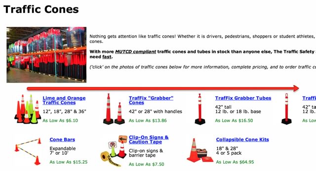
From the above screenshot you can see that lime and orange traffic cones are our top sellers, followed by grabber cones, grabber tubes, and so on.
Unfortunately this change was not the only change made on the website in the time period it was pushed live, so I do not have specific conversion data to show a lift directly correlated to these changes, but I can show that in the weeks after this was made – we saw a lift in the overall volume of traffic cone sales:

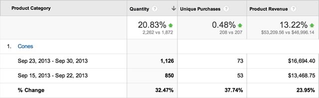
Over the period between September 23,2013 and September 30, 2013 we saw a 32.47% increase in the quantity of traffic cones sold over the previous week, resulting in a 23.95% increase in product revenue.
Another approach to making layout tweaks to increase overall site conversion rates is the practice of using actual user behavior data guide your designs further with additional data collected through both click-tracking and re-corded user tests (check out UserTesting.com).
Bonus tip: form field length should match the expected length of input. This helps cut down on user’s subconscious perceptions that the form is long and time consuming.
Conclusions
These 5 changes simplify your ordering process and show your shoppers you care about their time and their wallet.
The top-level takeaways here are:
- Automate ordering where possible.
- Cache all user collected data, both for speed and to remove frustration.
- Re-work site design and page layout to support the most common behaviors, and support your best selling products.
Thanks for reading. For even more user experience hacks to increase revenue, check out these 4 simple changes that grew sales by 50%.
Related Posts
-

What's user experience (UX) got to do with conversions? Everything. Great user experience is a…
-

Want to live longer, be there for your grandkids? But not just live longer, but…
-

Ever wonder why your site has a lot of visitors but not enough transactions, purchases,…
-

Do you need business experience? Where should you work to get the best experience? Work…

