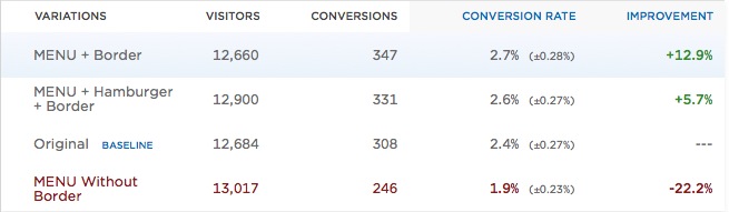
Exis Web tested the hamburger against the word “MENU,” creating three iterations. These were the results:
While the test ran for only five days, their (preliminary) results showed that the word MENU + border/hamburger worked better than just a plain hamburger menu.
The folks over at Booking.com tested the button as well—no difference in their case.
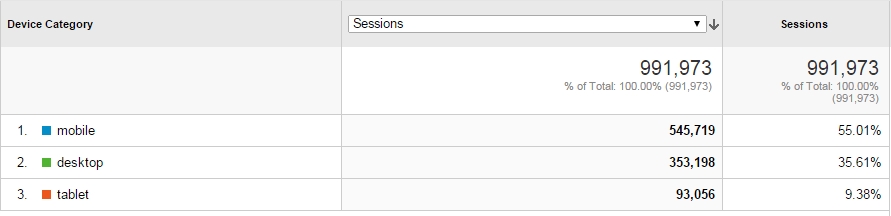
One of our clients is an ecommerce site selling scented candles. Mobile traffic is much more important than desktop in their case. This is their last 30 days:
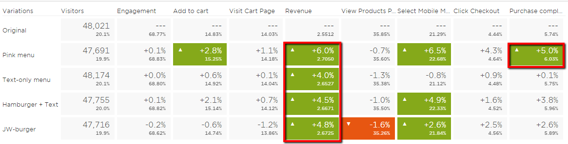
We decided to test the hamburger icon and came up with three challengers based on what other people had tested:
We tried to innovate as well, but we couldn’t come up with a totally new, better icon. So we tested the usual suspects: the word “menu,” with and without the hamburger.
In addition to these, we added a variation. We made the “hamburger + menu” icon pink, which was one of the site colors, not chosen randomly. The idea was to draw more attention to the icon via color.
We ran the test for six weeks, with a total sample size of about 240,000 users; each variation had about 2,800 purchases.
These were the results:
(Click to enlarge)
The key outcome? All 4 treatments brought in more revenue than the control. Not clicks, engagement, or other soft metrics—dollars.
This outcome is worth an extra couple of hundred thousand dollars per year. Not too shabby for just switching out the icon.
This was the winner:
We ran a three-week follow-up test as well (to test alternatives), but we failed to move the needle. The winner of the first test remained the best.
Why is the hamburger icon confusing (to some?)
Well, do you think it’s clear and obvious? Probably not. The icon was designed in 1990 for a whole different world. Just carrying it over to today doesn’t make a lot of sense.
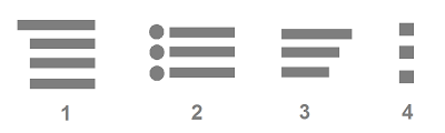
While it’s ubiquitous, not everyone is savvy enough to get it. So imagine that you’ve never seen the icon. Or you’ve seen similar icons, like these:
No wonder it’s confusing. When you read Norman Nielsen’s guidelines for designing icons, they recommend you use the five-second rule: If it takes you more than 5 seconds to think of an appropriate icon for something, it’s unlikely that an icon can effectively communicate that meaning.
Their own research into icon usability concluded that “Users are still unfamiliar with newer icons, including the three-line menu icon and the map-marker icon.”
Okay, so what’s better?
Our own test showed that the word “MENU” helps, and using a color to make it stand out from the noise can help, too.
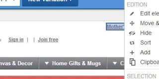
Luis Abreu recommends displaying the full menu as a list all the time: “As long as it’s evident as website navigation, people will still scroll past it and will definitely be immediately exposed to the available options.”
Example:
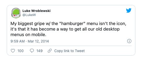
UX guru Luke Wroblewski has critiqued hamburgers on multiple occasions, like here:
“We know from the theory of gestalt principles, more specifically the proximity principle, that objects which are positioned near each other, are perceived as a group. So why not provide initial context by using this principle, and then fade out the “Menu” label as the user starts scrolling?”
By showing/hiding the labels during scroll, we can make sure that the user gets a chance to learn the icon’s associated action. We could even fade in the label once the user scrolls up again.
Conclusion
Don’t rely on the default option when it comes to navigation on mobile sites. Hamburgers icons have gotten their butts kicked in some tests, and, in others, replacement options made no difference.
Test your menu icon—run user tests as well as A/B split tests. Learn how your particular audience responds to it, and figure out what works best.


