
Optimizing your SaaS pricing page for mobile devices is doubly tricky. It’s tricky to optimize your pricing page in the first place, but optimizing it for such a small screen complicates things further.
To add fuel to the fire, it can be hard to see the value in optimizing a pricing page for mobile. Mobile B2B customers are just browsing and don’t intend to purchase anyway, right?
In fact, research tells us that an optimized mobile site has significant conversion potential, and redesigning the mobile UX can boost conversion rates.
Your mobile pricing pages doesn’t have to be held hostage by poor conversion rates if you know what you can—and should—optimize.
Table of contents
Mobile SaaS pricing page data
To analyze how pricing pages are handled on mobile, I selected 59 SaaS sites from all industries. Included in the data set are the biggest names in email automation, ecommerce, and page-builders.
On the opposite end of the company-size spectrum, I included lesser-known software in niches like HR, product tracking, and expense management.
A minimum requirement for analysis was that their pricing plans have at least 10 features, since more data displayed on a mobile device is harder to optimize.
Answers to questions like “What’s the best way to allow users to compare plans?” and “How can you display rows of industry-specific information concisely?” became a lot clearer after dozens of heuristic assessments of what these sites got right and wrong.
If you don’t have a data-heavy pricing page, these UX tips are still beneficial; in fact, they’ll be easier to put into practice since a simpler page is easier to refactor.
This data is more useful once you’ve optimized your SaaS conversion potential, implemented a pricing strategy, considered how to acquire customers, and audited your sign up flow.
With those prerequisites out of the way, UI/UX takes center stage—especially mobile optimization.
Re-thinking mobile optimization
As the hot spot for conversions, pricing pages for SaaS sites (and particularly B2B SaaS sites) tend to be information-rich.
Including so much data goes with the territory of informing your customers clearly about what your product (or product tier) provides. Qualifying customers this way helps to reduce churn in the long run, but that assumes the data is communicated effectively.
Pricing information is objectively easier to display with more screen real estate. Therefore, the goal is to make the experience for mobile “desktop-usable” without making it “desktop-like.”
You’re not altering a desktop pricing page for a phone, but instead re-designing the UX from a mobile device’s perspective.
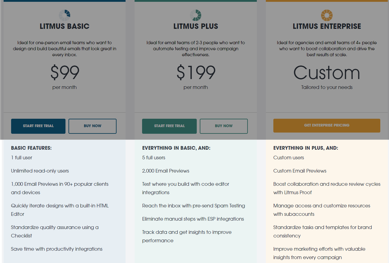
The simplicity of pricing cards
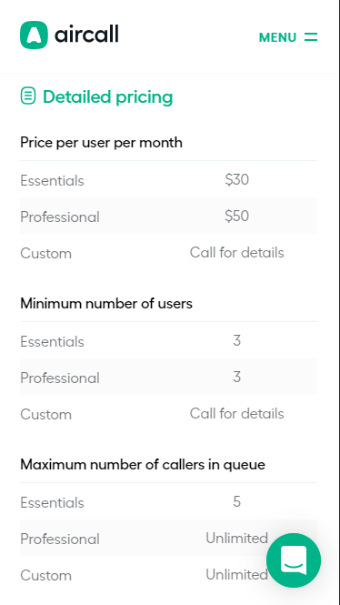
In nearly all 59 sites I researched, each pricing plan’s information was contained in a card.
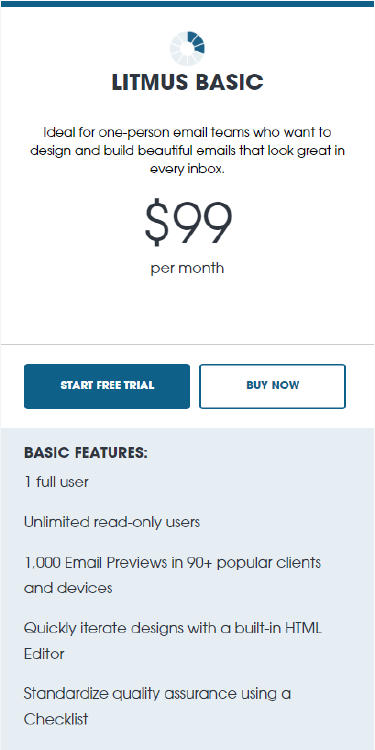
This design conforms to UX best practices—putting the pricing information and plan features in a clearly defined, compact area.
On desktop, these cards are commonly presented side-by-side:
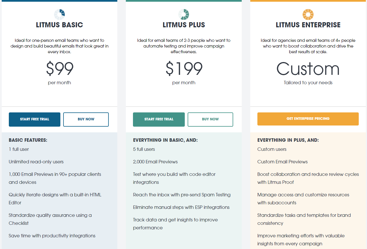
The pricing information for each plan is at the top…
…with a feature list below:
It’s easy to compare the features of each plan since everything is lined up horizontally:
How these cards were (or weren’t) optimized for mobile screens is where it gets interesting.
Pricing cards on mobile
In my research, cards were formatted in one of three ways: stack, tab, and carousel:
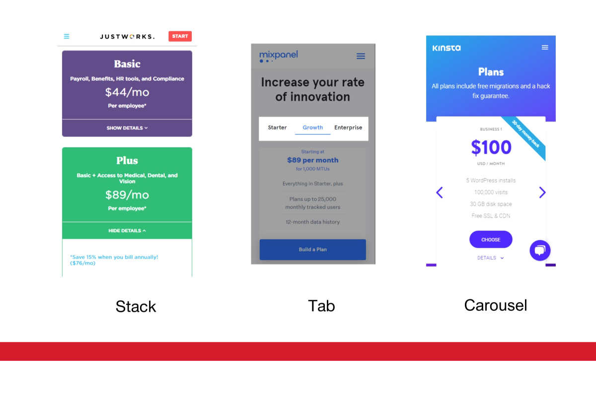
Stacking cards for mobile screens was by far the most popular way of displaying the information, with 78% opting for this method. The next most popular method was using tabs to navigate between cards (14%), followed by flipping through cards in a carousel (8%).
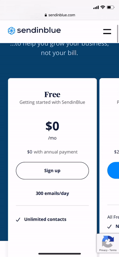
Solution 1: Stacking cards
Stacking the pricing cards for mobile makes a lot of sense—it’s a potent grid-like solution for smaller screens. There were two main ways to include a plan’s feature list on the card.
Most commonly, a plan’s features were displayed in a full list with an icon functioning as a bullet point for each item:
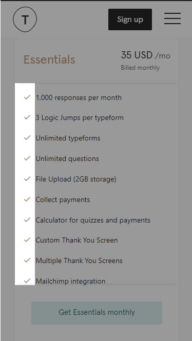
This treatment puts the features of each plan front and center, but it doesn’t allow easy comparison between plan types.
If it’s important that your users be able to compare the features for each plan, there are a few ways to overcome a limited screen size.
To start, 12% of the sites with stacked cards put additional information for each card inside an accordion:
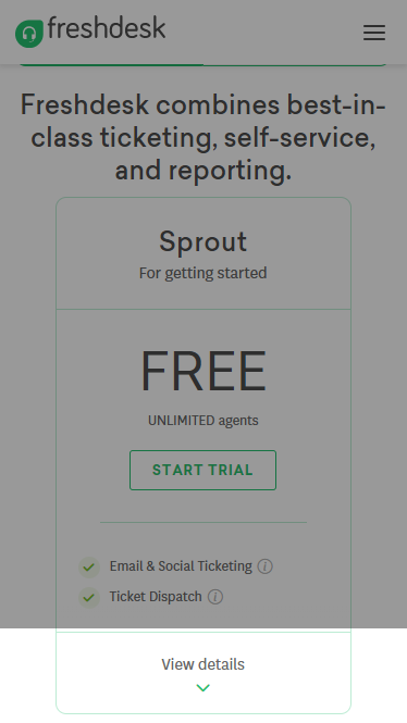
By clicking the arrow below “View details,” an animated drop-down revealed the features of that plan; closing the accordion hid the information again and encouraged users to browse the plan below it.
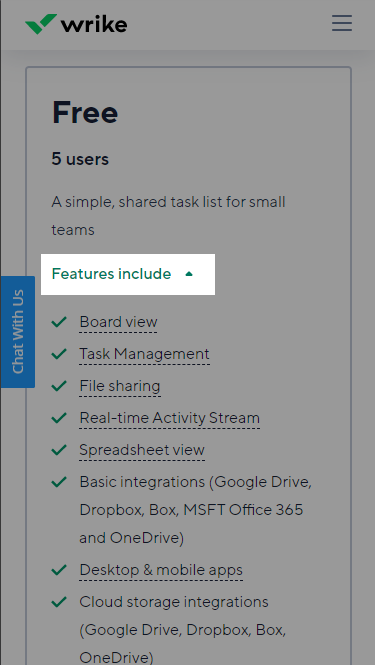
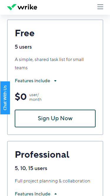
Wrike contained the features in an accordion but auto-enabled it on load. This solution empowers users to hide content they’re not interested in while still encouraging them to read the features for each plan:
While stacking is a strong way to present pricing information and limited features to your users, there are some use cases for which it’s not the best solution.
For instance, companies that stacked their cards on mobile had an average of 3.4 plans on their pricing page. Stacking cards for more than four plans would degrade the user experience. The back-and-forth vertical scrolling to compare just two plans is already challenging.
As a result, this method is most effective with fewer plan options. If you have more than four, see Solution 3.
Solution 2: Using tabs
The average number of pricing plans used with tabs was 2.5, which suggests that it’s a great method to use with fewer plans.
However, I’d argue that you can use it with more plans as well. While a carousel works well when dealing with more than five options, tabs provide a faster experience to switch between prospective plans.
Knak used tabs very well—the only thing I’d tweak is to fix the tabs to the top of the screen to avoid backtracking to the beginning.
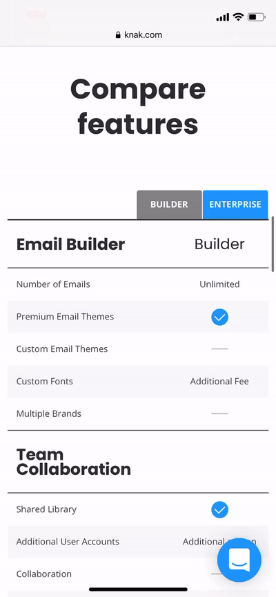
Something to keep in mind when using tab navigation: Prevent text wrapping so the content doesn’t jump around. It’s easy to lose track of which feature you’re comparing if you can’t keep the lines straight.
Solution 3: Sliding carousels
When you have a lot of plans, stacking cards or navigating with tabs won’t cut it. Your best bet is to use a sliding carousel, like Kinsta does:

When using a carousel, it makes a lot of sense to structure the feature lists differently. To eliminate redundancy, build off the previous plan’s features and include only new ones.
This technique conserves a lot of space and reassures users that all of the previous plan’s features are included, saving them the effort of checking.
It’s important that your mobile carousel looks and functions like a carousel should:
- The slider should take swipe gestures to scroll.
- Eliminate animated transitions that slow down use.
- Use a visual indicator to show that the carousel is scrollable.
Subtle aesthetic tweaks for your table UI
Making tables work well on a mobile phone is tough, so I want to cover a few best practices for table UI. While it’s also a good idea to apply these principles to your full-sized pricing table, the effects of poor table design are amplified on mobile.
The key to a great table is that information is easy to take in. These subtle aesthetic tweaks help provide a differentiation in rows, columns, and cells so that users can skim data faster.
Mobile table typography
The goal is to make table headers legible yet compact. Since a fixed header takes a certain amount of space, keep it usable but minimized.
- Rather than increasing the font size of headers, it can be more effective to increase the font weight instead. This enhances the readability without taking up much more space.
- Prevent text wrapping for longer strings of text. This can cause content to jump around (especially with tab navigation), making it difficult for users to compare aspects of plans. To solve this, make the cells of your table a fixed width. With consistency in your cell width, users can quickly glance to see if a plan has the features they need.
- Bold the most important pieces of information in long sentences. Bold text catches the eye and makes understanding the value proposition of the feature more skimmable.
Adjusting for fixed elements
If you decide to use fixed columns or rows in your mobile table layout, a few additions really add to the user experience.
A non-distracting way to separate the fixed information in the columns and rows from the variable information in the table is to use a subtle box shadow:

This clear delineation enables users to glance at the headers and scan feature lists easily.
Revising table borders
Many tables have dark, thin borders to define the edges of a cell:
A less-distracting and equally effective way to give your cells form is to reduce the contrast (or opacity) of the border—but make it a pixel or two thicker:
This still provides a clear differentiator that the eye can easily follow, but it gives more emphasis to the data itself.
A tooltip alternative to save space
Clear up fears, doubts, and uncertainty about features by adding a tooltip with additional info.
We’ve all seen it done with icons that pop up a block of text to clarify a feature, but that isn’t necessarily the best way to present them.
An alternative that saves on precious mobile space is simply to underline the feature’s text with a dotted line:
While it’s still clear that clicking on the text will provide more information, the saved space can show more data within the table.
With table UI optimizations covered, let’s tackle the pricing table flow.
Optimizing pricing tables for mobile
Eleven percent of sites in my study took away their pricing table for mobile. Some sites re-designed their table information to fit into cards. Others suggested browsing on desktop to view the table. Some did away with them with no explanation at all.
If you decide to leave out a table on mobile, I suggest re-packaging that information into cards, although, with these next tips, you should feel empowered to display mobile tables nicely.
Mobile table options
There are many ways to structure a mobile table, but a good way to tell which one might work best is to see how many plans need to be included.
Each type of mobile table has limits for how much data can be displayed on the screen at once. The number of plans you need to fit in the table and your analytics data should determine which method to go with.
Full-sized table
Including a full-sized table is often overlooked on mobile. The format of the table can be transferred fairly easily, but its success is predicated on a small number of plans.
Don’t use a full-sized table if you have more than 3 plans; though if you fit those parameters, you can replicate Fullstory’s design:
This method allows for easy comparison without fooling around with tabs, accordions, or horizontal scrollbars.
Font sizes and headings play an important role in full-sized tables. Conserving space makes the text more legible.
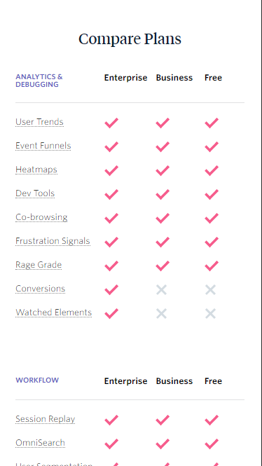
Tabbed and fixed tables
If a full table isn’t in the works, a table with tabs and fixed components is your best bet. The tabs make table navigation (i.e. plan comparison) a breeze for users. To boot, fixed columns and rows make it easy to identify included features.
LastPass is a great example of this:
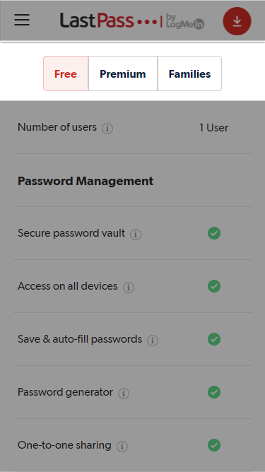
Using this solution, you can stay away from a table that has a horizontal scroll. With such a snappy UI, tabbed tables make a lot of sense for mobile.
It has an app-like feel rather than the pinch-to-zoom monster of a desktop table on mobile.
Horizontally scrolling tables
If you’re unable to integrate a tabbed table for some reason, horizontal scroll tables are a possibility. They don’t provide the best UX, but they’re still usable. If you opt for one, make it as polished as possible.
The quickest, biggest win for a horizontally scrollable table is to fix the left-most column in position:

When the row labels are always in view, the data is much easier to digest. Remove excess padding within the cells and between the columns to minimize scrolling.
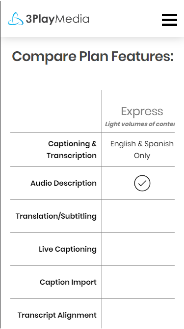
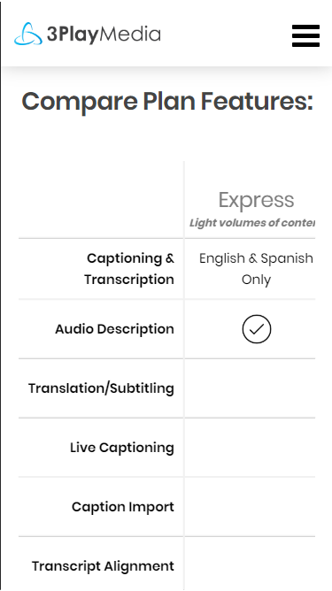
Finally, indicate that the table is scrollable. Take, for example, 3PlayMedia’s table:
You wouldn’t know that this table horizontally scrolls. One way to do that is to reduce the opacity of text on the edge of the table…
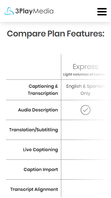
…or show table overflow:

Don’t assume that users will scroll.
Special considerations in mobile table design
These solutions are warranted only in special use cases, but they certainly provide a better UX specific to mobile tables.
Hamburger menus for table navigation
The first is a mobile menu to help navigate a beast of a pricing table, like Heroku’s:
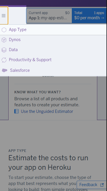
Clicking on each element takes you to the specific section of the table on the page. Note that we’re not switching between pages, rather just scrolling to the selected section.
Grouping by topic
If usage limits drive plan differences, consider flipping the traditional layout. Instead of putting the plan types in columns and features in the rows, reverse them:
With the plans grouped by topic, users can select the features they’re most interested in and compare plan types to see what’s covered.
When they’re done comparing one feature, they can minimize the accordion and keep researching (or complete a purchase).
The power of componentizing
The last idea involves thinking carefully about how your desktop pricing page is structured. If you can make each part of the page into a component, it could translate to a smaller device.
This is exactly what Mailerlite did, turning this…
…into this:
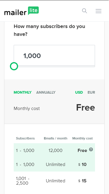
Nothing was lost by carrying over the design from desktop to mobile. If you make frequent tweaks to your pricing page, it could be helpful to contain those adjustments within components so that re-optimizing for mobile doesn’t become a headache.
Just be careful—responsive design is not mobile design.
Mobile pricing pages by the numbers
There’s a lot of diversity in how this sample of 59 SaaS sites handles their mobile pricing pages. There’s no one way to structure a pricing page. And the most common way of doing it isn’t necessarily the best.
However, there are a few insights we can extract from this data set. The average number of plans was 3.5, but when we account for the method the sites chose, it gets more interesting:
- Tabbed pricing cards were used 14% of the time and had an average of 2.5 plans.
- Stacked pricing cards were used 78% of the time and had an average of 3.4 plans. (Accordions were used 12% of the time when cards were stacked and had an average of 4 plans.)
- Carousels were used 8% of the time and had an average of 5.5 plans (with as many as 9 plans).
Regarding tables on mobile, there are a couple more insights:
- 11% of tables were straight-up excluded from mobile with no explanation or re-formatting of data into cards.
- 13% of tables were horizontally scrollable but had no visual indicator that they could be scrolled.
Combining those data points, nearly 1 in 4 pricing pages provided an obviously weaker experience on mobile.
Conclusion
Getting tables to look better on an iPhone isn’t the most exciting part of running a software company.
What is exciting, though, is when customers understand the value your product offers. The more they understand what you can do for them, the more likely they are to purchase, and the better long-term users they’ll be.
To summarize:
- Consider using tabs if you have 2–3 pricing plans and want users to compare features easily (especially useful if you don’t have a full table).
- Consider stacking your pricing cards if you have four or fewer plans—also think about using an accordion if your cards are feature-rich.
- Consider using a carousel if you have more than five cards; a good strategy is to build feature lists off each other as users progress through the carousel.
- Bad table UI for desktop translates to horrible table UI for mobile. Tweak the table elements to be less distracting and emphasize the data.
- Fix table rows and columns whenever possible to enhance readability and prevent confusion.
Most of the battle is simply knowing what to do (so no excuses now). Making something great isn’t much harder than making something good.
Test changes. Use your analytics data. And reap the benefits of communicating more effectively to your ideal customers at a critical juncture.
Related Posts
-

Google is a strong advocate for responsive design. Mashable named 2013 "The Year of Responsive Design,"…
-
As a SaaS company, both your product and service are unique solutions, and your pricing…
-
Most businesses struggle with their product pricing strategies. Are you charging too much or too…
-
When we talk about conversion optimization, much of the strategies remain the same across industries.…


Just one of the things I also personally think these SAAS pricing tables should have myself its a “more info” hover over effect on each bulleted items on the list each time as lots of times I don’t even know what the things mean/are when I see them. This has to help.
Hey Corey,
Thanks for the comment. I totally agree with you. SaaS sites can get deep into technical jargon really fast, it’s nice to have those tool tips at our disposal.